Oliver Twisted

These pages contain additional materials from the Oliver Twisted boxes in Discovering Statistics Using IBM SPSS Statistics (5th edition).
Chapter 1
No Oliver Twisted in this chapter.
Chapter 2
Please, Sir, can I have some more … power?
- GLIMMPSE: especially good for multilevel and longitudinal designs
- GPower: free all round software
- nQuery Adviser
- PASS (Power Analysis and Sample Size)
- Power and Precision
- pwr: package for R
Chapter 3
No Oliver Twisted in this chapter.
No solution required.
Chapter 4
No Oliver Twisted in this chapter.
Chapter 5
Please, Sir, can I have some more … dimensions?
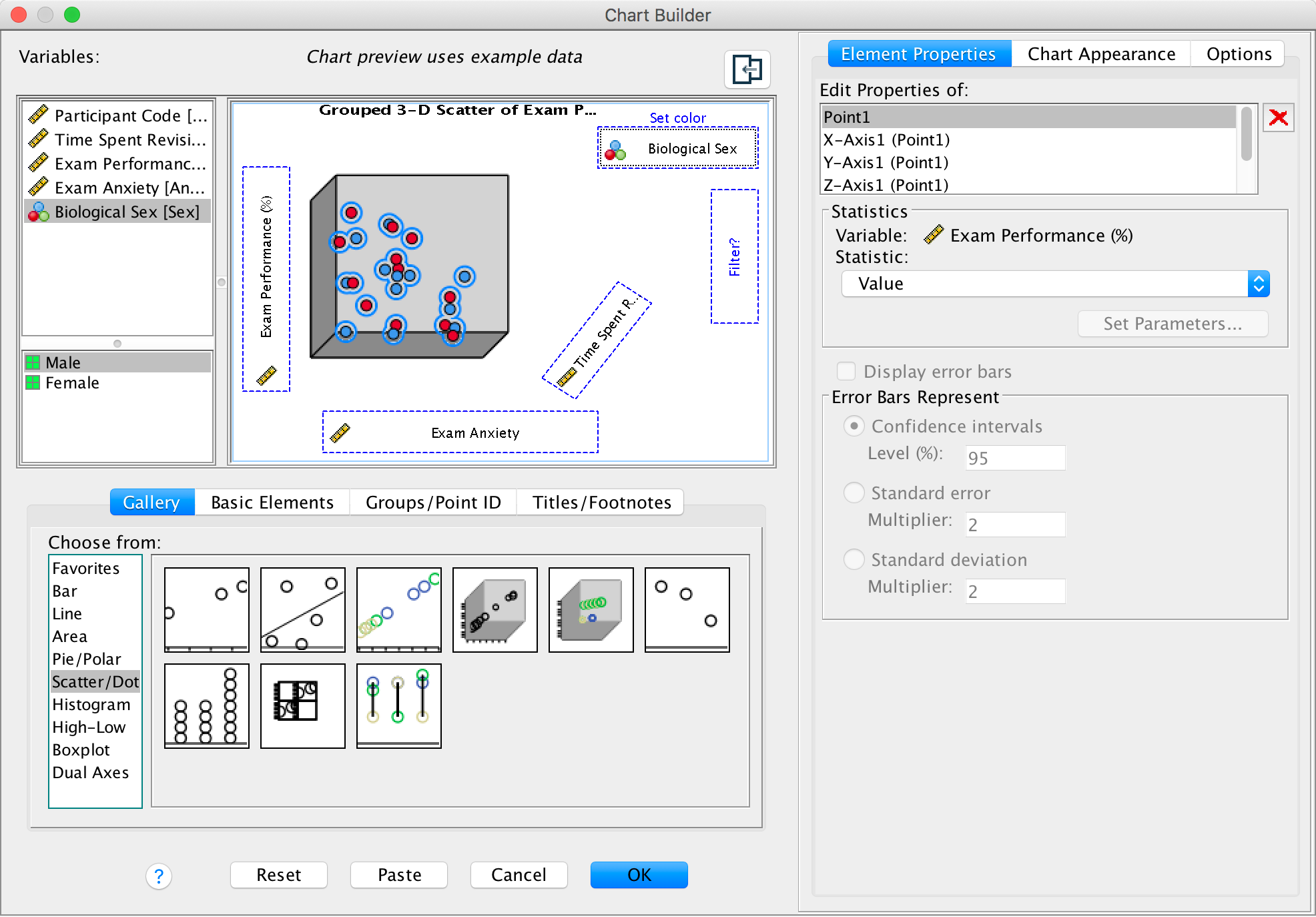
We’re going to extend the example from the book chapter to look at 3-D plots so load the data exam_anxiety.sav. Select Graphs > Chart Builder … and double-click on the simple 3-D scatter icon:
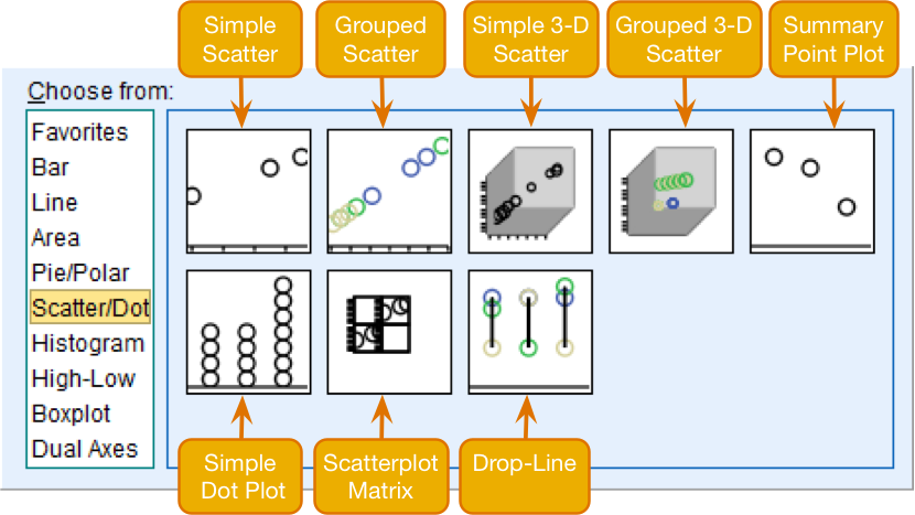
Figure
The graph preview on the canvas differs from ones that we have seen
in the book in that there is a third axis and a new drop zone  . It doesn’t take a
genius to work out that we simply repeat what we have done for other
scatterplots by dragging another continuous variable into this new drop
zone. So, drag Exam Performance (%) from the variable
list into
. It doesn’t take a
genius to work out that we simply repeat what we have done for other
scatterplots by dragging another continuous variable into this new drop
zone. So, drag Exam Performance (%) from the variable
list into  ,
drag Exam Anxiety into
,
drag Exam Anxiety into  , and drag
Time Spent Revising in the variable list and drag it
into . Click
, and drag
Time Spent Revising in the variable list and drag it
into . Click
 to produce
the plot.
to produce
the plot.
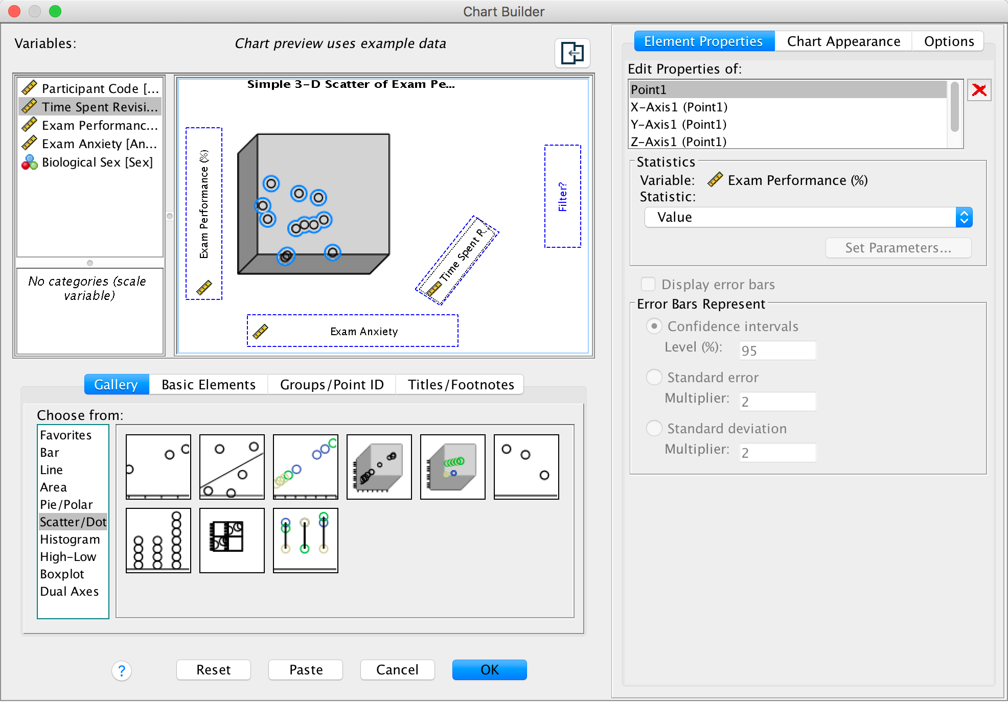
Completed dialog box
A 3-D scatterplot is great for displaying data concisely; however, as the resulting scatterplot shows (see below), it can be quite difficult to interpret (can you really see what the relationship between exam revision and exam performance is?). As such, its usefulness in exploring data can be limited.
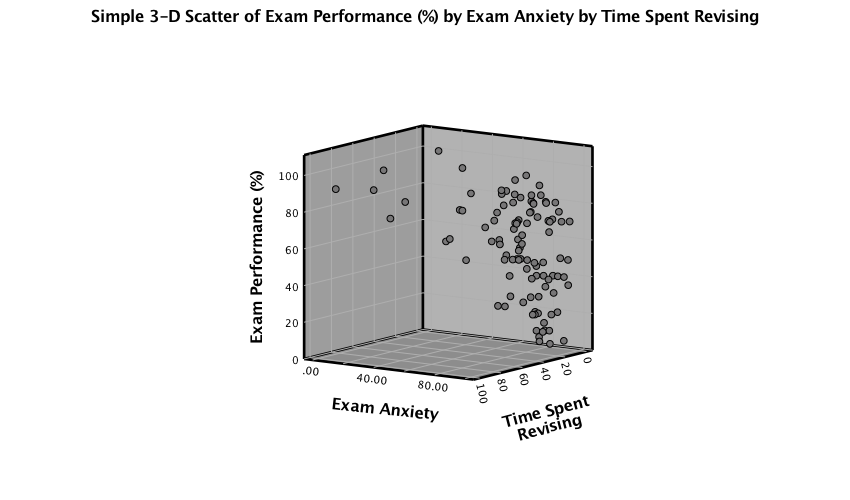
Output
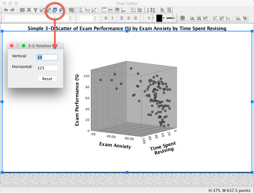
You can try to improve the interpretability by changing the angle of rotation of the graph (it sometimes helps, and sometimes doesn’t). To do this, double-click on the scatterplot in the SPSS Viewer to open it in the SPSS Chart Editor . Then click on the icon circled below to open the 3-D Rotation dialog box. You can change the values in this dialog box to achieve different views of data cloud. Have a play with the different values and see what happens; ultimately you’ll have to decide which angle best represents the relationship for when you want to put the graph on a 2-D piece of paper! If you end up in some horrid pickle by putting random numbers in the 3-D Rotation dialog box then click the Reset button to restore the original view.
Completed dialog box
We can also split the data cloud into different groups using the
grouped 3-D scatter icon in the Chart Builder. The graph
preview on the canvas will look the same as for the simple 3-D
scatterplot except that the  drop zone
appears. Drag the categorical variable by which you want to split the
data cloud (in this case Sex) into this drop zone.
drop zone
appears. Drag the categorical variable by which you want to split the
data cloud (in this case Sex) into this drop zone.
Completed dialog box
Click to
produce the plot:
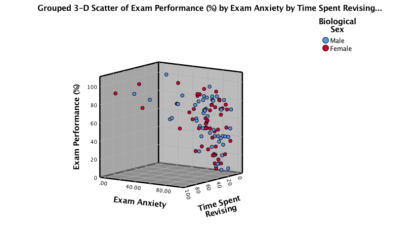
Output
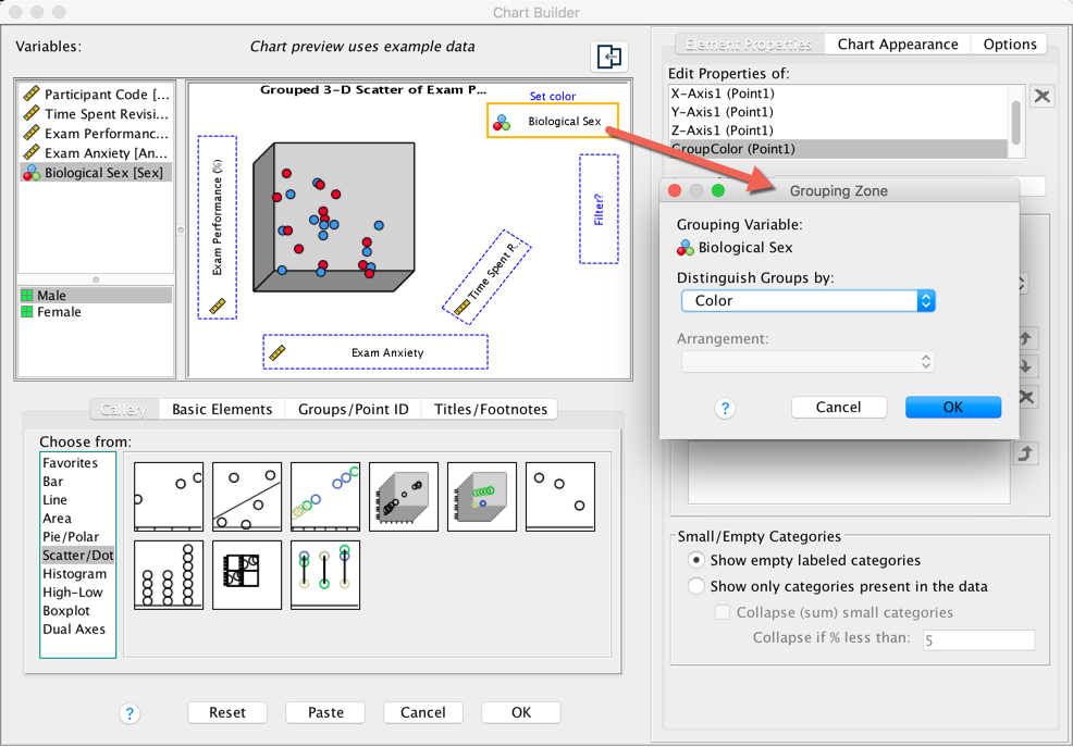
Note that data points for makles and females appear in different
colours. We can also display different groups as different symbols
(rather than different colours). To do this, go back to the Chart
Builder and double-click the drop zone. This
opens a dialog box that has a drop-down list in which Color
will be selected:
Completed dialog box
Click on this Distinguish Groups by: drop down list and
select Pattern instead of Color. Then click to register this
change. Back in the Chart Builder the drop zone will
have been renamed Set pattern. Click to plot the
graph, which should look something like the one below.
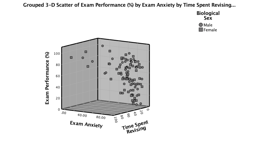
Output
Please, Sir, can I have some more … graphs?
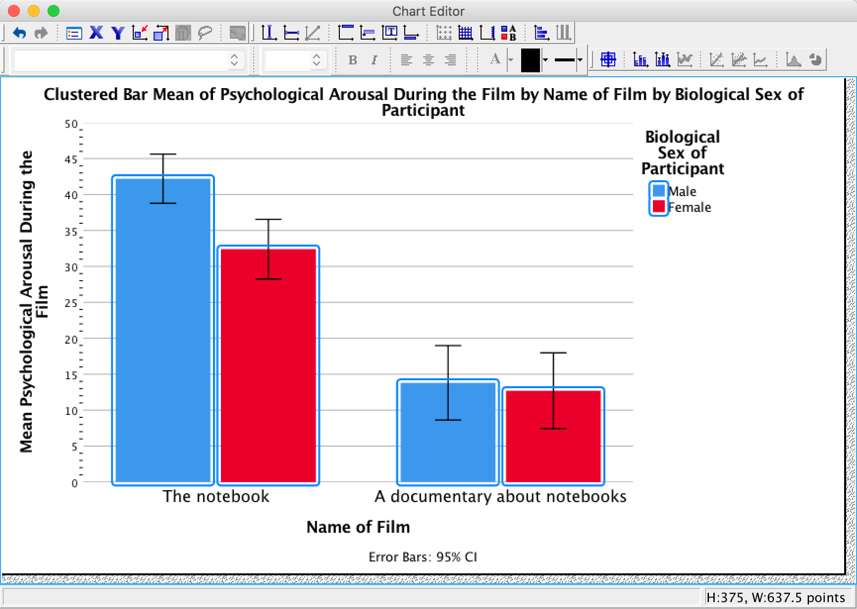
As an exercise to get you using some of the graph editing facilities we’re going to take one of the graphs from the chapter and change some of its properties to produce a graph that loosely follows Tufte’s guidelines (minimal ink, no chartjunk, etc.). We’ll use the clustered bar graph for the arousal scores for the two films (The notebook and A documentary about notebooks) in Figure 5.21 in the book:
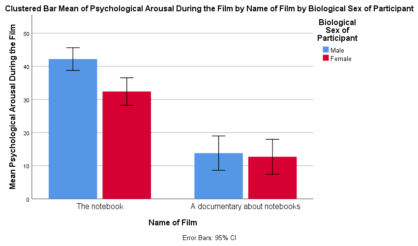
Figure 5.21 from the book
To edit this graph double-click on it in the SPSS Viewer. This will open the chart in the SPSS Chart Editor :
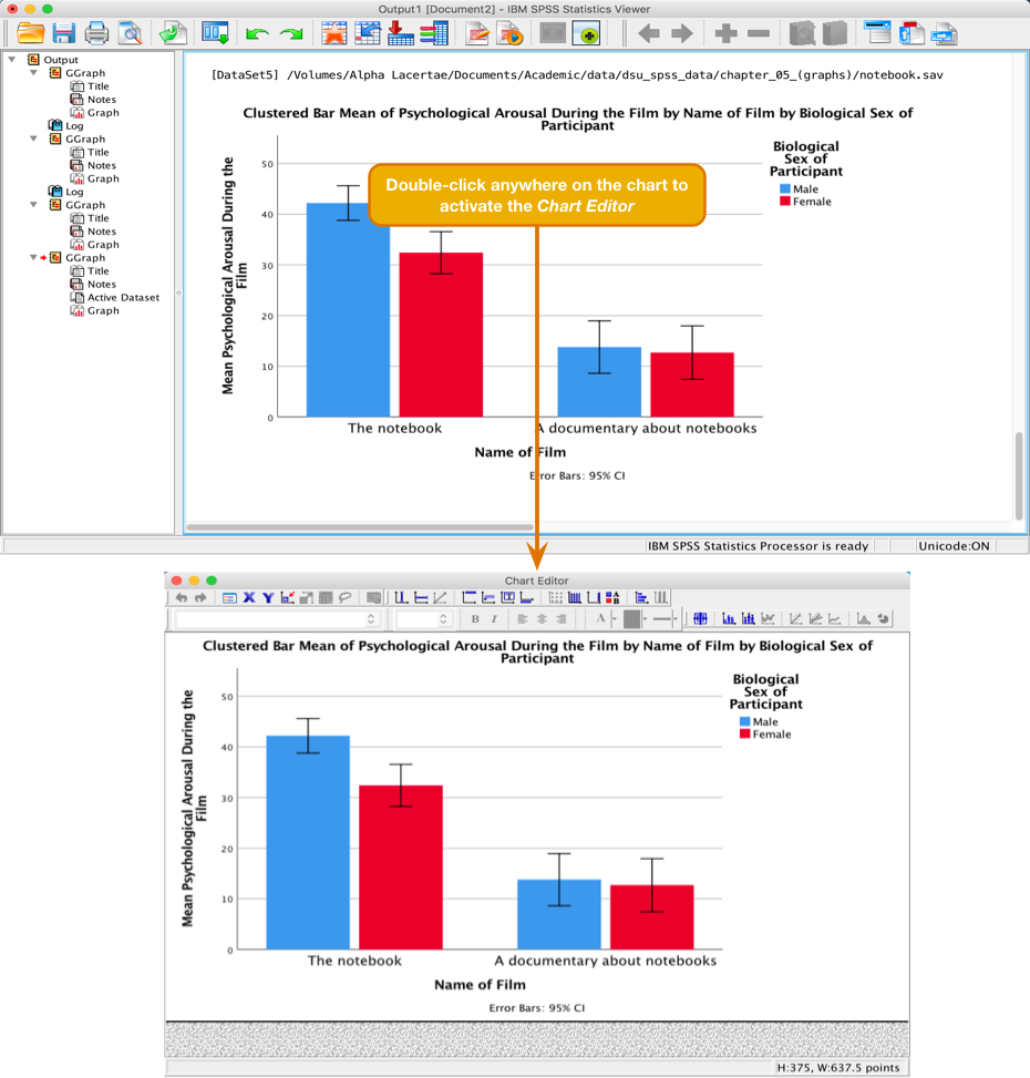
Activating the Chart Editor
Editing the axes
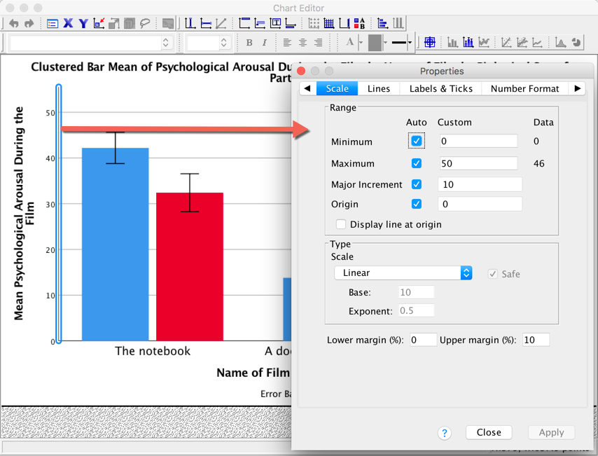
Now, let’s get rid of the axis lines – they’re just unnecessary ink! Select the y-axis by double-clicking on it with the mouse. It will become highlighted in yellow and a Properties dialog box will appear much the same as before. This dialog box has many tabs that allow us to change aspects of the y-axis. We’ll look at some of these in turn.
Activating the Chart Editor
The Scale tab can be used to change the minimum, maximum and
increments on the scale. Currently our graph is scaled from 0 to 50 and
has a tick every 10 units (the major increment is, therefore, 10). This
is fairly sensible but there is a lot of space at the top of the graph.
Let’s see why. First change the Major Increment to 5. Click
 and the
scale of the y-axis should change in the Chart Editor
. Note that even though the maximum is specified as 50, it goes up to
55. That’s weird isn’t it? This happens because the Upper Margin
(%): is set to 10, so it’s adding 10% to the top of the scale (10%
of 50 is 5, so we end up with a maximum of 55 instead of 50). Change the
Upper Margin (%): to 0 and click . the
y-axis will now be scaled from 0 to 50.
and the
scale of the y-axis should change in the Chart Editor
. Note that even though the maximum is specified as 50, it goes up to
55. That’s weird isn’t it? This happens because the Upper Margin
(%): is set to 10, so it’s adding 10% to the top of the scale (10%
of 50 is 5, so we end up with a maximum of 55 instead of 50). Change the
Upper Margin (%): to 0 and click . the
y-axis will now be scaled from 0 to 50.
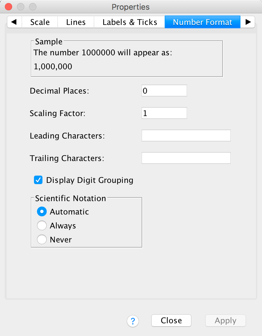
The Number Format tab allows us to change the number format used on the y-axis. The default is to have 0 decimal places, which is sensible, but for other plots you can change the Decimal Places to be a value appropriate for your plot.
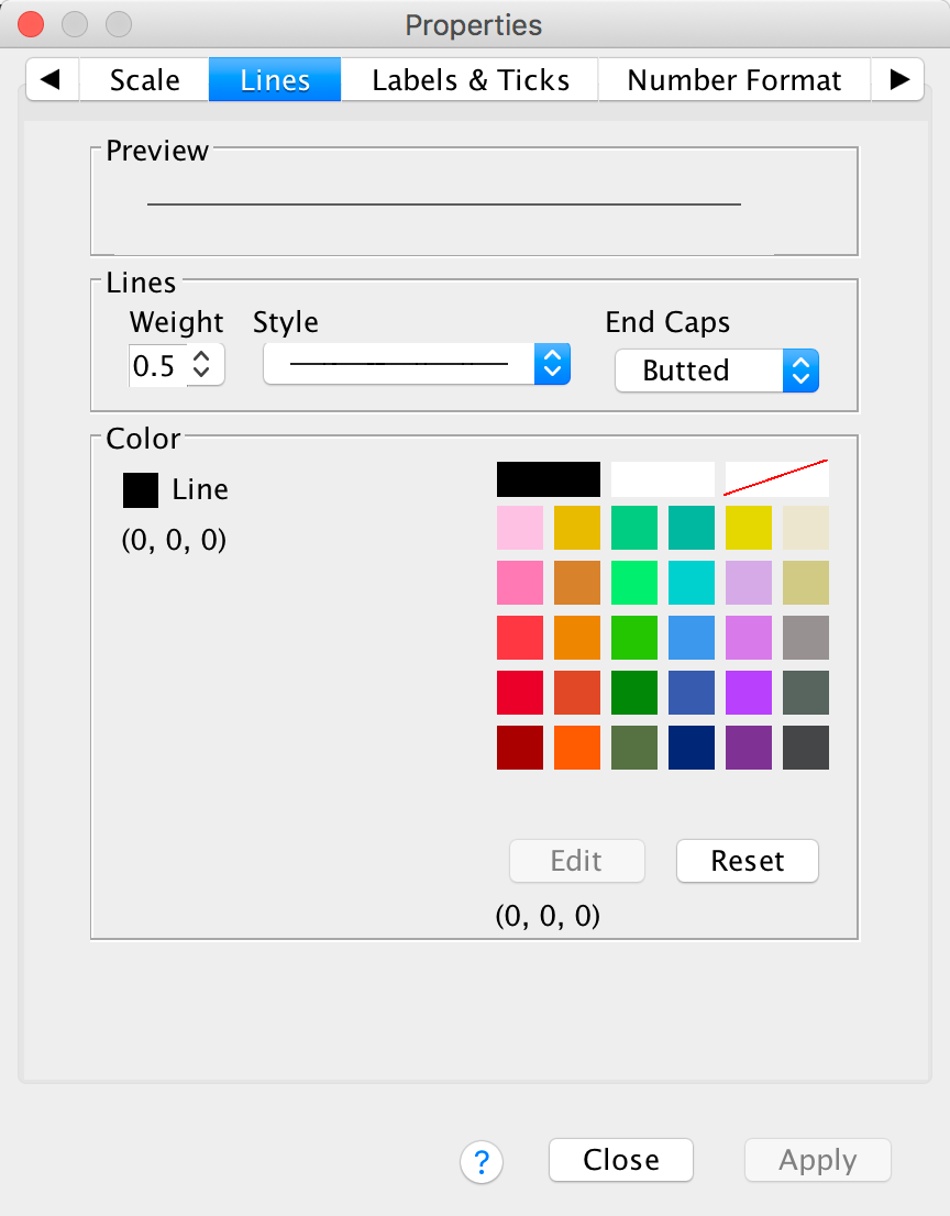
The Lines tab allows us to change the properties of the axis
itself. We don’t really need to have a line there at all, so let’s get
rid of it. Click  and then
click
and then
click ![]() .
Click and
the y-axis line should vanish in the Chart Editor
.
.
Click and
the y-axis line should vanish in the Chart Editor
.
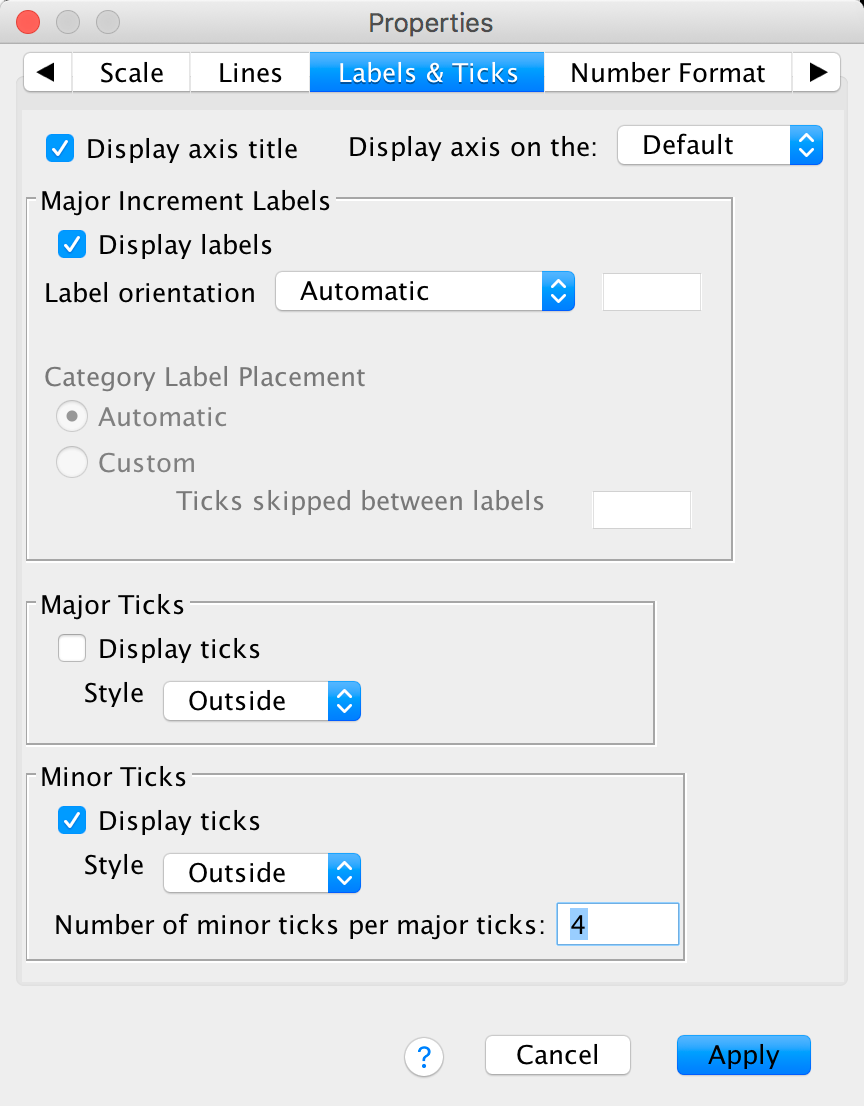
The Labels & Ticks tab allows us to change various
aspects of the ticks on the axis. The major increment ticks are shown by
default (you should leave them there), and labels for them (the numbers)
are shown by default also. These numbers are important, so leave the
defaults alone. You could choose to display minor ticks. Let’s do this.
Ask it to display the minor ticks. We have major ticks every 5, so it
might be useful to have a minor tick every 1. To do this we need to set
Number of minor ticks per major tick to be 4 and click .
Let’s now edit the x-axis. To do this double-click on it in the Chart Editor . The axis will become highlighted and the Properties dialog box will open. Some of the properties tabs are the same as for the y-axis so we’ll just look at the ones that differ. Using what you have learnt already, set the line colour to be transparent so this it disappears (see the Lines tab above).
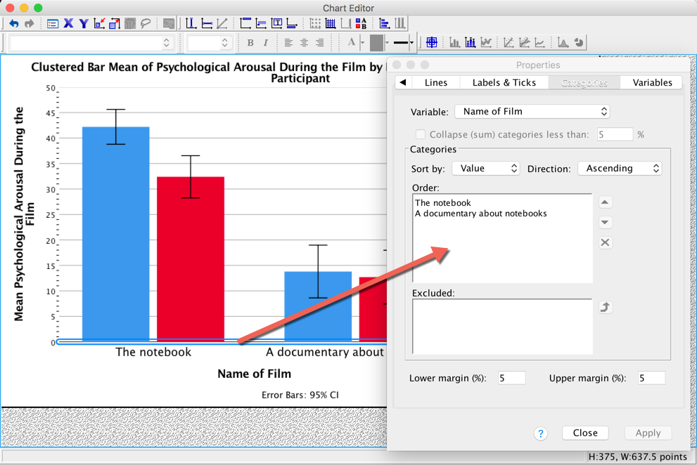
The Categories tab allows us to change the order of categories on this axis.
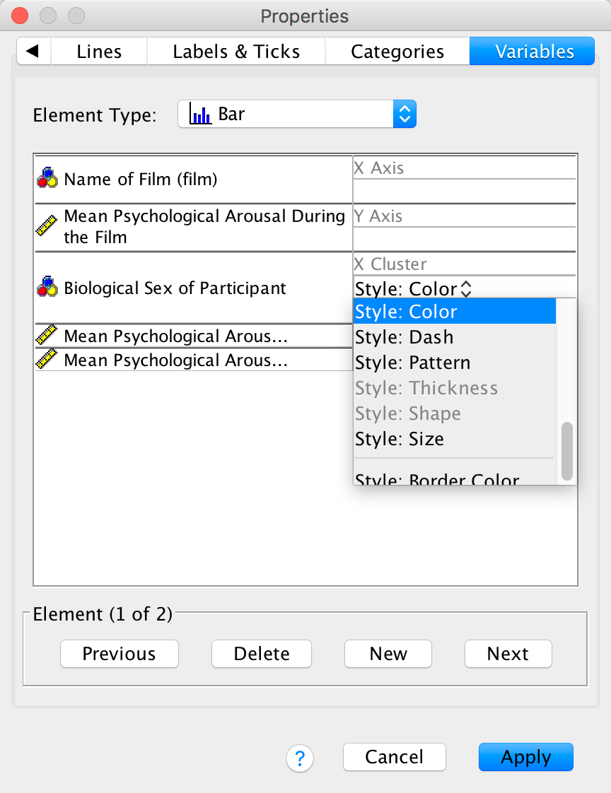
The Variables tab allows us to change properties of the variables. For one thing, if you don’t want a bar chart then there is a drop-down list of alternatives from which you can choose. Also we have Sex displayed in different colours, but we can change this so that males and females are differentiated in other ways (such as a pattern):
Editing the bars
To edit the bars, double-click on any of the bars to select them. They will become highlighted:
Let’s first change the colour of the blue bars. To do this we first need to click once on the blue bars. Now instead of all of the bars being highlighted, only the blue bars will be:
We can then use the Properties dialog box to change features of these bars.
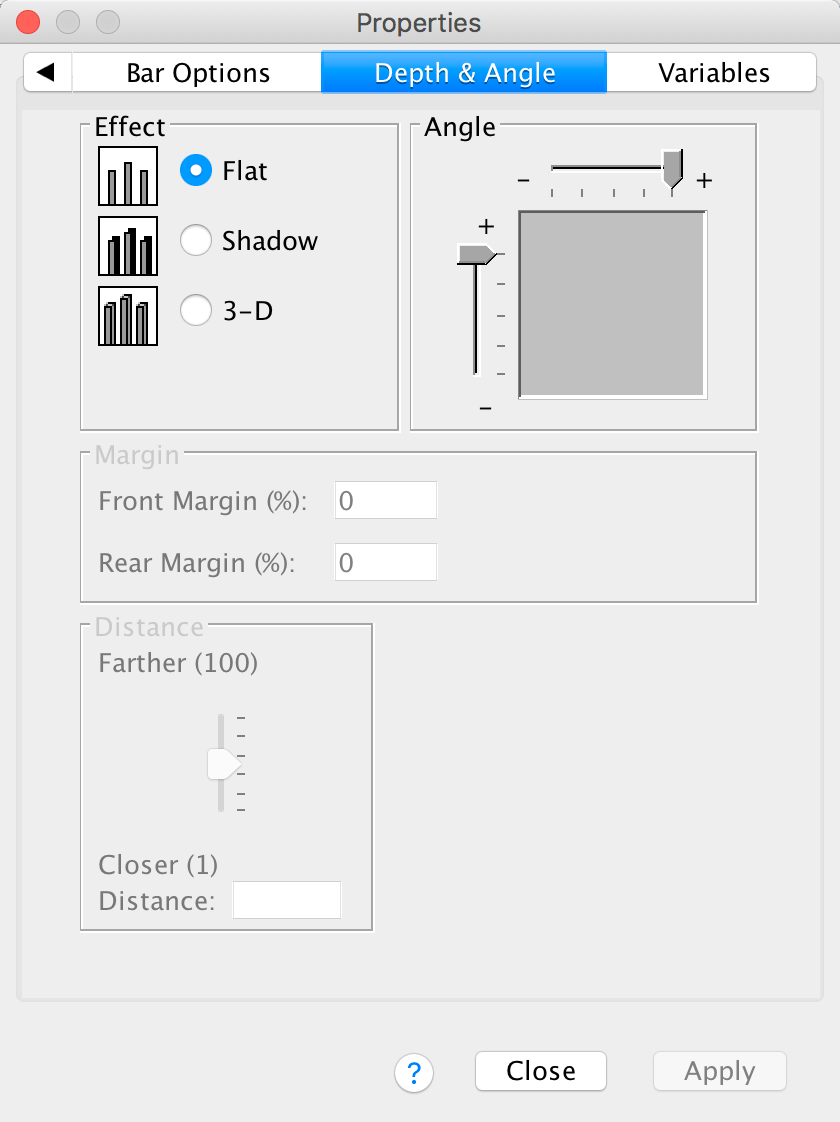
The Depth & Angle tab allows us to change whether the bars have a drop shadow or a 3-D effect. As I |tried to stress in the book, you shouldn’t add this kind of chartjunk, so you should leave your bars as flat. However, in case you want to ignore my advice, this is how you add chartjunk!
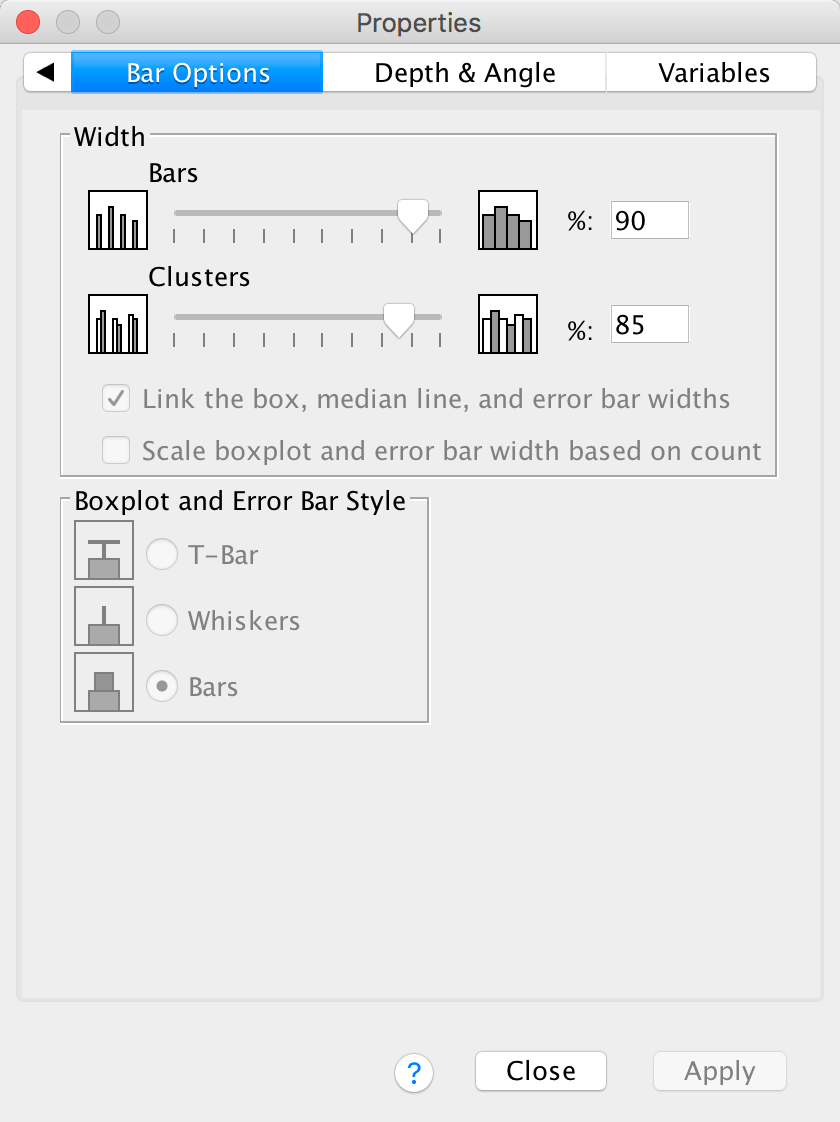
The Bar Options tab allows us to change the width of the bars (the default is to have bars within a cluster touching, but if you reduce the bar width below 100% then a gap will appear). You can also alter the gap between clusters. The default allows a small gap between clusters (which is sensible) but you can reduce the gap by increasing the value up to 100% (no gap between clusters) or less (a gap between clusters).
You can also select whether the bars are displayed as bars (the default) or if you want them to appear as a line (Whiskers) or a T-bar (T-bar). This kind of graph really looks best if you leave the bars as bars (otherwise the error bars look silly).
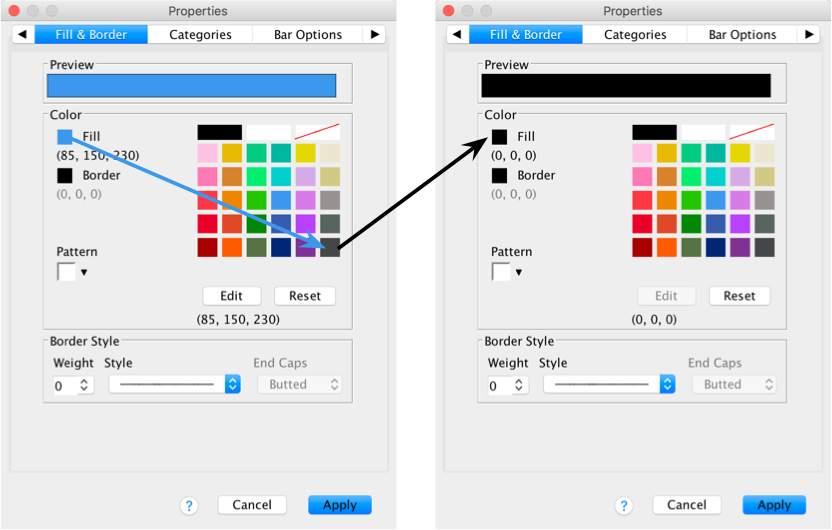
The Fill & Border tab allows us to change the colour of
the bar and the style and colour of the bar’s border. I want this bar to
be black, so click  and then on the
black square in the colour pallette. Click and the blue
bars should turn black.
and then on the
black square in the colour pallette. Click and the blue
bars should turn black.
Now we will change the colour of the red bars. To do this click once on the red bars to highlight them:
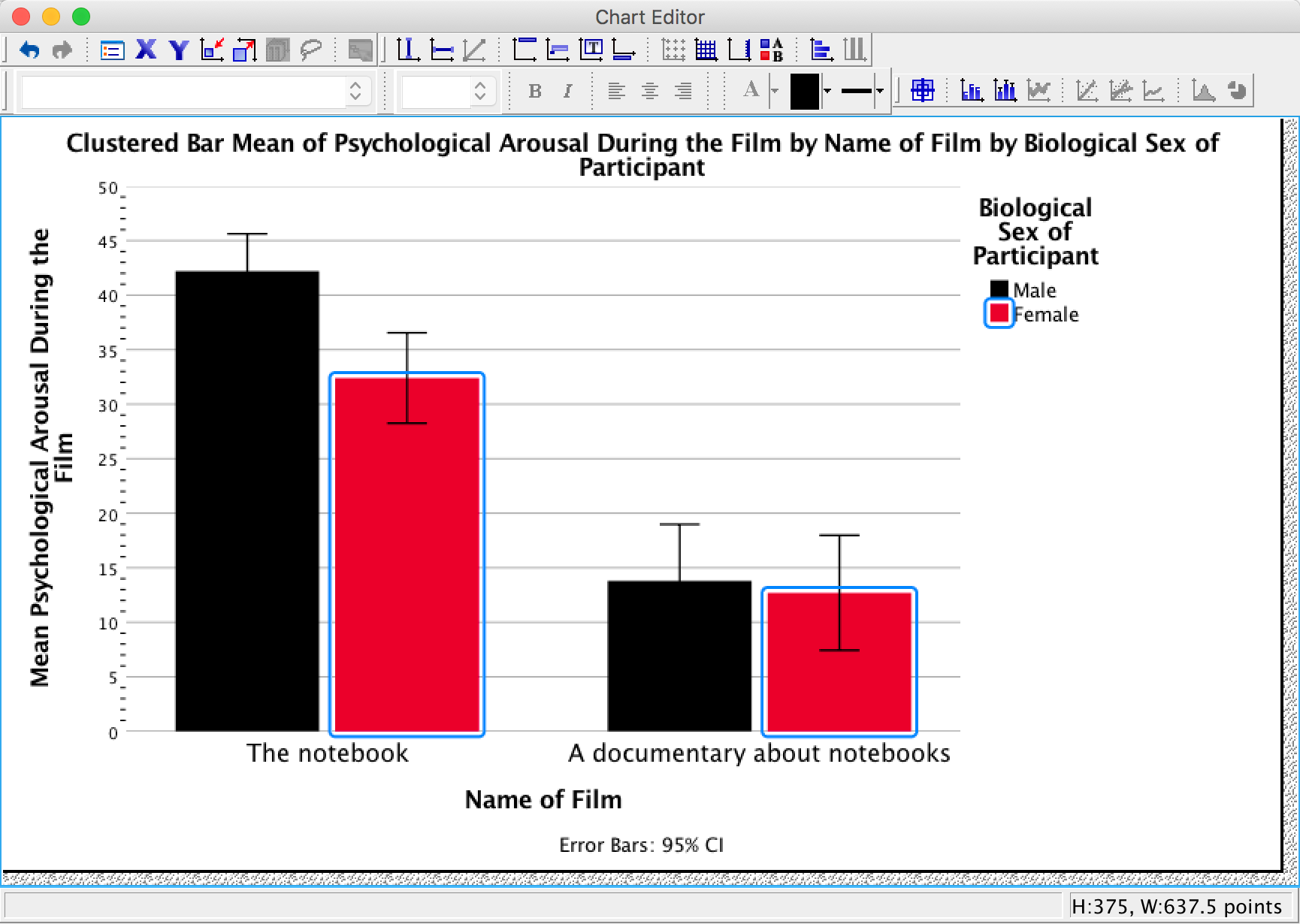
Use the Properties dialog boxes described above to change the colour of these bars. I want you to colour these bars grey:
Editing grid lines
By defualt SPSS Statistics includes gridlines, but we can edit these. To do this click on any one of the horizontal grid lines in the Chart Editor so that they become highlighted:
In the Properties dialog box select the Lines tab. You could change the grid lines to be dotted by selecting a dotted line from the Style drop-down list, but don’t, leave them as solid:
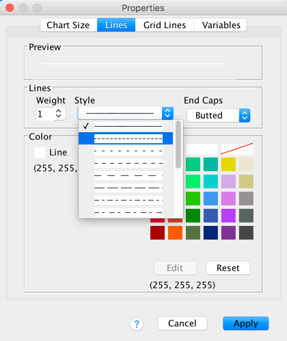
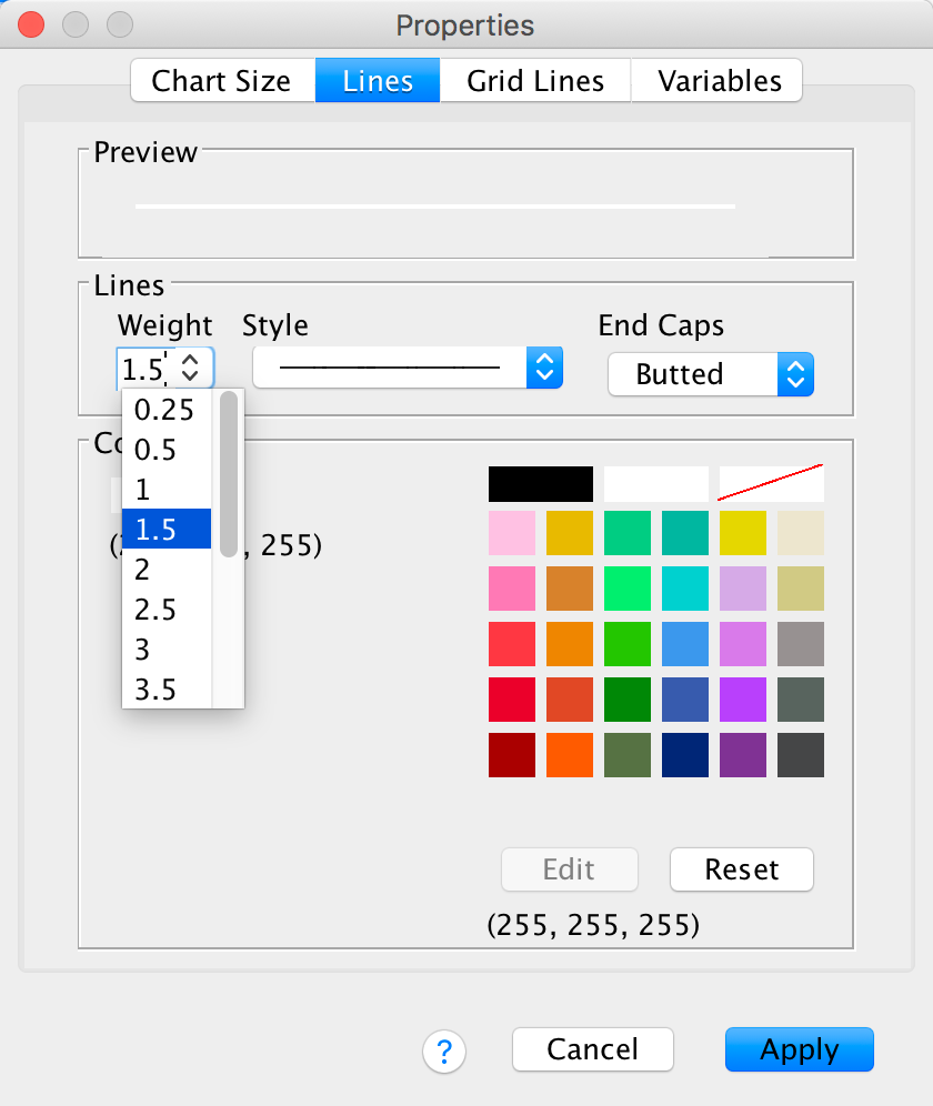
Next, let’s make the grid lines a bit thicker by selecting 1.5 from the Weight drop-down list:
Finally, let’s change their colour from black to white. We’ve used the colour palette a few times now so you should be able to do this without any help:
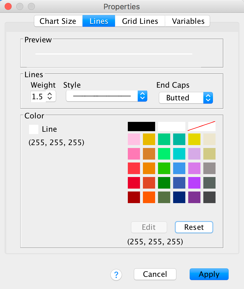
Click
and the horizontal grid lines should become white and thicker. Speaking
of thick, you’ve probably noticed that you can no longer see them
because we changed the colour to white and they are displayed on a white
background. You’re probably also thinking that I must be some kind of
idiot for telling you to do that. You’re probably right, but bear with
me — there is method to the madness inside my rotting breadcrumb of a
brain.
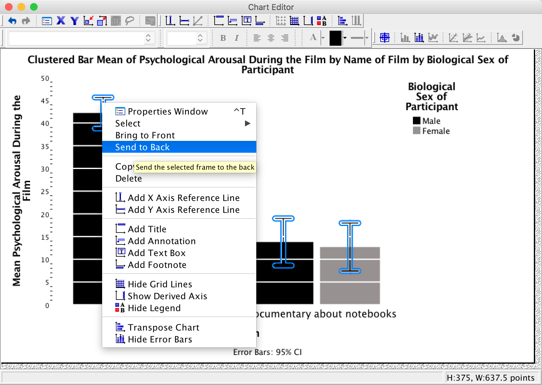
Changing the order of elements of a graph
We’ve got white grid lines and we can’t see them. That’s a bit pointless isn’t it? However, we would be able to see them if they were in front of the bars. We can make this happen by again selecting the horizontal grid lines so that they are highlighted in yellow; then if we click on one of them with the right mouse button a menu appears on which we can select Bring to Front. Select this option and, wow, the grid lines become visible on the bars themselves: pretty cool, I think you’ll agree.
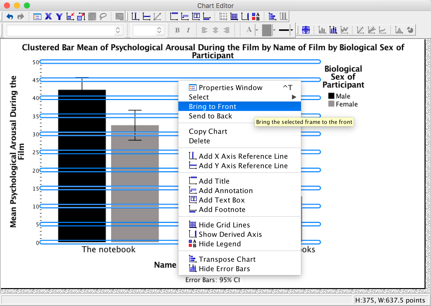
However, we still have a problem in that our error bars can be seen on top of the grey bars but not on top of the black bars. This looks a bit odd; it would be better if we could see them only poking out of the top on both bars. To do this, click on one of the error bars so that they become highlighted in yellow. Then if we click on one of them with the right mouse button a menu appears on which we can select Send to Back. Select this option and the error bas move behind the bars (therefore we can only see the top half).
Saving a chart template
You’ve done all of this hard work. What if you want to produce a similar-looking graph? Well, you can save these settings as a template. A template is just a file that contains a set of instructions telling SPSS how to format a graph (e.g., you want grid lines, you want the axes to be transparent, you want the bars to be coloured black and grey, and so on). To do this, in the Chart Editor go to the File menu and select Save Chart Template. You will get a dialog box, and you should select what parts of the formatting you want to save (and add a description also). Although it is tempting to just click on ‘save all’, this isn’t wise because, for example, when we rescaled the y-axis we asked for a range of 0–50, and this is unlikely to be a sensible range for other graphs, so this is one aspect of the formatting that we would not want to save.
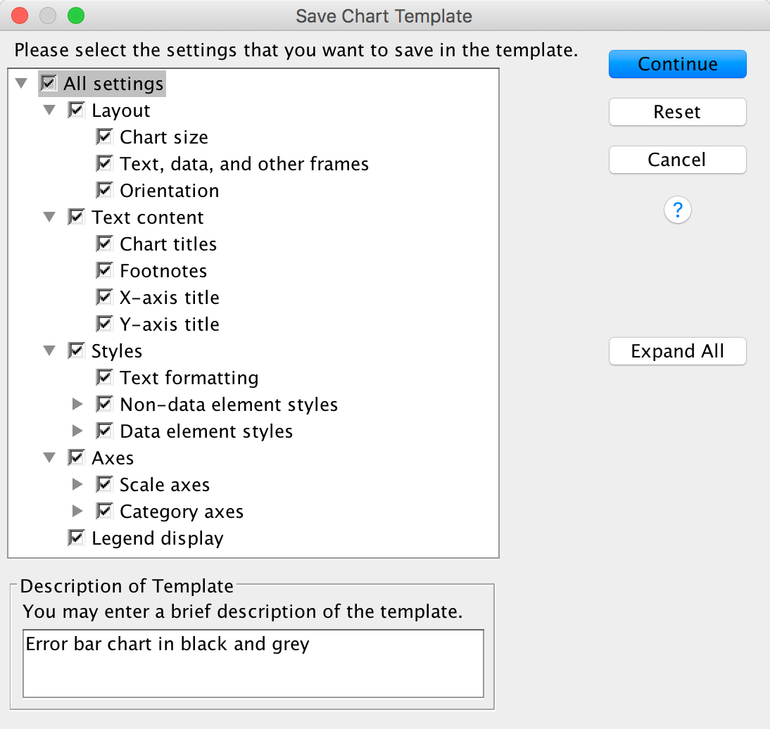
Click  and type a
name for your template (e.g., greyscale_bar.sgt) in the
subsequent dialog box and save. By default SPSS Statistics saves the
templates in a folder called ‘Looks’, but you can save it elsewhere if
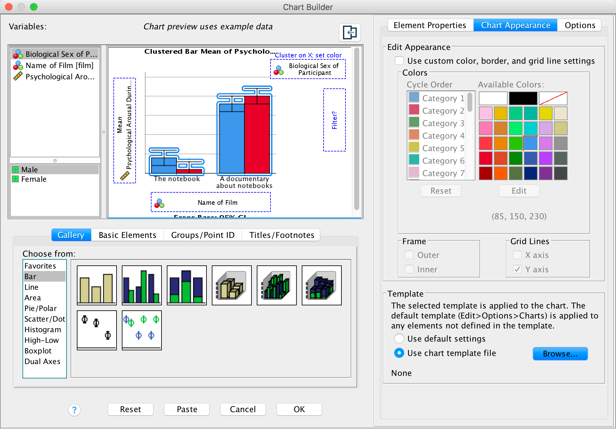
you like. Assuming you have saved a chart template, you can apply it
when you run a new graph in the Chart Editor by opening the
Options tab, clicking
and type a
name for your template (e.g., greyscale_bar.sgt) in the
subsequent dialog box and save. By default SPSS Statistics saves the
templates in a folder called ‘Looks’, but you can save it elsewhere if
you like. Assuming you have saved a chart template, you can apply it
when you run a new graph in the Chart Editor by opening the
Options tab, clicking  and
and
 and then
browsing your computer for your template file:
and then
browsing your computer for your template file:
Chapter 6
Please, Sir, can I have some more … normality tests?
If you want to test whether a model is a good fit of your data you can use a goodness-of-fit test (you can read about these in the chapter on categorical data analysis in the book), which has a chi-square test statistic (with the associated distribution). One problem with this test Kolmogorov–Smirnov (K-S) test was developed as a test of whether a distribution of scores matches a hypothesized distribution (Massey 1951). One good thing about the test is that the distribution of the K-S test statistic does not depend on the hypothesized distribution (in other words, the hypothesized distribution doesn’t have to be a particular distribution). It is also what is known as an exact test, which means that it can be used on small samples. It also appears to have more power to detect deviations from the hypothesized distribution than the chi-square test (Lilliefors 1967). However, one major limitation of the K-S test is that if location (i.e. the mean) and shape parameters (i.e. the standard deviation) are estimated from the data then the K-S test is very conservative, which means it fails to detect deviations from the distribution of interest (i.e. normal). What Lilliefors did was to adjust the critical values for significance for the K-S test to make it less conservative (Lilliefors 1967) using Monte Carlo simulations (these new values were about two-thirds the size of the standard values). He also reported that this test was more powerful than a standard chi-square test (and obviously the standard K-S test).
Another test you’ll use to test normality is the Shapiro–Wilk test (Shapiro and Wilk 1965) which was developed specifically to test whether a distribution is normal (whereas the K-S test can be used to test against distributions other than normal). They concluded that their test was:
‘comparatively quite sensitive to a wide range of non-normality, even with samples as small as n = 20. It seems to be especially sensitive to asymmetry, long-tailedness and to some degree to short-tailedness’ (p. 608).
To test the power of these tests they applied them to several samples (n = 20) from various non-normal distributions. In each case they took 500 samples which allowed them to see how many times (in 500) the test correctly identified a deviation from normality (this is the power of the test). They show in these simulations (see Table 7 in their paper) that the Shapiro–Wilk test is considerably more powerful to detect deviations from normality than the K-S test. They verified this general conclusion in a much more extensive set of simulations as well (Shapiro, Wilk, and Chen 1968).
Please, Sir, can I have some more … Hartley’s Fmax?
Critical values for Hartley’s test (α = .05).
- Rows represent different values of (n - 1) per group
- Columns represent the number of variances being compared (from 2 varioances to 12)
| 2 | 3 | 4 | 5 | 6 | 7 | 8 | 9 | 10 | 11 | 12 | |
|---|---|---|---|---|---|---|---|---|---|---|---|
| 2 | 39.00 | 87.50 | 142.00 | 202.00 | 266.00 | 333.00 | 403.00 | 475.00 | 550.00 | 626.00 | 704.00 |
| 3 | 15.40 | 27.80 | 39.20 | 50.70 | 62.00 | 72.90 | 83.50 | 93.90 | 104.00 | 114.00 | 124.00 |
| 4 | 9.60 | 15.50 | 20.60 | 25.20 | 29.50 | 33.60 | 37.50 | 41.40 | 44.60 | 48.00 | 51.40 |
| 5 | 7.15 | 10.80 | 13.70 | 16.30 | 18.70 | 20.80 | 22.90 | 24.70 | 26.50 | 28.20 | 29.90 |
| 6 | 5.82 | 8.38 | 10.40 | 12.10 | 13.70 | 15.00 | 16.30 | 17.50 | 18.60 | 19.70 | 20.70 |
| 7 | 4.99 | 6.94 | 8.44 | 9.70 | 10.80 | 11.80 | 12.70 | 13.50 | 14.30 | 15.10 | 15.80 |
| 8 | 4.43 | 6.00 | 7.18 | 8.12 | 9.03 | 9.80 | 10.50 | 11.10 | 11.70 | 12.20 | 12.70 |
| 9 | 4.03 | 5.34 | 6.31 | 7.11 | 7.80 | 8.41 | 8.95 | 9.45 | 9.91 | 10.30 | 10.70 |
| 10 | 3.72 | 4.85 | 5.67 | 6.34 | 6.92 | 7.42 | 7.87 | 8.28 | 8.66 | 9.01 | 9.34 |
| 12 | 3.28 | 4.16 | 4.79 | 5.30 | 5.72 | 6.09 | 6.42 | 6.72 | 7.00 | 7.25 | 7.48 |
| 15 | 2.86 | 3.54 | 4.01 | 4.37 | 4.68 | 4.95 | 5.19 | 5.40 | 5.59 | 5.77 | 5.93 |
| 20 | 2.46 | 2.95 | 3.29 | 3.54 | 3.76 | 3.94 | 4.10 | 4.24 | 4.37 | 4.49 | 4.59 |
| 30 | 2.07 | 2.40 | 2.61 | 2.78 | 2.91 | 3.02 | 3.12 | 3.21 | 3.29 | 3.36 | 3.39 |
| 60 | 1.67 | 1.85 | 1.96 | 2.04 | 2.11 | 2.17 | 2.22 | 2.26 | 2.30 | 2.33 | 2.36 |
| ∞ | 1.00 | 1.00 | 1.00 | 1.00 | 1.00 | 1.00 | 1.00 | 1.00 | 1.00 | 1.00 | 1.00 |
Coming soon.
Chapter 7
Please Sir, can I have some more … Jonck?
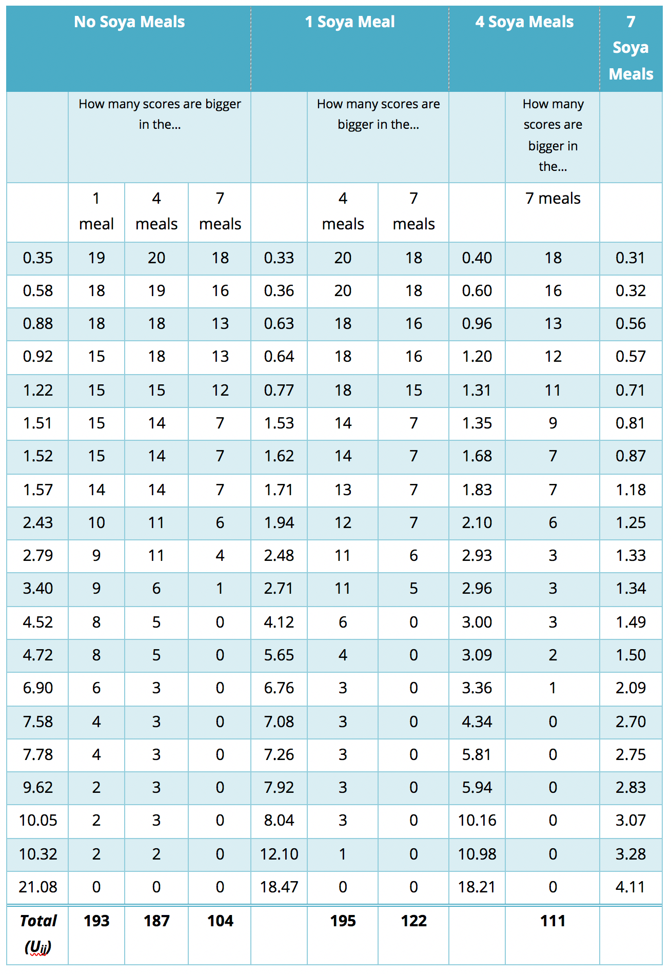
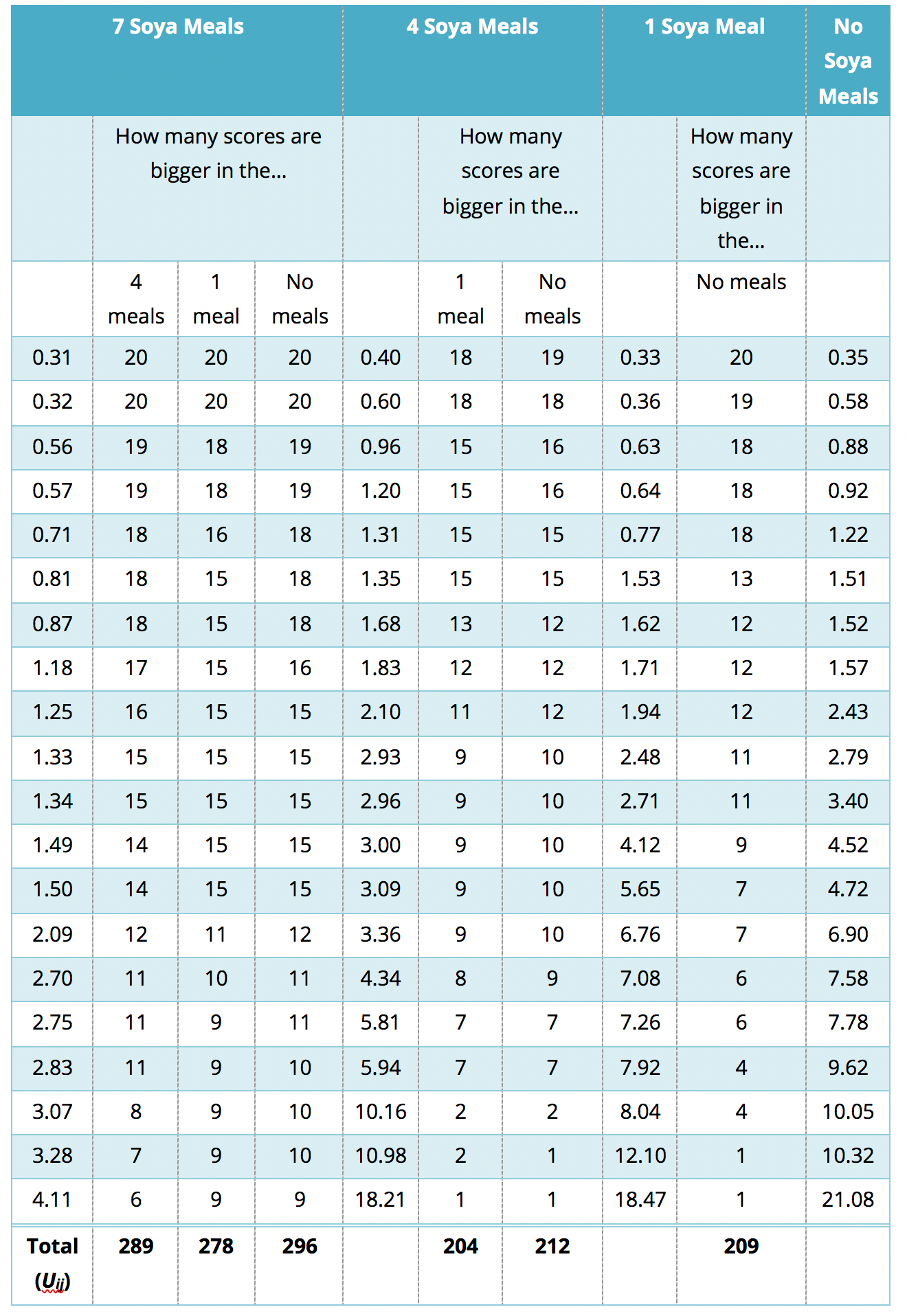
Jonckheere’s test is based on the simple, but elegant, idea of taking a score in a particular condition and counting how many scores in subsequent conditions are smaller than that score. So, the first step is to order your groups in the way that you expect your medians to change. If we take the soya example, then we expect sperm counts to be highest in the no soya meals condition, and then decrease in the following order: 1 meal per week, 4 meals per week, 7 meals per week. So, we start with the no meals per week condition, and we take the first score and ask ‘How many scores in the next condition are bigger than this score?’.
You’ll find that this is easy to work out if you arrange your data in ascending order in each condition. The table below shows a convenient way to lay out the data. Note that the sperm counts have been ordered in ascending order and the groups have been ordered in the way that we expect our medians to decrease. So, starting with the first score in the no soya meals group (this score is 0.35), we look at the scores in the next condition (1 soya meal) and count how many are greater than 0.35. It turns out that all 19 of the 20 scores are greater than this value, so we place the value of 19 in the appropriate column and move onto the next score (0.58) and do the same. When we’ve done this for all of the scores in the no meals group, we go back to the first score (0.35) again, but this time count how many scores are bigger in the next but one condition (the 4 soya meal condition). It turns out that 18 scores are bigger so we register this in the appropriate column and move onto the next score (0.58) and do the same until we’ve done all of the scores in the 7 meals group. We basically repeat this process until we’ve compared the first group with all subsequent groups.
At this stage we move onto the next group (the 1 soya meal condition). Again, we start with the first score (0.33) and count how many scores are bigger than this value in the subsequent group (the 4 meals group). In this case there all 20 scores are bigger than 0.33, so we register this for all scores and then go back to the beginning of this group (i.e. back to the first score of 0.33) and repeat the process until this category has been compared with all subsequent categories. When all categories have been compared with all subsequent categories in this way, we simply add up the counts as I have done in the table. These sums of counts are denoted by Uij.
Table 1: Data to show Jonckheere’s test for the soya example
The test statistic, J, is simply the sum of these counts: \[ J = \sum_{i<j}^k{U_{ij}} \]
which for these data is simply:
\[ \begin{align} J &= \sum_{i<j}^k{U_{ij}} \\ &= 193 + 187 + 104 + 195 + 122 + 111 \\ &= 912 \end{align} \]
For small samples there are specific tables to look up critical values of J; however, when samples are large (anything bigger than about 8 per group would be large in this case) the sampling distribution of J becomes normal with a mean and standard deviation of:
\[ \begin{align} \bar{J} &= \frac{N^2-\sum{n_k^2}}{4} \\ \sigma_j &= \sqrt{\frac{1}{72}\big[ N^2(2N+3)-\sum{n_k^2(2n_k+3)}\big]}\\ \end{align} \]
in which N is simply the total sample size (in this case 80) and nk is simply the sample size of group k (in each case in this example this will be 20 because we have equal sample sizes). So, we just square each group’s sample size and add them up, then subtract this the result by 4. Therefore, we can calculate the mean for these data as:
\[ \begin{align} \bar{J} &= \frac{80^2-(20^2+20^2+20^2+20^2)}{4} \\ &= \frac{4800}{4} \\ &= 1200 \end{align} \]
The standard deviation can similarly be calculated using the sample sizes of each group and the total sample size:
\[ \begin{align} \sigma_j &= \sqrt{\frac{1}{72}\bigg[80^2(2\times 80+3)-\big[20^2(2 \times 20 + 3) + 20^2(2 \times 20 + 3) + 20^2(2 \times 20 + 3) + 20^2(2 \times 20 + 3)\big]\bigg]} \\ &= \sqrt{\frac{1}{72}\bigg[6400(163) - \big[400(43) + 400(43) + 400(43) + 400(43)\big]}\\ & = \sqrt{\frac{1}{72}[1043200 - 68800]} \\ & = \sqrt{1353333} \\ & = 116.33 \end{align} \]
We can use the mean and standard deviation to convert J to a z-score using the standard formulae:
\[ \begin{align} z &= \frac{X-\bar{X}}{s} \\ &= \frac{J-\bar{J}}{\sigma_j}\\ &= \frac{912-1200}{116.33} \\ &= -2.476 \end{align} \]
This z can then be evaluated using the critical values in the Appendix of the book. This test is always one-tailed because we have predicted a trend to use the test. So we’re looking at z being above 1.65 (when ignoring the sign) to be significant at α = .05. In fact, the sign of the test tells us whether the medians ascend across the groups (a positive z) or descend across the groups (a negative z) as they do in this example!
I have just shown how to use the test when the groups are ordered by descending medians (i.e. we expect sperm counts to be highest in the no soya meals condition, and then decrease in the following order: 1 meal per week, 4 meals per week, 7 meals per week; so we ordered the groups: No soya, I meal, 4 meals and 7 meals). Certain books will tell you to order the groups in ascending order (start with the group that you expect to have the lowest median). For the soya data this would mean arranging the groups in the opposite order to how I did above; that is, 7 meals, 4 meals, 1 meal and no meals. The purpose of this section is to show you what happens if we order the groups the opposite way around!
The process is similar to that used in the Appendix, only now we start with start with the 7 meals per week condition, and we take the first this score?’ You’ll find that this is easy to work out if you arrange your data in ascending order in each condition. The table below shows a convenient way to lay out the data. Note that the sperm counts have been ordered in ascending order and the groups have been ordered in the way that we expect our medians to increase. So, starting with the first score in the 7 soya meals group (this score is 0.31), we look at the scores in the next condition (4 soya meals) and count how many are greater than 0.31. It turns out that all 20 scores are greater than this to the next score (0.32) and do the same. When we’ve done this for all of the scores in the 7 meals group, we go back to the first score (0.31) again, but this time count how many scores are bigger in the next but one condition (the 1 soya meal condition). It turns out that all 20 so we register this in the appropriate column and move on to the next score (0.32) and do the same until we’ve done all of the scores in the 7 meals group. We basically repeat this process until we’ve compared the first group to all subsequent groups.
Table 2: Data to show Jonckheere’s test for the soya example, groups in descending order
At this stage we move on to the next group (the 4 soya meals). Again, we start with the first score (0.40) and count how many scores are bigger than this value in the subsequent group (the 1 meal group). In this case are 18 scores bigger than 0.40, so we register this in the table and move on to the next score (0.60). Again, we repeat this for all scores and then go back to the beginning of this group (i.e. back to the first score of 0.40) and repeat the process until this category has been compared to all subsequent categories. When all categories have been counts as I have done in the table. These sums of counts are denoted by Uij. As before, test statistic J is simply the sum of these counts, which for these data is:
\[ \begin{align} J &= \sum_{i<j}^k{U_{ij}} \\ &= 289 + 278 + 296 + 204 + 212 + 209 \\ &= 1488 \end{align} \]
As I said earlier, for small samples there are specific tables to look up critical values of J; however, when samples are large (anything bigger than about 8 per group would be large in this case) the sampling distribution of J becomes normal with a mean and standard deviation that we defined before. The data haven’t changed so the values of the mean and standard deviation are the same as we calculated earlier.
We can use the mean and standard deviation to convert J to a z-score as we did before. All the values will be the same except for the test statistic (which is now 1488 rather than 912):
\[ \begin{align} z &= \frac{J-\bar{J}}{\sigma_j}\\ &= \frac{1488-1200}{116.33} \\ &= 2.476 \end{align} \]
Note that the z-score is the same value as when we ordered the groups in descending order, except that it now has a positive value rather than a negative one! This illustrates what I wrote earlier: the sign of the test tells us whether the medians ascend across the groups (a positive z) or descend across the groups (a negative z)! Earlier we ordered the groups in descending order and so got a negative z, and now we ordered them in ascending order and so got a positive z.
Chapter 8
Please, Sir, can I have some more … options?
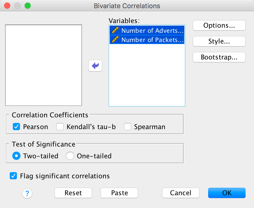
To illustrate what the extra options do, let’s run the data from the advert example in the chapter. First, enter the data as in Figure 8.4 in the chapter. Select Analyze > Correlate > Bivariate … to get this dialog box:
Completed dialog box
Drag the variables Number of Adverts Watched
[adverts] and Number of Packets Bought
[packets] to the box labelled Variables:. Now click
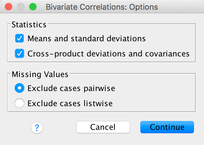
 and
another dialog box appears with two Statistics options. Select
them:
and
another dialog box appears with two Statistics options. Select
them:
Completed dialog box
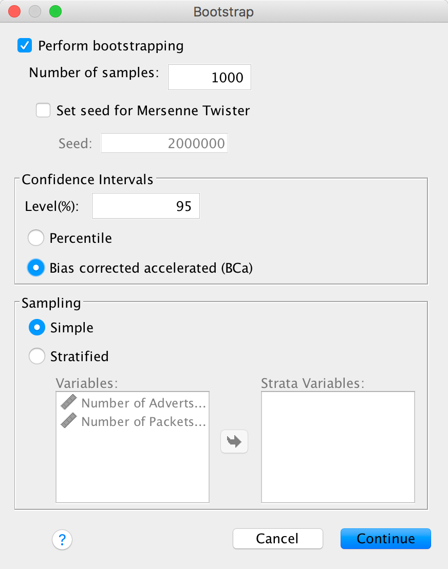
Next click  to get
some robust confidence intervals:
to get
some robust confidence intervals:
Completed dialog box
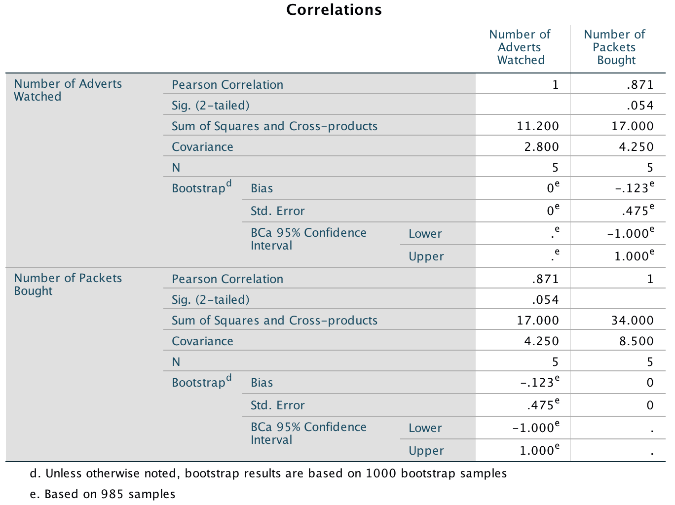
The resulting output is shown below. The section labelled Sum of Squares and Cross-products shows us the cross-product (17 in this example) that we calculated in equation (8.6) in the chapter, and the sums of squares for each variable. The sums of squares are calculated from the top half of equation (8.4). The value of the covariance between the two variables is 4.25, which is the same value as was calculated from equation (8.6). The covariance within each variable is the same as the variance for each variable (so the variance for the number of adverts seen is 2.8, and the variance for the number of packets bought is 8.5). These variances can be calculated manually from equation (8.4).
Note that the Pearson correlation coefficient between the two variables is .871, which is the same as the value we calculated in the chapter. Underneath is the significance value of this coefficient (.054). We also have the BCa 95% confidence interval that ranges from −1.00 to 1.00. The fact that the confidence interval crosses zero (and the significance is greater than .05) tells us that there was not a significant relationship between the number of adverts watched and packets bought. It also suggests, assuming that this sample is one of the 95% that generates a confidence interval containing the population value, that the population value could be anything between a perfect negative correlation and a perfect positive one. In other words, literally any value is plausible.
Output
Please, Sir, can I have some more … biserial correlation?
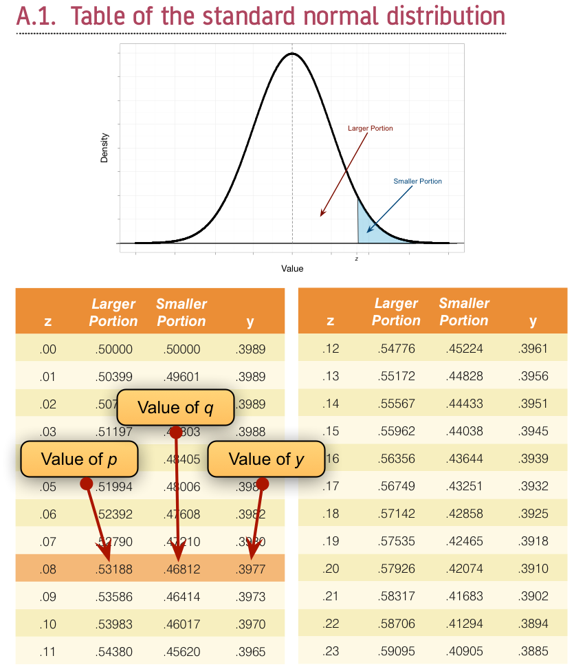
Imagine now that we wanted to convert the point-biserial correlation into the biserial correlation coefficient (rb) (because some of the male cats were neutered and so there might be a continuum of maleness that underlies the gender variable). We must use the equation below in which p is the proportion of cases that fell into the largest category and q is the proportion of cases that fell into the smallest category. Therefore, p and q are simply the number of male and female cats. In this equation, y is the ordinate of the normal distribution at the point where there is a proportion p of the area on one side and a proportion q on the other (this will become clearer as we do an example):
\[ r_{b} = \frac{r_{\text{pb}}\sqrt{pq}}{y} \]
To calculate p and q, access the Frequencies dialog box using Analyze > Descriptive Statistics > Frequencies … and drag the variable Sex to the box labelled Variable(s):. There is no need to click on any further options as the defaults will give you what you need to know (namely the percentage of male and female cats). It turns out that 53.3% (.533 as a proportion) of the sample was female (this is p, because it is the largest portion) while the remaining 46.7% (.467 as a proportion) were male (this is q because it is the smallest portion). To calculate y, we use these values and the values of the normal distribution displayed in the Appendix. The extract from the table shown below shows how to find y when the normal curve is split with .467 as the smaller portion and .533 as the larger portion. It shows which columns represent p and q, and we look for our values in these columns (the exact values of .533 and .467 are not in the table, so we use the nearest values that we can find, which are .5319 and .4681 respectively). The ordinate value is in the column y and is .3977.
Getting the ‘ordinate’ of the normal distribution
If we replace these values in the equation above we get .475 (see below), which is quite a lot higher than the value of the point-biserial correlation (.378). This finding just shows you that whether you assume an underlying continuum or not can make a big difference to the size of effect that you get:
\[ \begin{align} r_b &= \frac{r_\text{pb}\sqrt{pq}}{y}\\ &= \frac{0.378\sqrt{0.533 \times 0.467}}{0.3977}\\ &= 0.475 \end{align} \]
If this process freaks you out, you can also convert the point-biserial r to the biserial r using a table published by (Terrell 1982b) in which you can use the value of the point-biserial correlation (i.e., Pearson’s r) and p, which is just the proportion of people in the largest group (in the above example, .533). This spares you the trouble of having to work out y in the above equation (which you’re also spared from using). Using Terrell’s table we get a value in this example of .48, which is the same as we calculated to 2 decimal places.
To get the significance of the biserial correlation we need to first work out its standard error. If we assume the null hypothesis (that the biserial correlation in the population is zero) then the standard error is given by (Terrell 1982a):
\[ SE_{r_\text{b}} = \frac{\sqrt{pq}}{y\sqrt{N}} \]
This equation is fairly straightforward because it uses the values of p, q and y that we already used to calculate the biserial r. The only additional value is the sample size (N), which in this example was 60. So, our standard error is:
\[ \begin{align} SE_{r_\text{b}} &= \frac{\sqrt{0.533 \times 0.467}}{0.3977\sqrt{60}} \\ &= 0.162 \end{align} \]
The standard error helps us because we can create a z-score. To get a z-score we take the biserial correlation, subtract the mean in the population and divide by the standard error. We have assumed that the mean in the population is 0 (the null hypothesis), so we can simply divide the biserial correlation by its standard error:
\[ \begin{align} z_{r_\text{b}} &= \frac{r_b - \overline{r}_b}{SE_{r_\text{b}}} \\ &= \frac{r_b - 0}{SE_{r_\text{b}}} \\ &= \frac{.475-0}{.162} \\ &= 2.93 \end{align} \]
We can look up this value of z (2.93) in the table for the normal distribution in the Appendix and get the one-tailed probability from the column labelled Smaller Portion. In this case the value is .00169. To get the two-tailed probability we multiply this value by 2, which gives us .00338.
Chapter 9
No Oliver Twisted in this chapter.
Chapter 10
No Oliver Twisted in this chapter.
Chapter 11
Please Sir, can I have some more … centring?
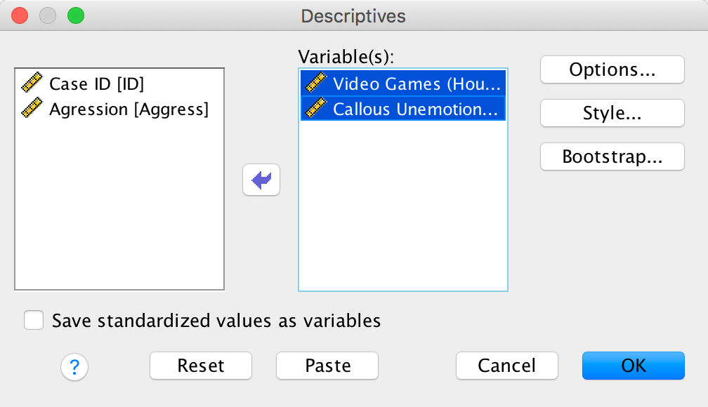
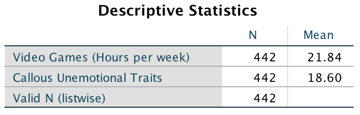
Grand mean centring is really easy: we can simply use the compute command that we encountered in the book. First, we need to find out the mean score for callous traits and gaming. We can do this using some simple descriptive statistics. Choose Analyze > Descrtiptive Statistics > Descriptives … to access the dialog box shown below. Drag Vid_Games and CaUnTs to the box labelled Variable(s):.
Completed dialog box
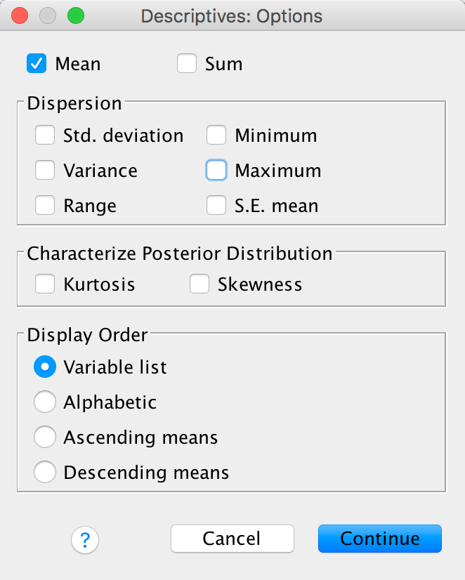
Next click and select
only the mean (we don’t need any other information):
Completed dialog box
The resulting output tells us that the mean for video game play was 21.84 hours per week, and for callous and unemotional traits was 18.60:
Output
We use these value to centre the variable. Access the compute command by selecting Transform > Compute Variable …. In the resulting dialog box enter the name CUT_Centred into the box labelled Target Variable. Drag the variable CaUnTs across to the area labelled Numeric Expression:, then type a minus sign (or click the button that looks like a minus sign) and type the value of the mean (18.60). Here is the completed dialog box:
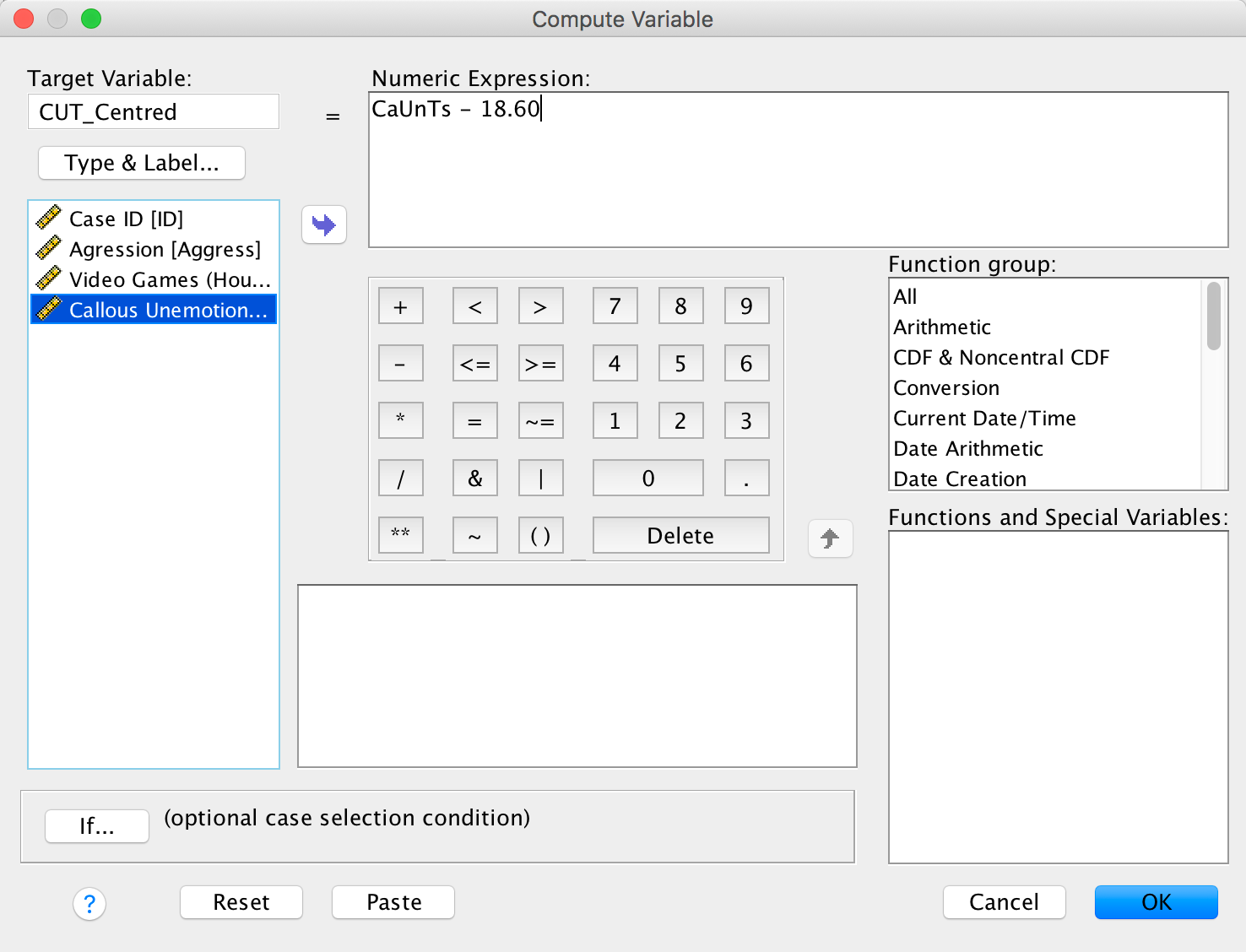
Completed dialog box
Click and
a new variable will be created called CUT_Centred,
which is centred around the mean of the callous unemotional traits
variable. The mean of this new variable should be approximately 0: run
some descriptive statistics to see that this is true.
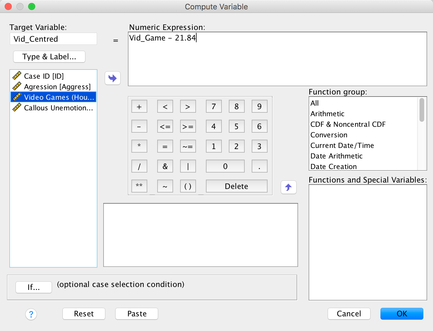
To centre the video game variable, we again select Transform > Compute Variable … but this time type the name Vid_Centred into the box labelled Target Variable. Drag the variable Vid_Games across to the area labelled Numric Expression, then type a minus sign (or click the button that looks like a minus sign) and type the value of the mean (21.84). The completed dialog box is as follows:
Completed dialog box
Click and
a new variable will be created called Vid_Centred,
which is centred around the mean of the number of hours spent playing
video games. The mean of this new variable should be approximately 0.
You can centre both variables in a syntax window by executing:
COMPUTE CUT_Centred = CaUnTs −18.60.
COMPUTE Vid_Centred = Vid_Games−21.84.
EXECUTE.
Chapter 12
Please, Sir, Can I have Some More … Welch’s F?
The (Welch 1951) F-statistic is somewhat more complicated (hence why it’s stuck on the website). First we have to work out a weight that is based on the sample size, ng, and variance, \(s_g^2\), for a particular group:
\[ w_g = \frac{n_g}{s_g^2} \]
We also need to use a grand mean based on a weighted mean for each group. So we take the mean of each group, \({\overline{x}}_{g}\), and multiply it by its weight, wg, do this for each group and add them up, then divide this total by the sum of weights:
\[ \bar{x}_\text{Welch grand} = \frac{\sum{w_g\bar{x}_g}}{\sum{w_g}} \]
The easiest way to do this using a table:
| Group | Variance (s2) | Sample size (ng) | Weight (Wg) | Mean (\(\bar{x}_g\)) | Weight × Mean (\(W_g\bar{x}_g\)) |
|---|---|---|---|---|---|
| Control | 1.70 | 5 | 2.941 | 2.2 | 6.4702 |
| 15 Minutes | 1.70 | 5 | 2.941 | 3.2 | 9.4112 |
| 30 minutes | 2.50 | 5 | 2.000 | 5.0 | 10.000 |
| Σ = 7.882 | Σ = 25.8814 |
So we get:
\[ \bar{x}_\text{Welch grand} = \frac{25.8814}{7.882} = 3.284 \]
Think back to equation 12.11 in the book, the model sum of squares was:
\[ \text{SS}_\text{M} = \sum_{g = 1}^{k}{n_g\big(\bar{x}_g - \bar{x}_\text{grand}\big)^2} \]
In Welch’s F this is adjusted to incorporate the weighting and the adjusted grand mean:
\[ \text{SS}_\text{M Welch} = \sum_{n = 1}^{k}{w_g\big(\bar{x}_g - \bar{x}_\text{Welch grand}\big)^2} \]
And to create a mean square we divide by the degrees of freedom, k – 1:
\[ \text{MS}_\text{M Welch} = \frac{\sum{w_g\big(\bar{x}_g - \bar{x}_\text{Welch grand} \big)^2}}{k - 1} \]
We obtain
\[ \text{MS}_\text{M Welch} = \frac{2.941( 2.2 - 3.284)^2 + 2.941( 3.2 - 3.284)^2 + 2(5 - 3.284)^2}{2}\ = 4.683 \]
We now have to work out a term called lambda, which is based again on the weights:
\[ \Lambda = \frac{3\sum\frac{\bigg(1 - \frac{w_g}{\sum{w_g}}\bigg)^2}{n_g - 1}}{k^2 - 1} \]
This looks horrendous, but is just based on the sample size in each group, the weight for each group (and the sum of all weights), and the total number of groups, k. For the puppy data this gives us:
\[ \begin{align} \Lambda &= \frac{3\Bigg(\frac{\Big(1 - \frac{2.941}{7.882}\Big)^2}{5 - 1} + \frac{\Big( 1 - \frac{2.941}{7.882}\Big)^2}{5 - 1} + \frac{\Big( 1 - \frac{2}{7.882}\Big)^2}{5 - 1}\Bigg)}{3^2 - 1} \\ &= \frac{3(0.098 + 0.098 + 0.139)}{8} \\ &= 0.126 \end{align} \]
The F ratio is then given by:
\[ F_{W} = \frac{\text{MS}_\text{M Welch}}{1 + \frac{2\Lambda(k - 2)}{3}} \]
where k is the total number of groups. So, for the puppy therapy data we get:
\[ \begin{align} F_W &= \frac{4.683}{1 + \frac{(2 \times 0.126)(3 - 2)}{3}} \\ &= \frac{9.336}{1.084} \\ &= 4.32 \end{align} \]
As with the Brown–Forsythe F, the model degrees of freedom stay the same at k – 1 (in this case 2), but the residual degrees of freedom, dfR, are 1/Λ (in this case, 1/0.126 = 7.94).
Chapter 13
No Oliver Twisted in this chapter.
Chapter 14
Please Sir, Can I … customize my model?
Different types of sums of squares
In the sister book on R (Field, Miles, and Field 2012), I needed to explain sums of squares because, unlike IBM SPSS Statistics, R does not routinely use Type III sums of squares. Here’s an adaptation of what I wrote:
We can compute sums of squares in four different ways, which gives rise to what are known as Type I, II, III and IV sums of squares. To explain these, we need an example. Let’s use the example from the chapter: we’re predicting attractiveness from two predictors, FaceType (attractive or unattractive facial stimuli) and Alcohol (the dose of alcohol consumed) and their interaction (FaceType × Alcohol).
The simplest explanation of Type I sums of squares is that they are like doing a hierarchical regression in which we put one predictor into the model first, and then enter the second predictor. This second predictor will be evaluated after the first. If we entered a third predictor then this would be evaluated after the first and second, and so on. In other words the order that we enter the predictors matters. Therefore, if we entered our variables in the order FaceType, Alcohol and then FaceType × Alcohol, then Alcohol would be evaluated after the effect of FaceType and FaceType × Alcohol would be evaluated after the effects of both FaceType and Alcohol.
Type III sums of squares differ from Type I in that all effects are evaluated taking into consideration all other effects in the model (not just the ones entered before). This process is comparable to doing a forced entry regression including the covariate(s) and predictor(s) in the same block. Therefore, in our example, the effect of Alcohol would be evaluated after the effects of both FaceType and FaceType × Alcohol, the effect of FaceType would be evaluated after the effects of both Alcohol and FaceType × Alcohol, finally, FaceType × Alcohol would be evaluated afterthe effects of both Alcohol and FaceType.
Type II sums of squares are somewhere in between Type I and III in that all effects are evaluated taking into consideration all other effects in the model except for higher-order effects that include the effect being evaluated. In our example, this would mean that the effect of Alcohol would be evaluated after the effect of FaceType (note that unlike Type III sums of squares, the interaction term is not considered); similarly, the effect of FaceType would be evaluated after only the effect of Alcohol. Finally, because there is no higher-order interaction that includes FaceType × Alcohol this effect would be evaluated after the effects of both Alcohol and FaceType. In other words, for the highest-order term Type II and Type III sums of squares are the same. Type IV sums of squares are essentially the same as Type III but are designed for situations in which there are missing data.
The obvious question is which type of sums of squares should you use:
- Type I: Unless the variables are completely independent of each other (which is unlikely to be the case) then Type I sums of squares cannot really evaluate the true main effect of each variable. For example, if we enter FaceType first, its sums of squares are computed ignoring Alcohol; therefore any variance in attractiveness that is shared by Alcohol and FaceType will be attributed to FaceType (i.e., variance that it shares with Alcohol is attributed solely to it). The sums of squares for Alcohol will then be computed excluding any variance that has already been ‘given over’ to FaceType. As such the sums of squares won’t reflect the true effect of Alcohol because variance in attractiveness that Alcohol shares with FaceType is not attributed to it because it has already been ‘assigned’ to FaceType. Consequently, Type I sums of squares tend not to be used to evaluate hypotheses about main effects and interactions because the order of predictors will affect the results.
- Type II: If you’re interested in main effects then you should use Type II sums of squares. Unlike Type III sums of squares, Type IIs give you an accurate picture of a main effect because they are evaluated ignoring the effect of any interactions involving the main effect under consideration. Therefore, variance from a main effect is not ‘lost’ to any interaction terms containing that effect. If you are interested in main effects and do not predict an interaction between your main effects then these tests will be the most powerful. However, if an interaction is present, then Type II sums of squares cannot reasonably evaluate main effects (because variance from the interaction term is attributed to them). However, if there is an interaction then you shouldn’t really be interested in main effects anyway. One advantage of Type II sums of squares is that they are not affected by the type of contrast coding used to specify the predictor variables.
- Type III: Type III sums of squares tend to get used as the default in SPSS Statistics. They have the advantage over Type IIs in that when an interaction is present, the main effects associated with that interaction are still meaningful (because they are computed taking the interaction into account). Perversely, this advantage is a disadvantage too because it’s pretty silly to entertain ‘main effects’ as meaningful in the presence of an interaction. Type III sums of squares encourage people to do daft things like get excited about main effects that are superseded by a higher-order interaction. Type III sums of squares are preferable to other types when sample sizes are unequal; however, they work only when predictors are encoded with orthogonal contrasts.
Hopefully, it should be clear that the main choice in ANOVA designs is between Type II and Type III sums of squares. The choice depends on your hypotheses and which effects are important in your particular situation. If your main hypothesis is around the highest order interaction then it doesn’t matter which you choose (you’ll get the same results); if you don’t predict an interaction and are interested in main effects then Type II will be most powerful; and if you have an unbalanced design then use Type III. This advice is, of course, a simplified version of reality; be aware that there is (often heated) debate about which sums of squares are appropriate to a given situation.
Customizing an ANOVA model
By default SPSS conducts a full factorial analysis (i.e., it includes
all of the main effects and interactions of all independent variables
specified in the main dialog box). However, there may be times when you
want to customize the model that you use to test for certain things. To
access the model dialog box, click  in the main
dialog box. By default, the full factorial model is selected. Even with
this selected, there is an option at the bottom to change the types of
sums of squares that are used in the analysis
in the main
dialog box. By default, the full factorial model is selected. Even with
this selected, there is an option at the bottom to change the types of
sums of squares that are used in the analysis  . We looked
above at the differences between the various sums of squares. As already
discussed, SPSS Statistics uses Type III sums of squares by default,
which have the advantage that they are invariant to the cell
frequencies. As such, they can be used with both balanced and unbalanced
(i.e., different numbers of participants in different groups) designs.
However, if you have any missing data in your design, you should change
the sums of squares to Type IV (see above).
. We looked
above at the differences between the various sums of squares. As already
discussed, SPSS Statistics uses Type III sums of squares by default,
which have the advantage that they are invariant to the cell
frequencies. As such, they can be used with both balanced and unbalanced
(i.e., different numbers of participants in different groups) designs.
However, if you have any missing data in your design, you should change
the sums of squares to Type IV (see above).
To customize a model, click  to
activate the dialog box. The variables specified in the main dialog box
will be listed on the left-hand side. You can select one, or several,
variables from this list and transfer them to the box labelled
Model: as either main effects or interactions. By default, SPSS
transfers variables as interaction terms, but there are several options
that allow you to enter main effects, or all two-way, three-way or
four-way interactions. These options save you the trouble of having to
select lots of combinations of variables (because, for example, you can
select three variables, transfer them as all two-way interactions and it
will create all three combinations of variables for you). Hence, you
could select FaceType and Alcohol (you
can select both of them at the same time by holding down Ctrl
or ⌘ on a Mac). Having selected them, click the drop-down menu and
change it to
to
activate the dialog box. The variables specified in the main dialog box
will be listed on the left-hand side. You can select one, or several,
variables from this list and transfer them to the box labelled
Model: as either main effects or interactions. By default, SPSS
transfers variables as interaction terms, but there are several options
that allow you to enter main effects, or all two-way, three-way or
four-way interactions. These options save you the trouble of having to
select lots of combinations of variables (because, for example, you can
select three variables, transfer them as all two-way interactions and it
will create all three combinations of variables for you). Hence, you
could select FaceType and Alcohol (you
can select both of them at the same time by holding down Ctrl
or ⌘ on a Mac). Having selected them, click the drop-down menu and
change it to  .
Having done this, click on
.
Having done this, click on ![]() to move
the main effects of FaceType and
Alcohol to the box labelled Model:. Next, you
could specify the interaction term. To do this, select
FaceType and Alcohol simultaneously,
then select
to move
the main effects of FaceType and
Alcohol to the box labelled Model:. Next, you
could specify the interaction term. To do this, select
FaceType and Alcohol simultaneously,
then select  in the
drop-down list and click on
in the
drop-down list and click on ![]() . This
action moves the interaction of FaceType and
Alcohol to the box labelled Model:.
. This
action moves the interaction of FaceType and
Alcohol to the box labelled Model:.
The finished dialog box should look like this:
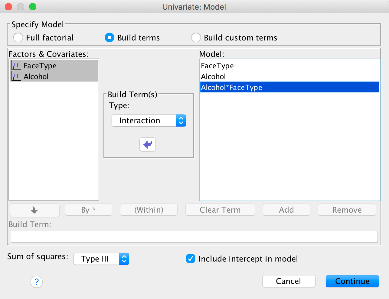
Completed dialog box
Having specified whatever model you want to specify, click to return
to the main dialog box and then click to fit the model.
Although model selection has important uses, it is likely that you’d
want to run the full factorial analysis on most occasions and so
wouldn’t customize your model.
Please Sir, can I have some more … contrasts?
In the book we looked at how to generate contrast codes. We used an example about puppy therapy and constructed these codes:
| Group | Dummy Variable 1 (Contrast 1) | Dummy Variable 2 (Contrast 2 ) | Product (Contrast 1 × Contrast 2) |
|---|---|---|---|
| Control | -2 | 0 | 0 |
| 15 minutes | 1 | -1 | -1 |
| 30 minutes | 1 | 1 | 1 |
| Total | 0 | 0 | 0 |
In the example in the chapter that referred you here, we have a similar design opn the variable Alcohol in that there is a ‘no treatment’ control (the placebo drink) and then different doses of alcohol. This mimics the puppy therapy data where there was a no treatment control and then two ‘doses’ of puppy therapy (15 and 30 minutes). As such, we might be interested in using the same contrasts. This also saves us thinking about new contrasts. The following table illustrates how these contrasts apply to the alcohol variable.
| Group | Dummy Variable 1 (Contrast 1) | Dummy Variable 2 (Contrast 2 ) | Product (Contrast 1 × Contrast 2) |
|---|---|---|---|
| Placebo | -2 | 0 | 0 |
| Low dose | 1 | -1 | -1 |
| High dose | 1 | 1 | 1 |
| Total | 0 | 0 | 0 |
Remember that contrast 1 compares the control group to the average of both alcohol groups. In other words, it compares the mean of the placebo group to the mean of the low- and high-dose groups combined. Contrast two then excludes the placebo group and compares the low dose group to the high dose group. These are basically the same contrasts as the Helmert contrasts explained in the chapter. Although we can specify Helmert contrasts through the dialog boxes, by specifying these contrasts manually it gives you a base to specify contrasts other than Helmert contrasts.
I explained in the book how you generate contrasts for a single predictor (see the chapter with puppy therapy example in). The complication when we have a factorial design is that we now have an interaction term the also involves this variable, so we need to specify contrast codes not just for the main effect but for the interaction also. For the example in the book we can specify a basic model with this syntax:
GLM Attractiveness BY FaceType AlcoholThis command tells SPSS to predict Attractiveness form the variables FaceType and Alcohol. If we specify the predictors in this order then our interaction will be made up of the groups in the order below:
| Cell | IV1 (FaceType) | IV2 (Alcohol) | Cell mean |
|---|---|---|---|
| 1 | Unattractive | Placebo | Un_Placebo |
| 2 | Unattractive | Low dose | Un_Low |
| 3 | Unattractive | High dose | Un_High |
| 4 | Attractive | Placebo | Att_Placebo |
| 5 | Attractive | Low dose | Att_Low |
| 6 | Attractive | High dose | Att_High |
The next issue is that we need to specify a contrast for the interaction term as well as the main effect. We have to sort of ‘spread’ the contrast for the main effect of alcohol across the two levels of type of face. To do this we divide the contrast code by the number of levels in the second predictor. For example, there were two levels of type of face (attractive vs unattractive) so we divide each code for the main effect of alcohol by 2. This gives us the codes for the interaction in the bottom row:
| Cell | IV1 (FaceType) | IV2 (Alcohol) | Main effect contrast code | Cell mean | Interaction contrast code |
|---|---|---|---|---|---|
| 1 | Unattractive | Placebo | 2 | Un_Placebo | 1.0 |
| 2 | Unattractive | Low dose | -1 | Un_Low | -0.5 |
| 3 | Unattractive | High dose | -1 | Un_High | -0.5 |
| 4 | Attractive | Placebo | 2 | Att_Placebo | 1.0 |
| 5 | Attractive | Low dose | -1 | Att_Low | -0.5 |
| 6 | Attractive | High dose | -1 | Att_High | -0.5 |
We do the same for the second contrast as illustrated below (note the contrast for the interaction is made up of the codes for the main effect of alcohol divided by the number of levels of FaceType).
| Cell | IV1 (FaceType) | IV2 (Alcohol) | Main effect contrast code | Cell mean | Interaction contrast code |
|---|---|---|---|---|---|
| 1 | Unattractive | Placebo | 0 | Un_Placebo | 0.0 |
| 2 | Unattractive | Low dose | 1 | Un_Low | 0.5 |
| 3 | Unattractive | High dose | -1 | Un_High | -0.5 |
| 4 | Attractive | Placebo | 0 | Att_Placebo | 0.0 |
| 5 | Attractive | Low dose | 1 | Att_Low | 0.5 |
| 6 | Attractive | High dose | -1 | Att_High | -0.5 |
The order of variables in the model matters, let’s just quickly look at why. We can specify the predictor variables the other way around to how we did above:
GLM Attractiveness BY Alcohol FaceType(Notice that the order of FaceType and Alcohol has swapped compared toabove). This command tells SPSS to predict Attractiveness form thevariables Alcohol and FaceType. If we specify the predictors in this order then our interaction will be made up of the groups in the order below (compare the earlier comparable table)
| Cell | IV1 (Alcohol) | IV2 (FaceType) | Cell mean |
|---|---|---|---|
| 1 | Placebo | Unattractive | Un_Placebo |
| 2 | Placebo | Attractive | Att_Placebo |
| 3 | Low dose | Unattractive | Un_Low |
| 4 | Low dose | Attractive | Att_Low |
| 5 | High dose | Unattractive | Un_High |
| 6 | High dose | Attractive | Att_High |
The resulting contrast codings have the same value but need to be placed in a different order because the order of groups has changed (compare the bottom row of the tables below with the earlier comparable tables). The take home message is that you need to pay attention to the order in which you specify the predictors.
| Cell | IV1 (Alcohol) | IV2 (FaceType) | Main effect contrast code | Cell mean | Interaction contrast code |
|---|---|---|---|---|---|
| 1 | Placebo | Unattractive | 2 | Un_Placebo | 1.0 |
| 2 | Placebo | Attractive | 2 | Att_Placebo | 1.0 |
| 3 | Low dose | Unattractive | -1 | Un_Low | -0.5 |
| 4 | Low dose | Attractive | -1 | Att_Low | -0.5 |
| 5 | High dose | Unattractive | -1 | Un_High | -0.5 |
| 6 | High dose | Attractive | -1 | Att_High | -0.5 |
| Cell | IV1 (Alcohol) | IV2 (FaceType) | Cell mean | Main effect contrast code | Interaction contrast code |
|---|---|---|---|---|---|
| 1 | Placebo | Unattractive | Un_Placebo | 0 | 0.0 |
| 2 | Placebo | Attractive | Att_Placebo | 0 | 0.0 |
| 3 | Low dose | Unattractive | Un_Low | 1 | 0.5 |
| 4 | Low dose | Attractive | Att_Low | 1 | 0.5 |
| 5 | High dose | Unattractive | Un_High | -1 | -0.5 |
| 6 | High dose | Attractive | Att_High | -1 | -0.5 |
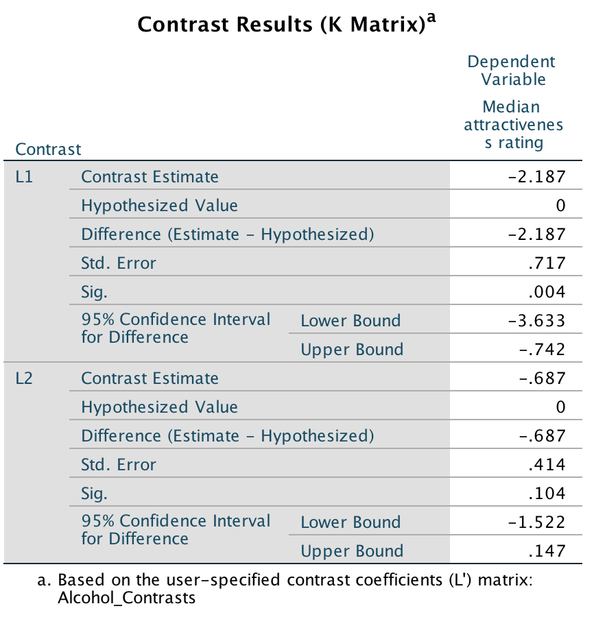
Having fathomed out the contrasts you want we need to specify them. You can do that with the syntax in the file GogglesContrasts.sps which looks like this:
GLM Attractiveness BY FaceType Alcohol
/PRINT TEST(LMATRIX)
/LMATRIX "Alcohol_Contrasts"
Alcohol 2 -1 -1
FaceType*Alcohol 1 -1/2 -1/2 1 -1/2 -1/2;
Alcohol 0 1 -1
FaceType*Alcohol 0 0.5 -0.5 0 0.5 -0.5.
Let’s run through this line by line:
GLM Attractiveness BY FaceType AlcoholThe above line specifies the model.
/PRINT TEST(LMATRIX)This line is optional, it just prints the tables of contrasts (useful for checking what you have specified).
/LMATRIX "Alcohol_Contrasts"This line is where we start to specify the contrasts. The stuff in “” is just a name, it can anything you like and you don’t have to specify a name at all if you won’t want to.
Alcohol 2 -1 -1
FaceType*Alcohol 1 -1/2 -1/2 1 -1/2 -1/2;
These two lines specify the first contrast by listing the codes for the main effect of alcohol, and then the interaction. A few things to note ‘Alcohol’ must match the variable name in the original GLM command as do the variable names in ’FaceType*Alcohol’. If they don’t match then SPSS won’t know what variables you’re referring to. After the variable name (or interaction name) you type the codes. For the main effect of alcohol there are 6 (one for each combination of face type and alcohol). Note the codes for the interaction match the values in Table 4. Note that there is a semi-colon at the end, which tells SPSS to expect another contrast to be defined underneath.
Alcohol 0 1 -1
FaceType*Alcohol 0 0.5 -0.5 0 0.5 -0.5.
These two lines specify the second contrast by listing the codes for the main effect of alcohol, and then the interaction. As above the variable (or interaction name) you type the codes as we did for the first contrast. Note the codes for the interaction match the values we calculated earlier.
The output shows the resulting contrasts. Note that the p-values match those from the Helmert contrast in the book (because that is what we specified). The contrast values do not match but this is simply because there are different values you can use to specify the same contrast, and these affect the value of the contrast itself but the contrast estimates will be a function of each other (for example, our first contrast estimate is −2.188 which is 2 × −1.094 (the value of the Helmert contrast).
Output
Please, Sir, can I have some more … simple effects?
A simple main effect (usually called a simple effect) is just the effect of one variable at levels of another variable. In the book we computed the simple effect of ratings of attractive and unattractive faces at each level of dose of alcohol (see the book for details of the example). Let’s look at how tp calculate these simple effects. In the book, we saw that the model sum of squares is calculated using:
\[ \text{SS}_\text{M} = \sum_{g = 1}^{k}{n_g\big(\bar{x}_g - \bar{x}_\text{grand}\big)^2} \]
We group the data by the amount of alcohol drunk (the first column within each block are the scores for attractive faces and thes econd column the scores for unattractive faces):
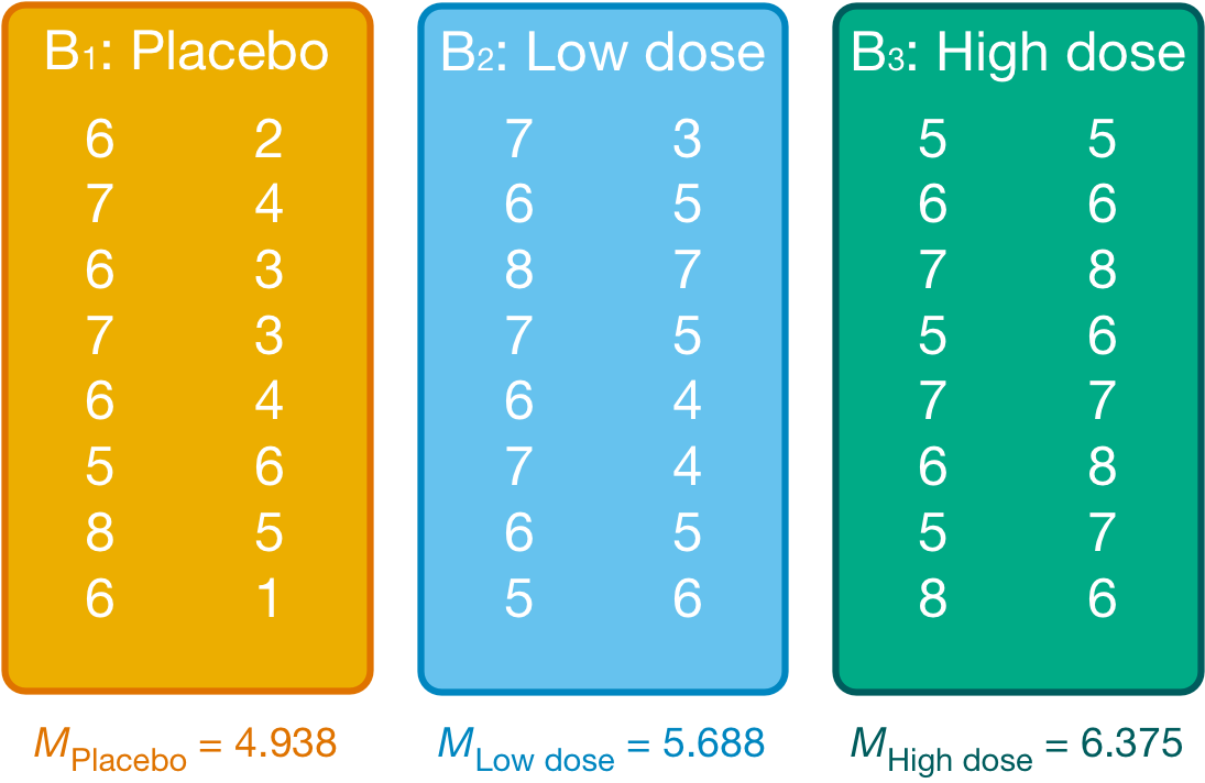
Figure
Within each of these three groups, we calculate the overall mean (shown in the figure) and the mean rating of attractive and unattractive faces separately:
## `summarise()` has grouped output by 'Alcohol'. You can override using the
## `.groups` argument.| Alcohol | FaceType | mean |
|---|---|---|
| Placebo | Unattractive | 3.500 |
| Placebo | Attractive | 6.375 |
| Low dose | Unattractive | 4.875 |
| Low dose | Attractive | 6.500 |
| High dose | Unattractive | 6.625 |
| High dose | Attractive | 6.125 |
For simple effects of face type at each level of alcohol we’d begin with the placebo and calculate the model sum of squares. The grand mean becomes the mean for all scores in the placebo group and the group means are the mean ratings of attractive and unattractive faces.
We can then apply the model sum of squares equation that we used for the overall model but using the grand mean of the placebo group (4.938) and the mean ratings of unattractive (3.500) and attractive (6.375) faces:
\[ \begin{align} \text{SS}_\text{Face, Placebo} &= \sum_{g = 1}^{k}{n_g\big(\bar{x}_g - \bar{x}_\text{grand}\big)^2} \\ &= 8(3.500 - 4.938)^2 + 8(6.375 - 4.938)^2 \\ &= 33.06 \end{align} \]
The degrees of freedom for this effect are calculated the same way as for any model sum of squares; they are one less than the number of conditions being compared (k – 1), which in this case, where we’re comparing only two conditions, will be 1.
We do the same for the low-dose group. We use the grand mean of the low-dose group (5.688) and the mean ratings of unattractive and attractive faces:
\[ \begin{align} \text{SS}_\text{Face, Low dose} &= \sum_{g = 1}^{k}{n_g\big(\bar{x}_g - \bar{x}_\text{grand}\big)^2} \\ &= 8(4.875 - 5.688)^2 + 8(6.500 - 5.688)^2 \\ &= 10.56 \end{align} \]
The degrees of freedom are again k – 1 = 1.
Next, we do the same for the high-dose group. We use the grand mean of the high-dose group (6.375) and the mean ratings of unattractive and attractive faces:
\[ \begin{align} \text{SS}_\text{Face, High dose} &= \sum_{g = 1}^{k}{n_g\big(\bar{x}_g - \bar{x}_\text{grand}\big)^2} \\ &= 8(6.625 - 6.375)^2 + 8(6.125 - 6.375)^2 \\ &= 1 \end{align} \]
Again, the degrees of freedom are 1 (because we’ve compared two groups).
We need to convert these sums of squares to mean squares by dividing by the degrees of freedom but because all of these sums of squares have 1 degree of freedom, the mean squares are the same as the sum of squares. The final stage is to calculate an F-statstic for each simple effect by dividing the mean squares for the model by the residual mean squares. When conducting simple effects we use the residual mean squares for the original model (the residual mean squares for the entire model). In doing so we partition the model sums of squares and keep control of the Type I error rate. For these data, the residual sum of squares was 1.37 (see the book chapter). Therefore, we get:
\[ \begin{align} F_\text{FaceType, Placebo} &= \frac{\text{MS}_\text{Face, Placebo}}{\text{MS}_\text{R}} = \frac{33.06}{1.37} = 24.13 \\ F_\text{FaceType, Low dose} &= \frac{\text{MS}_\text{Face, Low dose}}{\text{MS}_\text{R}} = \frac{10.56}{1.37} = 7.71 \\ F_\text{FaceType, High dose} &= \frac{\text{MS}_\text{Face, High dose}}{\text{MS}_\text{R}} = \frac{1}{1.37} = 0.73 \end{align} \]
These values match those for the output in the book (see the SPSS Tip in the chapter that referred you here).
Chapter 15
Please, Sir, can I have some more … sphericity?
Field, A. P. (1998). A bluffer’s guide to sphericity. Newsletter of the Mathematical, Statistical and Computing Section of the British Psychological Society, 6, 13–22.
Chapter 16
No Oliver Twisted in this chapter.
Chapter 17
Please, Sir, can I have some more … maths?
Calculation of E−1
\[ E = \begin{bmatrix} 51 & 13 \\ 13 & 122 \\ \end{bmatrix} \]
\[ \text{determinant of }E, |E| = (51 \times 122) - (13 \times 13) = 6053 \]
\[ \text{matrix of minors for }E = \begin{bmatrix} 122 & 13 \\ 13 & 51 \\ \end{bmatrix} \]
\[ \text{pattern of signs for 2 × 2 matrix} = \begin{bmatrix} + & - \\ - & + \\ \end{bmatrix} \]
\[ \text{matrix of cofactors} = \begin{bmatrix} 122 & -13 \\ -13 & 51 \\ \end{bmatrix} \]
The inverse of a matrix is obtained by dividing the matrix of cofactors for E by |E|, the determinant of E:
\[ E^{-1} = \begin{bmatrix} \frac{122}{6053} & \frac{- 13}{6053} \\ \frac{- 13}{6053} & \frac{51}{6053} \\ \end{bmatrix} = \begin{bmatrix} 0.0202 & -0.0021 \\ -0.0021 & 0.0084 \\ \end{bmatrix} \]
Calculation of HE−1
\[ \begin{align} HE^{-1} &= \begin{bmatrix} 10.47 & -7.53 \\ -7.53 & 19.47 \\ \end{bmatrix}\begin{bmatrix} 0.0202 & -0.0021 \\ -0.0021 & 0.0084 \\ \end{bmatrix} \\ &= \begin{bmatrix} (10.47 \times 0.0202) + (-7.53 \times -0.0021) & (10.47 \times - 0.0) + (-7.53\ \times 0.0084) \\ (-7.53 \times 0.0202) + (19.47 \times -0.0021) & (-7.53\ \times -0.0 ) + (19.47 \times 0.0084) \\ \end{bmatrix}\\ &= \begin{bmatrix} 0.2273 & - 0.0852 \\ -0.1903 & 0.1794 \\ \end{bmatrix} \end{align} \]
Calculation of eigenvalues
The eigenvalues or roots of any square matrix are the solutions to the determinantal equation |A − λI| = 0, in which A is the square matrix in question and I is an identity matrix of the same size as A. The number of eigenvalues will equal the number of rows (or columns) of the square matrix. In this case the square matrix of interest is HE−1:
\[ \begin{align} |\text{HE}^{-1} - \lambda I| &= \left| \begin{pmatrix} 0.2273 & - 0.0852 \\ -0.1903 & 0.1794 \\ \end{pmatrix}\begin{pmatrix} \lambda & 0 \\ 0 & \lambda \\ \end{pmatrix} \right|\\ &= \left| \begin{pmatrix} 0.2273-\lambda & -0.0852 \\ -0.1903 & 0.1794-\lambda \\ \end{pmatrix} \right|\\ &= (0.2273 - \lambda)(0.1794 - \lambda) - (-0.1930 \times -0.0852) \\ &= \lambda^2 - 0.2273\lambda - 0.1794\lambda + 0.0407 - 0.0164\\ &= \lambda^2 - 0.4067\lambda + 0.0243 \end{align} \]
Therefore the equation |HE−1 − λI| = 0 can be expressed as:
\[ \lambda^2 - 0.4067\lambda + 0.0243 = 0 \]
To solve the roots of any quadratic equation of the general form\(a\lambda^2 + b\lambda + c = 0\) we can apply the following formula:
\[ \lambda_i = \frac{-b \pm \sqrt{(b^2 - 4ac)}}{2a} \]
For the quadratic equation obtained, a = 1, b = −0.4067, c =0.0243. If we replace these values into the formula for discovering roots, we get:
\[ \begin{align} \lambda_i &= \frac{-b \pm \sqrt{(b^2 - 4ac)}}{2a}\\ &= \frac{0.4067 \pm \sqrt{-0.4067^2 - 0.0972}}{2}\\ &= \frac{0.4067 + 0.2612}{2} & \frac{0.4067 - 0.2612}{2}\\ &= \frac{0.6679}{2} & \frac{0.1455}{2}\\ &= 0.334\ &\ 0.073 \end{align} \]
Hence, the eigenvalues are 0.334 and 0.073.
Chapter 18
Please Sir, can I have some more … matrix algebra?
Calculation of factor score coefficients
The matrix of factor score coefficients (B) and the inverse of the correlation matrix (R−1) for the popularity data are shown below. The matrices R−1 and A can be multiplied by hand to get the matrix B. To get the same degree of accuracy as SPSS Statistics you should work to at least 5 decimal places:
\[ \begin{align} B &= R^{- 1}A \\ &= \begin{pmatrix} 4.76 & -7.46 & 3.91 & -2.35 & 2.42 & -0.49 \\ -7.46 & 18.49 & -12.42 & 5.45 & -5.54 & 1.22 \\ 3.91 & -12.42 & 10.07 & - 3.65 & 3.79 & -0.96 \\ -2.35 & 5.45 & -3.65 & 2.97 & -2.16 & 0.02 \\ 2.42 & -5.54 & 3.79 & - 2.16 & 2.98 & -0.56 \\ -0.49 & 1.22 & -0.96 & 0.02 & -0.56 & 1.27 \\ \end{pmatrix}\begin{pmatrix} 0.87 & 0.01 \\ 0.96 & -0.03 \\ 0.92 & 0.04 \\ 0.00 & 0.82 \\ -0.10 & 0.75 \\ 0.09 & 0.70 \\ \end{pmatrix}\\ &=\begin{pmatrix} 0.343 & 0.006 \\ 0.376 & -0.020 \\ 0.362 & 0.020 \\ 0.000 & 0.473 \\ -0.037 & 0.437 \\ 0.039 & 0.405 \\ \end{pmatrix} \end{align} \]
Column 1 of matrix B
To get the first element of the first column of matrix B, you need to multiply each element in the first column of matrix A with the correspondingly placed element in the first row of matrix R−1. Add these six products together to get the final value of the first element. To get the second element of the first column of matrix B, you need to multiply each element in the first column of matrix A with the correspondingly placed element in the second row of matrix R−1. Add these six products together to get the final value … and so on:
\[ \begin{align} B_{11} &= (4.76 \times 0.87) + (-7.46 \times 0.96) + (3.91 \times 0.92 ) + (-2.35 \times -0.00) + (2.42 \times -0.10) + (-0.49 \times 0.09)\\ &= 0.343\\ B_{21} &= (-7.46 \times 0.87) + \ (18.49 \times 0.96) + (-12.42 \times 0.92) + (5.45 \times -0.00) + (-5.54 \times -0.10) + ( 1.22 \times 0.09)\\ &= 0.376\\ B_{31} &= (3.91 \times 0.87) + (-12.42 \times 0.96) + (10.07 \times 0.92) + (-3.65 \times -0.00) + (3.70 \times - 0.10 ) + (-0.96 \times 0.09 )\\ &= 0.362\\ B_{41} &= (-2.35 \times 0.87) + ( 5.45\ \times 0.96) + (-3.65 \times 0.92 ) + ( 2.97 \times -0.00 ) + (-2.16 \times -0.10 ) + (0.02\ \times \ 0.09)\\ &= 0.000\\ B_{51} &= (2.42 \times 0.87) + (-5.54\ \times 0.96) + (3.79 \times 0.92 ) + (-2.16 \times -0.00 ) + (2.98 \times -0.10 ) + (- 0.56\ \times 0.09)\\ &= -0.037\\ B_{61} &= (-0.49 \times 0.87) + (1.22 \times 0.96) + (-0.96 \times 0.92 ) + ( 0.02 \times -0.00) + (-0.56 \times -0.10 ) + (1.27 \times 0.09)\\ &= 0.039 \end{align} \]
Column 2 of matrix B
To get the first element of the second column of matrix B, you need to multiply each element in the second column of matrix A with the correspondingly placed element in the first row of matrix R−1. Add these six products together to get the final value. To get the second element of the second column of matrix B, you need to multiply each with the correspondingly placed element in the second row of matrix R−1. Add these six products together to get the final value … and so on:
\[ \begin{align} B_{12} &= (4.76 \times 0.01) + (-7.46 \times -0.03) + (3.91 \times 0.04) + (-2.35 \times 0.82) + (2.42 \times 0.75) + (-0.49 \times 0.70)\\ &= 0.006\\ B_{22} &= (-7.46 \times 0.01) + \ (18.49 \times -0.03) + (-12.42 \times0.04) + (5.45 \times 0.82) + (-5.54 \times 0.75) + (1.22 \times 0.70)\\ &=-0.020\\ B_{32} &= (3.91 \times 0.01) + (-12.42 \times -0.03) + (10.07 \times 0.04) + (-3.65 \times 0.82) + (3.70 \times 0.75) + (-0.96 \times 0.70)\\ &= 0.020\\ B_{42} &= (-2.35 \times 0.01) + ( 5.45\ \times -0.03) + (-3.65 \times 0.04) + ( 2.97 \times 0.82) + (-2.16 \times 0.75) + (0.02\ \times \ 0.70)\\ &= 0.473\\ B_{52} &= (2.42 \times 0.01) + (-5.54\ \times -0.03) + (3.79 \times 0.04) + (-2.16 \times 0.82) + (2.98 \times 0.75) + (- 0.56\ \times 0.70)\\ &= 0.473\\ B_{62} &= (-0.49 \times 0.01) + (1.22 \times -0.03) + (-0.96 \times 0.04) + ( 0.02 \times 0.82) + (-0.56 \times 0.75) + (1.27 \times 0.70)\\ &= 0.405 \end{align} \]
Factor scores
The pattern of the loadings is the same for the factor score coefficients: that is, the first three variables have high loadings for the first factor and low loadings for the second, whereas the pattern is reversed for the last three variables. The difference is only in the actual value of the weightings, which are smaller because the correlations between variables are now accounted for. These factor score used to replace the b-values in the equation for the factor:
\[ \begin{align} \text{Sociability}_i &= 0.343\text{Talk 1}_i + 0.376\text{Social skills}_i + 0.362\text{Interest}_i + 0.00\text{Talk 2}_i - 0.037\text{Selfish}_i + 0.039\text{Liar}_i\\ &= (0.343 \times 4) + (0.376 \times 9) + (0.362 \times 8) + (0.00 \times 6) - (0.037\times 8) + (0.039\times 6)\\ &= 7.59\\ \text{Consideration}_i &= 0.006\text{Talk 1}_i - 0.020\text{Social skills}_i + 0.020\text{Interest}_i + 0.473\text{Talk 2}_i + 0.437\text{Selfish}_i + 0.405\text{Liar}_i\\ &= (0.006 \times 4) - (0.020 \times 9) + (0.020 \times 8) + (0.473 \times 6) + (0.437 \times 8) + (0.405 \times 6)\\ &= 8.768 \end{align} \]
In this case, we use the same participant scores on each variable as were used in the chapter. The resulting scores are much more similar than when the factor loadings were used as weights because the different variances among the six variables have now been controlled for. The fact that the values are very similar reflects the fact that this person not only scores highly on variables relating to sociability, but is also inconsiderate (i.e., they score equally highly on both factors).
Please, Sir, can I have some more … questionnaires?
As a rule of thumb, never to attempt to design a questionnaire! A questionnaire is very easy to design, but a good questionnaire is virtually impossible to design. The point is that it takes a long time to construct a questionnaire, with no guarantees that the end result will be of any use to anyone. A good questionnaire must have three things: discrimination, reliability and validity.
Discrimination
Discrimination is really an issue of item selection. Discrimination simply means that people with different scores on a questionnaire differ in the construct of interest to you. For example, a questionnaire measuring social phobia should discriminate between people with social phobia and people without it (i.e., people in the different groups should score differently). There are three corollaries to consider:
- People with the same score should be equal to each other along the measured construct.
- People with different scores should be different to each other along the measured construct.
- The degree of difference between people is proportional to the difference in scores.
This is all pretty self-evident really, so what’s the fuss about? Well, let’s take a really simple example of a three-item questionnaire measuring sociability. Imagine we administered this questionnaire to two people: Jane and Katie. Their responses are shown below.
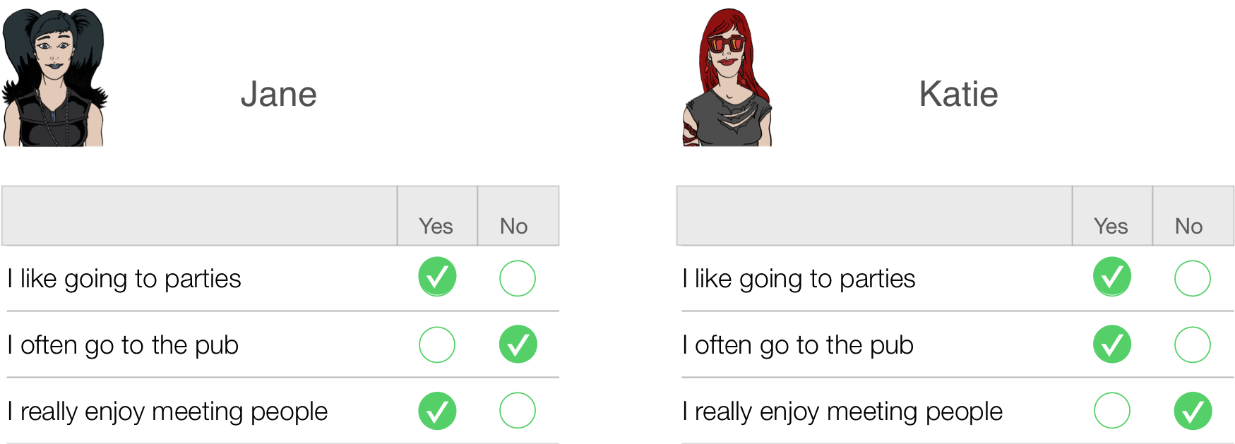
Figure
Jane responded yes to items 1 and 3 but no to item 2. If we score a yes with the value 1 and a no with a 0, then we can calculate a total score of 2. Katie, on the other hand, answers yes to items 1 and 2 but no to item 3. Using the same scoring system her score is also 2. Therefore, numerically you have identical answers (i.e. both Jane and Katie score 2 on this questionnaire); therefore, these two people should be comparable in their sociability — are they?
The answer is: not necessarily. It seems that Katie likes to go to parties and the pub but doesn’t enjoy meeting people in general, whereas Jane enjoys parties and meeting people but doesn’t enjoy the pub. It seems that Katie likes social situations involving alcohol (e.g. the pub and parties) but Jane likes socializing in general, but doesn’t like pubs — perhaps because there are more strangers there than at parties. In many ways, therefore, these people are very different because our questions are contaminated by other factors (i.e. attitudes to alcohol or different social environments). A good questionnaire should be designed such that people with identical numerical scores are identical in the construct being measured — and that’s not as easy to achieve as you might think!
A second related point is score differences. Imagine you take scores on the Spider Phobia Questionnaire. Imagine you have three participants who do the questionnaire and get the following scores: Andy scores 30 on the SPQ (very spider phobic), Graham scores 15 (moderately phobic) and Dan scores 10 (not very phobic at all). Does this mean that Dan and Graham are more similar in their spider phobia than Graham and Andy? In theory this should be the case because Graham’s score is more similar to Dan’s (difference = 5) than it is to Andy’s (difference = 15). In addition, is it the case that Andy is three times more phobic of spiders than Dan is? Is he twice as phobic as Graham? Again, his scores suggest that he should be. The point is that you can’t guarantee in advance that differences in score are going to be comparable, yet a questionnaire needs to be constructed such that the difference in score is proportional to the difference between people.
Validity
Items on your questionnaire must measure something, and a good questionnaire measures what you designed it to measure (this is called validity). Validity basically means ‘measuring what you think you’re measuring’. So, an anxiety measure that actually measures assertiveness is not valid; however, a materialism scale that does actually measure materialism is valid. Validity is a difficult thing to assess and it can take several forms:
- Content validity. Items on a questionnaire must relate to
the construct being measured. For example, a questionnaire measuring
intrusive thoughts is pretty useless if it contains items relating to
statistical ability. Content validity is really how representative your
questions are — the sampling adequacy of items. This is achieved when
items are first selected: don’t include items that are blatantly very
similar to other items, and ensure that questions cover the full range
of the construct.
- Criterion validity. This is basically whether the questionnaire is measuring what it claims to measure. In an ideal world, you could assess this by relating scores on each item to real-world observations (e.g., comparing scores on sociability items with the number of times a person actually goes out to socialize). This is often impractical and so there are other techniques such as (a) using the questionnaire in a variety of situations and seeing how predictive it is; (b) seeing how well it correlates with other known measures of your construct (i.e., sociable people might be expected to score highly on extroversion scales); and (c) using statistical techniques such as the Item Validity Index.
- Factorial validity. This validity basically refers to whether the factor structure of the questionnaire makes intuitive sense. As such, factorial validity is assessed through factor analysis. When you have your final set of items you can conduct a factor analysison the data (see the book). Factor analysis takes your correlated questions and recodes them into uncorrelated, underlying variables called factors (an example might be recoding the variables height, chest size, shoulder width and weight into an underlying variable called ‘build’). As another example, to assess success in a course we might measure attentiveness in seminars, the amount of notes taken in seminars, and the number of questions asked during seminars — all of these variables may relate to an underlying trait such as ‘motivation to succeed’. Factor analysis produces a table of items and their correlation, or loading, with each factor. A factor is composed of items that correlate highly with it. Factorial validity can be seen from whether the items tied on to factors make intuitive sense or not. Basically, if your items cluster into meaningful groups then you can infer factorial validity.
Validity is a necessary but not sufficient condition of a questionnaire.
Reliability
A questionnaire must be not only valid, but also reliable. Reliability is basically the ability of the questionnaire to produce the same results under the same conditions. To be reliable the questionnaire must first be valid. Clearly the easiest way to assess reliability is to test the same group of people twice: if the questionnaire is reliable you’d expect each person’s scores to be the same at both points in time. So, scores on the questionnaire should correlate perfectly (or very nearly!). However, in reality, if we did test the same people twice then we’d expect some practice effects and confounding effects (people might remember their responses from last time). Also this method is not very useful for questionnaires purporting to measure something that we would expect to change (such as depressed mood or anxiety). These problems can be overcome using the alternate form method in which two comparable questionnaires are devised and compared. Needless to say, this is a rather time-consuming way to ensure reliability and fortunately thereare statistical methods to make life much easier.
The simplest statistical technique is the split-half method. This method randomly splits the questionnaire items into two groups. A score for each subject is then calculated based on each half of the scale. If a scale is very reliable we’d expect a person’s score to be the same on one half of the scale as on the other, and so the two halves should correlate perfectly. The correlation between the two halves is the statistic computed in the split-half method, large correlations being a sign of reliability.1 The problem with this method is that there are a number of ways in which a set of data can be split into two and so the results might be a result of the way in which the data were split. To overcome this problem, Cronbach suggested splitting the data in two in every conceivable way and computing the correlation coefficient for each split. The average of these values is known as Cronbach’s alpha, which is the most common measure of scale reliability. As a rough guide, a value of .8 is seen as an acceptable value for Cronbach’s alpha; values substantially lower indicate an unreliable scale (see the book for more detail).
How to design your questionnaire
Step 1: Choose a construct
First you need to decide on what you would like to measure. Once you have done this, use PsychLit and the Web of Knowledge to do a basic search for some information on this topic. I don’t expect you to search through reams of material, but just get some basic background on the construct you’re testing and how it might relate to psychologically important things. For example, if you looked at empathy, this is seen as an important component of Carl Roger’s client-centred therapy; therefore, having the personality trait of empathy might be useful if you were to become a Rogerian therapist. It follows then that having a questionnaire to measure this trait might be useful for selection purposes on Rogerian therapy training courses. So, basically you need to set some kind of context as to why the construct is important — this information will form the basis of your introduction.
Step 2: Decide on a response scale
A fundamental issue is how you want respondents to answer questions. You could choose to have:
- Yes/no or yes/no/don’t know scales. This forces people to give one answer or another even though they might feel that they are neither a yes nor no. Also, imagine you were measuring intrusive thoughts and you had an item ‘I think about killing children’. Chances are everyone would respond no to that statement (even if they did have those thoughts) because it is a very undesirable thing to admit. Therefore, all this item is doing is subtracting a value from everybody’s score — it tells you nothing meaningful, it is just noise in the data. This scenario can also occur when you have a rating scale with a don’t know response (because people just cannot make up their minds and opt for the neutral response). This is why it is sometimes nice to have questionnaires with a neutral point to help you identify which things people really have no feeling about. Without this midpoint you are simply making people go one way or the other, which is comparable to balancing a coin on its edge and seeing which side up it lands when it falls. Basically, when forced, 50% will choose one option while 50% will choose the opposite — this is just noise in your data.
- Likert scale. This is the standard agree–disagree ordinal categories
response. It comes in many forms:
- 3-point: agree ⇒ neither agree nor disagree ⇒ disagree
- 5-point: agree ⇒ midpoint ⇒ neither agree nor disagree ⇒ midpoint ⇒ disagree
- 7-Point: agree ⇒ 2 points ⇒ neither agree nor disagree ⇒ 2 points ⇒ disagree
Questions should encourage respondents to use all points of the scale. So, ideally the statistical distribution of responses to a single item should be normal with a mean that lies at the centre of the scale (so on a 5-point Likert scale the mean on a given question should be 3). The range of scores should also cover all possible responses.
Step 3: Generate your items
Once you’ve found a construct to measure and decided on the type of response scale you’re going to use, the next task is to generate items. I want you to restrict your questionnaire to around 30 items (20 minimum). The best way to generate items is to ‘brainstorm’ a small sample of people. This involves getting people to list as many facets of your construct as possible. For example, if you devised a questionnaire on exam anxiety, you might ask a number of students (20 or so) from a variety of courses (arts and science), years (first, second and final) and even institutions (friends at other universities) to list (on a piece of paper) as many things about exams as possible that make them anxious. It is good if you can include people within this sample that you think might be at the extremes of your construct (e.g., select a few people who get very anxious about exams and some who are very calm). This enables you to get items that span the entire spectrum of the construct that you want to measure.
This will give you a pool of items to inspire questions. Rephrase your sample’s suggestions in a way that fits the rating scale you’ve chosen and then eliminate any questions that are basically the same. You should hopefully begin with a pool of say 50–60 questions that you can reduce to about 30 by eliminating obviously similar questions.
Things to consider:
- Wording of questions. The way in which questions are phrased can bias the answers that people give; For example, (Gaskell, Wright, and O’Muircheartaigh 1993) report several studies in which subtle changes in the wording of survey questions can radically affect people’s responses. Gaskell et al.’s article is a very readable and useful summary of this work and their conclusions might be useful to you when thinking about how to phrase your questions.
- Response bias. This is the tendency of respondents to give the same answer to every question. Try to reverse-phrase a few items to avoid response bias (and remember to score these items in reverse when you enter the data into SPSS Statistics).
Step 4: Collect the data
Once you’ve written your questions, randomize their order and produce your questionnaire. This is the questionnaire that you’re going to test. Administer it to as many people as possible (one benefit of making these questionnaires short is that it minimizes the time taken to complete them!). You should aim for 300+ respondents, but the more you get, the better your analysis (which is why I suggest working in slightly bigger groups to make data collection easier).
Step 5: Analysis
Enter the data into SPSS Statistics by having each question represented by a column in SPSS Statistics. Translate your response scale into numbers (e.g., a 5-point Likert might be 1 = completely disagree, 2 = disagree, 3 = neither agree nor disagree, 4 = agree, 5 = completely agree). Reverse-phrased items should be scored in reverse too!
What we’re trying to do with this analysis is to first eliminate any items on the questionnaire that aren’t useful. So, we’re trying to reduce our 30 items further before we run our factor analysis. We can do this by looking at descriptive statistics and also correlations between questions.
Descriptive statistics. The first thing to look at is the statistical distribution of item scores. This alone will enable you to throw out many redundant items. Therefore, the first thing to do when piloting a questionnaire is look at descriptive statistics on the questionnaire items. This is easily done in SPSS Statistics (see the book chapter). We’re on the lookout for:
- Range. Any item that has a limited range (all the points of the scale have not been used).
- Skew. I mentioned above that ideally each question should elicit a normally distributed set of responses across subjects (each item’s mean should be at the centre of the scale and there should be no skew). To check for items that produce skewed data, look for the skewness and SE skew in your output. Skew doesn’t affect factor analysis per se, it’s more that highly skewed questions are not eliciting a range of responses.
Correlations. All of your items should intercorrelate at a reasonable level if they are measuring aspects of the same thing. If any items have low correlations (< .2) with many other items then exclude them. You can get a table of correlations: from SPSS Statistics. The book gives more detail on screening correlation coefficients for items that correlate with few others or correlate too highly with other items (multicollinearity and singularity).
Factor analysis: When you’ve eliminated any items that have distributional problems or do not correlate with each other, then run your factor analysis on the remaining items and try to interpret the resulting factor structure. The book chapter details the process of factor analysis. What you should do is examine the factor structure and decide:
- Which factors to retain.
- Which items load on to those factors.
- What your factors represent.
If there are any items that don’t load highly on to any factors, they should be eliminated from future versions of the questionnaire (for our purposes you need only state that they are not useful items as you won’t have time to revise and retest your questionnaires!)
Step 6: Assess the questionnaire
Having looked at the factor structure, you need to check the reliability of your items and the questionnaire as a whole. You should run a reliability analysis on the questionnaire. This is explained in Chapter 18 of the book. There are two things to look at: (1) the Item Reliability Index (IRI), which is the correlation between the score on the item and the score on the test as a whole multiplied by the standard deviation of that item (called the corrected item–total correlation in SPSS Statistics). SPSS Statistics will do this corrected item–total correlation and we’d hope that these values would be significant for all items. Although we don’t get significance values as such, we can look for correlations greater than about .3 (although the exact value depends on the sample size, this is a good cut-off for the size of sample you’ll probably have). Any items having correlations less than .3 should be excluded from the questionnaire. (2) Cronbach’s alpha, as we’ve seen, should be .8 or more and the deletion of an item should not affect this value too much.
The end?
You should conclude by describing your factor structure and the reliability of the scale. Also say whether there are items that you would drop in a future questionnaire. In an ideal world we’d then generate new items to add to the retained items and start the whole process again!
Chapter 19
No Oliver Twisted in this chapter
Chapter 20
Please, Sir, can I have some more … diagnostics?
Here is a table of diagnostic statistics for this example.
Output
Chapter 21
Please, Sir, can I have some more … ICC?
Field, A. P. (2005). Intraclass correlation. In B. Everitt & D. C. Howell (Eds.), Encyclopedia of Statistics in Behavioral Science (Vol. 2, pp. 948–954). New York: Wiley.
Please, Sir, can I have some more … group mean centring?
We’ll use the Cosmetic Surgery.sav
data to illustrate the two types of centring discussed in the book
chapter. Load this file into SPSS Statistics. Let’s assume that we want
to centre the variable BDI. Group mean centring is
considerably more complicated than grand mean
centring. The first step is to create a file containing the means of
the groups. Let’s try this again for the BDI scores. We want to centre
this variable across the level 2 variable of Clinic. We
first need to know the mean BDI in each group and to save that
information in a form that SPSS can use later on. To do this we need to
use the aggregate command, which is not discussed in the book.
To access the main dialog box select Data > Aggregate …. In
this dialog box we want todrag Clinic and drag it to
the area labelled Break Variable(s):. This will mean that the
variable Clinic is used to split up the data file (in
other words, when the mean is computed it will do it for each clinic
separately). We then need to drag BDI to the area
labelled Summaries of Variable(s):. You’ll notice that once
this variable is selected the default is that SPSS Statistics will
create a new variable called BDI_mean, which is the
mean of BDI (split by Clinic,
obviously). We need to save this information in a file that we can
access later on, so select  . By
default, SPSS Statistics will save the file with the name
aggr.sav in your default directory. If you would like
to save it elsewhere or under a different name then click on
. By
default, SPSS Statistics will save the file with the name
aggr.sav in your default directory. If you would like
to save it elsewhere or under a different name then click on  to open a
normal file system dialog box where you can name the file and navigate
to a directory that you’d like to save it in. Click to create this
new file.
to open a
normal file system dialog box where you can name the file and navigate
to a directory that you’d like to save it in. Click to create this
new file.
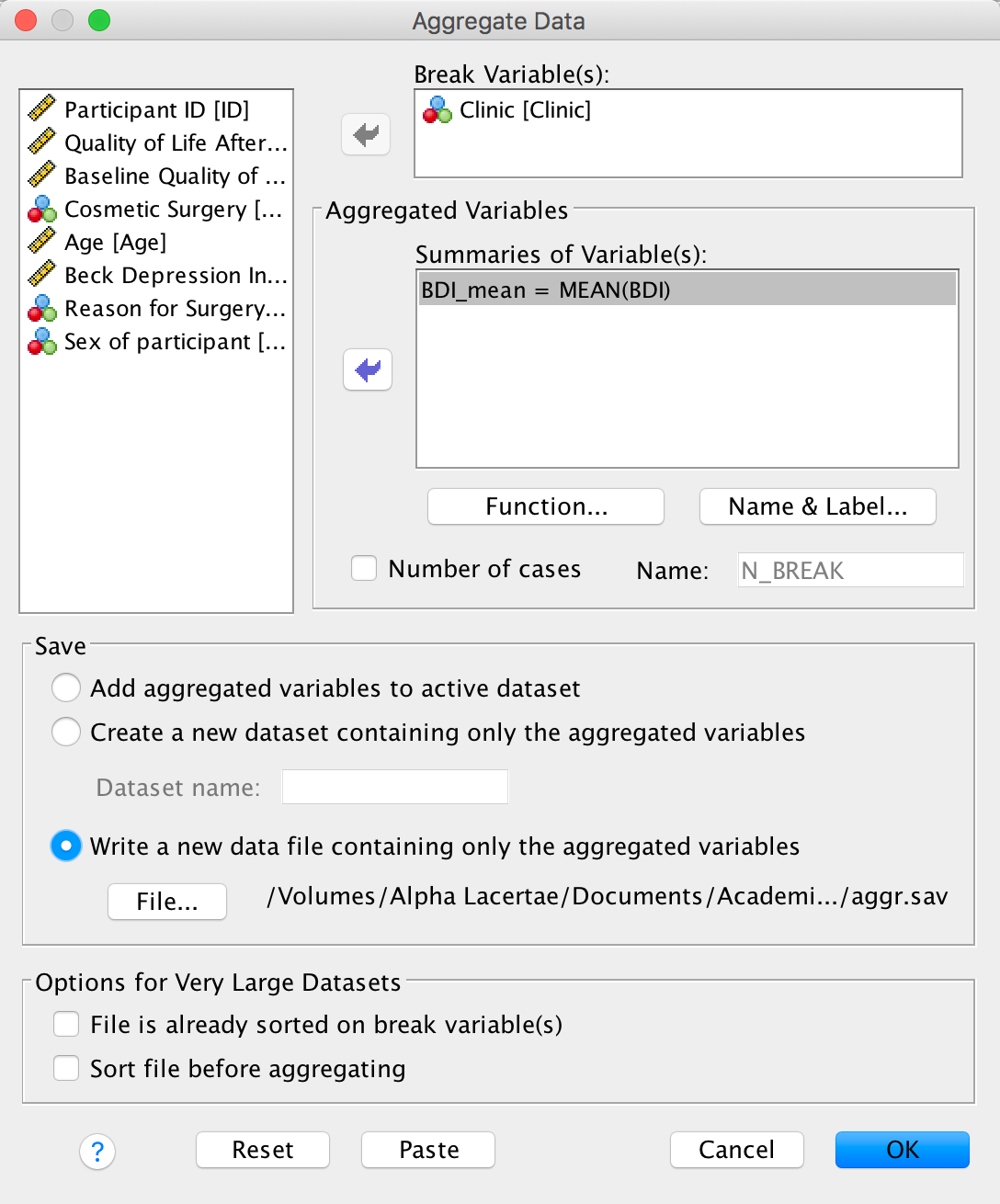
Completed dialog box
If you open the resulting data file (you don’t need to, but it will giveyou an idea of what it contains) you will see that it simply containstwo columns, one with a number specifying the clinic from which the datacame (there were 10 clinics) and the second containing the mean BDIscore within each clinic:
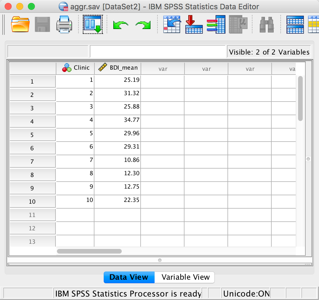
Aggregated data
When SPSS Statistics creates the aggregated data file it orders the
clinics from lowest to highest (regardless of what order they are in the
data set). Therefore, to make our working data file match this
aggregated file, we need to make sure that all of the data from the
various clinics are ordered too from clinic 1 up to clinic 10. This is
easily done by using the sort cases command. (Actually our data
are already ordered in this way, but because your data might not always
be, we’ll go through the motions anyway.) To access the sort
cases command select Data > Sort Cases …. The resulting
dialog box is shown below. Drag the variable that you want to sort the
file by (in this case Clinic) to the area labelled
Sort by. You can choose to order the file in ascending order
(clinic 1 to clinic 10), which is what we need to do here, or descending
order (clinic 10 to clinic 1). Click to sort the
file.
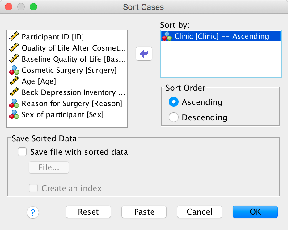
Sorting data
The next step is to use these clinic means in the aggregated file to
centre the BDI variable in our main file. To do this select the data
editor window that has the cosmetic_surgery.sav data
within it and make sure that aggr.sav is open too.
Select Data > Merge Files > Add Variables … to open the
dialog box below. Assuming you were in the
cosmetic_surgery.sav when you activated the menus it
will list aggr.sav (as in the Figure) and any other
data files you have open. If aggr.sav is listed then
select it, otherwise select  , click
and
navigate to wherever you decided to store the file of aggregated values
(in my case aggr.sav). Whichever method you use, select
this file, then click to return to the dialog box. Then click on to move on
to the next dialog box.
, click
and
navigate to wherever you decided to store the file of aggregated values
(in my case aggr.sav). Whichever method you use, select
this file, then click to return to the dialog box. Then click on to move on
to the next dialog box.
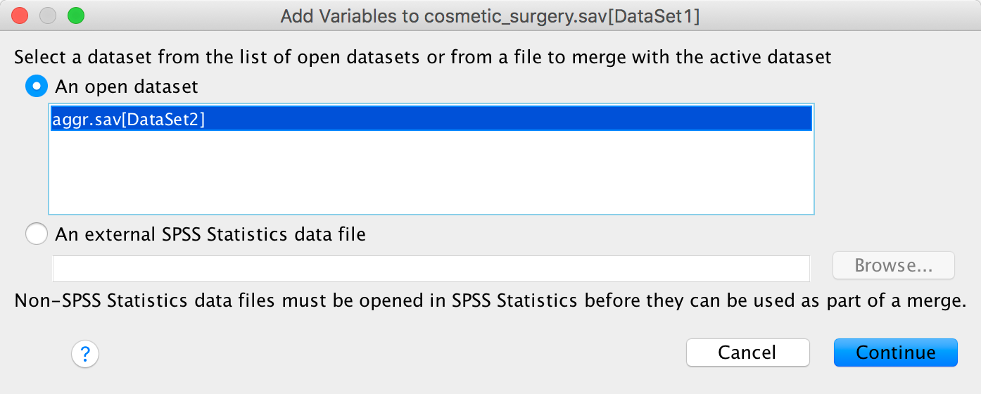
Merging files
In the next dialog box there are two tabs. In the Merge
Method tab SPSS Statistics has already identified that
Clinic is the variable common to both data sets and
assumes that you want to use that as the key variable on which to match
cases. We have single values (the mean within each clinic) in the
aggr.sav file that we want to apply to multiple cases
(all participants at a particular clinic) so we need to select  . This
will take one value from the lookup table and apply it to
multiple cases in the active dataset. Having selected this option the
Select Lookup Table area becomes active. The Lookup
Table is the file in which you want to ‘look up’ values to be added
to the active dataset. In this case we want to ‘look up’ the clinic
means in the file aggr.sav and then place them into the
active datafile (cosemtic_surgery.sav), so we would
want to use aggr.sav as the lookup table (i.e. the
non-active dataset). By default SPSS Statistics assumes that you want to
use the second dataset (i.e. not the active one) as the lookup table, so
we can leave the default settings as they are.
. This
will take one value from the lookup table and apply it to
multiple cases in the active dataset. Having selected this option the
Select Lookup Table area becomes active. The Lookup
Table is the file in which you want to ‘look up’ values to be added
to the active dataset. In this case we want to ‘look up’ the clinic
means in the file aggr.sav and then place them into the
active datafile (cosemtic_surgery.sav), so we would
want to use aggr.sav as the lookup table (i.e. the
non-active dataset). By default SPSS Statistics assumes that you want to
use the second dataset (i.e. not the active one) as the lookup table, so
we can leave the default settings as they are.
The Variables tab gives you more control over what variables
end up in the new data file. Note that Clinic is
automatically listed in Key Variables: because it is the
variable we’ll use to match cases. All other variables (from both data
sets) are listed as Included Variables:, which means they will
be included in the new file. Variables from the main data set (the data
set that was active when you initiated the Add Variables …
menu, in this case cosmetic_surgery.sav) are denoted
with an *, whereas variables from the secondary file (in this case
aggr.sav) are denoted with +. If you want to exclude
any variables form the new data file (we don’t) then drag them to the
box labelled Excluded Variables:. Click to merge the
files.
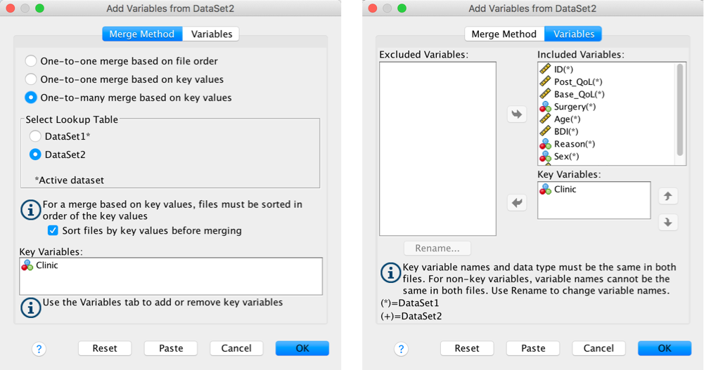
Merging files
The data editor should now include a new variable, BDI_mean, which contains the clinic means from our file aggr.sav. Basically, SPSS Statistics has matched the files for the clinic variable, so that the values in BDI_mean correspond to the mean value for the various clinics. So, when the clinic variable is 1, BDI_mean has been set as 25.19, but when clinic is 2, BDI_mean is set to 31.32.
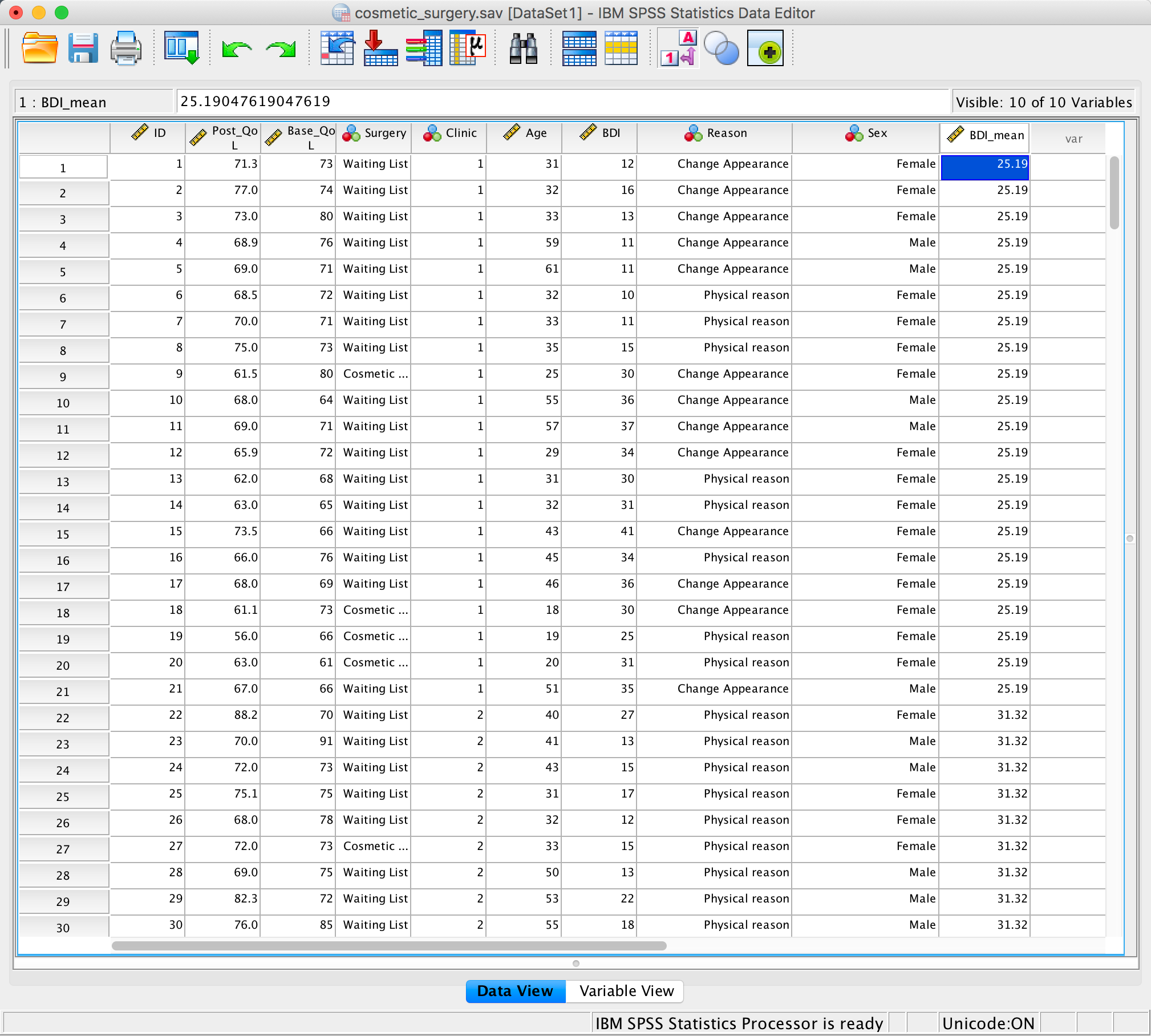
Data editor with group means added
We can use these values to group mean centre BDI. Select
Transform > Compute Variable … . In the resulting dialog box
type BDI_Group_Centred into the box labelled Target
Variable. Drag the variable BDI across to the area
labelled Numeric Expression, type a minus sign or click on the
button with the minus sign on, and then either type ‘BDI_mean’ or drag
this variable across from the variable list. Click and a new
variable will be created containing the group centred means.
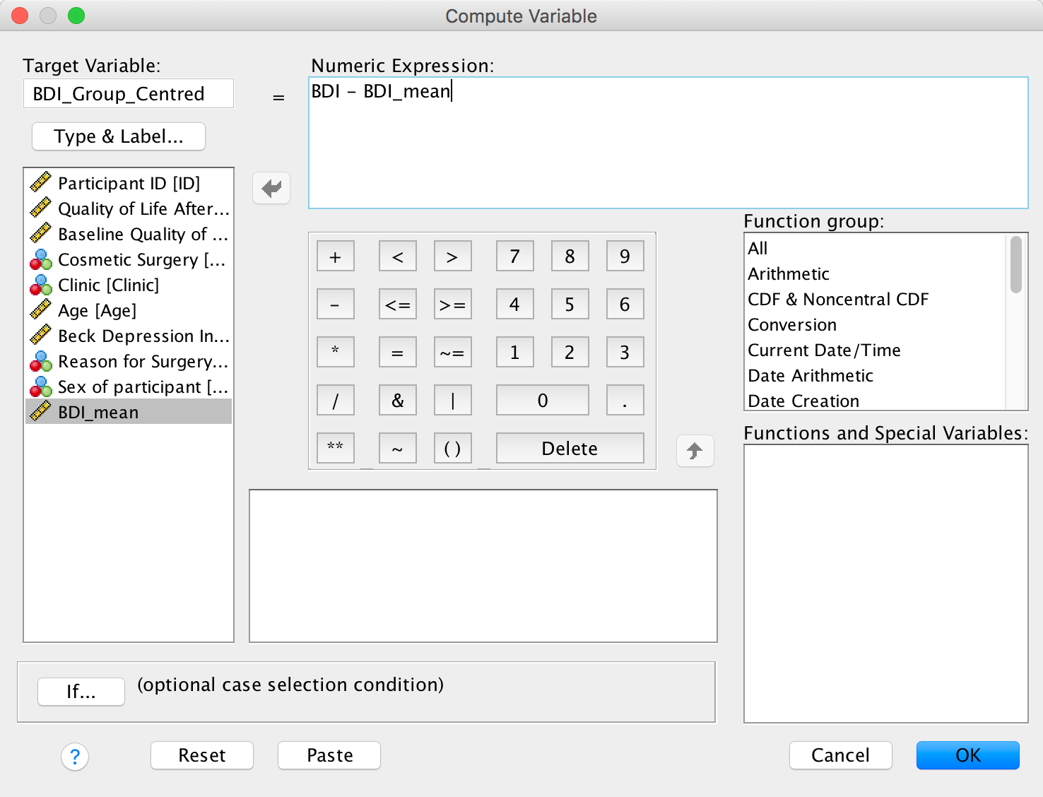
Computing group mean centred values
Alternatively, you can do this all with the following syntax:
AGGREGATE
  /OUTFILE='/Volumes/Alpha Lacertae/Documents/Academic/data/dsu_spss_data/chapter_21_(mlm)/aggr.sav'
  /BREAK=Clinic
  /BDI_mean=MEAN(BDI).

SORT CASES BY Clinic(A).

DATASET ACTIVATE DataSet1.
MATCH FILES /FILE=*
  /TABLE='DataSet2'
  /BY Clinic.
EXECUTE.

COMPUTE BDI_Group_Centred=BDI - BDI_mean.
EXECUTE.
Please, Sir, can I have some more … restructuring?
To access the Restructure Data Wizard select Data >
Restructure …. Open the honeymoon_period.sav
data file. In the first dialog box you need to say whether you are
converting variables to cases, or cases to variables. We have different
levels of time in different columns (variables), and we want them to be
in different rows (cases), so we need to select  .
.
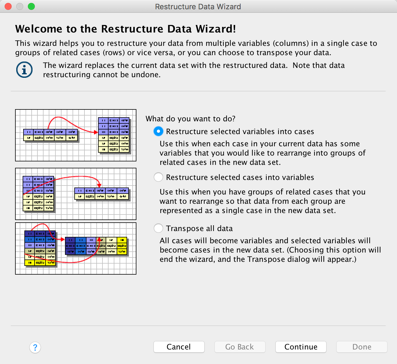
Completed dialog box
Click to move to
the next dialog box. This dialog box asks you whether you are creating
just one new variable in your new data file from different columns in
the old data file, or whether you want to create more than one new
variable. In our case we are going to create one variable representing
life satisfaction; therefore, select  . When
you have done this click .
. When
you have done this click .
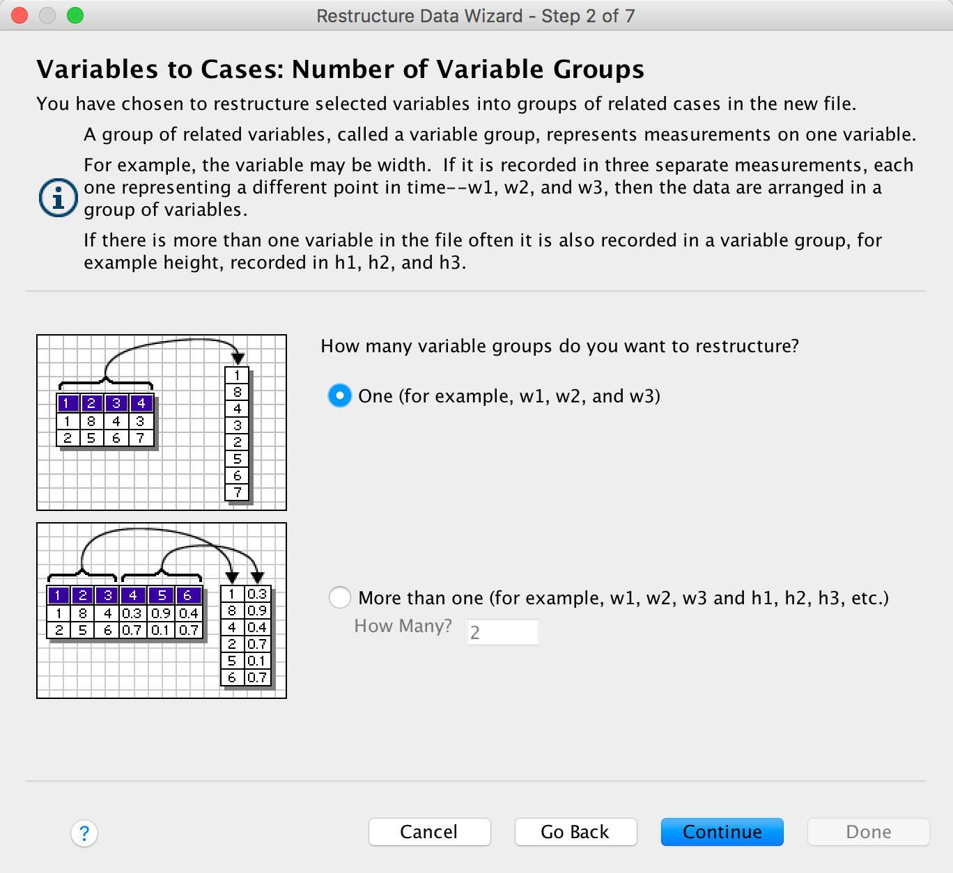
Completed dialog box
The next dialog box is crucial because it’s where you set up the new
data file. By default, SPSS creates a variable in your new data file
called id which tells you from which person the data
came (i.e., which row of the original data file). It does this by using
the case numbers in the original data file. This default is fine, but if
you want to change it (or the name id) then go to the
section labelled Case Group Identification and change  to be
to be
 and then select a variable from your data file to act as a label in the
new data file. I have chosen the variable Person from
the original data set to identify participants in the new data file.
and then select a variable from your data file to act as a label in the
new data file. I have chosen the variable Person from
the original data set to identify participants in the new data file.
In the section labelled Variables to be Transposed there is
a drop-down list labelled Target Variable: which should contain
an item labelled (rather unimaginatively) trans1.There is one
item because we specified that we wanted one new variable in the
previous dialog box (if we had asked for more than one new variable this
drop-down list would contain as many items as variables that we
requested). We can change the name of trans1 by selecting the
variables in the drop-down list and then editing their names. I suggest
that you rename the variable trans1 to be
Life_Satisfaction. We then need to specify which columns are
associated with this variable. Select from the list labelled
Variables in the Current File the four variables that represent
the different time points at which life satisfaction was measured
(Satisfaction_Baseline,
Satisfaction_6_Months,
Satisfaction_12_Months,
Satisfaction_18_Months). If you hold down the
Ctrl key (⌘ on a Mac) then you can select all four variables
simultaneously and drag them across. It’s important that you select the
variables in the correct order: SPSS Statistics assumes that the first
variable that it encounters is the first level of the repeated measure,
and the second variable is the second level and so on. Once the
variables are transferred, you can reorder them by using ![]() or
or ![]() to move
selected variables up or down the list.
to move
selected variables up or down the list.
Finally, there is a space to select Fixed Variable(s):. Drag
variables here that do not vary at level 1 of your hierarchy. In this
example, this means that we can select variables that are different in
different people (they vary at level 2) but have the same value at the
different time points (they do not vary at level 1). The only variable
that we have like this is Sex, which did not change
over the course of the data collection, but differs across people. When
you have finished click .
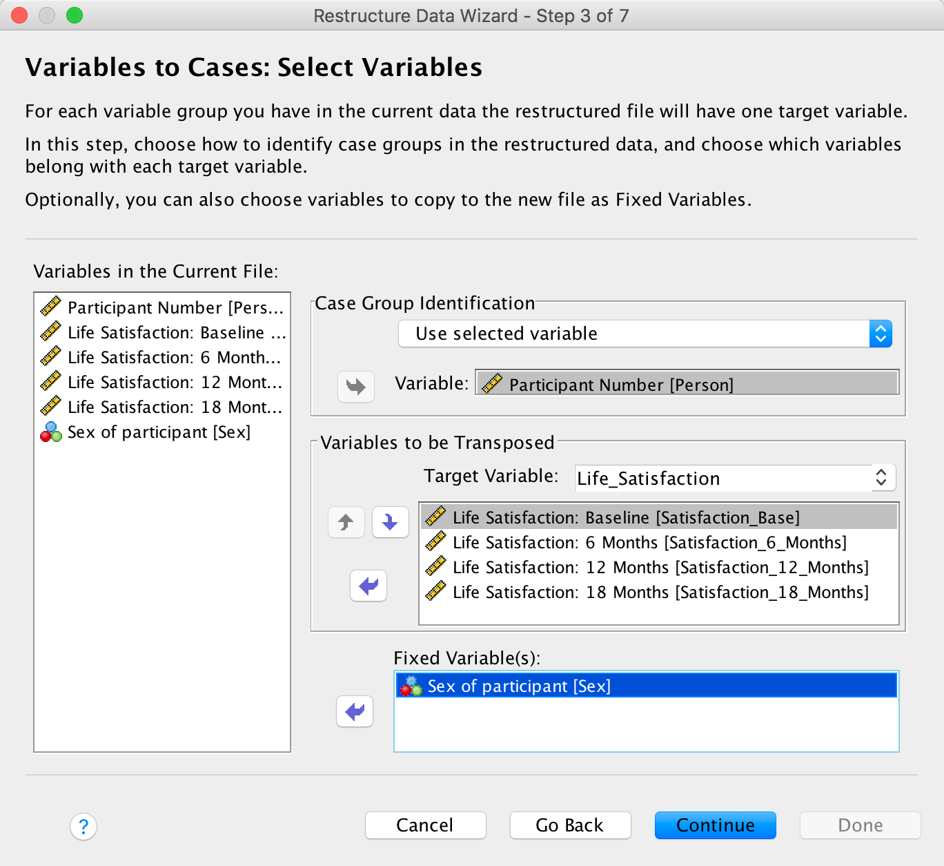
Completed dialog box
The remaining dialog boxes are fairly straightforward. The next two
deal with the indexing variable. SPSS creates a new variable that will
tell you from which column the data originate. In our case with four
time points this will mean that the variable is simply a sequence of
numbers from 1 to 4. So, if the data point came from the baseline phase
it will be assigned a 1, whereas it if came from the 18-month follow-up
phase it will be given a 4. You can select to have a single index
variable (which we need here) or not to have one, or to have several. We
have restructured only one repeated-measures variable
(Time), so we need only one index variable to represent
levels of this variable. Therefore, select and
click .
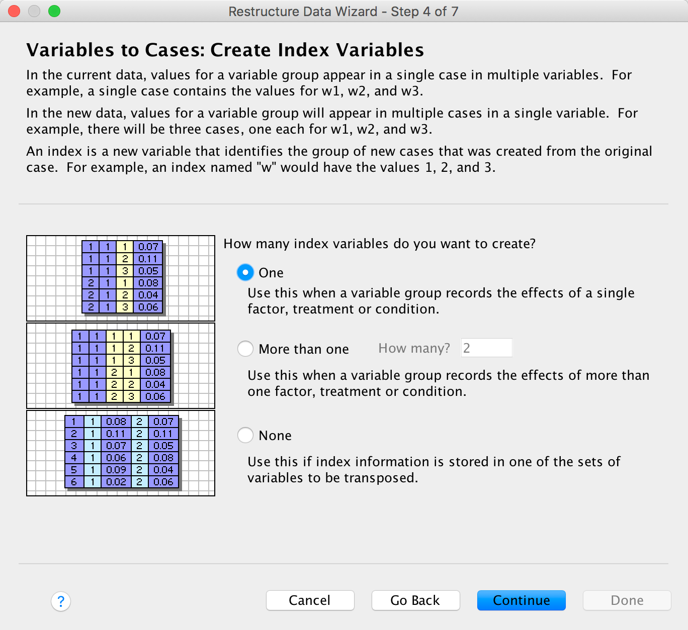
Completed dialog box
Using the next dialog box you can opt either to have the index
variable containing numbers (such as 1, 2, 3, 4) or to use the names at
the top of the columns from which the data came. The choice is up to
you. You can also change the index variables name from Index to
something useful such as Time (as I have done). The
default options in the remaining dialog boxes are fine for most
purposes, so you can just click on  to do the
restructuring.
to do the
restructuring.
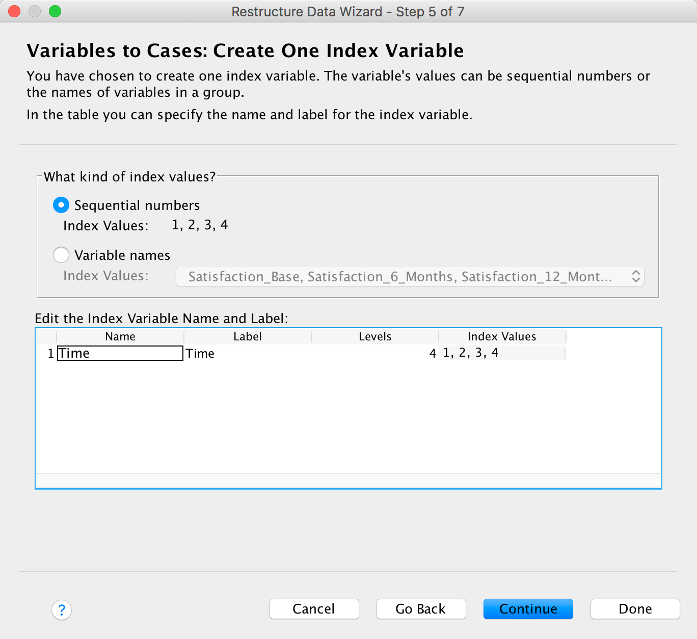
Completed dialog box
However, if you want to, you can click to move to
a dialog box that enables you to opt to keep any variables from your
original data file that you haven’t explicitly specified in the previous
dialog boxes. The default is to drop them, and that’s fine (any
variables from the original data file that you want in the new data file
should probably be specified earlier on in the wizard). You can also
choose to keep or discard missing data. Again, the default option to
keep missing data is advisable here because multilevel models can deal
with missing values. Click to move on
to the final dialog box.
Completed dialog box
This dialog box gives you the option to restructure the data (the
default) or to paste the syntax into a syntax window so that you can
save it as a syntax file. If you’re likely to do similar data
restructuring then saving the syntax might be useful. Otherwise, click
to
restructure the data.
Completed dialog box
References
In fact the correlation coefficient is adjusted to account for the smaller sample on which scores from the scale are based (remember that these scores are based on half of the items on the scale).↩︎
Copyright © 2000-2019, Professor Andy Field.