Self-Test Answers

These pages provide the answers to the self-test questions in chapter of Discovering Statistics Using IBM SPSS Statistics (5th edition).
Chapter 1
Self-test 1.1
Based on what you have read in this section, what qualities do you think a scientific theory should have?
A good theory should do the following:
- Explain the existing data.
- Explain a range of related observations.
- Allow statements to be made about the state of the world.
- Allow predictions about the future.
- Have implications.
Self-test 1.2
What is the difference between reliability and validity?
Validity is whether an instrument measures what it was designed to measure, whereas reliability is the ability of the instrument to produce the same results under the same conditions.
Self-test 1.3
Why is randomization important?
It is important because it rules out confounding variables (factors that could influence the outcome variable other than the factor in which you’re interested). For example, with groups of people, random allocation of people to groups should mean that factors such as intelligence, age and gender are roughly equal in each group and so will not systematically affect the results of the experiment.
Self-test 1.4
Compute the mean but excluding the score of 234.
\[ \begin{aligned} \overline{X} &= \frac{\sum_{i=1}^{n} x_i}{n} \\ \ &= \frac{22+40+53+57+93+98+103+108+116+121}{10} \\ \ &= \frac{811}{10} \\ \ &= 81.1 \end{aligned} \]
Self-test 1.5
Compute the range but excluding the score of 234.
Range = maximum score minimum score = 121 − 22 = 99.
Self-test 1.6
Twenty-one heavy smokers were put on a treadmill at the fastest setting. The time in seconds was measured until they fell off from exhaustion: 18, 16, 18, 24, 23, 22, 22, 23, 26, 29, 32, 34, 34, 36, 36, 43, 42, 49, 46, 46, 57. Compute the mode, median, mean, upper and lower quartiles, range and interquartile range
First, let’s arrange the scores in ascending order: 16, 18, 18, 22, 22, 23, 23, 24, 26, 29, 32, 34, 34, 36, 36, 42, 43, 46, 46, 49, 57.
- The mode: The scores with frequencies in brackets are: 16 (1), 18 (2), 22 (2), 23 (2), 24 (1), 26 (1), 29 (1), 32 (1), 34 (2), 36 (2), 42 (1), 43 (1), 46 (2), 49 (1), 57 (1). Therefore, there are several modes because 18, 22, 23, 34, 36 and 46 seconds all have frequencies of 2, and 2 is the largest frequency. These data are multimodal (and the mode is, therefore, not particularly helpful to us).
- The median: The median will be the (n + 1)/2th score. There are 21 scores, so this will be the 22/2 = 11th. The 11th score in our ordered list is 32 seconds.
- The mean: The mean is 32.19 seconds:
\[ \begin{aligned} \overline{X} &= \frac{\sum_{i=1}^{n} x_i}{n} \\ \ &= \frac{16+(2\times18)+(2\times22)+(2\times23)+24+26+29+32+(2\times34)+(2\times36)+42+43+(2\times46)+49+57}{21} \\ \ &= \frac{676}{21} \\ \ &= 32.19 \end{aligned} \]
- The lower quartile: This is the median of the lower half of scores. If we split the data at 32 (not including this score), there are 10 scores below this value. The median of 10 scores is the 11/2 = 5.5th score. Therefore, we take the average of the 5th score and the 6th score. The 5th score is 22, and the 6th is 23; the lower quartile is therefore 22.5 seconds.
- The upper quartile: This is the median of the upper half of scores. If we split the data at 32 (not including this score), there are 10 scores above this value. The median of 10 scores is the 11/2 = 5.5th score above the median. Therefore, we take the average of the 5th score above the median and the 6th score above the median. The 5th score above the median is 42 and the 6th is 43; the upper quartile is therefore 42.5 seconds.
- The range: This is the highest score (57) minus the lowest (16), i.e. 41 seconds.
- The interquartile range: This is the difference between the upper and lower quartiles: 42.5 − 22.5 = 20 seconds.
Self-test 1.7
Assuming the same mean and standard deviation for the ice bucket example above, what’s the probability that someone posted a video within the first 30 days of the challenge?
As in the example, we know that the mean number of days was 39.68, with a standard deviation of 7.74. First we convert our value to a z-score: the 30 becomes (30−39.68)/7.74 = −1.25. We want the area below this value (because 30 is below the mean), but this value is not tabulated in the Appendix. However, because the distribution is symmetrical, we could instead ignore the minus sign and look up this value in the column labelled ‘Smaller Portion’ (i.e. the area above the value 1.25). You should find that the probability is 0.10565, or, put another way, a 10.57% chance that a video would be posted within the first 30 days of the challenge. By looking at the column labelled ‘Bigger Portion’ we can also see the probability that a video would be posted after the first 30 days of the challenge. This probability is 0.89435, or a 89.44% chance that a video would be posted after the first 30 days of the challenge.
Chapter 2
Self-test 2.1
In Section 1.6.2.2 we came across some data about the number of friends that 11 people had on Facebook. We calculated the mean for these data as 95 and standard deviation as 56.79. Calculate a 95% confidence interval for this mean. Recalculate the confidence interval assuming that the sample size was 56.
To calculate a 95% confidence interval for the mean, we begin by calculating the standard error:
\[ SE = \frac{s}{\sqrt{N}} = \frac{56.79}{\sqrt{11}}=17.12 \]
The sample is small, so to calculate the confidence interval we need to find the appropriate value of t. For this we need the degrees of freedom, N – 1. With 11 data points, the degrees of freedom are 10. For a 95% confidence interval we can look up the value in the column labelled ‘Two-Tailed Test’, ‘0.05’ in the table of critical values of the t-distribution (Appendix). The corresponding value is 2.23. The confidence interval is, therefore, given by:
\[ \begin{aligned} \text{lower boundary of confidence interval} &= \bar{X}-(2.23 \times 17.12) = 95 - (2.23 \times 17.12) = 56.82 \\ \text{upper boundary of confidence interval} &= \bar{X}+(2.23 \times 17.12) = 95 + (2.23 \times 17.12) = 133.18 \end{aligned} \]
Assuming now a sample size of 56, we need to calculate the new standard error:
\[ SE = \frac{s}{\sqrt{N}} = \frac{56.79}{\sqrt{56}}=7.59 \] The sample is big now, so to calculate the confidence interval we can use the critical value of z for a 95% confidence interval (i.e. 1.96). The confidence interval is, therefore, given by:
\[ \begin{aligned} \text{lower boundary of confidence interval} &= \bar{X}-(1.96 \times 7.59) = 95 - (1.96 \times 7.59) = 80.1 \\ \text{upper boundary of confidence interval} &= \bar{X}+(1.96 \times 7.59) = 95 + (1.96 \times 7.59) = 109.8 \end{aligned} \]
Self-test 2.2
What are the null and alternative hypotheses for the following questions: (1) ‘Is there a relationship between the amount of gibberish that people speak and the amount of vodka jelly they’ve eaten?’ (2) ‘Does reading this chapter improve your knowledge of research methods?’
‘Is there a relationship between the amount of gibberish that people speak and the amount of vodka jelly they’ve eaten?’
- Null hypothesis: There will be no relationship between the amount of gibberish that people speak and the amount of vodka jelly they’ve eaten.
- Alternative hypothesis: There will be a relationship between the amount of gibberish that people speak and the amount of vodka jelly they’ve eaten.
‘Does reading this chapter improve your knowledge of research methods?’
- Null hypothesis: There will be no difference in the knowledge of research methods in people who have read this chapter compared to those who have not.
- Alternative hypothesis: Knowledge of research methods will be higher in those who have read the chapter compared to those who have not.
Self-test 2.3
Compare the graphs in Figure 2.16. What effect does the difference in sample size have? Why do you think it has this effect?
The graph showing larger sample sizes has smaller confidence intervals than the graph showing smaller sample sizes. If you think back to how the confidence interval is computed, it is the mean plus or minus 1.96 times the standard error. The standard error is the standard deviation divided by the square root of the sample size (√N), therefore as the sample size gets larger, the standard error (and, therefore, confidence interval) will get smaller.
Chapter 3
Self-test 3.1
Based on what you have learnt so far, which of the following statements best reflects your view of antiSTATic? (1) The evidence is equivocal, we need more research. (2) All of the mean differences show a positive effect of antiSTATic, therefore, we have consistent evidence that antiSTATic works. (3) Four of the studies show a significant result (p < .05), but the other six do not. Therefore, the studies are inconclusive: some suggest that antiSTATic is better than placebo, but others suggest there’s no difference. The fact that more than half of the studies showed no significant effect means that antiSTATic is not (on balance) more successful in reducing anxiety than the control. (4) I want to go for C, but I have a feeling it’s a trick question.
If you follow NHST you should pick C because only four of the six studies have a ‘significant’ result, which isn’t very compelling evidence for antiSTATic.
Self-test 3.2
Now you’ve looked at the confidence intervals, which of the earlier statements best reflects your view of Dr Weeping’s potion?
I would hope that some of you have changed your mind to option B: 10 out of 10 studies show a positive effect of antiSTATic (none of the means are below zero), and even though sometimes this positive effect is not always ‘significant’, it is consistently positive. The confidence intervals overlap with each other substantially in all studies, suggesting that all studies have sampled the same population. Again, this implies great consistency in the studies: they all throw up (potential) population effects of a similar size. Look at how much of the confidence intervals are above zero across the 10 studies: even in studies for which the confidence interval includes zero (implying that the population effect might be zero) the majority of the bar is greater than zero. Again, this suggests very consistent evidence that the population value is greater than zero (i.e. antiSTATic works).
Self-test 3.3
Compute Cohen’s d for the effect of singing when a sample size of 100 was used (right-hand graph in Figure 2.16).
\[ d = \frac{\bar{X}_\text{singing}-\bar{X}_\text{conversation}}{\sigma} = \frac{10-12}{3}=0.667 \]
Self-test 3.4
Compute Cohen’s d for the effect in Figure 2.17. The exact mean of the singing group was 10, and for the conversation group was 10.01. In both groups the standard deviation was 3.
\[ d = \frac{\bar{X}_\text{singing}-\bar{X}_\text{conversation}}{\sigma} = \frac{10-10.01}{3}=-0.003 \]
Self-test 3.5
Look at Figures 2.16 and Figure 2.17. Compare what we concluded about these three data sets based on p-values, with what we conclude using effect sizes.
Answer given in the text.
Self-test 3.6
Look back at Figure 2.18. Based on the effect sizes, is your view of the efficacy of the potion more in keeping with what we concluded based on p-values or based on confidence intervals?
Answer given in the text.
Chapter 4
Self-test 4.1
Why is the ‘Number of Friends’ variable a ‘scale’ variable?
It is a scale variable because the numbers represent consistent intervals and ratios along the measurement scale: the difference between having (for example) 1 and 2 friends is the same as the difference between having (for example) 10 and 11 friends, and (for example) 20 friends is twice as many as 10.
Self-test 4.2
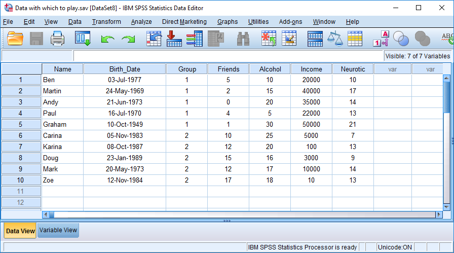
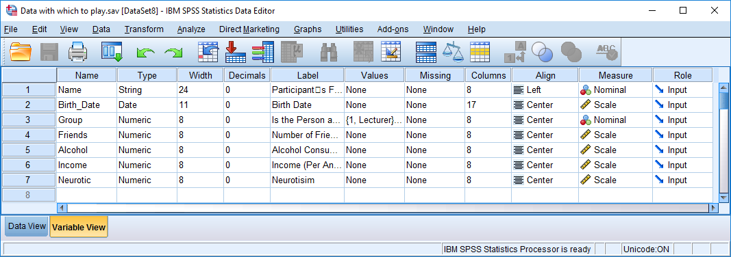
Having created the first four variables with a bit of guidance, try to enter the rest of the variables in Table 3.1 yourself.
The finished data and variable views should look like those in the figures below (more or less!). You can also download this data file (Data with which to play.sav)
Chapter 5
Self-test 5.1
What does a histogram show?
A histogram is a graph in which values of observations are plotted on the horizontal axis, and the frequency with which each value occurs in the data set is plotted on the vertical axis.
Self-test 5.2
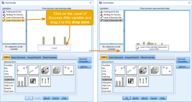
Produce a histogram and population pyramid for the success scores before the intervention.
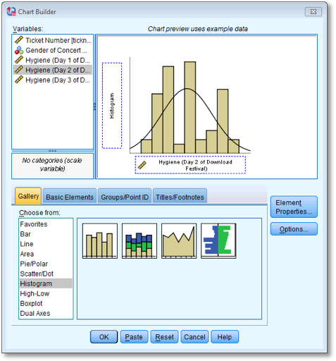
First, access the Chart Builder and then select
Histogram in the list labelled Choose from: to bring
up the gallery. This gallery has four icons representing different types
of histogram, and you should select the appropriate one either by
double-clicking on it, or by dragging it onto the canvas. We are going
to do a simple histogram first, so double-click the icon for a simple
histogram. The dialog box will show a preview of the graph in the canvas
area. Next, click the variable (Success_Pre) in the
list and drag it to  . You will now find
the histogram previewed on the canvas. To produce the histogram click
. You will now find
the histogram previewed on the canvas. To produce the histogram click
 .
.
The resulting histogram is shown below. Looking at the histogram, the data look fairly symmetrical and there doesn’t seem to be any sign of skew.
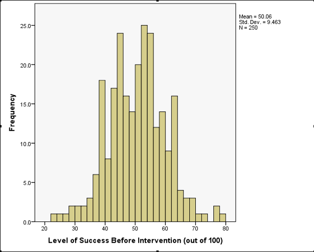
Histogram of success before intervention
To compare frequency distributions of several groups simultaneously
we can use a population pyramid. click the population pyramid icon (see
the book chapter) to display the template for this graph on the canvas.
Then from the variable list select the variable representing the success
scores before the intervention and drag it into the Distribution
Variable? drop zone. Then drag the variable
Strategy to  . click
to produce the
graph.
. click
to produce the
graph.
The resulting population pyramid is show below and looks fairly symmetrical. This indicates that both groups had a similar spread of scores before the intervention. Hopefully, this example shows how a population pyramid can be a very good way to visualise differences in distributions in different groups (or populations).
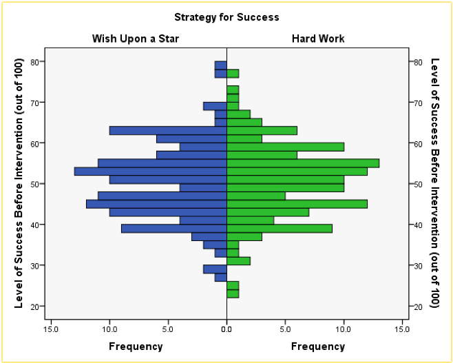
Population pyramid of success pre-intervention
Self-test 5.3
Produce boxplots for the success scores before the intervention.
To make a boxplot of the pre-intervention success scores for our two
groups, double-click the simple boxplot icon, then from the variable
list select the Success_Pre variable and drag it into
 and select
the variable Strategy and drag it to . Note that the
variable names are displayed in the drop zones, and the canvas now
displays a preview of our graph (e.g. there are two boxplots
representing each gender). click to produce the
graph.
and select
the variable Strategy and drag it to . Note that the
variable names are displayed in the drop zones, and the canvas now
displays a preview of our graph (e.g. there are two boxplots
representing each gender). click to produce the
graph.
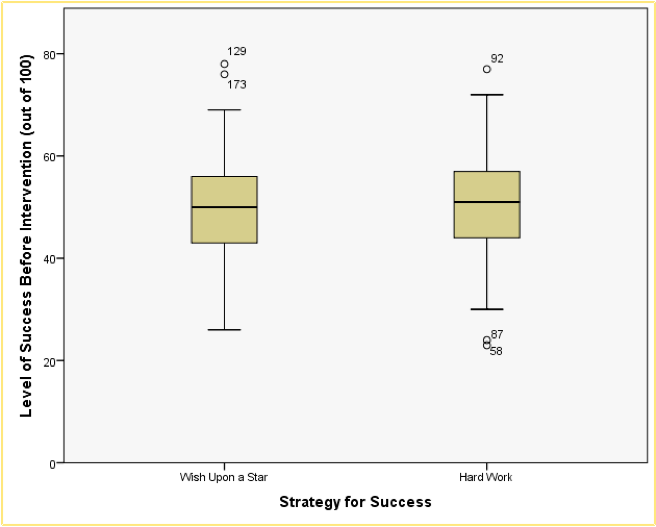
Boxplot of success before each of the two interventions
Looking at the resulting boxplots above, notice that there is a tinted box, which represents the IQR (i.e., the middle 50% of scores). It’s clear that the middle 50% of scores are more or less the same for both groups. Within the boxes, there is a thick horizontal line, which shows the median. The workers had a very slightly higher median than the wishers, indicating marginally greater pre-intervention success but only marginally.
In terms of the success scores, we can see that the range of scores was very similar for both the workers and the wishers, but the workers contained slightly higher levels of success than the wishers. Like histograms, boxplots also tell us whether the distribution is symmetrical or skewed. If the whiskers are the same length then the distribution is symmetrical (the range of the top and bottom 25% of scores is the same); however, if the top or bottom whisker is much longer than the opposite whisker then the distribution is asymmetrical (the range of the top and bottom 25% of scores is different). The scores from both groups look symmetrical because the two whiskers are similar lengths in both groups.
Self-test 5.4
Use what you learnt in Section 5.6.3 to add error bars to this graph and to label both the x- (I suggest ‘Time’) and y-axis (I suggest ‘Mean grammar score (%)’).
See Figure 5.26 in the book.
Self-test 5.5
The procedure for producing line graphs is basically the same as for bar charts. Follow the previous sections for bar charts but selecting a simple line chart instead of a simple bar chart, and a multiple line chart instead of a clustered bar chart. Produce line charts equivalents of each of the bar charts in the previous section. If you get stuck, the self-test answers on the companion website will walk you through it.
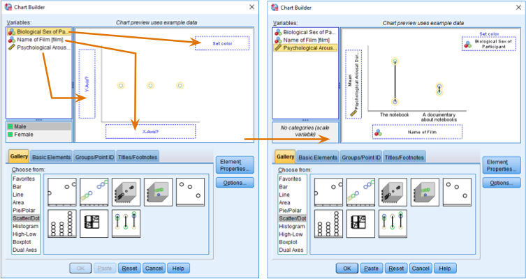
Simple Line Charts for Independent Means
Let’s use the data in Notebook.sav (see book for
details). Load this file now. Let’s just plot the mean rating of the two
films. We have just one grouping variable (the film) and one outcome
(the arousal); therefore, we want a simple line chart. Therefore, in the
Chart Builder double-click the icon for a simple line chart. On
the canvas you will see a graph and two drop zones: one for the
y-axis and one for the x-axis. The y-axis
needs to be the dependent variable, or the thing you’ve measured, or
more simply the thing for which you want to display the mean. In this
case it would be arousal, so select
arousal from the variable list and drag it into . The
x-axis should be the variable by which we want to split the
arousal data. To plot the means for the two films, select the variable
film from the variable list and drag it into .
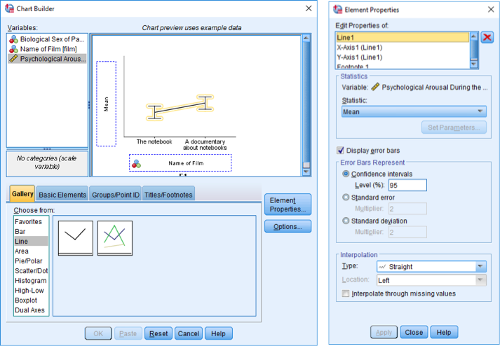
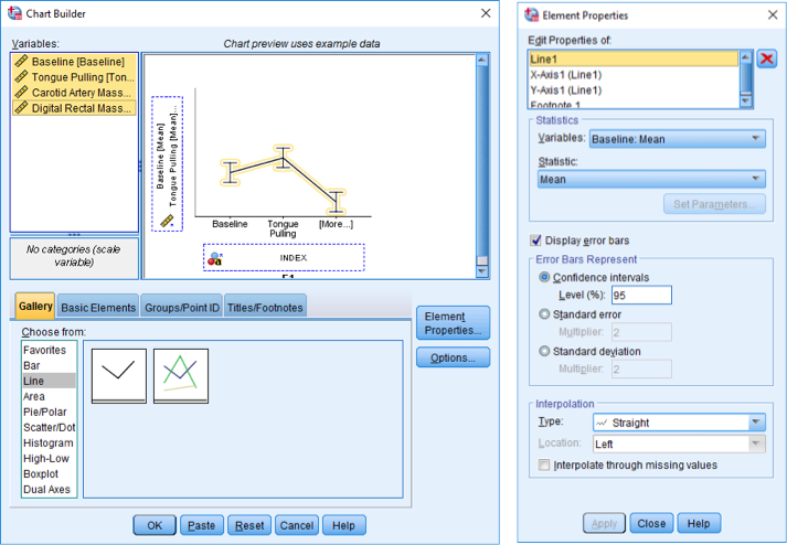
Dialog boxes for a simple line chart with error bars
The figure above shows some other options for the line chart. We can
add error bars to our line chart by selecting  .
Normally, error bars show the 95% confidence interval, and I have
selected this option (
.
Normally, error bars show the 95% confidence interval, and I have
selected this option ( ).
click
).
click  , then
on to produce
the graph.
, then
on to produce
the graph.
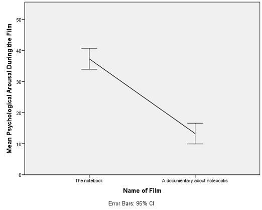
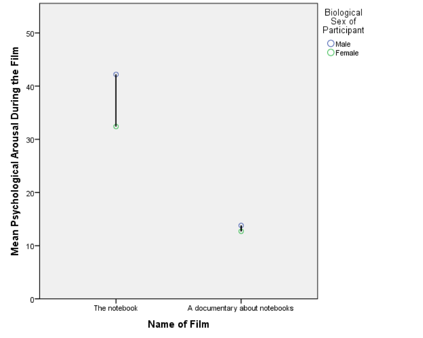
Line chart of the mean arousal for each of the two films
The resulting line chart displays the means (and the confidence interval of those means). This graph shows us that, on average, people were more aroused by The notebook than a documentary about notebooks.
Multiple line charts for independent means
To do a multiple line chart for means that are independent (i.e.,
have come from different groups) we need to double-click the multiple
line chart icon in the Chart Builder (see the book chapter). On
the canvas you will see a graph as with the simple line chart but there
is now an extra drop zone:  . All we need to
do is to drag our second grouping variable into this drop zone. As with
the previous example, drag arousal into , then drag
film into . Now drag
sex into . This will mean
that lines representing males and females will be displayed in different
colours. As in the previous section, select error bars in the properties
dialog box and click to apply them,
click to produce
the graph.
. All we need to
do is to drag our second grouping variable into this drop zone. As with
the previous example, drag arousal into , then drag
film into . Now drag
sex into . This will mean
that lines representing males and females will be displayed in different
colours. As in the previous section, select error bars in the properties
dialog box and click to apply them,
click to produce
the graph.
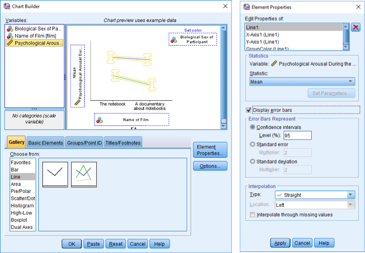
Dialog boxes for a multiple line chart with error bars
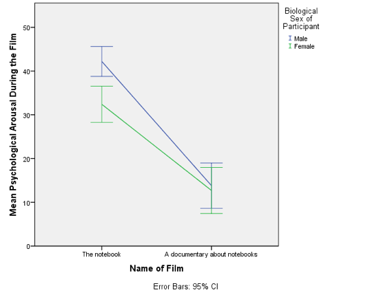
Line chart of the mean arousal for each of the two films.
The mean arousal for the notebook shows that males were more aroused during this film than females. This indicates they enjoyed the film more than the women did. Contrast this with the documentary, for which arousal levels are comparable in males and females.
Simple line charts for related means
Load the file Hiccups.sav (see book for details). To plot the mean number of hiccups as a line, go to the Chart Builder and double-click the icon for a simple line chart. For these data we have four columns containing data on the number of hiccups (the outcome variable). We need to drag all four of these variables from the variable list into the y-axis drop zone simultaneously. If you don’t know how to do this then, follow the instructions in the book for the bar chart of these data. You can set all of the properties of the axes, and add error bars in the same way as for a bar chart, so look at Figures 5.24 and 5.25 in the book and follow the accompanying instructions. The final dialog box will look like the Figure below.
Completed Chart Builder for a repeated-measures graph
The resulting line chart displays the mean (and the confidence interval of the mean) number of hiccups at baseline and after the three interventions. Note that the axis labels that we typed in have appeared on the graph. We can conclude that the amount of hiccups after tongue pulling was about the same as at baseline; however, carotid artery massage reduced hiccups, but not by as much as a good old-fashioned digital rectal massage. The moral here is: if you have hiccups, find something digital and go amuse yourself for a few minutes.
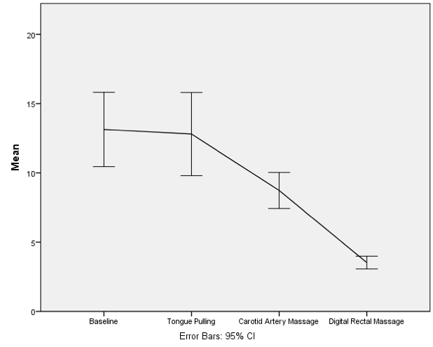
Line chart of the mean number of hiccups at baseline and after various interventions
Multiple line charts for mixed designs
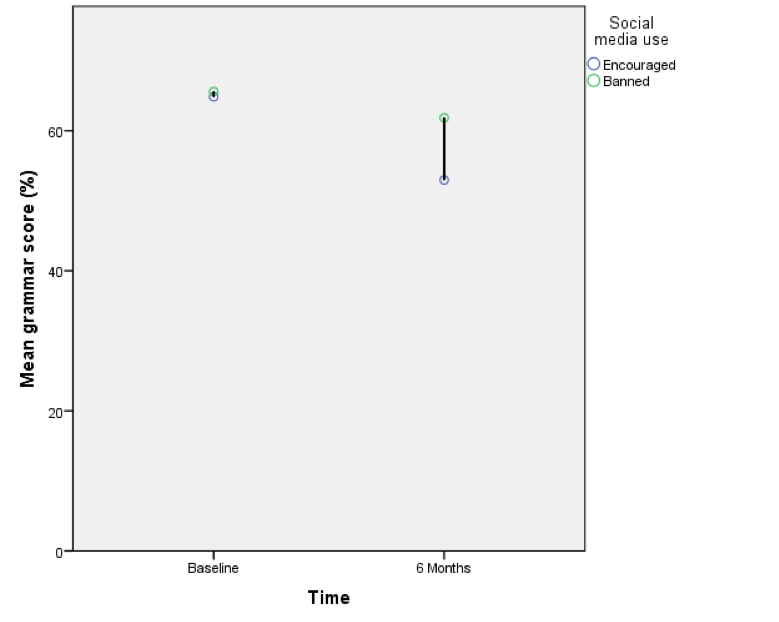
To do the line graph equivalent of the bar chart we did for the Social Media.sav data (see book for details) we follow the same procedure that we used to produce a bar chart of these described in the book, except that we begin the whole process by selecting a multiple line chart in the Chart Builder. Once this selection is made, everything else is the same as in the book.
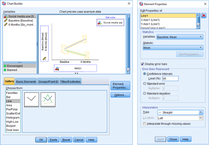
Completed dialog box for an error bar graph of a mixed design
The resulting line chart shows that that at baseline (before the intervention) the grammar scores were comparable in our two groups; however, after the intervention, the grammar scores were lower in those encouraged to use social media than those banned from using it. If you compare the lines you can see that social media users’ grammar scores have fallen over the six months; compare this to the controls whose grammar scores are similar over time. We might, therefore, conclude that social media use has a detrimental effect on people’s understanding of English grammar.
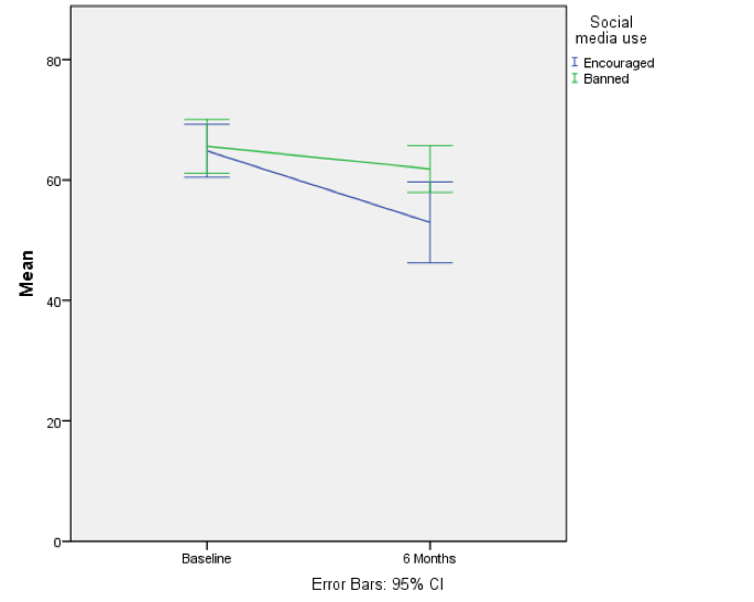
Error bar graph of the mean grammar score over 6 months in children who were allowed to text-message versus those who were forbidden
Self-test 5.6
Doing a simple dot plot in the Chart Builder is quite similar to drawing a histogram. Reload the Jiminy Cricket.sav data and see if you can produce a simple dot plot of the success scores after the intervention. Compare the resulting graph to the earlier histogram of the same data.
First, make sure that you have loaded the Jiminy Cricket.sav file and that you open the Chart Builder from this data file. Once you have accessed the Chart Builder (see the book chapter) select the Scatter/Dot in the chart gallery and then double-click the icon for a simple dot plot (again, see the book chapter if you’re unsure of what icon to click).
Like a histogram, a simple dot plot plots a single variable
(x-axis) against the frequency of scores (y-axis).To
do a simple dot plot of the success scores after the intervention we
drag this variable to as shown in the
figure. click .
Defining a simple dot plot (a.k.a. density plot) in the Chart Builder
The resulting density plot is shown below. Compare this with the histogram of the same data from the book. The first thing that should leap out at you is that they are very similar; they are two ways of showing the same thing. The density plot gives us a little more detail than the histogram, but essentially they show the same thing.
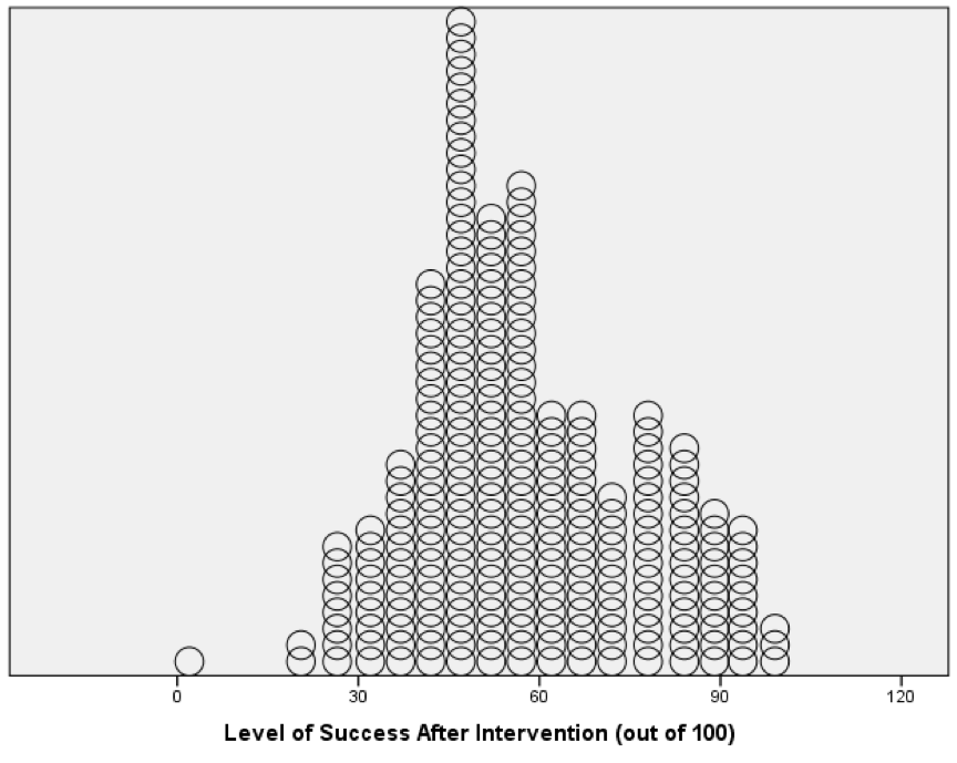
Density plot of the success scores after the intervention
Self-test 5.7
Doing a drop-line plot in the Chart Builder is quite similar to drawing a clustered bar chart. Reload the ChickFlick.sav data and see if you can produce a drop-line plot of the arousal scores. Compare the resulting graph with the earlier clustered bar chart of the same data.
To do a drop-line chart for means that are independent double-click
the drop-line chart icon in the Chart Builder (see the book
chapter if you’re not sure what this icon looks like or how to access
the Chart Builder). As with the clustered bar chart example
from the book, drag arousal from the variable list into
, drag
Film from the variable list into , and drag
Sex into the drop zone. This
will mean that the dots representing males and females will be displayed
in different colours, but if you want them displayed as different
symbols then read SPSS Tip 5.3 in the book. The completed dialog box is
shown in the figure; click to produce the
graph.
Using the Chart Builder to plot a drop-line graph
The resulting drop-line graph is shown below: compare it with the clustered bar chart from the book. Hopefully it’s clear that these graphs show the same information and can be interpretted in the same way (see the book).
Drop-line graph of mean arousal scores during two films for men and women and the original clustered bar chart from the book
Self-test 5.8
Now see if you can produce a drop-line plot of the Social Media.sav data from earlier in this chapter. Compare the resulting graph to the earlier clustered bar chart of the same data (in the book).
Double-click the drop-line chart icon in the Chart Builder
(see the book chapter if you’re not sure what this icon looks like or
how to access the Chart Builder). We have a repeated-measures variable
is time (whether grammatical ability was measured at baseline or six
months) and is represented in the data file by two columns, one for the
baseline data and the other for the follow-up data. In the Chart
Builder select these two variables simultaneously and drag them
into as shown
in the figure. (See the book for details of how to do this, if you need
them.) The second variable (whether people were encouraged to use social
media or were banned) was measured using different participants and is
represented in the data file by a grouping variable (Social
media use). Drag this variable from the variable list into . The completed
Chart Builder is shown in the figure; click to produce the
graph.
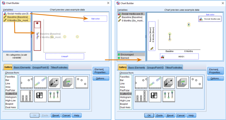
Completing the dialog box for a drop-line graph of a mixed design
The resulting drop-line graph is shown below. Compare this figure with the clustered bar chart of the same data from the book. They both show that at baseline (before the intervention) the grammar scores were comparable in our two groups. On the drop-line graph this is particularly apparent because the two dots merge into one (you can’t see the drop line because the means are so similar). After the intervention, in those encouraged to use social media than those banned from using it. By comparing the two vertical lines the drop-line graph makes clear that the difference between those encouraged to use social media than those banned is bigger at 6 months than it is pre-intervention.
Drop line graph of the mean grammar score over six months in people who were encouraged to use social media versus those who were banned
Chapter 6
Self-test 6.1
Compute the mean and sum of squared error for the new data set.
First we need to compute the mean:
\[ \begin{aligned} \overline{X} &= \frac{\sum_{i=1}^{n} x_i}{n} \\ \ &= \frac{1+3+10+3+2}{5} \\ \ &= \frac{19}{5} \\ \ &= 3.8 \end{aligned} \]
Compute the squared errors as follows:
| Score | Error (score - mean) | Error squared |
|---|---|---|
| 1 | -2.8 | 7.84 |
| 3 | -0.8 | 0.64 |
| 10 | 6.2 | 38.44 |
| 3 | -0.8 | 0.64 |
| 2 | -1.8 | 3.24 |
The sum of squared errors is:
\[ \begin{aligned} \ SS &= 7.84 + 0.64 + 38.44 + 0.64 + 3.24 \\ \ &= 50.8 \\ \end{aligned} \]
Self-test 6.2
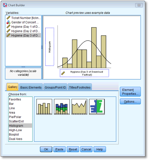
Using what you learnt in Section 5.4, plot a histogram of the hygiene scores on day 1 of the festival.
First, access the Chart Builder and select Histogram in the
list labelled Choose from:. We are going to do a simple
histogram, so double-click the icon for a simple histogram. The dialog
box will now show a preview of the graph in the canvas area. Drag the
hygiene day 1 variable to as shown below;
you will now find the histogram previewed on the canvas. To draw the
histogram click .

Defining a histogram in the Chart Builder
Self-test 6.3
Using what you learnt in Section 5.5, plot a boxplot of the hygiene scores on day 1 of the festival.
In the Chart Builder select Boxplot in the list labelled
Choose from:. Double-click the simple boxplot icon, then drag
the hygiene day 1 score variable from the variable list into . The dialog should
now look like the image below - note that the variable name is displayed
in the drop zone, and the canvas now displays a preview of our graph.
click to produce
the graph.
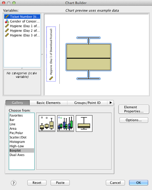
Completed dialog box for a simple boxplot
Self-test 6.3
Now we have removed the outlier in the data, re-plot the histogram and boxplot.
Repeat the instructions for the previous two self-tests.
Self-test 6.4
Produce boxplots for the day 2 and day 3 hygiene scores and interpret them. Re-plot them but splitting by Sex along the x-axis. Are there differences between men and women?
The boxplots for days 2 and 3 should look like this:
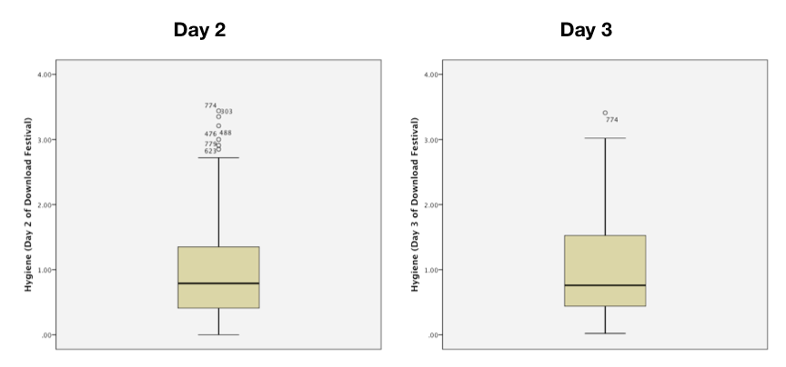
Boxplots for days 2 and 3 of the festival
On day 2 there are 6 scores that are deemed to be mild outliers (greater than 1.5 times the interquartile range) and on day 3 there is only 1 score deemed to be a mild outlier (case 774). We should consider whether to take action to reduce the impact of these scores. More generally, the fact that the top whisker is longer than the bottom one for both graphs indicates skew in the distribution. There’s more on that topic in the chapter.
After splitting by sex, the boxplot for the day 2 data should look like this:
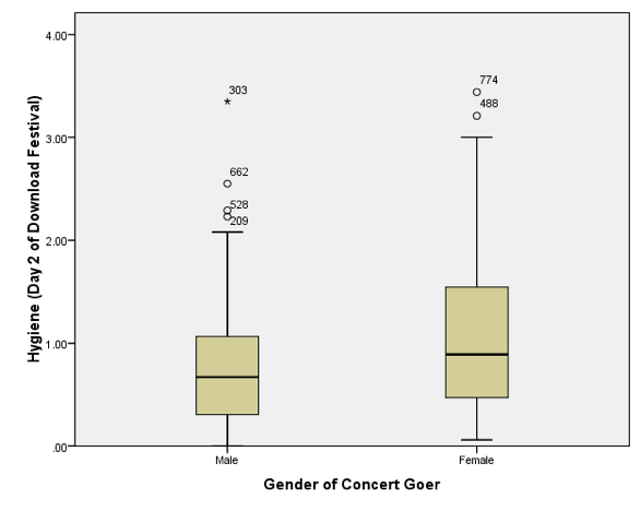
Boxplot for day 2 of the festival split by sex
Note that, as for day 1, the females are slightly more fragrant than males (look at the median line). However, if you compare these to the day 1 boxplots (in the book) scores are getting lower (i.e. people are getting less hygienic). In the males there are now more outliers (i.e. a rebellious few who have maintained their sanitary standards). The boxplot for the day 3 data should look like this:
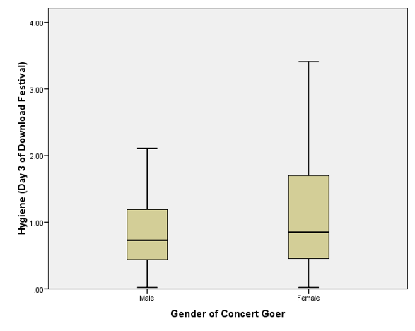
Boxplot for day 3 of the festival split by sex
Note that compared to day 1 and day 2, the females are getting more like the males (i.e., smelly). However, if you look at the top whisker, this is much longer for the females. In other words, the top portion of females are more variable in how smelly they are compared to males. Also, the top score is higher than for males. So, at the top end females are better at maintaining their hygiene at the festival compared to males. Also, the box is longer for females, and although both boxes start at the same score, the top edge of the box is higher in females, again suggesting that above the median score more women are achieving higher levels of hygiene than men. Finally, note that for both days 1 and 2, the boxplots have become less symmetrical (the top whiskers are longer than the bottom whiskers). On day 1 (see the book chapter), which is symmetrical, the whiskers on either side of the box are of equal length (the range of the top and bottom scores is the same); however, on days 2 and 3 the whisker coming out of the top of the box is longer than that at the bottom, which shows that the distribution is skewed (i.e., the top portion of scores is spread out over a wider range than the bottom portion).
Self-test 6.5
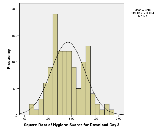
Using what you learnt in Section 5.4, plot histograms for the hygiene scores for days 2 and 3 of the Download Festival.
First, access the Chart Builder as in Chapter 5 of the book
and then select Histogram in the list labelled Choose from: to
bring up the gallery, which has four icons representing different types
of histogram. We want to do a simple histogram, so double-click the icon
for a simple histogram. The dialog box will now show a preview of the
graph in the canvas area. To plot the histogram of the day 2 hygiene
scores drag this variable from the list into . To draw the
histogram click .
Dialog box for plotting a histogram of the day 2 scores
To plot the day 3 scores go back to the Chart Builder but this time
drag the hygiene day 3 variable from the variable list into and click .
Dialog box for plotting a histogram of the day 3 scores
See Figure 5.12 in the book for the histograms of all three days of the festival.
Self-test 6.6
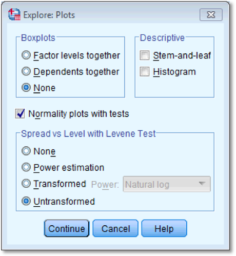
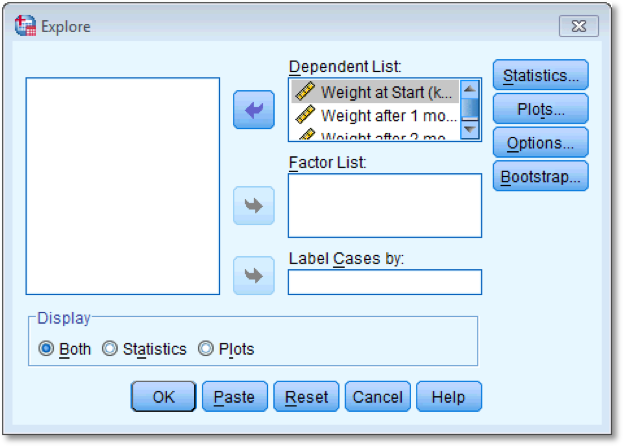
Compute and interpret a K-S test and Q-Q plots for males and females for days 2 and 3 of the music festival.
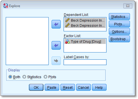
The K-S test is accessed through the explore command (Analyze
> Descriptive Statistics > Explore). First, enter the hygiene
scores for days 2 and 3 in the box labelled Dependent List by
highlighting them and transferring them by clicking on ![]() . The
question asks us to look at the K-S test for males and females
separately, therefore we need to select Sex and
transfer it to the box labelled Factor List so that SPSS will
produce exploratory analysis for each group - a bit like the split file
command. Next, click
. The
question asks us to look at the K-S test for males and females
separately, therefore we need to select Sex and
transfer it to the box labelled Factor List so that SPSS will
produce exploratory analysis for each group - a bit like the split file
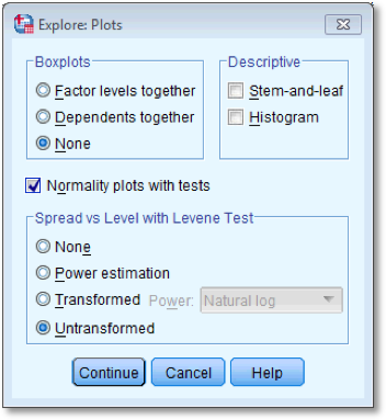
command. Next, click  and select the
option
and select the
option  ; this
will produce both the K-S test normal Q-Q plots. A Q-Q plot plots the
quantiles of the data set. If the data are normally distributed, then
the observed values (the dots on the chart) should fall exactly along
the straight line (meaning that the observed values are the same as you
would expect to get from a normally distributed data set). Kurtosis is
shown up by the dots sagging above or below the line, whereas skew is
shown up by the dots snaking around the line in an ‘S’ shape. We also
need to click
; this
will produce both the K-S test normal Q-Q plots. A Q-Q plot plots the
quantiles of the data set. If the data are normally distributed, then
the observed values (the dots on the chart) should fall exactly along
the straight line (meaning that the observed values are the same as you
would expect to get from a normally distributed data set). Kurtosis is
shown up by the dots sagging above or below the line, whereas skew is
shown up by the dots snaking around the line in an ‘S’ shape. We also
need to click  to tell SPSS how
to deal with missing values. We want to use all of the scores it has on
a given day, which is known as pairwise. Once you have clicked on , select
Exclude cases pairwise, then click
to tell SPSS how
to deal with missing values. We want to use all of the scores it has on
a given day, which is known as pairwise. Once you have clicked on , select
Exclude cases pairwise, then click  to return to
the main dialog box and click to run the
analysis:
to return to
the main dialog box and click to run the
analysis:
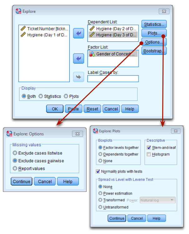
Dialog box for the explore command
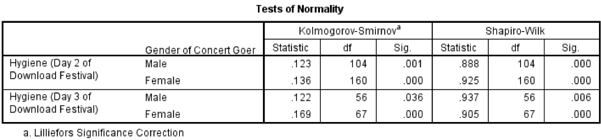
Output from the K-S test
You should get the table above in your SPSS output, which shows that the distribution of hygiene scores on both days 2 and 3 of the Download Festival were significantly different from normal for both males and females (all values of Sig. are less than .05). The normal Q-Q charts below plot the values you would expect to get if the distribution were normal (expected values) against the values actually seen in the data set (observed values). If we first look at the Q-Q plots for day 2, we can see that the plots for males and females are very similar: the quantiles do not fall close to the diagonal line, indicating a non-normal distribution; the quantiles sag below the line, suggesting a problem with kurtosis (this appears to be more of a problem for males than for females), and they have an ‘S’ shape, indicating skew. All this is not surprising given the significant K-S tests above. The Q-Q plot for females on day 3 is very similar to that of day 2. However, for males the Q-Q plot for day 3 now indicates a more normal distribution. The quantiles fall closer to the line and there is less sagging below the line. This makes sense as the K-S test for males on day 3 was close to being non-significant, D(56) = 0.12, p = .04.
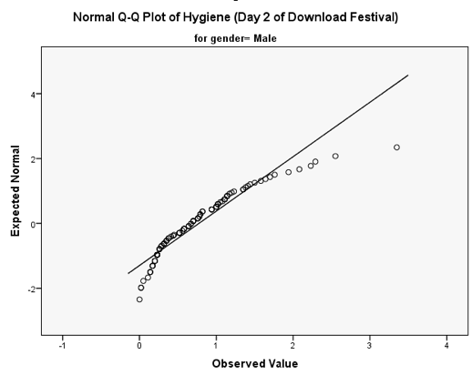
Q-Q plot for males on day 2 of the festival
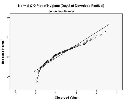
Q-Q plot for females on day 2 of the festival
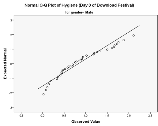
Q-Q plot for males on day 3 of the festival
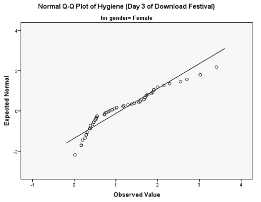
Q-Q plot for females on day 3 of the festival
Self-test 6.7
Compute the mean and variance of the attractiveness ratings. Now compute them for the 5%, 10% and 20% trimmed data.
Mean and variance
Compute the squared errors as follows:
| Score | Error (score - mean) | Error squared |
|---|---|---|
| 0 | -6 | 36 |
| 0 | -6 | 36 |
| 3 | -3 | 9 |
| 4 | -2 | 4 |
| 4 | -2 | 4 |
| 5 | -1 | 1 |
| 5 | -1 | 1 |
| 6 | 0 | 0 |
| 6 | 0 | 0 |
| 6 | 0 | 0 |
| 6 | 0 | 0 |
| 7 | 1 | 1 |
| 7 | 1 | 1 |
| 7 | 1 | 1 |
| 8 | 2 | 4 |
| 8 | 2 | 4 |
| 9 | 3 | 9 |
| 9 | 3 | 9 |
| 10 | 4 | 16 |
| 10 | 4 | 16 |
| 120 | NA | 152 |
To calculate the mean of the attractiveness ratings we use the equation (and the sum of the first column in the table):
\[ \begin{aligned} \overline{X} &= \frac{\sum_{i=1}^{n} x_i}{n} \\ \ &= \frac{120}{20} \\ \ &= 6 \end{aligned} \]
To calculate the variance we use the sum of squares (the sum of the values in the final column of the table) and this equation:
\[ \begin{aligned} \ s^2 &= \frac{\text{sum of squares}}{n-1} \\ \ &= \frac{152}{19} \\ \ &= 8 \end{aligned} \]
5% trimmed mean and variance
Next, let’s calculate the mean and variance for the 5% trimmed data. We basically do the same thing as before but delete 1 score at each extreme (there are 20 scores and 5% of 20 is 1).
Compute the squared errors as follows:
| Score | Error (score - mean) | Error squared |
|---|---|---|
| 0 | -6.11 | 37.33 |
| 3 | -3.11 | 9.67 |
| 4 | -2.11 | 4.45 |
| 4 | -2.11 | 4.45 |
| 5 | -1.11 | 1.23 |
| 5 | -1.11 | 1.23 |
| 6 | -0.11 | 0.01 |
| 6 | -0.11 | 0.01 |
| 6 | -0.11 | 0.01 |
| 6 | -0.11 | 0.01 |
| 7 | 0.89 | 0.79 |
| 7 | 0.89 | 0.79 |
| 7 | 0.89 | 0.79 |
| 8 | 1.89 | 3.57 |
| 8 | 1.89 | 3.57 |
| 9 | 2.89 | 8.35 |
| 9 | 2.89 | 8.35 |
| 10 | 3.89 | 15.13 |
| 110 | NA | 99.74 |
To calculate the mean of the attractiveness ratings we use the equation (and the sum of the first column in the table):
\[ \begin{aligned} \overline{X} &= \frac{\sum_{i=1}^{n} x_i}{n} \\ \ &= \frac{110}{18} \\ \ &= 6.11 \end{aligned} \]
To calculate the variance we use the sum of squares (the sum of the values in the final column of the table) and this equation:
\[ \begin{aligned} \ s^2 &= \frac{\text{sum of squares}}{n-1} \\ \ &= \frac{99.74}{17} \\ \ &= 5.87 \\ \end{aligned} \]
10% trimmed mean and variance
Next, let’s calculate the mean and variance for the 10% trimmed data. To do this we need to delete 2 scores from each extreme of the original data set (there are 20 scores and 10% of 20 is 2).
Compute the squared errors as follows:
| Score | Error (score - mean) | Error squared |
|---|---|---|
| 3 | -3.25 | 10.56 |
| 4 | -2.25 | 5.06 |
| 4 | -2.25 | 5.06 |
| 5 | -1.25 | 1.56 |
| 5 | -1.25 | 1.56 |
| 6 | -0.25 | 0.06 |
| 6 | -0.25 | 0.06 |
| 6 | -0.25 | 0.06 |
| 6 | -0.25 | 0.06 |
| 7 | 0.75 | 0.56 |
| 7 | 0.75 | 0.56 |
| 7 | 0.75 | 0.56 |
| 8 | 1.75 | 3.06 |
| 8 | 1.75 | 3.06 |
| 9 | 2.75 | 7.56 |
| 9 | 2.75 | 7.56 |
| 100 | NA | 46.96 |
To calculate the mean of the attractiveness ratings we use the equation (and the sum of the first column in the table):
\[ \begin{aligned} \overline{X} &= \frac{\sum_{i=1}^{n} x_i}{n} \\ \ &= \frac{100}{16} \\ \ &= 6.25 \end{aligned} \]
To calculate the variance we use the sum of squares (the sum of the values in the final column of the table) and this equation:
\[ \begin{aligned} \ s^2 &= \frac{\text{sum of squares}}{n-1} \\ \ &= \frac{46.96}{15} \\ \ &= 3.13 \\ \end{aligned} \]
###20% trimmed mean and variance
Finally, let’s calculate the mean and variance for the 20% trimmed data. To do this we need to delete 4 scores from each extreme of the original data set (there are 20 scores and 20% of 20 is 4).
Compute the squared errors as follows:
| Score | Error (score - mean) | Error squared |
|---|---|---|
| 4 | -2.25 | 5.06 |
| 5 | -1.25 | 1.56 |
| 5 | -1.25 | 1.56 |
| 6 | -0.25 | 0.06 |
| 6 | -0.25 | 0.06 |
| 6 | -0.25 | 0.06 |
| 6 | -0.25 | 0.06 |
| 7 | 0.75 | 0.56 |
| 7 | 0.75 | 0.56 |
| 7 | 0.75 | 0.56 |
| 8 | 1.75 | 3.06 |
| 8 | 1.75 | 3.06 |
| 75 | NA | 16.22 |
To calculate the mean of the attractiveness ratings we use the equation (and the sum of the first column in the table):
\[ \begin{aligned} \overline{X} &= \frac{\sum_{i=1}^{n} x_i}{n} \\ \ &= \frac{75}{12} \\ \ &= 6.25 \end{aligned} \]
To calculate the variance we use the sum of squares (the sum of the values in the final column of the table) and this equation:
\[ \begin{aligned} \ s^2 &= \frac{\text{sum of squares}}{n-1} \\ \ &= \frac{16.22}{11} \\ \ &= 1.47 \\ \end{aligned} \]
Self-test 6.8
Have a go at creating similar variables logday2 and logday3 for the day 2 and day 3 data. Plot histograms of the transformed scores for all three days
The completed Compute Variable dialog boxes for day 2 and day 3 should look as below:
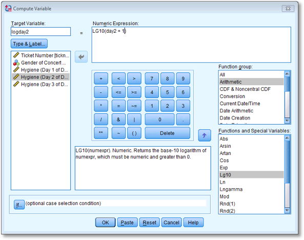
Dialog box to compute the log of the day 2 scores
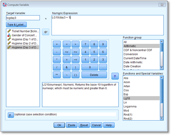
Dialog box to compute the log of the day 3 scores
The histograms for days 1 and 2 are in the book, but for day 3 the histogram should look like this:
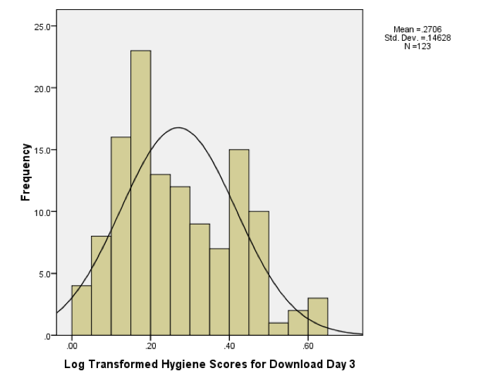
Histogram of the log of the day 3 scores
Self-test 6.9
Repeat this process for day2 and day3 to create variables called sqrtday2 and sqrtday3. Plot histograms of the transformed scores for all three days
The completed Compute Variable dialog boxes for day 2 and day 3 should look as below:
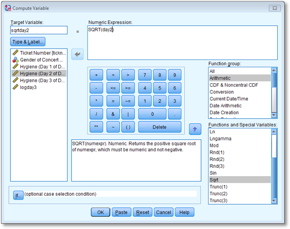
Dialog box to compute the square root of the day 2 scores
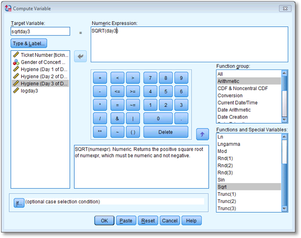
Dialog box to compute the square root of the day 3 scores
The histograms for days 1 and 2 are in the book, but for day 3 the histogram should look like this:
Histogram of the square root of the day 3 scores
Self-test 6.10
Repeat this process for day2 and day3. Plot histograms of the transformed scores for all three days.
The completed Compute Variable dialog boxes for day 2 and day 3 should look as below:
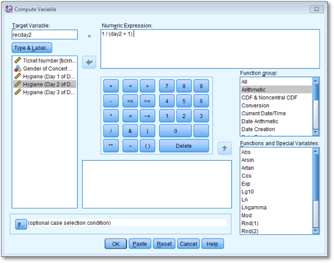
Dialog box to compute the reciprocal of the day 2 scores
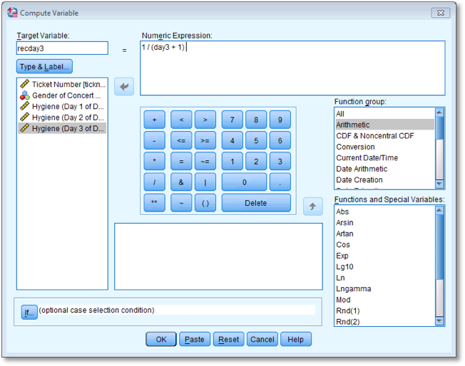
Dialog box to compute the reciprocal of the day 3 scores
The histograms for days 1 and 2 are in the book, but for day 3 the histogram should look like this:
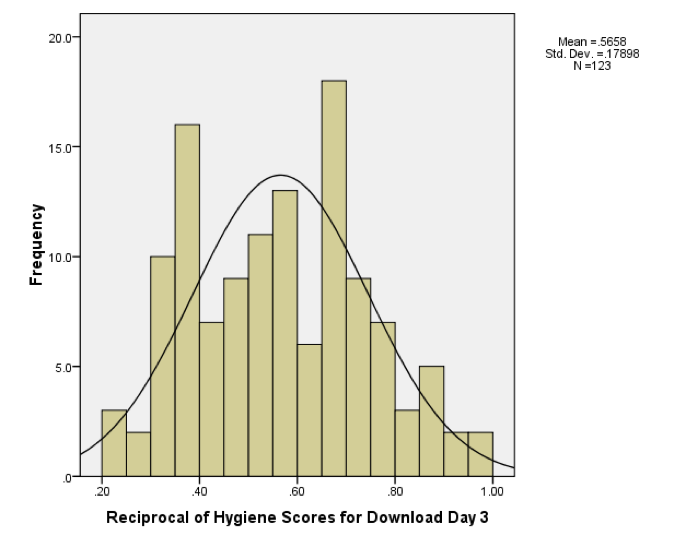
Histogram of the reciprocal of the day 3 scores
Chapter 7
Self-test 7.1
What are the null hypotheses for these hypotheses?
- There is no difference in depression levels between those who drank alcohol and those who took ecstasy on Sunday.
- There is no difference in depression levels between those who drank alcohol and those who took ecstasy on Wednesday.
Self-test 7.2
Based on what you have just learnt, try ranking the Sunday data.
The answers are in Figure 7.4. There are lots of tied ranks and the data are generally horrible.
Self-test 7.3
See whether you can use what you have learnt about data entry to enter the data in Table 7.1 into SPSS.
The solution is in the chapter (and see the file Drug.sav).
Self-test 7.4
Use SPSS to test for normality and homogeneity of variance in these data.
To get the outputs in the book use the following dialog boxes:
Self-test 7.5
Split the file by Drug
To split the file by drug you need to select Data > Split File and complete the dialog box as follows:
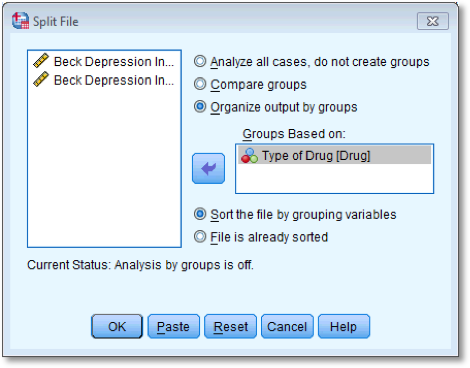
Dialog box for split file
Self-test 7.6
Have a go at ranking the data and see if you get the same results as me.
Solution is in the book chapter.
Self-test 7.7
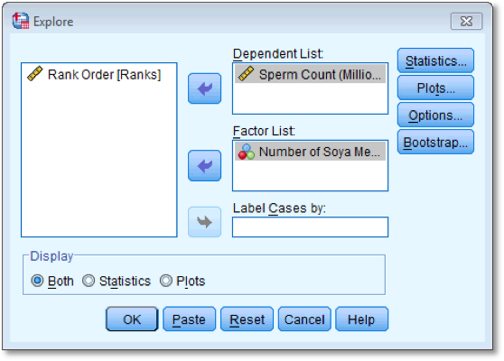
See whether you can enter the data in Table 1.3 into SPSS (you don’t need to enter the ranks). Then conduct some exploratory analyses on the data (see Sections Error! Reference source not found. and Error! Reference source not found.).
Data entry is explained in the book. To get the outputs in the book use the following dialog boxes:
Self-test 7.8
Have a go at ranking the data and see if you get the same results as in Table 7.5.
Solution is in the book chapter.
Self-test 7.9
Using what you know about inputting data, enter these data into SPSS and run exploratory analyses.
Data entry is explained in the book. To get the outputs in the book use the following dialog boxes:
Self-test 7.10
Carry out the three Wilcoxon tests suggested above (see Figure 7.9).
You have to do each of the Wilcoxon tests separately, you cannot do
them all in one go. For each test transfer the pair of variables for the
comparison to the box labelled Test Fields. To run the analysis
click  .
.
To run a Wilcoxon test, first of all select Analyze >
Nonparametric tests > Realted Samples …. When you reach the  tab you will see all
of the variables in the data editor listed in the box labelled
Fields. If you assigned roles for the variables in the data
editor
tab you will see all
of the variables in the data editor listed in the box labelled
Fields. If you assigned roles for the variables in the data
editor  will
be selected and SPSS will have automatically assigned your variables. If
you haven’t assigned roles then
will
be selected and SPSS will have automatically assigned your variables. If
you haven’t assigned roles then  will be selected and you’ll need to assign variables yourself.
To do the first test, select Weight at start (kg)
and Weight after 1 month (kg) and drag them to the box
labelled Test Fields (or click ![]() ). The
completed dialog box is shown below.
). The
completed dialog box is shown below.
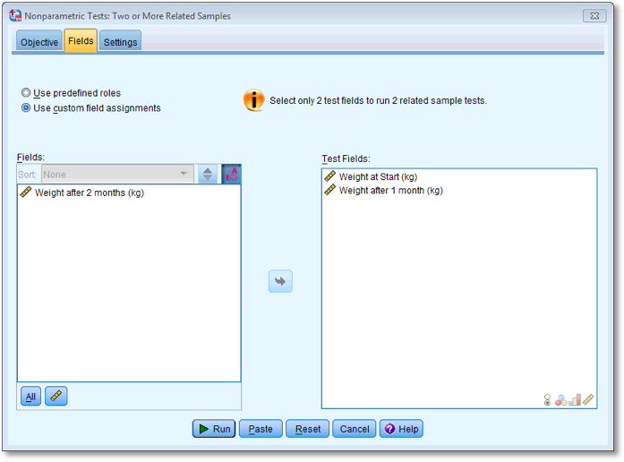
Dialog box for the first Wilcoxon test (Fields)
Next, select the  tab to activate
the test options. To do a Wilcoxon test check
tab to activate
the test options. To do a Wilcoxon test check  and
select
and
select  . To
run the analysis click .
. To
run the analysis click .
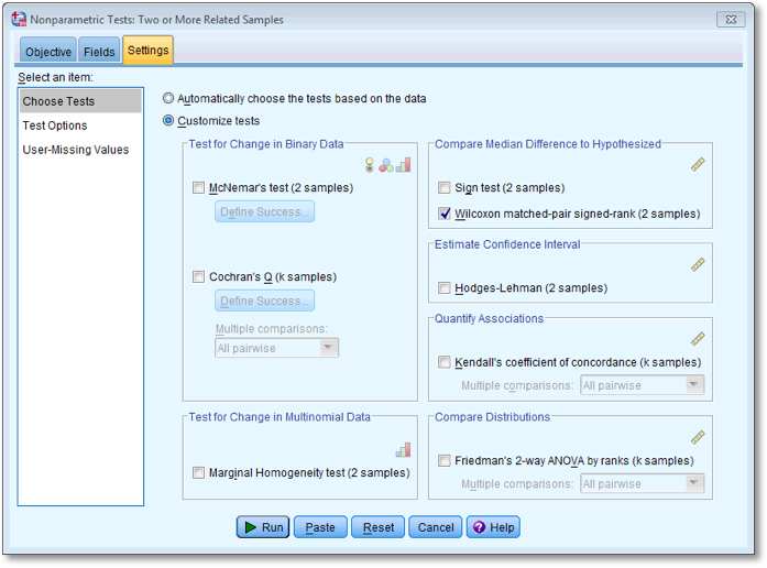
Dialog box for the first Wilcoxon test (Settings)
To run the second Wilcoxon test you do the same thing as before, but
this time dragging Weight at start (kg) and
Weight after 2 months (kg) to the box labelled Test
Fields (or clicking on ![]() ). The
completed dialog box is shown below.
). The
completed dialog box is shown below.
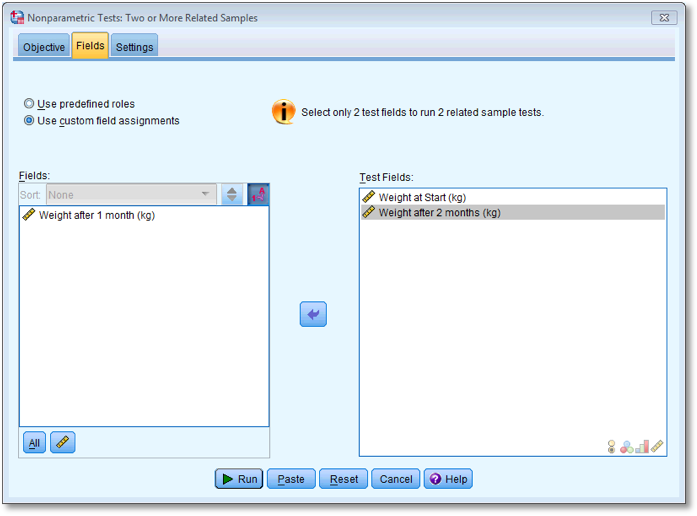
Dialog box for the second Wilcoxon test (Fields)
Next, select the tab to activate
the test options. To do a Wilcoxon test check and
select . To
run the analysis click .

Dialog box for the second Wilcoxon test (Settings)
To run the third Wilcoxon test you do the same thing as for the
previous two tests above, but this time dragging Weight after 1
month (kg) and Weight after 2 months (kg) to
the box labelled Test Fields (or clicking on ![]() ). The
completed dialog box is shown below.
). The
completed dialog box is shown below.

Dialog box for the final Wilcoxon test (Fields)
Next, select the tab to activate
the test options. To do a Wilcoxon test check and
select . To
run the analysis click . All of the outputs
are in the book chapter.

Dialog box for the final Wilcoxon test (Settings)
Chapter 8
Self-test 8.1
Enter the advert data and use the chart editor to produce a scatterplot (number of packets bought on the y-axis, and adverts watched on the x-axis) of the data.
The finished Chart Builder should look like this:
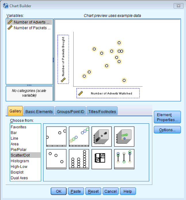
Dialog box for a scatterplot
My scatterplot came out like this:
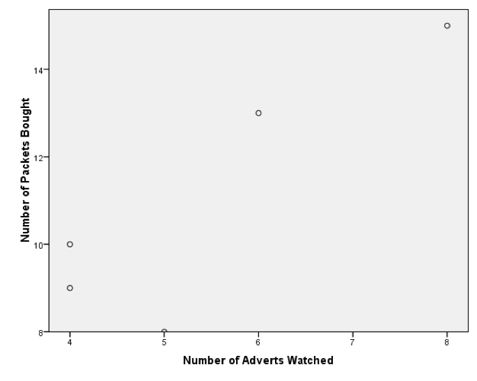
A horrible scatterplot
This graph looks stupid because SPSS has not scaled the axes from 0. If yours looks like this too, then, as an additional task, edit it so that the axes both start at 0. While you’re at it, why not make it look Tufte style. Mine ended up like this:
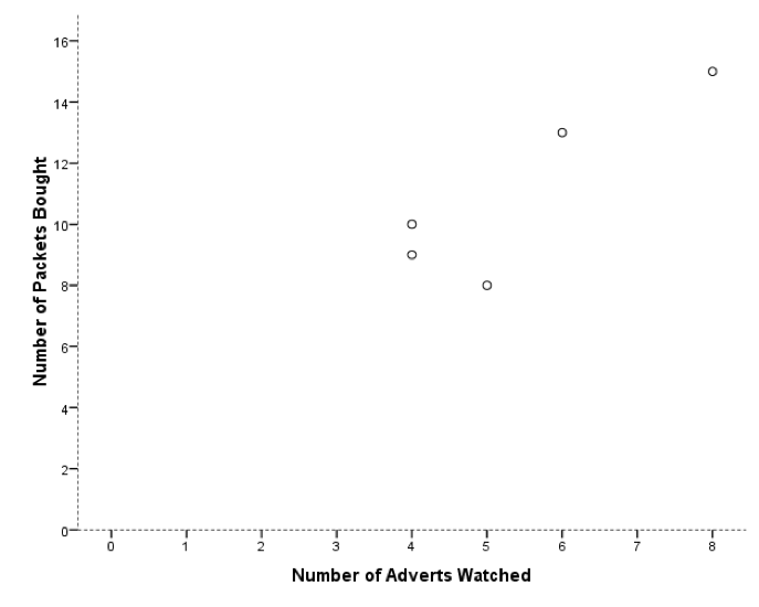
A less horrible scatterplot
Self-test 8.2
Create P-P plots of the variables Revise, Exam, and Anxiety.
To get a P-P plot use Analyze > Descriptive Statistics >
P-P Plots… to access the dialog box below. There’s not a lot to say
about this dialog box really because the default options will compare
any variables selected to a normal distribution, which is what we want
(although note that there is a drop-down list of different distributions
against which you could compare your data). Select the three variables
Revise, Exam and Anxiety in the variable list and transfer them to the
box labelled Variables by clicking on ![]() . click to draw the
graphs.
. click to draw the
graphs.
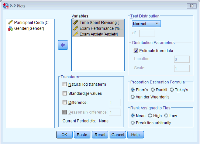
Dialog box for P-P Plots
Self-test 8.3
Conduct a Pearson correlation analysis of the advert data from the beginning of the chapter.
Select Analyze > Correlate > Bivariate to get this dialog box:
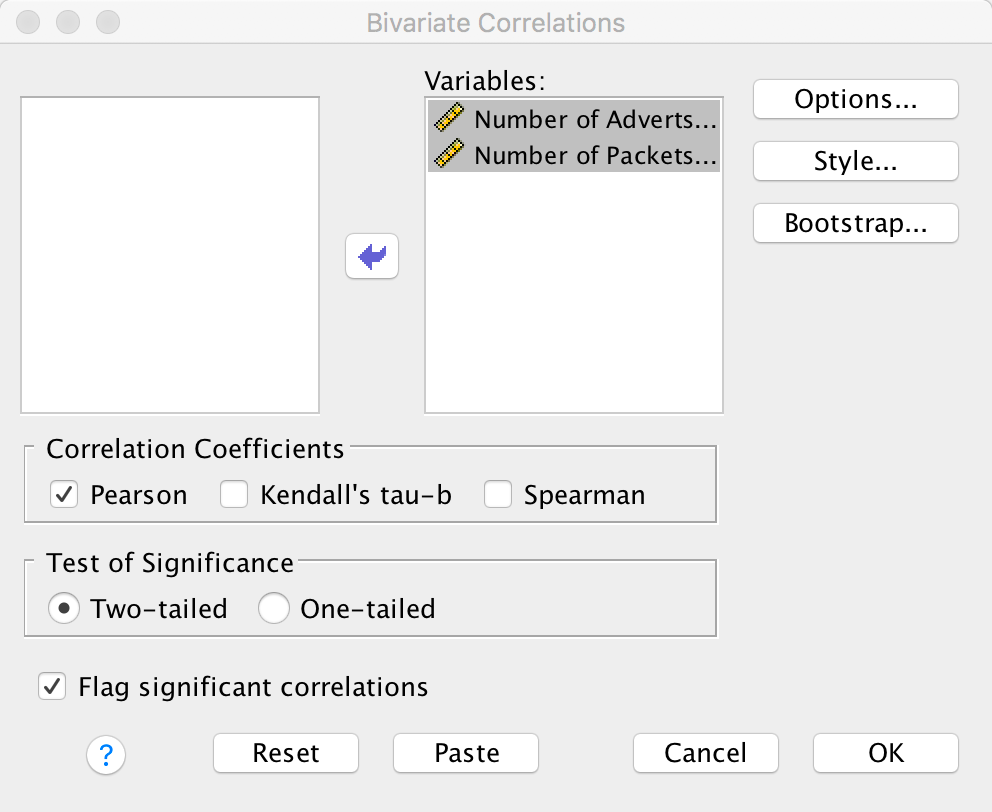
Dialog box for a Pearson correlation
Drag Adverts and Packets to the
variables list (or click ![]() ). Click
). Click
 to run the
analysis. The output is shown in the book chapter.
to run the
analysis. The output is shown in the book chapter.
Self-test 8.4
Using the Roaming Cats.sav file, compute a Pearson correlation between Sex and Time.
Select Analyze > Correlate > Bivariate to get this dialog box:
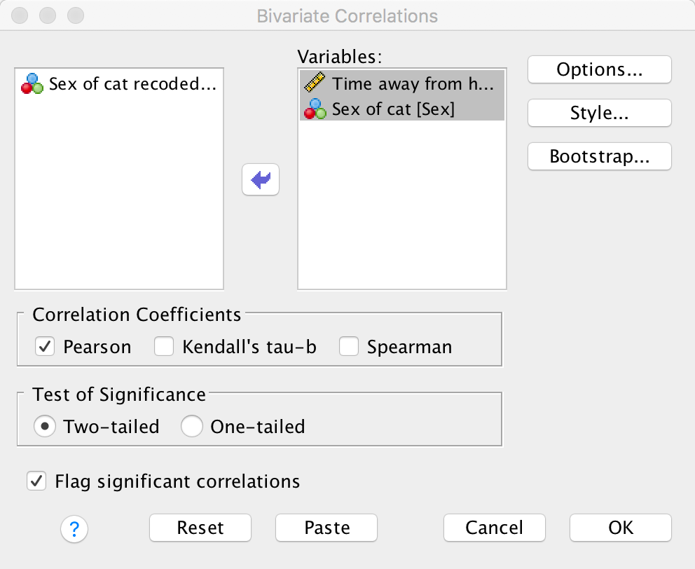
Dialog box for a Pearson correlation
Drag Time and Sex to the variables
list (or click ![]() ). click
). click
 to
get some robust confidence intervals and select these options:
to
get some robust confidence intervals and select these options:
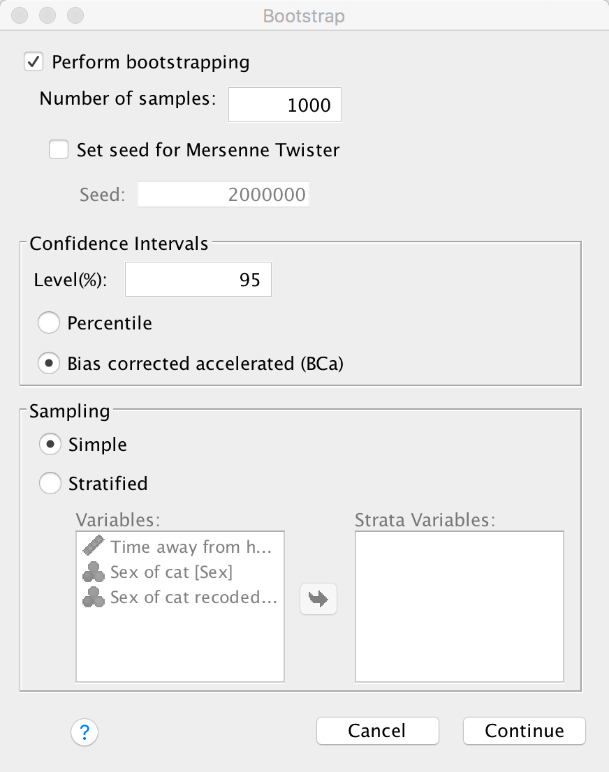
Dialog box for a Pearson correlation
Click  to return
to the main dialog box and to run the
analysis. The output is shown in the book chapter.
to return
to the main dialog box and to run the
analysis. The output is shown in the book chapter.
Self-test 8.5
Use the split file command to compute the correlation coefficient between exam anxiety and exam performance in men and women.
To split the file, select Data > Split File … . In the
resulting dialog box select the option Organize output by
groups. Drag the variable Sex to the Groups
Based on box (or click ![]() ). The
completed dialog box should look like this:
). The
completed dialog box should look like this:
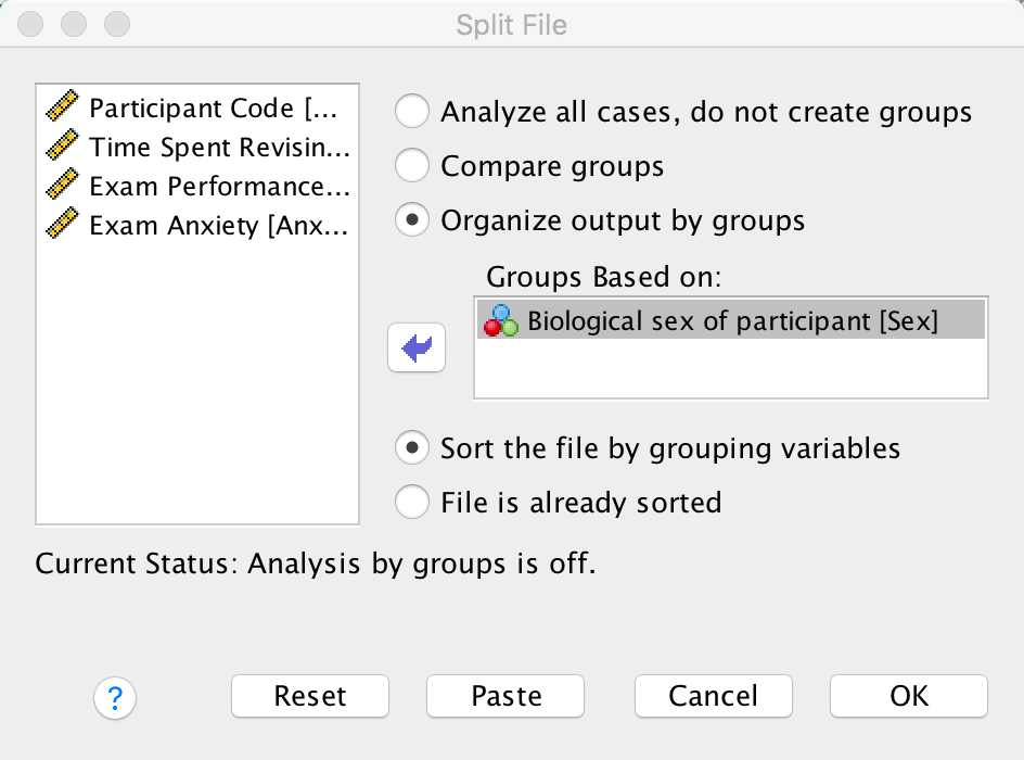
Dialog box for splitting the file
To get the correlation coefficients select Analyze > Correlate
> Bivariate to get the main dialog box. Drag the variables
Exam and Anxiety to the variables list
(or click ![]() ). Click
to run the
analysis. The completed dialog box will look like this:
). Click
to run the
analysis. The completed dialog box will look like this:
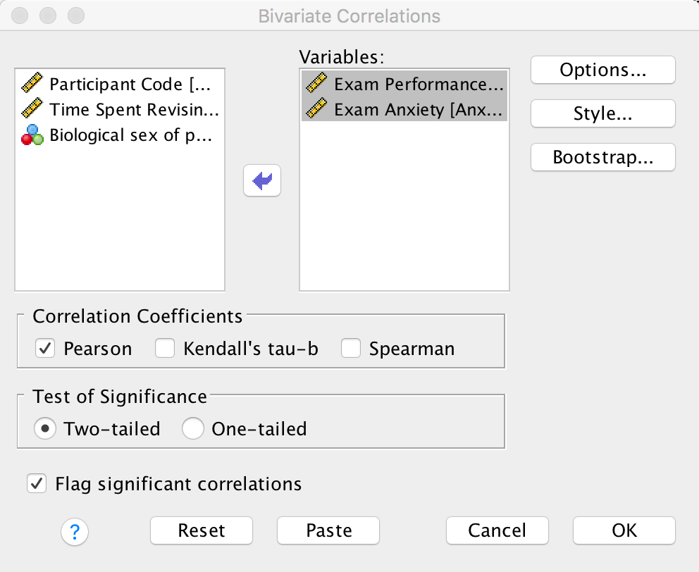
Dialog box for a Pearson correlation
The output for males will look like this:

Pearson correlation between anxiety and exam performance in males
For females, the output is as follows:
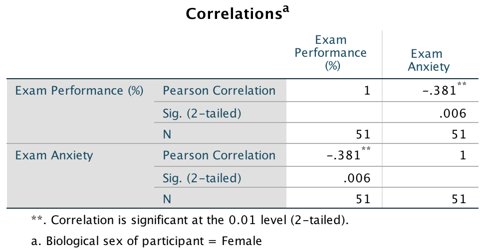
Pearson correlation between anxiety and exam performance in females
The book chapter has some interpretation of these findings and suggestions for how to compare the coefficients for males and females.
Chapter 9
Self-test 9.1
Residuals are used to compute which of the three sums of squares?
The residual sum of squares (\(\text{SS}_\text{R}\))
Self-test 9.2
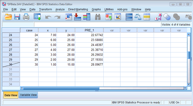
Once you have read Section 9.7, fit a linear model first with all the cases included and then with case 30 deleted.
To run the analysis on all 30 cases, you need to access the main
dialog box by selecting Analyze > Regression > Linear ….
The figure below shows the resulting dialog box. There is a space
labelled Dependent in which you should place the outcome
variable (in this example y). There is another space
labelled Independent(s) in which any predictor variable should
be placed (in this example, x). click  and tick
Unstandardized predicted values (see figure below), and then
click to
return to the main dialog box and to run the
analysis.
and tick
Unstandardized predicted values (see figure below), and then
click to
return to the main dialog box and to run the
analysis.
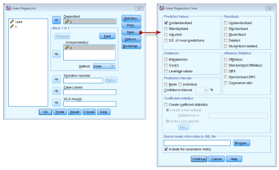
Dialog box for regression
After running the analysis you should get the output below See the book chapter for an explanation of these results.
Output for all 30 cases
To run the analysis with case 30 deleted, go to Data > Select
Cases to open the dialog box in the figure below. Once this dialog
box is open select Based on time or case range and then click Range. We
want to set the range to be from case 1 to case 29, so type these
numbers in the relevant boxes (see figure below). Click to return to
the main dialog box and to filter the
cases.
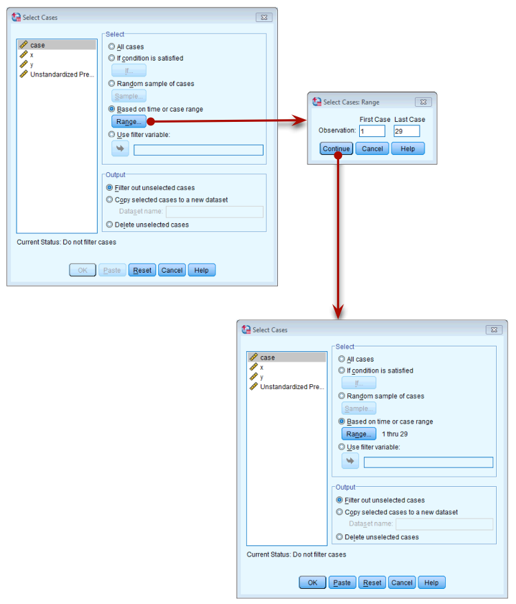
Filtering case 30
Once you have done this, your data should look like mine below. You will see that case 30 now has a diagonal strike through it to indicate that this case will be excluded from any further analyses.
Filtered data
Now we can run the regression in the same way as we did before by
selecting Analyze > Regression > Linear …. The figure
below shows the resulting dialog box. There is a space labelled
Dependent in which you should place the outcome variable (in
this example y). There is another space labelled
Independent(s) in which any predictor variable should be placed
(in this example, x). click and tick
Unstandardized predicted values (see figure below), and then
click to
return to the main dialog box and to run the analysis.
You should get the same output as mine below (see the book chapter for
an explanation of the results).
Output for first 29 cases
Once you have run both regressions, your data view should look like mine above. You can see two new columns PRE_1 and PRE_2 which are the saved unstandardized predicted values that we requested.
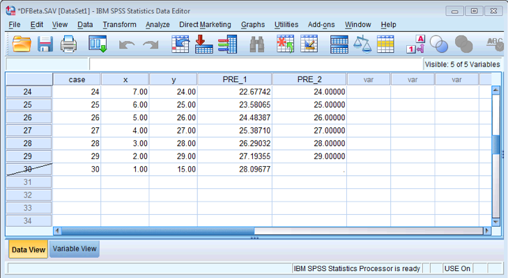
Filtered data
Self-test 9.3
Produce a scatterplot of sales (y-axis) against advertising budget (x-axis). Include the regression line.
The completed dialog box should look like this:
Self-test 9.4
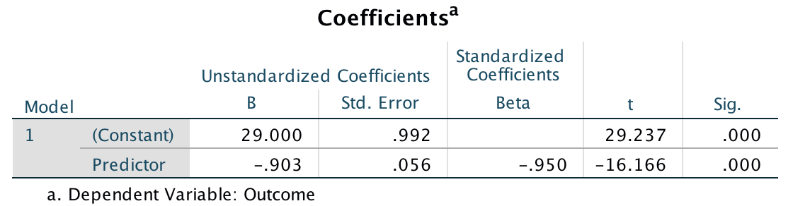
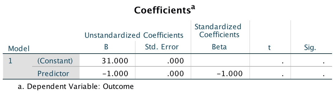
How is the t in Output 9.4 calculated? Use the values in the table to see if you can get the same value as SPSS.
The t is computed as follows:
\[ \begin{aligned} t &= \frac{b}{SE_b} \\ &= \frac{0.096}{0.010} \\ &= 9.6 \end{aligned} \]
This value is different to the value in the SPSS output (9.979) because we’ve used the rounded values displayed in the table. If you double-click the table, and then double click the cell for b and then for the SE we get the values to more decimal places:
\[ \begin{aligned} t &= \frac{b}{SE_b} \\ &= \frac{0.096124}{0.009632} \\ &= 9.979 \end{aligned} \]
which match the value of t computed by SPSS.
Self-test 9.5
How many albums would be sold if we spent £666,000 on advertising the latest album by Deafheaven?
Remember that advertising budget is in thousands, so we need to put £666 into the model (not £666,000). The b-values come from the SPSS output in the chapter:
\[ \begin{aligned} \text{Sales}_i &= b_0 + b_1\text{Advertising}_i + ε_i \\ \text{Sales}_i &= 134.14 + (0.096 \times \text{Advertising}_i) + ε_i \\ \text{Sales}_i &= 134.14 + (0.096 \times 666) + ε_i \\ \text{Sales}_i &= 198.08 \end{aligned} \]
Self-test 9.6
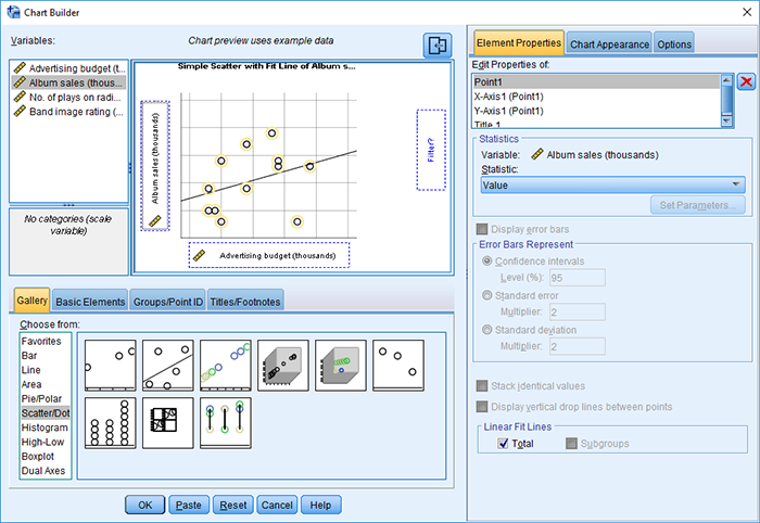
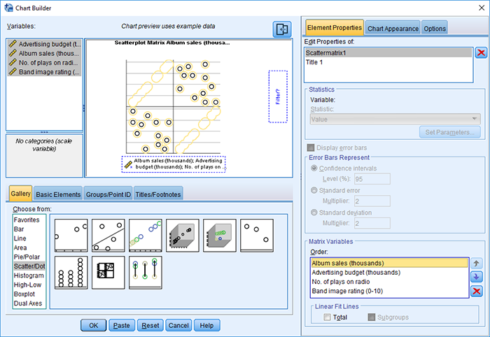
Produce a matrix scatterplot of Sales, Adverts, Airplay and Image including the regression line.
Self-test 9.7
Think back to what the confidence interval of the mean represented. Can you work out what the confidence intervals for b represent?
This question is answered in the text just after the self-test box.
Chapter 10
Self-test 10.1
Enter these data into SPSS.
The file Invisibility.sav shows how you should have entered the data.
Self-test 10.2
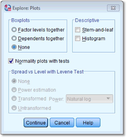
Produce some descriptive statistics for these data (using Explore)
To get some descriptive statistics using the Explore command you need
to go to Analyze > Descriptive Statistics > Explore ….
The dialog box for the Explore command is shown below. First, drag any
variables of interest to the box labelled Dependent List. For
this example, select Mischievous Acts. It is also
possible to select a factor (or grouping variable) by which to split the
output (so if you drag Cloak to the box labelled Factor
List, SPSS will produce exploratory analysis for each group - a bit
like the split file command). If you click  a dialog
box appears, but the default option is fine (it will produce means,
standard deviations and so on). If you click
a dialog
box appears, but the default option is fine (it will produce means,
standard deviations and so on). If you click  and select the
option Normality plots with tests, you will get the
Kolmogorov-Smirnov test and some normal Q-Q plots in your output. click
to return
to the main dialog box and to run the
analysis.
and select the
option Normality plots with tests, you will get the
Kolmogorov-Smirnov test and some normal Q-Q plots in your output. click
to return
to the main dialog box and to run the
analysis.
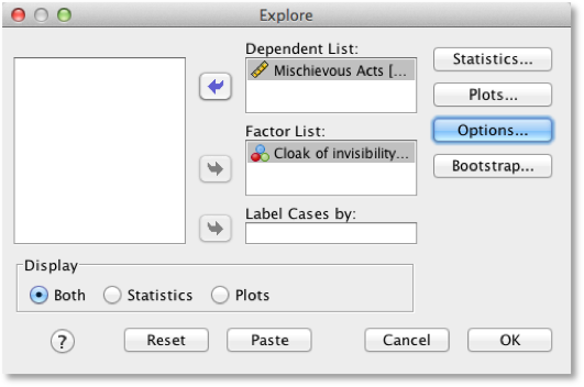
Explore dialog box
Self-test 10.3
To prove that I’m not making it up as I go along, fit a linear model to the data in Invisibility.sav with Cloak as the predictor and Mischief as the outcome using what you learnt in the previous chapter. Cloak is coded using zeros and ones as described above.
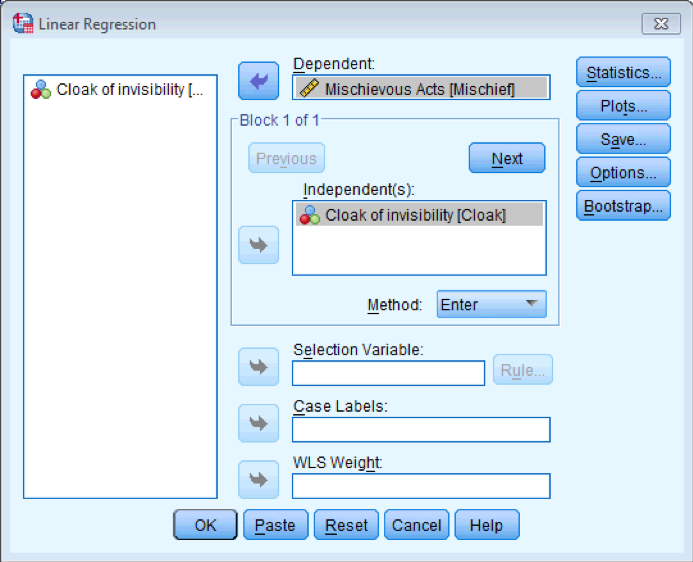
Regression dialog box
Self-test 10.4
Produce an error bar chart of the Invisibility.sav data (Cloak will be on the x-axis and Mischief on the y-axis).
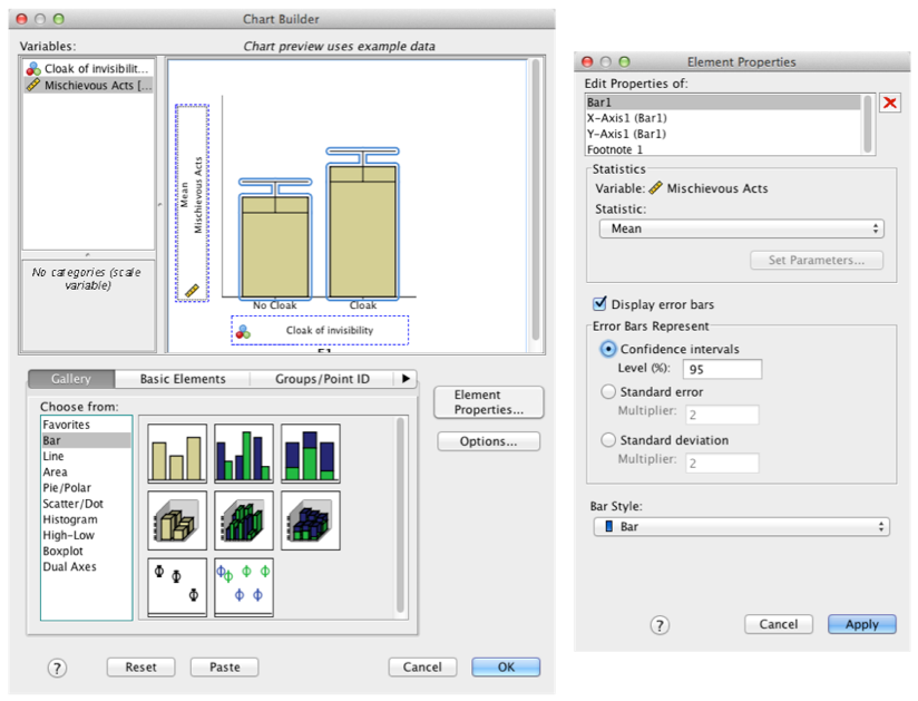
Completed dialog box
Self-test 10.5
Enter the data in Table 10.1 into the data editor as though a repeated-measures design was used.
We would arrange the data in two columns (one representing the Cloak condition and one representing the No_Cloak condition). You can see the correct layout in Invisibility RM.sav.
Self-test 10.6
Using the Invisibility RM.sav data, compute the differences between the cloak and no cloak conditions and check the assumption of normality for these differences.
First compute the differences using the compute function:
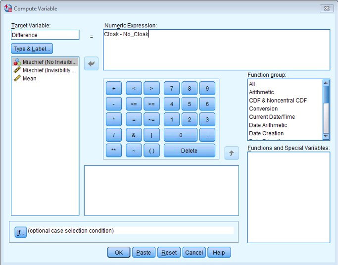
Completed dialog box
Next, use Analyze > Descriptive Statistics > Explore … to get some plots and the Kolmogorov-Smirnov test:
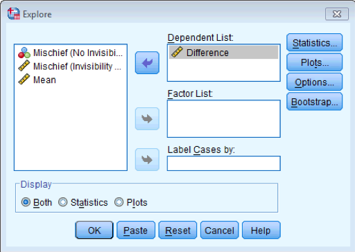
Completed dialog box
The Tests of Normality table below shows that the distribution of differences is borderline significantly different from normal, D(12) = 0.25, p = .045. However, the Q-Q plot shows that the quantiles fall pretty much on the diagonal line (indicating normality). As such, it looks as though we can assume that our differences are fairly normal and that, therefore, the sampling distribution of these differences is normal too. Happy days!
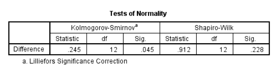
The K-S test
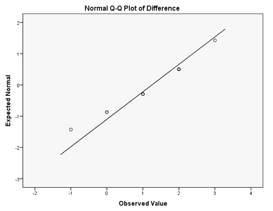
The P-P plot
Self-test 10.7
Produce an error bar chart of the Invisibility RM.sav data (Cloak on the x-axis and Mischief on the y-axis).
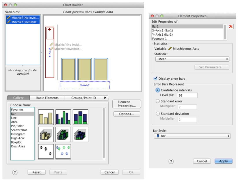
Completed dialog box
Self-test 10.8
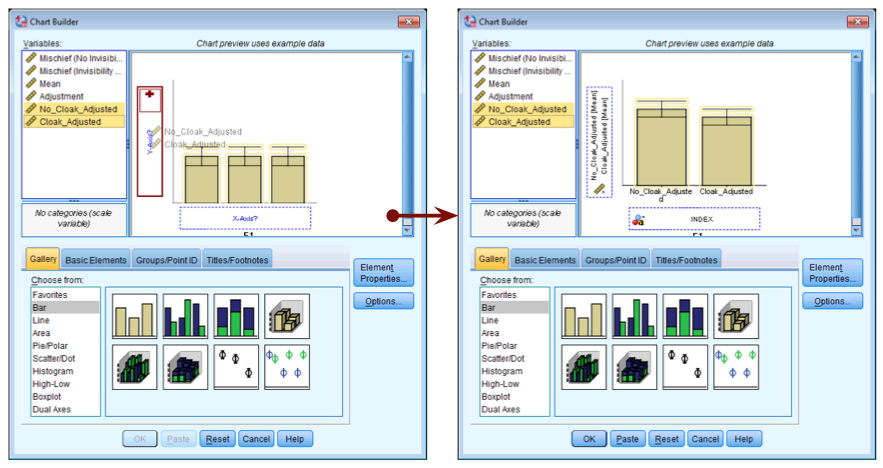
Create an error bar chart of the mean of the adjusted values that you have just made (Cloak_Adjusted and No_Cloak_Adjusted).
Completed dialog box
Chapter 11
Self-test 11.1
Follow Oliver Twisted’s instructions to create the centred variables CUT_Centred and Vid_Centred. Then use the compute command to create a new variable called Interaction in the Video Games.sav file, which is CUT_Centred multiplied by Vid_Centred.
To create the centred variables follow Oliver Twisted’s instructions
for this chapter. I’ll assume that you have a version of the data file
Video Games.sav containing the centred versions of the
predictors (CUT_Centred and
Vid_Centred). To create the interaction term, access
the compute dialog box by selecting Transform > Compute Variable
… and enter the name Interaction into the box
labelled Target Variable. Drag the variable
CUT_Centred to the area labelled Numeric
Expression, then click  and then select
the variable Vid_Centred and drag it across to the area
labelled Numeric Expression. The completed dialog box is shown
below. click and
a new variable will be created called Interaction, the
values of which are CUT_Centred multiplied by
Vid_Centred.
and then select
the variable Vid_Centred and drag it across to the area
labelled Numeric Expression. The completed dialog box is shown
below. click and
a new variable will be created called Interaction, the
values of which are CUT_Centred multiplied by
Vid_Centred.
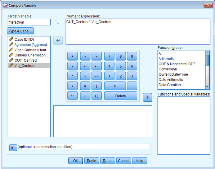
Dialog box to compute an interaction
Self-test 11.2
Assuming you have done the previous self-test, fit a linear model predicting Aggress from CUT_Centred, Vid_Centred and Interaction
To do the analysis you need to access the main dialog box by
selecting Analyze > Regression > Linear …. The resulting
dialog box is shown below. Drag Aggression from the
list on the left-hand side to the space labelled Dependent (or
click ![]() ).
Drag CUT_Centred, Vid_Centred and
Interaction from the variable list to the space
labelled Independent(s) (click or click
).
Drag CUT_Centred, Vid_Centred and
Interaction from the variable list to the space
labelled Independent(s) (click or click ![]() ). The
default method of Enter is what we want, so click to run the basic
analysis.
). The
default method of Enter is what we want, so click to run the basic
analysis.
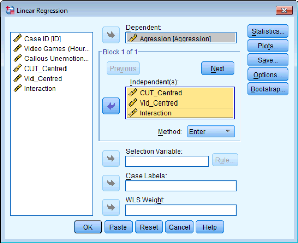
Dialog box for linear regression
Self-test 11.3
Assuming you did the previous self-test, compare the table of coefficients that you got with those in Output 11.1.
The output below shows the regression coefficients from the regression analysis that you ran using the centred versions of callous traits and hours spent gaming and their interaction as predictors. Basically, the regression coefficients are identical to those in Output 11.1 from using PROCESS. The standard errors differ a little from those from PROCESS, but that’s because when we used PROCESS we asked for heteroscedasticity-consistent standard errors, consequently the t-values are slightly different too (because these are computed from the standard errors: b/SE). The basic conclusion is the same though: there is a significant moderation effect as shown by the significant interaction between hours spent gaming and callous unemotional traits.
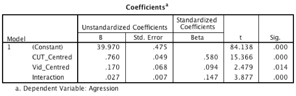
Output for linear regression
Self-test 11.4
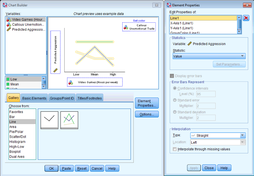
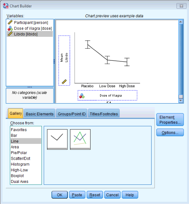
Draw a multiple line graph of Aggress (y-axis) against Games (x-axis) with different coloured lines for different values of CaUnTs
Dialog box for multiple line graph
Self-test 11.5
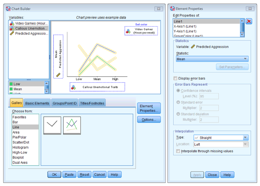
Now draw a multiple line graph of Aggress (y-axis) against CaUnTs (x-axis) with different coloured lines for different values of Games.
Dialog box for multiple line graph
Self-test 11.6
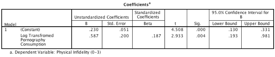
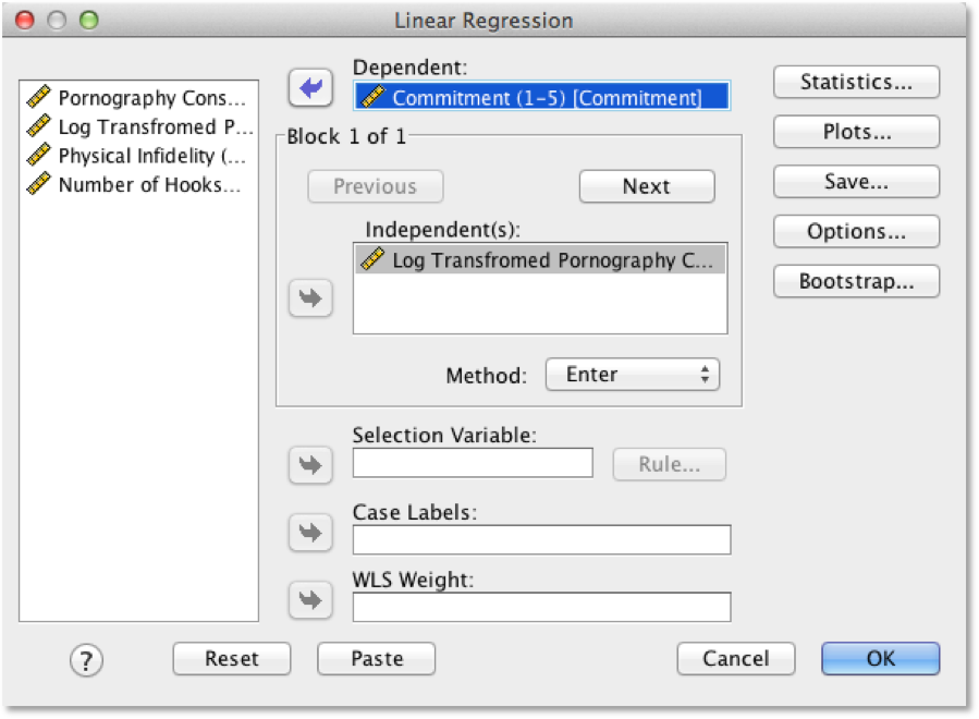
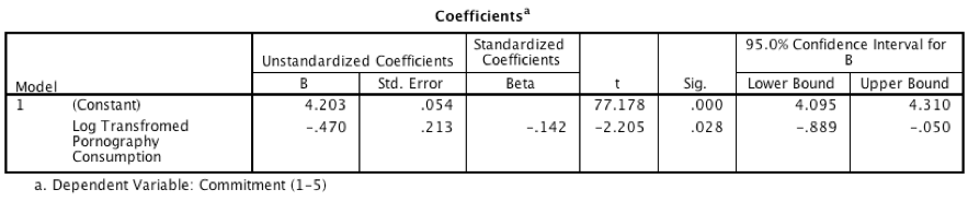
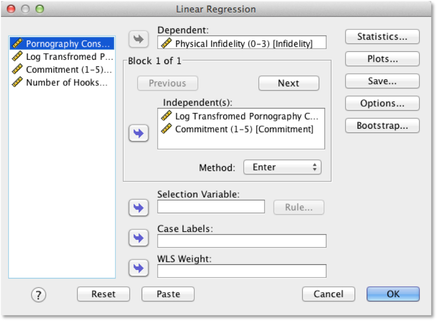
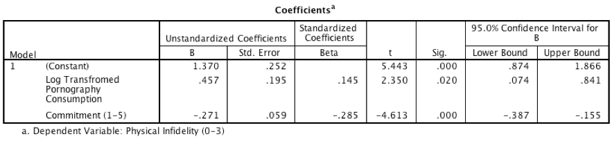
Run the three models necessary to test mediation for Lambert et al.’s data: (1) a linear model predicting Phys_Inf from LnPorn; (2) a linear model predicting Commit from LnPorn; and (3) a linear model predicting Phys_Inf from both LnPorn and Commit. Is there mediation?
Model 1: Predicting Infidelity from Consumption
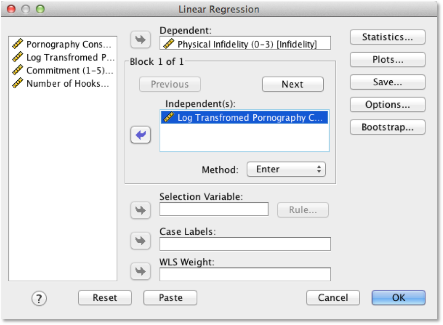
Dialog box for model 1
Output for model 1
Model 2: Predicting Commitment from Consumption
Dialog box for model 2
Output for model 2
Model 3: Predicting Infidelity from Consumption and Commitment
Dialog box for model 3
Output for model 3
Interpretation
- The output for model 1 shows that pornography consumption significantly predicts infidelity, b = 0.59, 95% CI [0.19, 0.98], t = 2.93, p = .004. As consumption increases, physical infidelity increases also.
- The output for model 2 shows that pornography consumption significantly predicts relationship commitment, b = \(-0.47\), 95% CI [\(-0.89\), \(-0.05\)], t = \(-2.21\), p = .028. As pornography consumption increases, commitment declines.
- The output for model 3 shows that relationship commitment significantly predicts infidelity, b = \(-0.27\), 95% CI [\(-0.39\), \(-0.16\)], t = \(-4.61\), p < .001. As relationship commitment increases, physical infidelity declines.
- The relationship between pornography consumption and infidelity is stronger in model 1, b = 0.59, than in model 3, b = 0.46.
As such, the four conditions of mediation have been met.
Self-test 11.7
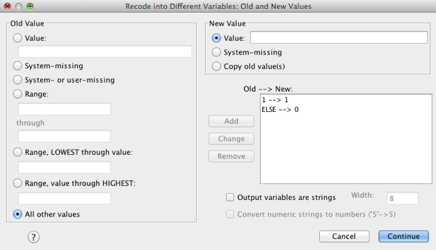
Try creating the remaining two dummy variables (call them Metaller and Indie_Kid) using the same principles.
Select Transform > Recode into Different Variables … to
access the recode dialog box. Select the variable you want to recode (in
this case music) and transfer it to the box labelled
Numeric Variable → Output Variable by clicking ![]() . You
then need to name the new variable. Go to the part that says Output
Variable and in the box below where it says Name write a
name for your second dummy variable (call it Metaller).
You can also give this variable a more descriptive name by typing
something in the box labelled Label (for this first dummy
variable I’ve called it No Affiliation vs. Metaller). When
you’ve done this, click on
. You
then need to name the new variable. Go to the part that says Output
Variable and in the box below where it says Name write a
name for your second dummy variable (call it Metaller).
You can also give this variable a more descriptive name by typing
something in the box labelled Label (for this first dummy
variable I’ve called it No Affiliation vs. Metaller). When
you’ve done this, click on  to transfer
this new variable to the box labelled Numeric Variable → Output
Variable (this box should now say music → Metaller).
to transfer
this new variable to the box labelled Numeric Variable → Output
Variable (this box should now say music → Metaller).
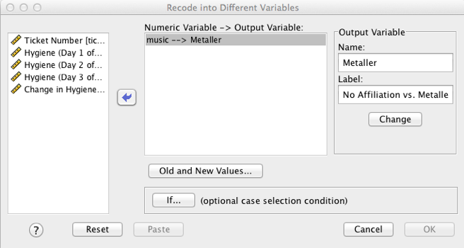
Recode dialog box
We need to tell SPSS how to recode the values of the variable music
into the values that we want for the new variable,
Metaller. To do this click on  to access
the dialog box below. This dialog box is used to change values of the
original variable into different values for the new variable. For this
dummy variable, we want anyone who was a metaller to get a code of 1 and
everyone else to get a code of 0. Now, metaller was coded with the value
2 in the original variable, so you need to type the value 2 in the
section labelled Old Value in the box labelled Value.
The new value we want is 1, so we need to type the value 1 in the
section labelled New Value in the box labelled Value.
When you’ve done this, click on click on
to access
the dialog box below. This dialog box is used to change values of the
original variable into different values for the new variable. For this
dummy variable, we want anyone who was a metaller to get a code of 1 and
everyone else to get a code of 0. Now, metaller was coded with the value
2 in the original variable, so you need to type the value 2 in the
section labelled Old Value in the box labelled Value.
The new value we want is 1, so we need to type the value 1 in the
section labelled New Value in the box labelled Value.
When you’ve done this, click on click on  to add this
change to the list of changes. The next thing we need to do is to change
the remaining groups to have a value of 0 for the first dummy variable.
To do this select All other values and type the value 0 in the
section labelled New Value in the box labelled Value. When you’ve done
this, click on to add this
change to the list of changes. Then click on to return
to the main dialog box, and then click on to create the
dummy variable. This variable will appear as a new column in the data
editor, and you should notice that it will have a value of 1 for anyone
originally classified as a metaller and a value of 0 for everyone
else.
to add this
change to the list of changes. The next thing we need to do is to change
the remaining groups to have a value of 0 for the first dummy variable.
To do this select All other values and type the value 0 in the
section labelled New Value in the box labelled Value. When you’ve done
this, click on to add this
change to the list of changes. Then click on to return
to the main dialog box, and then click on to create the
dummy variable. This variable will appear as a new column in the data
editor, and you should notice that it will have a value of 1 for anyone
originally classified as a metaller and a value of 0 for everyone
else.
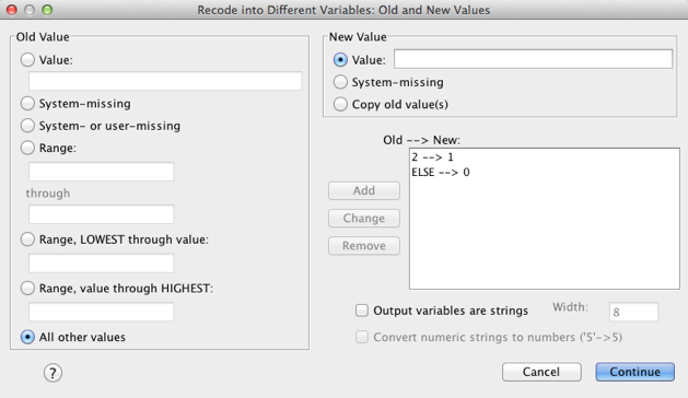
Recode dialog box
To create the final dummy variable, select Transform > Recode
into Different Variables … to access the recode dialog box. Drag
music to the box labelled Numeric Variable → Output
Variable (or click on ![]() ). Go to
the part that says Output Variable and in the box below where
it says Name write a name for your final dummy variable (call
it Indie_Kid). You can also give this variable a more
descriptive name by typing something in the box labelled Label
(for this dummy variable I’ve called it No Affiliation vs. Indie
Kid). When you’ve done this, click on to transfer
this new variable to the box labelled Numeric Variable → Output
Variable (this box should now say music → Indie_kid).
). Go to
the part that says Output Variable and in the box below where
it says Name write a name for your final dummy variable (call
it Indie_Kid). You can also give this variable a more
descriptive name by typing something in the box labelled Label
(for this dummy variable I’ve called it No Affiliation vs. Indie
Kid). When you’ve done this, click on to transfer
this new variable to the box labelled Numeric Variable → Output
Variable (this box should now say music → Indie_kid).
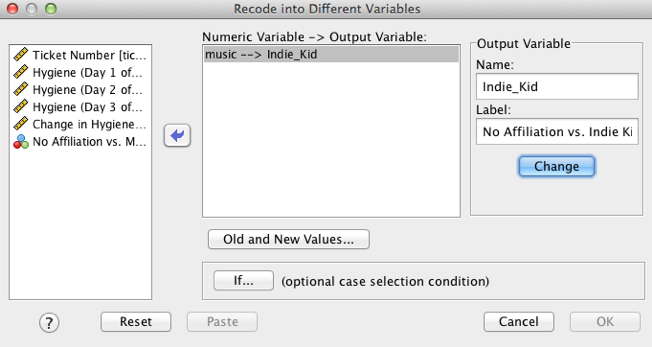
Recode dialog box
We need to tell SPSS how to recode the values of the variable music
into the values that we want for the new variable,
Indie_Kid. To do this click on to access
the dialog box below. For this dummy variable, we want anyone who was an
indie kid to get a code of 1 and everyone else to get a code of 0. Now,
indie kid was coded with the value 1 in the original variable, so you
need to type the value 1 in the section labelled Old Value in
the box labelled Value. The new value we want is 1, so we need
to type the value 1 in the section labelled New Value in the
box labelled Value. When you’ve done this, click on to add this
change to the list of changes. The next thing we need to do is to change
the remaining groups to have a value of 0 for the first dummy variable.
To do this just select and type the value 0 in the section labelled New
Value in the box labelled Value. When you’ve done this, click to add this
change to the list of changes. Then click to return
to the main dialog box, and then click to create the
dummy variable. This variable will appear as a new column in the data
editor, and you should notice that it will have a value of 1 for anyone
originally classified as an indie kid and a value of 0 for everyone
else.
Recode dialog box
Self-test 11.8
Use what you learnt in Chapter 9 to fit a linear model using the change scores as the outcome, and the three dummy variables as predictors.
Select Analyze > Regression > Linear … to access the main dialog box, which you should complete as below. Use the book chapter to determine what other options you want to select. The output and interpretation are in the book chapter.
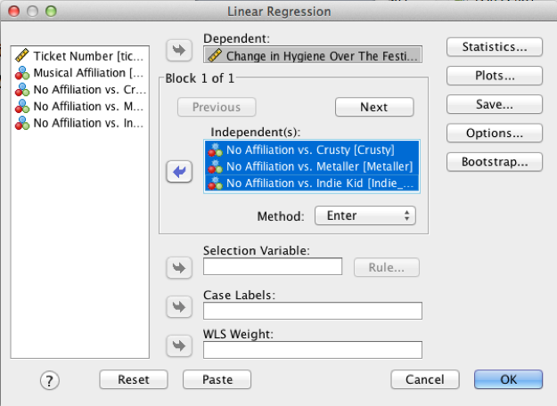
Regression dialog box
Chapter 12
Self-test 12.1
To illustrate what is going on I have created a file called Puppies Dummy.sav that contains the puppy therapy data along with the two dummy variables (dummy1 and dummy2) we’ve just discussed (Table 10.2). Fit a linear model predicting happiness from dummy1 and dummy2. If you’re stuck, read Chapter 9 again.
Self-test 12.2
To illustrate these principles, I have created a file called Puppies Contrast.sav in which the puppy therapy data are coded using the contrast coding scheme used in this section. Fit a linear model using happiness as the outcome and dummy1 and dummy2 as the predictor variables (leave all default options).
Self-test 12.3
Can you explain the contradiction between the planned contrasts and post hoc tests?
The answer is given in the book chapter.
Self-test 12.4
Produce a line chart with error bars for the puppy therapy data.
Completed dialog box
Chapter 13
Self-test 13.1
Use SPSS Statistics to find the means and standard deviations of both happiness and love of puppies across all participants and within the three groups.
You could do this using the Analyze > Descriptive Statistics > Explore dialog box:
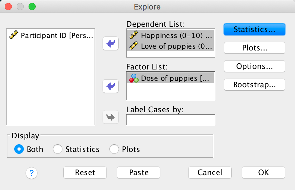
Completed dialog box
Answers are in Table 13.2 of the chapter.
Self-test 13.2
Add two dummy variables to the file Puppy Love.sav that compare the 15-minute group to the control (Dummy 1) and the 30-minute group to the control (Dummy 2) – see Section 12.2 for help. If you get stuck use Puppy Love Dummy.sav.
The data should look like the file Puppy Love Dummy.sav.
Self-test 13.3
Fit a hierarchical regression with Happiness as the outcome. In the first block enter love of puppies (Puppy_love) as a predictor, and then in a second block enter both dummy variables (forced entry) – see Section 9.10 for help.
To get to the main regression dialog box select Analyze >
Regression > Linear …. Drag the outcome variable
(Puppy_love) the box labelled Dependent (or
click ![]() ). To
specify the predictor variable for the first block we drag
Puppy_love to the box labelled Independent(s)
(or click
). To
specify the predictor variable for the first block we drag
Puppy_love to the box labelled Independent(s)
(or click ![]() .
Underneath the Independent(s) box, there is a drop-down menu
for specifying the Method of regression. The default option is
forced entry, and this is the option we want.
.
Underneath the Independent(s) box, there is a drop-down menu
for specifying the Method of regression. The default option is
forced entry, and this is the option we want.
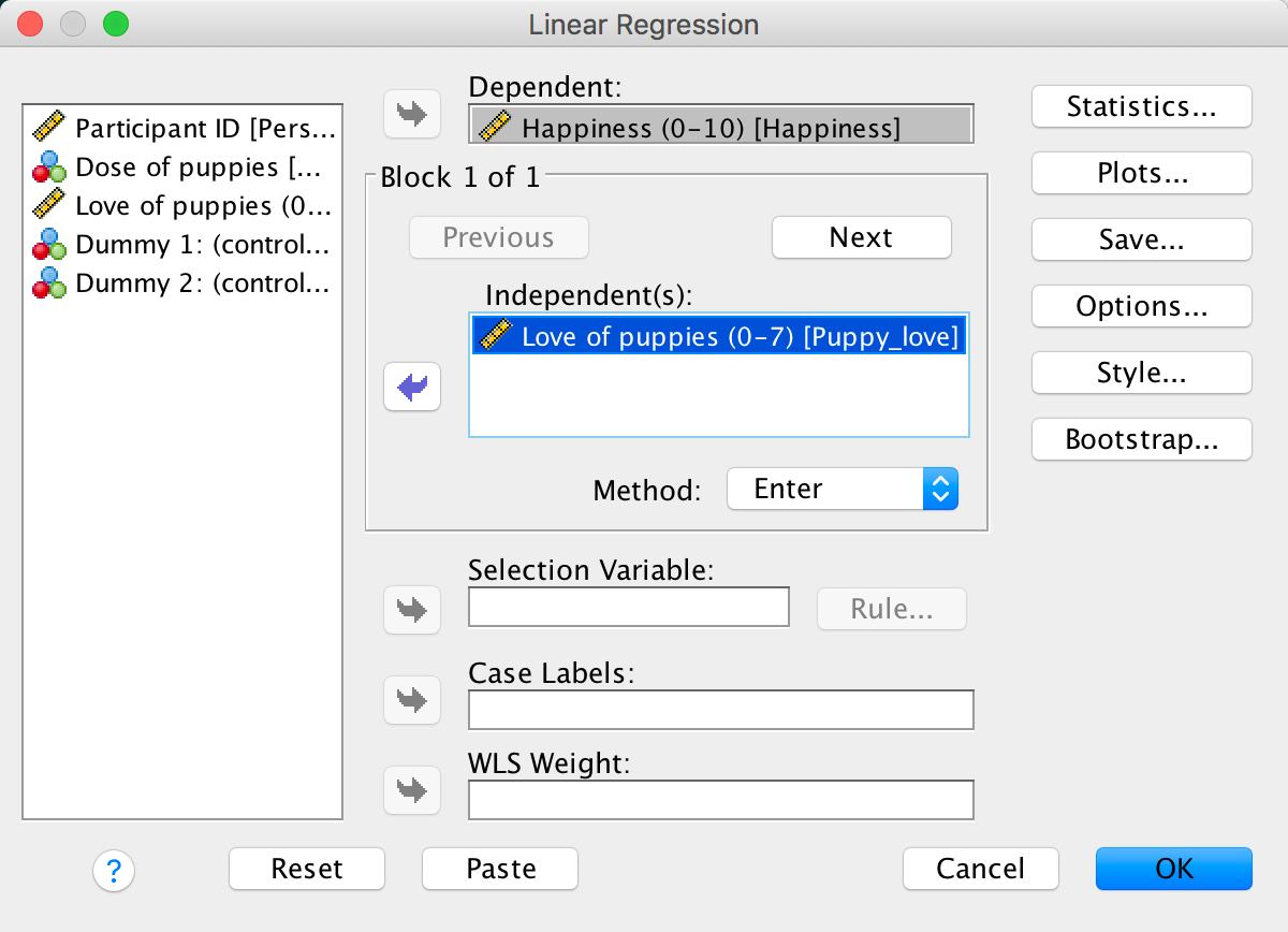
Completed dialog box
To specify the second block click  . This process
clears the Independent(s) box so that you can enter the new
predictors (you should also note that above this box it now reads
Block 2 of 2, indicating that you are in the second block of
the two that you have so far specified). The second block must contain
both of the dummy variables, so you should drag on
Low_Control and High_Control from the
variable list to the Independent(s) box (or click
. This process
clears the Independent(s) box so that you can enter the new
predictors (you should also note that above this box it now reads
Block 2 of 2, indicating that you are in the second block of
the two that you have so far specified). The second block must contain
both of the dummy variables, so you should drag on
Low_Control and High_Control from the
variable list to the Independent(s) box (or click ![]() ). We
also want to leave the method of regression set to Enter.
). We
also want to leave the method of regression set to Enter.
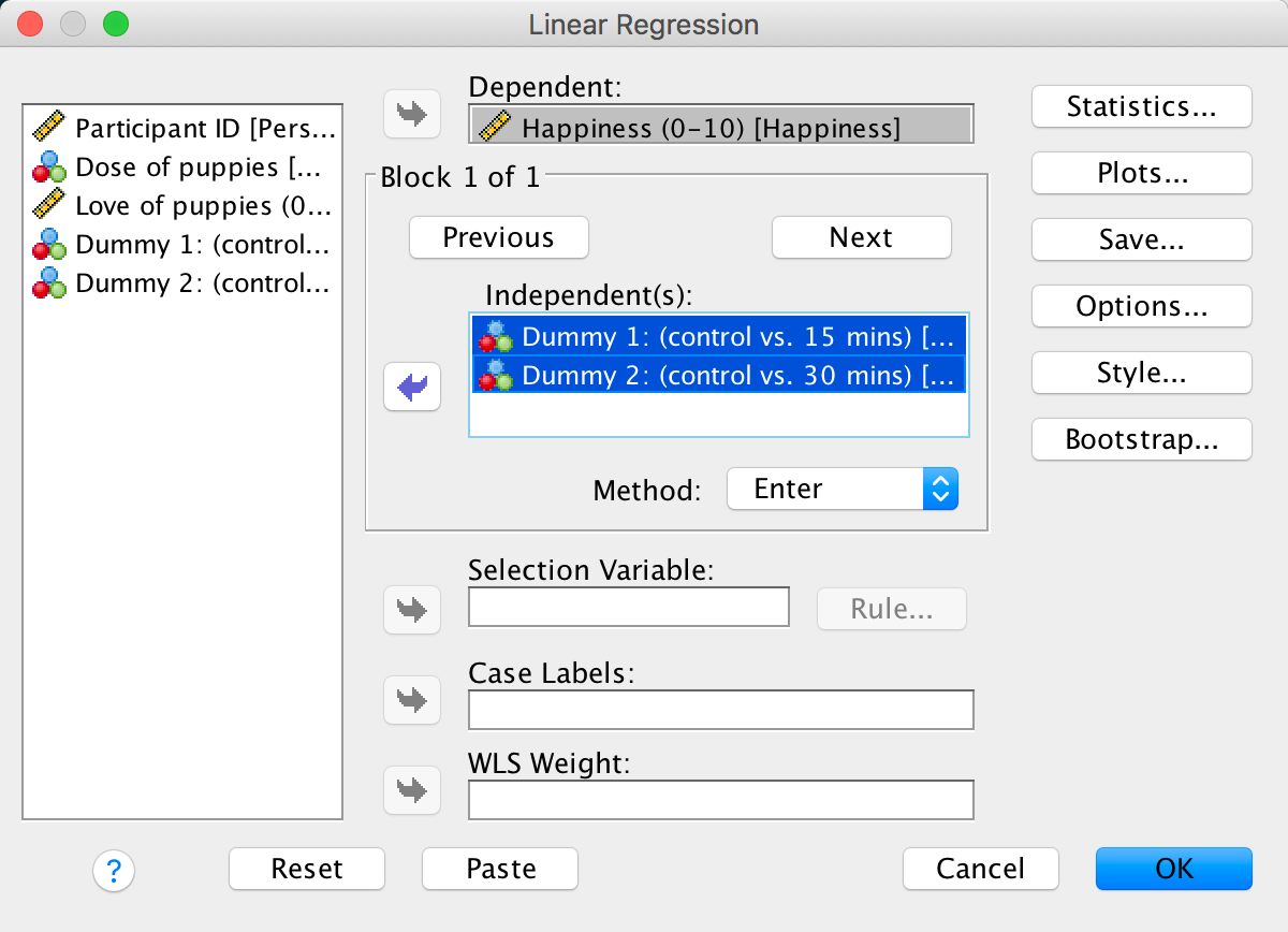
Completed dialog box
Outut 13.1 shows the results that you should get and the text in the chapter explains this output.
Self-test 13.4
Fit a model to test whether love of puppies (our covariate) is independent of the dose of puppy therapy (our independent variable).
We can do this analysis by selecting either Analyze > Compare Means > One-Way ANOVA… or Analyze > General Linear Model > Univariate…. If we do the latter then we can follow the example in the chapter but drag the covariate (Puppy_love) to the box labelled Dependent Variable and exclude Happiness from the model. The completed dialog box would look like this:
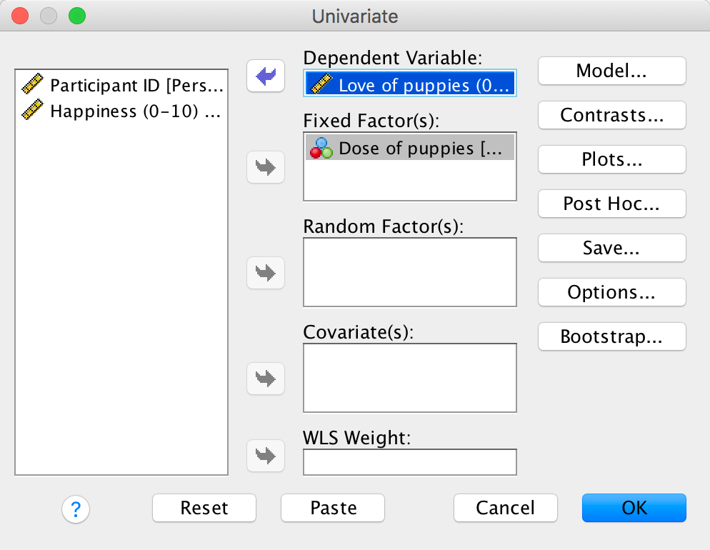
Completed dialog box
Self-test 13.5
Fit the model without the covariate to see whether the three groups differ in their levels of happiness.
We can do this analysis by selecting either Analyze > Compare Means > One-Way ANOVA… or Analyze > General Linear Model > Univariate…. If we do the latter then we can follow the example in the chapter exclude the covariate (Puppy_love). The completed dialog box would look like this:
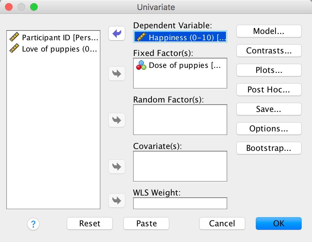
Completed dialog box
The output is in the book chapter.
Self-test 13.6
Produce a scatterplot of love of puppies (horizontal axis) against happiness (vertical axis).
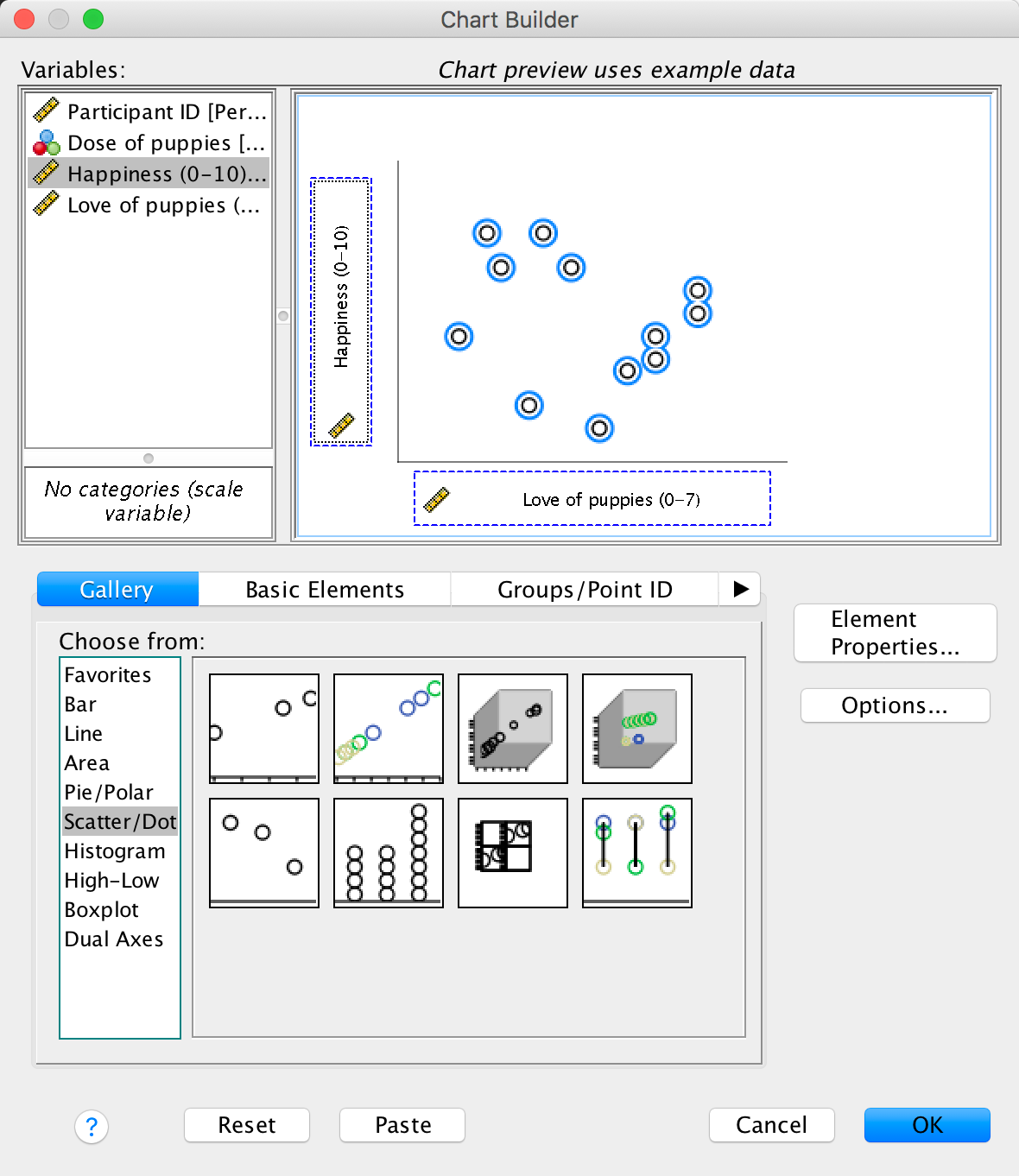
Completed dialog box
The scatterplot itself is in the book chapter.
Self-test 13.7
Rerun the analysis but select Estimates of effect size in Figure 13.7. Do the values of partial eta squared match the ones we have just calculated?
You should get the following output:
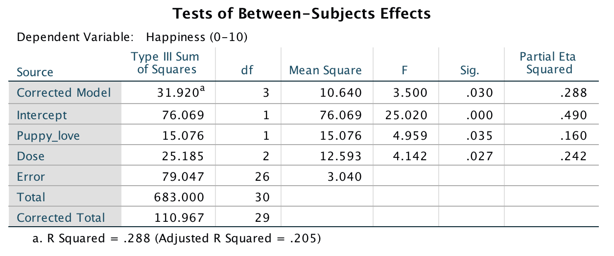
Output including effect sizes
This table is the same as the main output from the chapter, except that there is an extra column at the end with the values of partial eta-squared. For Dose, partial eta-squared is .24, and for Puppy_love it is .16, both of which are the same values as the hand-calculations in the chapter.
Chapter 14
Self-test 14.1
The file GogglesRegression.sav contains the dummy variables used in this example. Just to prove that this works, use this file to fit a linear model predicting attractiveness ratings from FaceType, Alcohol and the interaction variable.
Select Analyze > Regression > Linear … and complete the dialog box as below. The output is shown in Output 14.1 of the book.
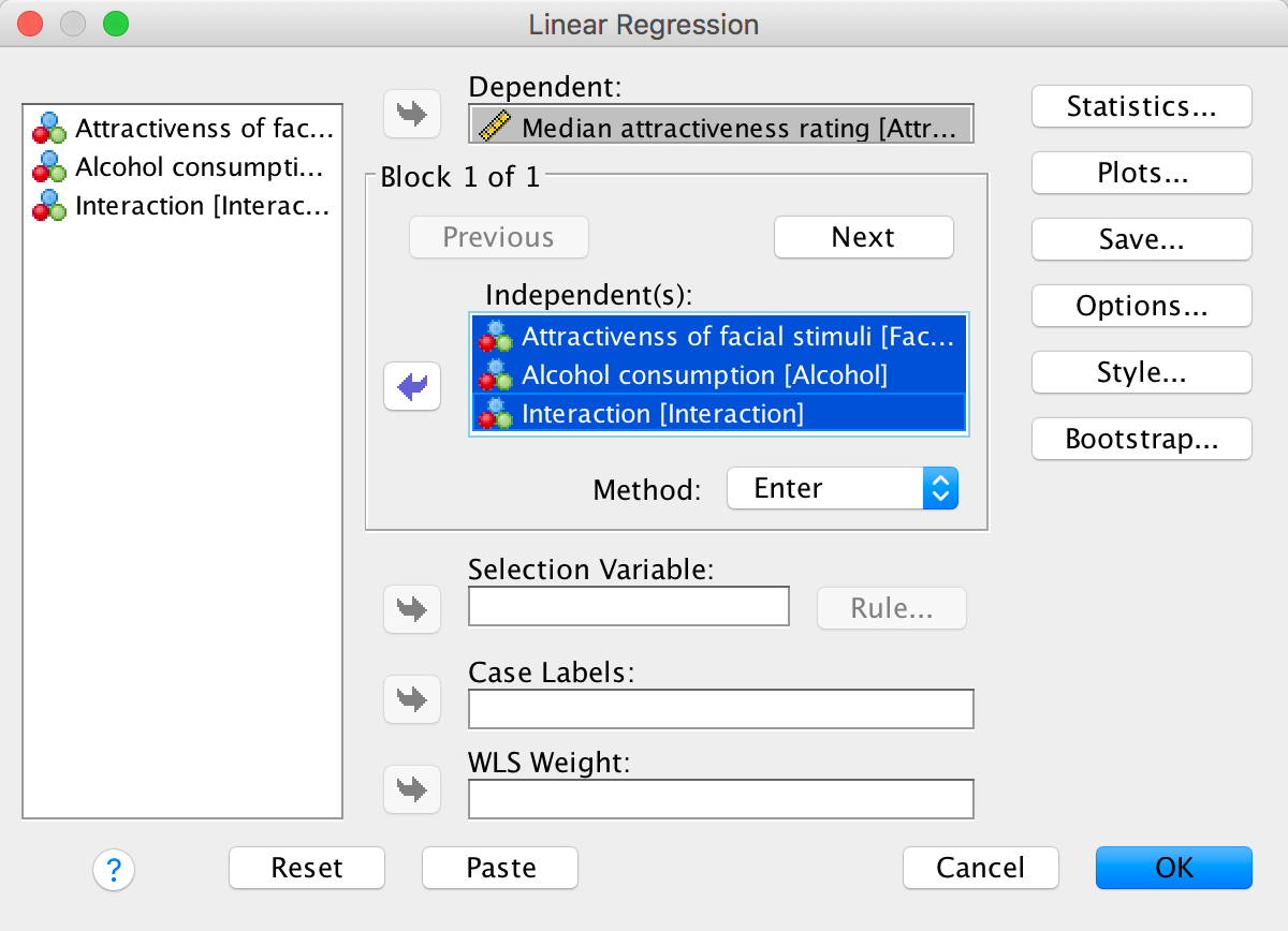
Completed dialog box
Self-test 14.2
Use the Chart Builder to plot an error bar graph of the attractiveness ratings with alcohol consumption on the x-axis and different coloured lines to represent whether the faces being rated were unattractive or attractive.
Select Graphs > Chart Builder … and complete the dialog box as below.
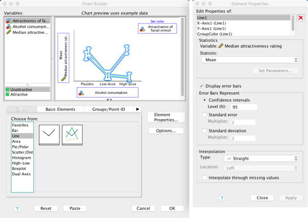
Completed dialog box
Self-test 14.3
What about panels (c) and (d): do you think there is an interaction?
This question is answered in the text in the chapter.
Chapter 15
Self-test 15.1
What is a repeated-measures design? (Clue: it is described in Chapter 1.)
Repeated-measures is a term used when the same entities participate in all conditions of an experiment.
Self-test 15.2
Devise some contrast codes for the contrasts described in the text.
The answer is in Table 15.3 in the chapter.
Self-test 15.3
What does contrast 3 (Level 3 vs. Level 4) compare?
Answers are in the text within the chapter.
Self-test 15.4
Once these variables have been created, enter the data as in Table 15.4. If you have problems entering the data then use the file Attitude.sav.
The correct data layout is shown in the file Attitude.sav.
Self-test 15.5
Try rerunning these post hoc tests but select the uncorrected values (LSD) in the options dialog box (see Section 13.8.5). You should find that the difference between beer and water is now significant (p = 0.02).
Follow the instructions in the chapter but when selecting from the
drop down list for post hoc tests (see below), select
LSD(none) before clicking .
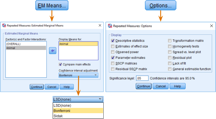
Completed dialog box
Self-test 15.6
Why do you think that this contradiction has occurred?
It’s because the contrasts have more power to detect differences than post hoc tests.
Chapter 16
Self-test 16.1
In the data editor create nine variables with the names and variable labels given in Figure 16.3. Create a variable Strategy with value labels 0 = normal, 1 = hard to get.
The data in the file LooksOrPersonality.sav show how the variables should be set up.
Self-test 16.2
Enter the data as in Table 16.1. If you have problems then use the file LooksOrPersonality.sav.
The data in the file LooksOrPersonality.sav show how the variables should be set up.
Self-test 16.3
Output 16.2 shows information about sphericity. Based on what you have already learnt, what would you conclude form this information?
Answers are in the text within the chapter.
Self-test 16.4
What is the difference between a main effect and an interaction?
A main effect is the unique effect of a predictor variable (or independent variable) on an outcome variable. In this context it can be the effect of strategy, charisma or looks on their own. So, in the case of strategy, the main effect is the difference between the average ratings of all dates that played hard to get (irrespective of their attractiveness or charisma) and all dates that acted normally (irrespective of their attractiveness or charisma). The main effect of looks would be the mean rating given to all attractive dates (irrespective of their charisma, or whether they played hard to get or acted normally), compared to the average rating given to all average-looking dates (irrespective of their charisma, or whether they played hard to get or acted normally) and the average rating of all ugly dates (irrespective of their charisma, or whether they played hard to get or acted normally). An interaction, on the other hand, looks at the combined effect of two or more variables: for example, were the average ratings of attractive, ugly and average-looking dates different when those dates played hard to get compared to when they acted normally?
Self-test 16.5
Based on Output 16.4, was the assumption of homogeneity of variance met?
Answers are in the text within the chapter.
Self-test 16.6
Based on the previous section, on what you have learned in previous chapters and on Output 16.3, can you interpret the main effect of Looks?
Answers are in the text within the chapter.
Chapter 17
Self-test 17.1
What is a cross-product?
Cross-products represent a total value for the combined error between two variables (in some sense they represent an unstandardized estimate of the total correlation between two variables).
Self-test 17.2
Why might the univariate tests be non-significant when the multivariate tests were significant?
The answer is in the chapter:
“The reason for the anomaly is that the multivariate test takes account of the correlation between outcome variables and looks at whether groups can be distinguished by a linear combination of the outcome variables. This suggests that it is not thoughts or actions in themselves that distinguish the therapy groups, but some combination of them. The discriminant function analysis will provide more insight into this conclusion.”
Self-test 17.3
Based on what you have learnt in previous chapters, interpret the table of contrasts in your output.
In the chapter I suggested carrying out a simple contrast that compares each of the therapy groups to the no-treatment control group. The output below shows the results of these contrasts. The table is divided into two sections conveniently labelled Level 1 vs. Level 3 and Level 2 vs. Level 3 where the numbers correspond to the coding of the group variable. If you coded the group variable using the same codes as I did, then these contrasts represent CBT vs. NT and BT vs. NT respectively. Each contrast is performed on both dependent variables separately and so they are identical to the contrasts that would be obtained from a univariate ANOVA. The table provides values for the contrast estimate and the hypothesized value (which will always be zero because we are testing the null hypothesis that the difference between groups is zero). The observed estimated difference is then tested to see whether it is significantly different from zero based on the standard error. A 95% confidence interval is produced for the estimated difference.
The first thing that you might notice (from the values of Sig.) is that when we compare CBT to NT there are no significant differences in thoughts (p = 0.104) or behaviours (p = 0.872) because both values are above the 0.05 threshold. However, comparing BT to NT, there is no significant difference in thoughts (p = 0.835) but there is a significant difference in behaviours between the groups (p = 0.044). The confidence intervals confirm these findings: they all include zero (the lower bounds are negative whereas the upper bounds are positive) except for the BT vs. NT contrast for behaviours. Assuming that these intervals are from the 95% that contain the population value, this means that all of these effects might be 0 in the population, except for the effect of BT vs. NT for behaviours. This finding is a little unexpected because the univariate ANOVA for behaviours was non-significant and so we would not expect there to be significant group differences.
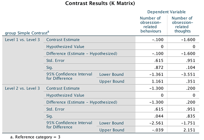
Output
Chapter 18
Self-test 18.1
What is the equation of a straight line/linear model?
As shown in the book:
\[ Y_i = b_1X_{\text{1}i} + b_2X_{\text{2}i} + \ldots + b_nX_{ni} \]
Self-test 18.2
Having done this, select the Direct Oblimin option in Figure 18.12 and repeat the analysis. You should obtain two outputs identical in all respects except that one used an orthogonal rotation and the other an oblique.
This should be self-explanatory from the book chapter.
Self-test 18.3
Use the case summaries command (Section 9.11.6) to list the factor scores for these data (given that there are over 2500 cases, restrict the output to the first 10).
To list the factor scores select Analyze > Reports > Case Summaries …. Drag the variables that you want to list (in this case the four columns of factor scores) to the box labelled Variables. By default, SPSS will limit the output to the first 100 cases, but let’s set this to 10 so we just look at the first few cases (as in the book chapter).
Completed dialog box
Self-test 18.4
Thinking back to Chapter 1, what are reliability and test–retest reliability?
The answer is given in the text.
Self-test 18.5
Use the compute command to reverse-score item 3 (see Chapter 6; remember that you are changing the variable to 6 minus its original value)
To access the compute dialog box, select Transform > Compute Variable …. Enter the name of the variable that we want to change in the space labelled Target Variable (in this case the variable is called Question_03). You can use a different name if you like, but if you do SPSS will create a new variable and you must remember that it’s this new variable that you need to use in the reliability analysis. Then, where it says Numeric Expression you need to tell SPSS how to compute the new variable. In this case, we want to take each person’s original score on item 3, and subtract that value from 6. Therefore, we simply type 6–Question_03 (which means 6 minus the value found in the column labelled Question_03). If you’ve used the same name then when you click you’ll get a dialog box asking if you want to change the existing variable; just click if you’re happy for the new values to replace the old ones.
Self-test 18.6
Run reliability analysis on the other three subscales.
The outputs and interpretation are in the chapter.
Chapter 19
Self-test 19.1
Fit a linear model with LnObserved as the outcome, and Training, Dance and Interaction as the three predictors.
The multiple regression dialog box will look like the figure below. We can leave all of the default options as they are because we are interested only in the regression parameters. The regression parameters are shown in the book.
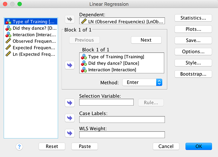
Self-test 19.2
Fit another linear model using Cat Regression.sav. This time the outcome is the log of expected frequencies (LnExpected) and Training and Dance are the predictors (the interaction is not included).
The multiple regression dialog box will look like this:
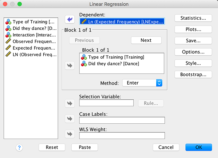
We can leave all of the default options as they are because we are interested only in the regression parameters. The resulting regression parameters are shown below. Note that b_0 = 3.16, the beta coefficient for the type of training is 1.45 and the beta coefficient for whether they danced is 0.49. All of these values are consistent with those calculated in the book chapter.
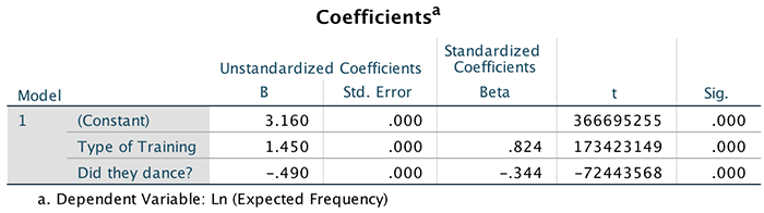
Self-test 19.3
Using the Cats Weight.sav data, change the frequency of cats that had food as reward and didn’t dance from 10 to 28. Redo the chi-square test and select and interpret z-tests (Compare column proportions). Is there anything about the results that seems strange?
You need to change the score so your data look like this:
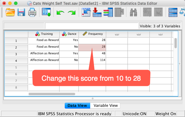
The data are the same as in the chapter so you can follow the instructions in the book to run the analysis. The contingency table you get looks like this:
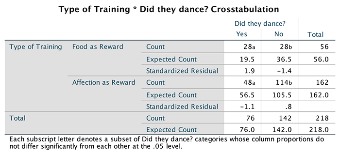
In the row labelled Food as Reward the count of 28 in the column labelled No has a subscript letter a, and in the column labelled Yes the count of 28 has a subscript letter b. These subscripts tell us the results of the z-test that we asked for: columns with different subscripts have significantly different column proportions. This is what should strike you as strange: how can it be that two identical counts of 28 can be deemed significantly different? The answer is that despite the subscripts being attached to the counts, that isn’t what they compare: they compare the proportion of the total frequency of that column that falls into that row against the proportion of the total frequency of the second column that falls into that row. In this case, it’s testing whether 19.7% is different from 36.8%, and it is (p < 0.05), which is why the column counts have been denoted with different letters. So, of all the cats that danced, 36.8% had food, and of all the cats that didn’t dance, 19.7% had food. These proportions are significantly different.
Self-test 19.4
Use Section 19.7.3 to help you to create a contingency table with Dance as the columns, Training as the rows and Animal as a layer.
Select Analyze > Descriptive Statistics > Crosstabs ….
We have three variables in our crosstabulation table: whether the animal
danced or not (Dance), the type of reward given
(Training), and whether the animal was a cat or dog
(Animal). Drag Training into the box
labelled Row(s) (or click ![]() ). Next,
drag Dance to the box labelled Column(s) (or
click
). Next,
drag Dance to the box labelled Column(s) (or
click ![]() ).
Finally,drag Animal to the box labelled Layer 1 of
1 (or click
).
Finally,drag Animal to the box labelled Layer 1 of
1 (or click ![]() ). The
completed dialog box should look like this:
). The
completed dialog box should look like this:
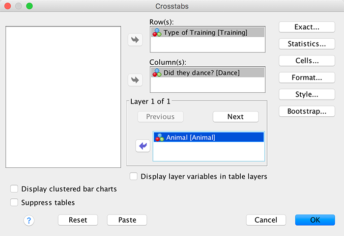
Click  and select
these options:
and select
these options:
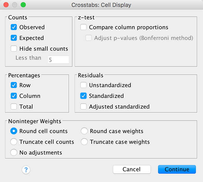
Self-test 19.5
Use the split file command (see Section 6.10.4) to run a chi-square test on Dance and Training for dogs and cats.
Select Date > Split File … and then select Organize
output by groups. Once this option is selected, the Groups
Based on box will activate. Drag Animal) into this
box (or click ![]() ):
):
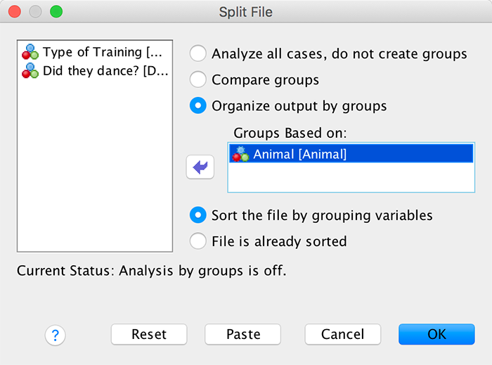
To run the chi-square tests, select Analyze > Descriptive
Statistics > Crosstabs …. Drag Training into
the box labelled Row(s) (or click ![]() ). Next,
drag Dance to the box labelled Column(s) (or
click
). Next,
drag Dance to the box labelled Column(s) (or
click ![]() ). The
completed dialog box should look like this:
). The
completed dialog box should look like this:
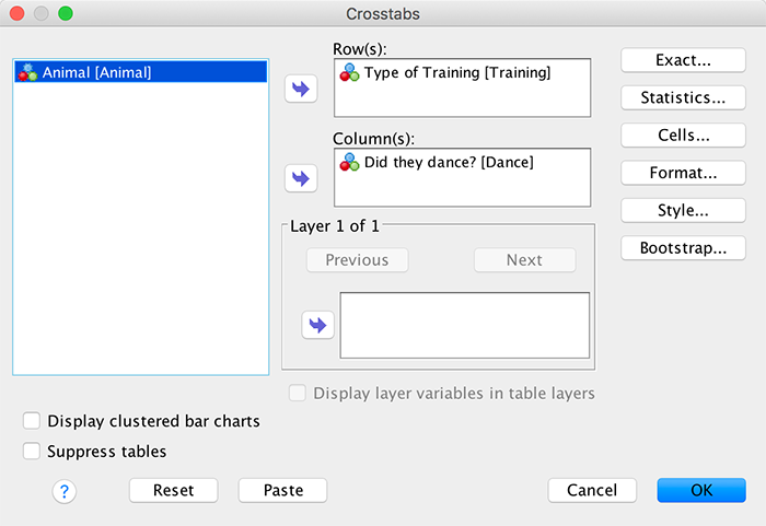
Select the same options as in the book (for the cat example).
Chapter 20
Self-test 20.1
Using equations (20.9) and (20.11), calculate the values of Cox and Snell’s and Nagelkerke’s \(R^2\). (Remember the sample size, N, is 113.)
SPSS reports \(-2LL_\text{new}\) as 144.16 and \(-2LL_\text{baseline}\) as 154.08. The sample size, N, is 113. So Cox and Snell’s \(R^2\) is calculated as follows:
\[ \begin{aligned} R_{\text{CS}}^2 &= 1-exp\bigg(\frac{-2LL_\text{new}-(-2LL_\text{baseline})}{n}\bigg) \\ &= 1-exp\bigg(\frac{144.16-154.08}{113}\bigg) \\ &= 1-exp(-0.0878) \\ &= 1-e^{-0.0878} \\ &= 0.084 \end{aligned} \]
Nagelkerke’s adjustment is calculated as:
\[ \begin{aligned} R_{\text{N}}^2 &= \frac{R_{\text{CS}}^2}{1-exp(-(\frac{-2LL_\text{baseline}}{n}))} \\ &= \frac{0.084}{1-exp(-(\frac{154.08}{113}))} \\ &= \frac{0.084}{1-e^{-1.3635}} \\ &= \frac{0.084}{1-0.2558} \\ &= 0.113 \end{aligned} \]
Self-test 20.2
Use the case summaries function to create a table for the first 15 cases in the file Eel.sav showing the values of Cured, Intervention, Duration, the predicted probability (PRE_1) and the predicted group membership (PGR_1) for each case.
The completed dialog box should look like this:
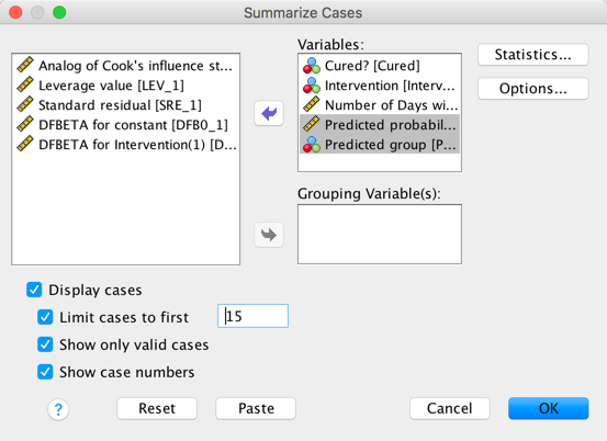
Self-test 20.3
Conduct a hierarchical logistic regression analysis on these data. Enter Previous and PSWQ in the first block and Anxious in the second (forced entry). There is a full guide on how to do the analysis and its interpretation on the companion website.
To run the analysis, bring up the main Logistic Regression dialog
box, by selecting Analyze > Regression > Binary Logistic
…. Drag the variable scored from the variables
list to the box labelled Dependent (or click ![]() ). Next,
drag PSWQ and Previous from the
variables list to the box labelled Covariates (or click
). Next,
drag PSWQ and Previous from the
variables list to the box labelled Covariates (or click ![]() ). Our
first block of variables is now specified:
). Our
first block of variables is now specified:
To specify the second block, click  to clear the
Covariates box, which should now be labelled Block 2 of
2. Now drag Anxious from the variables list to the
box labelled Covariates (or click
to clear the
Covariates box, which should now be labelled Block 2 of
2. Now drag Anxious from the variables list to the
box labelled Covariates (or click ![]() ). We
could at this stage select some interactions to be included in the
model, but unless there is a sound theoretical reason for believing that
the predictors should interact there is no need. Make sure that
Enter is selected as the method of regression (this method is
the default and so should be selected already). Once the variables have
been specified, you should select the options described in the chapter,
but because none of the predictors are categorical there is no need to
use the option. When you have selected the options and residuals that
you want you can return to the main Logistic Regression dialog
box and click
). We
could at this stage select some interactions to be included in the
model, but unless there is a sound theoretical reason for believing that
the predictors should interact there is no need. Make sure that
Enter is selected as the method of regression (this method is
the default and so should be selected already). Once the variables have
been specified, you should select the options described in the chapter,
but because none of the predictors are categorical there is no need to
use the option. When you have selected the options and residuals that
you want you can return to the main Logistic Regression dialog
box and click  :
:
The output of the logistic regression will be arranged in terms of the blocks that were specified. In other words, SPSS Statistics will produce a regression model for the variables specified in block 1, and then produce a second model that contains the variables from both blocks 1 and 2. First, the output shows the results from block 0: the output tells us that 75 cases have been accepted, and that the dependent variable has been coded 0 and 1 (because this variable was coded as 0 and 1 in the data editor, these codings correspond exactly to the data in SPSS). We are then told about the variables that are in and out of the equation. At this point only the constant is included in the model, and so to be perfectly honest none of this information is particularly interesting:
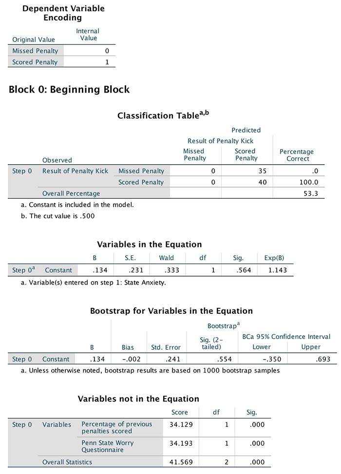
The results from block 1 are shown next, and in this analysis we forced SPSS to enter Previous and PSWQ into the regression model. Therefore, this part of the output provides information about the model after the variables Previous and PSWQ have been added. The first thing to note is that -2LL is 48.66, which is a change of 54.98 (which is the value given by the model chi-square). This value tells us about the model as a whole, whereas the block tells us how the model has improved since the last block. The change in the amount of information explained by the model is significant (p < 0.001), and so using previous experience and worry as predictors significantly improves our ability to predict penalty success. A bit further down, the classification table shows us that 84% of cases can be correctly classified using PSWQ and Previous. In the intervention example, Hosmer and Lemeshow’s goodness-of-fit test was 0. The reason is that this test can’t be calculated when there is only one predictor and that predictor is a categorical dichotomy! However, for this example the test can be calculated. The important part of this test is the test statistic itself (7.93) and the significance value (0.3388). This statistic tests the hypothesis that the observed data are significantly different from the predicted values from the model. So, in effect, we want a non-significant value for this test (because this would indicate that the model does not differ significantly from the observed data). We have a non-significant value here, which is indicative of a model that is predicting the real-world data fairly well. The part of the output labelled Variables in the Equation then tells us the parameters of the model when Previous and PSWQ are used as predictors. The significance values of the Wald statistics for each predictor indicate that both PSWQ and Previous significantly predict penalty success (p < 0.01). The value of the odds ratio (Exp(B)) for Previous indicates that if the percentage of previous penalties scored goes up by one, then the odds of scoring a penalty also increase (because the odds ratio is greater than 1). The confidence interval for this value ranges from 1.02 to 1.11, so we can be very confident that the value of the odds ratio in the population lies somewhere between these two values. What’s more, because both values are greater than 1 we can also be confident that the relationship between Previous and penalty success found in this sample is true of the whole population of footballers. The odds ratio for PSWQ indicates that if the level of worry increases by one point along the Penn State worry scale, then the odds of scoring a penalty decrease (because it is less than 1). The confidence interval for this value ranges from 0.68 to 0.93 so the value of the odds ratio in the population lies somewhere between these two values (assuming this sample is one of the 95% that yield confidence intervals containing the population values). In addition, because both values are less than 1 the relationship between PSWQ and penalty success found in this sample is true of the whole population of footballers. If we had found that the confidence interval ranged from less than 1 to more than 1, then this would limit the generalizability of our findings because the odds ratio in the population could indicate either a positive (odds ratio > 1) or negative (odds ratio < 1) relationship. A glance at the classification plot also brings us good news because most cases are clustered at the ends of the plot and few cases lie in the middle of the plot. This reiterates what we know already: that the model is correctly classifying most cases.
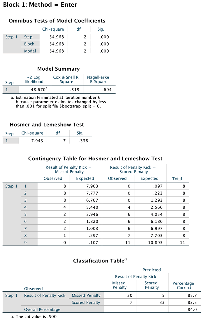
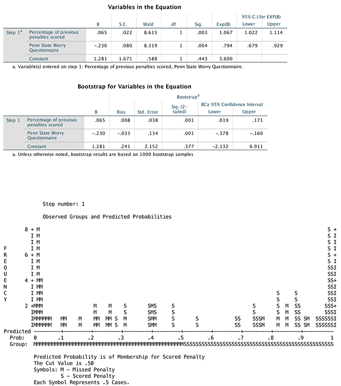
The output for block 2 shows what happens to the model when our new predictor is added (Anxious). So, we begin with the model that we had in block 1 and we add Anxious to it. The effect of adding Anxious to the model is to reduce –2LL to 47.416 (a reduction of 1.246 from the model in block 1 as shown in the model chi-square and block statistics). This improvement is non-significant, which tells us that including Anxious in the model has not significantly improved our ability to predict whether a penalty will be scored or missed. The classification table tells us that the model is now correctly classifying 85.33% of cases. Remember that in block 1 there were 84% correctly classified and so an extra 1.33% of cases are now classified (not a great deal more – in fact, examining the table shows us that only one extra case has now been correctly classified). The table labelled Variables in the Equation now contains all three predictors and something very interesting has happened: PSWQ is still a significant predictor of penalty success; however, Previous experience no longer significantly predicts penalty success. In addition, state anxiety appears not to make a significant contribution to the prediction of penalty success. How can it be that previous experience no longer predicts penalty success, and neither does anxiety, yet the ability of the model to predict penalty success has improved slightly?
The classification plot is similar to before and the contribution of PSWQ to predicting penalty success is relatively unchanged. What has changed is the contribution of previous experience. If we examine the values of the odds ratio for both Previous and Anxious it is clear that they both potentially have a positive relationship to penalty success (i.e., as they increase by a unit, the odds of scoring improve). However, the confidence intervals for these values cross 1, which indicates that the direction of this relationship may be unstable in the population as a whole (i.e., the value of the odds ratio in our sample may be quite different from the value if we had data from the entire population).
You may be tempted to use this final model to say that, although worry is a significant predictor of penalty success, the previous finding that experience plays a role is incorrect. This would be a dangerous conclusion to draw, and if you read the section on multicollinearity in the book you’ll see why.
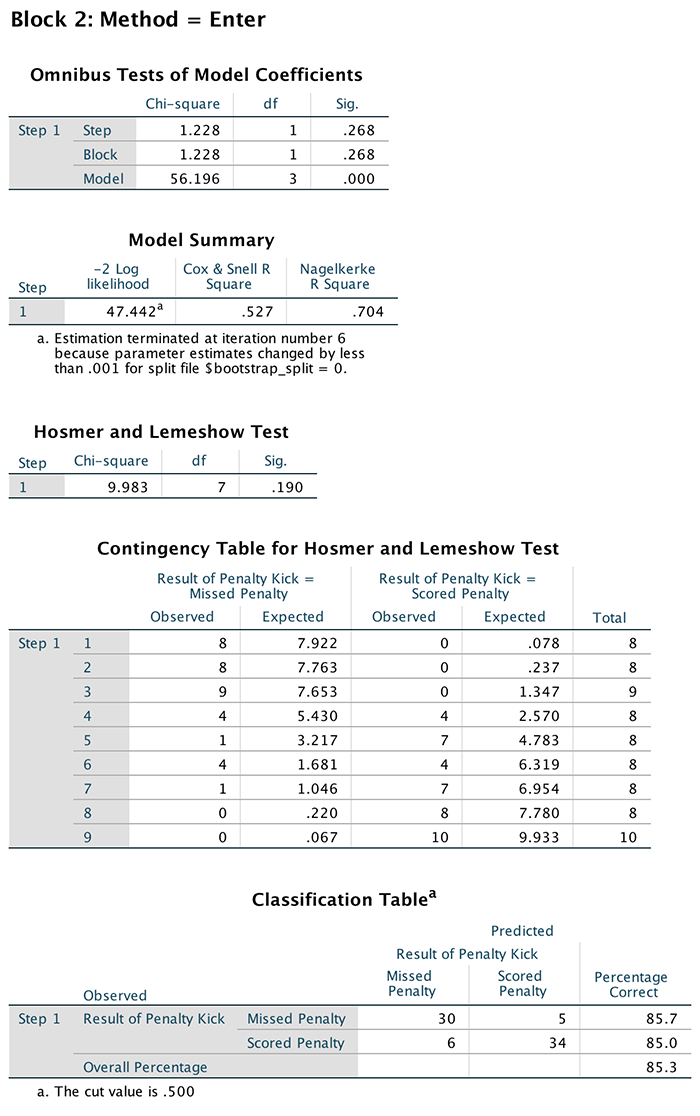
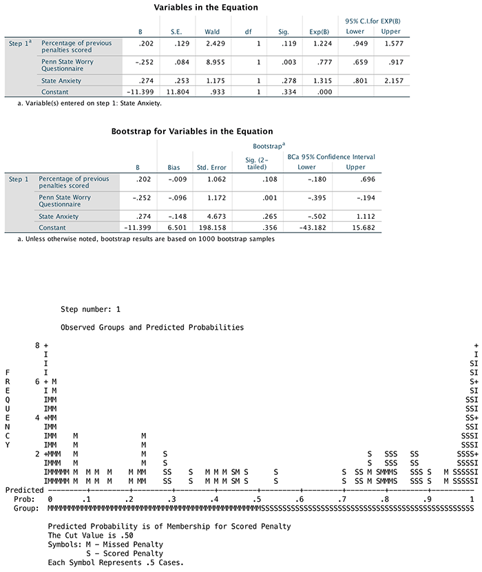
Self-test 20.4
Try creating two new variables that are the natural logs of Anxious and Previous.
First of all, the completed dialog box for *PSWQ** is shown below to give you some idea of how this variable is created (following the instructions in the chapter).
For Anxious, create a new variable called
LnAnxious by entering this name into the box labelled
Target Variable and then click  and give
the variable a more descriptive name such as Ln(anxiety). In
the list box labelled Function group, click Arithmetic
and then in the box labelled Functions and Special Variables
click Ln (this is the natural log transformation) and transfer
it to the command area by clicking on
and give
the variable a more descriptive name such as Ln(anxiety). In
the list box labelled Function group, click Arithmetic
and then in the box labelled Functions and Special Variables
click Ln (this is the natural log transformation) and transfer
it to the command area by clicking on ![]() . Replace
the question mark with the variable Anxious by dragging
the variable from the list to inside the brackets, selecting the
variable in the list and clicking
. Replace
the question mark with the variable Anxious by dragging
the variable from the list to inside the brackets, selecting the
variable in the list and clicking ![]() or
typing ‘Anxious’ where the question mark is. click to create the
variable.
or
typing ‘Anxious’ where the question mark is. click to create the
variable.
For Previous, create a new variable called
LnPrevious by entering this name into the box labelled
Target Variable and then click and give
the variable a more descriptive name such as Ln(previous
performance). In the list box labelled Function group,
click Arithmetic and then in the box labelled Functions and
Special Variables click Ln (this is the natural log
transformation) and transfer it to the command area by clicking on ![]() . Replace
the question mark with the variable Previous by
dragging the variable from the list to inside the brackets, selecting
the variable in the list and clicking
. Replace
the question mark with the variable Previous by
dragging the variable from the list to inside the brackets, selecting
the variable in the list and clicking ![]() or
typing ‘Anxious’ where the question mark is. click to create the
variable.
or
typing ‘Anxious’ where the question mark is. click to create the
variable.
Alternatively, you can create all three variables in one go using this syntax:
COMPUTE LnPSWQ= LN(PSWQ).
VARIABLE LABELS  LnPSWQ 'Ln(PSWQ)'.
COMPUTE LnAnxious= LN(Anxious).
VARIABLE LABELS  LnAnxious 'Ln(Anxious)'.
COMPUTE LnPrevious= LN(Previous).
VARIABLE LABELS  LnPrevious 'Ln(Previous Performance)'.
EXECUTE.
Self-test 20.5
Using what you learned in Chapter 8, carry out a Pearson correlation between all the variables in this analysis. Can you work out why we have a problem with collinearity?
The results of your analysis should look like this:
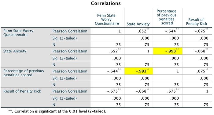
From this output we can see that Anxious and Previous are highly negatively correlated (r = 0.99); in fact they are nearly perfectly correlated. Both Previous and Anxious correlate with penalty success but because they are correlated so highly with each other, it is unclear which of the two variables predicts penalty success in the regression. As such our multicollinearity stems from the near-perfect correlation between Anxious and Previous.
Self-test 20.6
Think about the three categories that we have as an outcome variable. Which of these categories do you think makes most sense as a baseline category?
Answer is given in the text of the chapter.
Self-test 20.6
What does the log-likelihood measure?
The log-likelihood statistic is analogous to the residual sum of squares in multiple regression in the sense that it is an indicator of how much unexplained information there is after the model has been fitted. It follows, therefore, that large values of the log-likelihood statistic indicate poorly fitting statistical models, because the larger the value of the log-likelihood, the more unexplained observations there are.
Self-test 20.7
Why might the Pearson and deviance statistics be different? What could this be telling us?
Answer is given in the text of the chapter.
Self-test 20.8
Use what you learnt earlier in this chapter to check the assumptions of multicollinearity and linearity of the logit.
In this example we have three continuous variables
(Funny, Sex,
Good_Mate), therefore we have to check that each one is
linearly related to the log of the outcome variable
(Success). To test this assumption we need to run the
logistic regression but include predictors that are the interaction
between each predictor and the log of itself. For each variable create a
new variable that is the log of the original variable. For example, for
Funny, create a new variable called
LnFunny by entering this name into the box labelled
Target Variable and then click and give
the variable a more descriptive name such as Ln(Funny). In the
list box labelled Function group, click Arithmetic and
then in the box labelled Functions and Special Variables click
Ln (this is the natural log transformation) and transfer it to
the command area by clicking on ![]() . Replace
the question mark with the variable Funny by dragging
the variable from the list to inside the brackets, selecting the
variable in the list and clicking
. Replace
the question mark with the variable Funny by dragging
the variable from the list to inside the brackets, selecting the
variable in the list and clicking ![]() or
typing ‘Anxious’ where the question mark is. click to create the
variable.
or
typing ‘Anxious’ where the question mark is. click to create the
variable.
 Repeat this process for Sex and Good_Mate. Alternatively, do all three
at once using this syntax:
Repeat this process for Sex and Good_Mate. Alternatively, do all three
at once using this syntax:
COMPUTE LnFunny=LN(Funny).
COMPUTE LnSex=LN(Sex).
COMPUTE LnGood_Mate=LN(Good_Mate).
EXECUTE.
To test the assumption we need to redo the analysis but putting in our three covariates, and also the interactions of these covariates with their natural logs. So, as with the main example in the chapter, we need to specify a custom model. Note that (1) we need to enter the log variables in the first screen so that they are listed in the second dialog box:
and (2) in the second dialog box we have only included the main effects of Sex, Funny and Good_Mate and their interactions with their log values
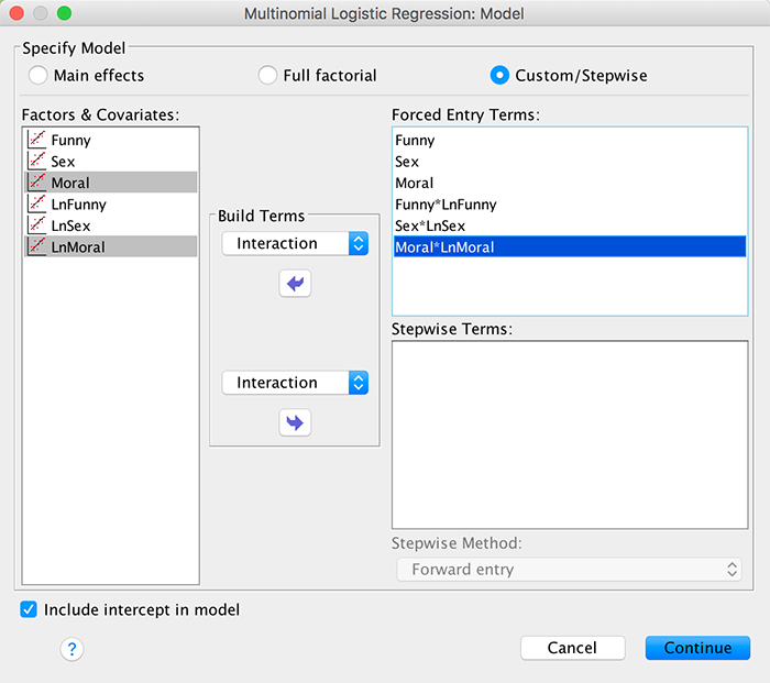
This output is all we need to look at:
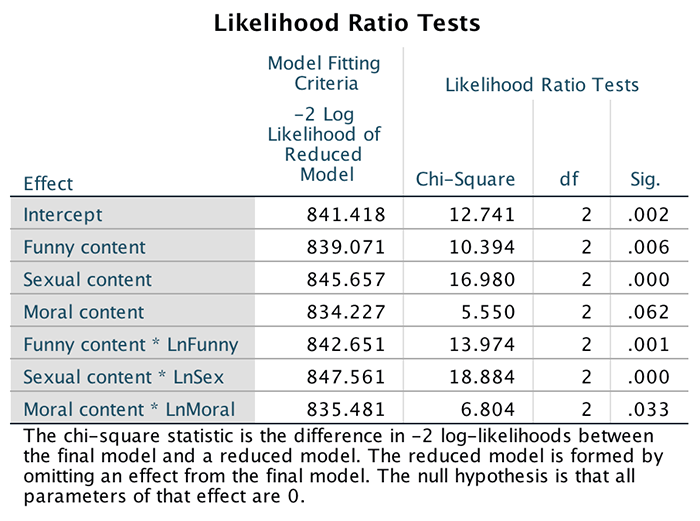
It tells us about whether any of our predictors significantly predict the outcome categories (generally). The assumption of linearity of the logit is tested by the three interaction terms, all of which are significant (p < 0.05). This means that all three predictors have violated the assumption.
To test for multicollinearity we obtain statistics such as the tolerance and VIF by running a linear regression analysis using the same outcome and predictors as the logistic regression. The main dialog box is set up as follows:
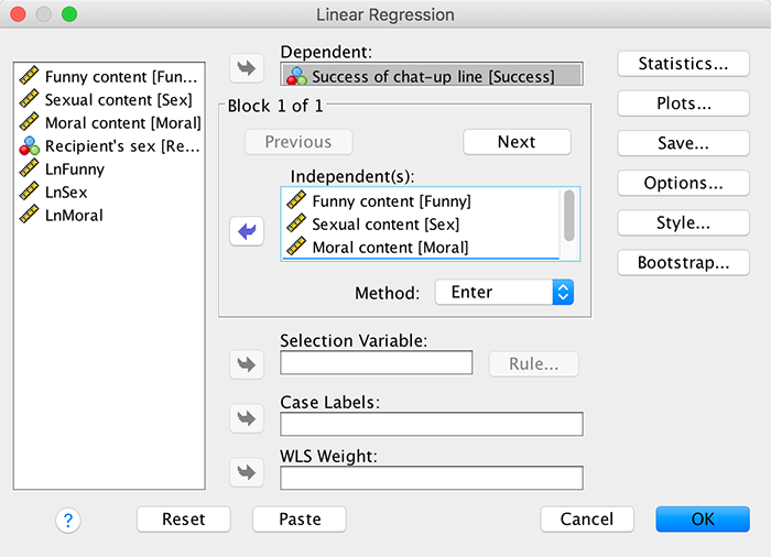
Completed dialog box
It is essential that you click  and then
select Collinearity diagnostics in the dialog box. Once you
have done this switch off all of the default options, click
and then
select Collinearity diagnostics in the dialog box. Once you
have done this switch off all of the default options, click  to return
you to the Linear Regression dialog box, and then click to run the
analysis.
to return
you to the Linear Regression dialog box, and then click to run the
analysis.
Menard (1995) suggests that a tolerance value less than 0.1 almost certainly indicates a serious collinearity problem. Myers (1990) also suggests that a VIF value greater than 10 is cause for concern. In these data all of the VIFs are well below 10 (and tolerances above 0.1) in the output. It seems from these values that there is not an issue of collinearity between the predictor variables. We can investigate this issue further by examining the collinearity diagnostics.
The table labelled Collinearity Diagnostics gives the eigenvalues of the scaled, uncentred cross-products matrix, the condition index and the variance proportions for each predictor. If the eigenvalues are fairly similar then the derived model is likely to be unchanged by small changes in the measured variables. The condition indexes are another way of expressing these eigenvalues and represent the square root of the ratio of the largest eigenvalue to the eigenvalue of interest (so, for the dimension with the largest eigenvalue, the condition index will always be 1). For these data the final dimension has a condition index of 15.03, which is nearly twice as large as the previous one. Although there are no hard-and-fast rules about how much larger a condition index needs to be to indicate collinearity problems, this could indicate a problem.
For the variance proportions we are looking for predictors that have high proportions on the same small eigenvalue, because this would indicate that the variances of their regression coefficients are dependent. So we are interested mainly in the bottom few rows of the table (which represent small eigenvalues). In this example, 40–57% of the variance in the regression coefficients of both Sex and Moral is associated with eigenvalue number 4 and 34–39% with eigenvalue number 5 (the smallest eigenvalue), which indicates some dependency between these variables. So, there is some dependency between Sex and Moral, but given the VIF we can probably assume that this dependency is not problematic.
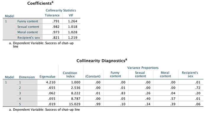
Chapter 21
Self-test 21.1
Conduct a linear model (one-way ANOVA) using Surgery as the predictor and Post_QoL as the outcome.
Select Analyze > Compare Means > One-Way ANOVA … and complete the dialog box as below. The output is explained in the book chapter.
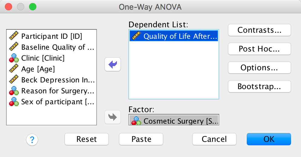
Completed dialog box
Self-test 21.2
Fit a linear model (a one-way ANCOVA) using Surgery as the predictor, Post_QoL as the outcome and Base_QoL as the covariate.
Select Analyze > General Linear Model > Univariate … and complete the dialog box as below. The output is explained in the book chapter.
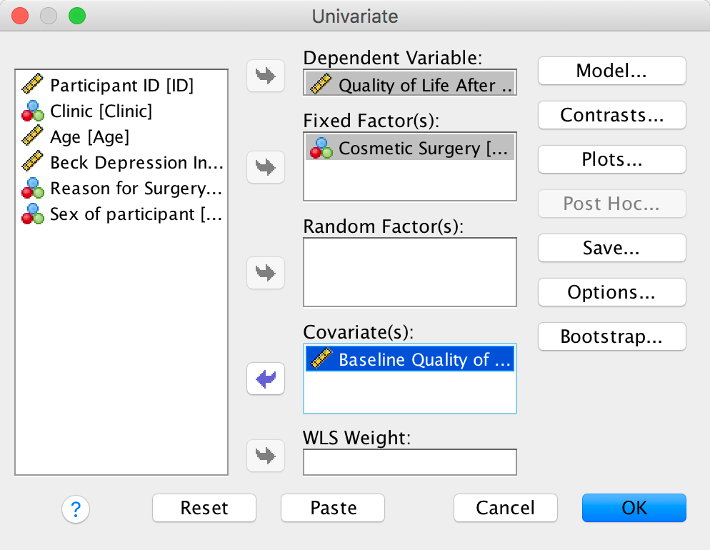
Completed dialog box
Self-test 21.3
Split the file by Reason and then run a multilevel model predicting Post_QoL with a random intercept, and random slopes for Surgery, and including Base_QoL and Surgery as predictors.
First, split the file by Reason by selecting Data > Split File…. The completed dialog box should look like this:
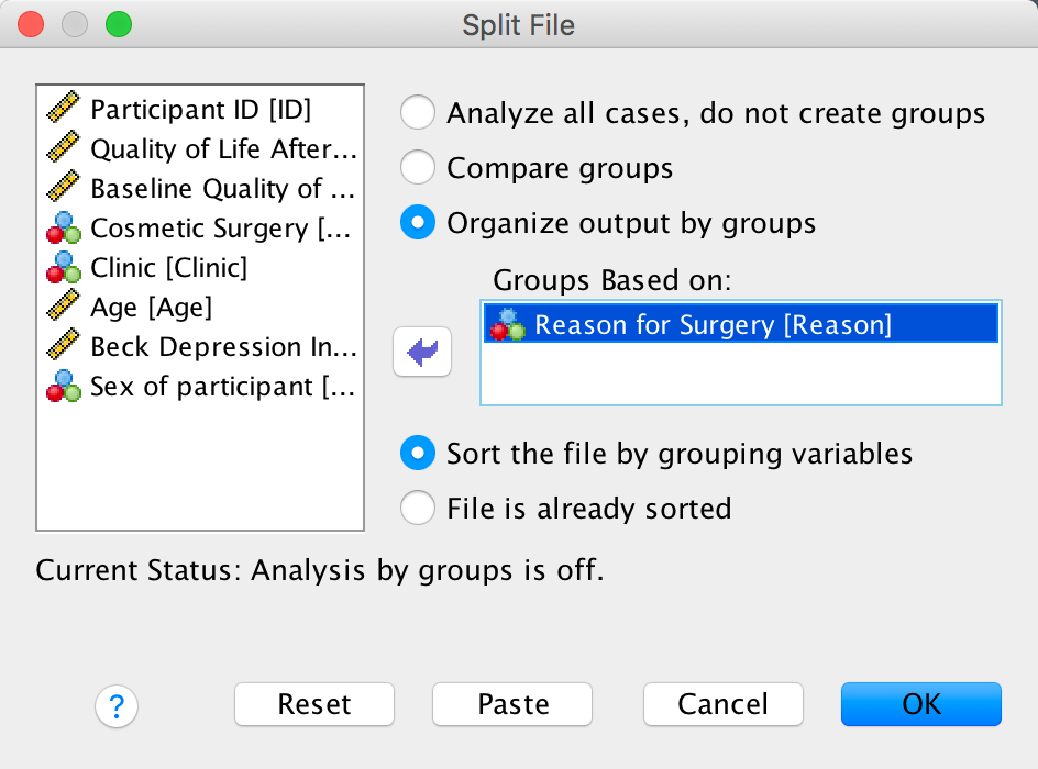
Completed dialog box
To run the multilevel model. Select Analyze > Mixed Models
> Linear… and specify the contextual variable by dragging
Clinic to the box labelled Subjects (or click
![]() ).
).
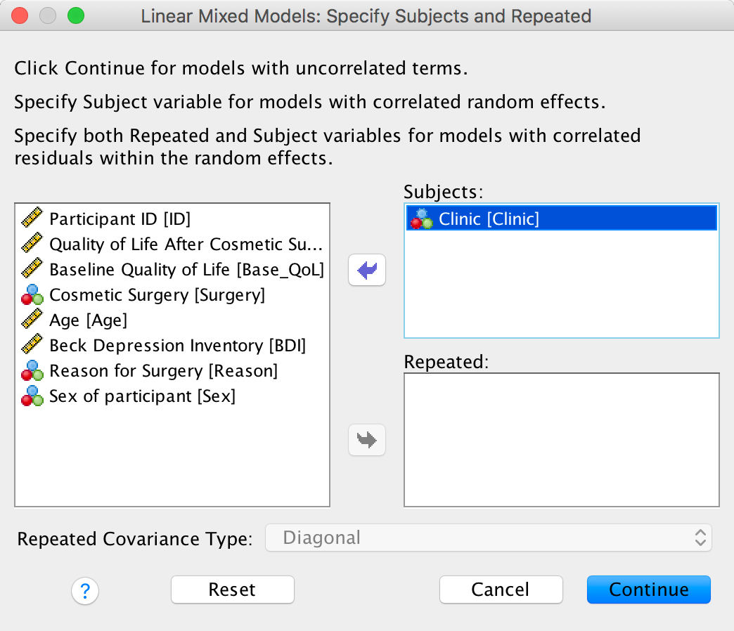
Completed dialog box
Click to move to
the main dialog box. First drag Post_QoL to the space
labelled Dependent variable (or click ![]() ). Next,
drag Surgery and Base_QoL to the space
labelled Covariate(s) (or click
). Next,
drag Surgery and Base_QoL to the space
labelled Covariate(s) (or click ![]() ).
).
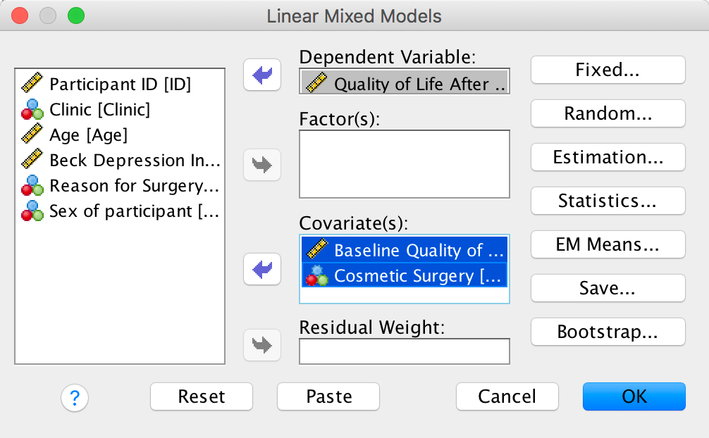
Completed dialog box
To add the predictors (Base_QoL and
Surgery) as fixed effects to the model, click  to activated
the Fixed Effects dialog box, then, make sure that
to activated
the Fixed Effects dialog box, then, make sure that  is set
to
is set
to  and
select these variables and click . Click to return
to the main dialog box.
and
select these variables and click . Click to return
to the main dialog box.
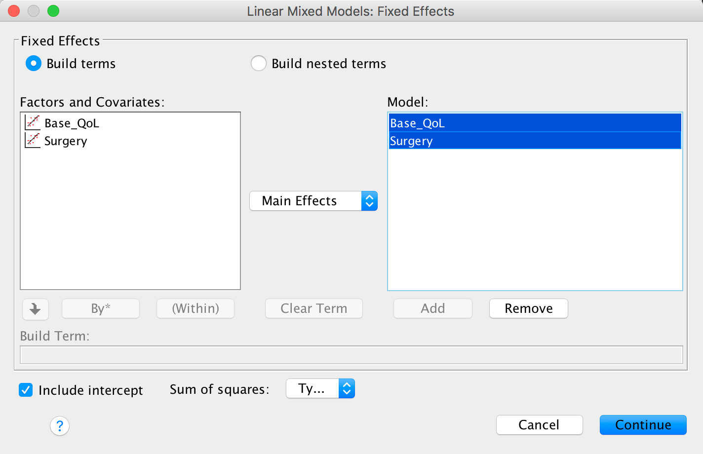
Completed dialog box
We now need to ask for a random intercept and random slopes for the
effect of Surgery. Click  in the main
dialog box. Drag Clinic to the area labelled
Combinations (or click
in the main
dialog box. Drag Clinic to the area labelled
Combinations (or click ![]() ). Select
). Select
 to
allow intercepts to vary across contexts (i.e., a random intercepts
model). Next, add Surgery to the model by selecting it
in the list of Factors and Covariates and clicking . Finally, to
estimate the covariance between the random slope and random intercept
click
to
allow intercepts to vary across contexts (i.e., a random intercepts
model). Next, add Surgery to the model by selecting it
in the list of Factors and Covariates and clicking . Finally, to
estimate the covariance between the random slope and random intercept
click  to access the drop-down list and select
  .
.
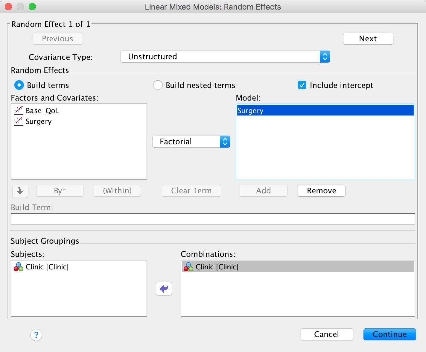
Completed dialog box
Click on  and
select
and
select  . Click
to
return to the main dialog box. In the main dialog box click and
request Parameter estimates and Tests for covariance
parameter. Click to return
to the main dialog box. To run the analysis, click .
. Click
to
return to the main dialog box. In the main dialog box click and
request Parameter estimates and Tests for covariance
parameter. Click to return
to the main dialog box. To run the analysis, click .
Self-test 21.4
Use Oliver Twisted’s guide to restructure the data file. Save the restructured file as Honeymoon Period Restructured.sav.
See Oliver Twisted’s guide.
Self-test 21.5
Use the compute command to transform Time into Time minus 1.
Select Transform > Compute Variable…. In the resulting dialog box enter the name Time into the box labelled Target Variable. Drag the variable Time and to the area labelled Numeric Expression, then ‘-1’. The completed dialog box is below:
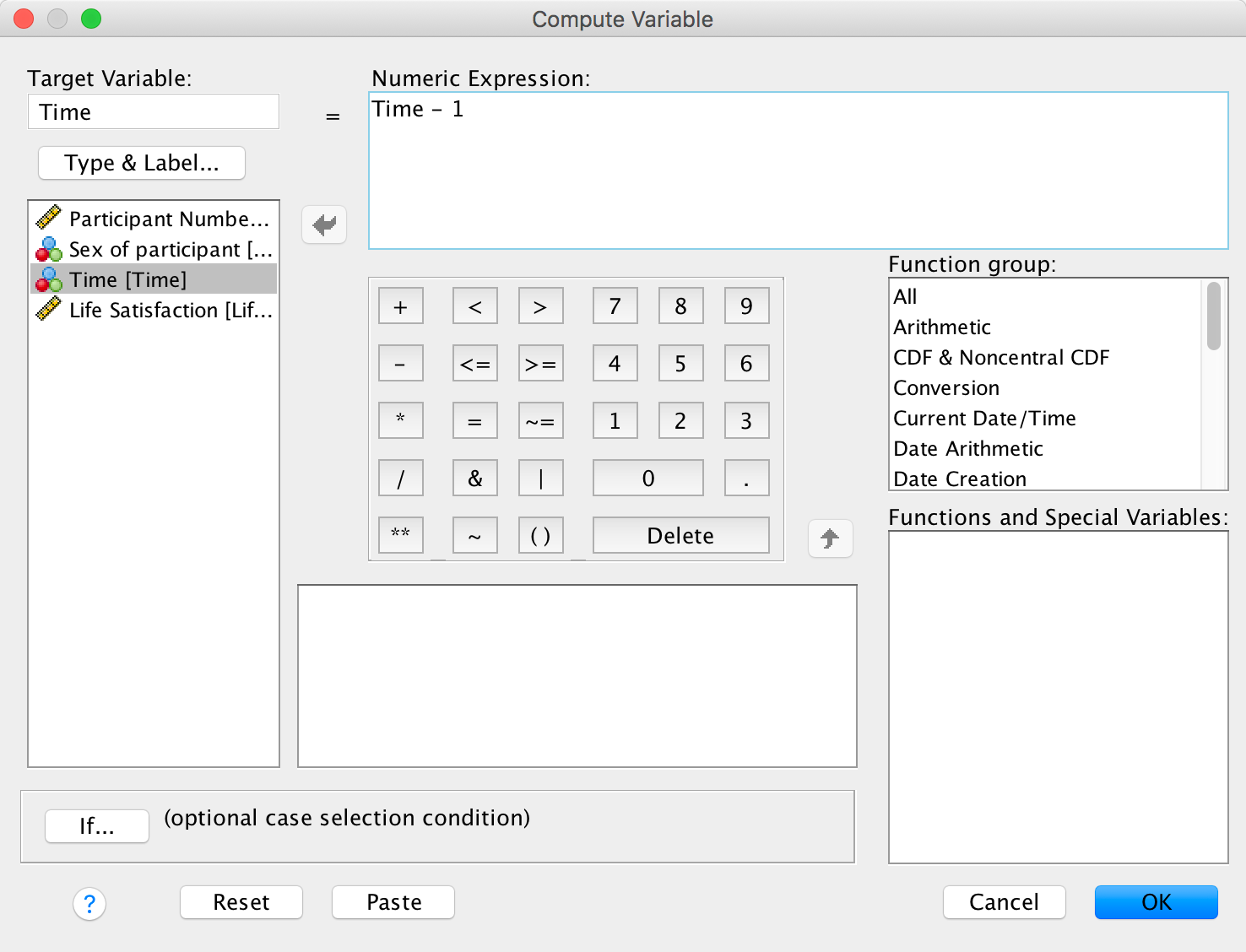
Completed dialog box
Copyright © 2000-2019, Professor Andy Field.