Smart Alex Answers

These pages provide the answers to the Smart Alex questions at the end of each chapter of Discovering Statistics Using IBM SPSS Statistics (5th edition).
Chapter 1
Task 1.1
What are (broadly speaking) the five stages of the research process?
- Generating a research question: through an initial observation (hopefully backed up by some data).
- Generate a theory to explain your initial observation.
- Generate hypotheses: break your theory down into a set of testable predictions.
- Collect data to test the theory: decide on what variables you need to measure to test your predictions and how best to measure or manipulate those variables.
- Analyse the data: look at the data visually and by fitting a statistical model to see if it supports your predictions (and therefore your theory). At this point you should return to your theory and revise it if necessary.
Task 1.2
What is the fundamental difference between experimental and correlational research?
In a word, causality. In experimental research we manipulate a variable (predictor, independent variable) to see what effect it has on another variable (outcome, dependent variable). This manipulation, if done properly, allows us to compare situations where the causal factor is present to situations where it is absent. Therefore, if there are differences between these situations, we can attribute cause to the variable that we manipulated. In correlational research, we measure things that naturally occur and so we cannot attribute cause but instead look at natural covariation between variables.
Task 1.3
What is the level of measurement of the following variables?
- The number of downloads of different bands’ songs on iTunes:
- This is a discrete ratio measure. It is discrete because you can download only whole songs, and it is ratio because it has a true and meaningful zero (no downloads at all).
- The names of the bands downloaded.
- This is a nominal variable. Bands can be identified by their name, but the names have no meaningful order. The fact that Norwegian black metal band 1349 called themselves 1349 does not make them better than British boy-band has-beens 911; the fact that 911 were a bunch of talentless idiots does, though.
- Their positions in the iTunes download chart.
- This is an ordinal variable. We know that the band at number 1 sold more than the band at number 2 or 3 (and so on) but we don’t know how many more downloads they had. So, this variable tells us the order of magnitude of downloads, but doesn’t tell us how many downloads there actually were.
- The money earned by the bands from the downloads.
- This variable is continuous and ratio. It is continuous because money (pounds, dollars, euros or whatever) can be broken down into very small amounts (you can earn fractions of euros even though there may not be an actual coin to represent these fractions).
- The weight of drugs bought by the band with their royalties.
- This variable is continuous and ratio. If the drummer buys 100 g of cocaine and the singer buys 1 kg, then the singer has 10 times as much.
- The type of drugs bought by the band with their royalties.
- This variable is categorical and nominal: the name of the drug tells us something meaningful (crack, cannabis, amphetamine, etc.) but has no meaningful order.
- The phone numbers that the bands obtained because of their fame.
- This variable is categorical and nominal too: the phone numbers have no meaningful order; they might as well be letters. A bigger phone number did not mean that it was given by a better person.
- The gender of the people giving the bands their phone numbers.
- This variable is categorical: the people dishing out their phone
numbers could fall into one of several categories based on how they
self-identify when asked about their gender (their gender identity could
be fluid). Taking a very simplistic view of gender, the variable might
contain categories of male, female, and non-binary.
- The instruments played by the band members.
- This variable is categorical and nominal too: the instruments have no meaningful order but their names tell us something useful (guitar, bass, drums, etc.).
- The time they had spent learning to play their instruments.
- This is a continuous and ratio variable. The amount of time could be split into infinitely small divisions (nanoseconds even) and there is a meaningful true zero (no time spent learning your instrument means that, like 911, you can’t play at all).
Task 1.4
Say I own 857 CDs. My friend has written a computer program that uses a webcam to scan my shelves in my house where I keep my CDs and measure how many I have. His program says that I have 863 CDs. Define measurement error. What is the measurement error in my friend’s CD counting device?
Measurement error is the difference between the true value of something and the numbers used to represent that value. In this trivial example, the measurement error is 6 CDs. In this example we know the true value of what we’re measuring; usually we don’t have this information, so we have to estimate this error rather than knowing its actual value.
Task 1.5
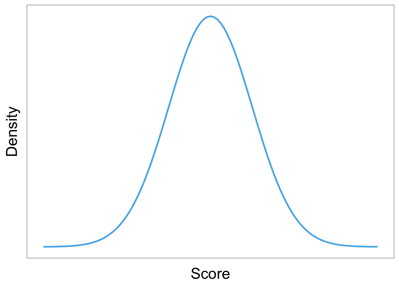
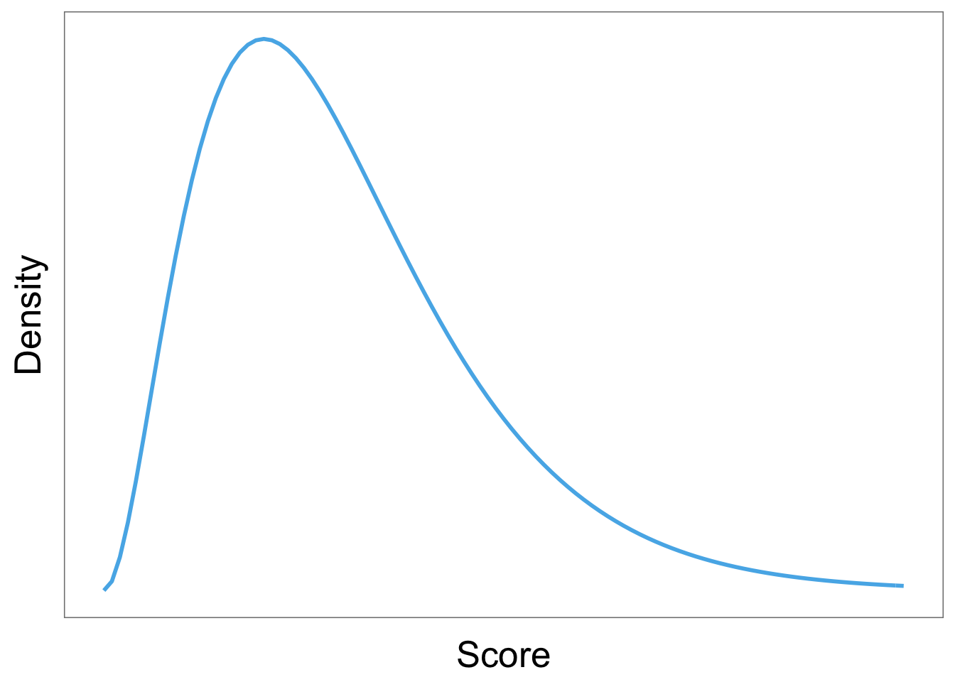
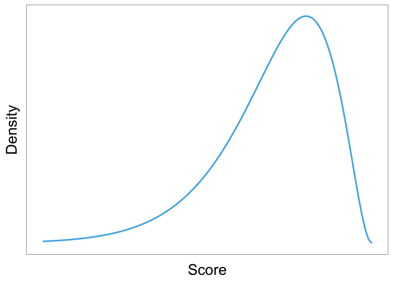
Sketch the shape of a normal distribution, a positively skewed distribution and a negatively skewed distribution.
Normal
Positive skew
Negative skew
Task 1.6
In 2011 I got married and we went to Disney Florida for our honeymoon. We bought some bride and groom Mickey Mouse hats and wore them around the parks. The staff at Disney are really nice and upon seeing our hats would say ‘congratulations’ to us. We counted how many times people said congratulations over 7 days of the honeymoon: 5, 13, 7, 14, 11, 9, 17. Calculate the mean, median, sum of squares, variance and standard deviation of these data.
First compute the mean: \[ \begin{aligned} \overline{X} &= \frac{\sum_{i=1}^{n} x_i}{n} \\ \ &= \frac{5+13+7+14+11+9+17}{7} \\ \ &= \frac{76}{7} \\ \ &= 10.86 \end{aligned} \] To calculate the median, first let’s arrange the scores in ascending order: 5, 7, 9, 11, 13, 14, 17. The median will be the (n + 1)/2th score. There are 7 scores, so this will be the 8/2 = 4th. The 4th score in our ordered list is 11.
To calculate the sum of squares, first take the mean from each score, then square this difference, finally, add up these squared values:
| Score | Error (score - mean) | Error squared |
|---|---|---|
| 5 | -5.86 | 34.34 |
| 13 | 2.14 | 4.58 |
| 7 | -3.86 | 14.90 |
| 14 | 3.14 | 9.86 |
| 11 | 0.14 | 0.02 |
| 9 | -1.86 | 3.46 |
| 17 | 6.14 | 37.70 |
So, the sum of squared errors is:
\[ \begin{aligned} \ SS &= 34.34 + 4.58 + 14.90 + 9.86 + 0.02 + 3.46 + 37.70 \\ \ &= 104.86 \\ \end{aligned} \] The variance is the sum of squared errors divided by the degrees of freedom:
\[ \begin{aligned} \ s^2 &= \frac{SS}{N - 1} \\ \ &= \frac{104.86}{6} \\ \ &= 17.48 \end{aligned} \] The standard deviation is the square root of the variance:
\[ \begin{aligned} \ s &= \sqrt{s^2} \\ \ &= \sqrt{17.48} \\ \ &= 4.18 \end{aligned} \]
Task 1.7
In this chapter we used an example of the time taken for 21 heavy smokers to fall off a treadmill at the fastest setting (18, 16, 18, 24, 23, 22, 22, 23, 26, 29, 32, 34, 34, 36, 36, 43, 42, 49, 46, 46, 57). Calculate the sums of squares, variance and standard deviation of these data.
To calculate the sum of squares, take the mean from each value, then square this difference. Finally, add up these squared values (the values in the final column). The sum of squared errors is a massive 2685.24.
| Score | Mean | Difference | Difference squared |
|---|---|---|---|
| 18 | 32.19 | -14.19 | 201.36 |
| 16 | 32.19 | -16.19 | 262.12 |
| 18 | 32.19 | -14.19 | 201.36 |
| 24 | 32.19 | -8.19 | 67.08 |
| 23 | 32.19 | -9.19 | 84.46 |
| 22 | 32.19 | -10.19 | 103.84 |
| 22 | 32.19 | -10.19 | 103.84 |
| 23 | 32.19 | -9.19 | 84.46 |
| 26 | 32.19 | -6.19 | 38.32 |
| 29 | 32.19 | -3.19 | 10.18 |
| 32 | 32.19 | -0.19 | 0.04 |
| 34 | 32.19 | 1.81 | 3.28 |
| 34 | 32.19 | 1.81 | 3.28 |
| 36 | 32.19 | 3.81 | 14.52 |
| 36 | 32.19 | 3.81 | 14.52 |
| 43 | 32.19 | 10.81 | 116.86 |
| 42 | 32.19 | 9.81 | 96.24 |
| 49 | 32.19 | 16.81 | 282.58 |
| 46 | 32.19 | 13.81 | 190.72 |
| 46 | 32.19 | 13.81 | 190.72 |
| 57 | 32.19 | 24.81 | 615.54 |
The variance is the sum of squared errors divided by the degrees of freedom (\(N-1\)). There were 21 scores and so the degrees of freedom were 20. The variance is, therefore:
\[ \begin{aligned} \ s^2 &= \frac{SS}{N - 1} \\ \ &= \frac{2685.24}{20} \\ \ &= 134.26 \end{aligned} \]
The standard deviation is the square root of the variance:
\[ \begin{aligned} \ s &= \sqrt{s^2} \\ \ &= \sqrt{134.26} \\ \ &= 11.59 \end{aligned} \]
Task 1.8
Sports scientists sometimes talk of a ‘red zone’, which is a period during which players in a team are more likely to pick up injuries because they are fatigued. When a player hits the red zone it is a good idea to rest them for a game or two. At a prominent London football club that I support, they measured how many consecutive games the 11 first team players could manage before hitting the red zone: 10, 16, 8, 9, 6, 8, 9, 11, 12, 19, 5. Calculate the mean, standard deviation, median, range and interquartile range.
First we need to compute the mean:
\[ \begin{aligned} \overline{X} &= \frac{\sum_{i=1}^{n} x_i}{n} \\ \ &= \frac{10+16+8+9+6+8+9+11+12+19+5}{11} \\ \ &= \frac{113}{11} \\ \ &= 10.27 \end{aligned} \]
Then the standard deviation, which we do as follows:
| Score | Error (score - mean) | Error squared |
|---|---|---|
| 10 | -0.27 | 0.07 |
| 16 | 5.73 | 32.83 |
| 8 | -2.27 | 5.15 |
| 9 | -1.27 | 1.61 |
| 6 | -4.27 | 18.23 |
| 8 | -2.27 | 5.15 |
| 9 | -1.27 | 1.61 |
| 11 | 0.73 | 0.53 |
| 12 | 1.73 | 2.99 |
| 19 | 8.73 | 76.21 |
| 5 | -5.27 | 27.77 |
So, the sum of squared errors is:
\[ \begin{aligned} \ SS &= 0.07 + 32.80 + 5.17 + 1.62 + 18.26 + 5.17 + 1.62 + 0.53 + 2.98 + 76.17 + 27.80 \\ \ &= 172.18 \\ \end{aligned} \] The variance is the sum of squared errors divided by the degrees of freedom: \[ \begin{aligned} \ s^2 &= \frac{SS}{N - 1} \\ \ &= \frac{172.18}{10} \\ \ &= 17.22 \end{aligned} \] The standard deviation is the square root of the variance:
\[ \begin{aligned} \ s &= \sqrt{s^2} \\ \ &= \sqrt{17.22} \\ \ &= 4.15 \end{aligned} \]
- To calculate the median, range and interquartile range, first let’s arrange the scores in ascending order: 5, 6, 8, 8, 9, 9, 10, 11, 12, 16, 19. The median: The median will be the (\(n + 1\))/2th score. There are 11 scores, so this will be the 12/2 = 6th. The 6th score in our ordered list is 9 games. Therefore, the median number of games is 9.
- The lower quartile: This is the median of the lower half of scores. If we split the data at 9 (the 6th score), there are 5 scores below this value. The median of 5 = 6/2 = 3rd score. The 3rd score is 8, the lower quartile is therefore 8 games.
- The upper quartile: This is the median of the upper half of scores. If we split the data at 9 again (not including this score), there are 5 scores above this value. The median of 5 = 6/2 = 3rd score above the median. The 3rd score above the median is 12; the upper quartile is therefore 12 games.
- The range: This is the highest score (19) minus the lowest (5), i.e. 14 games.
- The interquartile range: This is the difference between the upper and lower quartile: 12 − 8 = 4 games.
Task 1.9
Celebrities always seem to be getting divorced. The (approximate) length of some celebrity marriages in days are: 240 (J-Lo and Cris Judd), 144 (Charlie Sheen and Donna Peele), 143 (Pamela Anderson and Kid Rock), 72 (Kim Kardashian, if you can call her a celebrity), 30 (Drew Barrymore and Jeremy Thomas), 26 (Axl Rose and Erin Everly), 2 (Britney Spears and Jason Alexander), 150 (Drew Barrymore again, but this time with Tom Green), 14 (Eddie Murphy and Tracy Edmonds), 150 (Renee Zellweger and Kenny Chesney), 1657 (Jennifer Aniston and Brad Pitt). Compute the mean, median, standard deviation, range and interquartile range for these lengths of celebrity marriages.
First we need to compute the mean:
\[ \begin{aligned} \overline{X} &= \frac{\sum_{i=1}^{n} x_i}{n} \\ \ &= \frac{240+144+143+72+30+26+2+150+14+150+1657}{11} \\ \ &= \frac{2628}{11} \\ \ &= 238.91 \end{aligned} \]
Then the standard deviation, which we do as follows:
| Score | Error (score - mean) | Error squared |
|---|---|---|
| 240 | 1.09 | 1.19 |
| 144 | -94.91 | 9007.91 |
| 143 | -95.91 | 9198.73 |
| 72 | -166.91 | 27858.95 |
| 30 | -208.91 | 43643.39 |
| 26 | -212.91 | 45330.67 |
| 2 | -236.91 | 56126.35 |
| 150 | -88.91 | 7904.99 |
| 14 | -224.91 | 50584.51 |
| 150 | -88.91 | 7904.99 |
| 1657 | 1418.09 | 2010979.25 |
So, the sum of squared errors is:
\[ \begin{aligned} \ SS &= 1.19 + 9007.74 + 9198.55 + 27858.64 + 43643.01 + 45330.28 + 56125.92 + 7904.83 + 50584.10 + 7904.83 + 2010981.83 \\ \ &= 2268540.92 \\ \end{aligned} \] The variance is the sum of squared errors divided by the degrees of freedom: \[ \begin{aligned} \ s^2 &= \frac{SS}{N - 1} \\ \ &= \frac{2268540.92}{10} \\ \ &= 226854.09 \end{aligned} \] The standard deviation is the square root of the variance:
\[ \begin{aligned} \ s &= \sqrt{s^2} \\ \ &= \sqrt{226854.09} \\ \ &= 476.29 \end{aligned} \]
- To calculate the median, range and interquartile range, first let’s arrange the scores in ascending order: 2, 14, 26, 30, 72, 143, 144, 150, 150, 240, 1657. The median: The median will be the (n + 1)/2th score. There are 11 scores, so this will be the 12/2 = 6th. The 6th score in our ordered list is 143. The median length of these celebrity marriages is therefore 143 days.
- The lower quartile: This is the median of the lower half of scores. If we split the data at 143 (the 6th score), there are 5 scores below this value. The median of 5 = 6/2 = 3rd score. The 3rd score is 26, the lower quartile is therefore 26 days.
- The upper quartile: This is the median of the upper half of scores. If we split the data at 143 again (not including this score), there are 5 scores above this value. The median of 5 = 6/2 = 3rd score above the median. The 3rd score above the median is 150; the upper quartile is therefore 150 days.
- The range: This is the highest score (1657) minus the lowest (2), i.e. 1655 days.
- The interquartile range: This is the difference between the upper and lower quartile: 150 − 26 = 124 days.
Task 1.10
Repeat Task 9 but excluding Jennifer Anniston and Brad Pitt’s marriage. How does this affect the mean, median, range, interquartile range, and standard deviation? What do the differences in values between Tasks 9 and 10 tell us about the influence of unusual scores on these measures?
First let’s compute the new mean: \[ \begin{aligned} \overline{X} &= \frac{\sum_{i=1}^{n} x_i}{n} \\ \ &= \frac{240+144+143+72+30+26+2+150+14+150}{11} \\ \ &= \frac{971}{11} \\ \ &= 97.1 \end{aligned} \] The mean length of celebrity marriages is now 97.1 days compared to 238.91 days when Jennifer Aniston and Brad Pitt’s marriage was included. This demonstrates that the mean is greatly influenced by extreme scores.
Let’s now calculate the standard deviation excluding Jennifer Aniston and Brad Pitt’s marriage:
| Score | Error (score - mean) | Error squared |
|---|---|---|
| 240 | 142.9 | 20420.41 |
| 144 | 46.9 | 2199.61 |
| 143 | 45.9 | 2106.81 |
| 72 | -25.1 | 630.01 |
| 30 | -67.1 | 4502.41 |
| 26 | -71.1 | 5055.21 |
| 2 | -95.1 | 9044.01 |
| 150 | 52.9 | 2798.41 |
| 14 | -83.1 | 6905.61 |
| 150 | 52.9 | 2798.41 |
So, the sum of squared errors is:
\[ \begin{aligned} \ SS &= 20420.41 + 2199.61 + 2106.81 + 630.01 + 4502.41 + 5055.21 + 9044.01 + 2798.41 + 6905.61 + 2798.41 \\ \ &= 56460.90 \\ \end{aligned} \] The variance is the sum of squared errors divided by the degrees of freedom:
\[ \begin{aligned} \ s^2 &= \frac{SS}{N - 1} \\ \ &= \frac{56460.90}{9} \\ \ &= 6273.43 \end{aligned} \] The standard deviation is the square root of the variance:
\[ \begin{aligned} \ s &= \sqrt{s^2} \\ \ &= \sqrt{6273.43} \\ \ &= 79.21 \end{aligned} \]
From these calculations we can see that the variance and standard deviation, like the mean, are both greatly influenced by extreme scores. When Jennifer Aniston and Brad Pitt’s marriage was included in the calculations (see Smart Alex Task 9), the variance and standard deviation were much larger, i.e. 226854.09 and 476.29 respectively.
- To calculate the median, range and interquartile range, first, let’s again arrange the scores in ascending order but this time excluding Jennifer Aniston and Brad Pitt’s marriage: 2, 14, 26, 30, 72, 143, 144, 150, 150, 240.
- The median: The median will be the (n + 1)/2 score. There are now 10 scores, so this will be the 11/2 = 5.5th. Therefore, we take the average of the 5th score and the 6th score. The 5th score is 72, and the 6th is 143; the median is therefore 107.5 days.
- The lower quartile: This is the median of the lower half of scores. If we split the data at 107.5 (this score is not in the data set), there are 5 scores below this value. The median of 5 = 6/2 = 3rd score. The 3rd score is 26; the lower quartile is therefore 26 days.
- The upper quartile: This is the median of the upper half of scores. If we split the data at 107.5 (this score is not actually present in the data set), there are 5 scores above this value. The median of 5 = 6/2 = 3rd score above the median. The 3rd score above the median is 150; the upper quartile is therefore 150 days.
- The range: This is the highest score (240) minus the lowest (2), i.e. 238 days. You’ll notice that without the extreme score the range drops dramatically from 1655 to 238 – less than half the size.
- The interquartile range: This is the difference between the upper and lower quartile: 150 − 26 = 124 days of marriage. This is the same as the value we got when Jennifer Aniston and Brad Pitt’s marriage was included. This demonstrates the advantage of the interquartile range over the range, i.e. it isn’t affected by extreme scores at either end of the distribution
Chapter 2
Task 2.1
Why do we use samples?
We are usually interested in populations, but because we cannot collect data from every human being (or whatever) in the population, we collect data from a small subset of the population (known as a sample) and use these data to infer things about the population as a whole.
Task 2.2
What is the mean and how do we tell if it’s representative of our data?
The mean is a simple statistical model of the centre of a distribution of scores. A hypothetical estimate of the ‘typical’ score. We use the variance, or standard deviation, to tell us whether it is representative of our data. The standard deviation is a measure of how much error there is associated with the mean: a small standard deviation indicates that the mean is a good representation of our data.
Task 2.3
What’s the difference between the standard deviation and the standard error?
The standard deviation tells us how much observations in our sample differ from the mean value within our sample. The standard error tells us not about how the sample mean represents the sample itself, but how well the sample mean represents the population mean. The standard error is the standard deviation of the sampling distribution of a statistic. For a given statistic (e.g. the mean) it tells us how much variability there is in this statistic across samples from the same population. Large values, therefore, indicate that a statistic from a given sample may not be an accurate reflection of the population from which the sample came.
Task 2.4
In Chapter 1 we used an example of the time in seconds taken for 21 heavy smokers to fall off a treadmill at the fastest setting (18, 16, 18, 24, 23, 22, 22, 23, 26, 29, 32, 34, 34, 36, 36, 43, 42, 49, 46, 46, 57). Calculate standard error and 95% confidence interval for these data.
If you did the tasks in Chapter 1, you’ll know that the mean is 32.19 seconds: \[ \begin{aligned} \overline{X} &= \frac{\sum_{i=1}^{n} x_i}{n} \\ \ &= \frac{16+(2\times18)+(2\times22)+(2\times23)+24+26+29+32+(2\times34)+(2\times36)+42+43+(2\times46)+49+57}{21} \\ \ &= \frac{676}{21} \\ \ &= 32.19 \end{aligned} \]
We also worked out that the sum of squared errors was 2685.24; the variance was 2685.24/20 = 134.26; the standard deviation is the square root of the variance, so was \(\sqrt(134.26)\) = 11.59. The standard error will be: \[ SE = \frac{s}{\sqrt{N}} = \frac{11.59}{\sqrt{21}} = 2.53\]
The sample is small, so to calculate the confidence interval we need to find the appropriate value of t. First we need to calculate the degrees of freedom, \(N − 1\). With 21 data points, the degrees of freedom are 20. For a 95% confidence interval we can look up the value in the column labelled ‘Two-Tailed Test’, ‘0.05’ in the table of critical values of the t-distribution (Appendix). The corresponding value is 2.09. The confidence intervals is, therefore, given by:
- Lower boundary of confidence interval = \(\overline{X}-(2.09\times SE)\) = 32.19 – (2.09 × 2.53) = 26.90
- Upper boundary of confidence interval = \(\overline{X}+(2.09\times SE)\) = 32.19 + (2.09 × 2.53) = 37.48
Task 2.5
What do the sum of squares, variance and standard deviation represent? How do they differ?
All of these measures tell us something about how well the mean fits the observed sample data. Large values (relative to the scale of measurement) suggest the mean is a poor fit of the observed scores, and small values suggest a good fit. They are also, therefore, measures of dispersion, with large values indicating a spread-out distribution of scores and small values showing a more tightly packed distribution. These measures all represent the same thing, but differ in how they express it. The sum of squared errors is a ‘total’ and is, therefore, affected by the number of data points. The variance is the ‘average’ variability but in units squared. The standard deviation is the average variation but converted back to the original units of measurement. As such, the size of the standard deviation can be compared to the mean (because they are in the same units of measurement).
Task 2.6
What is a test statistic and what does it tell us?
A test statistic is a statistic for which we know how frequently different values occur. The observed value of such a statistic is typically used to test hypotheses, or to establish whether a model is a reasonable representation of what’s happening in the population.
Task 2.7
What are Type I and Type II errors?
A Type I error occurs when we believe that there is a genuine effect in our population, when in fact there isn’t. A Type II error occurs when we believe that there is no effect in the population when, in reality, there is.
Task 2.8
What is statistical power?
Power is the ability of a test to detect an effect of a particular size (a value of 0.8 is a good level to aim for).
Task 2.9
Figure 2.16 shows two experiments that looked at the effect of singing versus conversation on how much time a woman would spend with a man. In both experiments the means were 10 (singing) and 12 (conversation), the standard deviations in all groups were 3, but the group sizes were 10 per group in the first experiment and 100 per group in the second. Compute the values of the confidence intervals displayed in the Figure.
Experiment 1:
In both groups, because they have a standard deviation of 3 and a sample size of 10, the standard error will be: \[ SE = \frac{s}{\sqrt{N}} = \frac{3}{\sqrt{10}} = 0.95\]
The sample is small, so to calculate the confidence interval we need to find the appropriate value of t. First we need to calculate the degrees of freedom, \(N − 1\). With 10 data points, the degrees of freedom are 9. For a 95% confidence interval we can look up the value in the column labelled ‘Two-Tailed Test’, ‘0.05’ in the table of critical values of the t-distribution (Appendix). The corresponding value is 2.26. The confidence interval for the singing group is, therefore, given by:
- Lower boundary of confidence interval = \(\overline{X}-(2.26\times SE)\) = 10 – (2.26 × 0.95) = 7.85
- Upper boundary of confidence interval = \(\overline{X}+(2.26\times SE)\) = 10 + (2.26 × 0.95) = 12.15
For the conversation group:
- Lower boundary of confidence interval = \(\overline{X}-(2.26\times SE)\) = 12 – (2.26 × 0.95) = 9.85
- Upper boundary of confidence interval = \(\overline{X}+(2.26\times SE)\) = 12 + (2.26 × 0.95) = 14.15
Experiment 2
In both groups, because they have a standard deviation of 3 and a sample size of 100, the standard error will be: \[ SE = \frac{s}{\sqrt{N}} = \frac{3}{\sqrt{100}} = 0.3\] The sample is large, so to calculate the confidence interval we need to find the appropriate value of z. For a 95% confidence interval we should look up the value of 0.025 in the column labelled Smaller Portion in the table of the standard normal distribution (Appendix). The corresponding value is 1.96. The confidence interval for the singing group is, therefore, given by:
- Lower boundary of confidence interval = \(\overline{X}-(1.96\times SE)\) = 10 – (1.96 × 0.3) = 9.41
- Upper boundary of confidence interval = \(\overline{X}+(1.96\times SE)\) = 10 + (1.96 × 0.3) = 10.59
For the conversation group:
- Lower boundary of confidence interval = \(\overline{X}-(1.96\times SE)\) = 12 – (1.96 × 0.3) = 11.41
- Upper boundary of confidence interval = \(\overline{X}+(1.96\times SE)\) = 12 + (1.96 × 0.3) = 12.59
Task 2.10
Figure 2.17 shows a similar study to above, but the means were 10 (singing) and 10.01 (conversation), the standard deviations in both groups were 3, and each group contained 1 million people. Compute the values of the confidence intervals displayed in the figure.
In both groups, because they have a standard deviation of 3 and a sample size of 1,000,000, the standard error will be: \[ SE = \frac{s}{\sqrt{N}} = \frac{3}{\sqrt{1000000}} = 0.003\] The sample is large, so to calculate the confidence interval we need to find the appropriate value of z. For a 95% confidence interval we should look up the value of 0.025 in the column labelled Smaller Portion in the table of the standard normal distribution (Appendix). The corresponding value is 1.96. The confidence interval for the singing group is, therefore, given by:
Lower boundary of confidence interval = \(\overline{X}-(1.96\times SE)\) = 10 – (1.96 × 0.003) = 9.99412
Upper boundary of confidence interval = \(\overline{X}+(1.96\times SE)\)= 10 + (1.96 × 0.003) = 10.00588 For the conversation group:
Lower boundary of confidence interval = \(\overline{X}-(1.96\times SE)\) = 10.01 – (1.96 × 0.003) = 10.00412
Upper boundary of confidence interval = \(\overline{X}+(1.96\times SE)\) = 10.01 + (1.96 × 0.003) = 10.01588
Note: these values will look slightly different than the graph because the exact means were 10.00147 and 10.01006, but we rounded off to 10 and 10.01 to make life a bit easier. If you use these exact values you’d get, for the singing group:
- Lower boundary of confidence interval = 10.00147 – (1.96 × 0.003) = 9.99559
- Upper boundary of confidence interval = 10.00147 + (1.96 × 0.003) = 10.00735
For the conversation group:
- Lower boundary of confidence interval = 10.01006 – (1.96 × 0.003) = 10.00418
- Upper boundary of confidence interval = 10.01006 + (1.96 × 0.003) = 10.01594
Task 2.11
In Chapter 1 (Task 8) we looked at an example of how many games it took a sportsperson before they hit the ‘red zone’ Calculate the standard error and confidence interval for those data.
We worked out in Chapter 1 that the mean was 10.27, the standard deviation 4.15, and there were 11 sportspeople in the sample. The standard error will be: \[ SE = \frac{s}{\sqrt{N}} = \frac{4.15}{\sqrt{11}} = 1.25\] The sample is small, so to calculate the confidence interval we need to find the appropriate value of t. First we need to calculate the degrees of freedom, \(N − 1\). With 11 data points, the degrees of freedom are 10. For a 95% confidence interval we can look up the value in the column labelled ‘Two-Tailed Test’, ‘.05’ in the table of critical values of the t-distribution (Appendix). The corresponding value is 2.23. The confidence interval is, therefore, given by:
- Lower boundary of confidence interval = \(\overline{X}-(2.23\times SE)\) = 10.27 – (2.23 × 1.25) = 7.48
- Upper boundary of confidence interval = \(\overline{X}+(2.23\times SE)\) = 10.27 + (2.23 × 1.25) = 13.06
Task 2.12
At a rival club to the one I support, they similarly measured the number of consecutive games it took their players before they reached the red zone. The data are: 6, 17, 7, 3, 8, 9, 4, 13, 11, 14, 7. Calculate the mean, standard deviation, and confidence interval for these data.
First we need to compute the mean: \[ \begin{aligned} \overline{X} &= \frac{\sum_{i=1}^{n} x_i}{n} \\ \ &= \frac{6+17+7+3+8+9+4+13+11+14+7}{11} \\ \ &= \frac{99}{11} \\ \ &= 9.00 \end{aligned} \]
Then the standard deviation, which we do as follows:
| Score | Error (score - mean) | Error squared |
|---|---|---|
| 6 | -3 | 9 |
| 17 | 8 | 64 |
| 7 | -2 | 4 |
| 3 | -6 | 36 |
| 8 | -1 | 1 |
| 9 | 0 | 0 |
| 4 | -5 | 25 |
| 13 | 4 | 16 |
| 11 | 2 | 4 |
| 14 | 5 | 25 |
| 7 | -2 | 4 |
The sum of squared errors is:
\[ \begin{aligned} \ SS &= 9 + 64 + 4 + 36 + 1 + 0 + 25 + 16 + 4 + 25 + 4 \\ \ &= 188 \\ \end{aligned} \] The variance is the sum of squared errors divided by the degrees of freedom: \[ \begin{aligned} \ s^2 &= \frac{SS}{N - 1} \\ \ &= \frac{188}{10} \\ \ &= 18.8 \end{aligned} \] The standard deviation is the square root of the variance:
\[ \begin{aligned} \ s &= \sqrt{s^2} \\ \ &= \sqrt{18.8} \\ \ &= 4.34 \end{aligned} \] There were 11 sportspeople in the sample, so the standard error will be: \[ SE = \frac{s}{\sqrt{N}} = \frac{4.34}{\sqrt{11}} = 1.31\]
The sample is small, so to calculate the confidence interval we need to find the appropriate value of t. First we need to calculate the degrees of freedom, \(N − 1\). With 11 data points, the degrees of freedom are 10. For a 95% confidence interval we can look up the value in the column labelled ‘Two-Tailed Test’, ‘0.05’ in the table of critical values of the t-distribution (Appendix). The corresponding value is 2.23. The confidence intervals is, therefore, given by:
- Lower boundary of confidence interval = \(\overline{X}-(2.23\times SE)\) = 9 – (2.23 × 1.31) = 6.08
- Upper boundary of confidence interval = \(\overline{X}+(2.23\times SE)\) = 9 + (2.23 × 1.31) = 11.92
Task 2.13
In Chapter 1 (Task 9) we looked at the length in days of nine celebrity marriages. Here are the length in days of nine marriages, one being mine and the other eight being those of some of my friends and family (in all but one case up to the day I’m writing this, which is 8 March 2012, but in the 91-day case it was the entire duration – this isn’t my marriage, in case you’re wondering: 210, 91, 3901, 1339, 662, 453, 16672, 21963, 222. Calculate the mean, standard deviation and confidence interval for these data.
First we need to compute the mean:
\[ \begin{aligned} \overline{X} &= \frac{\sum_{i=1}^{n} x_i}{n} \\ \ &= \frac{210+91+3901+1339+662+453+16672+21963+222}{9} \\ \ &= \frac{45513}{9} \\ \ &= 5057 \end{aligned} \]
Compute the standard deviation as follows:
| Score | Error (score - mean) | Error squared |
|---|---|---|
| 210 | -4847 | 23493409 |
| 91 | -4966 | 24661156 |
| 3901 | -1156 | 1336336 |
| 1339 | -3718 | 13823524 |
| 662 | -4395 | 19316025 |
| 453 | -4604 | 21196816 |
| 16672 | 11615 | 134908225 |
| 21963 | 16906 | 285812836 |
| 222 | -4835 | 23377225 |
The sum of squared errors is:
\[ \begin{aligned} \ SS &= 23493409 + 24661156 + 1336336 + 13823524 + 19316025 + 21196816 + 134908225 + 285812836 + 23377225 \\ \ &= 547925552 \\ \end{aligned} \] The variance is the sum of squared errors divided by the degrees of freedom: \[ \begin{aligned} \ s^2 &= \frac{SS}{N - 1} \\ \ &= \frac{547925552}{8} \\ \ &= 68490694 \end{aligned} \] The standard deviation is the square root of the variance:
\[ \begin{aligned} \ s &= \sqrt{s^2} \\ \ &= \sqrt{68490694} \\ \ &= 8275.91 \end{aligned} \] The standard error is: \[ SE = \frac{s}{\sqrt{N}} = \frac{8275.91}{\sqrt{9}} = 2758.64\]
The sample is small, so to calculate the confidence interval we need to find the appropriate value of t. First we need to calculate the degrees of freedom, \(N − 1\). With 9 data points, the degrees of freedom are 8. For a 95% confidence interval we can look up the value in the column labelled ‘Two-Tailed Test’, ‘0.05’ in the table of critical values of the t-distribution (Appendix). The corresponding value is 2.31. The confidence interval is, therefore, given by:
- Lower boundary of CI = \(\overline{X}-(2.31\times SE)\) = 5057 – (2.31 × 2758.64) = 1315.46
- Upper boundary of CI = \(\overline{X}+(2.31\times SE)\) = 5057 + (2.31 × 2758.64) = 11429.46
Chapter 3
Task 3.1
What is an effect size and how is it measured?
An effect size is an objective and standardized measure of the magnitude of an observed effect. Measures include Cohen’s d, the odds ratio and Pearson’s correlations coefficient, r. Cohen’s d, for example, is the difference between two means divided by either the standard deviation of the control group, or by a pooled standard deviation.
Task 3.2
In Chapter 1 (Task 8) we looked at an example of how many games it took a sportsperson before they hit the ‘red zone’, then in Chapter 2 we looked at data from a rival club. Compute and interpret Cohen’s d for the difference in the mean number of games it took players to become fatigued in the two teams mentioned in those tasks.
Cohen’s d is defined as: \[\hat{d} = \frac{\bar{X_1}-\bar{X_2}}{s}\] There isn’t an obvious control group, so let’s use a pooled estimate of the standard deviation: \[ \begin{aligned} \ s_p &= \sqrt{\frac{(N_1-1) s_1^2+(N_2-1) s_2^2}{N_1+N_2-2}} \\ \ &= \sqrt{\frac{(11-1)4.15^2+(11-1)4.34^2}{11+11-2}} \\ \ &= \sqrt{\frac{360.23}{20}} \\ \ &= 4.24 \end{aligned} \]
Therefore, Cohen’s d is:
\[\hat{d} = \frac{10.27-9}{4.24} = 0.30\]
Therefore, the second team fatigued in fewer matches than the first team by about 1/3 standard deviation. By the benchmarks that we probably shouldn’t use, this is a small to medium effect, but I guess if you’re managing a top-flight sports team, fatiguing 1/3 of a standard deviation faster than one of your opponents could make quite a substantial difference to your performance and team rotation over the season.
Task 3.3
Calculate and interpret Cohen’s d for the difference in the mean duration of the celebrity marriages in Chapter 1 (Task 9) and me and my friend’s marriages (Chapter 2, Task 13).
Cohen’s d is defined as: \[\hat{d} = \frac{\bar{X_1}-\bar{X_2}}{s}\]
There isn’t an obvious control group, so let’s use a pooled estimate of the standard deviation:
\[ \begin{aligned} \ s_p &= \sqrt{\frac{(N_1-1) s_1^2+(N_2-1) s_2^2}{N_1+N_2-2}} \\ \ &= \sqrt{\frac{(11-1)476.29^2+(9-1)8275.91^2}{11+9-2}} \\ \ &= \sqrt{\frac{550194093}{18}} \\ \ &= 5528.68 \end{aligned} \]
Therefore, Cohen’s d is: \[\hat{d} = \frac{5057-238.91}{5528.68} = 0.87\] Therefore, my friend’s marriages are 0.87 standard deviations longer than the sample of celebrities. By the benchmarks that we probably shouldn’t use, this is a large effect.
Task 3.4
What are the problems with null hypothesis significance testing?
- We can’t conclude that an effect is important because the p-value from which we determine significance is affected by sample size. Therefore, the word ‘significant’ is meaningless when referring to a p-value.
- The null hypothesis is never true. If the p-value is greater than .05 then we can decide to reject the alternative hypothesis, but this is not the same thing as the null hypothesis being true: a non-significant result tells us is that the effect is not big enough to be found but it doesn’t tell us that the effect is zero.
- A significant result does not tell us that the null hypothesis is false (see text for details).
- It encourages all or nothing thinking: if p < 0.05 then an effect is significant, but if p > 0.05 it is not. So, a p = 0.0499 is significant but a p = 0.0501 is not, even though these ps differ by only 0.0002.
Task 3.5
What is the difference between a confidence interval and a credible interval?
A 95% confidence interval is set so that before the data are collected there is a long-run probability of 0.95 (or 95%) that the interval will contain the true value of the parameter. This means that in 100 random samples, the intervals will contain the true value in 95 of them but won’t in 5. Once the data are collected, your sample is either one of the 95% that produces an interval containing the true value, or one of the 5% that does not. In other words, having collected the data, the probability of the interval containing the true value of the parameter is either 0 (it does not contain it) or 1 (it does contain it), but you do not know which. A credible interval is different in that it reflects the plausible probability that the interval contains the true value. For example, a 95% credible interval has a plausible 0.95 probability of containing the true value.
Task 3.6
What is a meta-analysis?
Meta-analysis is where effect sizes from different studies testing the same hypothesis are combined to get a better estimate of the size of the effect in the population.
Task 3.7
What does a Bayes factor tell us?
The Bayes factor is the ratio of the probability of the data given the alternative hypothesis to that of the data given the null hypothesis. A Bayes factor less than 1 supports the null hypothesis (it suggests the data are more likely given the null hypothesis than the alternative hypothesis); conversely, a Bayes factor greater than 1 suggests that the observed data are more likely given the alternative hypothesis than the null. Values between 1 and 3 are considered evidence for the alternative hypothesis that is ‘barely worth mentioning’, values between 3 and 10 are considered to indicate evidence for the alternative hypothesis that ‘has substance’, and values greater than 10 are strong evidence for the alternative hypothesis.
Task 3.8
Various studies have shown that students who use laptops in class often do worse on their modules (Payne-Carter, Greenberg, & Walker, 2016; Sana, Weston, & Cepeda, 2013). Table 3.3 shows some fabricated data that mimics what has been found. What is the odds ratio for passing the exam if the student uses a laptop in class compared to if they don’t?
| Laptop | No Laptop | Sum | |
|---|---|---|---|
| Pass | 24 | 49 | 73 |
| Fail | 16 | 11 | 27 |
| Sum | 40 | 60 | 100 |
First we compute the odds of passing when a laptop is used in class: \[ \begin{aligned} \ \text{Odds}_{\text{pass when laptop is used}} &= \frac{\text{Number of laptop users passing exam}}{\text{Number of laptop users failing exam}} \\ \ &= \frac{24}{16} \\ \ &= 1.5 \end{aligned} \] Next we compute the odds of passing when a laptop is not used in class: \[ \begin{aligned} \ \text{Odds}_{\text{pass when laptop is not used}} &= \frac{\text{Number of students without laptops passing exam}}{\text{Number of students without laptops failing exam}} \\ \ &= \frac{49}{11} \\ \ &= 4.45 \end{aligned} \] The odds ratio is the ratio of the two odds that we have just computed: \[ \begin{aligned} \ \text{Odds Ratio} &= \frac{\text{Odds}_{\text{pass when laptop is used}}}{\text{Odds}_{\text{pass when laptop is not used}}} \\ \ &= \frac{1.5}{4.45} \\ \ &= 0.34 \end{aligned} \]
The odds of passing when using a laptop are 0.34 times those when a laptop is not used. If we take the reciprocal of this, we could say that the odds of passing when not using a laptop are 2.97 times those when a laptop is used.
Task 3.9
From the data in Table 3.1 (reproduced) what is the conditional probability that someone used a laptop given that they passed the exam, p(laptop|pass). What is the conditional probability of that someone didn’t use a laptop in class given they passed the exam, p(no laptop |pass)?
The conditional probability that someone used a laptop given they passed the exam is 0.33, or a 33% chance: \[p(\text{laptop|pass})=\frac{p(\text{laptop ∩ pass})}{p(\text{pass})}=\frac{{24}/{100}}{{73}/{100}}=\frac{0.24}{0.73}=0.33\]
The conditional probability that someone didn’t use a laptop in class given they passed the exam is 0.67 or a 67% chance. \[p(\text{no laptop|pass})=\frac{p(\text{no laptop ∩ pass})}{p(\text{pass})}=\frac{{49}/{100}}{{73}/{100}}=\frac{0.49}{0.73}=0.67\]
Task 3.10
Using the data in Table 3.1 (reproduced), what are the posterior odds of someone using a laptop in class (compared to not using one) given that they passed the exam?
The posterior odds are the ratio of the posterior probability for one hypothesis to another. In this example it would be the ratio of the probability that a used a laptop given that they passed (which we have already calculated above to be 0.33) to the probability that they did not use a laptop in class given that they passed (which we have already calculated above to be 0.67). The value turns out to be 0.49, which means that the probability that someone used a laptop in class if they passed the exam is about half of the probability that someone didn’t use a laptop in class given that they passed the exam.
\[\text{posterior odds}= \frac{p(\text{hypothesis 1|data})}{p(\text{hypothesis 2|data})} = \frac{p(\text{laptop|pass})}{p(\text{no laptop| pass})} = \frac{0.33}{0.67} = 0.49\]
Chapter 4
Task 4.1
No answer required.
Task 4.2
What are these icons shortcuts to:
 : This
icon displays a list of the last 12 dialog boxed that you used.
: This
icon displays a list of the last 12 dialog boxed that you used. :
Opens the Go To dialog box so that you can skip to a particular
variable.
:
Opens the Go To dialog box so that you can skip to a particular
variable. :
Produces descriptive statistics for the currently selected variable or
variables in the data editor.
:
Produces descriptive statistics for the currently selected variable or
variables in the data editor. : Inserts
a new case (row) in the data editor.
: Inserts
a new case (row) in the data editor. :
Produces a list of variables in the data editor and summary information
about each one.
:
Produces a list of variables in the data editor and summary information
about each one. : In
the syntax window this icon runs the currently selected syntax.
: In
the syntax window this icon runs the currently selected syntax. : This
icon opens the split file dialog box, which is used to repeat SPSS
procedures on different groups/categories separately.
: This
icon opens the split file dialog box, which is used to repeat SPSS
procedures on different groups/categories separately. :
This icon toggles between value labels and numeric codes in the data
editor
:
This icon toggles between value labels and numeric codes in the data
editor
Task 4.3
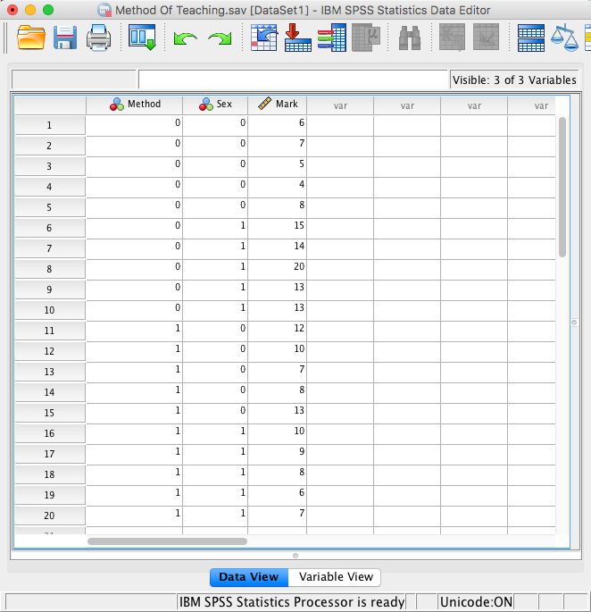
The data below show the score (out of 20) for 20 different students, some of whom are male and some female, and some of whom were taught using positive reinforcement (being nice) and others who were taught using punishment (electric shock). Enter these data into SPSS and save the file as Method of Teaching.sav. (Clue: the data should not be entered in the same way that they are laid out below.)
The data can be found in the file method_of_teaching.sav and should look like this:
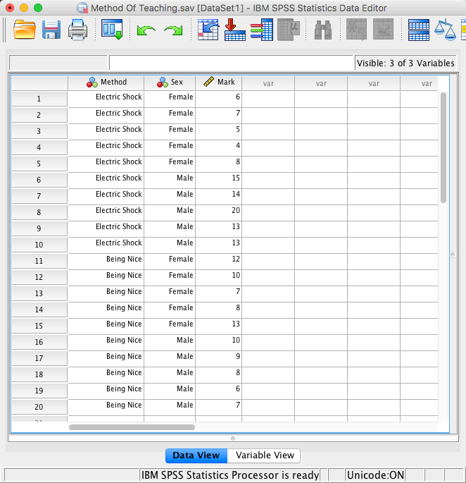
method_of_teaching.sav
Or with the value labels off, like this:
method_of_teaching.sav
Task 4.4
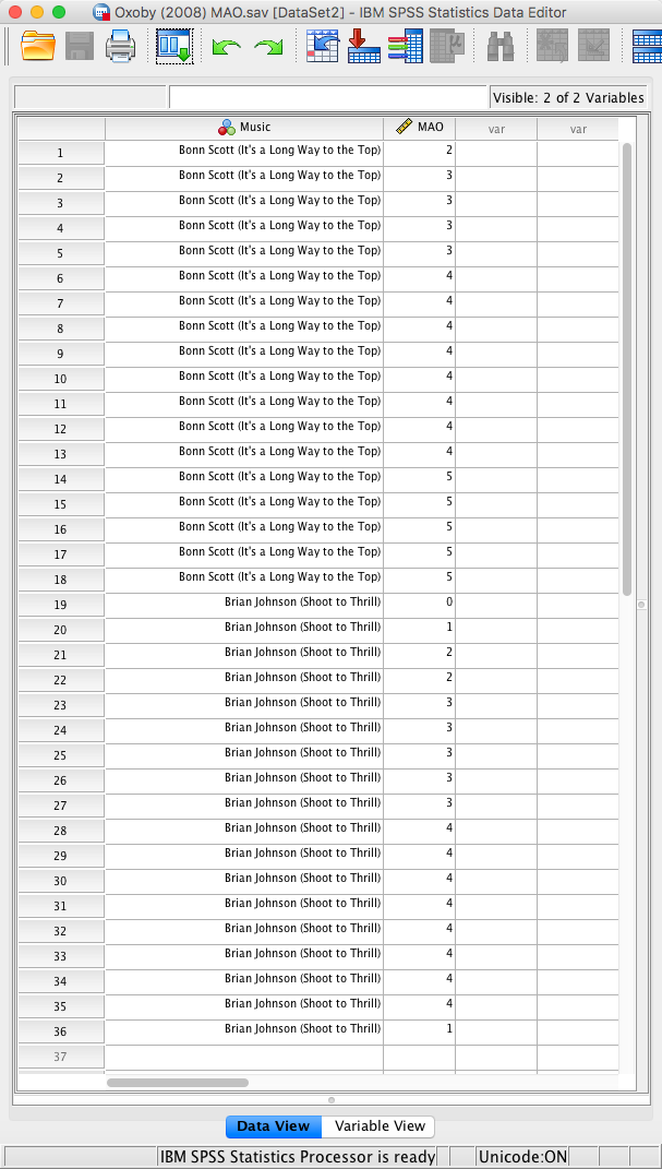
Thinking back to Labcoat Leni’s Real Research 3.1, Oxoby also measured the minimum acceptable offer; these MAOs (in dollars) are below (again, these are approximations based on the graphs in the paper). Enter these data into the SPSS data editor and save this file as Oxoby (2008) MAO.sav. * Bon Scott group: 2, 3, 3, 3, 3, 4, 4, 4, 4, 4, 4, 4, 4, 5, 5, 5, 5, 5 * Brian Johnson group: 0, 1, 2, 2, 3, 3, 3, 3, 3, 4, 4, 4, 4, 4, 4, 4, 4, 1
The data can be found in the file oxoby_2008_moa.sav and should look like this:
oxoby_2008_moa.sav
Or with the value labels off, like this:
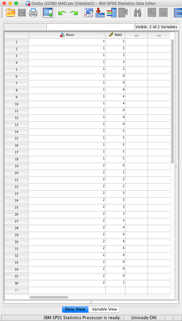
oxoby_2008_moa.sav
Task 4.5
According to some highly unscientific research done by a UK department store chain and reported in Marie Clare magazine (http://ow.ly/9Dxvy) shopping is good for you: they found that the average women spends 150 minutes and walks 2.6 miles when she shops, burning off around 385 calories. In contrast, men spend only about 50 minutes shopping, covering 1.5 miles. This was based on strapping a pedometer on a mere 10 participants. Although I don’t have the actual data, some simulated data based on these means are below. Enter these data into SPSS and save them as Shopping Exercise.sav.
The data can be found in the file shopping_exercise.sav and should look like this:
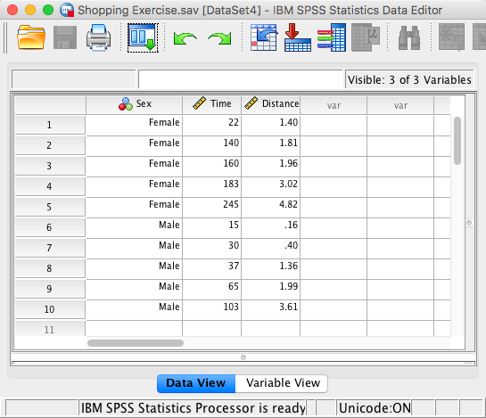
shopping_exercise.sav
Or with the value labels off, like this:
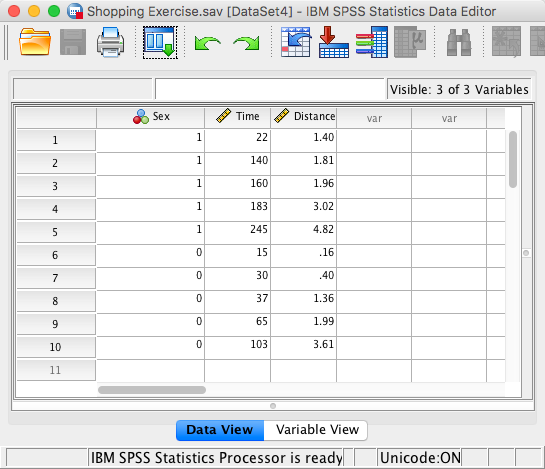
shopping_exercise.sav
Task 4.6
I was taken by two new stories. The first was about a Sudanese man who was forced to marry a goat after being caught having sex with it (http://ow.ly/9DyyP). I’m not sure he treated the goat to a nice dinner in a posh restaurant before taking advantage of her, but either way you have to feel sorry for the goat. I’d barely had time to recover from that story when another appeared about an Indian man forced to marry a dog to atone for stoning two dogs and stringing them up in a tree 15 years earlier (http://ow.ly/9DyFn). Why anyone would think it’s a good idea to enter a dog into matrimony with a man with a history of violent behaviour towards dogs is beyond me. Still, I wondered whether a goat or dog made a better spouse. I found some other people who had been forced to marry goats and dogs and measured their life satisfaction and, also, how much they like animals. Enter these data into SPSS and save as Goat or Dog.sav.
The data can be found in the file goat_or_dog.sav and should look like this:
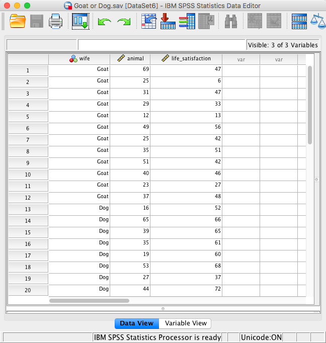
goat_or_dog.sav
Or with the value labels off, like this:
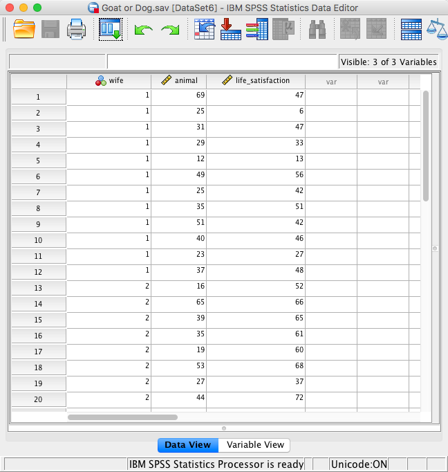
goat_or_dog.sav
Task 4.7
One of my favourite activities, especially when trying to do brain-melting things like writing statistics books, is drinking tea. I am English, after all. Fortunately, tea improves your cognitive function, well, in old Chinese people at any rate (Feng, Gwee, Kua, & Ng, 2010). I may not be Chinese and I’m not that old, but I nevertheless enjoy the idea that tea might help me think. Here’s some data based on Feng et al.’s study that measured the number of cups of tea drunk and cognitive functioning in 15 people. Enter these data in SPSS and save the file as Tea Makes You Brainy 15.sav.
The data can be found in the file tea_makes_you_brainy_15.sav and should look like this:
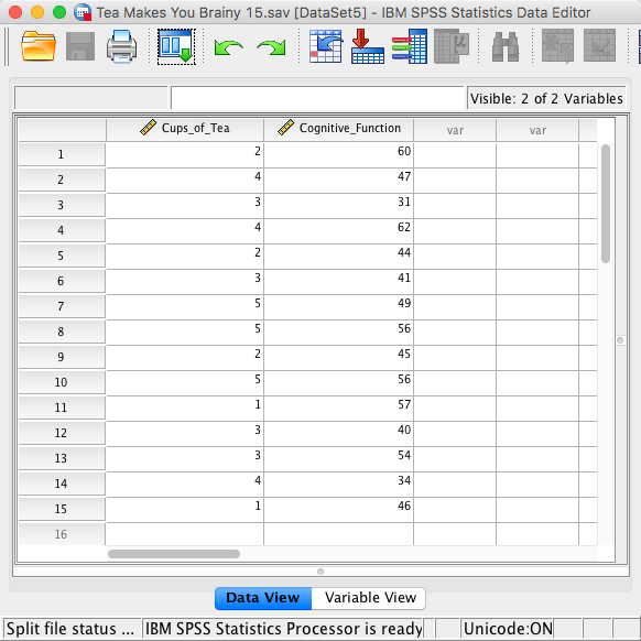
tea_makes_you_brainy_15.sav
Task 4.8
Statistics and maths anxiety are common and affect people’s performance on maths and stats assignments; women in particular can lack confidence in mathematics (Field, 2010). Zhang, Schmader, and Hall (2013) did an intriguing study in which students completed a maths test in which some put their own name on the test booklet, whereas others were given a booklet that already had either a male or female name on. Participants in the latter two conditions were told that they would use this other person’s name for the purpose of the test. Women who completed the test using a different name performed better than those who completed the test using their own name. (There were no such effects for men.) The data below are a random subsample of Zhang et al.’s data. Enter them into SPSS and save the file as Zhang (2013) subsample.sav
The correct format is as in the file zhang_2013_subsample.sav on the companion website. The data editor should look like this:
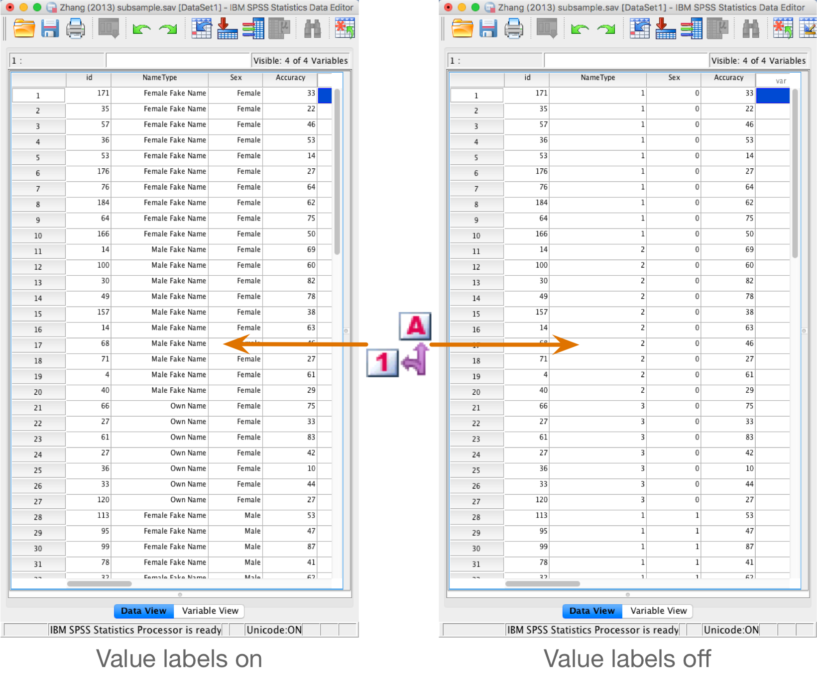
Zhan_2013_subsample.sav
Task 4.9
What is a coding variable?
A variable in which numbers are used to represent group or category membership. An example would be a variable in which a score of 1 represents a person being female, and a 0 represents them being male.
Task 4.10
What is the difference between wide and long format data?
Long format data are arranged such that scores on an outcome variable appear in a single column and rows represent a combination of the attributes of those scores (for example, the entity from which the scores came, when the score was recorded etc.). In long format data, scores from a single entity can appear over multiple rows where each row represents a combination of the attributes of the score (e.g., levels of an independent variable or time point at which the score was recorded etc.) In contrast, Wide format data are arranged such that scores from a single entity appear in a single row and levels of independent or predictor variables are arranged over different columns. As such, in designs with multiple measurements of an outcome variable within a case the outcome variable scores will be contained in multiple columns each representing a level of an independent variable, or a timepoint at which the score was observed. Columns can also represent attributes of the score or entity that are fixed over the duration of data collection (e.g., participant sex, employment status etc.).
Chapter 5
Task 5.1
Using the data from Chapter 4 (which you should have saved, but if you didn’t, re-enter it), plot and interpret an error bar chart showing the mean number of friends for students and lecturers.
First of all access the chart builder and select a simple bar chart.
The y-axis needs to be the dependent variable, or the thing
you’ve measured, or more simply the thing for which you want to display
the mean. In this case it would be number of friends,
so select this variable from the variable list and drag it into the  drop zone. The
x-axis should be the variable by which we want to split the
arousal data. To plot the means for the students and lecturers, select
the variable Group from the variable list and drag it
into the drop zone for the x-axis (
drop zone. The
x-axis should be the variable by which we want to split the
arousal data. To plot the means for the students and lecturers, select
the variable Group from the variable list and drag it
into the drop zone for the x-axis ( ). Then add error
bars by selecting
). Then add error
bars by selecting  in the
Element Properties dialog box. The finished chart builder will
look like this:
in the
Element Properties dialog box. The finished chart builder will
look like this:
.png)
The error bar chart will look like this:
.png)
We can conclude that, on average, students had more friends than lecturers.
Task 5.2
Using the same data, plot and interpret an error bar chart showing the mean alcohol consumption for students and lecturers.
Access the chart builder and select a simple bar chart. The
y-axis needs to be the thing we’ve measured, which in this case
is alcohol consumption, so select this variable from
the variable list and drag it into the drop zone. The
x-axis should be the variable by which we want to split the
arousal data. To plot the means for the students and lecturers, select
the variable Group from the variable list and drag it
into the drop zone for the x-axis (). Add error bars by
selecting in the
Element Properties dialog box. The finished chart builder will
look like this:
.png)
The error bar chart will look like this:
.png)
We can conclude that, on average, students and lecturers drank similar amounts, but the error bars tell us that the mean is a better representation of the population for students than for lecturers (there is more variability in lecturers’ drinking habits compared to students’).
Task 5.3
Using the same data, plot and interpret an error line chart showing the mean income for students and lecturers.
Access the chart builder and select a simple line chart. The
y-axis needs to be the thing we’ve measured, which in this case
is income, so select this variable from the variable
list and drag it into the drop zone. The
x-axis should again be students vs. lecturers, so select the
variable Group from the variable list and drag it into
the drop zone for the x-axis (). Add error bars by
selecting in the
Element Properties dialog box. The finished chart builder will
look like this:
.png)
The error line chart will look like this:
.png)
We can conclude that, on average, students earn less than lecturers, but the error bars tell us that the mean is a better representation of the population for students than for lecturers (there is more variability in lecturers’ income compared to students’).
Task 5.4
Using the same data, plot and interpret error a line chart showing the mean neuroticism for students and lecturers.
Access the chart builder and select a simple line chart. The
y-axis needs to be the thing we’ve measured, which in this case
is neurotic, so select this variable from the variable
list and drag it into the drop zone. The
x-axis should again be students vs. lecturers, so select the
variable Group from the variable list and drag it into
the drop zone for the x-axis (). Add error bars by
selecting in the
Element Properties dialog box. The finished chart builder will
look like this:
.png)
The error line chart will look like this:
.png)
We can conclude that, on average, students are slightly less neurotic than lecturers.
Task 5.5
Using the same data, plot and interpret a scatterplot with regression lines of alcohol consumption and neuroticism grouped by lecturer/student.
Access the chart builder and select a grouped scatterplot. It doesn’t
matter which way around we plot these variables, so let’s select
alcohol consumption from the variable list and drag it
into the y-axis drop zone, and then drag neurotic from the
variable list and drag it into the drop zone. We then need to split the
scatterplot by our grouping variable (lecturers or students), so select
Group and drag it to the  drop zone. The
completed chart builder dialog box will look like this:
drop zone. The
completed chart builder dialog box will look like this:
.png)
Click on  to
produce the graph. To fit the regression lines double-click on the graph
in the SPSS Viewer to open it in the SPSS Chart Editor. Then click on
to
produce the graph. To fit the regression lines double-click on the graph
in the SPSS Viewer to open it in the SPSS Chart Editor. Then click on
![]() in the chart editor to open the properties dialog box. In this dialog
box, ask for a linear model to be fitted to the data (this should be set
by default). Click on
in the chart editor to open the properties dialog box. In this dialog
box, ask for a linear model to be fitted to the data (this should be set
by default). Click on  to fit the
lines:
to fit the
lines:
.png)
We can conclude that for lecturers, as neuroticism increases so does alcohol consumption (a positive relationship), but for students the opposite is true, as neuroticism increases alcohol consumption decreases. Note that SPSS has scaled this graph oddly because neither axis starts at zero; as a bit of extra practice, why not edit the two axes so that they start at zero? You can do this by first double-clicking on the x-axis to activate the properties dialog box and then in the custom box set the minimum to be 0 instead of 5. Repeat this process for the y-axis. The resulting graph will look like this:
.png)
Task 5.6
Using the same data, plot and interpret a scatterplot matrix with regression lines of alcohol consumption, neuroticism and number of friends.
Access the chart builder and select a scatterplot matrix. We have to
drag all three variables into the  drop zone.
Select the first variable (Friends) by clicking on it
with the mouse. Now, hold down the Ctrl (Cmd on a Mac)
key on the keyboard and click on a second variable
(Alcohol). Finally, hold down the Ctrl (or
Cmd) key and click on a third variable
(Neurotic). Once the three variables are selected,
click on any one of them and then drag them into the drop zone.
The completed dialog box will look like this:
drop zone.
Select the first variable (Friends) by clicking on it
with the mouse. Now, hold down the Ctrl (Cmd on a Mac)
key on the keyboard and click on a second variable
(Alcohol). Finally, hold down the Ctrl (or
Cmd) key and click on a third variable
(Neurotic). Once the three variables are selected,
click on any one of them and then drag them into the drop zone.
The completed dialog box will look like this:
.png)
Click on to
produce the graph. To fit the regression lines double-click on the graph
in the SPSS Viewer to open it in the SPSS Chart Editor. Then click on
![]() in the Chart Editor to open the properties dialog box. In this dialog
box, ask for a linear model to be fitted to the data (this should be set
by default). Click on to fit the lines.
The resulting graph looks like this:
in the Chart Editor to open the properties dialog box. In this dialog
box, ask for a linear model to be fitted to the data (this should be set
by default). Click on to fit the lines.
The resulting graph looks like this:
.png)
We can conclude that there is no relationship (flat line) between the number of friends and alcohol consumption; there was a negative relationship between how neurotic a person was and their number of friends (line slopes downwards); and there was a slight positive relationship between how neurotic a person was and how much alcohol they drank (line slopes upwards).
Task 5.7
Using the Zang (2013) subsample.sav data from Chapter Error! Reference source not found. (see Smart Alex’s task) plot a clustered error bar chart of the mean test accuracy as a function of the type of name participants completed the test under (x-axis) and whether they were male or female (different coloured bars).
To graph these data we need to select a clustered bar chart in the
chart builder. First we need to select Test Accuracy
(%) and drag it into the drop zone. Next we
need to select Name Condition and drag it into the drop zone. Finally,
we select Participant Sex and drag it into the drop zone. The
two sexes will now be displayed as different-coloured bars. Add error
bars by selecting in the
Element Properties dialog box. The finished chart builder will
look like this:
.png)
The resulting graph looks like this:
.png)
The graph shows that, on average, males did better on the test than females when using their own name (the control) but also when using a fake female name. However, for participants who did the test under a fake male name, the women did better than males.
Task 5.8
Using the Method Of Teaching.sav data from Chapter 3, plot a clustered error line chart of the mean score when electric shocks were used compared to being nice, and plot males and females as different-coloured lines.
To graph these data we need to select a multiple line chart in the
chart builder. In the variable list select the method of
teaching variable and drag it into . Then highlight and
drag the variable representing score on SPSS homework into . Next, highlight and
drag the grouping variable Sex into  .
The two groups will now be displayed as different-coloured bars. Add
error bars by selecting in the
Element Properties dialog box. The finished chart builder will
look like this:]
.
The two groups will now be displayed as different-coloured bars. Add
error bars by selecting in the
Element Properties dialog box. The finished chart builder will
look like this:]
.png)
The resulting graph looks like this:
.png)
We can see that when the being nice method of teaching is used, males and females have comparable scores on their SPSS homework, with females scoring slightly higher than males on average, although their scores are also more variable than the males’ scores as indicated by the longer error bar). However, when an electric shock is used, males score higher than females but there is more variability in the males’ scores than the females’ for this method (as seen by the longer error bar for males than for females). Additionally, the graph shows that females score higher when the being nice method is used compared to when an electric shock is used, but the opposite is true for males. This suggests that there may be an interaction effect of sex.
Task 5.9
Using the Shopping Exercise.sav data from Chapter 3, plot two error bar graphs comparing men and women (x-axis): one for the distance walked, and the other of the time spent shopping.
Let’s first do the graph for distance walked. In the chart builder
double-click on the icon for a simple bar chart, then select the
Distance Walked… variable from the variable list and
drag it into the drop zone. The
x-axis should be the variable by which we want to split the
data. To plot the means for males and females, select the variable
Participant Sex from the variable list and drag it into
the drop zone for the x-axis (). Finally, add error
bars to your bar chart by selecting in the
Element Properties dialog box. The finished chart builder will
look like this:
.png)
The resulting graph looks like this:
.png)
Looking at the graph above, we can see that, on average, females walk longer distances while shopping than males.
Next we need to do the graph for time spent shopping. In the chart
builder double-click on the icon for a simple bar chart. Select the
Time Spent … variable from the variable list and drag
it into the
drop zone. The x-axis should be the variable by which we want
to split the data. To plot the means for males and females, select the
variable Participant Sex from the variable list and
drag it into the drop zone for the x-axis (). Finally, add error
bars to your bar chart by selecting in the
Element Properties dialog box. The finished chart builder will
look like this:
.png)
The resulting graph looks like this:
.png)
The graph shows that, on average, females spend more time shopping than males. The females’ scores are more variable than the males’ scores (longer error bar).
Task 5.10
Using the Goat or Dog.sav data from Chapter 3, plot two error bar graphs comparing scores when married to a goat or a dog (x-axis): one for the animal liking variable, and the other of the life satisfaction.
Let’s first do the graph for the animal liking variable. In the chart
builder double-click on the icon for a simple bar chart, then select the
Love of Animals variable from the variable list and
drag it into the drop zone. The
x-axis should be the variable by which we want to split the
data. To plot the means for males and females, select the variable
Type of Animal Wife from the variable list and drag it
into the drop zone for the x-axis (). Finally, add error
bars to your bar chart by selecting in the
Element Properties dialog box. The finished chart builder will
look like this:
.png)
The resulting graph looks like this:
.png)
The graph shows that the mean love of animals was the same for men married to a goat as for those married to a dog.
Next we need to do the graph for life satisfaction. In the chart
builder double-click on the icon for a simple bar chart. Select the
Life Satisfaction variable from the variable list and
drag it into the drop zone. The
x-axis should be the variable by which we want to split the
data. To plot the means for males and females, select the variable
Type of Animal Wife from the variable list and drag it
into the drop zone for the x-axis (). Finally, add error
bars to your bar chart by selecting in the
Element Properties dialog box. The finished chart builder will
look like this:
.png)
The resulting graph looks like this:
.png)
The graph shows that, on average, life satisfaction was higher in men who were married to a dog compared to men who were married to a goat.
Task 5.11
Using the same data as above, plot a scatterplot of animal liking scores against life satisfaction (plot scores for those married to dogs or goats in different colours).
Access the chart builder and select a grouped scatterplot. It doesn’t
matter which way around we plot these variables, so let’s select
Life Satisfaction from the variable list and drag it
into the drop
zone and then drag Love of Animals from the variable
list and drag it into the drop zone for the x-axis (). We then need to
split the scatterplot by our grouping variable (dogs or goats), so
select Type of Animal Wife and drag it to the drop zone. The
completed chart builder dialog box will look like this:
.png)
Click on to
produce the graph. Let’s fit some regression lines to make the graph
easier to interpret. To do this, double-click on the graph in the SPSS
viewer to open it in the SPSS chart editor. Then click on ![]() in the chart editor to open the properties dialog box. In this dialog
box, ask for a linear model to be fitted to the data (this should be set
by default). Click on to fit the
lines:
in the chart editor to open the properties dialog box. In this dialog
box, ask for a linear model to be fitted to the data (this should be set
by default). Click on to fit the
lines:
.png)
We can conclude that for men married to both goats and dogs, as love of animals increases so does life satisfaction (a positive relationship). However, this relationship is more pronounced for goats than for dogs (steeper regression line for goats than for dogs).
Task 5.12
Using the Tea Makes You Brainy 15.sav data from Chapter 3, plot a scatterplot showing the number of cups of tea drunk (x-axis) against cognitive functioning (y-axis).
In the chart builder double-click on the icon for a simple
scatterplot. Select the cognitive functioning variable from the variable
list and drag it into the drop zone. The
horizontal axis should display the independent variable (the variable
that predicts the outcome variable). In this case is it is the number of
cups of tea drunk, so click on this variable in the variable list and
drag it into the drop zone for the x-axis (). The completed
dialog box will look like this:
.png)
Click on to
produce the graph. Let’s fit a regression line to make the graph easier
to interpret. To do this, double-click on the graph in the SPSS Viewer
to open it in the SPSS Chart Editor. Then click on in the Chart Editor
to open the properties dialog box. In this dialog box, ask for a linear
model to be fitted to the data (this should be set by default). Click on
![]() to
fit the line. The resulting graph should look like this:
to
fit the line. The resulting graph should look like this:
.png)
The scatterplot (and near-flat line especially) tells us that there is a tiny relationship (practically zero) between the number of cups of tea drunk per day and cognitive function.
Chapter 6
Task 6.1
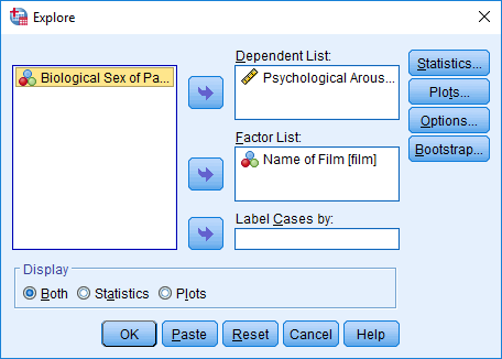
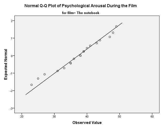
Using the Notebook.sav data, check the assumptions of normality and homogeneity of variance for the two films (ignore sex). Are the assumptions met?
The dialog box from the explore function should look like this (you can use the default options):
The resulting output looks like this:
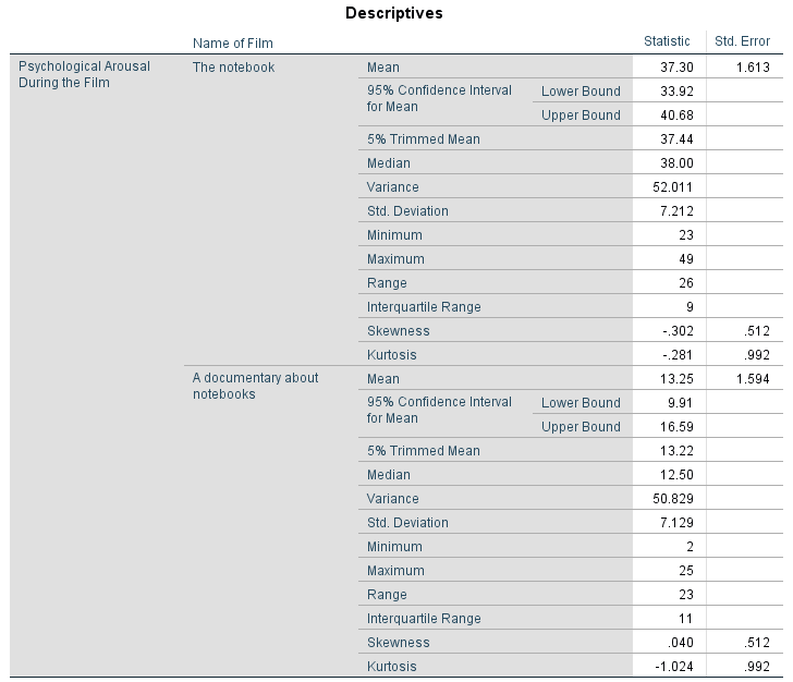
The skewness statistics gives rise to a z-score of −0.320/0.512 = –0.63 for The Notebook, and 0.04/0.512 = 0.08 for a documentary about notebooks. These show no significant skewness. For kurtosis these values are −0.281/0.992 = –0.28 for The Notebook, and –1.024/0.992 = –1.03 for a documentary about notebooks, which again are both non-significant. More important their values are close to zero.
The Q-Q plots confirm these findings: for both films the expected quantile points are close to those that would be expected from a normal distribution (i.e. the dots fall close to the diagonal line).
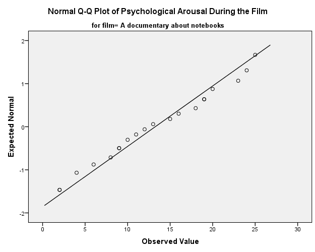
The K-S tests show no significant deviation from normality for both films. We could report that arousal scores for The Notebook, D(20) = 0.13, p = 0.20, and a documentary about notebooks, D(20) = 0.10, p = 0.20, were both not significantly different from a normal distribution. Therefore, if we believe these sorts of tests then we can assume normality in the sample data. However, the sample is small and these tests would have been very underpowered to detect a deviation from normal, so my conclusion here is based more on the Q-Q plots.
In terms of homogeneity of variance, again Levene’s test will be
underpowered, and I prefer to ignore this test altogether, but if you’re
the sort of person who doesn’t ignore it, it shows that the variances of
arousal for the two films were not significantly different,
F(1, 38) = 1.90, p = 0.753. 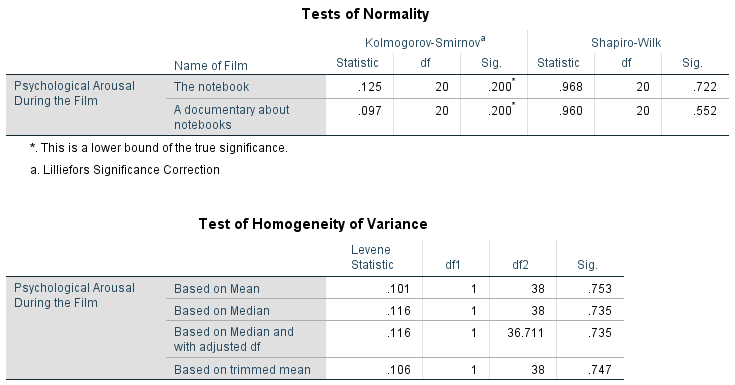
Task 6.2
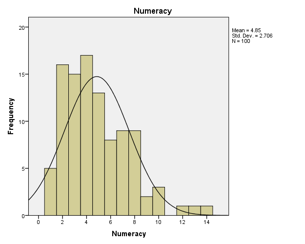
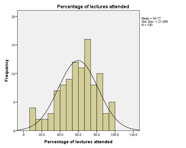
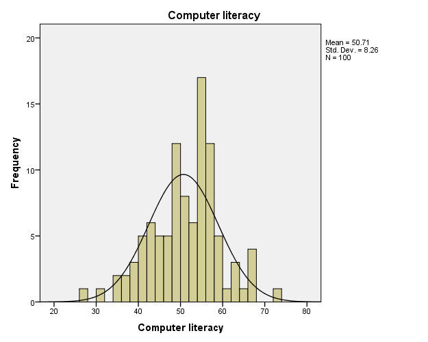
The file SPSSExam.sav contains data on students’ performance on an SPSS exam. Four variables were measured: exam (first-year SPSS exam scores as a percentage), computer (measure of computer literacy in percent), lecture (percentage of SPSS lectures attended) and numeracy (a measure of numerical ability out of 15). There is a variable called uni indicating whether the student attended Sussex University (where I work) or Duncetown University. Compute and interpret descriptive statistics for exam, computer, lecture and numeracy for the sample as a whole.
To see the distribution of the variables, we can use the frequencies command. Place all four variables (exam, computer, lecture and numeracy) in the Variable(s) box in the dialog box:
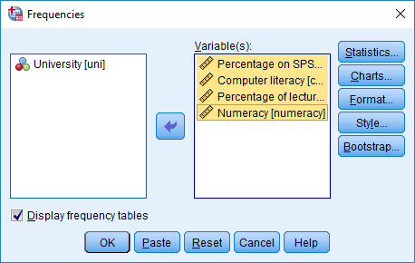
Click  and select measures of central tendency (mean, mode, median),
variability (range, standard deviation, variance, quartile splits) and
shape (kurtosis and skewness). Click
and select measures of central tendency (mean, mode, median),
variability (range, standard deviation, variance, quartile splits) and
shape (kurtosis and skewness). Click  and select a
frequency distribution of scores with a normal curve.
and select a
frequency distribution of scores with a normal curve.
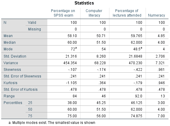
The output shows the table of descriptive statistics for the four variables in this example. From this table, we can see that, on average, students attended nearly 60% of lectures, obtained 58% in their SPSS exam, scored only 51% on the computer literacy test, and only 5 out of 15 on the numeracy test. In addition, the standard deviation for computer literacy was relatively small compared to that of the percentage of lectures attended and exam scores. These latter two variables had several modes (multimodal). The output provides tabulated frequency distributions of each variable (not reproduced here). These tables list each score and the number of times that it is found within the data set. In addition, each frequency value is expressed as a percentage of the sample (in this case the frequencies and percentages are the same because the sample size was 100). Also, the cumulative percentage is given, which tells us how many cases (as a percentage) fell below a certain score. So, for example, we can see that 66% of numeracy scores were 5 or less, 74% were 6 or less, and so on. Looking in the other direction, we can work out that only 8% (\(100−92%\)) got scores greater than 8.
The histograms show us several things. The exam scores are very interesting because this distribution is quite clearly not normal; in fact, it looks suspiciously bimodal (there are two peaks, indicative of two modes). This observation corresponds with the earlier information from the table of descriptive statistics. It looks as though computer literacy is fairly normally distributed (a few people are very good with computers and a few are very bad, but the majority of people have a similar degree of knowledge) as is the lecture attendance. Finally, the numeracy test has produced very positively skewed data (the majority of people did very badly on this test and only a few did well). This corresponds to what the skewness statistic indicated.
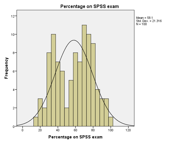
Descriptive statistics and histograms are a good way of getting an instant picture of the distribution of your data. This snapshot can be very useful: for example, the bimodal distribution of SPSS exam scores instantly indicates a trend that students are typically either very good at statistics or struggle with it (there are relatively few who fall in between these extremes). Intuitively, this finding fits with the nature of the subject: statistics is very easy once everything falls into place, but before that enlightenment occurs it all seems hopelessly difficult!
Task 6.3
Calculate and interpret the z-scores for skewness for all variables.
For the SPSS exam scores, the z-score of skewness is −0.107/0.241 = −0.44. For numeracy, the z-score of skewness is 0.961/0.241 = 3.99. For computer literacy, the z-score of skewness is −0.174/0.241 = −0.72. For lectures attended, the z-score of skewness is −0.422/0.241 = −1.75. It is pretty clear then that the numeracy scores are significantly positively skewed (p < .05) because the z-score is greater than 1.96, indicating a pile-up of scores on the left of the distribution (so most students got low scores). For the other three variables, the skewness is non-significant, p < .05, because the values lie between −1.96 and 1.96.
Task 6.4
Calculate and interpret the z-scores for kurtosis for all variables.
- For SPSS exam scores, the z-score of kurtosis is −1.105/0.478 = −2.31, which is significant, p < 0.05, because it lies outside −1.96 and 1.96.
- For computer literacy, the z-score of kurtosis is 0.364/0.478 = 0.76, which is non-significant, p < 0.05, because it lies between −1.96 and 1.96.
- For lectures attended, the z-score of kurtosis is −0.179/0.478 = −0.37, which is non-significant, p < 0.05, because it lies between −1.96 and 1.96.
- For numeracy, the z-score of kurtosis is 0.946/0.478 = 1.98, which is significant, p < 0.05, because it lies outside −1.96 and 1.96.
Task 6.5
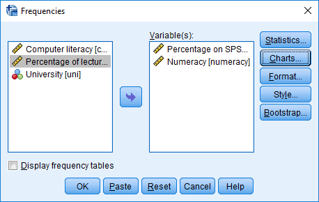
Use the split file command to look at and interpret the descriptive statistics for numeracy and exam.
If we want to obtain separate descriptive statistics for each of the
universities, we can split the file, and then proceed using the
frequencies command. In the split file dialog box select the
option Organize output by groups. Drag Uni
into the box labelled Groups Based on and click :
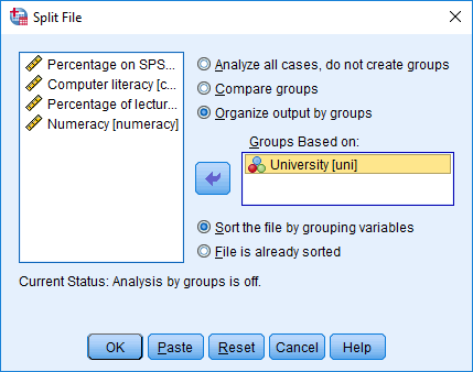
Once you have split the file, use the frequencies command:
The output is split into two sections: first the results for students at Duncetown University, then the results for those attending Sussex University. From these tables it is clear that Sussex students scored higher on both their SPSS exam and the numeracy test than their Duncetown counterparts. In fact, looking at the means reveals that, on average, Sussex students scored an amazing 36% more on the SPSS exam than Duncetown students, and had higher numeracy scores too (what can I say, my students are the best).
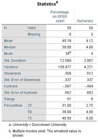
Descriptive statistics for Duncetown University

Descriptive statistics for Sussex University
The histograms of these variables split according to the university attended show numerous things. The first interesting thing to note is that for exam marks, the distributions are both fairly normal. This seems odd because the overall distribution was bimodal. However, it starts to make sense when you consider that for Duncetown the distribution is centred around a mark of about 40%, but for Sussex the distribution is centred around a mark of about 76%. This illustrates how important it is to look at distributions within groups. If we were interested in comparing Duncetown to Sussex it wouldn’t matter that overall the distribution of scores was bimodal; all that’s important is that each group comes from a normal distribution, and in this case it appears to be true. When the two samples are combined, these two normal distributions create a bimodal one (one of the modes being around the centre of the Duncetown distribution, and the other being around the centre of the Sussex data!). For numeracy scores, the distribution is slightly positively skewed (there is a larger concentration at the lower end of scores) in both the Duncetown and Sussex groups. Therefore, the overall positive skew observed before is due to the mixture of universities.
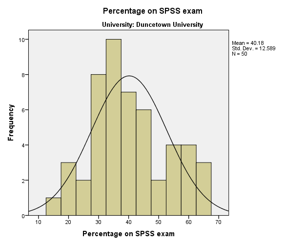
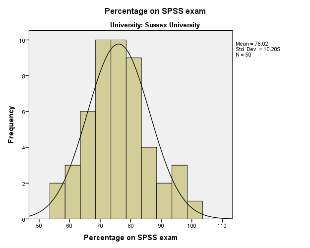
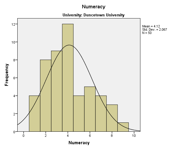
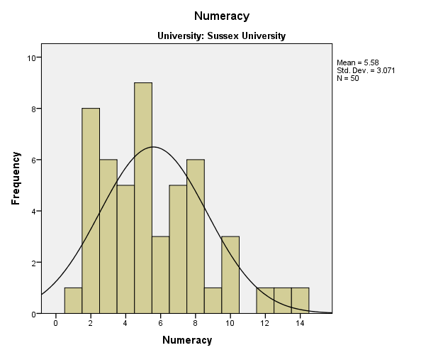
Task 6.6
Repeat Task 5 but for the computer literacy and percentage of lectures attended.
The SPSS output is split into two sections: first, the results for students at Duncetown University, then the results for those attending Sussex University. From these tables it is clear that Sussex and Duncetown students scored similarly on computer literacy (both means are very similar). Sussex students attended slightly more lectures (63.27%) than their Duncetown counterparts (56.26%). The histograms are also split according to the university attended. All of the distributions look fairly normal. The only exception is the computer literacy scores for the Sussex students. This is a fairly flat distribution apart from a huge peak between 50 and 60%. It’s slightly heavy-tailed (right at the very ends of the curve the bars come above the line) and very pointy. This suggests positive kurtosis. If you examine the values of kurtosis you will find that there is significant (p < 0.05) positive kurtosis: 1.38/0.662 = 2.08, which falls outside of −1.96 and 1.96.
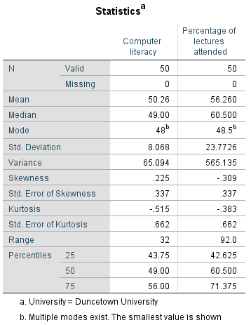
Descriptive statistics for Duncetown University
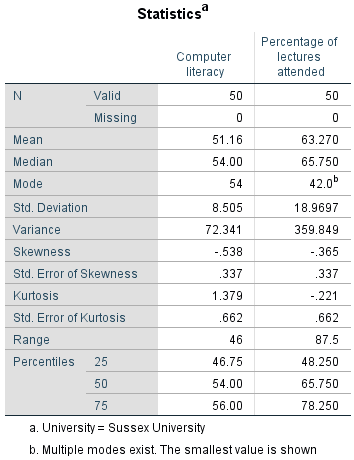
Descriptive statistics for Sussex University
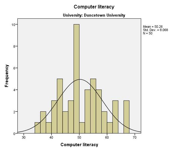
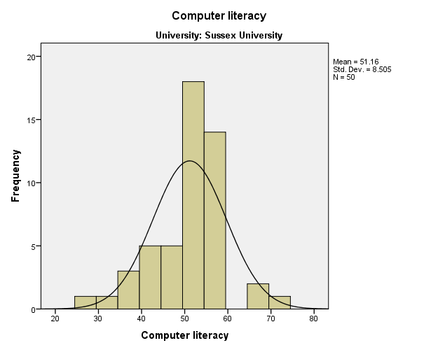
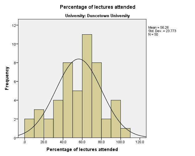
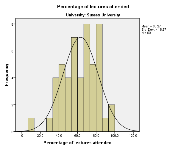
Task 6.7
Conduct and interpret a K-S test for numeracy and exam.
The Kolmogorov–Smirnov (K-S) test can be accessed through the explore command. First, drag exam and numeracy to the box labelled Dependent List. It is also possible to select a factor (or grouping variable) by which to split the output (so if you drag Uni to the box labelled Factor List, output will be produced for each group — a bit like the split file command).
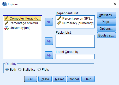 Click
Click  and
select
and
select  .
.
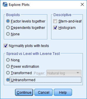
The output containing the K-S test, looks like this:
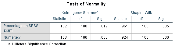
For both numeracy and SPSS exam scores, the K-S test is highly significant, indicating that both distributions are not normal. This result is likely to reflect the bimodal distribution found for exam scores, and the positively skewed distribution observed in the numeracy scores. However, these tests confirm that these deviations were significant. (But bear in mind that the sample is fairly big.) We can report that the percentages on the SPSS exam, D(100) = 0.10, p = 0.012, and the numeracy scores, D(100) = 0.15, p < .001, were both significantly non-normal.
As a final point, bear in mind that when we looked at the exam scores for separate groups, the distributions seemed quite normal; now if we’d asked for separate tests for the two universities (by dragging Uni in the box labelled Factor List) the K-S test will have been dfifferent. If you try this out, you’ll get this output:
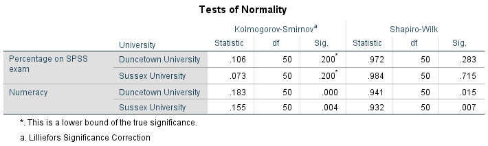
Note that the percentages on the SPSS exam are not significantly different from normal within the two groups. This point is important because if our analysis involves comparing groups, then what’s important is not the overall distribution but the distribution in each group.
Because tests like K-S are at the mercy of sample size, it’s also worth looking at the Q-Q plots. These plots confirm that both variables (overall) are not normal because the dots deviate substantially from the line. (incidentally, the deviation is greater for the numeracy scores, and this is consistent with the higher significance value of this variable on the K-S test.)
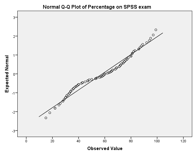
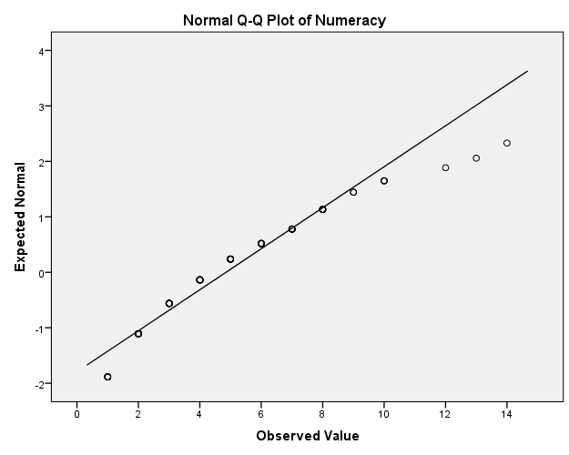
Task 6.8
Conduct and interpret a Levene’s test for numeracy and exam.
Let’s begin this example by reminding ourselves that Levene’s test is basically pointless (see the book!). Nevertheless, if you insist on consulting it, Levene’s test is obtained using the explore dialog box. Drag the variables exam and numeracy to the box labelled Dependent List. To compare variances across the two universities we need to drag the variable Uni to the box labelled Factor List.
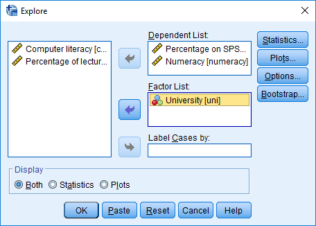 Click and
select
Click and
select ![]() .
.
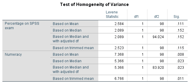
Levene’s test is non-significant for the SPSS exam scores indicating either that that the variances are not significantly different (i.e. they are similar and the homogeneity of variance assumption is tenable) or that the test is underpowered to detect a difference. For the numeracy scores, Levene’s test is significant indicating that the variances are significantly different (i.e., the homogeneity of variance assumption has been violated). We could report that for the percentage on the SPSS exam, the variances for Duncetown and Sussex University students were not significantly different, F(1, 98) = 2.58, p = 0.111, but for numeracy scores the variances were significantly different, F(1, 98) = 7.37, p = 0.008.
Task 6.9
Transform the numeracy scores (which are positively skewed) using one of the transformations described in this chapter. Do the data become normal?
Reproduced below are histograms of the original scores and thes ame scores after all three transformations discussed in the book:
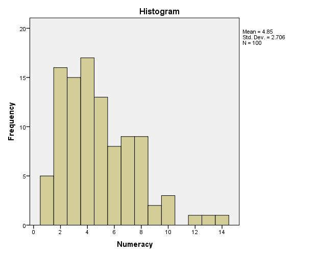
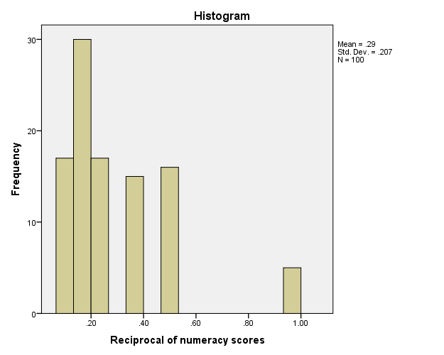
None of these histograms are particularly normal. With thenusual strong caveats that I apply to significance tests of normality (read the book!), here’s the output from the K–S tests:
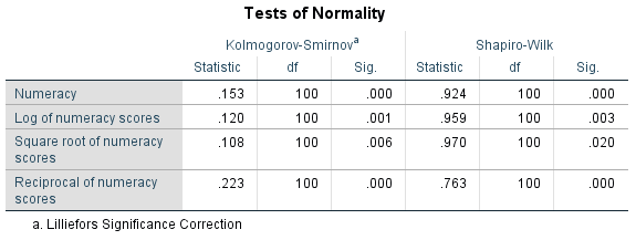
All of these tests are significant, suggesting (to the extent to which the K-S test tells us anything useful) that although the square root transformation does the best job of normalizing the data, none of these transformations work.
Task 6.10
Use the explore command to see what effect a natural log transformation would have on the four variables measured in SPSSExam.sav.
The completed dialog box should look like this:
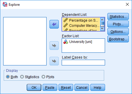 Click and
select
Click and
select ![]() :
:
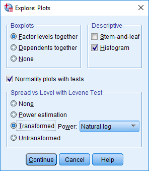
The outputshows Levene’s test on the log-transformed scores. Compare this table to the one in Task 8 (which was conducted on the untransformed SPSS exam scores and numeracy). To recap Task 8, for the untransformed scores Levene’s test was non-significant for the SPSS exam scores (p = 0.111) indicating that the variances were not significantly different (i.e., the homogeneity of variance assumption is tenable). However, for the numeracy scores, Levene’s test was significant (p = 0.008) indicating that the variances were significantly different (i.e. the homogeneity of variance assumption was violated).
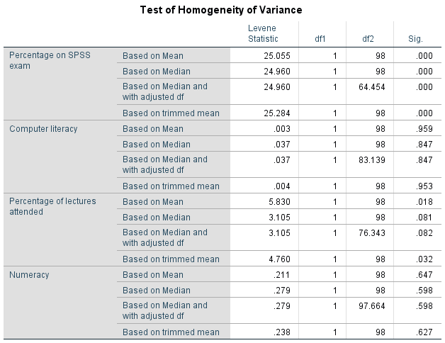
For the log-transformed scores, the problem has been reversed: Levene’s test is now significant for the SPSS exam scores (p < 0.001) but is no longer significant for the numeracy scores (p = 0.647). This reiterates my point from the book chapter that transformations are often not a magic solution to problems in the data.
Chapter 7
Task 7.1
A psychologist was interested in the cross-species differences between men and dogs. She observed a group of dogs and a group of men in a naturalistic setting (20 of each). She classified several behaviours as being dog-like (urinating against trees and lampposts, attempts to copulate with anything that moved, and attempts to lick their own genitals). For each man and dog she counted the number of dog-like behaviours displayed in a 24-hour period. It was hypothesized that dogs would display more dog-like behaviours than men. Analyze the data in MenLikeDogs.sav with a Mann–Whitney test.
Output
Interpretation
The output tells us that z is –0.15 (standardized test statistic), and we had 20 men and 20 dogs so the total number of observations was 40. The effect size is, therefore:
\[ r = \frac{-0.15}{\sqrt{40}} = -0.02\]
This represents a tiny effect (it is close to zero), which tells us that there truly isn’t much difference between dogs and men. We could report something like:
- Men (Mdn = 27) and dogs (Mdn = 24) did not significantly differ in the extent to which they displayed dog-like behaviours, U = 194.5, p = 0.881 , r = −0.02.
Task 7.2
Both Ozzy Osbourne and Judas Priest have been accused of putting backward masked messages on their albums that subliminally influence poor unsuspecting teenagers into doing things like blowing their heads off with shotguns. A psychologist was interested in whether backward masked messages could have an effect. He created a version of Britney Spears’ ‘Baby one more time’ that contained the masked message ‘deliver your soul to the dark lord’ repeated in the chorus. He took this version, and the original, and played one version (randomly) to a group of 32 people. Six months later he played them whatever version they hadn’t heard the time before. So each person heard both the original and the version with the masked message, but at different points in time. The psychologist measured the number of goats that were sacrificed in the week after listening to each version. Test the hypothesis that the backward message would lead to more goats being sacrificed using a Wilcoxon signed-rank test (DarkLord.sav).
Output
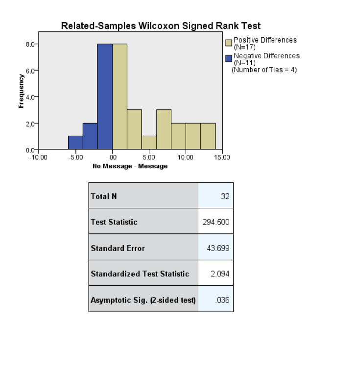
Interpretation
The output tells us that z is 2.094 (standardized test statistic), and we had 64 observations (although we only used 32 people and tested them twice, it is the number of observations, not the number of people, that is important here). The effect size is, therefore:
\[r = \frac{2.094}{\sqrt{64}} = 0.26\]
This value represents a medium effect (it is close to Cohen’s benchmark of 0.3), which tells us that the effect of whether or a subliminal message was present was a substantive effect. We could report something like:
- The number of goats sacrificed after hearing the message (Mdn = 9) was significantly less than after hearing the normal version of the song (Mdn = 11), T = 294.50, p = 0.036, r = 0.26.
Task 7.3
A media researcher was interested in the effect of television programmes on domestic life. She hypothesized that through ‘learning by watching’, certain programmes encourage people to behave like the characters within them. She exposed 54 couples to three popular TV shows after which the couple were left alone in the room for an hour. The experimenter measured the number of times the couple argued. Each couple viewed all TV shows but at different points in time (a week apart) and in a counterbalanced order. The TV shows were EastEnders (which portrays the lives of extremely miserable, argumentative, London folk who spend their lives assaulting each other, lying and cheating), Friends (which portrays unrealistically considerate and nice people who love each other oh so very much—but I love it anyway), and a National Geographic programme about whales (this was a control). Test the hypothesis with Friedman’s ANOVA *(Eastenders.sav).
Output
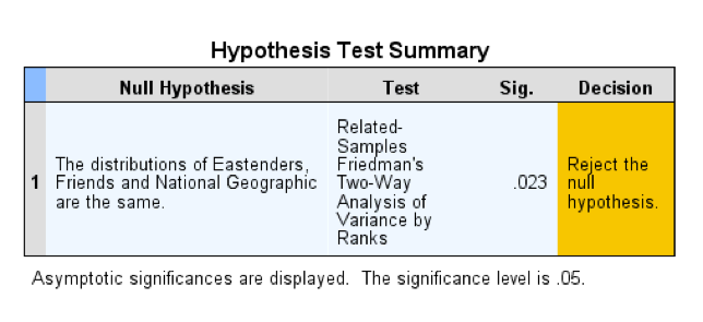
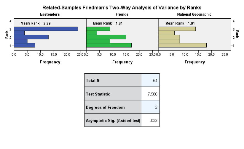
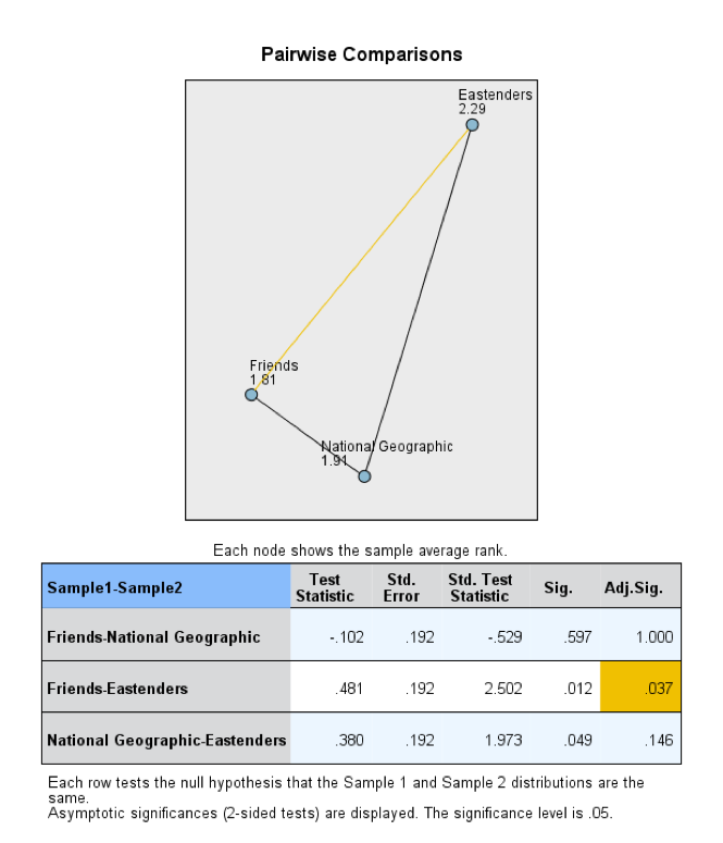
Interpretation
The mean ranks were highest after watching EastEnders. From the chi-square test statistic we can conclude that the type of programme watched significantly affected the subsequent number of arguments (because the significance value is less than 0.05). To see where the differences lie we look at pairwise comparisons.
The output of the pairwise comparisons shows that the test comparing Friends to EastEnders is significant (as indicated by the yellow line); however, the other two comparisons were both non-significant (as indicated by the black lines). The table below the diagram confirms this and tells us the significance values of the three comparisons. The significance value of the comparison between Friends and EastEnders is 0.037, which is below the criterion of 0.05, therefore we can conclude that EastEnders led to significantly more arguments than Friends. The effect seems to reflect the fact that* EastEnders* makes people argue more.
For the first comparison (Friends vs. National Geographic) z is –0.529, and because this is based on comparing two groups each containing 54 observations, we have 108 observations in total (remember that it isn’t important that the observations come from the same people). The effect size is, therefore:
\[ r_{\text{Friends}-\text{National Geographic}} = \frac{-0.529}{\sqrt{108}} = -0.05\]
This represents virtually no effect (it is close to zero). Therefore, Friends had very little effect in creating arguments compared to the control. For the second comparison (Friends compared to EastEnders) z is 2.502, and this was again based on 108 observations. The effect size is:
\[ r_{\text{Friends}-\text{EastEnders}} = \frac{2.502}{\sqrt{108}} = 0.24\]
This tells us that the effect of EastEnders relative to Friends was a small to medium effect. For the third comparison (EastEnders vs. National Geographic) z is 1.973, and this was again based on 108 observations. The effect size is:
\[ r_{\text{National Geographic}-\text{EastEnders}} = \frac{1.973}{\sqrt{108}} = 0.19\]
This also represents a small to medium effect. We could report all of this as follows:
- The number of arguments that couples had was significantly affected by the programme they had just watched, \(\chi^\text{2}\)(2) = 7.59, p = 0.023. Pairwise comparisons with adjusted p-values showed that watching EastEnders significantly increased the number of arguments compared to watching Friends (p = 0. 037, r = 0.24). However, there were no significant differences in number of arguments when watching Friends compared to the control programme (National Geographic), p = 1.00, r = -0.05. Finally, EastEnders did not significantly increase the number of arguments compared to the control programme; however, there was a small to medium effect (p = 0.146, r = 0.19).
Task 7.4
A researcher was interested in preventing coulrophobia (fear of clowns) in children. She did an experiment in which different groups of children (15 in each) were exposed to positive information about clowns. The first group watched adverts in which Ronald McDonald is seen cavorting with children and singing about how they should love their mums. A second group was told a story about a clown who helped some children when they got lost in a forest (what a clown was doing in a forest remains a mystery). A third group was entertained by a real clown, who made balloon animals for the children. A final, control, group had nothing done to them at all. Children rated how much they liked clowns from 0 (not scared of clowns at all) to 5 (very scared of clowns). Use a Kruskal–Wallis test to see whether the interventions were successful (coulrophobia.sav).
Output
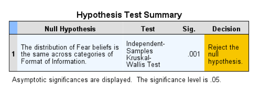
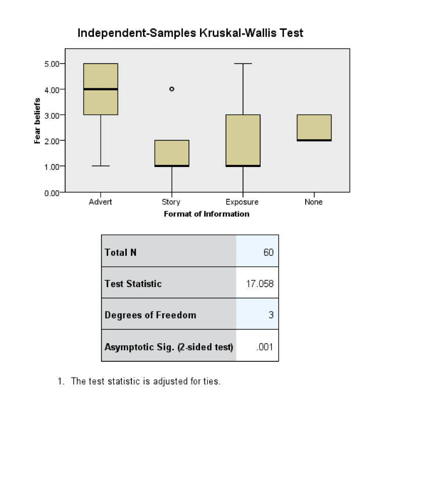
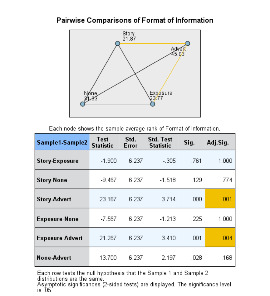
Interpretation
We can conclude that the type of information presented to the children about clowns significantly affected their fear ratings of clowns. The boxplot in the output above gives us an indication of the direction of the effects, but to see where the significant differences lie we need to look at the pairwise comparisons.
The test comparing the story and advert groups, and the test comparing the exposure and the advert groups were significant (yellow connecting lines). However, none of the other comparisons were significant (black connecting lines). The table below the diagram confirms this, and tells us the significance values of the comparisons. The significance value of the comparison between exposure and advert is 0.004, and between story and advert is 0.001, both of which are below the common criterion of 0.05. Therefore, we can conclude that hearing a story and exposure to a clown significantly decreased fear beliefs compared to watching the advert (I know the direction of the effects by looking at the boxplot). There was no significant difference between hearing and exposure on children’s fear beliefs. Finally, none of the interventions significantly decreased fear beliefs compared to the control condition.
For the first comparison (story vs. exposure) z is –0.305, and because this is based on comparing two groups each containing 15 observations, we have 30 observations in total. The effect size is:
\[ r_{\text{story}-\text{exposure}} = \frac{-0.305}{\sqrt{30}} = -0.06\]
This represents a very small effect, which tells us that the effect of a story relative to exposure was similar. For the second comparison (story vs. control) z is –1.518, and this was again based on 30 observations. The effect size is:
\[ r_{\text{story}-\text{control}} = \frac{-1.518}{\sqrt{30}} = -0.28\]
This represents a small to medium effect. Therefore, although non-significant, the effect of stories relative to the control was a fairly substantive effect. For the next comparison (story vs. advert) z is 3.714, and this was again based on 30 observations. The effect size is:
\[ r_{\text{story}-\text{advert}} = \frac{3.714}{\sqrt{30}} = 0.68\]
This represents a large effect. Therefore, the effect of a stories relative to adverts was a substantive effect. For the next comparison (exposure vs. control) z is –1.213, and this was again based on 30 observations. The effect size is:
\[ r_{\text{exposure}-\text{control}} = \frac{-1.213}{\sqrt{30}} = -0.22\]
This represents a small effect. Therefore, there was a small effect of exposure relative to the control.For the next comparison (exposure vs. advert) z is 3.410, and this was again based on 30 observations. The effect size is:
\[ r_{\text{exposure}-\text{advert}} = \frac{3.419}{\sqrt{30}} = 0.62\]
This represents a large effect. Therefore, the effect of a stories relative to adverts was a substantive effect. For the final comparison (adverts vs. control) z is 2.197, and this was again based on 30 observations. The effect size is, therefore:
\[ r_{\text{Control}-\text{advert}} = \frac{2.197}{\sqrt{30}} = 0.40\]
This represents a medium to large effect, Therefore, although non-significant, the effect of adverts relative to the control was a substantive effect.
We could report something like:
- Children’s fear beliefs about clowns was significantly affected the format of information given to them, H(3) = 17.06, p = 0.001. Pairwise comparisons with adjusted p-values showed that fear beliefs were significantly higher after the adverts compared to the story, U = 23.17, p = 0.001, r = 0.68, and exposure, U = 21.27, p = 0.004, r = 0.62. However, fear beliefs were not significantly different after the stories, U = −9.47, p = 0.774, r = −0.28, exposure, U = −7.56, p = 1.000, r = −0.22, or adverts, U = 13.70, p = 0.168, r = 0.40, relative to the control. Finally, fear beliefs were not significantly different after the stories relative to exposure, U = −1.90, p = 1.000, r = −0.06. We can conclude that clown information through adverts, stories and exposure did produce medium-size effects in reducing fear beliefs about clowns compared to the control, but not significantly so (future work with larger samples might be appropriate).
Task 7.5
Test whether the number of offers was significantly different in people listening to Bon Scott compared to those listening to Brian Johnson (Oxoby (2008) Offers.sav). Compare your results to those reported by Oxoby (2008).
We need to conduct a Mann–Whitney test because we want to compare scores in two independent samples: participants who listened to Bon Scott vs. those who listened to Brian Johnson.
Output
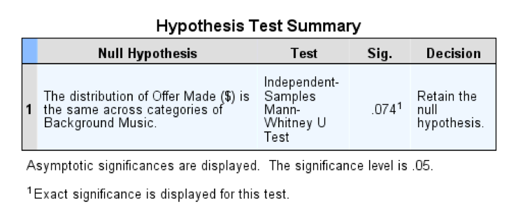
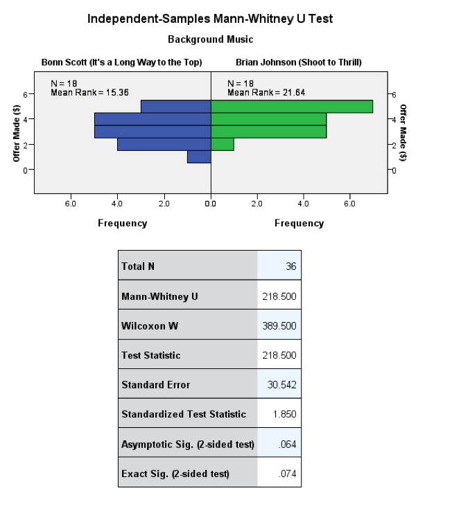
Interpretation
Let’s calculate an effect size, r:
\[ r_{\text{Bon}-\text{Brian}} = \frac{1.850}{\sqrt{36}} = 0.31\]
This represents a medium effect: when listening to Brian Johnson people proposed higher offers than when listening to Bon Scott, suggesting that they preferred Brian Johnson to Bon Scott. Although this effect has some substance, it was not significant, which shows that a fairly substantial effect size can be non-significant in a small sample. We could report something like:
- Offers made by people listening to Bon Scott (Mdn = 3.0) were not significantly different from offers by people listening to Brian Johnson (Mdn = 4.0), U = 218.50, z = 1.85, p = 0.074, r = 0.31.
I’ve reported the median for each condition because this statistic is more appropriate than the mean for non-parametric tests. You’ll can get these values by running descriptive statistics, or you could report the mean ranks instead of the median. We could also choose to report Wilcoxon’s test rather than the Mann–Whitney U-statistic as follows:
- Offers made by people listening to Bon Scott (M = 15.36) were not significantly different from offers by people listening to Brian Johnson (M = 21.64), Ws = 389
Task 7.6
Repeat the analysis above, but using the minimum acceptable offer (Oxoby (2008) MAO.sav).
We again conduct a Mann–Whitney test. This is because we are comparing two independent samples (those who listened to Brian Johnson and those who listened to Bon Scott).
Output
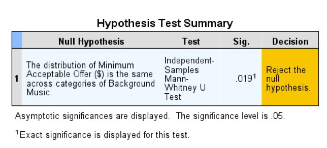
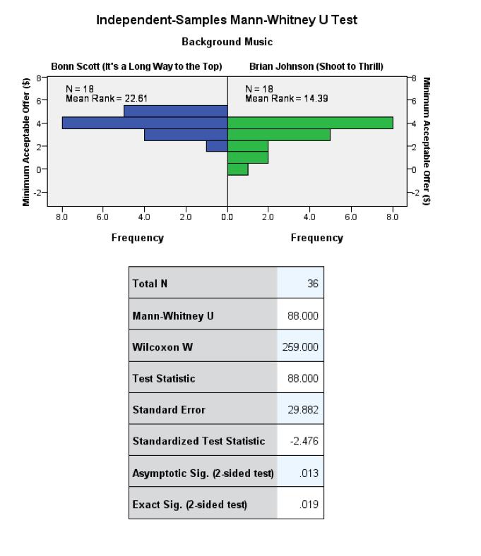
Interpretation
Let’s calculate the effect size, r:
\[ r_{\text{Bon}-\text{Brian}} = \frac{-2.476}{\sqrt{36}} = -0.41\]
This represents a medium effect. looking at the mean ranks in the output above, we can see that people accepted lower offers when listening to Brian Johnson than when listening to Bon Scott. We could report something like:
- The minimum acceptable offer was significantly higher in people listening to Bon Scott (Mdn = 4.0) than in people listening to Brian Johnson (Mdn = 3.0), U = 88.00, z = 2.48, p = 0.019, r = 0.41, suggesting that people preferred Brian Johnson to Bon Scott.
I’ve reported the median for each condition because this statistic is more appropriate than the mean for non-parametric tests. You’ll can get these values by running descriptive statistics, or you could report the mean ranks instead of the median. We could also choose to report Wilcoxon’s test rather than the Mann–Whitney U-statistic as follows:
- The minimum acceptable offer was significantly higher in people listening to Bon Scott (M = 22.61) than in people listening to Brian Johnson (M = 14.39), Ws = 259.00, z = 2.48, p = 0.019, r = 0.41, suggesting that people preferred Brian Johnson to Bon Scott.
Task 7.7
Using the data in Shopping Exercise.sav test whether men and women spent significantly different amounts of time shopping?
We need to conduct a Mann–Whitney test because we are comparing two independent samples (men and women).
Output
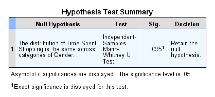
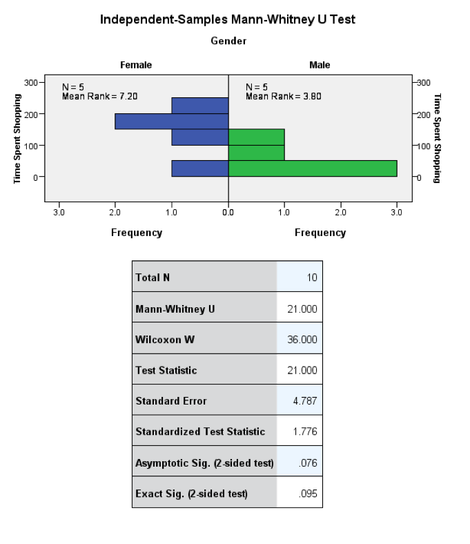
Interpretation
Let’s calculate the effect size, r:
\[ r_{\text{men}-\text{women}} = \frac{1.776}{\sqrt{10}} = 0.56\]
This represents a large effect, which highlights how large effects can be non-significant in small samples. The mean ranks show that women spent more time shopping than men. We could report the analysis as follows:
- Men (Mdn = 37.0) and women (Mdn = 160.0) did not significantly differ in the length of time they spent shopping, U = 21.00, z = 1.78, p = 0.095, r = 0.56.
I’ve reported the median for each condition (this statistic is more appropriate than the mean for non-parametric tests). Alternatively you can report the mean ranks. If you choose to report Wilcoxon’s test rather than the Mann–Whitney U-statistic you would do so as follows:
- Men (M = 3.8) and women (M = 7.2) did not significantly differ in the length of time they spent shopping, Ws = 36.00, z = 1.78, p = 0.095, r = 0.56.
Task 7.8
Using the same data, test whether men and women walked significantly different distances while shopping.
Again, we conduct a Mann–Whitney test because – yes, you guessed it – we are once again comparing two independent samples (men and women).
Output
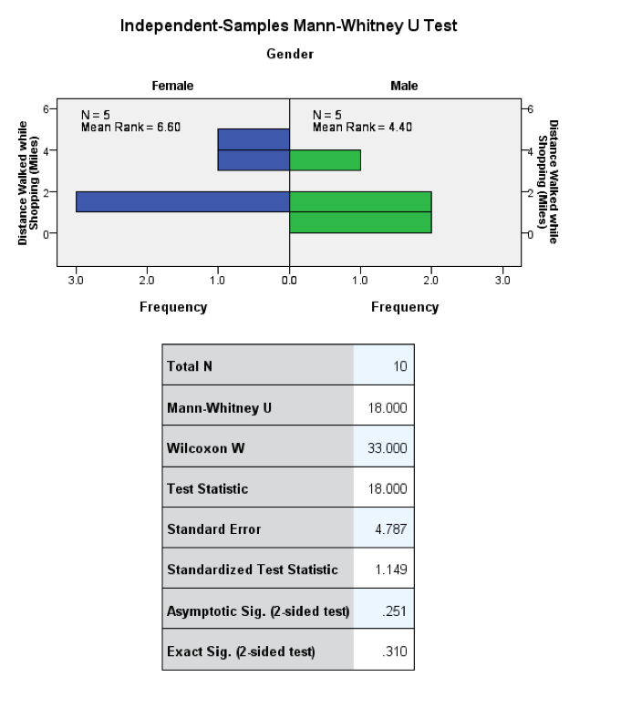
Interpretation
Let’s calculate the effect size, r:
\[ r_{\text{men}-\text{women}} = \frac{1.149}{\sqrt{10}} = 0.36\]
This represents a medium effect, which highlights how substantial effects can be non-significant in small samples. The mean ranks show that women travelled greater distances while shopping than men (but not significantly so). We could report this analysis as follows:
- Men (Mdn = 1.36) and women (Mdn = 1.96) did not significantly differ in the distance walked while shopping, U = 18.00, z = 1.15, p = 0.310, r = 0.36.
If we reported the mean ranks (instead of the median) and Wilcoxon’s test (rather than the Mann–Whitney U-statistic), we could do so as follows:
- Men (M = 4.4) and women (M = 6.6) did not significantly differ in the distance walked while shopping, Ws = 33.00, z = 1.15, p = 0.310, r = 0.36.
Task 7.9
Using the data in Goat or Dog.sav test whether people married to goats and dogs differed significantly in their life satisfaction.
To answer this question we run a Mann–Whitney test. The reason for choosing this test is that we are comparing two independent groups (men could be married to a goat or a dog, not both – that would be weird).
Output
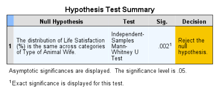
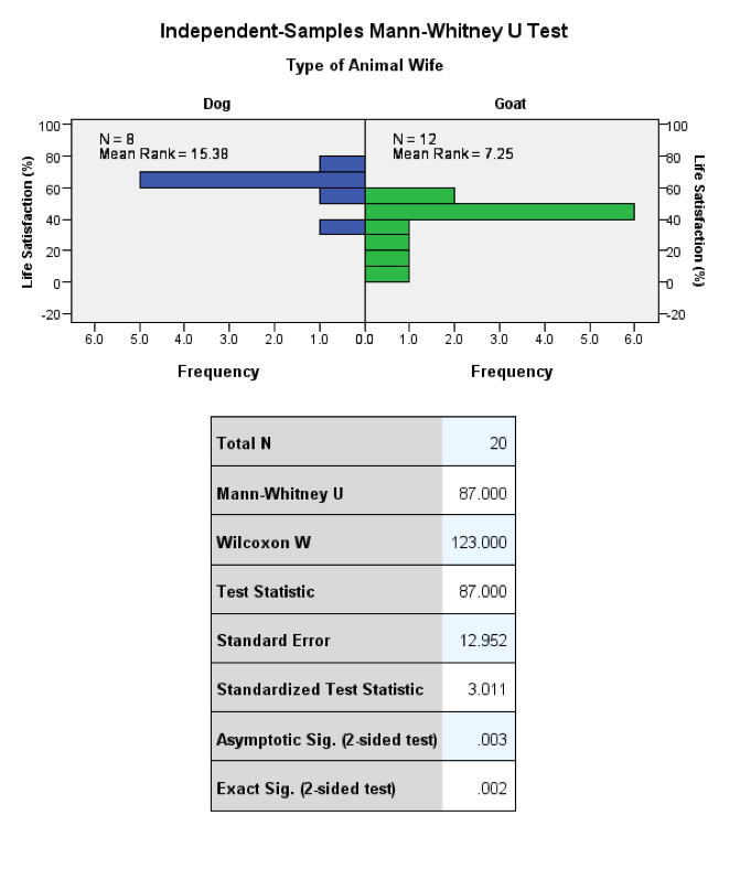
Interpretation
Let’s calculate the effect size, r:
\[ r_{\text{goat}-\text{dog}} = \frac{3.011}{\sqrt{20}} = 0.67\]
This represents a very large effect. Looking at the mean ranks in the output above, we can see that men who were married to dogs had a higher life satisfaction than those married to goats – well, they do say that dogs are man’s best friend. We could report the analysis as:
- Men who were married to dogs (Mdn = 63) had significantly higher levels of life satisfaction than men who were married to goats (Mdn = 44), U = 87.00, z = 3.01, p = 0.002, r = 0.67.
If we reported the mean ranks (instead of the median) and Wilcoxon’s test (rather than the Mann–Whitney U-statistic), we could do so as follows:
- Men who were married to dogs (M = 15.38) had significantly higher levels of life satisfaction than men who were married to goats (M = 7.25), Ws = 123.00, z = 3.01, p = 0.002, r = 0.67.
Task 7.10
Use the SPSSExam.sav data to test whether students at the Universities of Sussex and Duncetown differed significantly in their SPSS exam scores, their numeracy, their computer literacy, and the number of lectures attended.
To answer this question run a Mann–Whitney test. The reason for choosing this test is that we are comparing two unrelated groups (students who attended Sussex University and students who attended Duncetown University).
Output
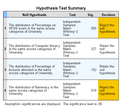
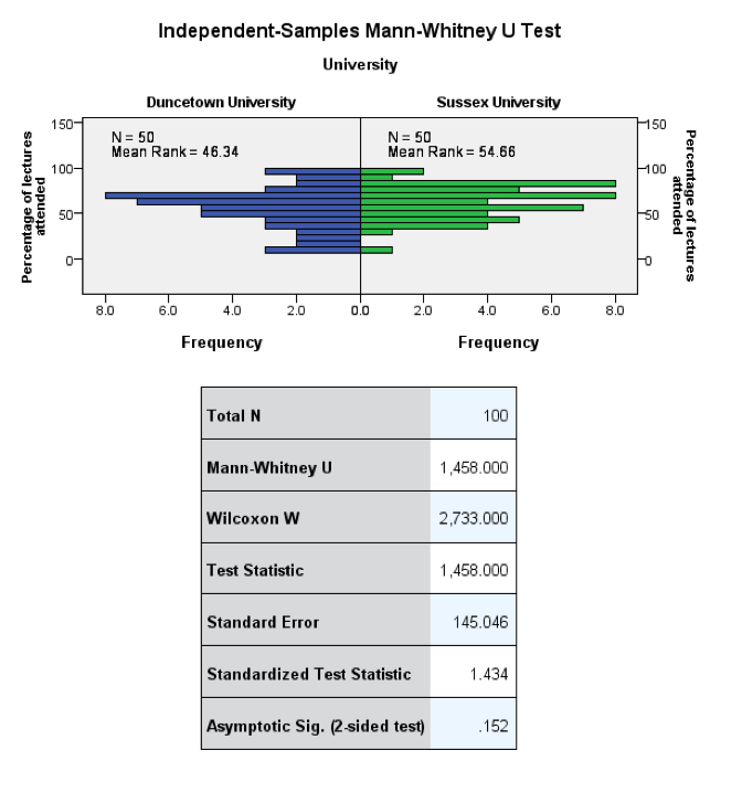
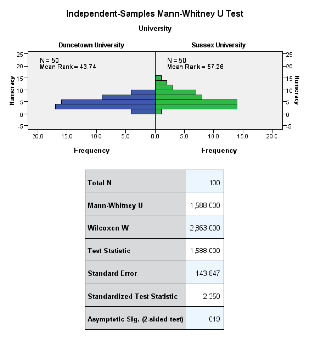
Interpretation
Let’s calculate the effect size, r, for the difference between Duncetown and Sussex universities for each outcome variable:
\[ \begin{aligned} \ r_{\text{SPSS exam}} &= \frac{8.412}{\sqrt{100}} = 0.84 \\ \ r_{\text{computer literacy}} &= \frac{0.980}{\sqrt{100}} = 0.10 \\ \ r_{\text{lectures attended}} &= \frac{1.434}{\sqrt{100}} = 0.14 \\ \ r_{\text{numeracy}} &= \frac{2.35}{\sqrt{100}} = 0.24 \\ \end{aligned} \]
We could report the analysis as:
- Students from the Sussex University (Mdn = 75) scored significantly higher on their SPSS exam than students from Duncetown University (Mdn = 38), U = 2,470.00, z = 8.41, p = 0.00, r = 0.84. Sussex students (Mdn = 5) were also significantly more numerate than those at Duncetown University (Mdn = 4), U = 1,588.00, z = 2.35, p = 0.019, r = 0.24. However, Sussex students (Mdn = 54), were not significantly more computer literate than Duncetown students (Mdn = 49), U = 1,392.00, z = 0.980, p = 0.327, r = 0.10, nor did Sussex students (Mdn = 65.75) attend significantly more lectures than Duncetown students (Mdn = 60.50), U = 1,458.00, z = 1.43, p = 0.152, r = 0.14. Sussex students are just more intelligent, naturally.:-)
Task 7.11
Use the DownloadFestival.sav data to test whether hygiene levels changed significantly over the three days of the festival.
Conduct a Friedman’s ANOVA because we want to compare more than two (day 1, day 2 and day 3) related samples (the same participants were used across the three days of the festival).
Output
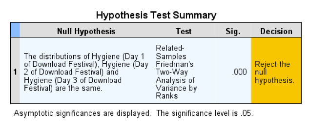
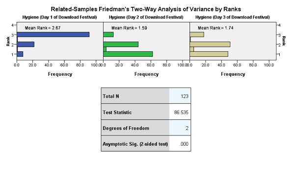
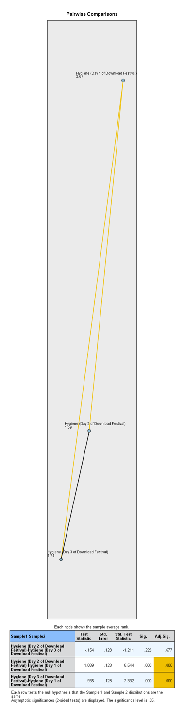
Interpretation
We could report something like:
- The hygiene levels significantly decreased over the three days of the music festival, \(\chi^\text{2}\)(2) = 86.54, p < 0.001. However, pairwise comparisons with adjusted p-values revealed that while hygiene scores significantly decreased between days 1 and 2, (p < 0.001, r = 0.54), and days 1 and 3, (p < 0.001, r = 0.47), they did not significantly decrease between days 2 and 3 (p = 0.677, r = 0.08).
\[ \begin{aligned} \ r_{\text{day 1}-\text{day 1}} &= \frac{8.544}{\sqrt{246}} = 0.54 \\ \ r_{\text{day 1}-\text{day 3}} &= \frac{7.332}{\sqrt{246}} = 0.47 \\ \ r_{\text{day 2}-\text{day 3}} &= \frac{-1.211}{\sqrt{246}} = -0.08 \\ \end{aligned} \]
Chapter 8
Task 8.1
A student was interested in whether there was a positive relationship between the time spent doing an essay and the mark received. He got 45 of his friends and timed how long they spent writing an essay (hours) and the percentage they got in the essay (essay). He also translated these grades into their degree classifications (grade): in the UK, a student can get a first-class mark (the best), an upper-second-class mark, a lower second, a third, a pass or a fail (the worst). Using the data in the file EssayMarks.sav find out what the relationship was between the time spent doing an essay and the eventual mark in terms of percentage and degree class (draw a scatterplot too).
We’re interested in looking at the relationship between hours spent on an essay and the grade obtained. We could create a scatterplot of hours spent on the essay (x-axis) and essay mark (y-axis). I’ve chosen to highlight the degree classification grades using different colours. The resulting scatterplot looks like this:
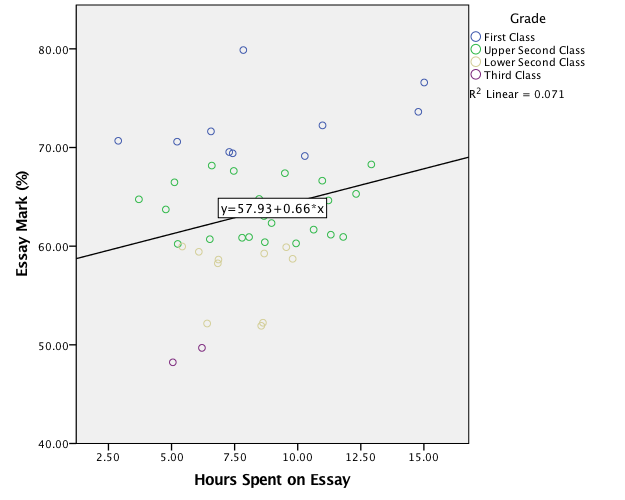
We should check whether the data are parametric using the explore menu to look at the distributions of scores. The resulting output is as follows:
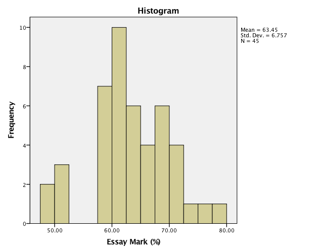
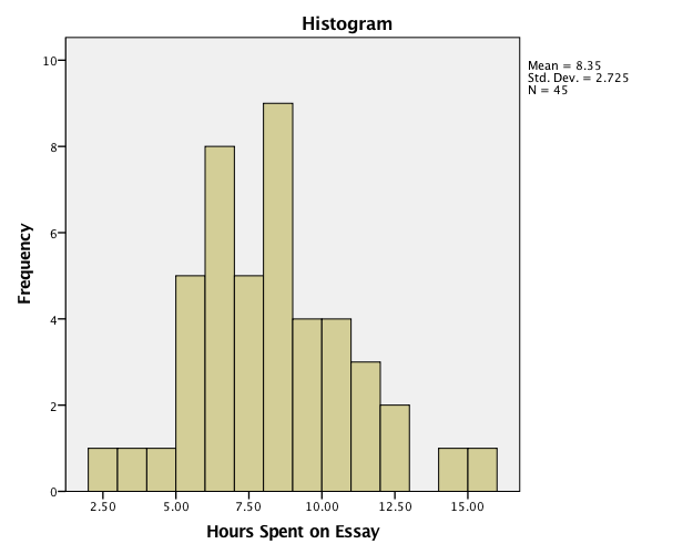
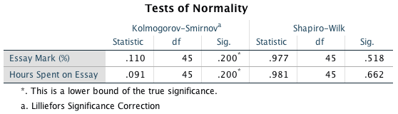
The histograms both look fairly normal. Also, the Kolmogorov–Smirnov and Shapiro–Wilk statistics are non-significant for both variables, which indicates that they are normally distributed (or that the test are underpowered). On balance, we can probably use Pearson’s correlation coefficient. The result of this analysis is:
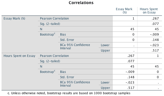
I chose a two-tailed test because it is never really appropriate to conduct a one-tailed test (see the book chapter). I also requested the bootstrapped confidence intervals even though the data were normal because they are robust. The results in the table above indicate that the relationship between time spent writing an essay and grade awarded was not significant, Pearson’s r = 0.27, 95% BCa CI [0.023, 0.517], p = 0.077. The second part of the question asks us to do the same analysis but when the percentages are recoded into degree classifications. The degree classifications are ordinal data (not interval): they are ordered categories. So we shouldn’t use Pearson’s test statistic, but Spearman’s and Kendall’s ones instead:
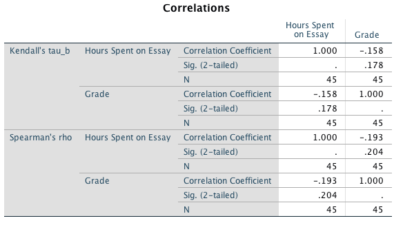
In both cases the correlation is non-significant. There was no significant relationship between degree grade classification for an essay and the time spent doing it, ρ = 0.19, p = 0.204, and τ = –0.16, p = 0.178. Note that the direction of the relationship has reversed. This has happened because the essay marks were recoded as 1 (first), 2 (upper second), 3 (lower second), and 4 (third), so high grades were represented by low numbers. This example illustrates one of the benefits of not taking continuous data (like percentages) and transforming them into categorical data: when you do, you lose information and often statistical power!
Task 8.2
Using the Notebook.sav data, find out the size of relationship between the participant’s sex and arousal.
Sex is a categorical variable with two categories, therefore, we need to quantify this relationship using a point-biserial correlation. The resulting output table is as follows:
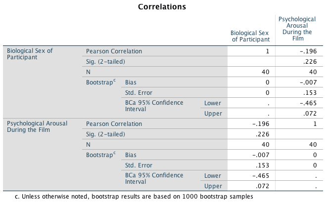
I used a two-tailed test because one-tailed tests should never really be used. I have also asked for the bootstrapped confidence intervals as they are robust. There was no significant relationship between biological sex and arousal because the p-value is larger than 0.05 and the bootstrapped confidence intervals cross zero, \(r_\text{pb}\) = –0.20, 95% BCa CI [–0.47, 0.07], p = 0.266.
Task 8.3
Using the notebook data again, quantify the relationship between the film watched and arousal.
There was a significant relationship between the film watched and arousal, \(r_\text{pb}\) = –0.87, 95% BCa CI [–0.92, –0.80], p < 0.001. Looking at how the groups were coded, you should see that The Notebook had a code of 1, and the documentary about notebooks had a code of 2, therefore the negative coefficient reflects the fact that as film goes up (changes from 1 to 2) arousal goes down. Put another way, as the film changes from The Notebook to a documentary about notebooks, arousal decreases. So The Notebook gave rise to the greater arousal levels.
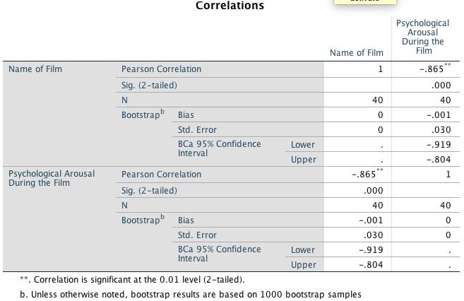
Task 8.4
As a statistics lecturer I am interested in the factors that determine whether a student will do well on a statistics course. Imagine I took 25 students and looked at their grades for my statistics course at the end of their first year at university: first, upper second, lower second and third class (see Task 1). I also asked these students what grade they got in their high school maths exams. In the UK GCSEs are school exams taken at age 16 that are graded A, B, C, D, E or F (an A grade is the best). The data for this study are in the file grades.sav. To what degree does GCSE maths grade correlate with first-year statistics grade?
Let’s look at these variables. In the UK, GCSEs are school exams taken at age 16 that are graded A, B, C, D, E or F. These grades are categories that have an order of importance (an A grade is better than all of the lower grades). In the UK, a university student can get a first-class mark, an upper second, a lower second, a third, a pass or a fail. These grades are categories, but they have an order to them (an upper second is better than a lower second). When you have categories like these that can be ordered in a meaningful way, the data are said to be ordinal. The data are not interval, because a first-class degree encompasses a 30% range (70–100%), whereas an upper second only covers a 10% range (60–70%). When data have been measured at only the ordinal level they are said to be non-parametric and Pearson’s correlation is not appropriate. Therefore, the Spearman correlation coefficient is used. In the file, the scores are in two columns: one labelled stats and one labelled gcse. Each of the categories described above has been coded with a numeric value. In both cases, the highest grade (first class or A grade) has been coded with the value 1, with subsequent categories being labelled 2, 3 and so on. Note that for each numeric code I have provided a value label (just like we did for coding variables).
In the question I predicted that better grades in GCSE maths would correlate with better degree grades for my statistics course. This hypothesis is directional and so a one-tailed test could be selected; however, in the chapter I advised against one-tailed tests so I have done two-tailed:
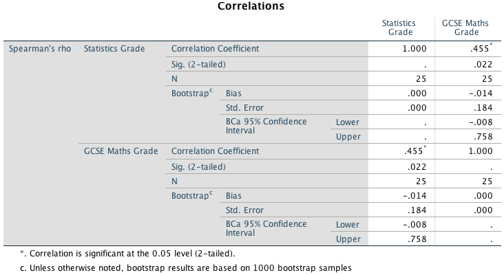
The SPSS output shows the Spearman correlation on the variables stats and gcse. The output shows a matrix giving the correlation coefficient between the two variables (0.455), underneath is the significance value of this coefficient (0.022) and then the sample size (25). I also requested the bootstrapped confidence intervals (–0.008, 0.758). The significance value for this correlation coefficient is less than 0.05; therefore, it can be concluded that there is a significant relationship between a student’s grade in GCSE maths and their degree grade for their statistics course. However, the bootstrapped confidence interval crosses zero, suggesting that the effect in the population could be zero. It is worth remembering that if we were to rerun the analysis we would get different results for the bootstrap confidence interval. I have rerun the analysis, and the resulting output is below. You can see that this time the confidence interval does not cross zero (0.041, 0.755), which suggests that there is likely to be a positive effect in the population (as GCSE grades improve, there is a corresponding improvement in degree grades for statistics). The p-value is only just significant (0.022), although the correlation coefficient is fairly large (0.455). This situation demonstrates that it is important to replicate studies. Finally, it is good to check that the value of N corresponds to the number of observations that were made. If it doesn’t then data may have been excluded for some reason.
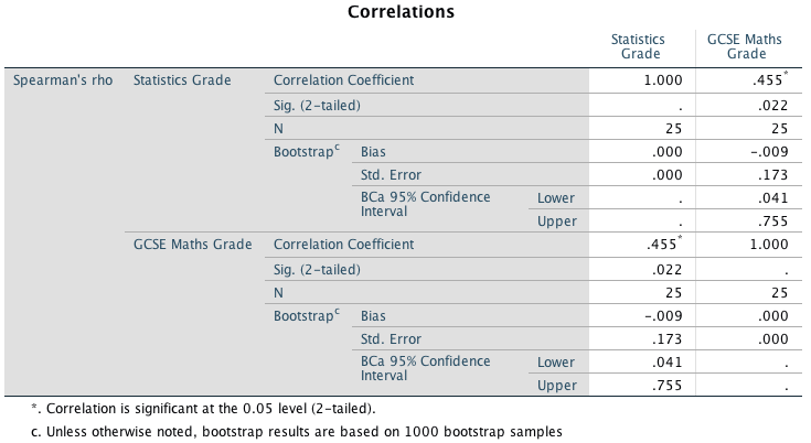
We could also look at Kendall’s correlation. The output is much the same as for Spearman’s correlation. The value of Kendall’s coefficient is less than Spearman’s (it has decreased from 0.455 to 0.354), but it is still statistically significant (because the p-value of 0.029 is less than 0.05). The bootstrapped confidence intervals do not cross zero (0.029, 0.625) suggesting that there is likely to be a positive relationship in the population. We cannot assume that the GCSE grades caused the degree students to do better in their statistics course.

We could report these results as follows:
- Bias corrected and accelerated bootstrap 95% CIs are reported in square brackets. There was a positive relationship between a person’s statistics grade and their GCSE maths grade, \(r_\text{s}\) = 0.46, 95% BCa CI [0.04, 0.76], p = 0.022.
- There was a positive relationship between a person’s statistics grade and their GCSE maths grade, τ = 0.35, 95% BCa CI [0.03, 0.65], p = 0.029. (Note that I’ve quoted Kendall’s τ here.)
Task 8.5
In the book we saw some data relating to people’s ratings of dishonest acts and the likeableness of the perpetrator (for a full description see the book). Compute the Spearman correlation between ratings of dishonesty and likeableness of the perpetrator. The data are in HonestyLab.sav.
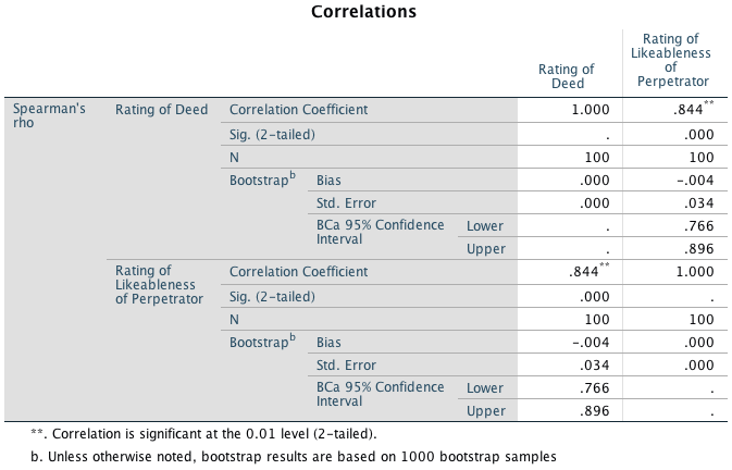
The relationship between ratings of dishonesty and likeableness of the perpetrator was significant because the p-value is less than 0.05 (p = 0.000) and the bootstrapped confidence intervals do not cross zero (0.766, 0.896). The value of Spearman’s correlation coefficient is quite large and positive (0.844), indicating a large positive effect: the more likeable the perpetrator was, the more positively their dishonest acts were viewed.
We could report the results as follows:
- Bias corrected and accelerated bootstrap 95% CIs are reported in square brackets. There was a positive relationship between the likeableness of a perpetrator and how positively their dishonest acts were viewed, \(r_\text{s}\) = 0.84, 95% BCa CI [0.77, 0.90], p < 0.001.
Task 8.6
We looked at data from people who had been forced to marry goats and dogs and measured their life satisfaction and, also, how much they like animals (Goat or Dog.sav). Is there a significant correlation between life satisfaction and the type of animal to which a person was married?
Wife is a categorical variable with two categories (goat or dog). Therefore, we need to look at this relationship using a point-biserial correlation. The resulting table is as follows:
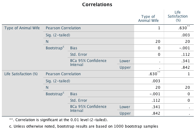
I used a two-tailed test because one-tailed tests should never really be used (see book chapter for more explanation). I have also asked for the bootstrapped confidence intervals as they are robust. As you can see there, was a significant relationship between type of animal wife and life satisfaction because our p-value is less than 0.05 and the bootstrapped confidence intervals do not cross zero, \(r_\text{pb}\) = 0.63, BCa CI [0.34, 0.84], p = 0.003. Looking at how the groups were coded, you should see that goat had a code of 1 and dog had a code of 2, therefore this result reflects the fact that as wife goes up (changes from 1 to 2) life satisfaction goes up. Put another way, as wife changes from goat to dog, life satisfaction increases. So, being married to a dog was associated with greater life satisfaction.
Task 8.7
Repeat the analysis above taking account of animal liking when computing the correlation between life satisfaction and the animal to which a person was married.
We can conduct a partial correlation between life satisfaction and the animal to which a person was married while ‘adjusting’ for the effect of liking animals.
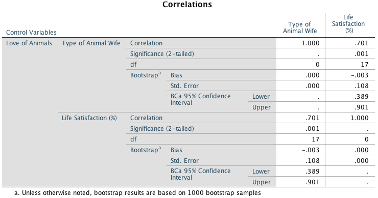
The output for the partial correlation above is a matrix of correlations for the variables wife and life satisfaction but controlling for the effect of animal liking. Note that the top and bottom of the table contain identical values, so we can ignore one half of the table. First, notice that the partial correlation between wife and life satisfaction is 0.701, which is greater than the correlation when the effect of animal liking is not controlled for (r = 0.630). The correlation has become more statistically significant (its p-value has decreased from 0.003 to 0.001) and that the confidence interval [0.389, 0.901] still doesn’t contain zero. In terms of variance, the value of \(R^2\) for the partial correlation is 0.491, which means that type of animal wife now shares 49.1% of the variance in life satisfaction (compared to 39.7% when animal liking was not controlled). Running this analysis has shown us that type of wife alone explains a large portion of the variation in life satisfaction. In other words, the relationship between wife and life satisfaction is not due to animal liking.
Task 8.8
We looked at data based on findings that the number of cups of tea drunk was related to cognitive functioning (Feng et al., 2010). The data are in the file Tea Makes You Brainy 15.sav. What is the correlation between tea drinking and cognitive functioning? Is there a significant effect?
Because the numbers of cups of tea and cognitive function are both interval variables, we can conduct a Pearson’s correlation coefficient. If we request bootstrapped confidence intervals then we don’t need to worry about checking whether the data are normal because they are robust.
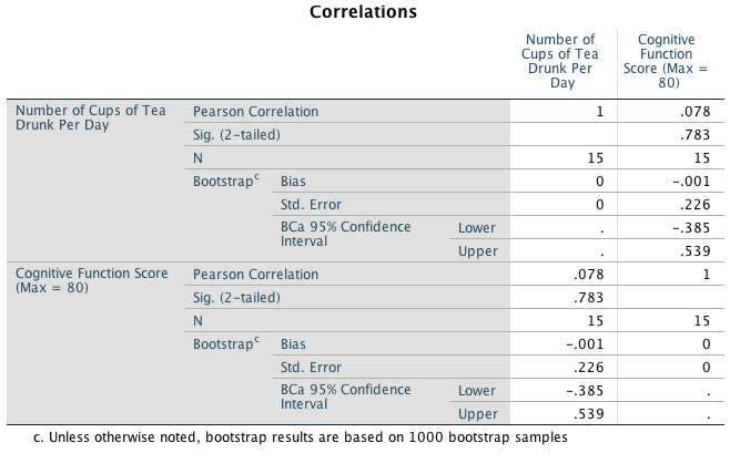
I chose a two-tailed test because it is never really appropriate to conduct a one-tailed test (see the book chapter). The results in the table above indicate that the relationship between number of cups of tea drunk per day and cognitive function was not significant. We can tell this because our p-value is greater than 0.05, and the bootstrapped confidence intervals cross zero, indicating that the effect in the population could be zero (i.e. no effect). Pearson’s r = 0.078, 95% BCa CI [–0.39, 0.54], p = 0.783.
Task 8.9
The research in the previous task was replicated but in a larger sample (N = 716), which is the same as the sample size in Feng et al.’s research (Tea Makes You Brainy 716.sav). Conduct a correlation between tea drinking and cognitive functioning. Compare the correlation coefficient and significance in this large sample, with the previous task What statistical point do the results illustrate?
The output for the Pearson’s correlation is:
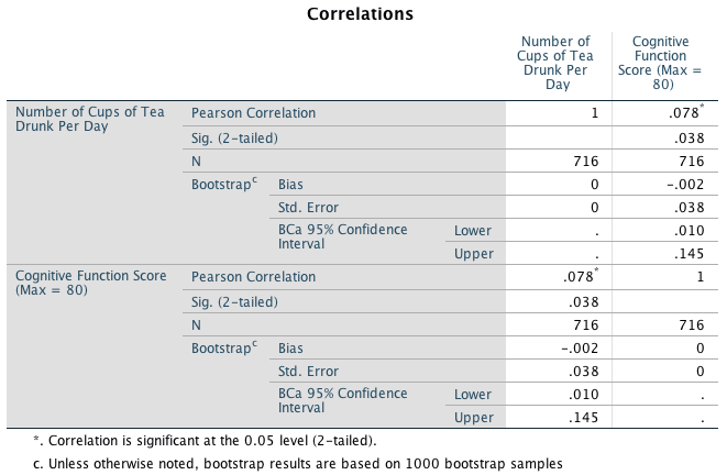
We can see that although the value of Pearson’s r has not changed, it is still very small (0.078), the relationship between the number of cups of tea drunk per day and cognitive function is now just significant (p = 0.038) and the confidence intervals no longer cross zero (0.010, 0.145) – though the lower confidence interval is very close to zero, suggesting that the effect in the population could still be very close to zero. This example indicates one of the downfalls of significance testing; you can get significant results when you have large sample sizes even if the effect is very small. Basically, whether you get a significant result or not is entirely subject to the sample size.
Task 8.10
In Chapter 6 we looked at hygiene scores over three days of a rock music festival (Download Festival.sav). Using Spearman’s correlation, were hygiene scores on day 1 of the festival significantly correlated with those on day 3?
The hygiene scores on day 1 of the festival correlated significantly with hygiene scores on day 3. The value of Spearman’s correlation coefficient is 0.344, which is a positive value suggesting that the smellier you are on day 1, the smellier you will be on day 3, \(r_\text{s}\) = 0.34, 95% BCa CI [0.14, 0.52], p < 0.001.
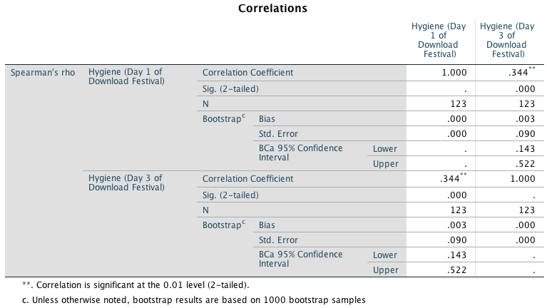
Task 8.11
Using the data in Shopping Exercise.sav find out if there is a significant relationship between the time spent shopping and the distance covered.
The variables Time and Distance are both interval. Therefore, we can conduct a Pearson’s correlation. I chose a two-tailed test because it is never really appropriate to conduct a one-tailed test (see the book chapter). The output indicates that there was a significant positive relationship between time spent shopping and distance covered. We can tell that the relationship was significant because the p-value is smaller than 0.05. More important, the robust confidence intervals do not cross zero (0.480, 0.960), suggesting that the effect in the population is unlikely to be zero. Also, our value for Pearson’s r is very large (0.83) indicating a large effect. Pearson’s r = 0.83, 95% BCa CI [0.48, 0.96], p = 0.003.
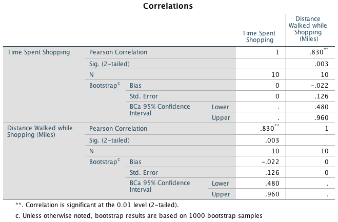
Task 8.12
What effect does accounting for the participant’s sex have on the relationship between the time spent shopping and the distance covered?
To answer this question, we need to conduct a partial correlation between the time spent shopping (interval variable) and the distance covered (interval variable) while ‘adjusting’ for the effect of sex (dicotomous variable). The partial correlation between Time and Distance is 0.820, which is slightly smaller than the correlation when the effect of sex is not controlled for (r = 0.830). The correlation has become slightly less statistically significant (its p-value has increased from 0.003 to 0.007). In terms of variance, the value of \(R^2\) for the partial correlation is 0.672, which means that time spent shopping now shares 67.2% of the variance in distance covered when shopping (compared to 68.9% when not adjusted for sex). Running this analysis has shown us that time spent shopping alone explains a large portion of the variation in distance covered.
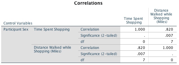
Chapter 9
Task 9.1
We looked at data based on findings that the number of cups of tea drunk was related to cognitive functioning (Feng, Gwee, Kua, & Ng, 2010). Using a linear model that predicts cognitive functioning from tea drinking, what would cognitive functioning be if someone drank 10 cups of tea? Is there a significant effect? (Tea Makes You Brainy 716.sav)
The basic output from SPSS Statistics is as follows:
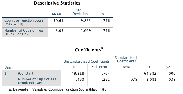
Looking at the output below, we can see that we have a model that significantly improves our ability to predict cognitive functioning. The positive standardized beta value (0.078) indicates a positive relationship between number of cups of tea drunk per day and level of cognitive functioning, in that the more tea drunk, the higher your level of cognitive functioning. We can then use the model to predict level of cognitive functioning after drinking 10 cups of tea per day. The first stage is to define the model by replacing the b-values in the equation below with the values from the Coefficients output. In addition, we can replace the X and Y with the variable names so that the model becomes:
\[ \begin{aligned} \text{Cognitive functioning}_i &= b_0 + b_1 \text{Tea drinking}_i \\ \ &= 49.22 +(0.460 \times \text{Tea drinking}_i) \end{aligned} \]
We can predict cognitive functioning, by replacing Tea drinking in the equation with the value 10:
\[ \begin{aligned} \text{Cognitive functioning}_i &= 49.22 +(0.460 \times \text{Tea drinking}_i) \\ &= 49.22 +(0.460 \times 10) \\ &= 53.82 \end{aligned} \]
Therefore, if you drank 10 cups of tea per day, your level of cognitive functioning would be 53.82.
Task 9.2
Estimate a linear model for the pubs.sav data predicting mortality from the number of pubs. Try repeating the analysis but bootstrapping the confidence intervals.
The key output from SPSS Statistics is as follows:
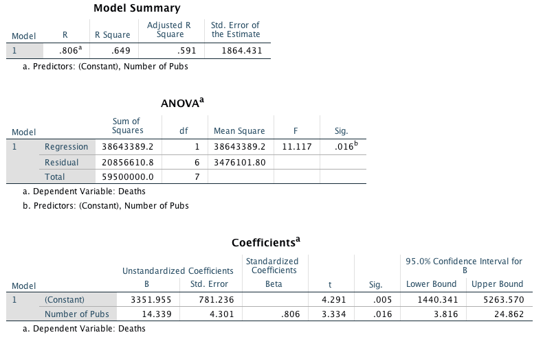
Looking at the output, we can see that the number of pubs significantly predicts mortality, t(6) = 3.33, p = 0.016. The positive beta value (0.806) indicates a positive relationship between number of pubs and death rate in that, the more pubs in an area, the higher the rate of mortality (as we would expect). The value of \(R^2\) tells us that number of pubs accounts for 64.9% of the variance in mortality rate – that’s over half!
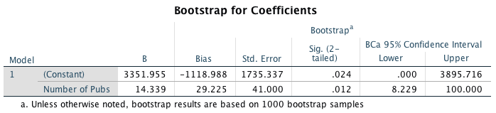
Looking at the table labelled Bootstrap for Coefficients we can see that the bootstrapped confidence intervals are both positive values – they do not cross zero (8.229, 100.00) – then assuming this interval is one of the 95% that contain the population value we can gain confidence that there is a positive and non-zero relationship between number of pubs in an area and its mortality rate.
Task 9.3
We encountered data (HonestyLab.sav) relating to people’s ratings of dishonest acts and the likeableness of the perpetrator. Run a linear model with bootstrapping to predict ratings of dishonesty from the likeableness of the perpetrator.
The key output from SPSS Statistics is as follows:
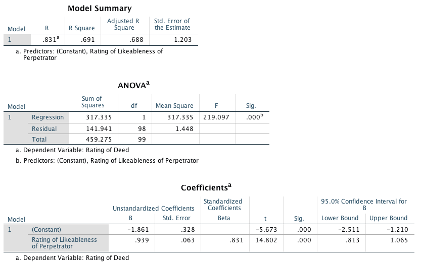 Looking at the output we can see that the likeableness of the
perpetrator significantly predicts ratings of dishonest acts,
t(98) = 14.80, p < 0.001. The positive standardized
beta value (0.83) indicates a positive relationship between likeableness
of the perpetrator and ratings of dishonesty, in that, the more likeable
the perpetrator, the more positively their dishonest acts were viewed
(remember that dishonest acts were measured on a scale from 0 =
appalling behaviour to 10 = it’s OK really). The value of \(R^2\) tells us that likeableness of the
perpetrator accounts for 69.1% of the variance in the rating of
dishonesty, which is over half.
Looking at the output we can see that the likeableness of the
perpetrator significantly predicts ratings of dishonest acts,
t(98) = 14.80, p < 0.001. The positive standardized
beta value (0.83) indicates a positive relationship between likeableness
of the perpetrator and ratings of dishonesty, in that, the more likeable
the perpetrator, the more positively their dishonest acts were viewed
(remember that dishonest acts were measured on a scale from 0 =
appalling behaviour to 10 = it’s OK really). The value of \(R^2\) tells us that likeableness of the
perpetrator accounts for 69.1% of the variance in the rating of
dishonesty, which is over half.
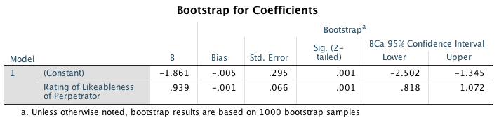
Looking at the table labelled Bootstrap for Coefficients, we can see that the bootstrapped confidence intervals do not cross zero (0.818, 1.072), then assuming this interval is one of the 95% that contain the population value we can gain confidence that there is a non-zero relationship between the likeableness of the perpetrator and ratings of dishonest acts.
Task 9.4
A fashion student was interested in factors that predicted the salaries of catwalk models. She collected data from 231 models (Supermodel.sav). For each model she asked them their salary per day (salary), their age (age), their length of experience as models (years), and their industry status as a model as their percentile position rated by a panel of experts (beauty). Use a linear model to see which variables predict a model’s salary. How valid is the model?
The model
The first parts of the output are as follows:
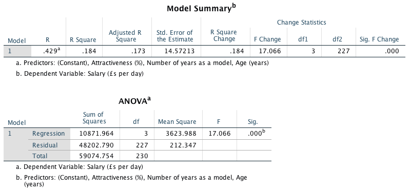
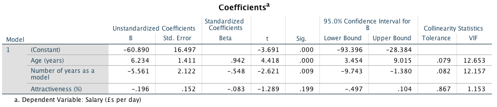
To begin with, a sample size of 231 with three predictors seems reasonable because this would easily detect medium to large effects (see the diagram in the chapter). Overall, the model accounts for 18.4% of the variance in salaries and is a significant fit to the data (F(3, 227) = 17.07, p < .001). The adjusted \(R^2\) (0.17) shows some shrinkage from the unadjusted value (0.184), indicating that the model may not generalize well.
In terms of the individual predictors we could report:
| Estimate | Std. Error | t value | Pr(>|t|) | |
|---|---|---|---|---|
| (Intercept) | -60.890 | 16.497 | -3.691 | 0.000 |
| age | 6.234 | 1.411 | 4.418 | 0.000 |
| years | -5.561 | 2.122 | -2.621 | 0.009 |
| beauty | -0.196 | 0.152 | -1.289 | 0.199 |
It seems as though salaries are significantly predicted by the age of the model. This is a positive relationship (look at the sign of the beta), indicating that as age increases, salaries increase too. The number of years spent as a model also seems to significantly predict salaries, but this is a negative relationship indicating that the more years you’ve spent as a model, the lower your salary. This finding seems very counter-intuitive, but we’ll come back to it later. Finally, the attractiveness of the model doesn’t seem to predict salaries significantly. If we wanted to write the regression model, we could write it as:
The next part of the question asks whether this model is valid.
Residuals
There are six cases that have a standardized residual greater than 3, and two of these are fairly substantial (case 5 and 135). We have 5.19% of cases with standardized residuals above 2, so that’s as we expect, but 3% of cases with residuals above 2.5 (we’d expect only 1%), which indicates possible outliers.
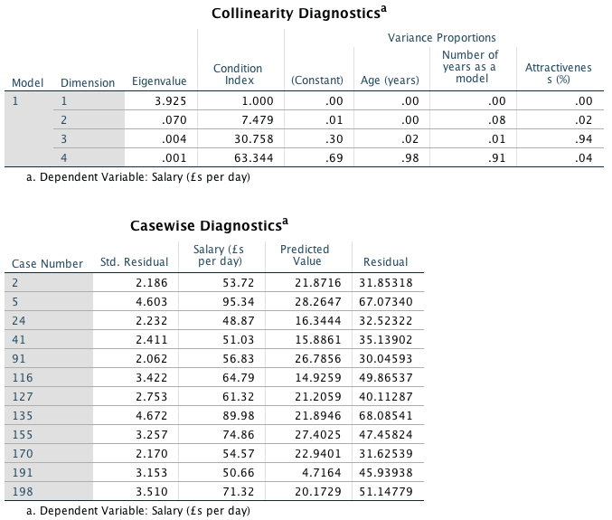
Normality of errors
The histogram reveals a skewed distribution, indicating that the normality of errors assumption has been broken. The normal P–P plot verifies this because the dashed line deviates considerably from the straight line (which indicates what you’d get from normally distributed errors).

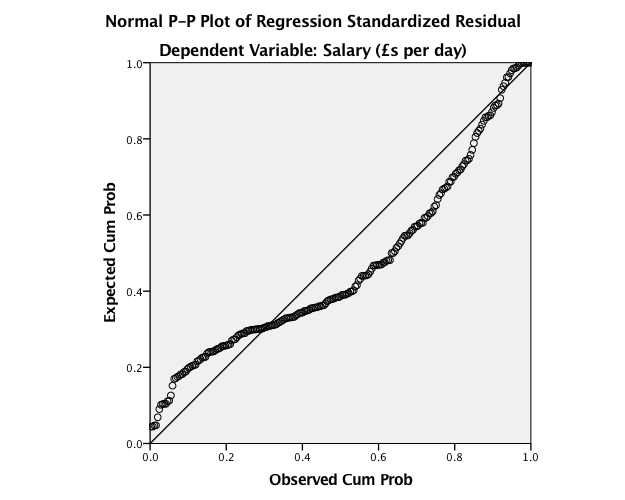
Homoscedasticity and independence of errors
The scatterplot of ZPRED vs. ZRESID does not show a random pattern. There is a distinct funnelling, indicating heteroscedasticity.
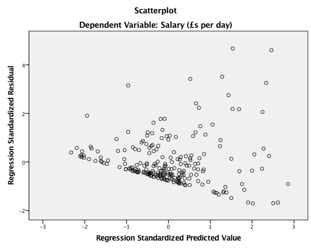
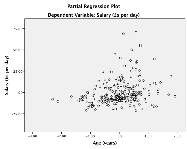
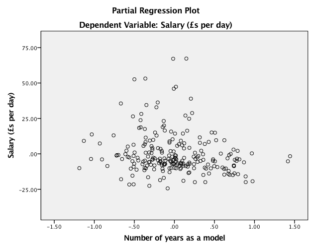
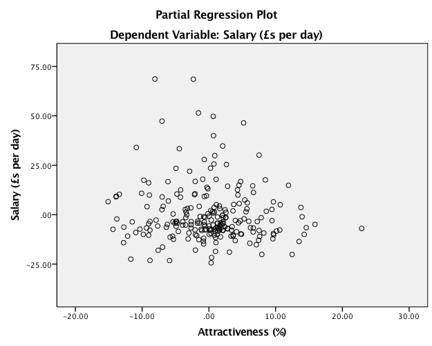
Multicollinearity
For the age and experience variables in the model, VIF values are above 10 (or alternatively, tolerance values are all well below 0.2), indicating multicollinearity in the data. In fact, the correlation between these two variables is around .9! So, these two variables are measuring very similar things. Of course, this makes perfect sense because the older a model is, the more years she would’ve spent modelling! So, it was fairly stupid to measure both of these things! This also explains the weird result that the number of years spent modelling negatively predicted salary (i.e. more experience = less salary!): in fact if you do a simple regression with experience as the only predictor of salary you’ll find it has the expected positive relationship. This hopefully demonstrates why multicollinearity can bias the regression model. All in all, several assumptions have not been met and so this model is probably fairly unreliable.
Task 9.5
A study was carried out to explore the relationship between Aggression and several potential predicting factors in 666 children who had an older sibling. Variables measured were Parenting_Style (high score = bad parenting practices), Computer_Games (high score = more time spent playing computer games), Television (high score = more time spent watching television), Diet (high score = the child has a good diet low in harmful additives), and Sibling_Aggression (high score = more aggression seen in their older sibling). Past research indicated that parenting style and sibling aggression were good predictors of the level of aggression in the younger child. All other variables were treated in an exploratory fashion. Analyse them with a linear model (Child Aggression.sav).
We need to conduct this analysis hierarchically, entering parenting style and sibling aggression in the first step (forced entry):
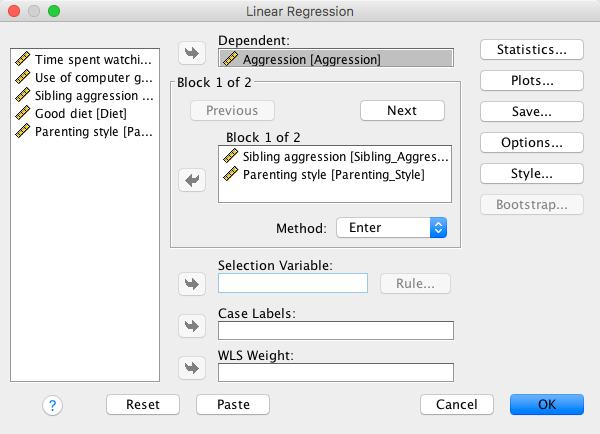
and the remaining variables in a second step (stepwise):
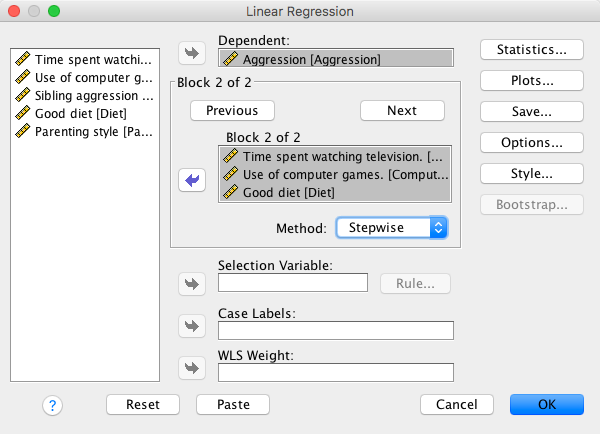
The key output is as follows:
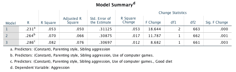
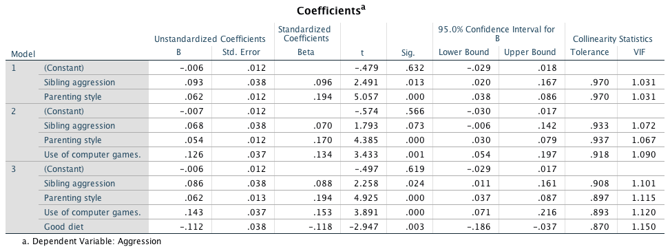
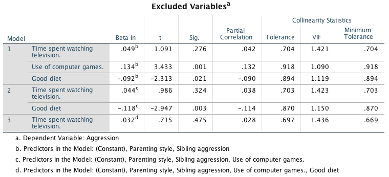
Based on the final model (which is actually all we’re interested in) the following variables predict aggression:
- Parenting style (b = 0.062, \(\beta\) = 0.194, t = 4.93, p < 0.001) significantly predicted aggression. The beta value indicates that as parenting increases (i.e. as bad practices increase), aggression increases also.
- Sibling aggression (b = 0.086, \(\beta\)= 0.088, t = 2.26, p = 0.024) significantly predicted aggression. The beta value indicates that as sibling aggression increases (became more aggressive), aggression increases also.
- Computer games (b = 0.143, \(\beta\) = 0.037, t= 3.89, p < .001) significantly predicted aggression. The beta value indicates that as the time spent playing computer games increases, aggression increases also.
- Good diet (b = –0.112, \(\beta\) = –0.118, t = –2.95, p = 0.003) significantly predicted aggression. The beta value indicates that as the diet improved, aggression decreased.
The only factor not to predict aggression significantly was:
- Television (b if entered = 0.032, t = 0.72, p = 0.475 ) did not significantly predict aggression.
Based on the standardized beta values, the most substantive predictor of aggression was actually parenting style, followed by computer games, diet and then sibling aggression.
\(R^2\) is the squared correlation between the observed values of aggression and the values of aggression predicted by the model. The values in this output tell us that sibling aggression and parenting style in combination explain 5.3% of the variance in aggression. When computer game use is factored in as well, 7% of variance in aggression is explained (i.e. an additional 1.7%). Finally, when diet is added to the model, 8.2% of the variance in aggression is explained (an additional 1.2%). With all four of these predictors in the model still less than half of the variance in aggression can be explained.
The histogram and P-P plots suggest that errors are (approximately) normally distrubuted:
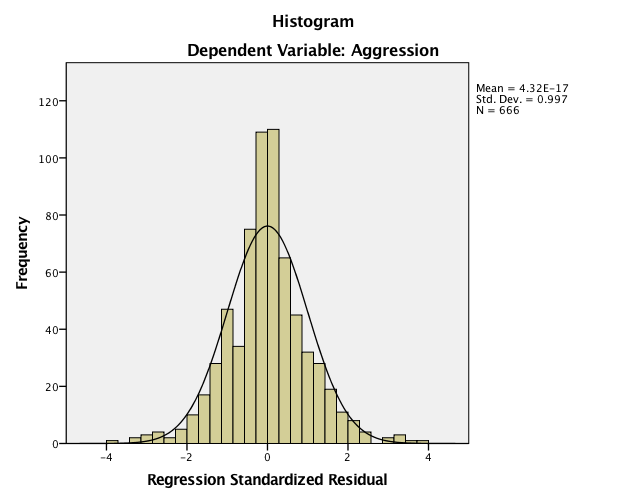
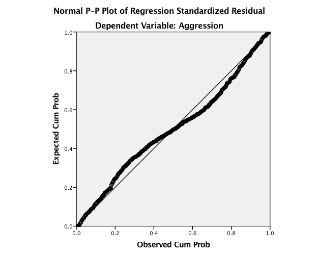
The scatterplot helps us to assess both homoscedasticity and independence of errors. The scatterplot of ZPRED vs. ZRESID does show a random pattern and so indicates no violation of the independence of errors assumption. Also, the errors on the scatterplot do not funnel out, indicating homoscedasticity of errors, thus no violations of these assumptions.
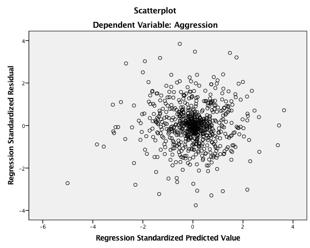
Task 9.6
Repeat the analysis in Labcoat Leni’s Real Research 9.1 using bootstrapping for the confidence intervals. What are the confidence intervals for the regression parameters?
To recap the dialog boxes to run the analysis (see also the Labcoat Leni answers). First, enter Grade, Age and Gender into the model:
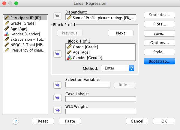
In a second block, enter NEO_FFI (extroversion):
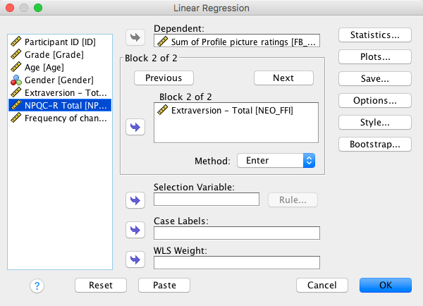
In the final block, enter NPQC_R (narcissism):
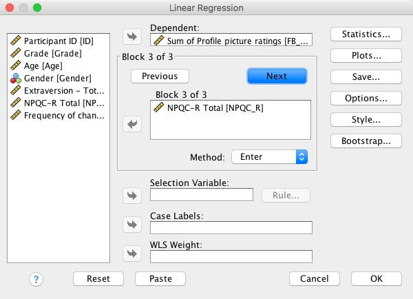
We can activate bootstrapping with thes options:
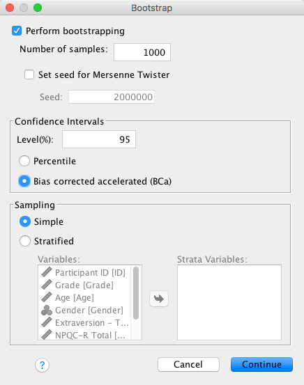
Facebook status update frequency
The main benefit of the bootstrap confidence intervals and significance values is that they do not rely on assumptions of normality or homoscedasticity, so they give us an accurate estimate of the true population value of b for each predictor. The bootstrapped confidence intervals in the output do not affect the conclusions reported in Ong et al. (2011). Ong et al.’s prediction was still supported in that, after controlling for age, grade and gender, narcissism significantly predicted the frequency of Facebook status updates over and above extroversion, b = 0.066 [0.025, 0.107], p = 0.003.
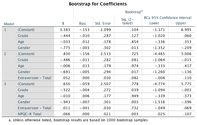
Facebook profile picture rating
Similarly, the bootstrapped confidence intervals for the second regression are consistent with the conclusions reported in Ong et al. (2011). That is, after adjusting for age, grade and gender, narcissism significantly predicted the Facebook profile picture ratings over and above extroversion, b = 0.173 [0.106, 0.230], p = 0.001.
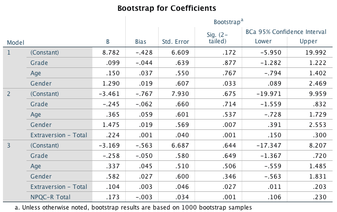
Task 9.7
Coldwell, Pike and Dunn (2006) investigated whether household chaos predicted children’s problem behaviour over and above parenting. From 118 families they recorded the age and gender of the youngest child (child_age and child_gender). They measured dimensions of the child’s perceived relationship with their mum: (1) warmth/enjoyment (child_warmth), and (2) anger/hostility (child_anger). Higher scores indicate more warmth/enjoyment and anger/hostility respectively. They measured the mum’s perceived relationship with her child, resulting in dimensions of positivity (mum_pos) and negativity (mum_neg). Household chaos (chaos) was assessed. The outcome variable was the child’s adjustment (sdq): the higher the score, the more problem behaviour the child was reported to be displaying. Conduct a hierarchical linear model in three steps: (1) enter child age and gender; (2) add the variables measuring parent-child positivity, parent-child negativity, parent-child warmth, parent-child anger; (3) add chaos. Is household chaos predictive of children’s problem behaviour over and above parenting? (Coldwell et al. (2006).sav).
To summarize the dialog boxes to run the analysis, first, enter child_age and child_gender into the model and set sdq as the outcome variable:
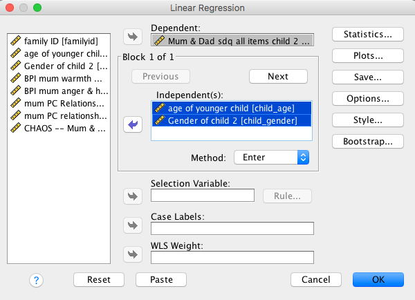
In a new block, add child_anger, child_warmth, mum_pos and mum_neg into the model:
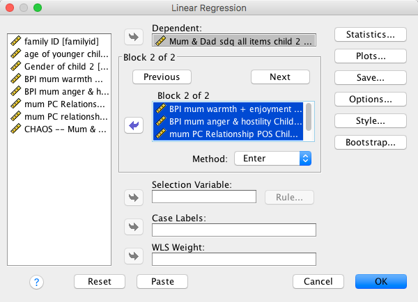
In a final block, add chaos to the model:
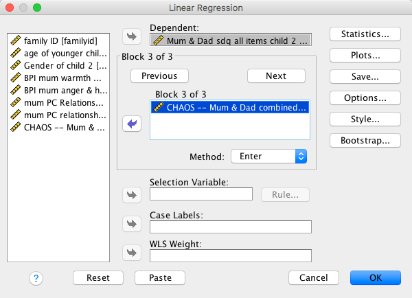
Set some basic options such as these:
From the output we can conclude that household chaos significantly predicted younger sibling’s problem behaviour over and above maternal parenting, child age and gender, t(88) = 2.09, p = 0.039. The positive standardized beta value (0.218) indicates that there is a positive relationship between household chaos and child’s problem behaviour. In other words, the higher the level of household chaos, the more problem behaviours the child displayed. The value of \(R^2\) (0.11) tells us that household chaos accounts for 11% of the variance in child problem behaviour.
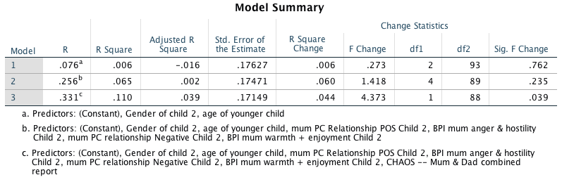
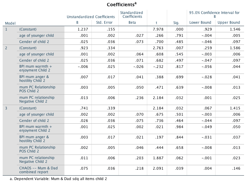
Chapter 10
Task 10.1
Is arachnophobia (fear of spiders) specific to real spiders or will pictures of spiders evoke similar levels of anxiety? Twelve arachnophobes were asked to play with a big hairy tarantula with big fangs and an evil look in its eight eyes and at a different point in time were shown only pictures of the same spider. The participants’ anxiety was measured in each case. Do a t-test to see whether anxiety is higher for real spiders than pictures (Big Hairy Spider.sav).
Compute the test
We have 12 arachnophobes who were exposed to a picture of a spider
(Picture) and on a separate occasion a real live
tarantula (Real). Their anxiety was measured in each
condition (half of the participants were exposed to the picture before
the real spider while the other half were exposed to the real spider
first). I have already described how the data are arranged, and so we
can move straight onto doing the test itself. First, we need to access
the main dialog box by selecting Analyze > Compare Means >
Paired-Samples T Test …. Once the dialog box is activated, select
the pair of variables to be analysed (Real and
Picture) by clicking on one and holding down the
Ctrl key (Cmd on a Mac) while clicking on the other.
Drag these variables to the box labelled Paired Variables (or
click ![]() ).
To run the analysis click .
).
To run the analysis click .
Main dialog box for paired-samples t-test
SPSS Statistics output
The resulting output contains three tables. The first contains summary statistics for the two experimental conditions. For each condition we are told the mean, the number of participants (N) and the standard deviation of the sample. In the final column we are told the standard error. The second table contains the Pearson correlation between the two conditions. For these data the experimental conditions yield a fairly large, but not significant, correlation coefficient, r = 0.545, p = 0.067.
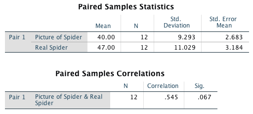
The final table tells us whether the difference between the means of the two conditions was significant;y different from zero. First, the table tells us the mean difference between scores. The table also reports the standard deviation of the differences between the means and, more important, the standard error of the differences between participants’ scores in each condition. The test statistic, t, is calculated by dividing the mean of differences by the standard error of differences (t = −7/2.8311 = −2.47). The size of t is compared against known values (under the null hypothesis) based on the degrees of freedom. When the same participants have been used, the degrees of freedom are the sample size minus 1 (df = N − 1 = 11). SPSS uses the degrees of freedom to calculate the exact probability that a value of t at least as big as the one obtained could occur if the null hypothesis were true (i.e., there was no difference between these means). This probability value is in the column labelled Sig. The two-tailed probability for the spider data is very low (p = 0.031) and significant because 0.031 is smaller than the widely-used criterion of 0.05. The fact that the t-value is a negative number tells us that the first condition (the picture condition) had a smaller mean than the second (the real condition) and so the real spider led to greater anxiety than the picture. Therefore, we can conclude that exposure to a real spider caused significantly more reported anxiety in arachnophobes than exposure to a picture, t(11) = −2.47, p = .031.
Finally, this output contains a 95% confidence interval for the mean difference. Assuming that this sample’s confidence interval is one of the 95 out of 100 that contains the population value, we can say that the true mean difference lies between −13.231 and −0.769. The importance of this interval is that it does not contain zero (i.e., both limits are negative) because this tells us that the true value of the mean difference is unlikely to be zero.
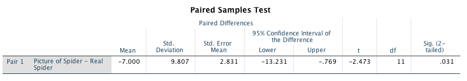
Calculating the effect size
We can compute the effect size from the value of t and the df from the output:
\[ r = \sqrt{\frac{-2.473^2}{-2.473^2 + 11}} = \sqrt{\frac{6.116}{17.116}} = 0.60 \]
This represents a very large effect. Therefore, as well as being statistically significant, this effect is large and probably a substantive finding.
Reporting the analysis
We could report the result as:
- On average, participants experienced significantly greater anxiety with real spiders (M = 47.00, SE = 3.18) than with pictures of spiders (M = 40.00, SE = 2.68), t(11) = −2.47, p = 0.031, r = 0.60.
Task 10.2
Plot an error bar graph of the data in Task 1 (remember to adjust for the fact that the data are from a repeated measures design.) (2)
Step 1: Calculate the mean for each participant
To correct the repeated-measures error bars, we need to use the
compute command. To begin with, we need to calculate the average anxiety
for each participant and so we use the mean function. Access the main
compute dialog box by selecting Transform > Compute
Variable. Enter the name Mean into the box
labelled Target Variable and then in the list labelled
Function group select Statistical and then in the list
labelled Functions and Special Variables select Mean.
Transfer this command to the command area by clicking on ![]() . When the command
is transferred, it appears in the command area as MEAN(?,?);
the question marks should be replaced with variable names (which can be
typed manually or transferred from the variables list). So replace the
first question mark with the variable picture and the
second one with the variable real. The completed dialog
box should look like the one below. Click on to create this new
variable, which will appear as a new column in the data editor.
. When the command
is transferred, it appears in the command area as MEAN(?,?);
the question marks should be replaced with variable names (which can be
typed manually or transferred from the variables list). So replace the
first question mark with the variable picture and the
second one with the variable real. The completed dialog
box should look like the one below. Click on to create this new
variable, which will appear as a new column in the data editor.
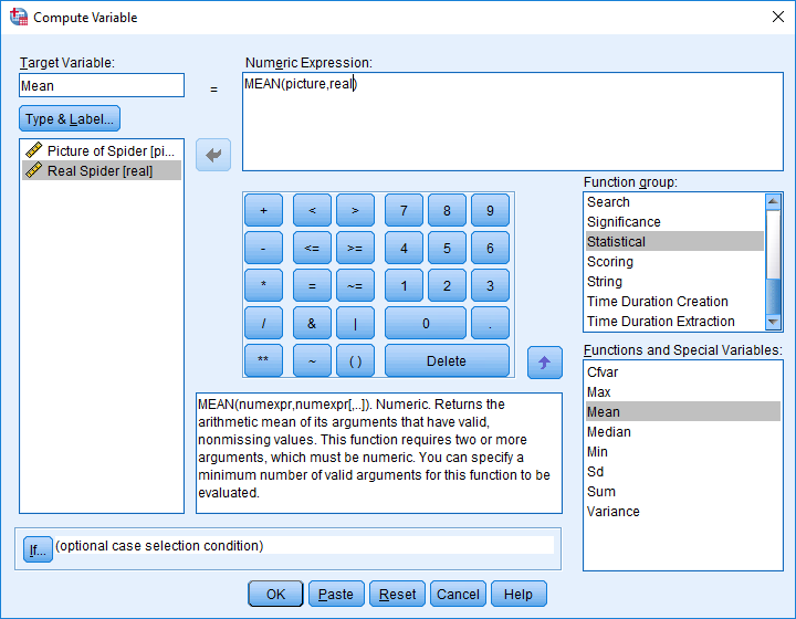
Using the compute function to calculate the mean of two columns
Step 2: Calculate the grand mean
Access the descriptives command by selecting Analyze >
Descriptive Statistics > Descriptives …. The dialog box shown
below should appear. The descriptives command is used to get
basic descriptive statistics for variables, and by clicking  a second dialog
box is activated. Select the variable Mean from the
list and drag it to the box labelled Variable(s) (or click
a second dialog
box is activated. Select the variable Mean from the
list and drag it to the box labelled Variable(s) (or click ![]() ). Then use the
Options dialog box to specify only the mean (you can leave the
default settings as they are, but it is only the mean in which we are
interested). If you run this analysis the output should provide you with
some self-explanatory descriptive statistics for each of the three
variables (assuming you selected all three). You should see that we get
the mean of the picture condition, and the mean of the real spider
condition, but it’s the final variable we’re interested in: the mean of
the picture and spider condition. The mean of this variable is the grand
mean, and you can see from the summary table that its value is 43.50. We
will use this grand mean in the following calculations.
). Then use the
Options dialog box to specify only the mean (you can leave the
default settings as they are, but it is only the mean in which we are
interested). If you run this analysis the output should provide you with
some self-explanatory descriptive statistics for each of the three
variables (assuming you selected all three). You should see that we get
the mean of the picture condition, and the mean of the real spider
condition, but it’s the final variable we’re interested in: the mean of
the picture and spider condition. The mean of this variable is the grand
mean, and you can see from the summary table that its value is 43.50. We
will use this grand mean in the following calculations.
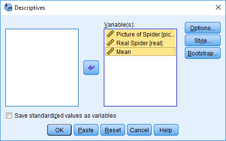
Main dialog box for descriptive statistics
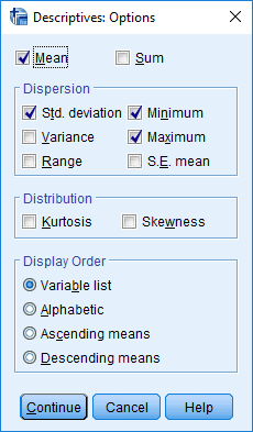
Options for descriptive statistics
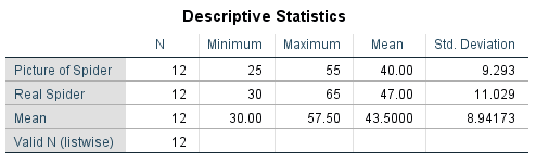
Output for descriptive statistics
Step 3: Calculate the adjustment factor
Next, we equalize the means between participants (i.e., adjust the scores in each condition such that when we take the mean score across conditions, it is the same for all participants). To do this, we calculate an adjustment factor by subtracting each participant’s mean score from the grand mean. We can use the compute function to do this calculation for us. Activate the compute dialog box, give the target variable a name (I suggest Adjustment) and then use the command ‘43.5-mean’. This command will take the grand mean (43.5) and subtract from it each participant’s average anxiety level:
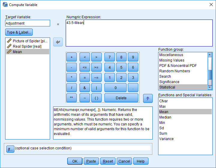
Calculating the adjustment factor
This process creates a new variable in the data editor called Adjustment. The scores in the Adjustment column represent the difference between each participant’s mean anxiety and the mean anxiety level across all participants. You’ll notice that some of the values are positive, and these participants are one’s who were less anxious than average. Other participants were more anxious than average and they have negative adjustment scores. We can now use these adjustment values to eliminate the between-subject differences in anxiety.
Step 4: Create adjusted values for each variable
So far, we have calculated the difference between each participant’s
mean score and the mean score of all participants (the grand mean). This
difference can be used to adjust the existing scores for each
participant. First we need to adjust the scores in the picture
condition. Once again, we can use the compute command to make the
adjustment. Activate the compute dialog box in the same way as
before, and then title our new variable
Picture_Adjusted. All we are going to do is to add each
participant’s score in the picture condition to their adjustment value.
Select the variable picture and drag it to the command
area (or click ![]() , then click on
, then click on
 and drag the
variable Adjustment to the command area (or click
and drag the
variable Adjustment to the command area (or click ![]() ). The
completed dialog box is:
). The
completed dialog box is:

Adjusting the values of picture
Now do the same thing for the variable real: create a variable called Real_Adjusted that contains the values of real added to the value in the Adjustment column:
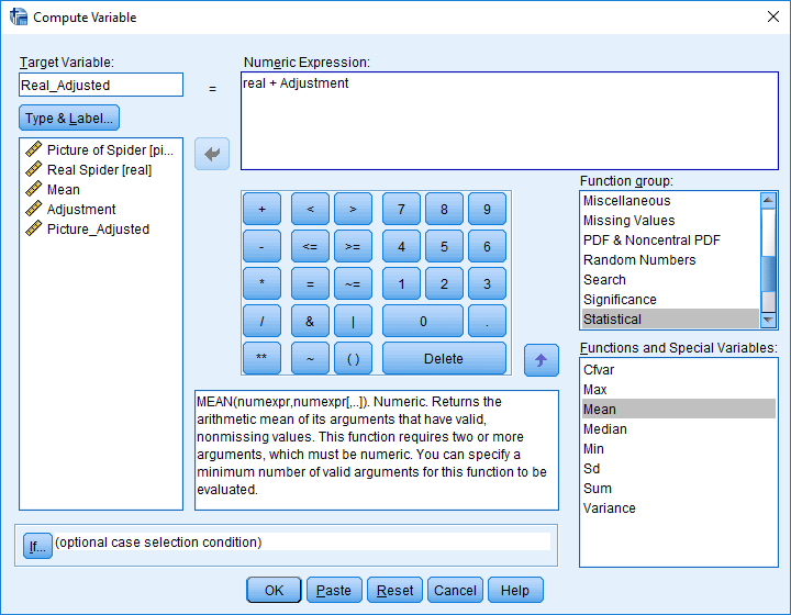
Adjusting the values of real
Now, the variables Real_Adjusted and Picture_Adjusted represent the anxiety experienced in each condition, adjusted so as to eliminate any between-subject differences. You can plot an error bar ghraph using the chart builder. The finished dialog box will look like this:
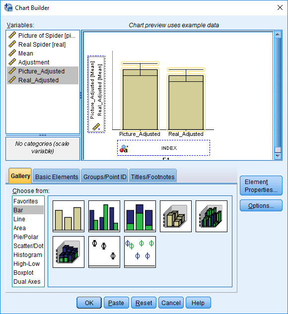
Completed chart builder dialog box
The resulting error bar graph is shown below. The error bars don’t overlap which suggests that the groups are significantly different (although we knew this already from the previous task).
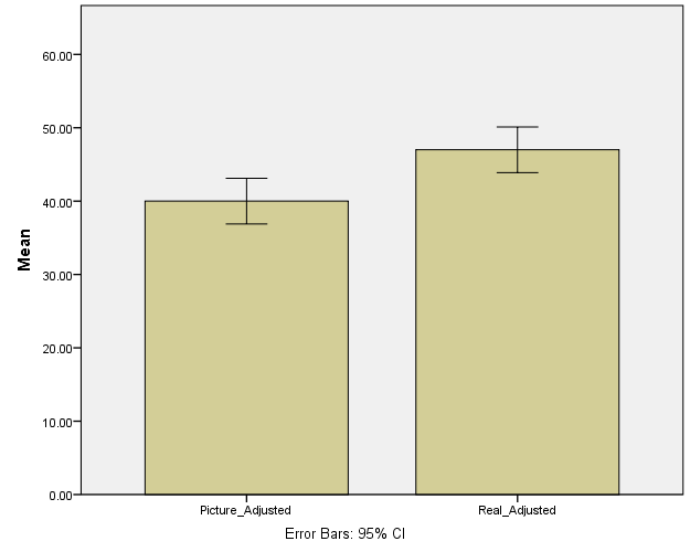
Error bar graph of the adjusted values of Big Hairy Spider.sav
Task 10.3
‘Pop psychology’ books sometimes spout nonsense that is unsubstantiated by science. As part of my plan to rid the world of pop psychology I took 20 people in relationships and randomly assigned them to one of two groups. One group read the famous popular psychology book Women are from Bras and men are from Penis, and the other read Marie Claire. The outcome variable was their relationship happiness after their assigned readin. Were people happier with their relationship after reading the pop psychology book? (Penis.sav).
The output for this example should be:
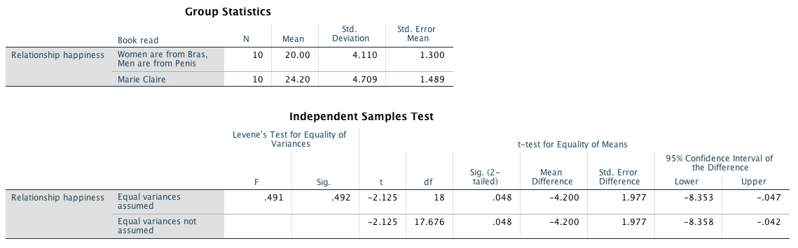
We can compute an effect size as follows:
\[ r = \sqrt{\frac{-2.125^2}{-2.125^2 + 18}} = \sqrt{\frac{4.52}{22.52}} = 0.45 \]
Or Cohen’s d. Let’s use a pooled estimate of the standard deviation: \[ \begin{aligned} \ s_p &= \sqrt{\frac{(N_1-1) s_1^2+(N_2-1) s_2^2}{N_1+N_2-2}} \\ \ &= \sqrt{\frac{(10-1)4.110^2+(10-1)4.709^2}{10+10-2}} \\ \ &= \sqrt{\frac{351.60}{18}} \\ \ &= 4.42 \end{aligned} \]
Therefore, Cohen’s d is:
\[\hat{d} = \frac{20-24.20}{4.42} = -0.95\] This means that reading the self-help book reduced relationship happiness by about one standard deviation, which is a fairly big effect. We could report this result as:
- On average, the reported relationship happiness after reading Marie Claire (M = 24.20, SE = 1.49), was significantly higher than after reading Women are from bras and men are from penis (M = 20.00, SE = 1.30), t(17.68) = −2.12, p = 0.048, \(\hat{d} = -0.95\)
Task 10.4
Twaddle and Sons, the publishers of Women are from Bras and men are from Penis, were upset about my claims that their book was as useful as a paper umbrella. They ran their own experiment (N = 500) in which relationship happiness was measured after participants had read their book and after reading one of mine (Field & Hole, 2003). (Participants read the books in counterbalanced order with a six-month delay.) Was relationship happiness greater after reading their wonderful contribution to pop psychology than after reading my tedious tome about experiments? (Field&Hole.sav).
The output for this example should be:
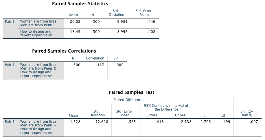
We can compute an effect size, r, as follows:
\[ r = \sqrt{\frac{-2.706^2}{-2.706^2 + 499}} = \sqrt{\frac{7.32}{506.32}} = 0.12 \]
Or Cohen’s d. Let’s use Field and Hole as the control:
\[\hat{d} = \frac{20.02-18.49}{8.992} = 0.17\]
We can adjust this estimate for the repeated-measures design:
\[\hat{d}_D = \frac{\hat{d}}{\sqrt{1-r}} = \frac{0.17}{\sqrt{1-0.117}} = 0.18\]
Therefore, although this effect is highly statistically significant, the size of the effect is very small and represents a trivial finding. In this example, it would be tempting for Twaddle and Sons to conclude that their book produced significantly greater relationship happiness than our book. In fact, many researchers would write conclusions like this:
- On average, the reported relationship happiness after reading Field and Hole (2003) (M = 18.49, SE = 0.402), was significantly higher than after reading Women are from bras and men are from penis (M = 20.02, SE = 0.446), t(499) = 2.71, p = 0.007, \(\hat{d}_D = 0.18\). In other words, reading Women are from bras and men are from penis produces significantly greater relationship happiness than that book by smelly old Field and Hole.
However, to reach such a conclusion is to confuse statistical significance with the importance of the effect. By calculating the effect size we’ve discovered that although the difference in happiness after reading the two books is statistically different, the size of effect that this represents is very small. A more correct interpretation might, therefore, be:
- On average, the reported relationship happiness after reading Field and Hole (2003) (M = 18.49, SE = 0.402), was significantly higher than after reading Women are from bras and men are from penis (M = 20.02, SE = 0.446), t(499) = 2.71, p = 0.007, \(\hat{d}_D = 0.18\). However, the effect size was small, revealing that this finding was not substantial in real terms.
Of course, this latter interpretation would be unpopular with Twaddle and Sons who would like to believe that their book had a huge effect on relationship happiness.
Task 10.5
We looked at data from people who had been forced to marry goats and dogs and measured their life satisfaction as well as how much they like animals (Goat or Dog.sav). Conduct a t-test to see whether life satisfaction depends upon the type of animal to which a person was married.
The output for this example should be:
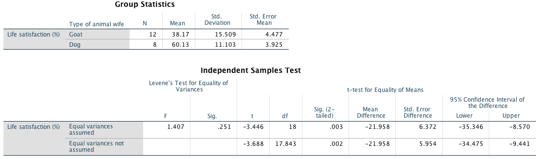
we can compute an effect size, r, as follows:
\[ r = \sqrt{\frac{-3.446^2}{-3.446^2 + 18}} = \sqrt{\frac{11.87}{29.87}} = 0.63 \]
Or Cohen’s d. Let’s use a pooled estimate of the standard deviation: \[ \begin{aligned} \ s_p &= \sqrt{\frac{(N_1-1) s_1^2+(N_2-1) s_2^2}{N_1+N_2-2}} \\ \ &= \sqrt{\frac{(12-1)15.509^2+(8-1)11.103^2}{12+8-2}} \\ \ &= \sqrt{\frac{3508.756}{18}} \\ \ &= 13.96 \end{aligned} \] Cohen’s d is:
\[\hat{d} = \frac{38.17-60.13}{13.96} = -1.57\]
As well as being statistically significant, this effect is very large and so represents a substantive finding. We could report:
- On average, the life satisfaction of men married to dogs (M = 60.13, SE = 3.93) was significantly higher than that of men who were married to goats (M = 38.17, SE = 4.48), t(17.84) = −3.69, p = 0.002, \(\hat{d} = -1.57\).
Task 10.6
Fit a linear model to the data in Task 5 to see whether life satisfaction is significantly predicted from the type of animal that was married. What do you notice about the t-value and significance in this model compared to Task 5.
The output from the linear model should be:
Compare this output with the one from the previous Task: the values of t and p are the same. (Technically, t is different because for the linear model it is a positive value and for the t-test it is negative However, the sign of t merely reflects which way around you coded the dog and goat groups. The linear model, by default, has coded the groups the opposite way around to the t-test.) The main point I wanted to make here is that whether you run these data through the regression or t-test menus, the results are identical.
Task 10.7
In Chapter Error! Reference source not found. we looked at hygiene scores over three days of a rock music festival (Download Festival.sav). Do a paired-samples t-test to see whether hygiene scores on day 1 differed from those on day 3.
The output for this example should be:
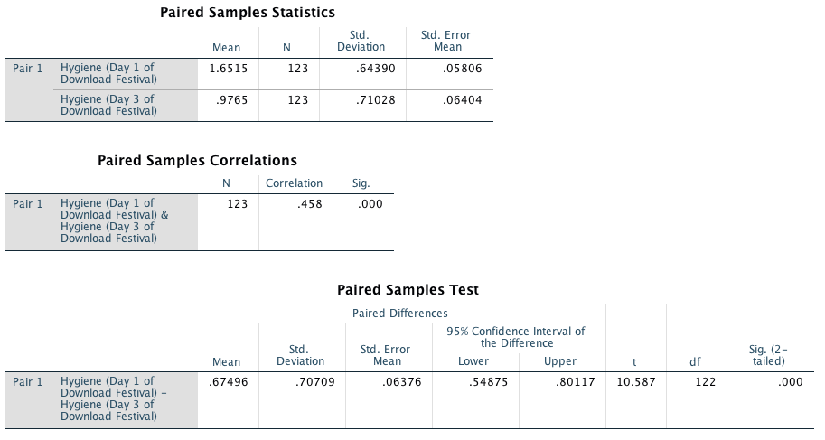
We can compute the effect size r as follows:
\[ r = \sqrt{\frac{-10.587^2}{-10.587^2 + 122}} = \sqrt{\frac{112.08}{234.08}} = 0.69 \]
Or Cohen’s d. Let’s use day 1 as the control:
\[\hat{d} = \frac{0.9765-1.6515}{0.6439} = -1.048\]
We can adjust this estimate for the repeated-measures design:
\[\hat{d}_D = \frac{\hat{d}}{\sqrt{1-r}} = \frac{-1.048}{\sqrt{1-0.458}} = -1.424\]
This represents a very large effect. Therefore, as well as being statistically significant, this effect is large and represents a substantive finding. We could report:
- On average, hygiene scores significantly decreased from day 1 (M = 1.65, SE = 0.06), to day 3 (M = 0.98, SE = 0.06) of the Download music festival, t(122) = 10.59, p < .001, \(\hat{d}_D = -1.42\).
Task 10.8
Analyse the data in Chapter Error! Reference source not found., Task 1 (whether men and dogs differ in their dog-like behaviours) using an independent t-test with bootstrapping. Do you reach the same conclusions? MenLikeDogs.sav
The output for this example should be:
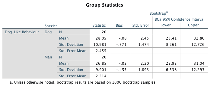
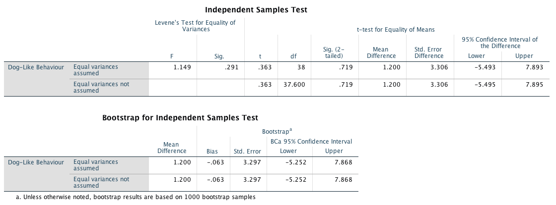
We would conclude that men and dogs do not significantly differ in the amount of dog-like behaviour they engage in. The output also shows the results of bootstrapping. The confidence interval ranged from -5.25 to 7.87, which implies (assuming that this confidence interval is one of the 95% containing the true effect) that the difference between means in the population could be negative, positive or even zero. In other words, it’s possible that the true difference between means is zero. Therefore, this bootstrap confidence interval confirms our conclusion that men and dogs do not differ in amount of dog-like behaviour.
we can compute an effect size, r, as follows:
\[ r = \sqrt{\frac{0.363^2}{0.363^2 + 38}} = \sqrt{\frac{0.132}{38.13}} = 0.06 \]
Or Cohen’s d. Let’s use a pooled estimate of the standard deviation: \[ \begin{aligned} \ s_p &= \sqrt{\frac{(N_1-1) s_1^2+(N_2-1) s_2^2}{N_1+N_2-2}} \\ \ &= \sqrt{\frac{(20-1)9.90^2+(20-1)10.98^2}{20+20-2}} \\ \ &= \sqrt{\frac{4152.838}{38}} \\ \ &= 10.45 \end{aligned} \] Cohen’s d is:
\[\hat{d} = \frac{26.85-28.05}{10.45} = -0.115\]
As well as being statistically significant, this effect is very large and so represents a substantive finding. We could report:
- On average, men (M = 26.85, SE = 2.23) engaged in less dog-like behaviour than dogs (M = 28.05, SE = 2.37). However, this difference, 1.2, BCa 95% CI [-5.25 to 7.87], was not significant, t(37.60) = 0.36, p = 0.72, \(\hat{d} = -0.12\).
Task 10.9
Analyse the data on whether the type of music you hear influences goat sacrificing — DarkLord.sav), using a paired-samples t-test with bootstrapping. Do you reach the same conclusions?
The output for this example should be:
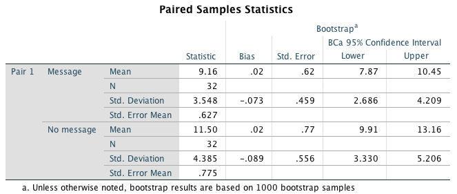
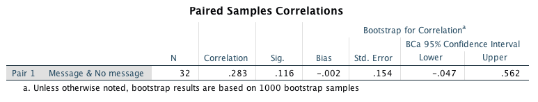
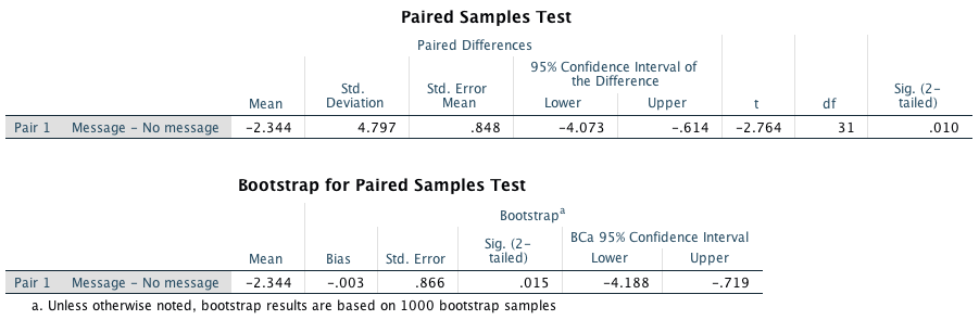
The bootstrap confidence interval ranges from -4.19 to -0.72. It does not cross zero suggesting that (if we assume that it is one of the 95% of confidence intervals that contain the true value) that the effect in the population is unlikely to be zero. Therefore, this bootstrap confidence interval confirms our conclusion that there is a significant difference between the number of goats sacrificed when listening to the song containing the backward message compared to when listing to the song played normally.
We can compute the effect size r as follows:
\[ r = \sqrt{\frac{-2.76^2}{-2.76^2 + 31}} = \sqrt{\frac{7.62}{38.62}} = 0.44 \]
Or Cohen’s d. Let’s use the no message group as the control:
\[\hat{d} = \frac{9.16-11.50}{4.385} = -0.534\]
We can adjust this estimate for the repeated-measures design:
\[\hat{d}_D = \frac{\hat{d}}{\sqrt{1-r}} = \frac{-0.534}{\sqrt{1-0.283}} = -0.631\]
This represents a fairly large effect. We could report:
- Fewer goats were sacrificed after hearing the backward message (M = 9.16, SE = 0.62), than after hearing the normal version of the Britney song (M = 11.50, SE = 0.80). This difference, -2.34, BCa 95% CI [-4.19, -0.72], was significant, t(31) = 2.76, p = 0.015, \(\hat{d}_D = -0.12\).
Task 10.10
Test whether the number of offers was significantly different in people listening to Bon Scott than in those listening to Brian Johnson, using an independent t-test and bootstrapping. Do your results differ from Oxoby (2008)? (Oxoby (2008) Offers.sav).
The output for this example should be:
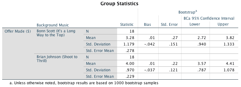
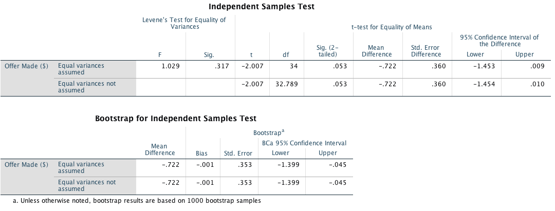
The bootstrap confidence interval ranged from -1.399 to -0.045, which does not cross zero suggesting that (if we assume that it is one of the 95% of confidence intervals that contain the true value) that the effect in the population is unlikely to be zero.
we can compute an effect size, r, as follows:
\[ r = \sqrt{\frac{-2.007^2}{2.007^2 + 34}} = \sqrt{\frac{4.028}{38.028}} = 0.33 \]
Or Cohen’s d. Let’s use a pooled estimate of the standard deviation: \[ \begin{aligned} \ s_p &= \sqrt{\frac{(N_1-1) s_1^2+(N_2-1) s_2^2}{N_1+N_2-2}} \\ \ &= \sqrt{\frac{(18-1)0.970^2+(18-1)1.179^2}{18 + 18 -2}} \\ \ &= \sqrt{\frac{39.626}{34}} \\ \ &= 1.08 \end{aligned} \] Cohen’s d is:
\[\hat{d} = \frac{4.00-3.28}{1.08} = 0.667\]
Well, that’s pretty spooky: the difference between Bon Scott and Brian Johnson turns out to be the number of the beast. Who’d have thouyght it. We could report these results as:
- On average, more offers were made when listening to Brian Johnson (M = 4.00, SE = 0.23) than Bon Scott (M = 3.28, SE = 0.28). This difference, -0.72, BCa 95% CI [-1.45, -0.05], was only borderline significant, t(34) = 2.01, p = 0.053; however, it produced a medium effect, \(\hat{d}_D = -0.67\).
Chapter 11
Task 11.1
McNulty et al. (2008) found a relationship between a person’s Attractiveness and how much Support they give their partner among newlyweds. The data are in McNulty et al. (2008).sav, Is this relationship moderated by gender (i.e., whether the data were from the husband or wife)?
Specifying the model
Make sure you have the PROCESS tool installed (installation details
are in the book). Access the PROCESS dialog box using Analyze >
Regression > PROCESS. Remember that you can move variables in
the dialog box by dragging them, or selecting them and cliking ![]() . We need
to specify three variables:
. We need
to specify three variables:
- Drag the outcome variable (Support) to the box labelled Outcome Variable (Y).
- Drag the predictor variable (Attractiveness) to the box labelled Independent Variable (X).
- Drag the moderator variable (Gender) to the box labelled M Variable(s).
The models tested by PROCESS are listed in the drop-down box labelled
Model Number. Simple moderation analysis is represented by
model 1, so activate this drop-down list and select  . The finished
dialog box looks like this:
. The finished
dialog box looks like this:
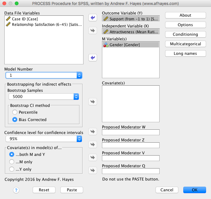
Click on  and
set these options:
and
set these options:
Because our data file has variables with names longer than 8
characters, click on  and set the
option to allow long names:
and set the
option to allow long names:
Back in the main dialog box, click  to run the
analysis.
to run the
analysis.
Interpreting the output
The first part of the output contains the main moderation analysis. Moderation is shown up by a significant interaction effect, and in this case the interaction is highly significant, b = 0.105, 95% CI [0.047, 0.164], t = 3.57, p < 0.001, indicating that the relationship between attractiveness and support is moderated by gender:
To interpret the moderation effect we can examine the simple slopes, which are shown in the next part of the output. Essentially, the output shows the results of two different regressions: the regression for attractiveness as a predictor of support (1) when the value for gender is 0.5 (i.e., low). Because husbands were coded as zero, this represents the value for males; and (2) when the value for gender is 0.5 (i.e., high). Because wives were coded as 1, this represents the female end of the gender spectrum. We can interpret these three regressions as we would any other: we’re interested the value of b (called Effect in the output), and its significance. From what we have already learnt about regression we can interpret the two models as follows:
- When gender is low (male), there is a significant negative relationship between attractiveness and support, b = 0.060, 95% CI [-0.100, -0.020], t = -2.95, p = 0.004.
- When gender is high (female), there is a significant positive relationship between attractiveness and support, b = 0.046, 95% CI [0.003, 0.088], t = 2.12, p = 0.036.
These results tell us that the relationship between attractiveness of a person and amount of support given to their spouse is different for men and women. Specifically, for women, as attractiveness increases the level of support that they give to their husbands increases, whereas for men, as attractiveness increases the amount of support they give to their wives decreases:
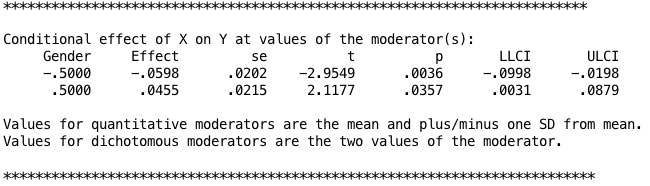
Task 11.2
Produce the simple slopes graphs for Task 1.
If you set the options that I suggested in task 1, your output should contain the values that you need to plot:
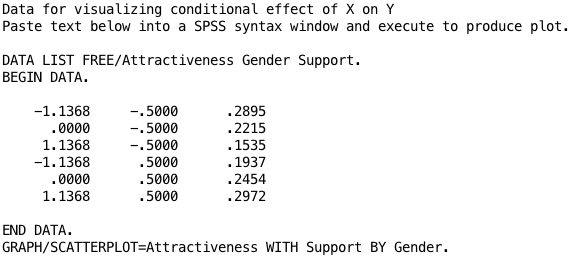
Create a data file with a variable that codes Attractiveness as low, mean or high, a variable that codes Gender as husbands or wives, and a variable that contains the values of Support from the output. The data file will look like this:
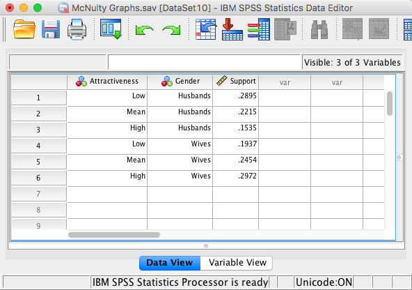
Use the chart builder to draw a line chart with Attractiveness on the x-axis, Support on the y-axis and has different coloured lines for Gender. The dialog box will look like this:
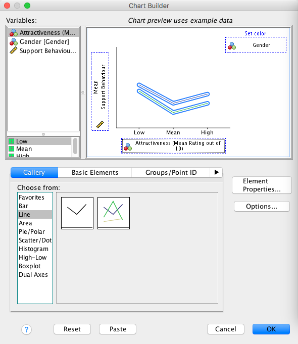
The resulting graph confirms our results from the simple slops analysis in the previous task. The direction of the relationship between attractiveness and support is different for men and women: the two regression lines slope in different directions. Specifically, for husbands (blue line) the relationship is negative (the regression line slopes downwards), whereas for wives (green line) the relationship is positive (the regression line slopes upwards). Additionally, the fact that the lines cross indicates a significant interaction effect (moderation). So basically, we can conclude that the relationship between attractiveness and support is positive for wives (more attractive wives give their husbands more support), but negative for husbands (more attractive husbands give their wives less support than unattractive ones). Although they didn’t test moderation, this mimics the findings of McNulty et al. (2008).
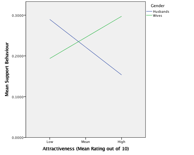
Task 11.3
McNulty et al. (2008) also found a relationship between a person’s Attractiveness and their relationship Satisfaction among newlyweds. Using the same data as in Tasks 1 and 2, find out if this relationship is moderated by gender?
sure you have the PROCESS tool installed (installation details are in
the book). Access the PROCESS dialog box using Analyze >
Regression > PROCESS. Remember that you can move variables in
the dialog box by dragging them, or selecting them and cliking ![]() . We need
to specify three variables:
. We need
to specify three variables:
- Drag the outcome variable (Relationship Satisfaction) to the box labelled Outcome Variable (Y).
- Drag the predictor variable (Attractiveness) to the box labelled Independent Variable (X).
- Drag the moderator variable (Gender) to the box labelled M Variable(s).
The models tested by PROCESS are listed in the drop-down box labelled
Model Number. Simple moderation analysis is represented by
model 1, so activate this drop-down list and select . The finished
dialog box looks like this:
Click on and
set these options:
Because our data file has variables with names longer than 8
characters, click on and set the
option to allow long names:
Back in the main dialog box, click to run the
analysis.
Interpreting the output
The first part of the output contains the main moderation analysis. Moderation is shown up by a significant interaction effect, and in this case the interaction is not significant, b = 0.547, 95% CI [-0.594, 1.687], t = 0.95, p = 0.345, indicating that the relationship between attractiveness and relationship satisfaction is not significantly moderated by gender:
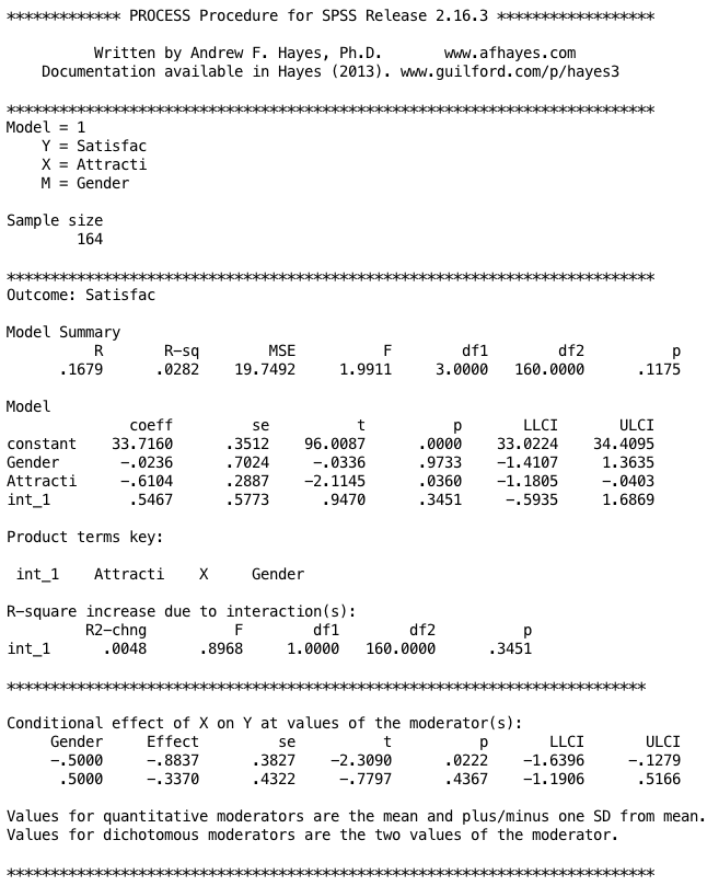
Task 11.4
In this chapter we tested a mediation model of infidelity for Lambert et al.’s data using Baron and Kenny’s regressions. Repeat this analysis but using Hook_Ups as the measure of infidelity.
Baron and Kenny suggested that mediation is tested through three regression models:
- A regression predicting the outcome (Hook_Ups) from the predictor variable (Consumption).
- A regression predicting the mediator (Commitment) from the predictor variable (Consumption).
- A regression predicting the outcome (Hook_Ups) from both the predictor variable (Consumption) and the mediator (Commitment).
These models test the four conditions of mediation: (1) the predictor variable (Consumption) must significantly predict the outcome variable (Hook_Ups) in model 1; (2) the predictor variable (Consumption) must significantly predict the mediator (Commitment) in model 2; (3) the mediator (Commitment) must significantly predict the outcome (Hook_Ups) variable in model 3; and (4) the predictor variable (Consumption) must predict the outcome variable (Hook_Ups) less strongly in model 3 than in model 1.
Model 1: Predicting infidelity from consumption
Dialog box for model 1:
Output for model 1:
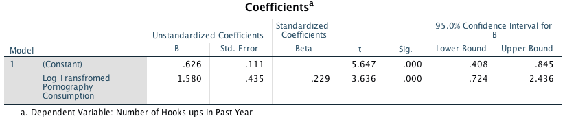
Model 2: Predicting commitment from consumption
box for model 2:
Output for model 2:
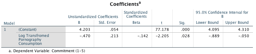
Model 3: Predicting Infidelity from Consumption and Commitment
Dialog box for model 3:
Output for model 3:
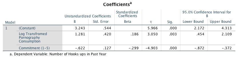
Conclusion
Is there evidence for mediation?
- The output from model 1 shows that pornography consumption significantly predicts hook-ups, b = 1.58, 95% CI [0.72, 2.45], t = 3.64, p < .001. As pornography consumption increases, the number of hook-ups increases also.
- The output from model 2 shows that pornography consumption significantly predicts relationship commitment, b = 0.47, 95% CI [0.89, 0.05], t = 2.21, p = .028. As pornography consumption increases commitment declines.
- The output from model 3 shows that relationship commitment significantly predicts hook-ups, b = 0.62, 95% CI [0.87, 0.37], t = 4.90, p < .001. As relationship commitment increases the number of hook-ups decreases.
- The relationship between pornography consumption and infidelity is stronger in model 1, b = 1.58, than in model 3, b = 1.28.
As such, the four conditions of mediation have been met.
Task 11.5
Repeat the analysis in Task 4 but using the PROCESS tool to estimate the indirect effect and its confidence interval.
Specifying the model
Make sure you have the PROCESS tool installed (installation details
are in the book). Access the PROCESS dialog box using Analyze >
Regression > PROCESS. Remember that you can move variables in
the dialog box by dragging them, or selecting them and cliking ![]() . We need
to specify three variables:
. We need
to specify three variables:
- Drag the outcome variable (Hook_Ups) to the box labelled Outcome Variable (Y).
- Drag the predictor variable (LnConsumption) to the box labelled Independent Variable (X).
- Drag the mediator variable (Commitment) to the box labelled M Variable(s).
The models tested by PROCESS are listed in the drop-down box labelled
Model Number. Simple mediation analysis is represented by model
4 (the default). If the drop-down list is not already set to  then select this
option. The finished dialog box looks like this:
then select this
option. The finished dialog box looks like this:
Click on and
set these options:
Because our data file has variables with names longer than 8
characters, click on and set the
option to allow long names:
Back in the main dialog box, click to run the
analysis.
Interpreting the output
The first part of the output shows us the results of the simple regression of commitment predicted from pornography consumption. Pornography consumption significantly predicts relationship commitment, b = -0.47, t = -2.21, p = 0.028. The \(R^2\) value tells us that pornography consumption explains 2% of the variance in relationship commitment, and the fact that the b is negative tells us that the relationship is negative also: as consumption increases, commitment declines (and vice versa):
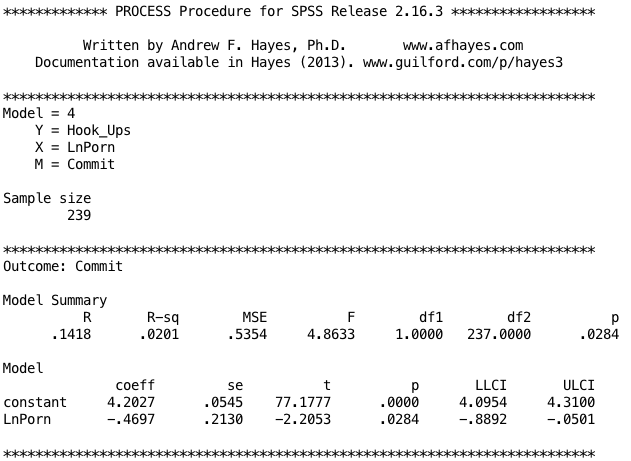
The next part of the output shows the results of the regression of number of hook-ups predicted from both pornography consumption and commitment. We can see that pornography consumption significantly predicts number of hook-ups even with relationship commitment in the model, b = 1.28, t = 3.05, p = 0.003; relationship commitment also significantly predicts number of hook-ups, b = -0.62, t = 4.90, p < .001. The \(R^2\) value tells us that the model explains 14.0% of the variance in number of hook-ups. The negative b for commitment tells us that as commitment increases, number of hook-ups declines (and vice versa), but the positive b for consumptions indicates that as pornography consumption increases, the number of hook-ups increases also. These relationships are in the predicted direction:
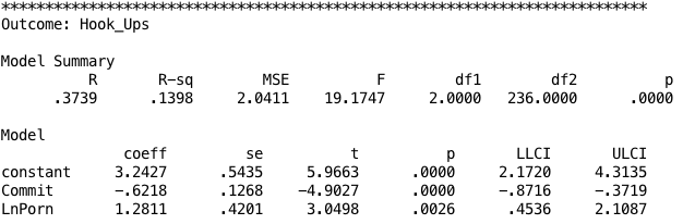
The next part of the output shows the total effect of pornography consumption on number of hook-ups (outcome). When relationship commitment is not in the model, pornography consumption significantly predicts the number of hook-ups, b = 1.57, t = 3.61, p < .001. The \(R^2\) value tells us that the model explains 5.22% of the variance in number of hook-ups. As is the case when we include relationship commitment in the model, pornography consumption has a positive relationship with number of hook-ups (as shown by the positive b-value):
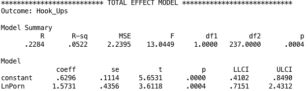
The next part of the output is the most important because it displays the results for the indirect effect of pornography consumption on number of hook-ups (i.e. the effect via relationship commitment). We’re told the effect of pornography consumption on the number of hook-ups when relationship commitment is included as a predictor as well (the direct effect). The first bit of new information is the Indirect Effect of X on Y, which in this case is the indirect effect of pornography consumption on the number of hook-ups. We’re given an estimate of this effect (b = 0.292) as well as a bootstrapped standard error and confidence interval. As we have seen many times before, 95% confidence intervals contain the true value of a parameter in 95% of samples. Therefore, we tend to assume that our sample isn’t one of the 5% that does not contain the true value and use them to infer the population value of an effect. In this case, assuming our sample is one of the 95% that ‘hits’ the true value, we know that the true b-value for the indirect effect falls between 0.035 and 0.636. This range does not include zero, and remember that b = 0 would mean ‘no effect whatsoever’; therefore, the fact that the confidence interval does not contain zero means that there is likely to be a genuine indirect effect. Put another way, relationship commitment is a mediator of the relationship between pornography consumption and the number of hook-ups. The rest of the output contains various standardized forms of the indirect effect. In each case they are accompanied by a bootstrapped confidence interval. As with the unstandardized indirect effect, if the confidence intervals don’t contain zero then we can be confident that the true effect size is different from ‘no effect’. In other words, there is mediation. All of the effect size measures have confidence intervals that don’t include zero, so whichever one we look at we can be fairly confident that the indirect effect is greater than ‘no effect’. Focusing on the most useful of these effect sizes, the standardized b for the indirect effect, its value is b = .042, 95% BCa CI [.005, .090]. Although it is better to interpret the bootstrap confidence intervals than formal tests of significance, the Sobel test suggests a significant indirect effect, b = 0.292, z = 1.98, p = .048.
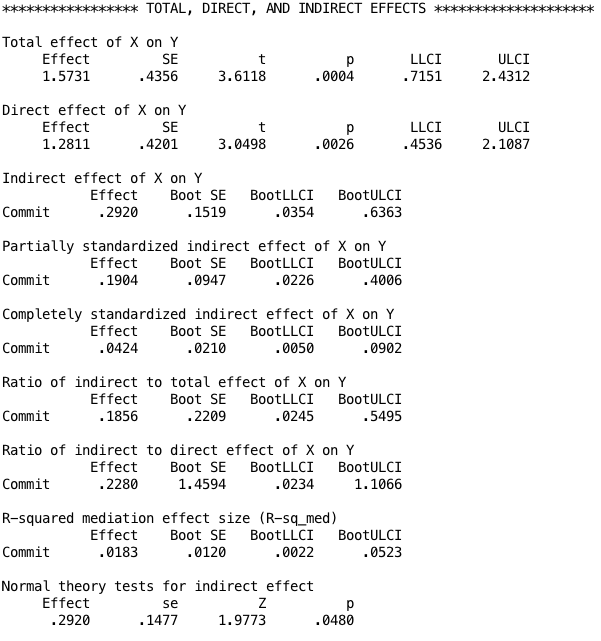
You could report the results as:
- There was a significant indirect effect of pornography consumption on the number of hook-ups though relationship commitment, b = 0.292, BCa CI [0.035, 0.636]. This represents a relatively small effect, standardized indirect effect \(ab_{\text{CS}}\) = 0.042, 95% BCa CI [0.005, 0.090].
Task 11.6
We looked at data from people who had been forced to marry goats and dogs and measured their life satisfaction as well as how much they like animals (Goat or Dog.sav). Fit a linear model predicting life satisfaction from the type of animal to which a person was married. Write out the final model.
The completed dialog box should look like this:
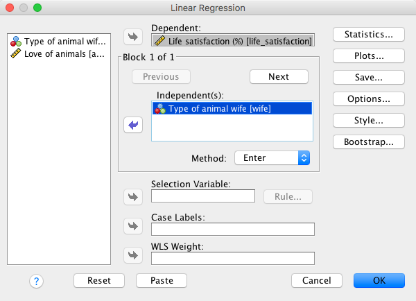
The relevant part of the output is as follows:
Looking at the coefficients, we can see that type of animal wife significantly predicted life satisfaction because the p-value is less than 0.05 (0.003). The positive standardized beta value (0.630) indicates a positive relationship between type of animal wife and life satisfaction. Remember that goat was coded as 0 and dog was coded as 1, therefore as type of animal wife increased from goat to dog, life satisfaction also increased. In other words, men who were married to dogs were more satisfied than those who were married to goats. By replacing the b-values in the equation for the linear model (see the book), the specific model is:
\[ \begin{aligned} \text{Life satisfaction}_i &= b_0 + b_1\text{type of animal wife}_i\\ &= 16.21 + 21.96 \times\text{type of animal wife}_i \end{aligned} \]
Task 11.7
Repeat the analysis in Task 6 but include animal liking in the first block, and type of animal in the second block. Do your conclusions about the relationship between type of animal and life satisfaction change?
The completed dialog box for block 1 should look like this:

The completed dialog box for block 2 should look like this:
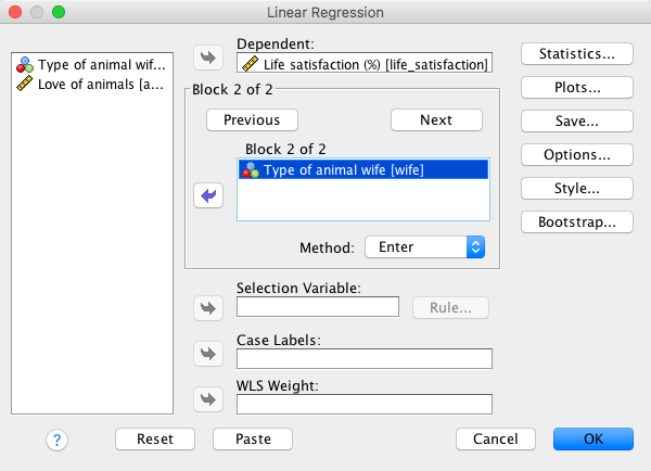
The relevant part of the output is as follows:
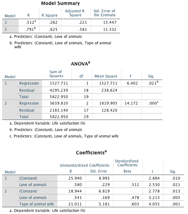
Looking at the coefficients from the final model, we can see that both love of animals, t(17) = 3.21, p = 0.005, and type of animal wife, t(17) = 4.06, p = 0.001, significantly predicted life satisfaction. This means that even after adjusting for the effect of love of animals, type of animal wife still significantly predicted life satisfaction. \(R^2\) is the squared correlation between the observed values of life satisfaction and the values of life satisfaction predicted by the model. The values in this output tell us that love of animals explains 26.2% of the variance in life satisfaction. When type of animal wife is factored in as well, 62.5% of variance in life satisfaction is explained (i.e., an additional 36.3%).
Task 11.8
Using the GlastonburyDummy.sav data, for which we have already fitted the model, comment on whether you think the model is reliable and generalizable.
The completed main dialog box should look like this:
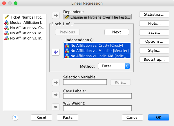
Click  and set
these options:
and set
these options:
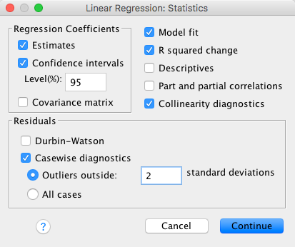
Click  and set these options:
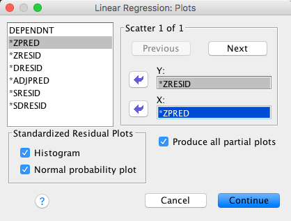
Back in the main dialog box click to fit the
model.
This question asks whether this model is valid. Based on the output below:
- Residuals: There are no cases that have a standardized residual greater than 3. If you look at the casewise diagnostics table, you can see that there were 5 cases out of a total of 123 (for day 3) with standardized residuals above 2. As a percentage this would be 5/123 × 100 = 4.07%, so that’s as we would expect. There was only 1 case out of 123 with residuals above 2.5, which as a percentage would be 1/123 × 100 = 0.81% (and we’d expect 1%), which indicates the data are consistent with what we’d expect.
- Normality of errors: The histogram looks reasonably normally distributed, indicating that the normality of errors assumption has probably been met. The normal P–P plot verifies this because the dashed line doesn’t deviate much from the straight line (which indicates what you’d get from normally distributed errors).
- Homoscedasticity and independence of errors: The scatterplot of ZPRED vs. ZRESID does look a bit odd with categorical predictors, but essentially we’re looking for the height of the lines to be about the same (indicating the variability at each of the three levels is the same). This is true, indicating homoscedasticity.
- Multicollinearity: For all variables in the model, VIF values are below 10 (or alternatively, tolerance values are all well above 0.2) indicating no multicollinearity in the data.
All in all, the model looks fairly reliable (but you should check for influential cases).
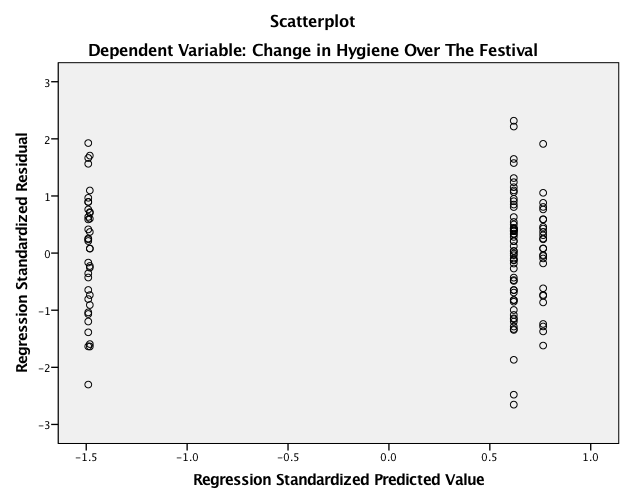
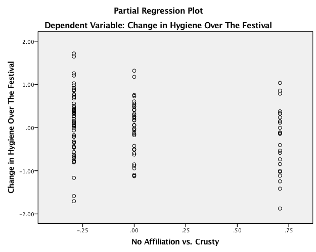
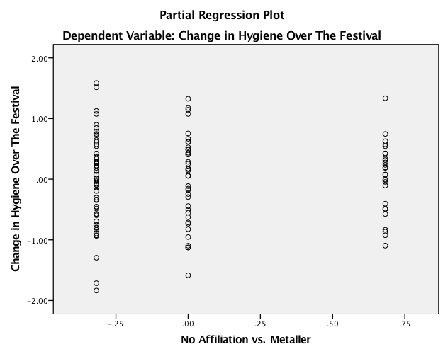
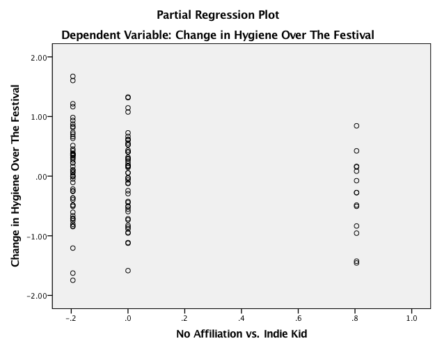
Task 11.9
Tablets like the iPad are very popular. A company owner was interested in how to make his brand of tablets more desirable. He collected data on how cool people perceived a product’s advertising to be (Advert_Cool), how cool they thought the product was (Product_Cool), and how desirable they found the product (Desirability). Test his theory that the relationship between cool advertising and product desirability is mediated by how cool people think the product is (Tablets.sav). Am I showing my age by using the word ‘cool’?
Specifying the model
Make sure you have the PROCESS tool installed (installation details
are in the book). Access the PROCESS dialog box using Analyze >
Regression > PROCESS. Remember that you can move variables in
the dialog box by dragging them, or selecting them and cliking ![]() . We need
to specify three variables:
. We need
to specify three variables:
- Drag the outcome variable (Desirability) to the box labelled Outcome Variable (Y).
- Drag the predictor variable (Advert_Cool) to the box labelled Independent Variable (X).
- Drag the mediator variable (Product_Cool) to the box labelled M Variable(s).
The models tested by PROCESS are listed in the drop-down box labelled
Model Number. Simple mediation analysis is represented by model
4 (the default). If the drop-down list is not already set to then select this
option. The finished dialog box looks like this:
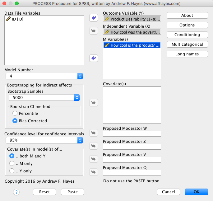
Click on and
set these options:
Because our data file has variables with names longer than 8
characters, click on and set the
option to allow long names:
Back in the main dialog box, click to run the
analysis.
Interpreting the output
The first part of the output shows us the results of the simple regression of how cool the product is perceieved as being predicted from cool advertising. This output is interpreted just as we would interpret any regression: we can see that how cool people perceive the advertising to be significantly predicts how cool they think the product is, b = 0.20, t = 2.98, p = .003. The \(R^2\) value tells us that cool advertising explains 3.59% of the variance in how cool they think the product is, and the fact that the b is positive tells us that the relationship is positive also: the more ‘cool’ people think the advertising is, the more ‘cool’ they think the product is (and vice versa):
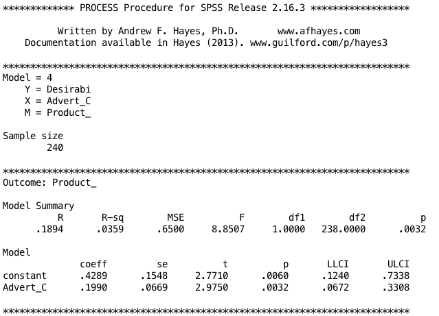
The next part of the output shows the results of the regression of Desirability predicted from both how cool people think the product is and how cool people think the advertising is. We can see that cool advertising significantly predicts product desirability even with Product_Cool in the model, b = 0.19, t = 3.12, p = .002; Product_Cool also significantly predicts product desirability, b = 0.25, t = 4.37, p < .001. The \(R^2\) values tells us that the model explains 12.97% of the variance in product desirability. The positive bs for Product_Cool and Advert_Cool tells us that as adverts and products increase in how cool they are perceived to be, product desirability increases also (and vice versa). These relationships are in the predicted direction:
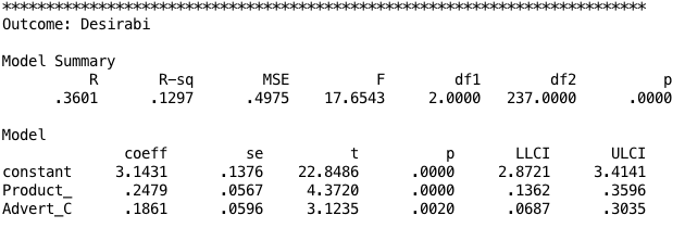
The next part of the output shows the total effect of cool advertising on product desirability (outcome). You will get this bit of the output only if you selected Total effect model. The total effect is the effect of the predictor on the outcome when the mediator is not present in the model. When Product_Cool is not in the model, cool advertising significantly predicts product desirability, b = .24, t = 3.88, p < .001. The \(R^2\) values tells us that the model explains 5.96% of the variance in product desirability. As is the case when we include Product_Cool in the model, Advert_Cool has a positive relationship with product desirability (as shown by the positive b-value):
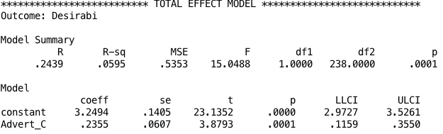
The next part of the output is the most important because it displays the results for the indirect effect cool advertising on product desirability (i.e. the effect via Product_Cool). First, we’re again told the effect of cool advertising on the product desirability in isolation (the total effect). Next, we’re told the effect of cool advertising on the product desirability when Product_Cool is included as a predictor as well (the direct effect). The first bit of new information is the Indirect Effect of X on Y, which in this case is the indirect effect of cool advertising on the product desirability. We’re given an estimate of this effect (b = 0.049) as well as a bootstrapped standard error and confidence interval. As we have seen many times before, 95% confidence intervals contain the true value of a parameter in 95% of samples. Therefore, we tend to assume that our sample isn’t one of the 5% that does not contain the true value and use them to infer the population value of an effect. In this case, assuming our sample is one of the 95% that ‘hits’ the true value, we know that the true b-value for the indirect effect falls between .0140 and .1012. This range does not include zero, and remember that b = 0 would mean ‘no effect whatsoever’; therefore, the fact that the confidence interval does not contain zero means that there is likely to be a genuine indirect effect. Put another way, Product_Cool is a mediator of the relationship between cool advertising and product desirability. The rest of the output contains various standardized forms of the indirect effect. In each case they are accompanied by a bootstrapped confidence interval. As with the unstandardized indirect effect, if the confidence intervals don’t contain zero then we tend to assume that the true effect size is different from ‘no effect’. In other words, there is mediation. All of the effect size measures have confidence intervals that don’t include zero, so whatever one we look at we can assume that the indirect effect is greater than ‘no effect’. Focusing on the most useful of these effect sizes, the standardized b for the indirect effect, its value is b = 0.051, 95% BCa CI [0.014, 0.104]. Although it is better to interpret the bootstrap confidence intervals than formal tests of significance, the Sobel test suggests a significant indirect effect, b = 0.049, z = 2.42, p = .016.
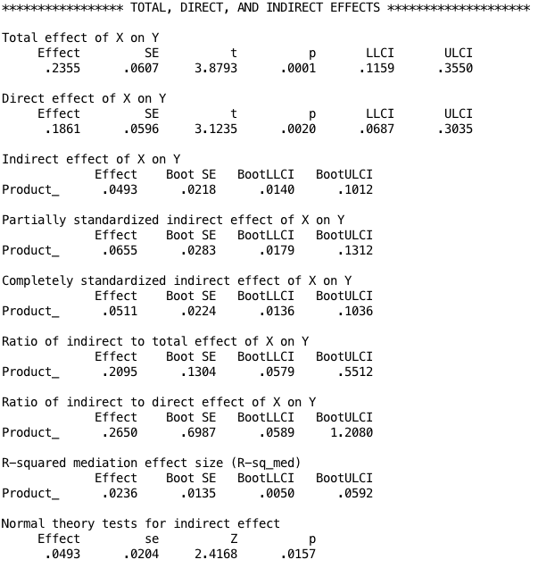
You could report the results as:
- There was a significant indirect effect of how cool people think a products’ advertising is on the desirability of the product though how cool they think the product is, b = 0.049, BCa CI [0.014, 0.101]. This represents a relatively small effect, standardized indirect effect \(ab_{\text{CS}}\) = 0.051, 95% BCa CI [0.014, 0.104].
Chapter 12
Task 12.1
To test how different teaching methods affected students’ knowledge I took three statistics modules where I taught the same material. For one module I wandered around with a large cane and beat anyone who asked daft questions or got questions wrong (punish). In the second I encouraged students to discuss things that they found difficult and gave anyone working hard a nice sweet (reward). In the final course I neither punished nor rewarded students’ efforts (indifferent). I measured the students’ exam marks (percentage). The data are in the file Teach.sav. Fit a model with planned contrasts to test the hypotheses that: (1) reward results in better exam results than either punishment or indifference; and (2) indifference will lead to significantly better exam results than punishment
The first part of the output shows the table of descriptive statistics from the one-way ANOVA; we’re told the means, standard deviations and standard errors of the means for each experimental condition. The means should correspond to those plotted in the graph. These diagnostics are important for interpretation later on. It looks as though marks are highest after reward and lowest after punishment:
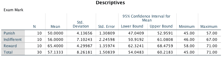
The next part of the output is the main ANOVA summary table. We should routinely look at the robust Fs. Because the observed significance value is less than 0.05 we can say that there was a significant effect of teaching style on exam marks. However, at this stage we still do not know exactly what the effect of the teaching style was (we don’t know which groups differed).
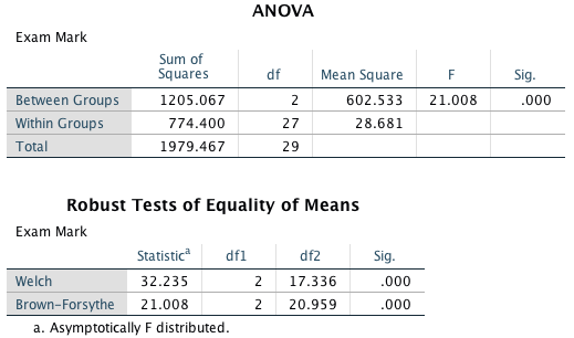
Because there were specific hypotheses I specified some contrasts. The next part of the output shows the codes I used. The first contrast compares reward (coded with −2) against punishment and indifference (both coded with 1). The second contrast compares punishment (coded with 1) against indifference (coded with −1). Note that the codes for each contrast sum to zero, and that in contrast 2, reward has been coded with a 0 because it is excluded from that contrast.
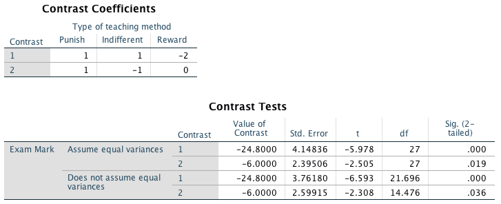
It is safest to interpret the part of the table labelled Does not assume equal variances. The t-test for the first contrast tells us that reward was significantly different from punishment and indifference (it’s significantly different because the value in the column labelled Sig. is less than 0.05). Looking at the means, this tells us that the average mark after reward was significantly higher than the average mark for punishment and indifference combined. The second contrast (together with the descriptive statistics) tells us that the marks after punishment were significantly lower than after indifference (again, significantly different because the value in the column labelled Sig. is less than 0.05). As such we could conclude that reward produces significantly better exam grades than punishment and indifference, and that punishment produces significantly worse exam marks than indifference. So lecturers should reward their students, not punish them.
Task 12.2
Compute the effect sizes for the previous task.
The outputs provide us with three measures of variance: the between-group effect (\(\text{SS}_\text{M}\)), the within-subject effect (\(\text{MS}_\text{R}\)) and the total amount of variance in the data \(\text{SS}_\text{T}\). We can use these to calculate omega squared (\(\omega^2\)): \[ \begin{aligned} \omega^2 &= \frac{\text{SS}_\text{M} - df_\text{M} \times \text{MS}_\text{R}}{\text{SS}_\text{T} + \text{MS}_\text{R}} \\ &= \frac{1205.067 - 2 \times 28.681}{1979.467 + 28.681}\\ &= \frac{1147.705}{2008.148}\\ &= 0.57 \end{aligned} \]
For the contrasts the effect sizes will be (I’m using t and df corrected for variances):
\[ \begin{aligned} r_\text{contrast} &= \sqrt{\frac{t^2}{t^2 + df}} \\ r_\text{contrast 1} &= \sqrt{\frac{-6.593^2}{-6.593^2 + 21.696}} = 0.82\\ r_\text{contrast 2} &= \sqrt{\frac{-2.308^2}{-2.3085^2 + 14.476}} = 0.52\\ \end{aligned} \]
We could report these analyses (including task 1) as (I’m reporting the Welch F):
- There was a significant effect of teaching style on exam marks, F(2, 17.34) = 32.24, p < 0.001, \(\omega^2\) = 0.57. Planned contrasts revealed that reward produced significantly better exam grades than punishment and indifference, t(21.70) = –6.59, p < 0.001, r = 0.82, and that punishment produced significantly worse exam marks than indifference, t(14.48) = −2.31, r = 0.52.
Task 12.3
Children wearing superhero costumes are more likely to harm themselves because of the unrealistic impression of invincibility that these costumes could create. For example, children have reported to hospital with severe injuries because of trying ‘to initiate flight without having planned for landing strategies’ (Davies, Surridge, Hole, & Munro-Davies, 2007). I can relate to the imagined power that a costume bestows upon you; indeed, I have been known to dress up as Fisher by donning a beard and glasses and trailing a goat around on a lead in the hope that it might make me more knowledgeable about statistics. Imagine we had data (Superhero.sav) about the severity of injury (on a scale from 0, no injury, to 100, death) for children reporting to the accident and emergency department at hospitals, and information on which superhero costume they were wearing (hero): Spiderman, Superman, the Hulk or a teenage mutant ninja turtle. Fit a model with planned contrasts to test the hypothesis that different costumes give rise to more severe injuries.
The means suggest that children wearing a Ninja Turtle costume had the least severe injuries (M = 26.25), whereas children wearing a Superman costume had the most severe injuries (M = 60.33):
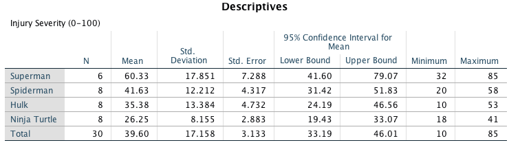
In the ANOVA output (we should routinely look at the robust Fs.), the observed significance value is much less than 0.05 and so we can say that there was a significant effect of superhero costume on injury severity. However, at this stage we still do not know exactly what the effect of superhero costume was (we don’t know which groups differed).
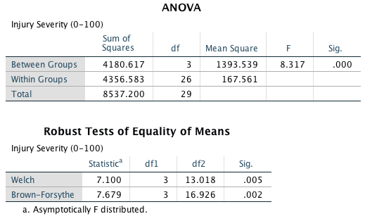
Because there were no specific hypotheses, only that the groups would differ, we can’t look at planned contrasts but we can conduct some post hoc tests. I am going to use Gabriel’s post hoc test because the group sizes are slightly different (Spiderman, N = 8; Superman, N = 6; Hulk, N = 8; Ninja Turtle, N = 8). The output tells us that wearing a Superman costume was significantly different from wearing either a Hulk or Ninja Turtle costume in terms of injury severity, but that none of the other groups differed significantly. The post hoc test has shown us which differences between means are significant; however, if we want to see the direction of the effects we can look back to the means in the table of descriptives (Output 7). We can conclude that wearing a Superman costume resulted in significantly more severe injuries than wearing either a Hulk or a Ninja Turtle costume.
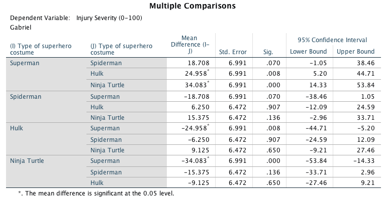
We can calculate (\(\omega^2\) ) as follows:
\[ \begin{aligned} \omega^2 &= \frac{\text{SS}_\text{M} - df_\text{M} \times \text{MS}_\text{R}}{\text{SS}_\text{T} + \text{MS}_\text{R}} \\ &= \frac{4180.617 - 3 \times 167.561}{8537.20 + 167.561}\\ &= \frac{3677.934}{8704.761}\\ &= 0.42 \end{aligned} \]
We could report the analysis as follows:
- There was a significant effect of superhero costume on severity of injury, F(3, 13.02) = 7.10, p = 0.005, \(\omega^2\) = 0.42. Gabriel’s post hoc tests revealed that wearing a Superman costume resulted in significantly more severe injuries compared to wearing a Hulk (p = 0.008) or a Ninja Turtle (p < 0.001) costume, but not a spiderman costume (p = 0.70). Injuries were not significantly different when wearing a spiderman costume compared to a Hulk (p = 0.907) or a Ninja Turtle (p = 0.136) costume. Injuries were not significantly different when wearing a Hulk compared to a Ninja Turtle costume (p = 0.650).
Task 12.4
In Chapter 7 there are some data looking at whether eating soya meals reduces your sperm count. Analyse these data with a linear model (ANOVA). What’s the difference between what you find and what was found in Chapter 7. Why do you think this difference has arisen?
A boxplot of the data suggests that (1) scores within conditions are skewed; and (2) variability in scores is different across groups.
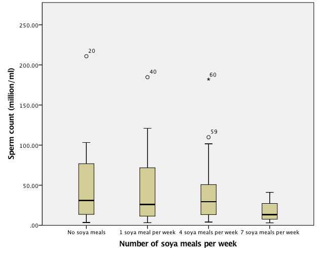
The table of descriptive statistics suggests that as soya intake increases, sperm counts decrease as predicted:
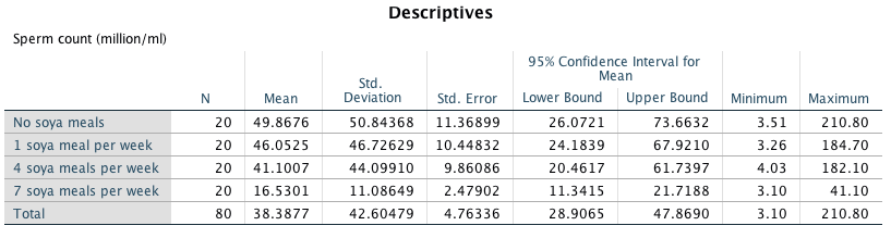
The next part of the output is the main ANOVA summary table. We should routinely look at the robust Fs. Note that the Welch test agrees with the non-parametric test in Chapter 7 in that the significance of F is below the 0.05 threshold. However, the Brown-Forsythe F is non-significant (it is just above the threshold). This illustrates the relative superiority (with respect to power) of the Welch procedure. The unadjusted F is also not significant.
If we were using the unadjusted F then we would conclude that, because the observed significance value is greater than 0.05, there was no significant effect of soya intake on men’s sperm count. This may seem strange because if you read Chapter 7, from where this example came, the Kruskal–Wallis test produced a significant result. The reason for this difference is that the data violate the assumptions of normality and homogeneity of variance. As I mention in Chapter 7, although parametric tests have more power to detect effects when their assumptions are met, when their assumptions are violated non-parametric tests have more power! This example was arranged to prove this point: because the parametric assumptions are violated, the non-parametric tests produced a significant result and the parametric test did not because, in these circumstances, the non-parametric test has the greater power. Also, the Welch F, which does adjust for these violations yields a significant result.
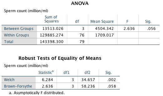
Task 12.5
Mobile phones emit microwaves, and so holding one next to your brain for large parts of the day is a bit like sticking your brain in a microwave oven and pushing the ‘cook until well done’ button. If we wanted to test this experimentally, we could get six groups of people and strap a mobile phone on their heads, then by remote control turn the phones on for a certain amount of time each day. After six months, we measure the size of any tumour (in mm3) close to the site of the phone antenna (just behind the ear). The six groups experienced 0, 1, 2, 3, 4 or 5 hours per day of phone microwaves for six months. Do tumours significantly increase with greater daily exposure? The data are in Tumour.sav.
The following figure displays the error bar chart of the mobile phone data shows the mean size of brain tumour in each condition, and the funny ‘I’ shapes show the confidence interval of these means. Note that in the control group (0 hours), the mean size of the tumour is virtually zero (we wouldn’t actually expect them to have a tumour) and the error bar shows that there was very little variance across samples - this almost certainly means we cannot assume equal variances.
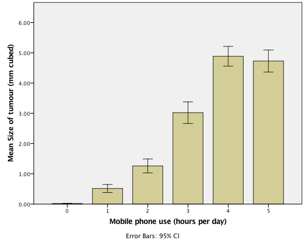
The first part of the output shows the table of descriptive statistics from the one-way ANOVA; we’re told the means, standard deviations and standard errors of the means for each experimental condition. The means should correspond to those plotted in the graph. These diagnostics are important for interpretation later on.
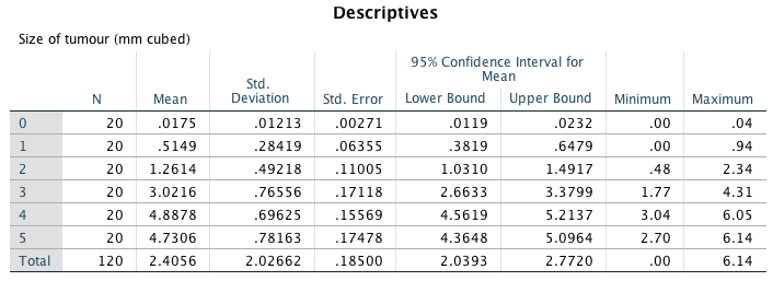
The next part of the output is the main ANOVA summary table. We should routinely look at the robust Fs. Because the observed significance of Welch’s F is less than 0.05 we can say that there was a significant effect of mobile phones on the size of tumour. However, at this stage we still do not know exactly what the effect of the phones was (we don’t know which groups differed).
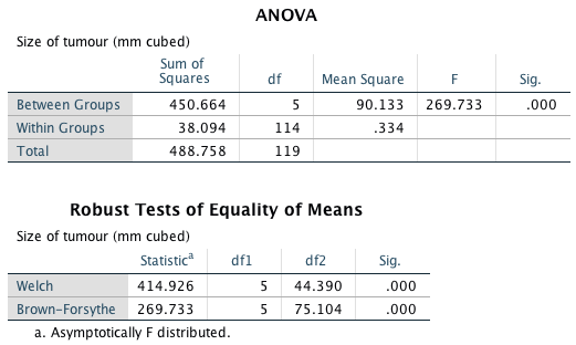
Because there were no specific hypotheses I just carried out post hoc tests and stuck to my favourite Games–Howell procedure (because variances were unequal). It is clear from that each group of participants is compared to all of the remaining groups. First, the control group (0 hours) is compared to the 1, 2, 3, 4 and 5 hour groups and reveals a significant difference in all cases (all the values in the column labelled Sig. are less than 0.05). In the next part of the table, the 1 hour group is compared to all other groups. Again all comparisons are significant (all the values in the column labelled Sig. are less than 0.05). In fact, all of the comparisons appear to be highly significant except the comparison between the 4 and 5 hour groups, which is non-significant because the value in the column labelled Sig. is larger than 0.05.
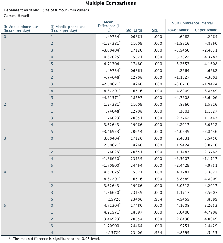
We can calculate omega squared (\(\omega^2\)) as follows:
\[ \begin{aligned} \omega^2 &= \frac{\text{SS}_\text{M} - df_\text{M} \times \text{MS}_\text{R}}{\text{SS}_\text{T} + \text{MS}_\text{R}} \\ &= \frac{450.664 - 5 \times 0.334}{488.758 + 0.334}\\ &= \frac{448.994}{488.424}\\ &= 0.92 \end{aligned} \]
We could report the main finding as follows: * The results show that using a mobile phone significantly affected the size of brain tumour found in participants, F(5, 44.39) = 414.93, p < 0.001, \(\omega^2\) = 0.92. The effect size indicated that the effect of phone use on tumour size was substantial. Games–Howell post hoc tests revealed significant differences between all groups (p < 0.001 for all tests) except between 4 and 5 hours (p = 0.984).
Task 12.6
Using the Glastonbury data from Chapter 11 (GlastonburyFestival.sav), fit a model to see if the change in hygiene (*change) is significant across people with different musical tastes (music). Compare the results to those described in Chapter 11.
The first part of the output is the main ANOVA table. We could say that the change in hygiene scores was significantly different across the different musical groups, F(3, 119) = 3.27, p = 0.024:
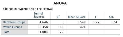
Compare this table to the one in Chapter 11, in which we analysed these data as a regression (reproduced below):
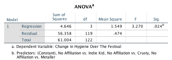
The tables are exactly the same! What about the contrasts? The table below shows the codes I used to get simple contrasts that compare each group to the no affiliation group, and the subsequent contrasts:
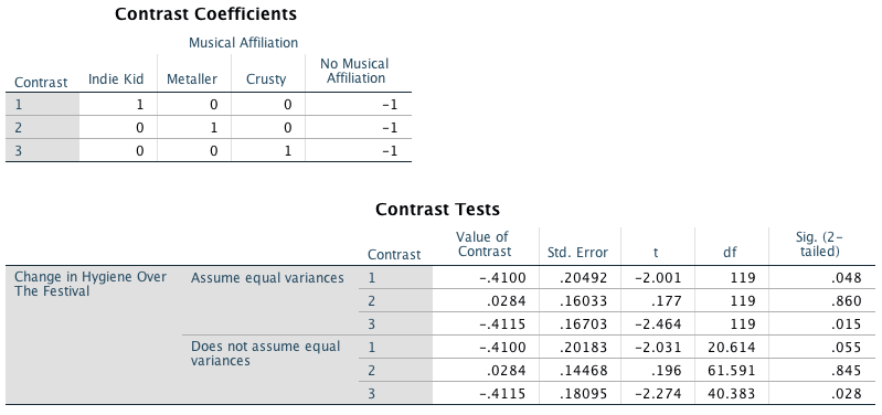
And here’s what we got when we ran the same analysis as a linear model with the groups dummy coded (see Chapter 11):
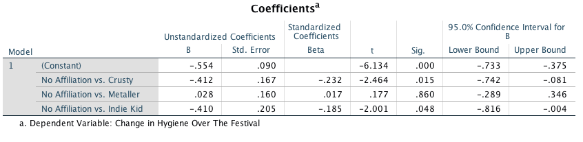
Again they are the same (the values of the contrast match the unstandardized B, and the standard errors, t-values and p-values match):
- Contrast 1 matches exactly the No Affiliation vs. Indie Kid dummy variable from the linear model.
- Contrast 2 matches exactly the No Affiliation vs. Metaller dummy variable from the linear model.
- Contrast 3 matches exactly the No Affiliation vs. Crusty dummy variable from the linear model.
This should, I hope, re-emphasize to you that regression and ANOVA are the same analytic system.
Task 12.7
Labcoat Leni 7.2 describes an experiment (Çetinkaya & Domjan, 2006) on quails with fetishes for terrycloth objects. There were two outcome variables (time spent near the terrycloth object and copulatory efficiency) that we didn’t analyse. Read Labcoat Leni 7.2 to get the full story then fit a model with Bonferroni post hoc tests on the time spent near the terrycloth object
The first part of the output tells usb that the group (fetishistic, non-fetishistic or control group) had a significant effect on the time spent near the terrycloth object. The authors report the unadjusted F, although I would recommend usinh Welch’s F (not that it affects the conclusions from this model).
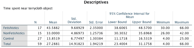
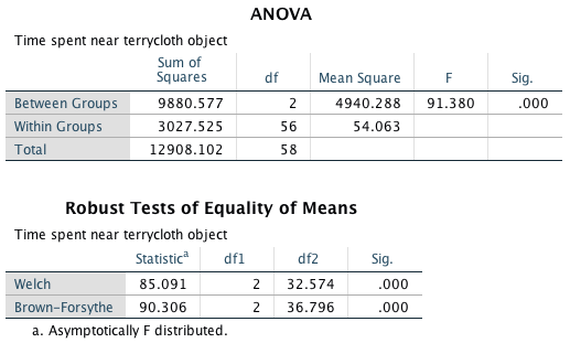
To find out exactly what’s going on we can look at our post hoc tests.
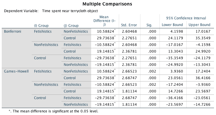
The authors reported this analysis in their paper as follows:
- A one-way ANOVA indicated significant group differences, F(2, 56) = 91.38, p < 0.05, \(\eta_\text{p}\) = 0.76. Subsequent pairwise comparisons (with the Bonferroni correction) revealed that fetishistic male quail stayed near the CS longer than both the nonfetishistic male quail (mean difference = 10.59; 95% CI = 4.16, 17.02; p < 0.05) and the control male quail (mean difference = 29.74 s; 95% CI = 24.12, 35.35; p < 0.05). In addition, the nonfetishistic male quail spent more time near the CS than did the control male quail (mean difference = 19.15 s; 95% CI = 13.30, 24.99; p < 0.05). (pp. 429–430)
These results show that male quails do show fetishistic behaviour (the time spent with the terrycloth). Note that the ‘CS’ is the terrycloth object. Look at the output to see from where the values reported in the paper come.
Task 12.8
Repeat the analysis in Task 7 but using copulatory efficiency as the outcome.
The first part of the output tells usb that the group (fetishistic, non-fetishistic or control group) had a significant effect on copulatory efficiency. The authors report the unadjusted F, although I would recommend usinh Welch’s F (not that it affects the conclusions from this model).
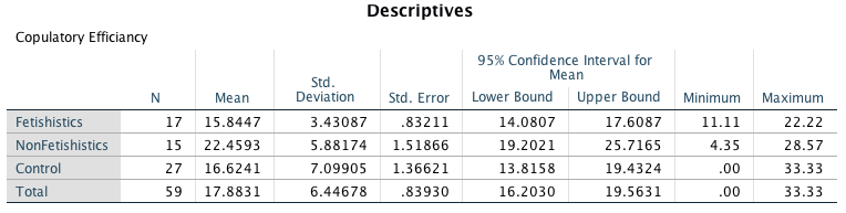
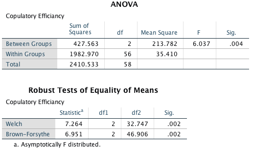
To find out exactly what’s going on we can look at our post hoc tests.
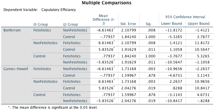
The authors reported this analysis in their paper as follows:
- A one-way ANOVA yielded a significant main effect of groups, F(2, 56) = 6.04, p < 0.05, \(\eta_\text{p}\) = 0.18. Paired comparisons (with the Bonferroni correction) indicated that the nonfetishistic male quail copulated with the live female quail (US) more efficiently than both the fetishistic male quail (mean difference = 6.61; 95% CI = 1.41, 11.82; p < 0.05) and the control male quail (mean difference = 5.83; 95% CI = 1.11, 10.56; p < 0.05). The difference between the efficiency scores of the fetishistic and the control male quail was not significant (mean difference = 0.78; 95% CI = –5.33, 3.77; p > 0.05). (p. 430)
These results show that male quails do show fetishistic behaviour (the time spent with the terrycloth – see Task 7 above) and that this affects their copulatory efficiency (they are less efficient than those that don’t develop a fetish, but it’s worth remembering that they are no worse than quails that had no sexual conditioning – the controls). If you look at Labcoat Leni’s box then you’ll also see that this fetishistic behaviour may have evolved because the quails with fetishistic behaviour manage to fertilize a greater percentage of eggs (so their genes are passed on).
Task 12.9
A sociologist wanted to compare murder rates (Murder) each month in a year at three high-profile locations in London (Street). Fit a model with bootstrapping on the post hoc tests to see in which streets the most murders happened. The data are in Murder.sav.
Looking at the means we can see that Rue Morgue had the highest mean number of murders (M = 2.92) and Ruskin Avenue had the smallest mean number of murders (M = 0.83). These means will be important in interpreting the post hoc tests later.
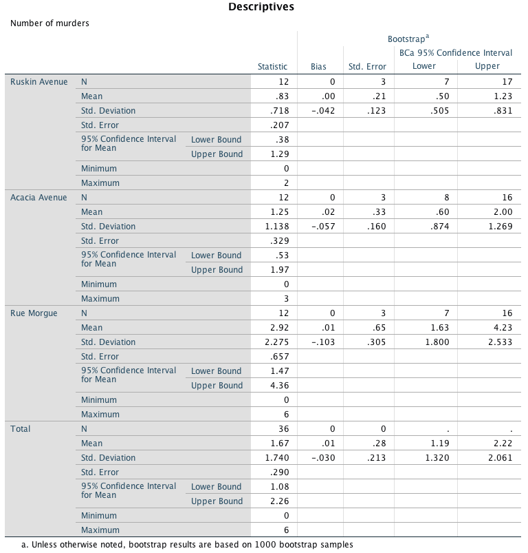
The next part of the output shows us the F-statistic for predicting mean murders from location. We should routinely look at the robust Fs. For all tests, because the observed significance value is less than 0.05 we can say that there was a significant effect of street on the number of murders. However, at this stage we still do not know exactly which streets had significantly more murders (we don’t know which groups differed). I’d favour reporting the Welch F.
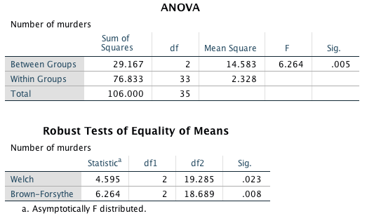
Because there were no specific hypotheses I just carried out post hoc tests and stuck to my favourite Games–Howell procedure (because variances were unequal). It is clear from the output that each street is compared to all of the remaining streets. If we look at the values in the column labelled Sig. we can see that the only significant comparison was between Ruskin Avenue and Rue Morgue (p = 0.024); all other comparisons were non-significant because all the other values in this column are greater than 0.05. However, Acacia Avenue and Rue Morgue were close to being significantly different (p = 0.089). The question asked us to bootstrap the post hoc tests and this has been done. The columns of interest are the ones containing the BCa 95% confidence intervals (lower and upper limits). We can see that the difference between Ruskin Avenue and Rue Morgue remains significant after bootstrapping the confidence intervals; we can tell this because the confidence intervals do not cross zero for this comparison. Surprisingly, it appears that the difference between Acacia Avenue and Rue Morgue is now significant after bootstrapping the confidence intervals, because again the confidence intervals do not cross zero. This seems to contradict the p-values in the previous output; however, the p-value was close to being significant (p = 0.089). The mean values in the table of descriptives tell us that Rue Morgue had a significantly higher number of murders than Ruskin Avenue and Acacia Avenue; however, Acacia Avenue did not differ significantly in the number of murders compared to Ruskin Avenue.
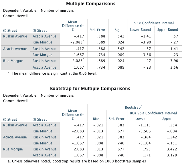
We can calculate the effect size,\(\omega^2\), as follows:
\[ \begin{aligned} \omega^2 &= \frac{\text{SS}_\text{M} - df_\text{M} \times \text{MS}_\text{R}}{\text{SS}_\text{T} + \text{MS}_\text{R}} \\ &= \frac{29.167 - 2 \times 2.328}{106.00 + 2.328}\\ &= \frac{24.511}{108.328}\\ &= 0.23 \end{aligned} \]
We could report the main finding as:
- The results show that the streets measured differed significantly in the number of murders, F(2, 19.29) = 4.60, p = 0.023, \(\omega^2\) = 0.23. Games–Howell post hoc tests with 95% bias corrected confidence intervals on the mean differences revealed that Rue Morgue experienced a significantly greater number of murders than either Ruskin Avenue, 95% BCa CI [0.76, 3.42] or Acacia Avenue, 95% BCa CI [0.17, 3.13]. However, Acacia Avenue and Ruskin Avenue did not differ significantly in the number of murders that had occurred, 95% BCa CI [0.38, 1.24].
Chapter 13
General information
- Access the ANCOVA dialog box by selecting Analyze > General Linear Model > Univariate …
- Remember that you can move variables in the dialog box by dragging
them, or selecting them and cliking
 .
.
Task 13.1
A few years back I was stalked. You’d think they could have found someone a bit more interesting to stalk, but apparently times were hard. It could have been a lot worse, but it wasn’t particularly pleasant. I imagined a world in which a psychologist tried two different therapies on different groups of stalkers (25 stalkers in each group – this variable is called group). To the first group he gave cruel-to-be-kind therapy (every time the stalkers followed him around, or sent him a letter, the psychologist attacked them with a cattle prod). The second therapy was psychodyshamic therapy, in which stalkers were hypnotized and regressed into their childhood to discuss their penis (or lack of penis), their father’s penis, their dog’s penis, the seventh penis of a seventh penis, and any other penis that sprang to mind. The psychologist measured the number of hours stalking in one week both before (stalk1) and after (stalk2) treatment (Stalker.sav). Analyse the effect of therapy on stalking behaviour after therapy, covarying for the amount of stalking behaviour before therapy.
First, conduct an ANOVA to test whether the number of hours spent stalking before therapy (our covariate) is independent of the type of therapy (our predictor variable). Your completed dialog box should look like:

The output shows that the main effect of group is not significant, F(1, 48) = 0.06, p = 0.804, which shows that the average level of stalking behaviour before therapy was roughly the same in the two therapy groups. In other words, the mean number of hours spent stalking before therapy is not significantly different in the cruel-to-be-kind and psychodyshamic therapy groups. This result is good news for using stalking behaviour before therapy as a covariate in the analysis.
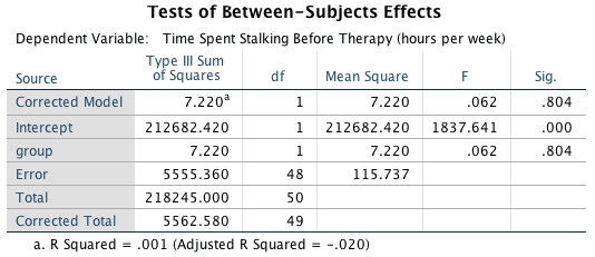
To conduct the ANCOVA, access the main dialog box and:
- Drag the outcome variable (stalk2) to the box labelled Dependent Variable.
- Drag the predictor variable (group) to the box labelled Fixed Factor(s).
- Drag the covariate (stalk1) to the box labelled Covariate(s).
Your completed dialog box should look like this:
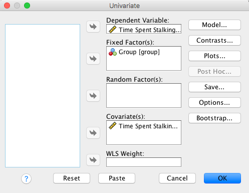
Click  to access the options dialog box, and select these options:
The output shows that the covariate significantly predicts the outcome variable, so the hours spent stalking after therapy depend on the extent of the initial problem (i.e. the hours spent stalking before therapy). More interesting is that after adjusting for the effect of initial stalking behaviour, the effect of therapy is significant. To interpret the results of the main effect of therapy we look at the adjusted means, which tell us that stalking behaviour was significantly lower after the therapy involving the cattle prod than after psychodyshamic therapy (after adjusting for baseline stalking).
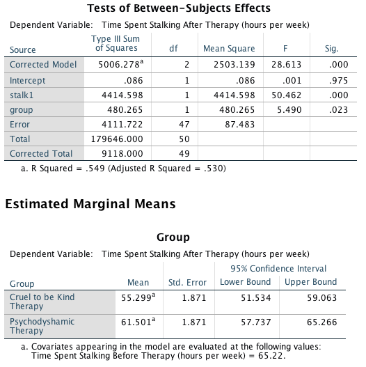
To interpret the covariate create a graph of the time spent stalking after therapy (outcome variable) and the initial level of stalking (covariate) using the chart builder:
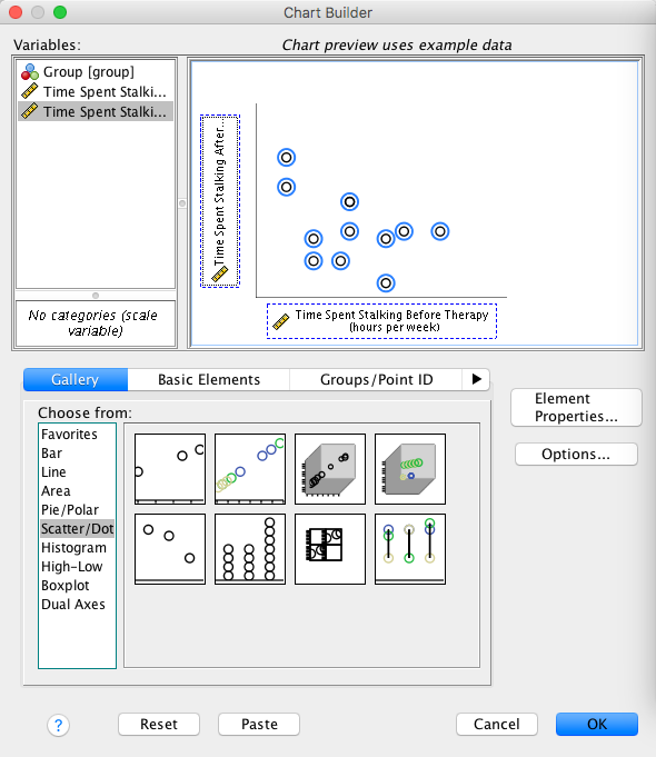
The resulting graph shows that there is a positive relationship between the two variables: that is, high scores on one variable correspond to high scores on the other, whereas low scores on one variable correspond to low scores on the other.
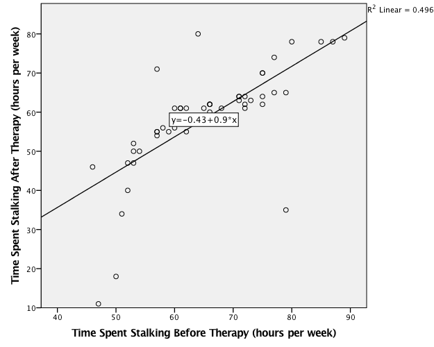
Task 13.2
Compute effect sizes for Task 1 and report the results.
The effect sizes for the main effect of group can be calculated as follows:
\[ \begin{aligned} \eta_p^2 &= \frac{\text{SS}_\text{group}}{\text{SS}_\text{group} + \text{SS}_\text{residual}} \\ &= \frac{480.27}{480.27+4111.722}\\ &= 0.10 \end{aligned} \] And for the covariate:
\[ \begin{aligned} \eta_p^2 &= \frac{\text{SS}_\text{stalk1}}{\text{SS}_\text{stalk1} + \text{SS}_\text{residual}} \\ &= \frac{4414.598}{4414.598+4111.722} \\ &= 0.52 \end{aligned} \]
We could report the results as follows:
- The main effect of therapy was significant, F(1, 47) = 5.49, p = 0.02, \(\eta_p^2\) = 0.10, indicating that the time spent stalking was lower after using a cattle prod (M = 55.30, SE = 1.87) than after psychodyshamic therapy (M = 61.50, SE = 1.87). The covariate was also significant, F(1, 47) = 50.46, p < 0.001, partial \(\eta_p^2\) = 0.52, indicating that level of stalking before therapy had a significant effect on level of stalking after therapy (there was a positive relationship between these two variables).
Task 13.3
A marketing manager tested the benefit of soft drinks for curing hangovers. He took 15 people and got them drunk. The next morning as they awoke, dehydrated and feeling as though they’d licked a camel’s sandy feet clean with their tongue, he gave five of them water to drink, five of them Lucozade (a very nice glucose-based UK drink) and the remaining five a leading brand of cola (this variable is called drink). He measured how well they felt (on a scale from 0 = I feel like death to 10 = I feel really full of beans and healthy) two hours later (this variable is called well). He measured how drunk the person got the night before on a scale of 0 = as sober as a nun to 10 = flapping about like a haddock out of water on the floor in a puddle of their own vomit (HangoverCure.sav). Fit a model to see whether people felt better after different drinks when covarying for how drunk they were the night before.
First let’s check that the predictor variable (drink) and the covariate (drunk) are independent. To do this we can run a one-way ANOVA. Your completed dialog box should look like:

The output shows that the main effect of drink is not significant, F(2, 12) = 1.36, p = 0.295, which shows that the average level of drunkenness the night before was roughly the same in the three drink groups. This result is good news for using the variable drunk as a covariate in the analysis.
To conduct the ANCOVA, access the main dialog box and:
- Drag the outcome variable (well) to the box labelled Dependent Variable.
- Drag the predictor variable (drink) to the box labelled Fixed Factor(s).
- Drag the covariate (drunk) to the box labelled Covariate(s).
Your completed dialog box should look like this:
Click
to access the options dialog box, and select these options:
Click  to access
the contrasts dialog box. In this example, a sensible set of
contrasts would be simple contrasts comparing each experimental group
with the control group, water. Select simple from the drop down
list and specifying the first category as the reference category. The
final dialog box should look like this:
to access
the contrasts dialog box. In this example, a sensible set of
contrasts would be simple contrasts comparing each experimental group
with the control group, water. Select simple from the drop down
list and specifying the first category as the reference category. The
final dialog box should look like this:
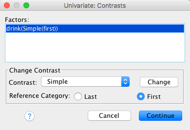
Back in the main dialog box click to fit the
model.
The output shows that the covariate significantly predicts the outcome variable, so the drunkenness of the person influenced how well they felt the next day. What’s more interesting is that after adjusting for the effect of drunkenness, the effect of drink is significant. The parameter estimates for the model (selected in the options dialog box) are computed having paramterized the variable drink using two dummy coding variables that compare each group against the last (the group coded with the highest value in the data editor, in this case the cola group). This reference category (labelled drink=3 in the output) is coded with a 0 for both dummy variables; drink=2 represents the difference between the group coded as 2 (Lucozade) and the reference category (cola); and drink=1 represents the difference between the group coded as 1 (water) and the reference category (cola). The beta values literally represent the differences between the means of these groups and so the significances of the t-tests tell us whether the group means differ significantly. From these estimates we could conclude that the cola and water groups have similar means whereas the cola and Lucozade groups have significantly different means.
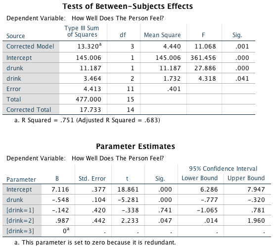
The contrasts compare level 2 (Lucozade) against level 1 (water) as a first comparison, and level 3 (cola) against level 1 (water) as a second comparison. These results show that the Lucozade group felt significantly better than the water group (contrast 1), but that the cola group did not differ significantly from the water group (p = 0.741). These results are consistent with the regression parameter estimates (note that contrast 2 is identical to the regression parameters for drink=1 in the previous output).
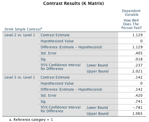
The adjusted group means should be used for interpretation. The adjusted means show that the significant difference between the water and the Lucozade groups refelects people feeling better in the Lucozade group (than the water group).
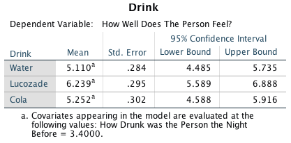
To interpret the covariate create a graph of the outcome (well, y-axis) against the covariate ( drunk, x-axis) using the chart builder:
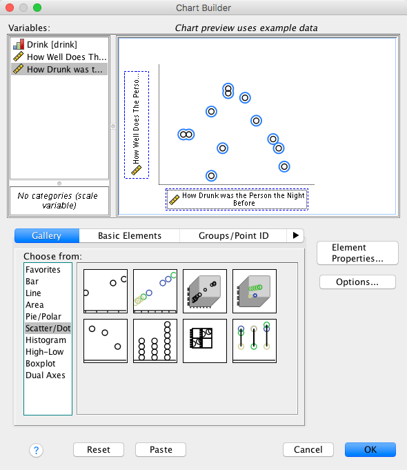
The resulting graph shows that there is a negative relationship between the two variables: that is, high scores on one variable correspond to high scores on the other, whereas low scores on one variable correspond to low scores on the other. The more drunk you got, the less well you felt the following day.
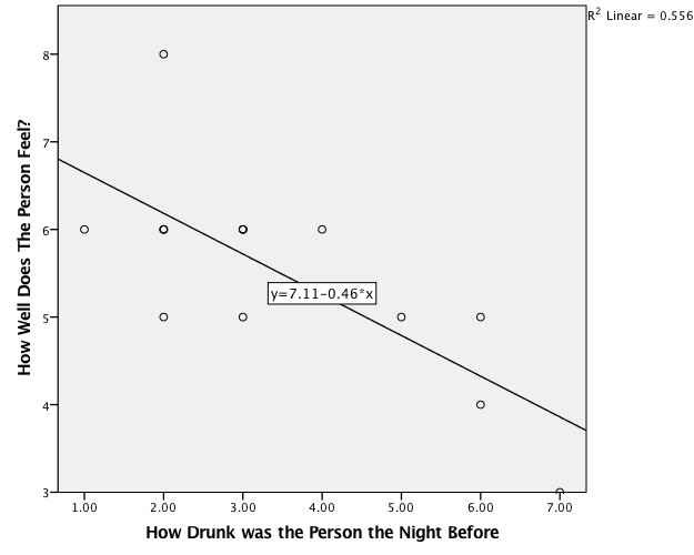
Task 13.4
Compute effect sizes for Task 3 and report the results.
The effect sizes for the main effect of drink can be calculated as follows:
\[ \begin{aligned} \eta_p^2 &= \frac{\text{SS}_\text{drink}}{\text{SS}_\text{drink} + \text{SS}_\text{residual}} \\ &= \frac{3.464}{3.464+4.413}\\ &= 0.44 \end{aligned} \]
And for the covariate:
\[ \begin{aligned} \eta_p^2 &= \frac{\text{SS}_\text{drunk}}{\text{SS}_\text{drunk} + \text{SS}_\text{residual}} \\ &= \frac{11.187}{11.187+4.413} \\ &= 0.72 \end{aligned} \] We could also calculate effect sizes for the model parameters using the t-statistics, which have \(N−2\) degrees of freedom, where N is the total sample size (in this case 15). Therefore we get:
\[ \begin{aligned} r &= \sqrt{\frac{t^2}{t^2 + df}} \\ r_\text{cola vs. water} &= \sqrt{\frac{-0.338^2}{-0.338^2+13}} = 0.09 \\ r_\text{cola vs. Lucozade} &= \sqrt{\frac{2.233^2}{2.233^2+13}} = 0.53 \\ \end{aligned} \]
We could report the results as follows:
- The covariate, drunkenness, was significantly related to the how ill the person felt the next day, F(1, 11) = 27.89, p < 0.001, \(\eta_p^2\) = 0.72. There was also a significant effect of the type of drink on how well the person felt after adjusting for how drunk they were the night before, F(2, 11) = 4.32, p = 0.041, \(\eta_p^2\) = 0.44. Planned contrasts revealed that having Lucozade significantly improved how well you felt compared to having cola, t(13) = 2.23, p = 0.018, r = 0.53, but having cola was no better than having water, t(13) = –0.34, p = 0.741, r = 0.09. We can conclude that cola and water have the same effect on hangovers but that Lucozade seems significantly better at curing hangovers than cola.
Task 13.5
The highlight of the elephant calendar is the annual elephant soccer event in Nepal (google search it). A heated argument burns between the African and Asian elephants. In 2010, the president of the Asian Elephant Football Association, an elephant named Boji, claimed that Asian elephants were more talented than their African counterparts. The head of the African Elephant Soccer Association, an elephant called Tunc, issued a press statement that read ‘I make it a matter of personal pride never to take seriously any remark made by something that looks like an enormous scrotum’. I was called in to settle things. I collected data from the two types of elephants (elephant) over a season and recorded how many goals each elephant scored (goals) and how many years of experience the elephant had (experience). Analyse the effect of the type of elephant on goal scoring, covarying for the amount of football experience the elephant has (Elephant Football.sav).
First, let’s check that the predictor variable (elephant) and the covariate (experience) are independent. To do this we can run a one-way ANOVA. Your completed dialog box should look like:
The output shows that the main effect of elephant is not significant, F(1, 118) = 1.38, p = 0.24, which shows that the average level of prior football experience was roughly the same in the two elephant groups. This result is good news for using the variable experience as a covariate in the analysis.
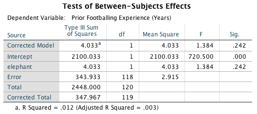
To conduct the ANCOVA, access the main dialog box and:
- Drag the outcome variable (goals) to the box labelled Dependent Variable.
- Drag the predictor variable (elephant) to the box labelled Fixed Factor(s).
- Drag the covariate (experience) to the box labelled Covariate(s).
Your completed dialog box should look like this:
Click
to access the options dialog box, and select these options:

Back in the main dialog box click to fit the
model.
The output shows that the experience of the elephant significantly predicted how many goals they scored, F(1, 117) = 9.93, p = 0.002. After adjusting for the effect of experience, the effect of elephant is also significant. In other words, African and Asian elephants differed significantly in the number of goals they scored. The adjusted means tell us, specifically, that African elephants scored significantly more goals than Asian elephants after adjusting for prior experience, F(1, 117) = 8.59, p = 0.004.
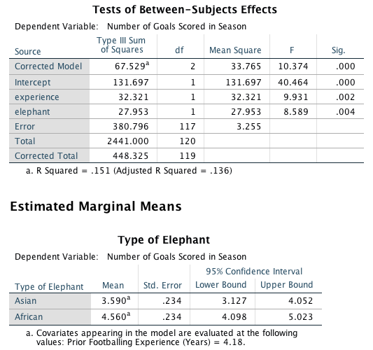
To interpret the covariate create a graph of the outcome (goals, y-axis) against the covariate ( experience, x-axis) using the chart builder:
The resulting graph shows that there is a positive relationship between the two variables: the more prior football experience the elephant had, the more goals they scored in the season.
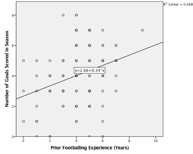
Task 13.6
In Chapter 4 (Task 6) we looked at data from people who had been forced to marry goats and dogs and measured their life satisfaction and, also, how much they like animals (Goat or Dog.sav). Fit a model predicting life satisfaction from the type of animal to which a person was married and their animal liking score (covariate).
First, check that the predictor variable (wife) and the covariate (animal) are independent. To do this we can run a one-way ANOVA. Your completed dialog box should look like:
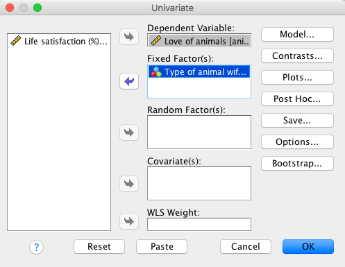
The output shows that the main effect of wife is not significant, F(1, 18) = 0.06, p = 0.81, which shows that the average level of love of animals was roughly the same in the two type of animal wife groups. This result is good news for using the variable love of animals as a covariate in the analysis.
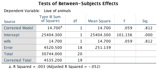
To conduct the ANCOVA, access the main dialog box and:
- Drag the outcome variable (life_satisfaction) to the box labelled Dependent Variable.
- Drag the predictor variable (wife) to the box labelled Fixed Factor(s).
- Drag the covariate (animal) to the box labelled Covariate(s).
Your completed dialog box should look like this:
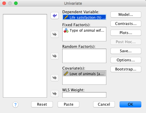
Click
to access the options dialog box, and select these options:
Back in the main dialog box click to fit the
model.
The output shows that love of animals significantly predicted life satisfaction, F(1, 17) = 10.32, p = 0.005. After adjusting for the effect of love of animals, the effect of animal is also significant. In other words, life satisfaction differed significantly in those married to goats compared to those married to dogs. The adjusted means tell us, specifically, that life satisfaction was significantly higher in those married to dogs, F(1, 17) = 16.45, p = 0.001. (My spaniel would like it on record that this result is obvious because, as he puts it, ‘dogs are fucking cool’.)
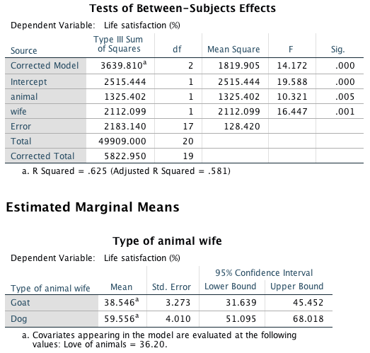
To interpret the covariate create a graph of the outcome (life_satisfaction, y-axis) against the covariate ( animal, x-axis) using the chart builder:
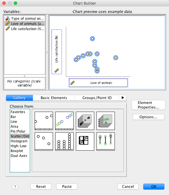
The resulting graph shows that there is a positive relationship between the two variables: the greater ones love of animals, the greater ones life satisfaction.
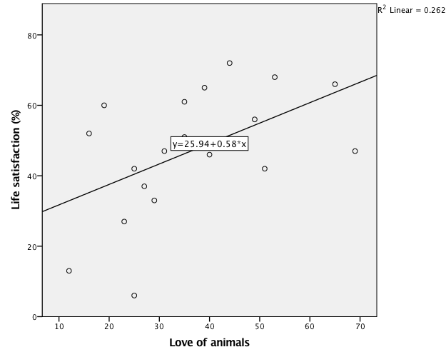
The effect sizes for the main effect of wife can be calculated as follows:
\[ \begin{aligned} \eta_p^2 &= \frac{\text{SS}_\text{wife}}{\text{SS}_\text{wife} + \text{SS}_\text{residual}} \\ &= \frac{2112.099}{2112.099+2183.140}\\ &= 0.49 \end{aligned} \]
And for the covariate:
\[ \begin{aligned} \eta_p^2 &= \frac{\text{SS}_\text{animal}}{\text{SS}_\text{animal} + \text{SS}_\text{residual}} \\ &= \frac{1325.402}{1325.402+2183.140} \\ &= 0.38 \end{aligned} \]
We could report the model as follows:
- The covariate, love of animals, was significantly related to life satisfaction, F(1, 17) = 10.32, p = 0.01, \(\eta_p^2\) = 0.38. There was also a significant effect of the type of animal wife after adjusting for love of animals, F(1, 17) = 16.45, p = 0.001, \(\eta_p^2\) = 0.49, indicating that life satisfaction was significantly higher for men who were married to dogs (M = 59.56, SE = 4.01) than for men who were married to goats (M = 38.55, SE = 3.27).
Task 13.7
Compare your results for Task 6 to those for the corresponding task in Chapter 11. What differences do you notice and why?
Let’s remind ourselves of the output from Smart Alex Task 7, Chapter 11, in which we conducted a hierarchical regression predicting life satisfaction from the type of animal wife, and the effect of love of animals. Animal liking was entered in the first block, and type of animal wife in the second block:
Looking at the coefficients from model 2, we can see that both love of animals, t(17) = 3.21, p = 0.005, and type of animal wife, t(17) = 4.06, p = 0.001, significantly predicted life satisfaction. In other words, after adjusting for the effect of love of animals, type of animal wife significantly predicted life satisfaction.
Now, let’s look again at the output from Task 6 (above), in which we conducted an ANCOVA predicting life satisfaction from the type of animal to which a person was married and their animal liking score (covariate):
The covariate, love of animals, was significantly related to life satisfaction, F(1, 17) = 10.32, p = 0.01, \(\eta_p^2\) = 0.38. There was also a significant effect of the type of animal wife after adjusting for love of animals, F(1, 17) = 16.45, p = 0.001, \(\eta_p^2\) = 0.49, indicating that life satisfaction was significantly higher for men who were married to dogs (M = 59.56, SE = 4.01) than for men who were married to goats (M = 38.55, SE = 3.27). The conclusions are the same, but more than that:
- The p-values for both effects are identical.
- This is because there is a direct relationship between t
and F. In fact F = t^2. Let’s compare the
ts and Fs of our two effects:
- for love of animals, when we ran the analysis as ‘regression’ we got t = 3.213. If we square this value we get \(t^2 = 3.213^2 = 10.32\). This is the value of F that we got when we ran the model as ‘ANCOVA’.
- for the type of wife, when we ran the analysis as ‘regression’ we got t = 4.055 If we square this value we get \(t^2 = 4.055^2 = 16.44\). This is the value of F that we got when we ran the model as ‘ANCOVA’.
Basically, this Task is all about showing you that despite the menu structure in SPSS creating false distinctions between models, when you do ‘ANCOVA’ and ‘regression’ you are simply using the general linear model and accessing it via different menus.
Task 13.8
In Chapter Error! Reference source not found. we compared the number of mischievous acts (mischief2) in people who had invisibility cloaks to those without (cloak). Imagine we also had information about the baseline number of mischievous acts in these participants (mischief1). Fit a model to see whether people with invisibility cloaks get up to more mischief than those without when factoring in their baseline level of mischief (Invisibility Baseline.sav).
First, check that the predictor variable (cloak) and the covariate (mischief1) are independent. To do this we can run a one-way ANOVA. Your completed dialog box should look like:
The output shows that the main effect of cloak is not significant, F(1, 78) = 0.14, p = 0.71, which shows that the average level of baseline mischief was roughly the same in the two cloak groups. This result is good news for using baseline mischief as a covariate in the analysis.
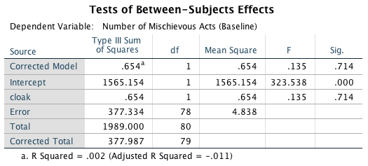
To conduct the ANCOVA, access the main dialog box and:
- Drag the outcome variable (mischief2) to the box labelled Dependent Variable.
- Drag the predictor variable (cloak) to the box labelled Fixed Factor(s).
- Drag the covariate (mischief1) to the box labelled Covariate(s).
Your completed dialog box should look like this:
Click
to access the options dialog box, and select these options:

Back in the main dialog box click to fit the
model.
The output shows that baseline mischief significantly predicted post-intervention mischief, F(1, 77) = 7.40, p = 0.008. After adjusting for baseline mischief, the effect of cloak is also significant. In other words, mischief levels after the intervention differed significantly in those who had an invisibility cloak and those who did not. The adjusted means tell us, specifically, that mischief was significantly higher in those with invisibility cloaks, F(1, 77) = 11.33, p = 0.001.
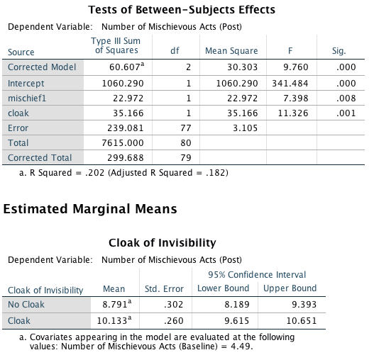
To interpret the covariate create a graph of the outcome (mischief2, y-axis) against the covariate ( mischief1, x-axis) using the chart builder:
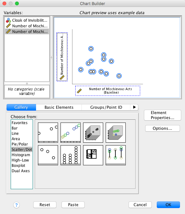
The resulting graph shows that there is a positive relationship between the two variables: the greater ones mischief levels before the cloaks were assigned to participants, the greater ones mischief after the cloaks were assigned to participants.
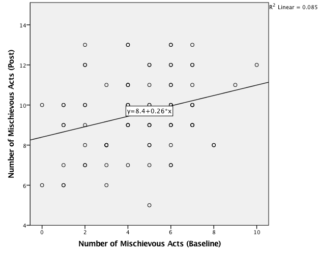
The effect sizes for the main effect of cloak can be calculated as follows:
\[ \begin{aligned} \eta_p^2 &= \frac{\text{SS}_\text{cloak}}{\text{SS}_\text{cloak} + \text{SS}_\text{residual}} \\ &= \frac{35.166}{35.166+239.081}\\ &= 0.13 \end{aligned} \]
And for the covariate:
\[ \begin{aligned} \eta_p^2 &= \frac{\text{SS}_\text{mischief1}}{\text{SS}_\text{mischief1} + \text{SS}_\text{residual}} \\ &= \frac{22.972}{22.972+239.081} \\ &= 0.09 \end{aligned} \]
We could report the model as follows:
- The covariate, baseline number of mischievous acts, was significantly related to the number of mischievous acts after the cloak of invisibility manipulation, F(1, 77) = 7.40, p = 0.01, \(\eta_p^2\) = 0.09. There was also a significant effect of wearing a cloak of invisibility after adjusting for baseline number of mischievous acts, F(1, 77) = 11.33, p = 0.001, \(\eta_p^2\) = 0.13, indicating that the number of mischievous acts was higher in those who were given a cloak of invisibility (M = 10.13, SE = 0.26) than in those who were not (M = 8.79, SE = 0.30).
Chapter 14
General information
- Access the main dialog box for factorial designs by selecting Analyze > General Linear Model > Univariate …
- Remember that you can move variables in the dialog box by dragging
them, or selecting them and cliking .
Task 14.1
I’ve wondered whether musical taste changes as you get older: my parents, for example, after years of listening to relatively cool music when I was a kid, hit their mid-forties and developed a worrying obsession with country and western. This possibility worries me immensely because if the future is listening to Garth Brooks and thinking ‘oh boy, did I underestimate Garth’s immense talent when I was in my twenties’, then it is bleak indeed. To test the idea I took two groups (age): young people (which I arbitrarily decided was under 40 years of age) and older people (above 40 years of age). I split each of these groups of 45 into three smaller groups of 15 and assigned them to listen to Fugazi, ABBA or Barf Grooks (music). Each person rated the music (liking) on a scale ranging from +100 (this is sick) through 0 (indifference) to −100 (I’m going to be sick). Fit a model to test my idea (Fugazi.sav).
To fit the model, access the main dialog box and:
- Drag the outcome variable (liking) to the box labelled Dependent Variable.
- Drag the predictor variables (age and music) to the box labelled Fixed Factor(s).
Your completed dialog box should look like this:

Click  to access the Post Hoc dialog box, and select these
options:
to access the Post Hoc dialog box, and select these
options:
The output shows that the main effect of music is significant, F(2, 84) = 105.62, p < 0.001, as is the interaction, F(2, 84) = 400.98, p < 0.001, but the main effect of age is not, F(1, 84) = 0.002, p = 0.966. Let’s look at these effects in turn.
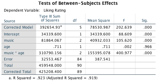
The graph of the main effect of music shows that the significant effect is likely to reflect the fact that ABBA were rated (overall) much more positively than the other two artists.
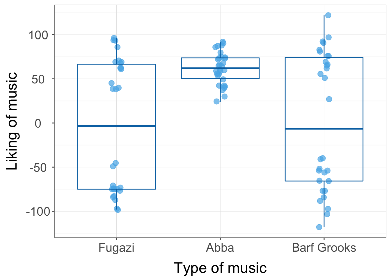
The table of post hoc tests tells us more:
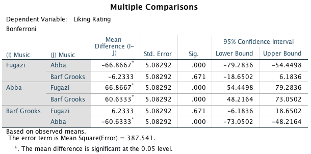
First, ratings of Fugazi are compared to ABBA, which reveals a significant difference (the value in the column labelled Sig. is less than 0.05), and then Barf Grooks, which reveals no significant difference (the significance value is greater than 0.05). In the next part of the table, ratings of ABBA are compared first to Fugazi (which repeats the finding in the previous part of the table) and then to Barf Grooks, which reveals a significant difference (the significance value is below 0.05). The final part of the table compares Barf Grooks to Fugazi and ABBA, but these results repeat findings from the previous sections of the table. The main effect of music, therefore, reflects that ABBA were rated significantly more highly than both Fugazi and Barf Grooks.
The main effect of age was not significant, and the graph shows that when you ignore the type of music that was being rated, older people and younger people, on average, gave almost identical ratings.
The interaction effect is shown in the plot of the data split by type of music and age. Ratings of Fugazi are very different for the two age groups: the older ages rated it very low, but the younger people rated it very highly. A reverse trend is found if you look at the ratings for Barf Grooks: the youngsters give it low ratings, while the wrinkly ones love it. For ABBA the groups agreed: both old and young rated them highly. The interaction effect reflects the fact that there are age differences for some bands (Fugazi, Garf Brooks) but not others (ABBA) and that the age difference for Fugazi is in the opposite direction than for Barf.
Task 14.2
Compute omega squared for the effects in Task 1 and report the results of the analysis.
First we use the mean squares and degrees of freedom in the summary table and the sample size per group to compute sigma for each effect:
\[ \begin{aligned} \hat{\sigma}_\alpha^2 &= \frac{(a-1)(\text{MS}_A-\text{MS}_\text{R})}{nab} = \frac{(3-1)(40932.033-387.541)}{15×3×2} = 900.99 \\ \hat{\sigma}_\beta^2 &= \frac{(b-1)(\text{MS}_B-\text{MS}_\text{R})}{nab} = \frac{(2-1)(0.711-387.541)}{15×3×2} = -4.30 \\ \hat{\sigma}_{\alpha\beta}^2 &= \frac{(a-1)(b-1)(\text{MS}_{A \times B}-\text{MS}_\text{R})}{nab} = \frac{(3-1)(2-1)(155395.078-387.541)}{15×3×2} = 3444.61 \\ \end{aligned} \]
We next need to estimate the total variability, and this is the sum of these other variables plus the residual mean squares:
\[ \begin{aligned} \hat{\sigma}_\text{total}^2 &= \hat{\sigma}_\alpha^2 + \hat{\sigma}_\beta^2 + \hat{\sigma}_{\alpha\beta}^2 + \text{MS}_\text{R} \\ &= 900.99-4.30+3444.61+387.54 \\ &= 4728.84 \\ \end{aligned} \]
The effect size is then the variance estimate for the effect in which you’re interested divided by the total variance estimate:
\[ \omega_\text{effect}^2 = \frac{\hat{\sigma}_\text{effect}^2}{\hat{\sigma}_\text{total}^2} \]
For the main effect of music we get:
\[ \omega_\text{music}^2 = \frac{\hat{\sigma}_\text{music}^2}{\hat{\sigma}_\text{total}^2} = \frac{900.99}{4728.84} = 0.19 \]
For the main effect of age we get:
\[ \omega_\text{age}^2 = \frac{\hat{\sigma}_\text{age}^2}{\hat{\sigma}_\text{total}^2} = \frac{-4.30}{4728.84} = -0.001 \]
For the interaction of music and age we get:
\[ \omega_{\text{music} \times \text{age}}^2 = \frac{\hat{\sigma}_{\text{music} \times \text{age}}^2}{\hat{\sigma}_\text{total}^2} = \frac{3444.61}{4728.84} = 0.73 \]
We could report (remember if you’re using APA format to drop the leading zeros before p-values and \(\omega^2\), for example report p = .035 instead of p = 0.035):
- The results show that the type of music listened to significantly affected the ratings of that music, F(2, 84) = 105.62, p < .001, \(\omega^2 = 0.19\). Bonferonni post hoc tests revealed that ABBA were rated significantly higher than both Fugazi and Barf Grooks (p < 0.001 in both cases). The main effect of age on the ratings of the music was not significant, F(1, 84) = 0.002, p = .966, \(\omega^2 = –0.001\). The music by age interaction was significant,* F(2, 84) = 400.98, p* < 0.001, \(\omega^2 = 0.73\) indicating that different types of music were rated differently by the two age groups. Specifically, Fugazi were rated more positively by the young group (M = 66.20, SD = 19.90) than the old (M = –75.87, SD = 14.37); ABBA were rated fairly equally by the young (M = 64.13, SD = 16.99) and old groups (M = 59.93, SD = 19.98); Barf Grooks was rated less positively by the young group (M = –71.47, SD = 23.17) than by the old (M = 74.27, SD = 22.29). These findings indicate that there is no hope — the minute you hit 40 you will suddenly start to love country and western music and will delete all of your Fugazi music files (don’t worry, it didn’t happen to me!).
Task 14.3
In Chapter 5 we used some data that related to male and female arousal levels when watching The Notebook or a documentary about notebooks (Notebook.sav). Fit a model to test whether men and women differ in their reactions to different types of films.
To fit the model, access the main dialog box and:
- Drag the outcome variable (arousal) to the box labelled Dependent Variable.
- Drag the predictor variables (sex and film) to the box labelled Fixed Factor(s).
Your completed dialog box should look like this:

The output shows that the main effect of sex is significant, F(1, 36) = 7.292, p = 0.011, as is the main effect of filmt, F(1, 36) = 141.87, p < 0.001 and the interaction, F(1, 36) = 4.64, p = 0.038. Let’s look at these effects in turn.
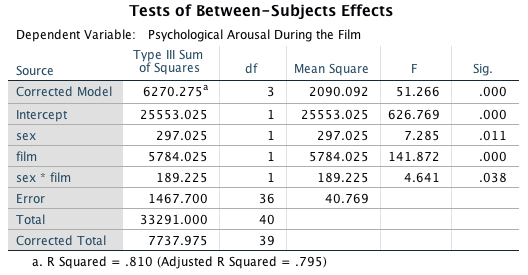
The graph of the main effect of sex shows that the significant effect is likely to reflect the fact that males experienced higher levels of psychological arousal in general than women (when the type of film is ignored).
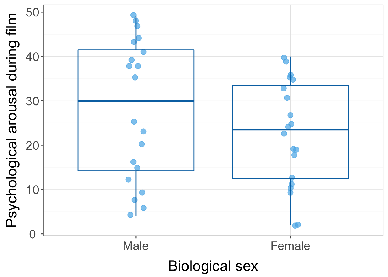
The main effect of the film was also significant, and the graph shows that when you ignore the biological sex of the participant, psychological arousal was higher during the notebook than during a documentary about notebooks.
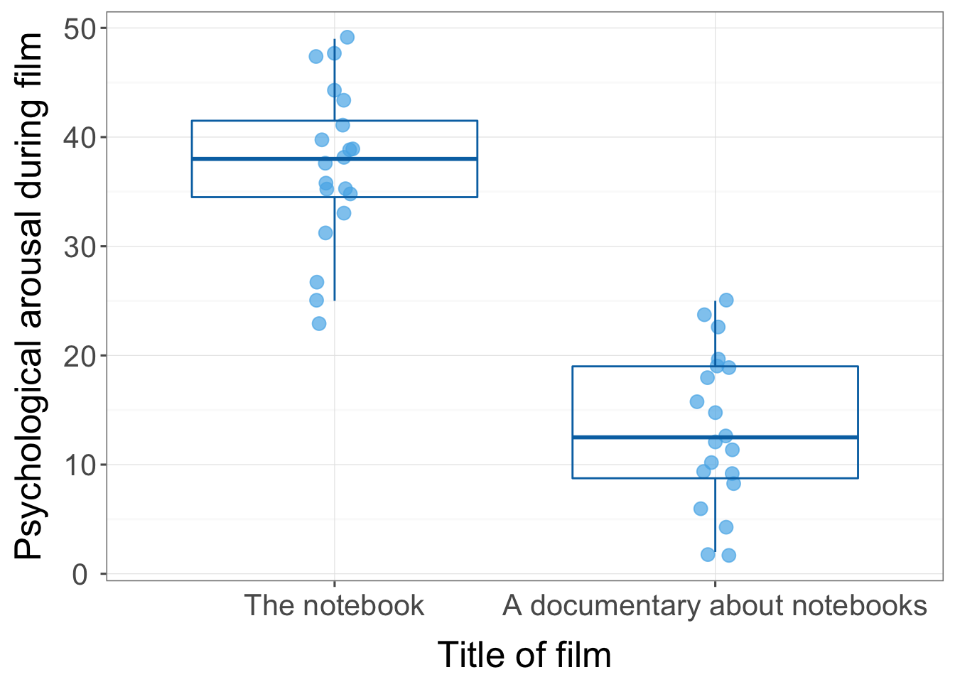
The interaction effect is shown in the plot of the data split by type of film and sex of the participant. Psychological arousal is very similar for men and women during the documentary about notebooks (it is low for both sexes). However, for the notebook men experienced greater psychological arousal than women. The interaction is likley to reflect that there is a difference between men and women for one type of film (the notebook) but not the other (the documentary about notebooks).
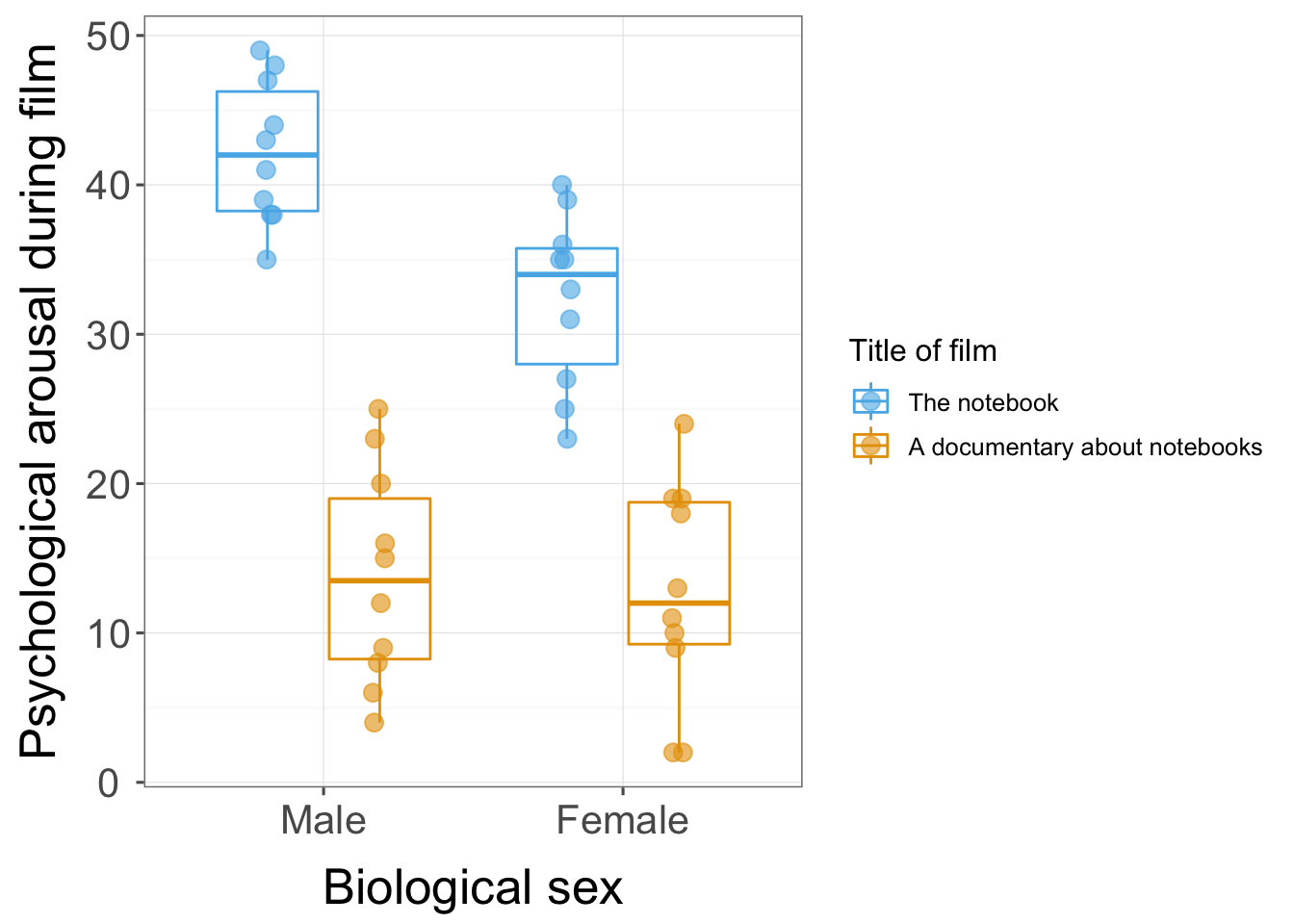
Task 14.4
Compute omega squared for the effects in Task 3 and report the results of the analysis.
First we use the mean squares and degrees of freedom in the summary table and the sample size per group to compute sigma for each effect:
\[ \begin{aligned} \hat{\sigma}_\alpha^2 &= \frac{(a-1)(\text{MS}_A-\text{MS}_\text{R})}{nab} = \frac{(2-1)(297.03-40.77)}{10×2×2} = 6.41 \\ \hat{\sigma}_\beta^2 &= \frac{(b-1)(\text{MS}_B-\text{MS}_\text{R})}{nab} = \frac{(2-1)(5784.03-40.77)}{10×2×2} = 143.58 \\ \hat{\sigma}_{\alpha\beta}^2 &= \frac{(a-1)(b-1)(\text{MS}_{A \times B}-\text{MS}_\text{R})}{nab} = \frac{(2-1)(2-1)(189.23-40.77)}{10×2×2} = 3.71 \\ \end{aligned} \]
We next need to estimate the total variability, and this is the sum of these other variables plus the residual mean squares:
\[ \begin{aligned} \hat{\sigma}_\text{total}^2 &= \hat{\sigma}_\alpha^2 + \hat{\sigma}_\beta^2 + \hat{\sigma}_{\alpha\beta}^2 + \text{MS}_\text{R} \\ &= 6.41+143.58+3.71+40.77 \\ &= 194.47 \\ \end{aligned} \]
The effect size is then the variance estimate for the effect in which you’re interested divided by the total variance estimate:
\[ \omega_\text{effect}^2 = \frac{\hat{\sigma}_\text{effect}^2}{\hat{\sigma}_\text{total}^2} \]
For the main effect of sex we get:
\[ \omega_\text{sex}^2 = \frac{\hat{\sigma}_\text{sex}^2}{\hat{\sigma}_\text{total}^2} = \frac{6.41}{194.47} = 0.03 \]
For the main effect of film we get:
\[ \omega_\text{film}^2 = \frac{\hat{\sigma}_\text{film}^2}{\hat{\sigma}_\text{total}^2} = \frac{143.58}{194.47} = 0.74 \]
For the interaction of sex and film we get:
\[ \omega_{\text{sex} \times \text{film}}^2 = \frac{\hat{\sigma}_{\text{sex} \times \text{film}}^2}{\hat{\sigma}_\text{total}^2} = \frac{3.71}{194.47} = 0.02 \]
We could report (remember if you’re using APA format to drop the leading zeros before p-values and \(\omega^2\), for example report p = .035 instead of p = 0.035):
- The results show that the psychological arousal during the films was significantly higher for males than females, F(1, 36) = 7.292, p = 0.011, \(\omega^2 = 0.03\). Psychological arousal was also significantly higher during the notebook than during a documentary about notebooks, F(1, 36) = 141.87, p < 0.001. The interaction was also significant, F(1, 36) = 4.64, p = 0.038, and seemed to reflect the fact that psychological arousal was very similar for men and women during the documentary about notebooks (it was low for both sexes), but for the notebook men experienced greater psychological arousal than women.
Task 14.5
In Chapter 4 we used some data that related to learning in men and women when either reinforcement or punishment was used in teaching (Method Of Teaching.sav). Analyse these data to see whether men and women’s learning differs according to the teaching method used.
To fit the model, access the main dialog box and:
- Drag the outcome variable (Mark) to the box labelled Dependent Variable.
- Drag the predictor variables (Sex and Method) to the box labelled Fixed Factor(s).
Your completed dialog box should look like this:
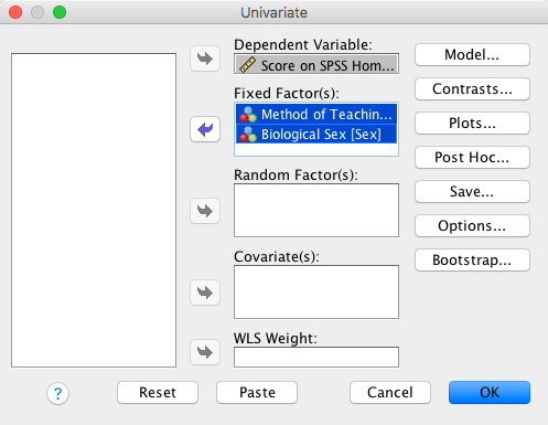
We can see that there was no significant main effect of method of teaching, indicating that when we ignore the sex of the participant both methods of teaching had similar effects on the results of the SPSS exam, F(1, 16) = 2.25, p = 0.153. This result is not surprising when we look at the graphed means because being nice (M = 9.0) and electric shock (M = 10.5) had similar means. There was a significant main effect of the sex of the participant, indicating that if we ignore the method of teaching, men and women scored differently on the SPSS exam, F(1, 16) = 12.50, p = 0.003. If we look at the graphed means, we can see that on average men (M = 11.5) scored higher than women (M = 8.0). However, this effect is qualified by a significant interaction between sex and the method of teaching, F(1, 16) = 30.25, p < 0.001. The graphed means suggest that for men, using an electric shock resulted in higher exam scores than being nice, whereas for women, the being nice teaching method resulted in significantly higher exam scores than when an electric shock was used.
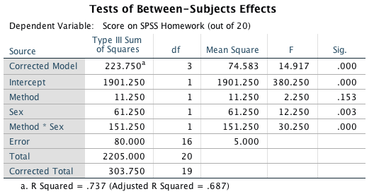
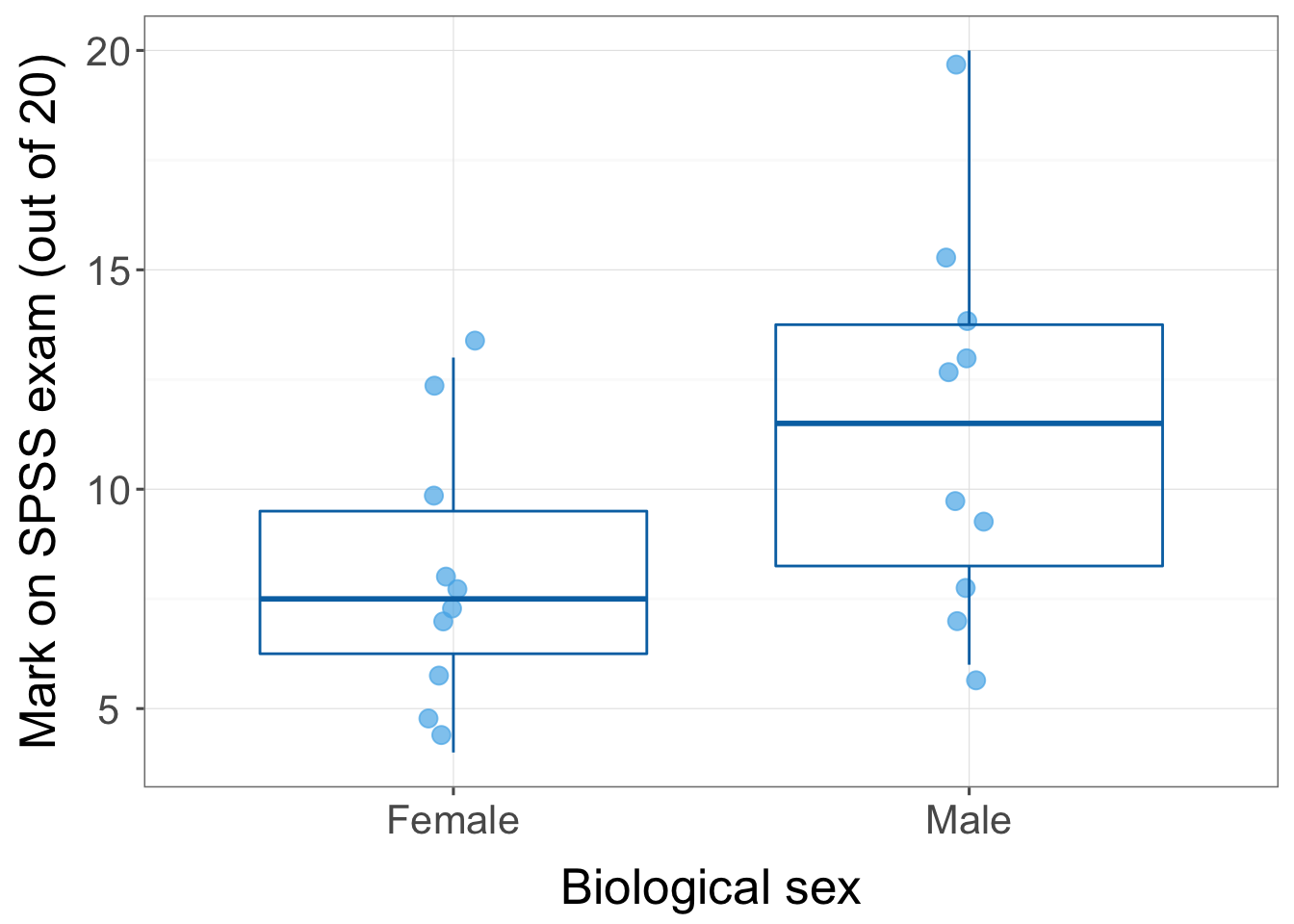
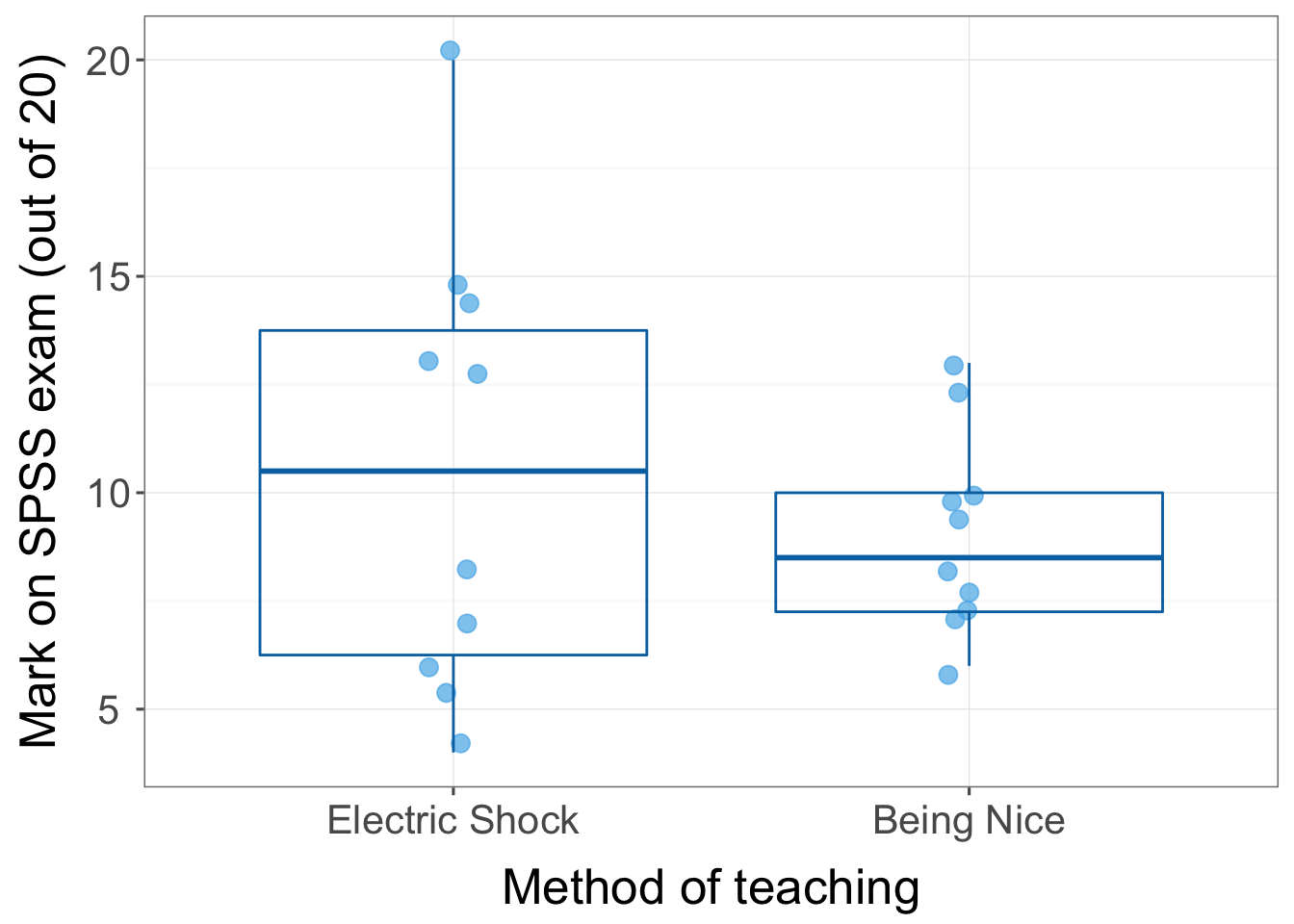
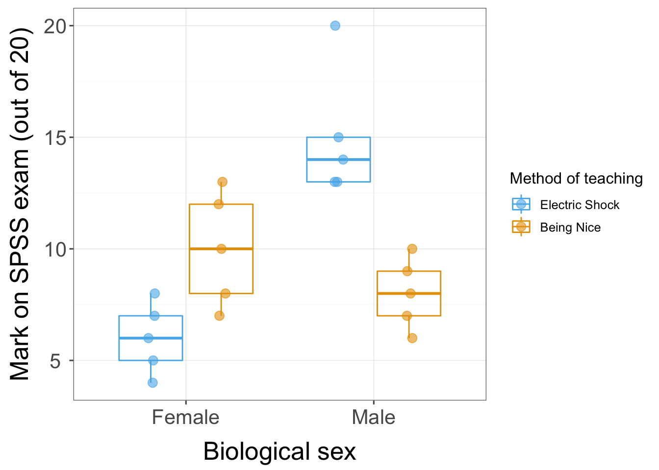
Task 14.6
At the start of this Chapter I described a way of empirically researching whether I wrote better songs than my old bandmate Malcolm, and whether this depended on the type of song (a symphony or song about flies). The outcome variable was the number of screams elicited by audience members during the songs. Draw an error bar graph (lines) and analyse these data (Escape From Inside.sav).
To produce the graph, access the chart builder and selecta multiple line graph from the gallery. Then:
- Drag the outcome variable (Screams) to .
- Drag one predictor variable (Song_Type) to .
- Drag the other predictor variable (Songwriter) to
.
Your completed dialog box should look like this:

In the Element Properties dialog box remember to select to add
error bars:
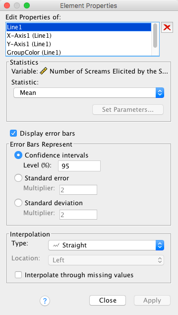
The resulting graph will look like this:
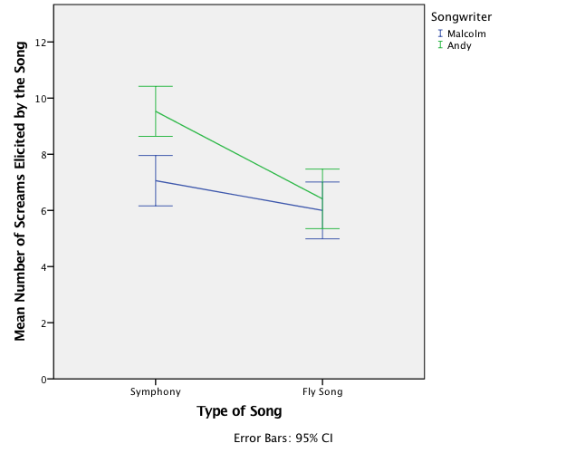
To fit the model, access the main dialog box and:
- Drag the outcome variable (Screams) to the box labelled Dependent Variable.
- Drag the predictor variables (Song_Type and Songwriter) to the box labelled Fixed Factor(s).
Your completed dialog box should look like this:
We can see that there was a significant main effect of songwriter, indicating that when we ignore the type of song Andy’s songs elicited significantly more screams than those written by Malcolm, F(1, 64) = 9.94, p = 0.002. There was a significant main effect of the type of song indicating that, when we ignore the songwriter, symphonies elicited significantly more screams of agony than songs about flies, F(1, 64) = 20.87, p < 0.001. The interaction was also significant, F(1, 64) = 5.07, p = 0.028. The graphed means suggest that although reactions to Malcolm’s and Andy’s songs were similar for the fly songs, they differed quite a bit for the symphonies (Andy’s symphony elicited more screams of torment than Malcolm’s). Therefore, although the main effect of songwriter suggests that Malcolm was a better songwriter than Andy, the interaction tells us that this effect is driven by Andy being poor at writing symphonies.
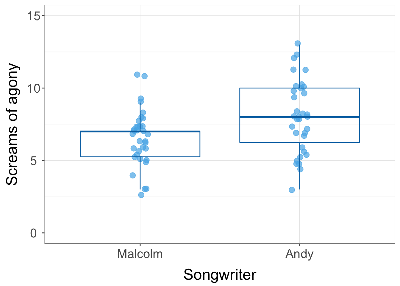
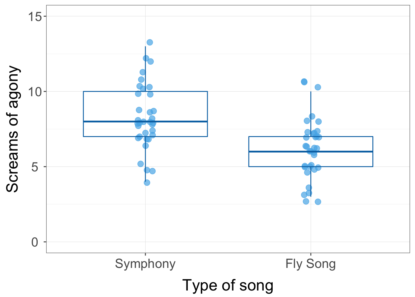
Task 14.7
Compute omega squared for the effects in Task 6 and report the results of the analysis.
First we use the mean squares and degrees of freedom in the summary table and the sample size per group to compute sigma for each effect:
\[ \begin{aligned} \hat{\sigma}_\alpha^2 &= \frac{(a-1)(\text{MS}_A-\text{MS}_\text{R})}{nab} = \frac{(2-1)(74.13-3.55)}{17×2×2} = 1.04 \\ \hat{\sigma}_\beta^2 &= \frac{(b-1)(\text{MS}_B-\text{MS}_\text{R})}{nab} = \frac{(2-1)(35.31-3.55)}{17×2×2} = 0.47 \\ \hat{\sigma}_{\alpha\beta}^2 &= \frac{(a-1)(b-1)(\text{MS}_{A \times B}-\text{MS}_\text{R})}{nab} = \frac{(2-1)(2-1)(18.02-3.77)}{17×2×2} = 0.21 \\ \end{aligned} \]
We next need to estimate the total variability, and this is the sum of these other variables plus the residual mean squares:
\[ \begin{aligned} \hat{\sigma}_\text{total}^2 &= \hat{\sigma}_\alpha^2 + \hat{\sigma}_\beta^2 + \hat{\sigma}_{\alpha\beta}^2 + \text{MS}_\text{R} \\ &= 1.04+0.47+0.21+3.77 \\ &= 5.49 \\ \end{aligned} \]
The effect size is then the variance estimate for the effect in which you’re interested divided by the total variance estimate:
\[ \omega_\text{effect}^2 = \frac{\hat{\sigma}_\text{effect}^2}{\hat{\sigma}_\text{total}^2} \]
For the main effect of type of song we get:
\[ \omega_\text{type of song}^2 = \frac{\hat{\sigma}_\text{type of song}^2}{\hat{\sigma}_\text{total}^2} = \frac{1.04}{5.49} = 0.19 \]
For the main effect of songwriter we get:
\[ \omega_\text{songwriter}^2 = \frac{\hat{\sigma}_\text{songwriter}^2}{\hat{\sigma}_\text{total}^2} = \frac{0.47}{5.49} = 0.09 \]
For the interaction of songwriter and type of song we get:
\[ \omega_{\text{songwriter} \times \text{type of song}}^2 = \frac{\hat{\sigma}_{\text{songwriter} \times \text{type of song}}^2}{\hat{\sigma}_\text{total}^2} = \frac{0.21}{5.49} = 0.04 \]
We could report (remember if you’re using APA format to drop the leading zeros before p-values and \(\omega^2\), for example report p = .035 instead of p = 0.035):
- The main effect of the type of song significantly affected screams elicited during that song, F(1, 64) = 20.87, p < 0.001, \(\omega^2 = 0.19\); the two symphonies elicited significantly more screams of agony than the two songs about flies. The main effect of the songwriter significantly affected screams elicited during that song, F(1, 64) = 9.94, p = 0.002, \(\omega^2 = 0.09\); Andy’s songs elicited significantly more screams of torment from the audience than Malcolm’s songs. The song type\(\times\)songwriter interaction was significant, F(1, 64) = 5.07, p = 0.028, \(\omega^2 = 0.04\). Although reactions to Malcolm’s and Andy’s songs were similar for songs about a fly, Andy’s symphony elicited more screams of torment than Malcolm’s.
Task 14.8
Using SPSS Tip 14.1, change the syntax in GogglesSimpleEffects.sps to look at the effect of alcohol at different levels of type of face.
The correct syntax to use is:
glm Attractiveness by FaceType Alcohol
 /emmeans = tables(FaceType*Alcohol)compare(Alcohol).
Note that all we change is compare(FaceType) to compare(Alcohol). The pertinent part of the output is:
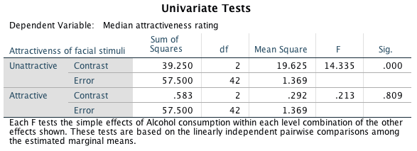
This output shows a significant effect of alcohol for unattractive faces, F(2, 42) = 14.34, p < 0.001, but not attractive ones F(2, 42) = 0.29, p = 0.809. Think back to the chapter. These tests reflect the fact that ratings of unattractive faces go up as more alcohol is consumed, but for attractive faces ratings are quite stable across doses of alcohol.
Task 14.9
There are reports of increases in injuries related to playing Nintendo Wii (http://ow.ly/ceWPj). These injuries were attributed mainly to muscle and tendon strains. A researcher hypothesized that a stretching warm-up before playing Wii would help lower injuries, and that athletes would be less susceptible to injuries because their regular activity makes them more flexible. She took 60 athletes and 60 non-athletes (athlete); half of them played Wii and half watched others playing as a control (wii), and within these groups half did a 5-minute stretch routine before playing/watching whereas the other half did not (stretch). The outcome was a pain score out of 10 (where 0 is no pain, and 10 is severe pain) after playing for 4 hours (injury). Fit a model to test whether athletes are less prone to injury, and whether the prevention programme worked (Wii.sav).
This design is a 2(Athlete: athlete vs. non-athlete) by 2(Wii: playing Wii vs. watching Wii) by 2(Stretch: stretching vs. no stretching) three-way independent design. To fit the model, access the main dialog box and:
- Drag the outcome variable (injury) to the box labelled Dependent Variable.
- Drag the predictor variables (athlete, wii and stretch) to the box labelled Fixed Factor(s).
Your completed dialog box should look like this:
The main summary table is as follows and we will look at each effect in turn:
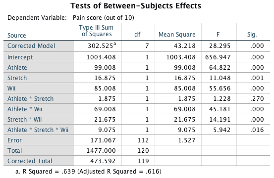
There was a significant main effect of athlete, F(1, 112) = 64.82, p < .001. The graph shows that, on average, athletes had significantly lower injury scores than non-athletes.
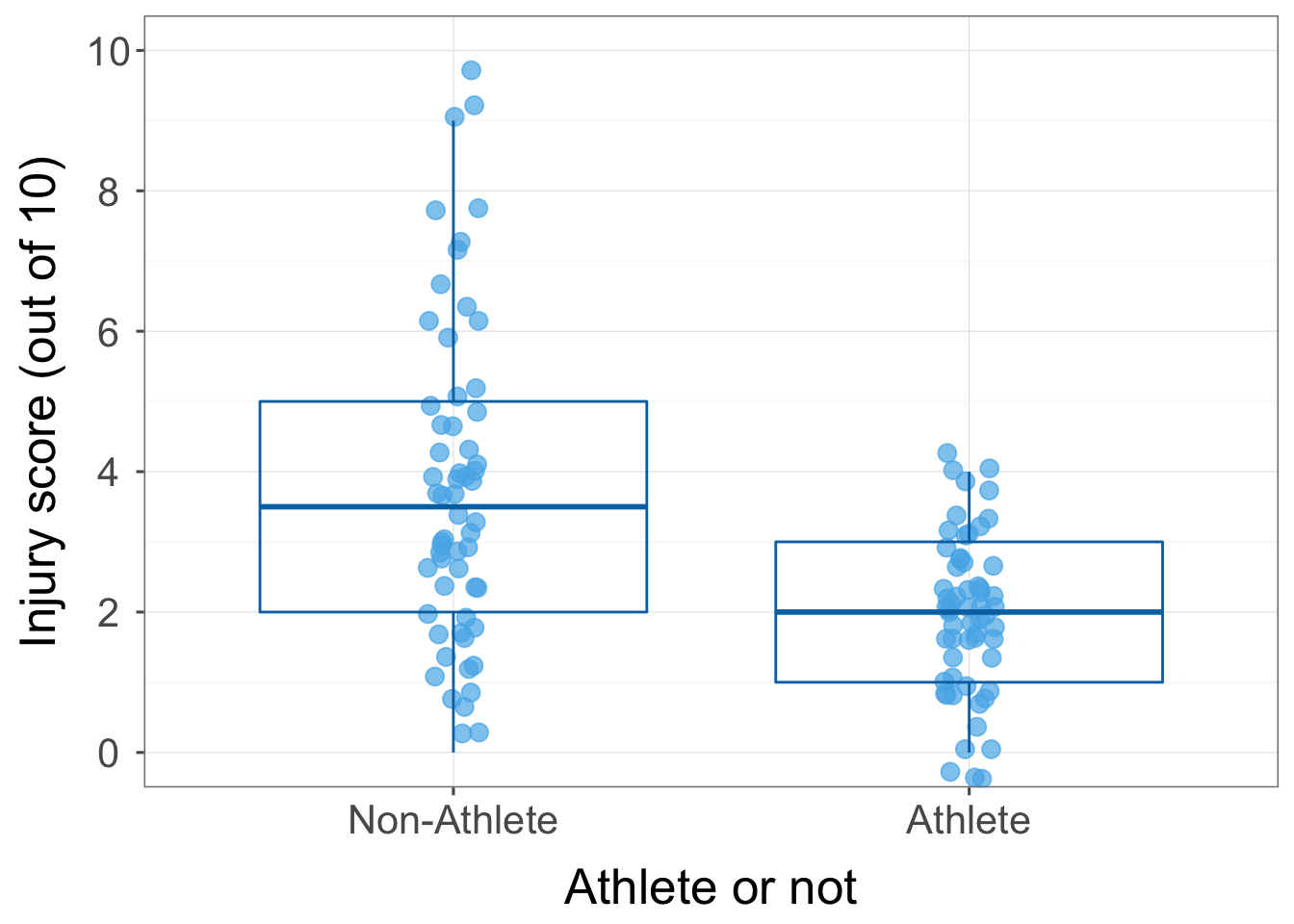
There was a significant main effect of stretching, F(1, 112) = 11.05, p = 0.001. The graph shows that stretching significantly decreased injury score compared to not stretching. However, the two-way interaction with athletes will show us that this is true only for athletes and non-athletes who played on the Wii, not for those in the control group (you can also see this pattern in the three-way interaction graph). This is an example of how main effects can sometimes be misleading.
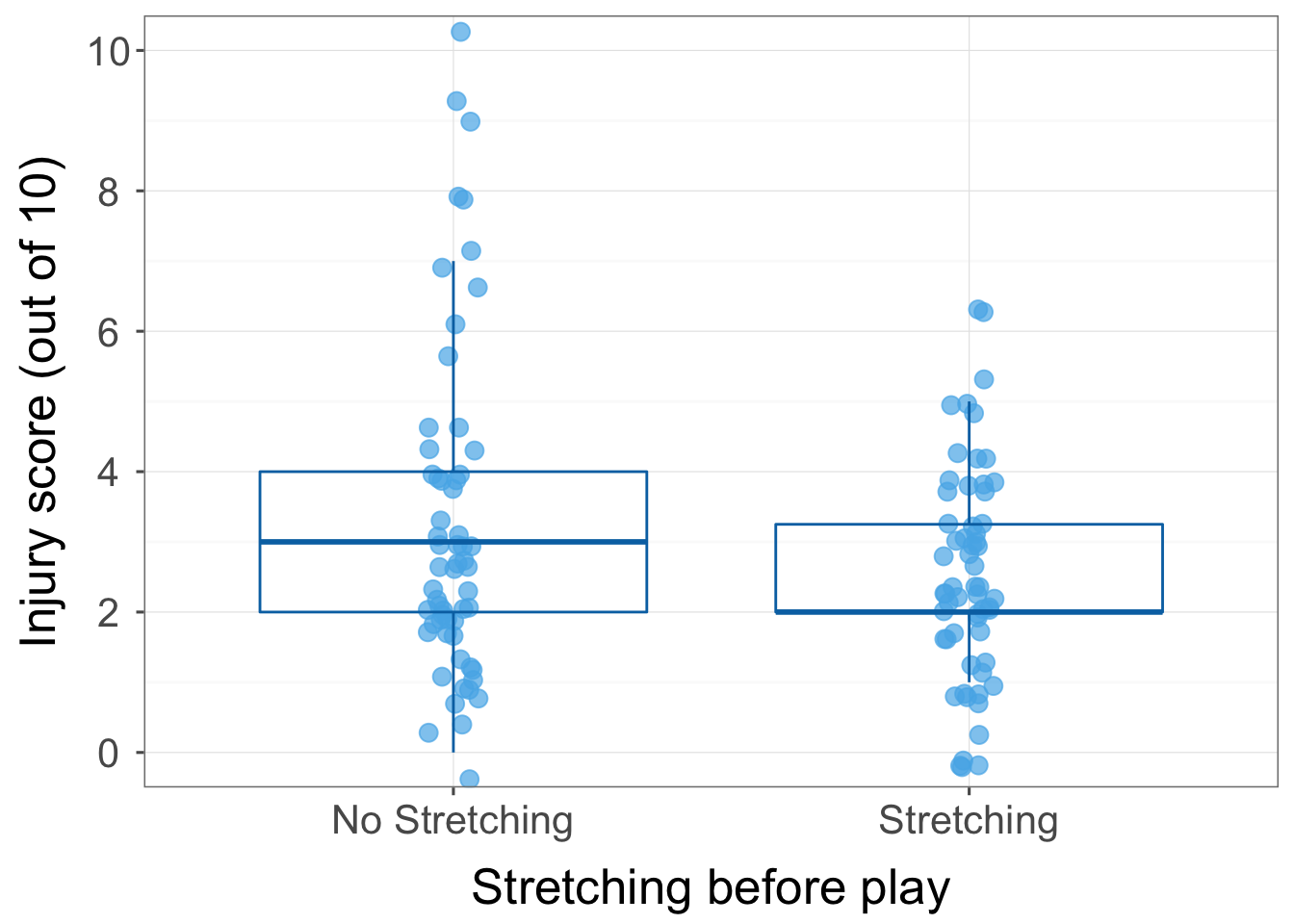
There was also a significant main effect of Wii, F(1, 112) = 55.66, p < .001. The graph shows (not surprisingly) that playing on the Wii resulted in a significantly higher injury score compared to watching other people playing on the Wii (control).
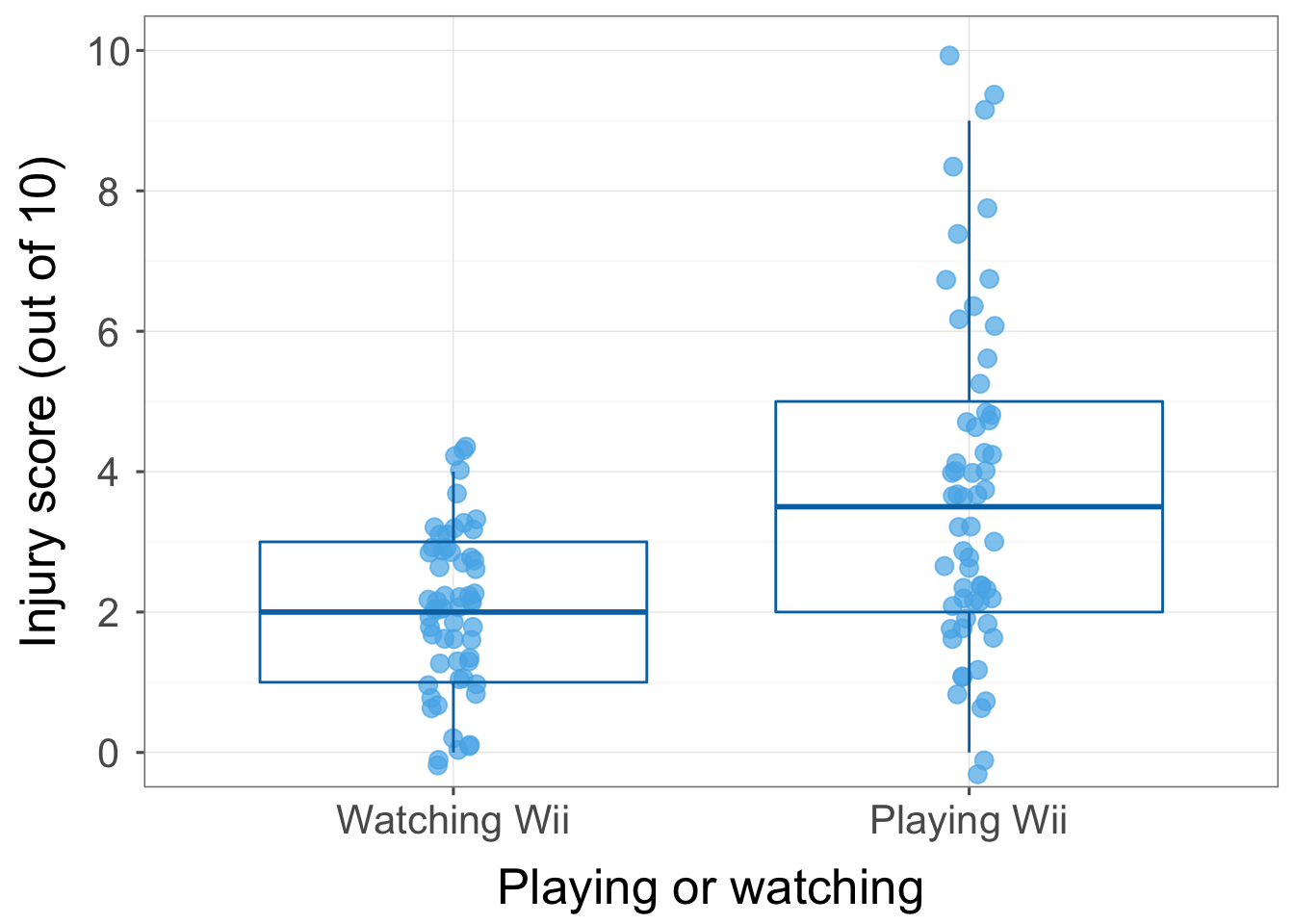
There was not a significant athlete by stretch interaction F(1, 112) = 1.23, p = 0.270. The graph of the interaction effect shows that (not taking into account playing vs. watching the Wii) while non-athletes had higher injury scores than athletes overall, stretching decreased the number of injuries in both athletes and non-athletes by roughly the same amount. Parallel lines usually indicate a non-significant interaction effect, and so it is not surprising that the interaction between stretch and athlete was non-significant.
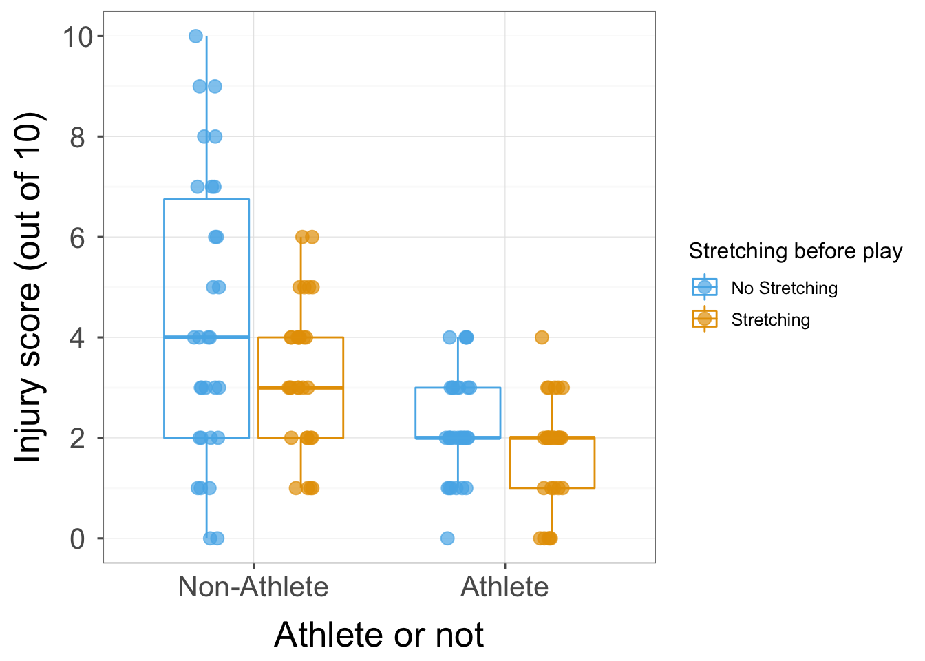
There was a significant athlete by Wii interaction F(1, 112) = 45.18, p < .001. The interaction graph shows that (not taking stretching into account) non-athletes had low injury scores when watching but high injury scores when playing whereas athletes had low injury scores when both playing and watching.
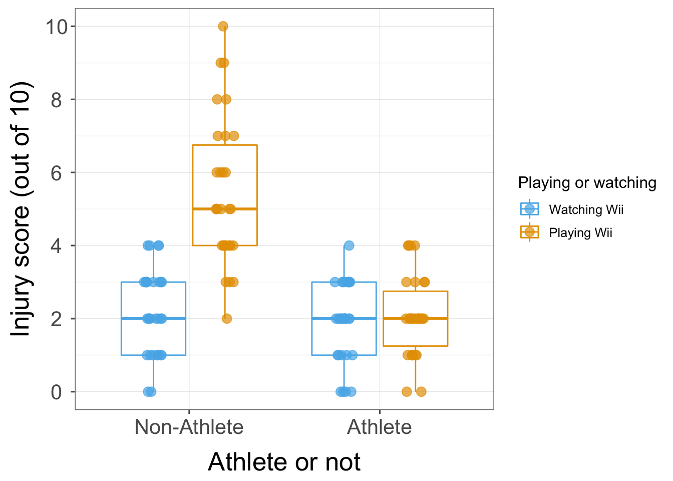
There was a significant stretch by Wii interaction F(1, 112) = 14.19, p < .001. The interaction graph shows that (not taking athlete into account) stretching before playing on the Wii significantly decreased injury scores, but stretching before watching other people playing on the Wii did not significantly reduce injury scores. This is not surprising as watching other people playing on the Wii is unlikely to result in sports injury!
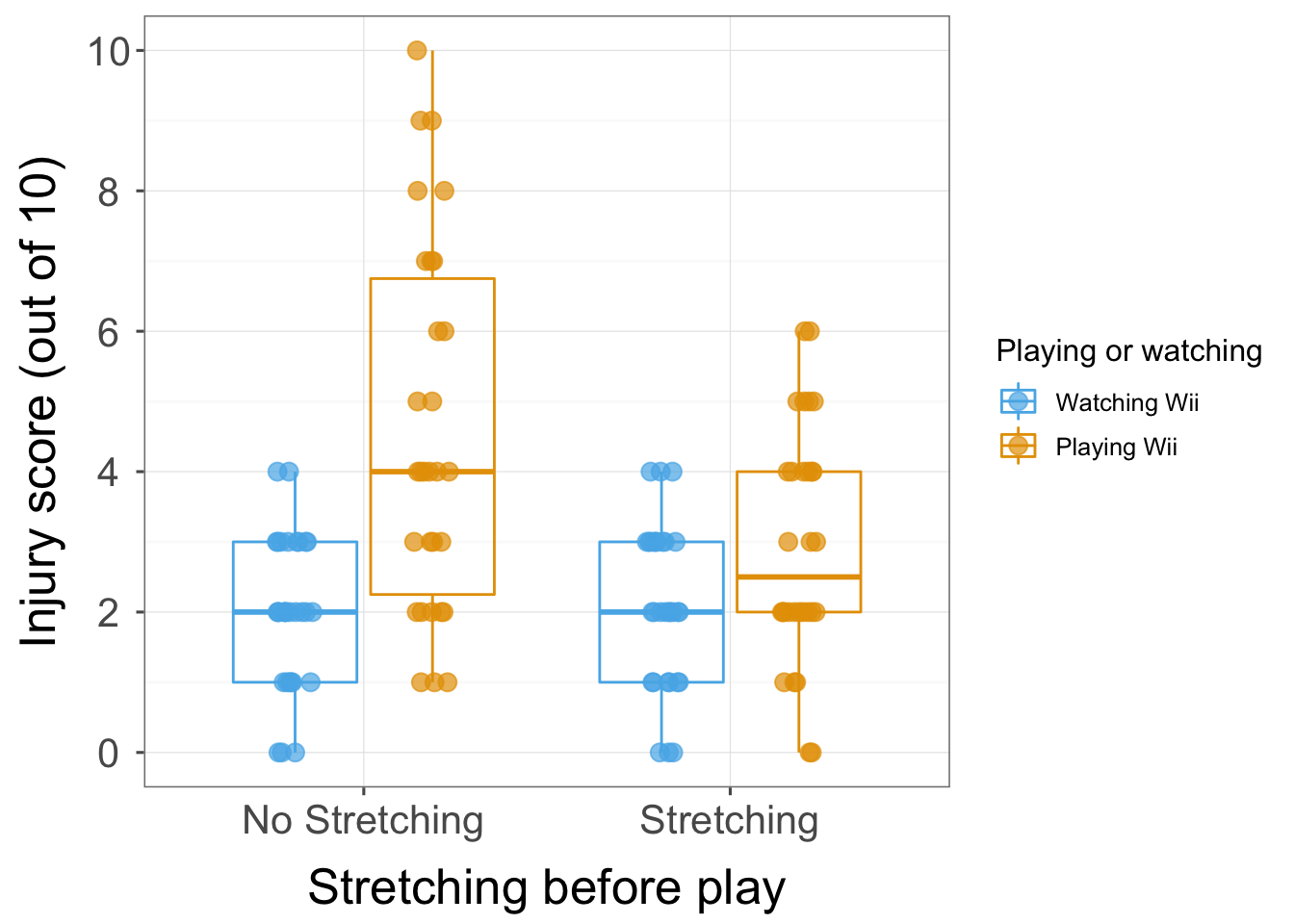
There was a significant athlete by stretch by Wii interaction F(1, 112) = 5.94, p < .05. What this actually means is that the effect of stretching and playing on the Wii on injury score was different for athletes than it was for non-athletes. In the presence of this significant interaction it makes no sense to interpret the main effects. The interaction graph for this three-way effect shows that for athletes, stretching and playing on the Wii has very little effect: their mean injury score is quite stable across the two conditions (whether they played on the Wii or watched other people playing on the Wii, stretched or did no stretching). However, for the non-athletes, watching other people play on the Wii compared to not stretching and playing on the Wii rapidly declines their mean injury score. The interaction tells us that stretching and watching rather than playing on the Wii both result in a lower injury score and that this is true only for non-athletes. In short, the results show that athletes are able to minimize their injury level regardless of whether they stretch before exercise or not, whereas non-athletes only have to bend slightly and they get injured!
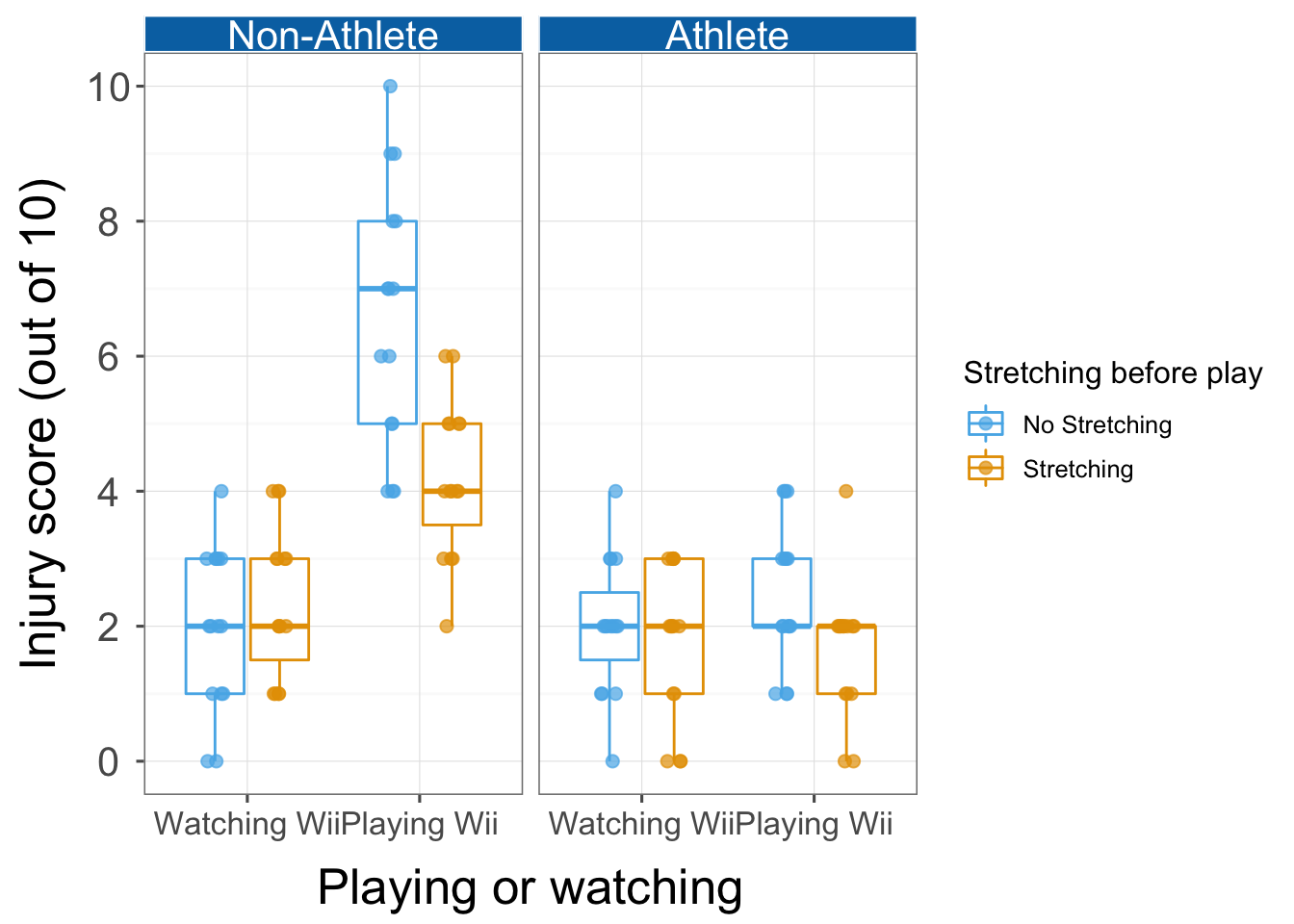
Chapter 15
General information
- Access the main dialog box for repeated-measures designs by selecting Analyze > General Linear Model > Repeated Measures …
- Remember that you can move variables in the dialog box by dragging
them, or selecting them and cliking .
Task 15.1
It is common that lecturers obtain reputations for being ‘hard’ or ‘light’ markers (or, to use the students’ terminology, ‘evil manifestations from Beelzebub’s bowels’ and ‘nice people’), but there is often little to substantiate these reputations. A group of students investigated the consistency of marking by submitting the same essays to four different lecturers. The outcome was the percentage mark given by each lecturer and the predictor was the lecturer who marked the report (TutorMarks.sav). Compute the F-statistic for the effect of marker by hand.
There were eight essays, each marked by four different lecturers. The data look like this:
| tutor1 | tutor2 | tutor3 | tutor4 | mean | variance |
|---|---|---|---|---|---|
| 62 | 58 | 63 | 64 | 61.75 | 6.92 |
| 63 | 60 | 68 | 65 | 64.00 | 11.33 |
| 65 | 61 | 72 | 65 | 65.75 | 20.92 |
| 68 | 64 | 58 | 61 | 62.75 | 18.25 |
| 69 | 65 | 54 | 59 | 61.75 | 43.58 |
| 71 | 67 | 65 | 50 | 63.25 | 84.25 |
| 78 | 66 | 67 | 50 | 65.25 | 132.92 |
| 75 | 73 | 75 | 45 | 67.00 | 216.00 |
The mean mark that each essay received and the variance of marks for a particular essay are shown too. Now, the total variance within essay marks will in part be due to different lecturers marking (some are more critical and some more lenient), and in part by the fact that the essays themselves differ in quality (individual differences). Our job is to tease apart these sources.
The total sum of squares
The \(\text{SS}_\text{T}\) is calculated as:
\[ \text{SS}_\text{T} = \sum_{i=1}^{N} (x_i-\bar{X})^2 \]
Let’s get some descriptive statistics for all of the scores when they are lumped together:
| median | mean | SE.mean | CI.mean.0.95 | var | std.dev | coef.var |
|---|---|---|---|---|---|---|
| 65 | 63.9375 | 1.311347 | 2.674511 | 55.02823 | 7.418101 | 0.1160211 |
This tells us, for example, that the grand mean (the mean of all scores) is 63.94. We take each score, substract from it the mean of all scores (63.94) and square this difference to get the squared errors:
| allScores | Mean | Difference | Squared_difference |
|---|---|---|---|
| 62 | 63.94 | -1.94 | 3.76 |
| 63 | 63.94 | -0.94 | 0.88 |
| 65 | 63.94 | 1.06 | 1.12 |
| 68 | 63.94 | 4.06 | 16.48 |
| 69 | 63.94 | 5.06 | 25.60 |
| 71 | 63.94 | 7.06 | 49.84 |
| 78 | 63.94 | 14.06 | 197.68 |
| 75 | 63.94 | 11.06 | 122.32 |
| 58 | 63.94 | -5.94 | 35.28 |
| 60 | 63.94 | -3.94 | 15.52 |
| 61 | 63.94 | -2.94 | 8.64 |
| 64 | 63.94 | 0.06 | 0.00 |
| 65 | 63.94 | 1.06 | 1.12 |
| 67 | 63.94 | 3.06 | 9.36 |
| 66 | 63.94 | 2.06 | 4.24 |
| 73 | 63.94 | 9.06 | 82.08 |
| 63 | 63.94 | -0.94 | 0.88 |
| 68 | 63.94 | 4.06 | 16.48 |
| 72 | 63.94 | 8.06 | 64.96 |
| 58 | 63.94 | -5.94 | 35.28 |
| 54 | 63.94 | -9.94 | 98.80 |
| 65 | 63.94 | 1.06 | 1.12 |
| 67 | 63.94 | 3.06 | 9.36 |
| 75 | 63.94 | 11.06 | 122.32 |
| 64 | 63.94 | 0.06 | 0.00 |
| 65 | 63.94 | 1.06 | 1.12 |
| 65 | 63.94 | 1.06 | 1.12 |
| 61 | 63.94 | -2.94 | 8.64 |
| 59 | 63.94 | -4.94 | 24.40 |
| 50 | 63.94 | -13.94 | 194.32 |
| 50 | 63.94 | -13.94 | 194.32 |
| 45 | 63.94 | -18.94 | 358.72 |
We then add these squared differences to get the sum of squared error:
\[ \begin{aligned} \text{SS}_\text{T} &= 3.76 + 0.88 + 1.12 + 16.48 + 25.60 + 49.84 + 197.68 + 122.32 + 35.28 + 15.52 + 8.64 + 0.00 + 1.12 + 9.36 + 4.24 + 82.08 + 0.88 + 16.48 + 64.96 + 35.28 + 98.80 + 1.12 + 9.36 122.32 + 0.00 + 1.12 + 1.12 + 8.64 + 24.40 + 194.32 + 194.32 + 358.72 \\ &= 1705.76 \end{aligned} \]
The degrees of freedom for this sum of squares is \(N–1\), or 31.
The within-participant sum of squares
The within-participant sum of squares, \(\text{SS}_\text{W}\), is calculated using:
\[ \text{SS}_\text{W} = s_\text{entity 1}^2(n_1-1)+s_\text{entity 2}^2(n_2-1) + s_\text{entity 3}^2(n_3-1) +\ldots+ s_\text{entity n}^2(n_n-1) \]
Our ‘entities’ in this example are 8 essays so we could write the equation as:
\[ \text{SS}_\text{W} = s_\text{essay 1}^2(n_1-1)+s_\text{essay 2}^2(n_2-1) + s_\text{essay 3}^2(n_3-1) +\ldots+ s_\text{essay 8}^2(n_8-1) \]
The ns are the number of scores on which the variances are based (i.e. in this case the number of marks each essay received, which was 4). The variance in marks for each essay were computed in one of the tables above so we use these values to calculate \(\text{SS}_\text{W}\) as:
\[ \begin{aligned} \text{SS}_\text{W} &= s_\text{essay 1}^2(n_1-1)+s_\text{essay 2}^2(n_2-1) + s_\text{essay 3}^2(n_3-1) +\ldots+ s_\text{essay 8}^2(n_8-1) \\ &= 6.92(4-1) + 11.33(4-1) + 20.92(4-1) + 18.25(4-1) + 43.58(4-1) + 84.25(4-1) + 132.92(4-1) + 216.00(4-1)\\ &= 1602.51 \end{aligned} \]
The degrees of freedom for each essay are \(n–1\) (i.e. the number of marks per essay minus 1). To get the total degrees of freedom we add the df for each essay
\[ \begin{aligned} \text{df}_\text{W} &= df_\text{essay 1}+df_\text{essay 2} + df_\text{essay 3} +\ldots+ df_\text{essay 8} \\ &= (4-1) + (4-1) + (4-1) + (4-1) + (4-1) + (4-1) + (4-1) + (4-1)\\ &= 24 \end{aligned} \]
A shortcut would be to multiply the degrees of freedom per essay (3) by the number of essays (8): \(3 \times 8 = 24\)
The model sum of squares
We calculate the model sum of squares \(\text{SS}_\text{M}\) as:
\[ \sum_{g = 1}^{k}n_g(\bar{x}_g-\bar{x}_\text{grand})^2 \] Therefore, we need to subtract the mean of all marks from the mean mark awarded by each tutor, then squres these differences, multiply them by the number of essays marked and sum the results. The mean mark awarded by each tutor is:
| median | mean | SE.mean | CI.mean.0.95 | var | std.dev | coef.var | |
|---|---|---|---|---|---|---|---|
| tutor1 | 68.5 | 68.875 | 1.994971 | 4.717358 | 31.83929 | 5.642631 | 0.0819257 |
| tutor2 | 64.5 | 64.250 | 1.666369 | 3.940337 | 22.21429 | 4.713203 | 0.0733573 |
| tutor3 | 66.0 | 65.250 | 2.447666 | 5.787812 | 47.92857 | 6.923046 | 0.1061003 |
| tutor4 | 60.0 | 57.375 | 2.796283 | 6.612158 | 62.55357 | 7.909082 | 0.1378489 |
We can calculate \(\text{SS}_\text{M}\) as:
\[ \begin{aligned} \text{SS}_\text{M} &= 8(68.88 – 63.94)^2 +8(64.25 – 63.94)^2 + 8(65.25 – 63.94)^2 + 8(57.38–63.94)^2\\ &= 554 \end{aligned} \] The degrees of freedom are the number of conditions (in this case the number of markers) minus 1, \(df_M = k-1 = 3\)
The residual sum of squares
We now know that there are 1706 units of variation to be explained in our data, and that the variation across our conditions accounts for 1602 units. Of these 1602 units, our experimental manipulation can explain 554 units. The final sum of squares is the residual sum of squares (\(\text{SS}_\text{R}\)), which tells us how much of the variation cannot be explained by the model. Knowing \(\text{SS}_\text{W}\) and \(\text{SS}_\text{M}\) already, the simplest way to calculate \(\text{SS}_\text{R}\) is throiugh subtraction:
\[ \begin{aligned} \text{SS}_\text{R} &= \text{SS}_\text{W}-\text{SS}_\text{M}\\ &=1602.51-554\\ &=1048.51 \end{aligned} \]
The degrees of freedom are calculated in a similar way: \[ \begin{aligned} df_\text{R} &= df_\text{W}-df_\text{M}\\ &=24-3\\ &=21 \end{aligned} \] = 21 ### The mean squares Next, convert the sums of squares to mean squares by dividing by their degrees of freedom:
\[ \begin{aligned} \text{MS}_\text{M} &= \frac{\text{SS}_\text{M}}{df_\text{M}} = \frac{554}{3} = 184.67 \\ \text{MS}_\text{R} &= \frac{\text{SS}_\text{R}}{df_\text{R}} = \frac{1048.51}{21} = 49.93 \\ \end{aligned} \]
The F-statistic
The F-statistic is calculated by dividing the model mean squares by the residual mean squares:
\[ F = \frac{\text{MS}_\text{M}}{\text{MS}_\text{R}} = \frac{184.67}{49.93} = 3.70 \]
This value of F can be compared against a critical value based on its degrees of freedom (which are 3 and 21 in this case).
Task 15.2
Repeat the analysis for Task 1 using SPSS Statistics and interpret the results.
To fit the model:
- Type a name (I typed Marker) for the repeated measures variable in the box labelled Within-Subject Factor Name:
- Enter the number of levels of the repeated measures variable (4) in the box labelled Number of Levels:
- Click
 to register
the variable
to register
the variable
The dialog box should look like this:
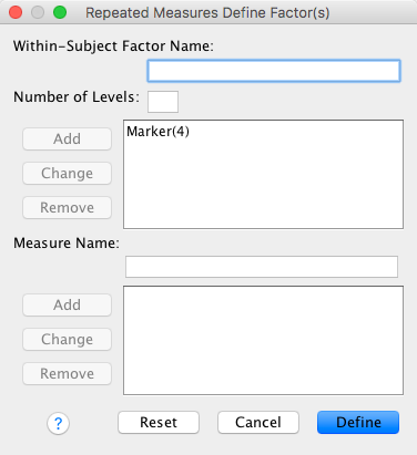
- Click
 to
define the variable
to
define the variable - Move the variables representing the levels of your repeated measures variable) to the box labelled Within-Subjects Variables
The dialog box should look like this:

- Click
 to
request post hoc tests
to
request post hoc tests - Move the variable representing the repeated measures predictor to
the box labelled Display Means for:, select
 and select
Bonferroni from the drop down list
and select
Bonferroni from the drop down list
The dialog box should look like this:
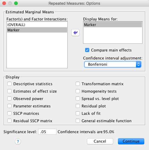
The first part of the output tells us about sphericity. Mauchley’s test indicates a significant violation of sphericity, but I have argued in the book that you should ignore this test and routinely correct for sphericity.
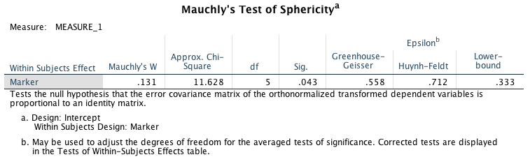
The second part of the output tells us about the main effect of marker. If we look at the Greenhouse-Geisser corrected values, we would conclude that tutors did not significantly differ in the marks they award, F(1.67, 89.53) = 3.70, p = 0.063. If, however, we look at the Huynh-Feldt corrected values, we would conclude that tutors did significantly differ in the marks they award, F(2.14, 70.09) = 3.70, p = 0.047. Which to believe then? Well, this example illustrates just how silly it is to have a cetagorical threshold like p < 0.05 that lead to completely opposite conclusions. The best course of action here would be report both results openly, compute some effect sizes and focus more on the size of the effect than its p-value.
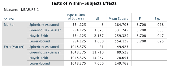
The final part of the output shows the post hoc tests. Assuming we want to interpret these (which, if we do, we might be speculative unless the effect size for the main effect seems meaningul). The only significant difference between group means is between Prof Field and Prof Smith. Looking at the means of these markers, we can see that I give significantly higher marks than Prof Smith. However, there is a rather anomalous result in that there is no significant difference between the marks given by Prof Death and myself, even though the mean difference between our marks is higher (11.5) than the mean difference between myself and Prof Smith (4.6). The reason is the sphericity in the data. The interested reader might like to run some correlations between the four tutors’ grades. You will find that there is a very high positive correlation between the marks given by Prof Smith and myself (indicating a low level of variability in our data). However, there is a very low correlation between the marks given by Prof Death and myself (indicating a high level of variability between our marks). It is this large variability between Prof Death and myself that has produced the non-significant result despite the average marks being very different (this observation is also evident from the standard errors).
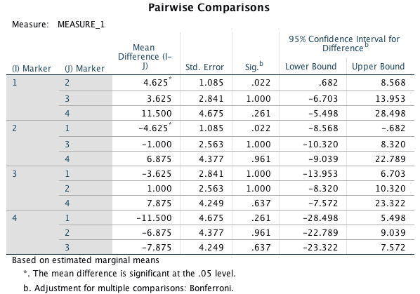 ##
Task 15.3
##
Task 15.3
Calculate the effect sizes for the analysis in Task 1.
In repeated-measures ANOVA, the equation for \(\omega^2\) is:
\[ \omega^2 = \frac{[\frac{k-1}{nk}(\text{MS}_\text{M}-\text{MS}_\text{R})]}{\text{MS}_\text{R}+\frac{\text{MS}_\text{B}-\text{MS}_\text{R}}{k}+[\frac{k-1}{nk}(\text{MS}_\text{M}-\text{MS}_\text{R})]} \]
To get \(\text{MS}_\text{B}\) we need \(\text{SS}_\text{W}\), which is not in the output. However, we can obtain it as follows:
\[ \begin{aligned} \text{SS}_\text{T} &= \text{SS}_\text{B} + \text{SS}_\text{M} + \text{SS}_\text{R} \\ \text{SS}_\text{B} &= \text{SS}_\text{T} - \text{SS}_\text{M} - \text{SS}_\text{R} \\ \end{aligned} \] The next problem is that the output also doesn’t include \(\text{SS}_\text{T}\) but we have the value from Task 1. You should get:
\[ \begin{aligned} \text{SS}_\text{B} &= 1705.868-554.125-1048.375 \\ &=103.37 \end{aligned} \]
The next step is to convert this to a mean squares by dividing by the degrees of freedom, which in this case are the number of essays minus 1:
\[ \begin{aligned} \text{MS}_\text{B} &= \frac{\text{SS}_\text{B}}{df_\text{B}} = \frac{\text{SS}_\text{B}}{N-1} \\ &=\frac{103.37}{8-1} \\ &= 14.77 \end{aligned} \]
The resulting effect size is:
\[ \begin{aligned} \omega^2 &= \frac{[\frac{4-1}{8 \times 4}(184.71-49.92)]}{49.92+\frac{14.77-49.92}{4}+[\frac{4-1}{8 \times4}(184.71-49.92)]} \\ &= \frac{12.64}{53.77} \\ &= 0.24 \end{aligned} \]
I mention in the book that it’s typically more useful to have effect size measures for focused comparisons (rather than the omnibus test), and so another approach to calculating effect sizes is to calculate them for the contrasts by converting the F-statistics (because they all have 1 degree of freedom for the model) to r:
\[ r = \sqrt{\frac{F(1, df_\text{R})}{F(1, df_\text{R}) + df_\text{R}}} \]
For the three comparisons we did, we would get:
\[ \begin{aligned} r_\text{Field vs. Smith} &= \sqrt{\frac{18.18}{18.18 + 7}} = 0.85\\ r_\text{Smith vs. Scrote} &= \sqrt{\frac{0.15}{0.15 + 7}} = 0.14\\ r_\text{Scrote vs. Death} &= \sqrt{\frac{3.44}{3.44 + 7}} = 0.57\ \end{aligned} \]
We could report the main finding as follows (remember if you’re using APA format to drop the leading zeros before p-values and \(\omega^2\), for example report p = .063 instead of p = 0.063):
- Degrees of freedom were corrected using Greenhouse–Geisser estimates of sphericity (ε = .56). The mark of an essay was not significantly affected by the lecturer who marked it, F(1.67, 11.71) = 3.70, p = 0.063, \(\omega^2\) = 0.24.
Remember that because the main F-statistic was not significant we should not report further analysis.
Task 15.4
The ‘roving eye’ effect is the propensity of people in relationships to ‘eye up’ members of the opposite sex. I fitted 20 people with incredibly sophisticated glasses that tracked their eye movements (yes, I am making this up …). Over four nights I plied them with either 1, 2, 3 or 4 pints of strong lager in a nightclub and recorded how many different people they eyed up (i.e., scanned their bodies). Is there an effect of alcohol on the tendency to eye people up? (RovingEye.sav).
To fit the model:
- Type a name (I typed alcohol) for the repeated measures variable in the box labelled Within-Subject Factor Name:
- Enter the number of levels of the repeated measures variable (4) in the box labelled Number of Levels:
- Click to register
the variable
The dialog box should look like this:
- Click to
define the variable
- Move the variables representing the levels of your repeated measures variable) to the box labelled Within-Subjects Variables
The dialog box should look like this:
- Click to
request post hoc tests
- Move the variable representing the repeated measures predictor to
the box labelled Display Means for:, select and select
Bonferroni from the drop down list
The dialog box should look like this:
The first part of the output tells us about sphericity. Mauchley’s test indicates a significant violation of sphericity, but I have argued in the book that you should ignore this test and routinely correct for sphericity.
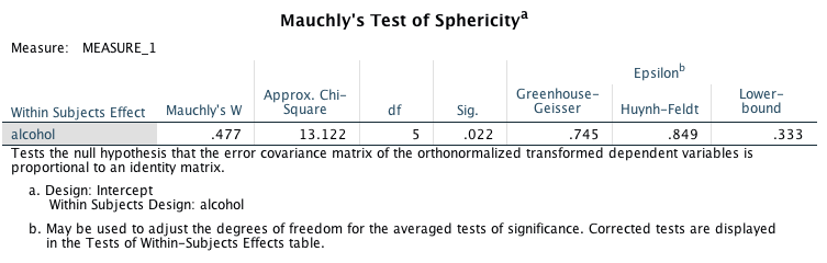
The second part of the output tells us about the main effect of alcohol. If we look at the Greenhouse-Geisser corrected values, we would conclude that the dose of alcohol significantly affected how many people were ‘eyed up’, F(2.24, 42.47) = 4.73, p = 0.011.
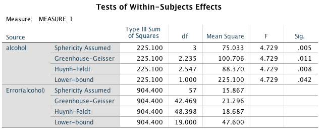
The final part of the output shows the post hoc tests. These show that the only significant difference was between 2 and 3 pints of alcohol. Looking at the graph of means, this sugegsts that the number of people ‘eyed up’ by participants significantly increases from 2 to 3 pints.
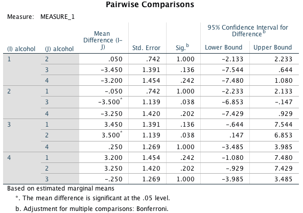
## Warning: attributes are not identical across measure variables;
## they will be dropped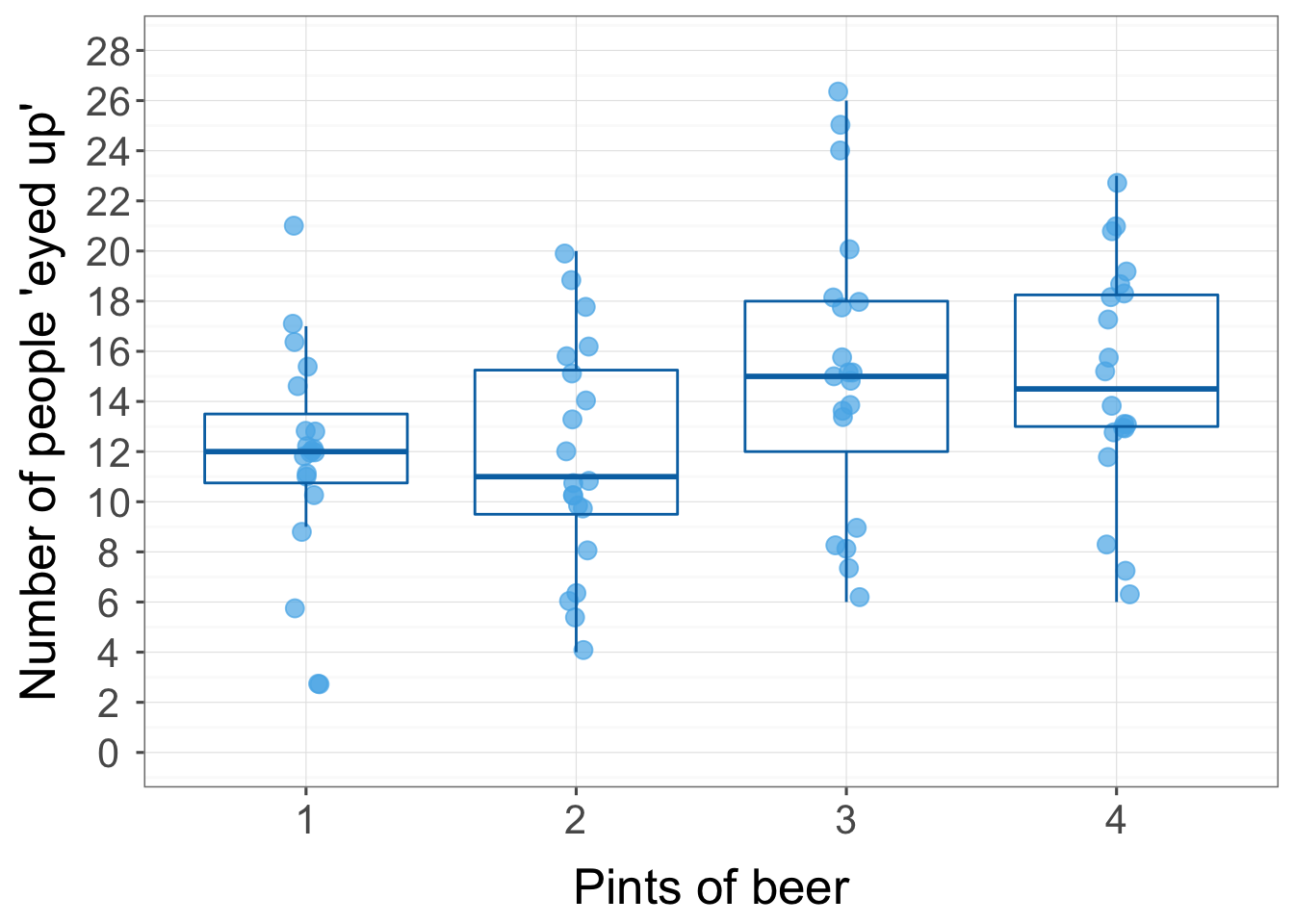
We could report (remember if you’re using APA format to drop the leading zeros before p-values and \(\omega^2\), for example report p = .063 instead of p = 0.063):
- Degrees of freedom were corrected using Greenhouse–Geisser estimates of sphericity (ε = 0.75). The number of people eyed up was significantly affected by the amount of alcohol drunk, F(2.24, 42.47) = 4.73, p = 0.011. Bonferroni post hoc tests revealed a significant increase in the number of people eyed up from when 2 pints were drunk to when 3 pints were, 95% CI (–6.85, –0.15), p = .038, but not between 1 and 2 pints, 95% CI (–2.13, 2.23), p = 1.00, 1 and 3 pints, 95% CI (–7.54, 0.64), p = .136, 1 and 4 pints, 95% CI (–7.48, 1.08), p = .242, 2 and 4 pints, 95% CI (–7.43, 0.93, p = .202, or 3 and 4 pints, 95% CI (–3.49, 3.99), p = 1.00.
Task 15.5
In the previous chapter we came across the beer-goggles effect. In that chapter, we saw that the beer-goggles effect was stronger for unattractive faces. We took a follow-up sample of 26 people and gave them doses of alcohol (0 pints, 2 pints, 4 pints and 6 pints of lager) over four different weeks. We asked them to rate a bunch of photos of unattractive faces in either dim or bright lighting. The outcome measure was the mean attractiveness rating (out of 100) of the faces, and the predictors were the dose of alcohol and the lighting conditions (BeerGogglesLighting.sav). Do alcohol dose and lighting interact to magnify the beer goggles effect?
To fit the model:
- Type a name (I typed lighting) for the first repeated measures variable in the box labelled Within-Subject Factor Name:
- Enter the number of levels of the repeated measures variable (2) in the box labelled Number of Levels:
- Click to register
the variable
- Type a name (I typed alcohol) for the second repeated measures variable in the box labelled Within-Subject Factor Name:
- Enter the number of levels of the repeated measures variable (4) in the box labelled Number of Levels:
- Click to register
the variable
The dialog box should look like this:
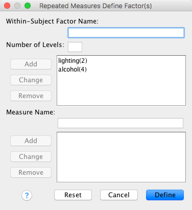
- Click to
define the variables
- Move the variables representing the levels of your repeated measures variable) to the box labelled Within-Subjects Variables in the appropriate order
The dialog box should look like this:
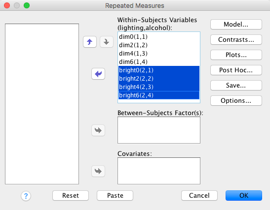
- Click
 to
request repeated contrasts as in the dialog box below
to
request repeated contrasts as in the dialog box below
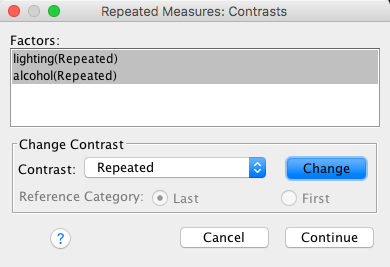
The first part of the output tells us about sphericity. Mauchley’s test indicates a non-significant violation of sphericity for both variables, but I have argued in the book that you should ignore this test and routinely correct for sphericity, so that’s what we’ll do.
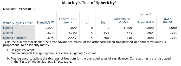
The second part of the output tells us about the main effects of alcohol and lighting, and also their interaction. All effects are significant at p < 0.001. We’ll look at each effect in turn.
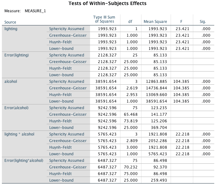
The final part of the output shows the contrasts. We will refer to this table as we interpret each effect.
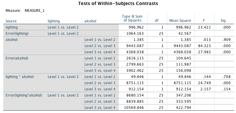
The main effect of lighting shows that the attractiveness ratings of photos was significantly lower when the lighting was dim compared to when it was bright, F(1, 25) = 23.42, p < 0.001.
## Warning: attributes are not identical across measure variables;
## they will be dropped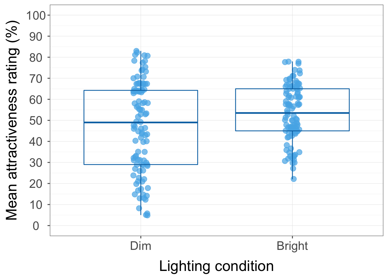
The main effect of alcohol shows that the attractiveness ratings of photos of faces was significantly affected by how much alcohol was consumed, F(2.62, 65.47) = 104.39, p < 0.001. Looking at the contrasts, ratings were not significantly different when two pints were consumed compared to no pints, F(1, 25) = 0.01, p = 0.909. However, ratings were significantly lower after four pints compared to two, F(1, 25) = 84.32, p < .001, and after six pints compared to four, F(1, 25) = 27.98, p < .001.
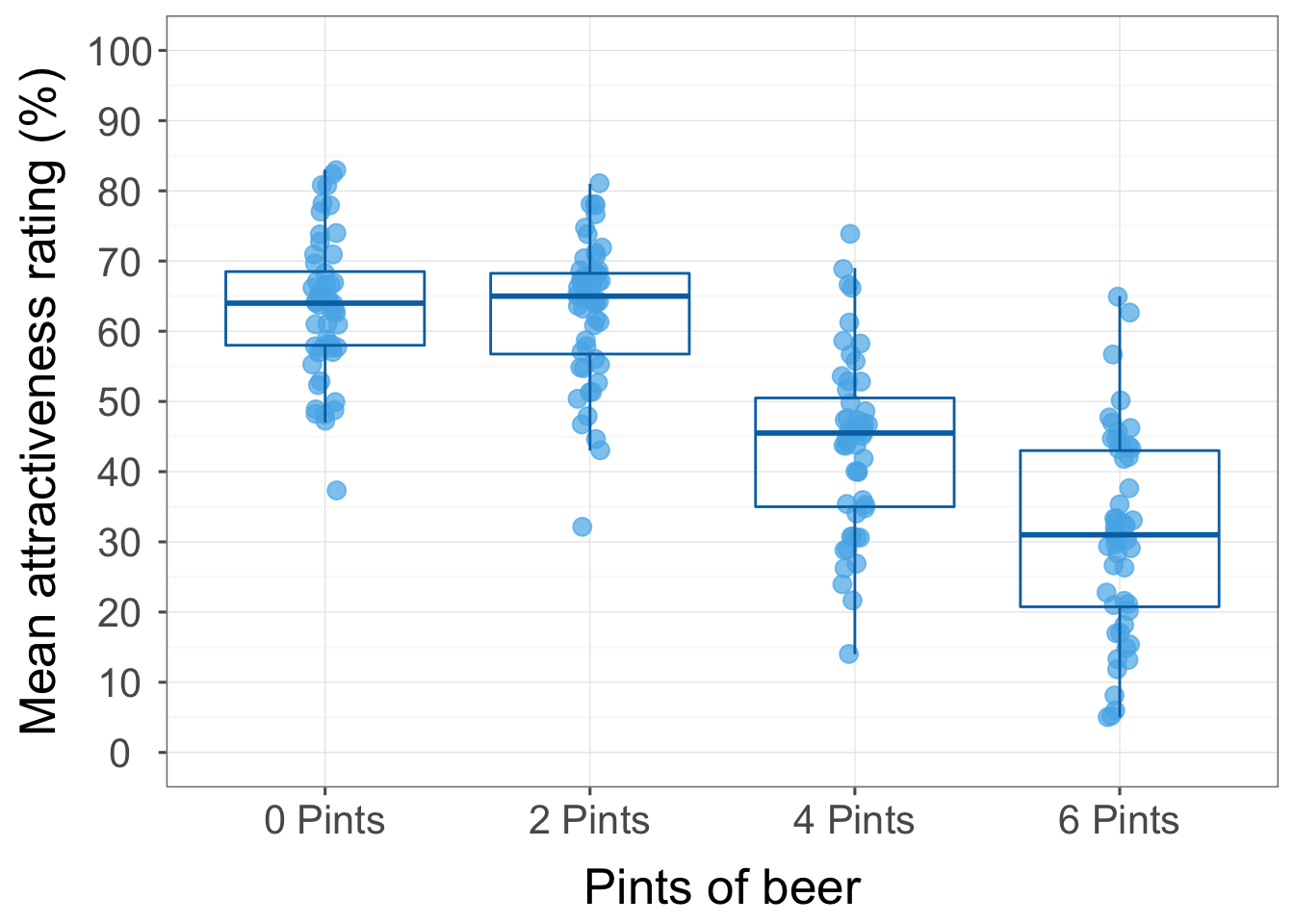
The lighting by alcohol interaction was significant, F(2.81, 70.23) = 22.22, p < 0.001, indicating that the effect of alcohol on the ratings of the attractiveness of faces differed when lighting was dim compared to when it was bright. Contrasts on this interaction term revealed that when the difference in attractiveness ratings in dim and bright conditions was compared after no alcohol to after two pints there was no significant difference, F(1, 25) = 0.14, p = 0.708. However, when comparing the difference of ratings in dim and bright conditions after two pints compared to four, a significant difference emerged, F(1, 25) = 24.75, p < 0.001. The graph shows that the decline in attractiveness ratings between two and four pints was more pronounced in the dim lighting condition. A final contrast revealed that the difference in ratings in dim conditions compared to bright after consuming four pints compared to six was not significant, F(1, 25) = 2.16, p = 0.154. To sum up, there was a significant interaction between the amount of alcohol consumed and whether ratings were made in bright or dim lighting conditions: the decline in the attractiveness ratings seen after two pints (compared to after four) was significantly more pronounced when the lighting was dim.
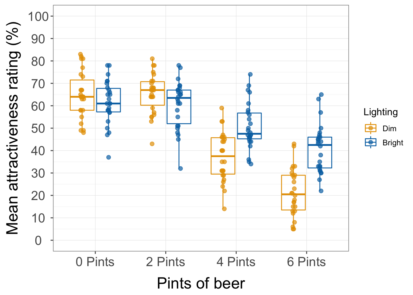
Task 15.6
Using SPSS Tip 15.3, change the syntax in SimpleEffectsAttitude.sps to look at the effect of drink at different levels of imagery.
The correct syntax to use is:
GLM beerpos beerneg beerneut winepos wineneg wineneut waterpos waterneg waterneut
  /WSFACTOR=Drink 3  Imagery 3
 /EMMEANS = TABLES(Drink*Imagery) COMPARE(Drink).
Then output shows a significant effect of drink at level 1 of imagery. So, the ratings of the three drinks significantly differed when positive imagery was used. Because there are three levels of drink, though, this isn’t that helpful in untangling what’s going on. There is also a significant effect of drink at level 2 of imagery. So, the ratings of the three drinks significantly differed when negative imagery was used. Finally, there is also a significant effect of drink at level 3 of imagery. So, the ratings of the three drinks significantly differed when neutral imagery was used.
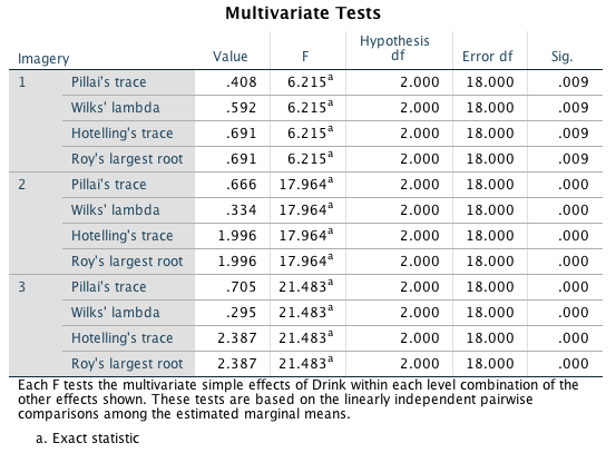
Task 15.7
Early in my career I looked at the effect of giving children information about animals. In one study (Field, 2006), I used three novel animals (the quoll, quokka and cuscus), and children were told negative things about one of the animals, positive things about another, and given no information about the third (our control). After the information I asked the children to place their hands in three wooden boxes each of which they believed contained one of the aforementioned animals (Field(2006).sav). Draw an error bar graph of the means and do some normality tests on the data.
To produce the graph, access the chart builder and select a bar graph from the gallery. Then:
- Select the three variables representing the levels of the repeated
measures variable (bhvneg, bhvpos, and
bhvnone) and drag them (simultaneously) to .

- Your completed dialog box should look like this:
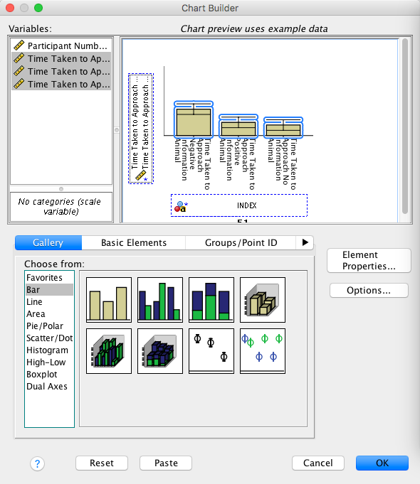
In the Element Properties dialog box remember to select to add
error bars. The resulting graph will look like this:
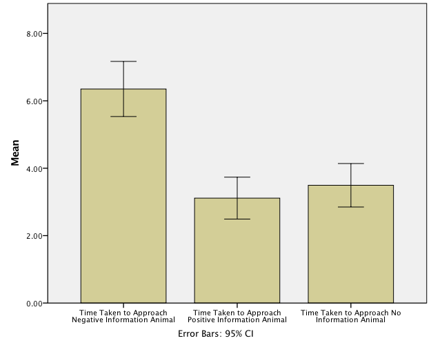
To get the normality tests I used the Kolmogorov–Smirnov test from the Nonparametric > One Sample… menu. I did this because I had a fairly large sample and back when I did this research the Kolmogorov–Smirnov test executed through this menu differed from that obtained through the Explore menu because it did not use the Lilliefor’s correction (see Oliver Twisted for Chapter 6). This appears to have changed so you’ll likley get the same results using the explore menu. To get this test complete the dialog boxes as described.
- First, ask for a custom analysis
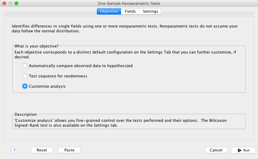
- Next, select the Fields tab and drag the three variables representing the levels of the repeated measures variable (bhvneg, bhvpos, and bhvnone) to the box labelled Test Fields:
- In the Settings tab select Test observed distribution against hypothesized (Kolmogorov-Smirnov test)
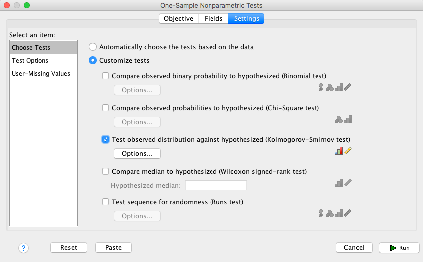
- You can leave the default as they are because we
want to test our sample data against a normal distribution:
The resulting tests for each variable show that they are all very heavily non-normal. This will be, in part, because if a child didn’t put their hand in the box after 15 seconds we gave them a score of 15 and asked them to move on to the next box (this was for ethical reasons: if a child hadn’t put their hand in the box after 15 s we assumed that they did not want to do the task). These days I’d use a robust test on these data but back when I conducted these research I decided to log-transform to reduce the skew. hence Task 8!
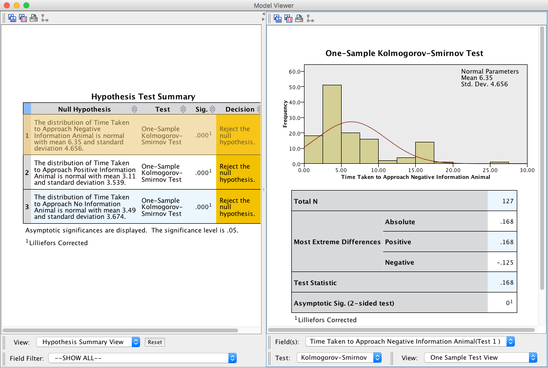
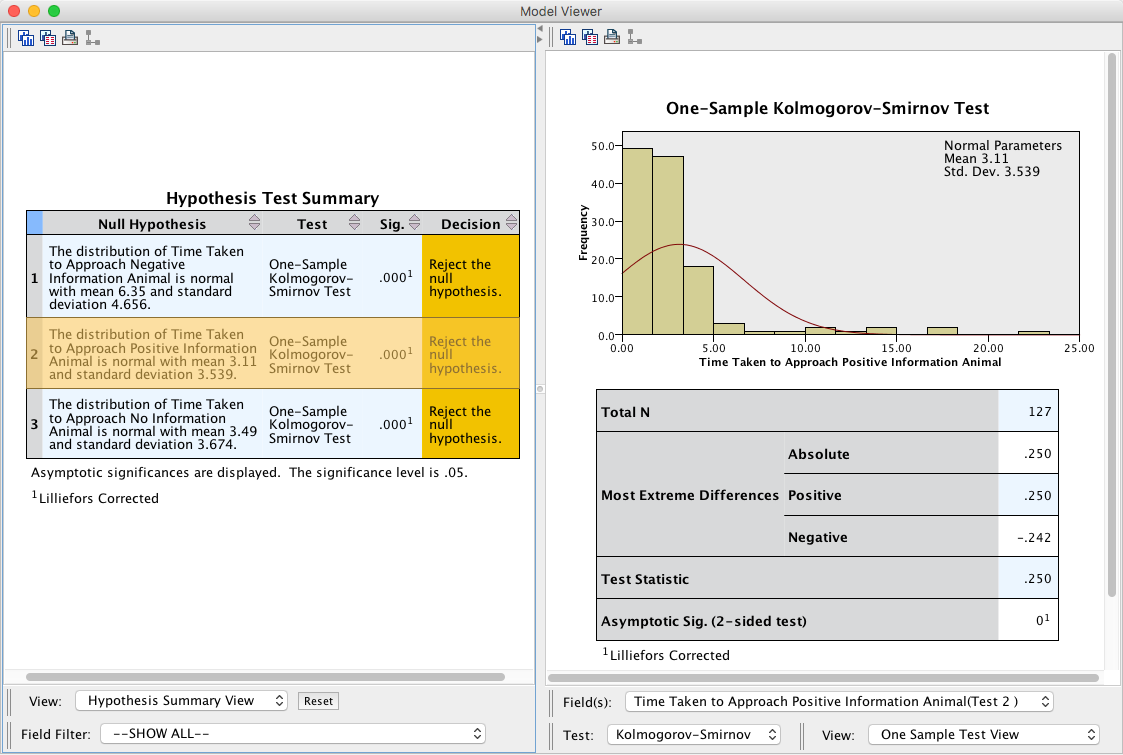
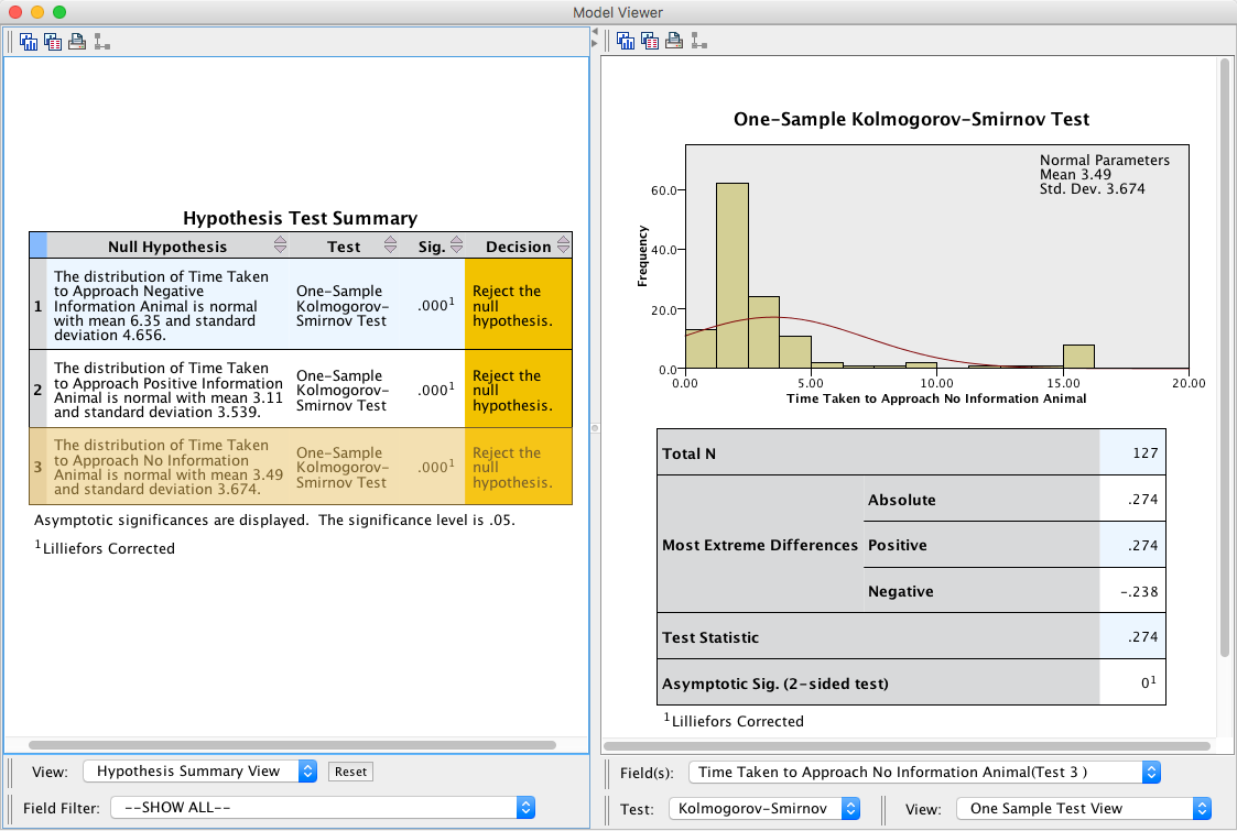
Task 15.8
Log-transform the scores in Task 7 and repeat the normality tests.
The easiest way to conduct these transformations is by executing the following syntax:
COMPUTE LogNegative=ln(bhvneg).
COMPUTE LogPositive=ln(bhvpos).
COMPUTE LogNoInformation=ln(bhvnone).
EXECUTE.
When you re-run the Kolmogorov-Smirnov tests, you will see that the state of affairs hasn’t changed much (except for the negative information animal). As an interesting aside, older versions of SPSS did not apply Lillifor’s correction, and the results suggested that the log-transformed variables could be considered normally-distributed. However, doing this many years later, SPSS applies Lillifor’s correction and the results are different!
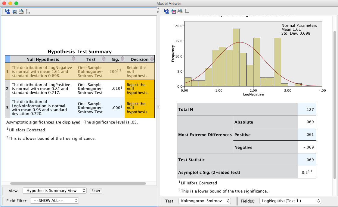
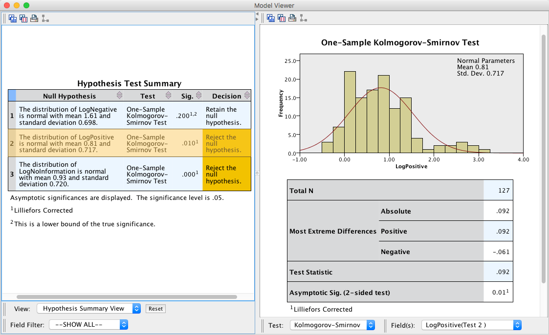
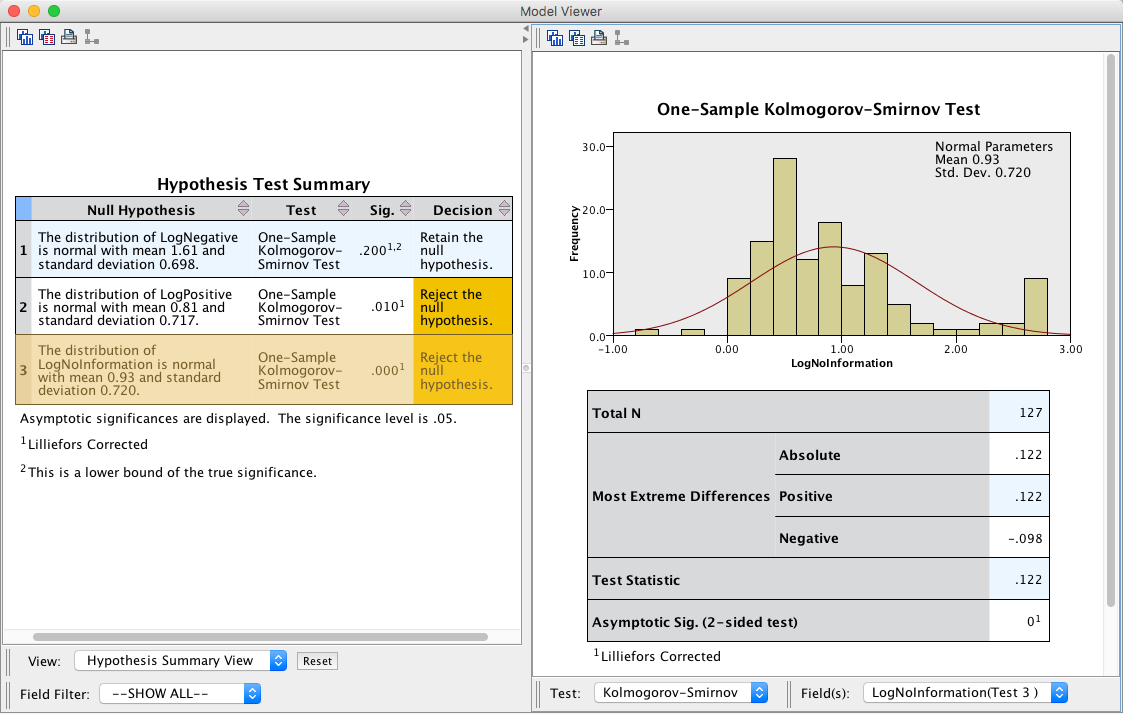
Task 15.9
Analyse the data in Task 7 with a robust model. Do children take longer to put their hands in a box that they believe contains an animal about which they have been told nasty things?
You would adapt the syntax file as follows:
mySPSSdata =  spssdata.GetDataFromSPSS(factorMode = "labels")
ID<-"code"
rmFactor<-c("bhvneg", "bhvpos", "bhvnone")

df<-melt(mySPSSdata, id.vars = ID, measure.vars = rmFactor)
names(df)[names(df) == ID] <- "id"

rmanova(df$value, df$variable, df$id, tr = 0.2)
rmmcp(df$value, df$variable, df$id, tr = 0.2)
The results from the robust model mirror the analysis that I conducted on the log-transformed values in the paper itself (in case you want to check). The main effect of the type of information was significant F(1.24, 94.32) = 78.15, p < 0.001. The post hoc tests show a significantly longer time to approach the box containing the negative information animal compared to the positive information animal, \(\hat{\psi} = 2.42, p_{\text{observed}} < 0.001, p_{\text{crit}} =0.017\), and compared to the no information box, \(\hat{\psi} = 2.07, p_{\text{observed}} < 0.001, p_{\text{crit}} =0.025\). Children also approached the box containing the positive information animal signifiacntly faster than the no information animal, \(\hat{\psi} = -0.21, p_{\text{observed}} = 0.014, p_{\text{crit}} = 0.050\).
## Warning: attributes are not identical across measure variables;
## they will be dropped
## Call:
## rmanova(y = fieldLong$latency, groups = fieldLong$info, blocks = fieldLong$code,
## tr = 0.2)
##
## Test statistic: F = 78.1521
## Degrees of freedom 1: 1.24
## Degrees of freedom 2: 94.32
## p-value: 0## Call:
## rmmcp(y = fieldLong$latency, groups = fieldLong$info, blocks = fieldLong$code,
## tr = 0.2)
##
## psihat ci.lower ci.upper p.value p.crit sig
## bhvneg vs. bhvpos 2.41558 1.71695 3.11421 0.00000 0.0169 TRUE
## bhvneg vs. bhvnone 2.07013 1.35313 2.78713 0.00000 0.0250 TRUE
## bhvpos vs. bhvnone -0.20597 -0.40537 -0.00658 0.01351 0.0500 TRUE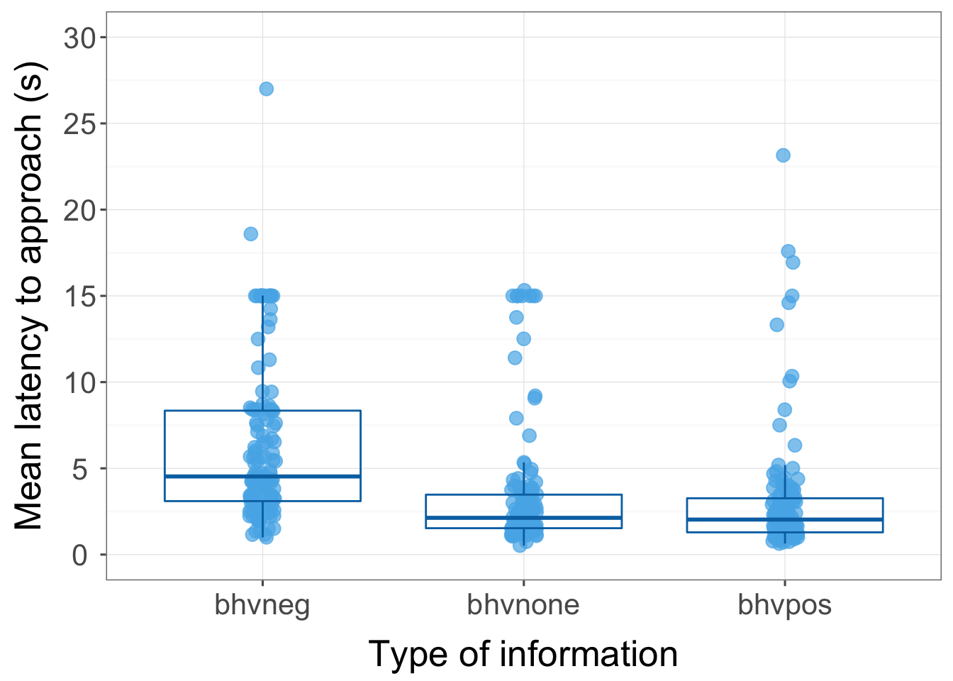
Chapter 16
General information
- Access the main dialog box for repeated-measures designs by selecting Analyze > General Linear Model > Repeated Measures …
- Remember that you can move variables in the dialog box by dragging
them, or selecting them and cliking .
Task 16.1
In the previous chapter we looked at an example in which participants viewed videos of different drink products in the context of positive, negative or neutral imagery. Men and women might respond differently to the products so reanalyse the data taking sex (a between-group variable) into account. The data are in the file MixedAttitude.sav.
To fit the model, follow the same instructions that are in the book. There is a video that runs through the process here. In addition to what’s in the video/book you must specify sex as a between-group variable by dragging it from the variable list and to the box labelled Between-Subjects Factors.
The initial output is the same as in the two-way ANOVA example in the book (previous chapter) so look there for an explanation. The results of Mauchly’s sphericity test (Output 1) shows that the main effect of drink significantly violates the sphericity assumption (W = 0.572, p = .009) but the main effect of imagery and imagery by drink interaction do not. Hoiwever, as suggested in the book, it’s a good idea to correct for sphericity regardless of Mauchley’s test so that’s what we’ll do.
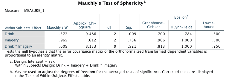
Output 1
The summary table of the repeated-measures effects (Output 2) has been edited to show only Greenhouse-Geisser corrected degrees of freedom (the book explains how to change how the layers of the table are displayed). We would expect the main effects that were previously significant to still be so (in a balanced design, the inclusion of an extra predictor variable should not affect these effects). By looking at the significance values it is clear that this prediction is true: there are still significant effects of the type of drink being rated, the type of imagery used, and the interaction of these two variables. I won’t re-explain these effects as you can look at the book. I will forcus only on the effects involving sex.
The output shows that sex interacts significantly with both the type of drink being rated, and imagery. The combined interaction between sex, imagery and drink is also significant, indicating that the way in which imagery affects responses to different types of drinks depends on whether the participant is male or female.
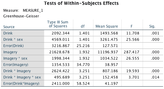
Output 2
The main effect of sex
There was a significant main effect of sex, F(1, 18) = 6.75, p = 0.018. This effect tells us that if we ignore all other variables, male participants’ ratings were significantly different than females. The table of means for the main effect of sex make clear that men’s ratings were significantly more positive than females (in general).
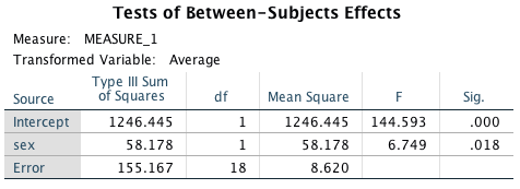
Output 3
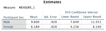
Output 4
The interaction between sex and drink
There was a significant interaction between the type of drink being rated and the sex of the participant, F(1.40, 25.22) = 25.57, p < .001 (Output 2). This effect tells us that the different types of drinks were rated differently by men and women. We can use the estimated marginal means (Output 5) to determine the nature of this interaction (I have graphed these means too). The graph shows that male (orange) and female (blue) ratings are very similar for wine and water, but men rate beer more highly than women — regardless of the type of imagery used.
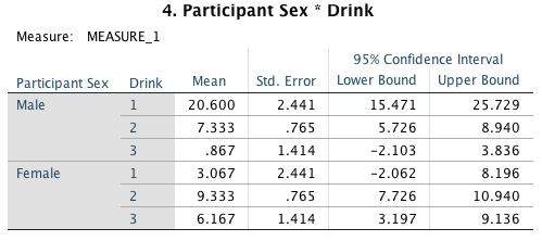
Output 5
## Warning: attributes are not identical across measure variables;
## they will be dropped
## Warning: `fun.y` is deprecated. Use `fun` instead.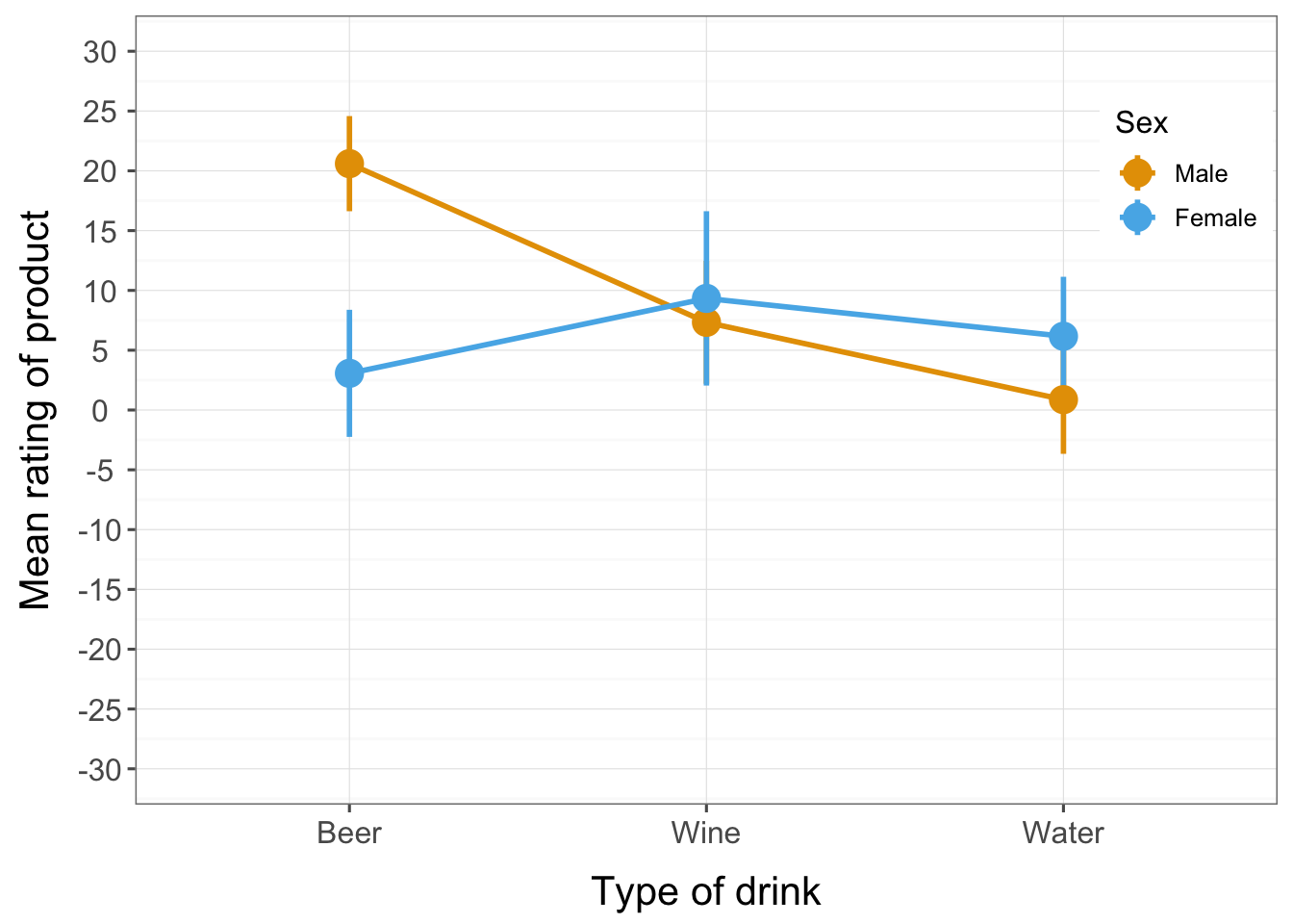
This interaction can be clarified using the contrasts specified before the analysis (Output 6).
- Drink × sex interaction 1: beer vs. water, male vs. female. The first interaction term looks at level 1 of drink (beer) compared to level 3 (water), comparing male and female scores. This contrast is highly significant, F(1, 18) = 28.97, p < .001. This result tells us that the increased ratings of beer compared to water found for men are not found for women. So, in the graph male and female ratings of water are quite similar (the points are close) but for beer they are very different (male point is much higher than the female one).
- Drink × sex interaction 2: wine vs. water, male vs. female. The second interaction term compares level 2 of drink (wine) to level 3 (water), contrasting male and female scores. There is no significant difference for this contrast, F(1, 18) = 2.34, p = 0.14, which tells us that the difference between ratings of wine compared to water in males is roughly the same as in females.
Therefore, overall, the drink sex interaction has shown up a difference between males and females in how they rate beer relative to water (regardless of the type of imagery used).
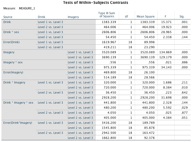
Output 6
The interaction between sex and imagery
There was a significant interaction between the type of imagery used and the sex of the participant, F(1.93, 34.77) = 26.55, p < .001). This effect tells us that the type of imagery used in the advert had a different effect on men and women. We can use the estimated marginal means to determine the nature of this interaction (Output 7), which I have graphed also. The graph shows the average male (orange) and female (blue) ratings in each imagery condition ignoring the type of drink that was rated. Male and female ratings are very similar for positive and neutral imagery, but men seem to be less affected by negative imagery than women — regardless of the drink in the advert.
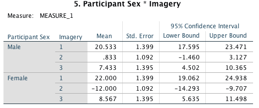
Output 7
## Warning: `fun.y` is deprecated. Use `fun` instead.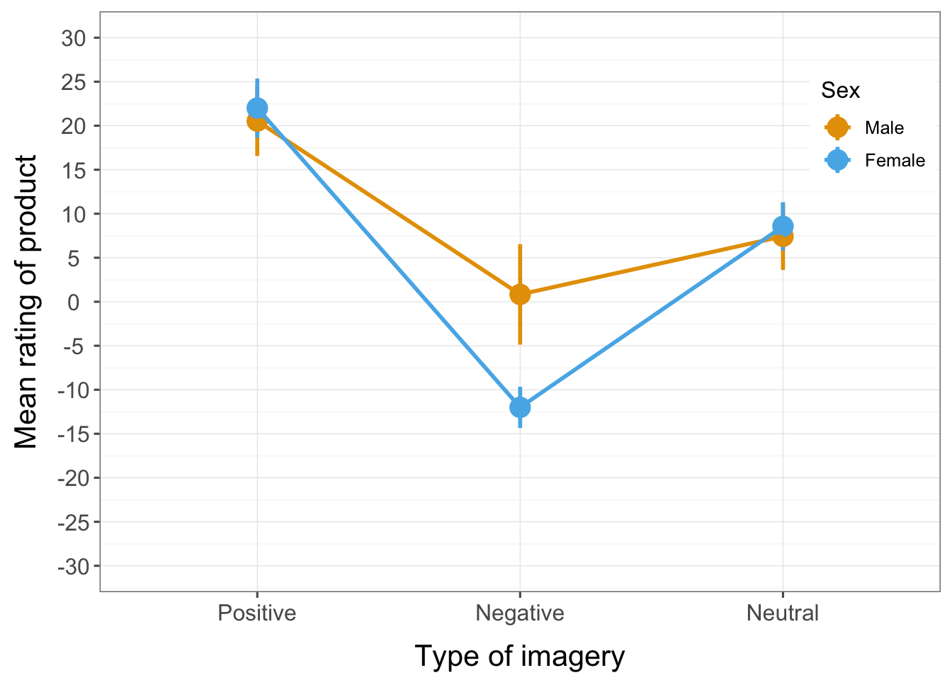 This interaction can be clarified using the contrasts specified before
the analysis (Output 6).
This interaction can be clarified using the contrasts specified before
the analysis (Output 6).
- Imagery × sex interaction 1: positive vs. neutral, male vs. female. The first interaction term looks at level 1 of imagery (positive) compared to level 3 (neutral), comparing male and female scores. This contrast is not significant F(1, 18) = 0.02, p = 0.886. This result tells us that ratings of drinks presented with positive imagery (relative to those presented with neutral imagery) were equivalent for males and females. This finding represents the fact that in the graph of this interaction the orange and blue points for both the positive and neutral conditions overlap (therefore male and female responses were the same).
- Imagery × sex interaction 2: negative vs. neutral, male vs. female. The second interaction term looks at level 2 of imagery (negative) compared to level 3 (neutral), comparing male and female scores. This contrast is highly significant, F(1, 18) = 34.13, p < .001. This result tells us that the difference between ratings of drinks paired with negative imagery compared to neutral was different for men and women. Looking at the interaction graph, this finding represents the fact that for men, ratings of drinks paired with negative imagery were relatively similar to ratings of drinks paired with neutral imagery (the orange dots have a fairly similar vertical position). However, if you look at the female ratings, then drinks were rated much less favourably when presented with negative imagery than when presented with neutral imagery (the blue dot for negative imagery is much lower than the one for neutral imagery).
Overall, the imagery sex interaction has shown up a difference between males and females in terms of their ratings of drinks presented with negative imagery compared to neutral; specifically, men seem less affected by negative imagery.
The interaction between drink and imagery
The interpretation of this interaction is the same as for the two-way design that we analysed in the chapter in the book on repeated measures designs. You may remember that the interaction reflected the fact that negative imagery has a different effect than both positive and neutral imagery. The graph shows that the pattern of response across drinks was similar when positive and neutral imagery were used (blue and grey lines). That is, ratings were positive for beer, they were slightly higher for wine and they were lower for water. The fact that the (blue) line representing positive imagery is higher than the neutral (grey) line indicates that positive imagery produced higher ratings than neutral imagery across all drinks. The red line (representing negative imagery) shows a different pattern: ratings were lowest for wine and water but quite high for beer.
## Warning: `fun.y` is deprecated. Use `fun` instead.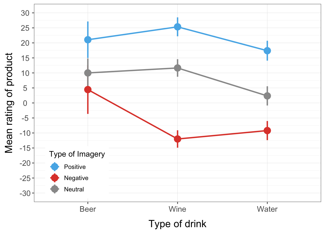
The interaction between sex, drink and imagery
The three-way interaction tells us whether the drink × imagery interaction is the same for men and women (i.e., whether the combined effect of the type of drink and the imagery used is the same for male participants as for female ones). There is a significant three-way drink × imagery × sex interaction, F(3.25, 58.52) = 3.70, p = .014. The nature of this interaction is shown up in the means (Output 8), which are also plotted below.
The male graph shows that when positive imagery is used (blue line), men generally rated all three drinks positively (the blue line is higher than the other lines for all drinks). This pattern is true of women also (the line representing positive imagery is above the other two lines). When neutral imagery is used (grey line), men rate beer very highly, but rate wine and water fairly neutrally. Women, on the other hand rate beer and water neutrally, but rate wine more positively (in fact, the pattern of the positive and neutral imagery lines show that women generally rate wine slightly more positively than water and beer). So, for neutral imagery men still rate beer positively, and women still rate wine positively. For the negative imagery (red line), the men still rate beer very highly, but give low ratings to the other two types of drink. So, regardless of the type of imagery used, men rate beer very positively (if you look at the graph you’ll note that ratings for beer are virtually identical for the three types of imagery). Women, however, rate all three drinks very negatively when negative imagery is used. The three-way interaction is, therefore, likely to reflect that men seem fairly immune to the effects of imagery when beer is being used as a stimulus, whereas women are not.
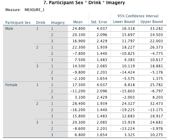
Output 8
## Warning: `fun.y` is deprecated. Use `fun` instead.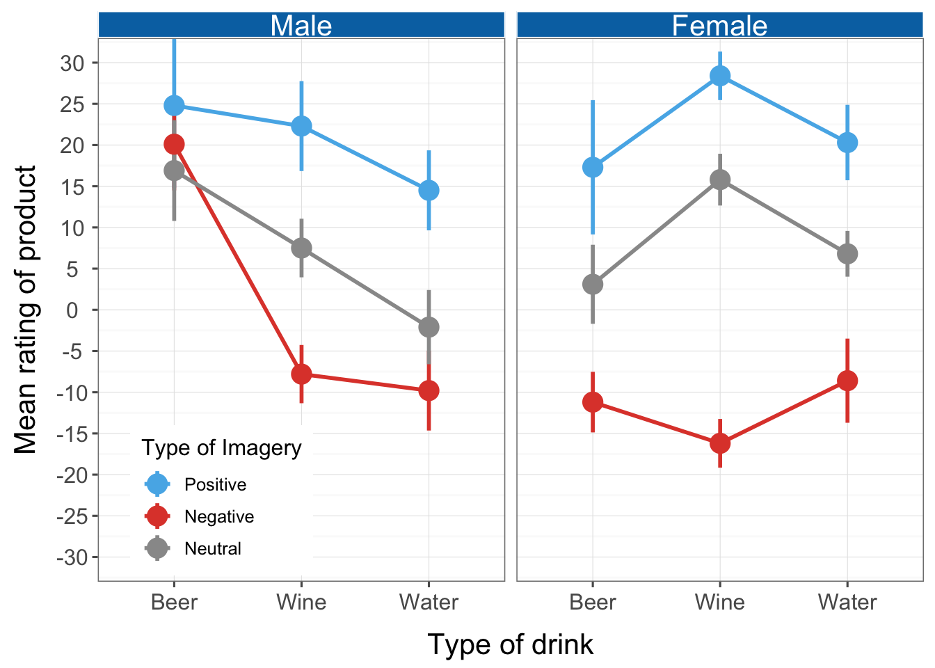
The contrasts will show up exactly what this interaction represents.
Drink × imagery × sex interaction 1: beer vs. water, positive vs. neutral imagery, male vs. female. The first interaction term compares level 1 of drink (beer) to level 3 (water), when positive imagery (level 1) is used compared to neutral (level 3) in males compared to females, F(1, 18) = 2.33, p = .144. The non-significance of this contrast tells us that the difference in ratings when positive imagery is used compared to neutral imagery is roughly equal when beer is used as a stimulus and when water is used, and these differences are equivalent in male and female participants. In terms of the interaction graph it means that the distance between the blue and grey points in the beer condition is the same as the distance between the blue and grey points in the water condition and that these distances are equivalent in men and women.
Drink × imagery × sex interaction 2: beer vs. water, negative vs. neutral imagery, male vs. female. The second interaction term looks at level 1 of drink (beer) compared to level 3 (water), when negative imagery (level 2) is used compared to neutral (level 3). This contrast is significant, F(1, 18) = 5.59, p = 0.029. This result tells us that the difference in ratings between beer and water when negative imagery is used (compared to neutral imagery) is different between men and women. In terms of the interaction graph it means that the distance between the red and grey points in the beer condition relative to the same distance for water was different in men and women.
Drink × imagery × sex interaction 3: wine vs. water, positive vs. neutral imagery, male vs. female. The third interaction term looks at level 2 of drink (wine) compared to level 3 (water), when positive imagery (level 1) is used compared to neutral (level 3) in males compared to females. This contrast is non-significant, F(1, 18) = 0.03, p = 0.877. This result tells us that the difference in ratings when positive imagery is used compared to neutral imagery is roughly equal when wine is used as a stimulus and when water is used, and these differences are equivalent in male and female participants. In terms of the interaction graph it means that the distance between the blue and grey points in the wine condition is the same as the corresponding distance in the water condition and that these distances are equivalent in men and women.
Drink × imagery × sex interaction 4: wine vs. water, negative vs. neutral imagery, male vs. female. The final interaction term looks at level 2 of drink (wine) compared to level 3 (water), when negative imagery (level 2) is used compared to neutral (level 3). This contrast is very close to significance, F(1, 18) = 4.38, p = .051. This result tells us that the difference in ratings between wine and water when negative imagery is used (compared to neutral imagery) is different between men and women (although this difference has not quite reached significance). In terms of the interaction graph it means that the distance between the red and grey points in the wine condition relative to the same distance for water was different (depending on how you interpret a p of 0.051) in men and women. It is noteworthy that this contrast was close to the 0.051 threshold. At best, this result is suggestive and not definitive.
Task 16.2
Text messaging and Twitter encourage communication using abbreviated forms of words (if u no wat I mean). A researcher wanted to see the effect this had on children’s understanding of grammar. One group of 25 children was encouraged to send text messages on their mobile phones over a six-month period. A second group of 25 was forbidden from sending text messages for the same period (to ensure adherence, this group were given armbands that administered painful shocks in the presence of a phone signal). The outcome was a score on a grammatical test (as a percentage) that was measured both before and after the experiment. The data are in the file TextMessages.sav. Does using text messages affect grammar?
The line chart shows the mean grammar score (and 95% confidence interval) before and after the experiment for the text message group and the controls. It’s clear that in the text message group grammar scores went down over the six-month period whereas they remained fairly static for the controls.
## Warning: attributes are not identical across measure variables;
## they will be dropped
## Warning: `fun.y` is deprecated. Use `fun` instead.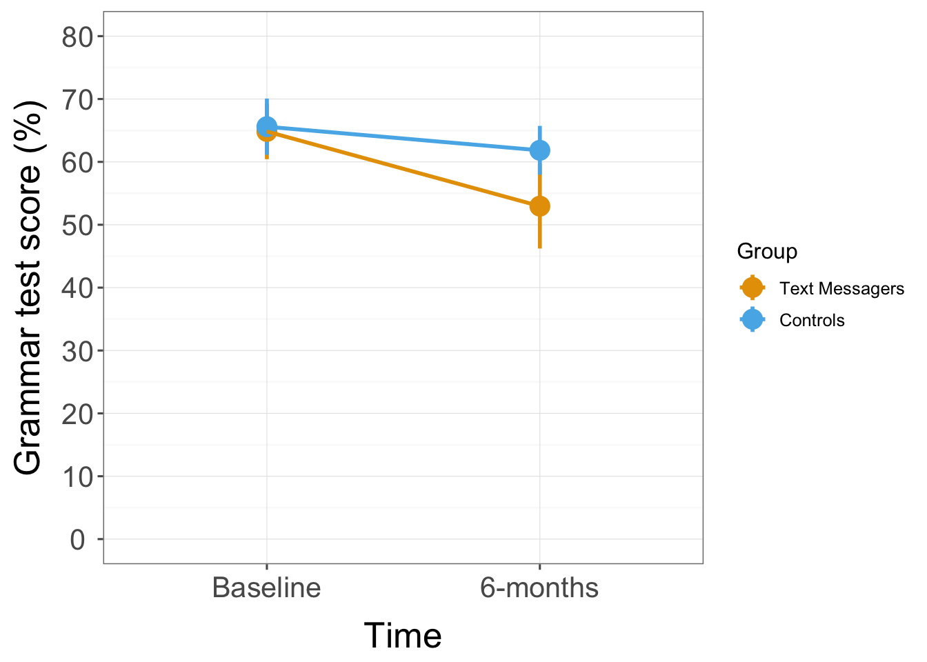
The basic analysis is achieved by following the general instructions and setting up the initial dialog boxes as follows (for more detailed instructions see the book):
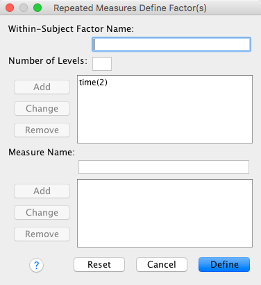
Completed dialog box
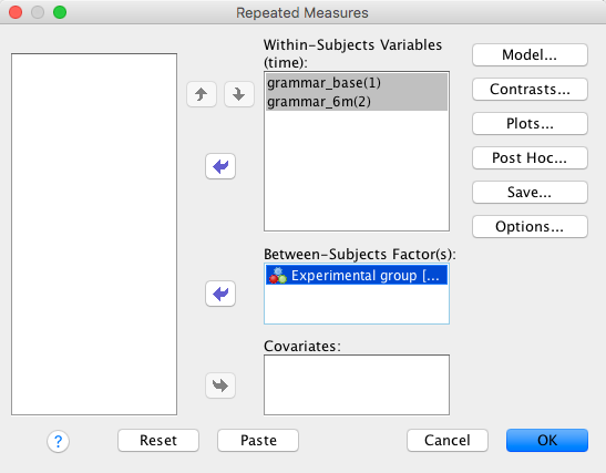
Completed dialog box
The output shows the table of descriptive statistics; the table has means at baseline split according to whether the people were in the text messaging group or the control group, and then the means for the two groups at follow-up. These means correspond to those plotted in the graph above.
Output
For a mixed design we should check the assumptions of sphericity and homogeneity of variance. In this case, we have only two levels of the repeated measure so the assumption of sphericity does not apply. Levene’s test produces a different test for each level of the repeated-measures variable (see Output). The homogeneity assumption has to hold for every level of the repeated-measures variable. At both levels of time, Levene’s test is non-significant (p = 0.77 before the experiment and p = .069 after the experiment). To the extent that Levene’s is useful in testing this assumption we might conclude that the assumption has not been broken (although we might want to take a closer look for the follow-up scores).
Output
The main effect of time is significant, so we can conclude that grammar scores were significantly affected by the time at which they were measured. The exact nature of this effect is easily determined because there were only two points in time (and so this main effect is comparing only two means).
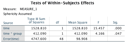
Output
The means show that grammar scores were higher before the experiment than at follow-up: before the experimental manipulation scores were higher than after, meaning that the manipulation had the net effect of significantly reducing grammar scores. This main effect seems interesting until you consider that these means include both text messagers and controls. There are three possible reasons for the drop in grammar scores: (1) the text messagers got worse and are dragging down the mean after the experiment; (2) the controls somehow got worse; or (3) the whole group just got worse and it had nothing to do with whether the children text-messaged or not. Until we examine the interaction, we won’t see which of these is true.
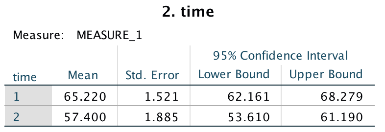
Output
The main effect of group has a p-value probabilityof .09, which is just above the critical value of .05. We should conclude that there was no significant main effect on grammar scores of whether children text-messaged or not.
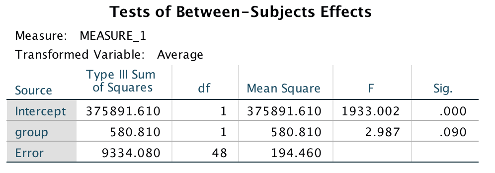
Output
Again, this effect seems interesting enough, and mobile phone companies might certainly choose to cite it as evidence that text messaging does not affect your grammatical ability. However, remember that this main effect ignores the time at which grammatical ability is measured. It just means that if we took the average grammar score for text messagers (that’s including their score both before and after they started using their phone), and compared this to the mean of the controls (again including scores before and after) then these means would not be significantly different. The graph shows that when you ignore the time at which grammar was measured, the controls have slightly better grammar than the text messagers, but not significantly so.
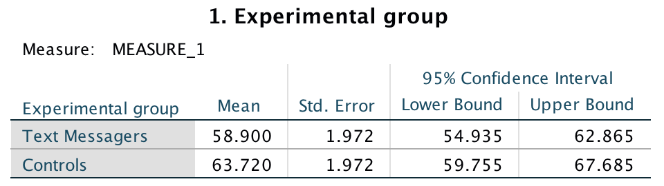
Output
Main effects are not always that interesting and should certainly be viewed in the context of any interaction effects. The interaction effect in this example is shown by the F-statistic in the row labelled **Time*Group**, and because the p-value is .047, which is just less than the criterion of .05, we might conclude that there is a significant interaction between the time at which grammar was measured and whether or not children were allowed to text-message within that time. The mean ratings in all conditions help us to interpret this effect. Looking at the earlier interaction graph, we can see that although grammar scores fell in controls, the drop was much more marked in the text messagers; so, text messaging does seem to ruin your ability at grammar compared to controls.
We can report the three effects from this analysis as follows: * he results show that the grammar ratings at the end of the experiment were significantly lower than those at the beginning of the experiment, F(1, 48) = 15.46, p < .001, r = .61. * The main effect of group on the grammar scores was non-significant, F(1, 48) = 2.99, p = .09, r = .27. This indicated that when the time at which grammar was measured is ignored, the grammar ability in the text message group was not significantly different from the controls. * The time group interaction was significant, F(1, 48) = 4.17, p = .047, r = .34, indicating that the change in grammar ability in the text message group was significantly different from the change in the control groups. These findings indicate that although there was a natural decay of grammatical ability over time (as shown by the controls) there was a much stronger effect when participants were encouraged to use text messages. This shows that using text messages accelerates the inevitable decline in grammatical ability.
Task 16.3
A researcher hypothesized that reality TV show contestants start off with personality disorders that are exacerbated by being forced to spend time with people as attention-seeking as them (see Chapter 1). To test this hypothesis, she gave eight contestants a questionnaire measuring personality disorders before and after they entered the show. A second group of eight people were given the questionnaires at the same time; these people were short-listed to go on the show, but never did. The data are in RealityTV.sav. Does entering a reality TV competition give you a personality disorder?
The plot shows that in the contestant group the mean personality disorder score increased from time 1 (before entering the house) to time 2 (after leaving the house). However, in the no contestant group the mean personality disorder score decreased over time.
## Warning: attributes are not identical across measure variables;
## they will be dropped
## Warning: `fun.y` is deprecated. Use `fun` instead.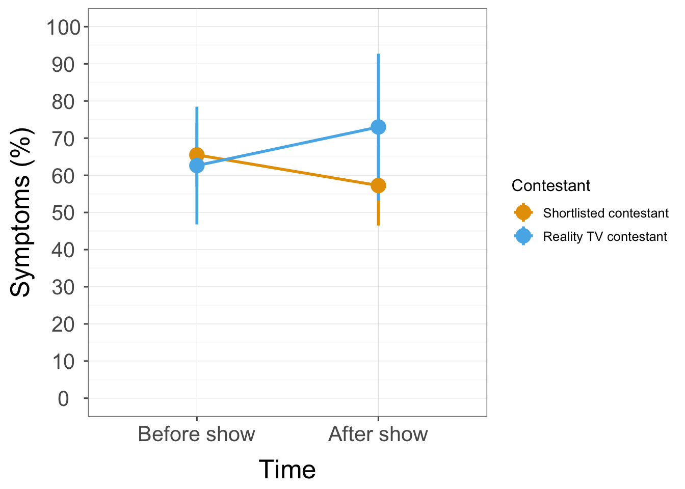
The basic analysis is achieved by following the general instructions and setting up the initial dialog boxes as follows (for more detailed instructions see the book):
Completed dialog box
Completed dialog box
The descriptive statistics shows the mean personality disorder symptom (PDS) scores before going on reality TV split according to whether the people were a contestant or not, and then the means for the two groups after leaving the house. These means correspond to those plotted above.
Output
For sphericity to be an issue we need at least three conditions. We have only two conditions here so sphericity does not need to be tested. We do need to check the homogeneity of variance assumption. Levene’s test produces a different test for each level of the repeated-measures variable. In mixed designs, the homogeneity assumption has to hold for every level of the repeated-measures variable. At both levels of time, Levene’s test is non-significant (p = 0.061 before entering the show and p = .088 after leaving). This means the assumption has not been significantly broken (but it was quite close to being a problem).
Output
The main effect of time is not significant, so we can conclude that PDS scores were not significantly affected by the time at which they were measured. The means show that symptom levels were cmparable before entering the show (M = 64.06) and after (M = 65.13).
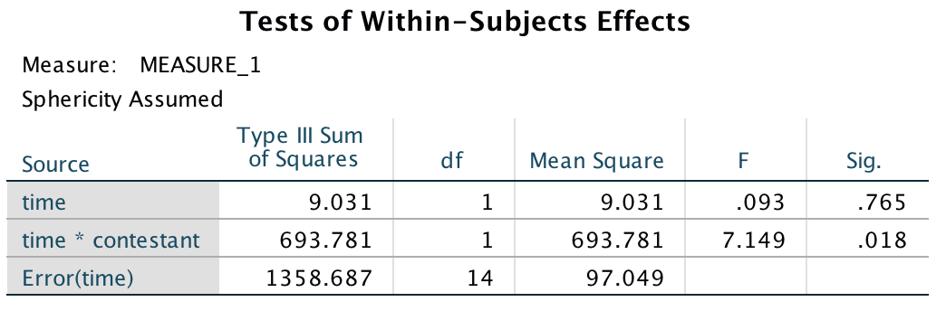
Output
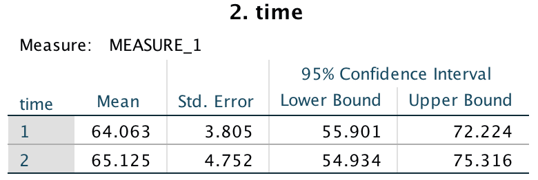
Output
The main effect of contestant has a p-value of .43, which is above the critical value of .05. Therefore, most people would conclude that there was no significant main effect on PDS scores of whether the person was a contestant or not. The means shows that when you ignore the time at which PDS was measured, the contestants and shortlist are not significantly different.
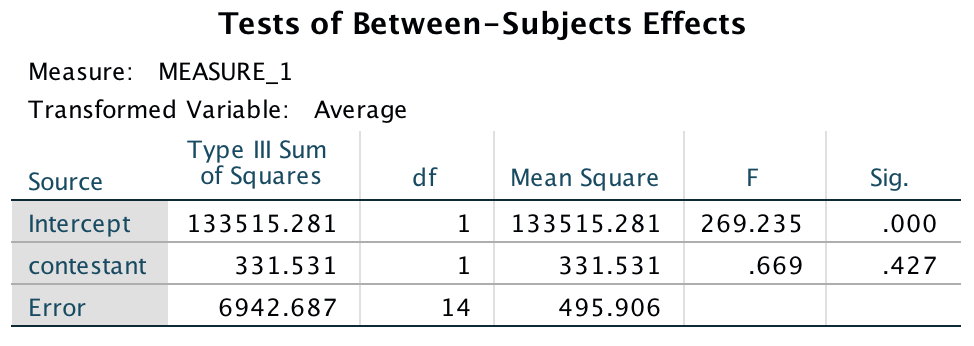
Output
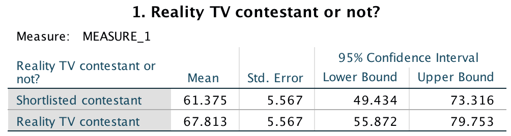
Output
The interaction effect in this example is shown by the F-statistic in the row labelled **time*contestant** (see earlier), and because the p-value is .018, which is less than the criterion of .05, most people would conclude that there is a significant interaction between the time at which PDS was measured and whether or not the person was a contestant. The mean ratings in all conditions (and on the interaction graph) help us to interpret this effect. The significant interaction seems to indicate that for controls PDS scores went down (slightly) from before entering the show to after leaving it, but for contestants these opposite is true: PDS scores increased over time.
We can report the three effects from this analysis as follows: * The main effect of group was not significant, F(1, 14) = 0.67, p = .43, indicating that across both time points personality disorder symptoms were similar in reality TV contestants and shortlist controls. * The main effect of time was not significant, F(1, 14) = 0.09, p = .77, indicating that across all participants personality disorder symptoms were similar before the show and after it. * The time × group interaction was significant, F(1, 14) = 7.15, p = .018, indicating that although personality disorder symptoms decreased for shortlist controls from before the show to after, scores increased for the contestants.
Task 16.4
Angry Birds is a video game in which you fire birds at pigs. Some daft people think this sort of thing makes people more violent. A (fabricated) study was set up in which people played Angry Birds and a control game (Tetris) over a two-year period (one year per game). They were put in a pen of pigs for a day before the study, and after 1 month, 6 months and 12 months. Their violent acts towards the pigs were counted. Does playing Angry Birds make people more violent to pigs compared to a control game? (Angry Pigs.sav)
To answer this question we need to conduct a 2 (BaselineGame: Angry Birds vs. Tetris) × 4 (Time: Baseline, 1 month, 6 months and 12 months) two-way mixed ANOVA with repeated measures on the time variable. Follow the general instructions for this chapter. Your completed dialog boxes should look like this:
Completed dialog box
Completed dialog box
The plot of the angry pigs data shows that when participants played Tetris in general their aggressive behaviour towards pigs decreased over time but when participants played Angry Birds, their aggressive behaviour towards pigs increased over time.
## Warning: attributes are not identical across measure variables;
## they will be dropped
## Warning: `fun.y` is deprecated. Use `fun` instead.
The output shows the means for the interaction between Game and time These values correspond with those plotted above.
Output
When we use a mixed design we have to check both the assumptions of sphericity and homogeneity of variance. Mauchly’s test for our repeated-measures variable Time has a value in the column labelled Sig of .170, which is larger than the cut off of .05, therefore it is non-significant.
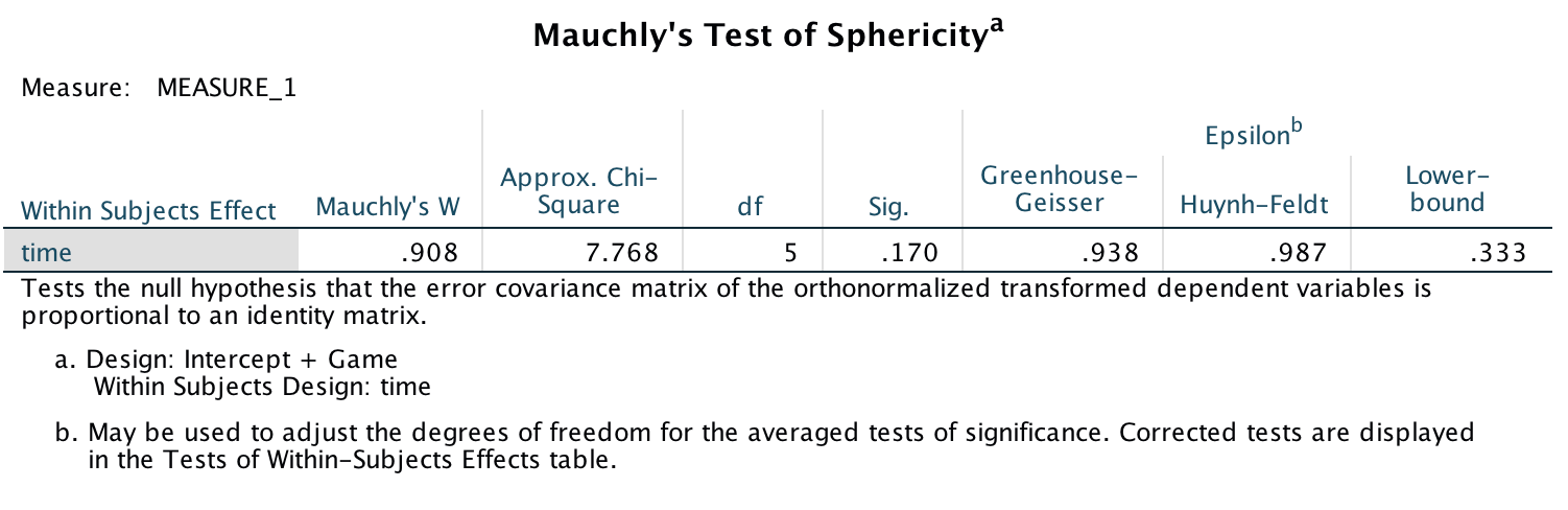
Output
Levene’s test produces a different test for each level of the repeated-measures variable. In mixed designs, the homogeneity assumption has to hold for every level of the repeated-measures variable. At each level of the variable Time, Levene’s test is significant (p < .05 in every case). This means the assumption has been broken.
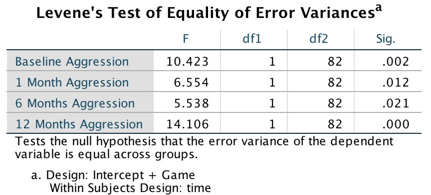
Output
The main effect of Game was significant, indicating that (ignoring the time at which the aggression scores were measured), the type of game being played significantly affected participant’s aggression towards pigs.
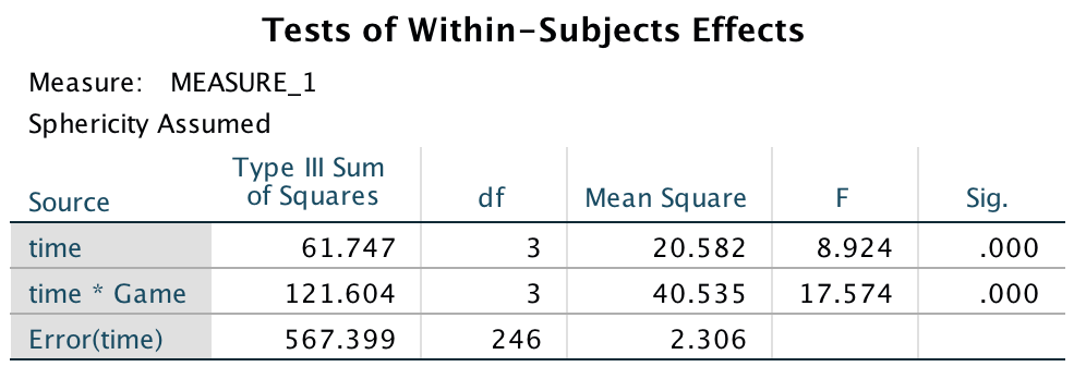
Output
The main effect of Time was also significant, so we can conclude that (ignoring the type of game being played), aggression was significantly different at different points in time. However, the effect that we are most interested in is the Time × Game interaction, which was also significant. This effect tells us that changes in aggression scores over time were different when participants played Tetris compared to when they played Angry Birds. Looking at the graph, we can see that for Angry Birds, aggression scores increase over time, whereas for Tetris, aggression scores decreased over time.
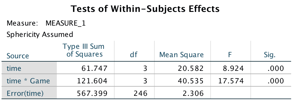
Output
To investigate the exact nature of this interaction effect we can look at some contrasts. I chose to use the repeated contrast, which compare aggression scores for the two games at each time point against the previous time point.
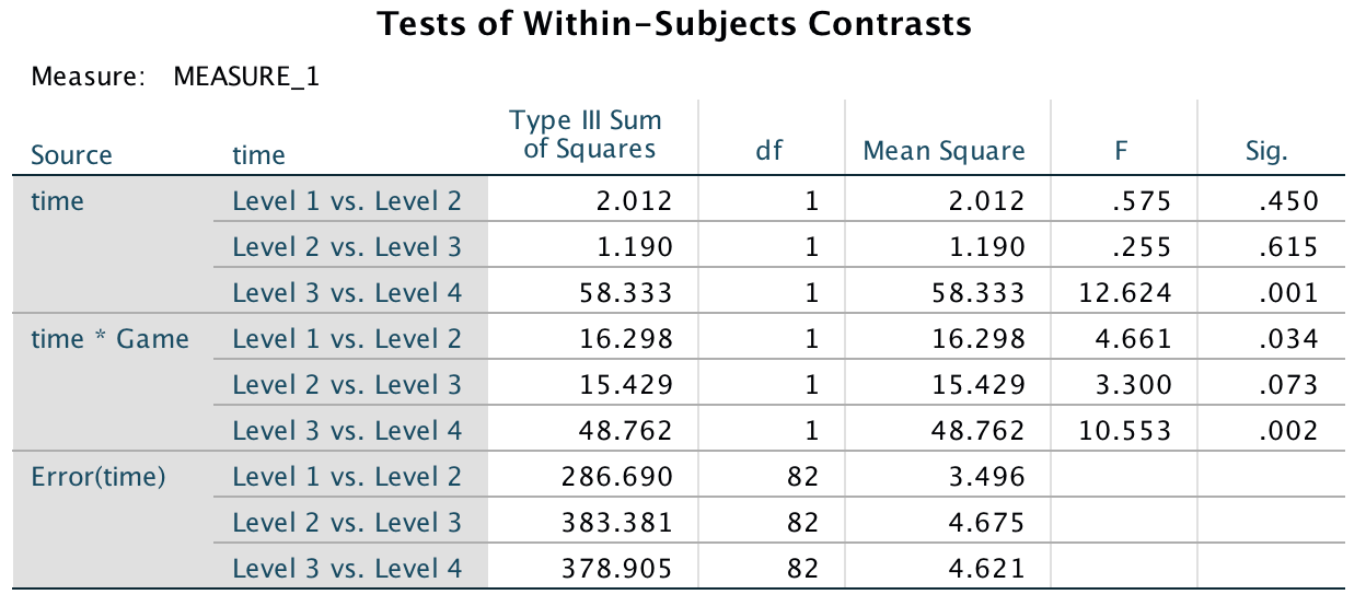
Output
We are most interested in the Time × Game interaction. We can see that the first contrast (Level 1 vs. Level 2) was significant, p = .034, indicating that the change in aggression scores from the baseline to 1 month was significantly different for Tetris and Angry birds. If we look at the plot, we can see that on average, aggression scores decreased from baseline to 1 month when participants played Tetris. However, aggression scores increased from baseline to 1 month when participants played Angry Birds. The second contrast (Level 2 vs. Level 3) was non-significant (p = .073), indicating that the change in aggression scores from 1 month to 6 months was similar when participants played Tetris compared to when they played Angry Birds. Looking at the plot, we can see that aggression scores increased for Angry Birds but decreased for Tetris – according to the contrast, not significantly so. The final contrast (Level 3 vs. Level 4) was significant, p = .002. Again looking at the plot, we can see that for Angry Birds aggression scores increased dramatically from 6 to 12 months, whereas for Tetris they stayed fairly stable.
We can report the three effects from this analysis as follows: * The results show that the aggression scores were significantly higher when participants played Angry Birds compared to when they played Tetris, F(1, 82) = 12.87, p = .001. * The main effect of Time on the aggression scores was significant, F(3, 246) = 8.92, p < .001. This indicated that when the game which participants played is ignored, aggressive behaviour was significantly different across the four time points. * The time game interaction was significant, F(3, 246) = 17.57, p < .001, indicating that the change in aggression scores when participants played Tetris was significantly different from the change in aggression scores when they played Angry Birds. Looking at the line graph, we can see that these findings indicate that when participants played Tetris, their aggressive behaviour towards pigs significantly decreased over time, whereas when they played Angry birds their aggressive behaviour towards pigs significantly increased over time.
Task 16.5
A different study was conducted with the same design as in Task 4. The only difference was that the participant’s violent acts in real life were monitored before the study, and after 1 month, 6 months and 12 months. Does playing Angry Birds make people more violent in general compared to a control game? (Angry Real.sav)
The plot below shows the mean aggressive acts after playing the two games. Compare this plot with the one in the previous task and you can see that aggressive behaviour in the real world was more erratic for the two video games than aggressive behaviour towards pigs. For Tetris, aggressive behaviour in the real world increased from time 1 (baseline) to time 3 (6 months) and then decreased from time 3 (6 months) to time 4 (12 months). For Angry Birds, aggressive behaviour in the real world initially increased from baseline to 1 month, it then decreased from 1 month to 6 months and then dramatically increased from 6 months to 12 months. The plot also shows that the means are very similar for the two games at each time point.
## Warning: attributes are not identical across measure variables;
## they will be dropped
## Warning: `fun.y` is deprecated. Use `fun` instead.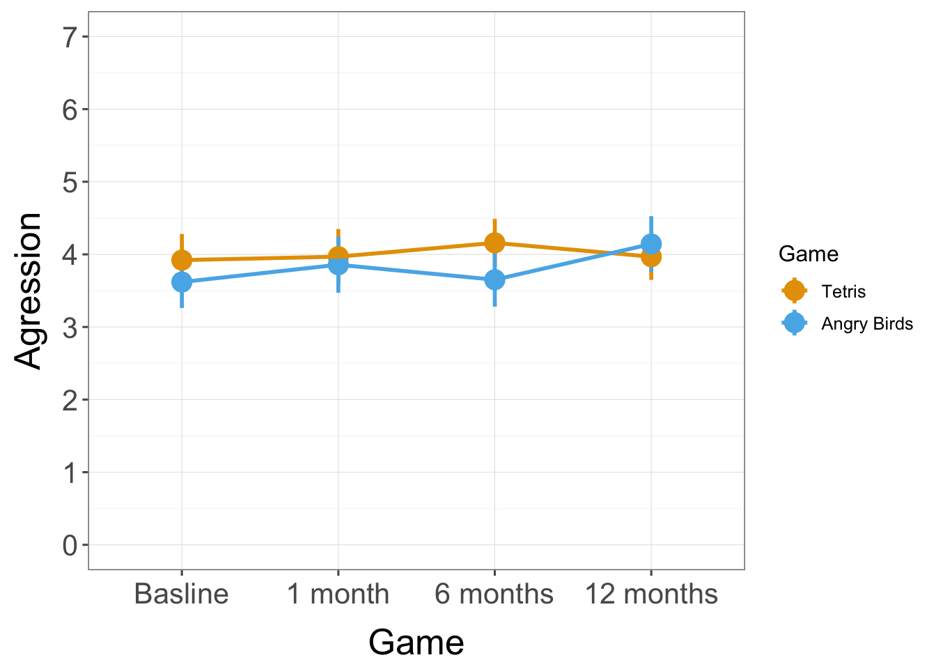
To fit the model follow the instructions for the previous task.
Not that I particularly recommend basing your life decisions on Mauchley’s and Levene’s tests, Mauchly’s test is not significant (p = 0.808) and Levene’s is similarly non-significant for all but the final timepoint. More important (for sphericity) the estimates themselves are effectively 1, indicating no deviation from sphericity.
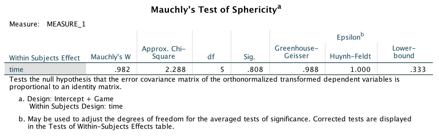
Output
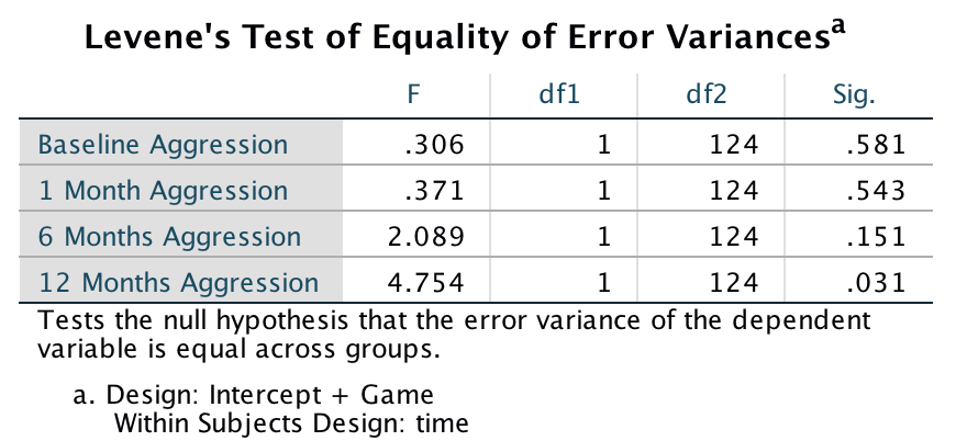
Output
The remaining 2 outputs show the effects in the model. The main effect of Game is non-significant, indicating that (ignoring the time at which the aggression scores were measured), the type of game being played did not significantly affect participants’ aggression in the real world. The main effect of Time is also non-significant, so we can conclude that (ignoring the type of game being played), aggression was not significantly different at different points in time. The effect that we are most interested in is the Time × Game interaction, which like the main effects is non-significant. This effect tells us that change in aggression scores over time were not significantly different when participants played Tetris compared to when they played Angry Birds. Because none of the effects were significant it doesn’t make sense to conduct any contrasts. Therefore, we can conclude that playing Angry Birds does not make people more violent in general, just towards pigs.
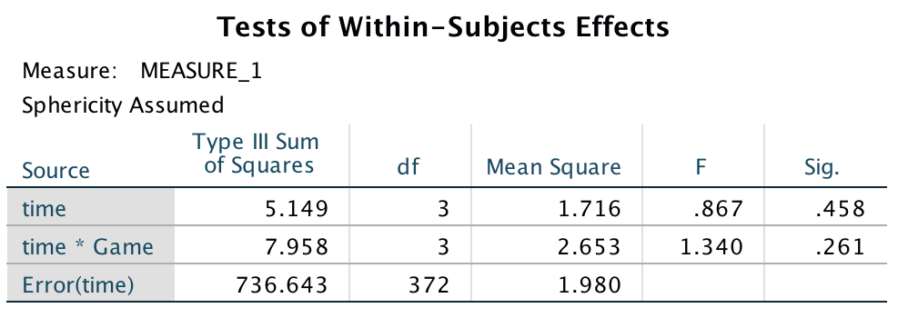
Output
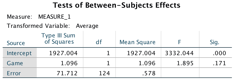
Output
Task 16.6
My wife believes that she has received fewer friend requests from random men on Facebook since she changed her profile picture to a photo of us both. Imagine we took 40 women who had profiles on a social networking website; 17 of them had a relationship status of ‘single’ and the remaining 23 had their status as ‘in a relationship’ (relationship_status). We asked these women to set their profile picture to a photo of them on their own (alone) and to count how many friend request they got from men over 3 weeks, then to switch it to a photo of them with a man (couple) and record their friend requests from random men over 3 weeks. Fit a model to see if friend requests are affected by relationship status and type of profile picture (ProfilePicture.sav).
We need to run a 2 (relationship_status: single vs. in a relationship) 2(photo: couple vs. alone) mixed ANOVA with repeated measures on the second variable. Follow the general instructions for this chapter. Your completed dialog boxes should look like this:
Completed dialog box
Completed dialog box
The plot below shows the two-way interaction between relationship status and profile picture. It shows that in both photo conditions, single women received more friend requests than women who were in a relationship. The number of friend requests increased in both single women and those who were in a relationship when they displayed a profile picture of themselves alone compared to with a partner. However, for single women this increase was greater than for women who were in a relationship.
## Warning: attributes are not identical across measure variables;
## they will be dropped
## Warning: `fun.y` is deprecated. Use `fun` instead.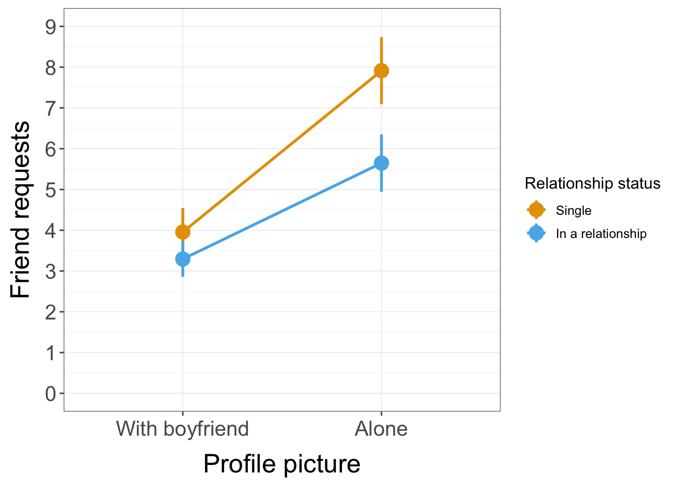
We have only two repeated-measures conditions here so sphericity is not an issue (see the book). Levene’s test shows no heterogeneity of variance (although in such a small sample it will be hideously underpowered to detect a problem).
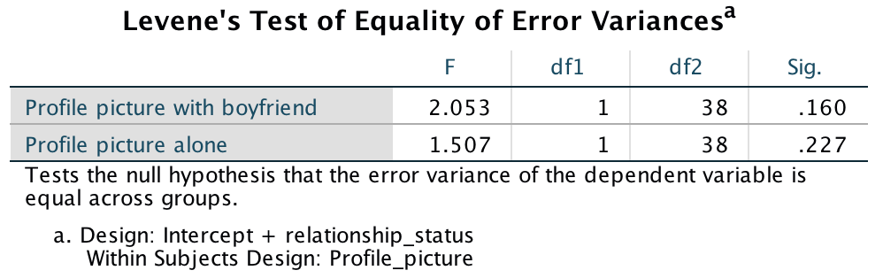
Output
The main effect of relationship_status is significant, so we can conclude that, ignoring the type of profile picture, the number of friend requests was significantly affected by the relationship status of the woman. The exact nature of this effect is easily determined because there were only two levels of relationship status (and so this main effect is comparing only two means).
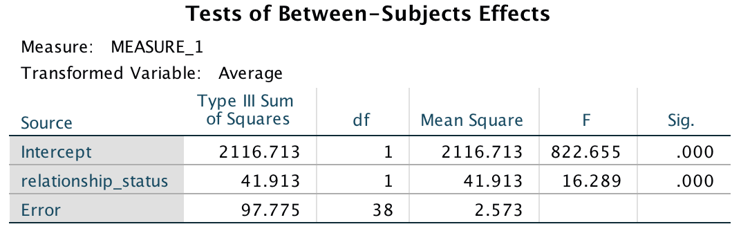
Output
Looking at the estimated marginal means we can see that the number of friend requests was significantly higher for single women (M = 5.94) compared to women who were in a relationship (M = 4.47).
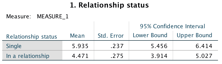
Output
The main effect of Profile_picture is also significant. Therefore, we can conclude that when ignoring relationship status, there was a significant main effect of whether the person was alone in their profile picture or with a partner on the number of friend requests.
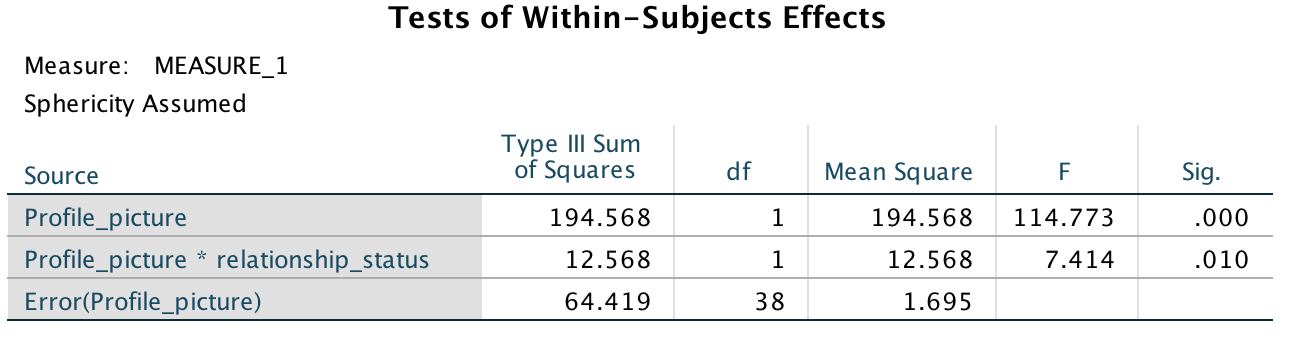
Output
Looking at the estimated marginal means for the profile picture variable, we can see that the number of friend requests was significantly higher when women were alone in their profile picture (M = 6.78) than when they were with a partner (M = 3.63). Note: we know that 1 = ‘in a couple’ and 2 = ‘alone’ because this is how we coded the levels of the profile picture variable in the define dialog box (in Figure 20)see above).
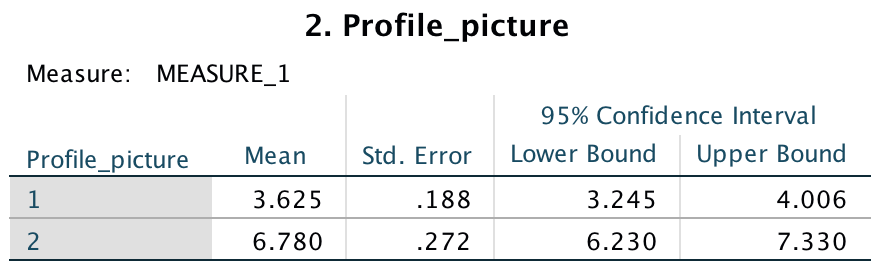
Output
The interaction effect is the effect that we are most interested in and it is also significant (p = .010 in one of the outputs above). We would conclude that there is a significant interaction between the relationship status of women and whether they had a photo of themselves alone or with a partner. The interaction graph (see earlier) help us to interpret this effect. The significant interaction seems to indicate that when displaying a photo of themselves alone rather than with a partner, the number of friend requests increases in both women in a relationship and single women. However, for single women this increase is greater than for women who are in a relationship.
We can report the three effects from this analysis as follows:
- The main effect of relationship status was significant, F(1, 38) = 16.29, p < .001, indicating that single women received more friend requests than women who were in a relationship, regardless of their type of profile picture.
- The main effect of profile picture was significant, F(1, 38) = 114.77, p < .001, indicating that across all women, the number of friend requests was greater when displaying a photo alone rather than with a partner.
- The relationship status × profile picture interaction was significant, F(1, 38) = 7.41, p = .010, indicating that although number of friend requests increased in all women when they displayed a photo of themselves alone compared to when they displayed a photo of themselves with a partner, this increase was significantly greater for single women than for women who were in a relationship.
Task 16.7
Labcoat Leni described a study by Johns, Hargrave, and Newton-Fisher (2012) in which they reasoned that if red was a proxy signal to indicate sexual proceptivity then men should find red female genitalia more attractive than other colours. They also recorded the men’s sexual experience (Partners) as ‘some’ or ‘very little’. Fit a model to test whether attractiveness was affected by genitalia colour (PalePink, LightPink, DarkPink, Red) and sexual experience (Johns et al. (2012).sav). Look at page 3 of Johns et al. to see how to report the results.
We need to run a 2 (sexual experience: very little vs. some) × 4(genital colour: pale pink, light pink, dark pink, red) mixed ANOVA with repeated measures on the second variable. Follow the general instructions for this chapter. Your completed dialog boxes should look like this:
Completed dialog box
Completed dialog box
Because the theory predicted that red should be the most attractive colour I also asked fora s imple contrast comparing each colour to red:
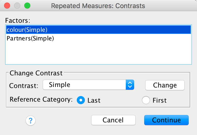
Completed dialog box
The plot below shows the two-way interaction between sexual experience and colour. It shows that overall attractiveness ratings were higher for pink colours than red and this appears relatively unaffected by sexual experience.
## Warning: attributes are not identical across measure variables;
## they will be dropped
## Warning: `fun.y` is deprecated. Use `fun` instead.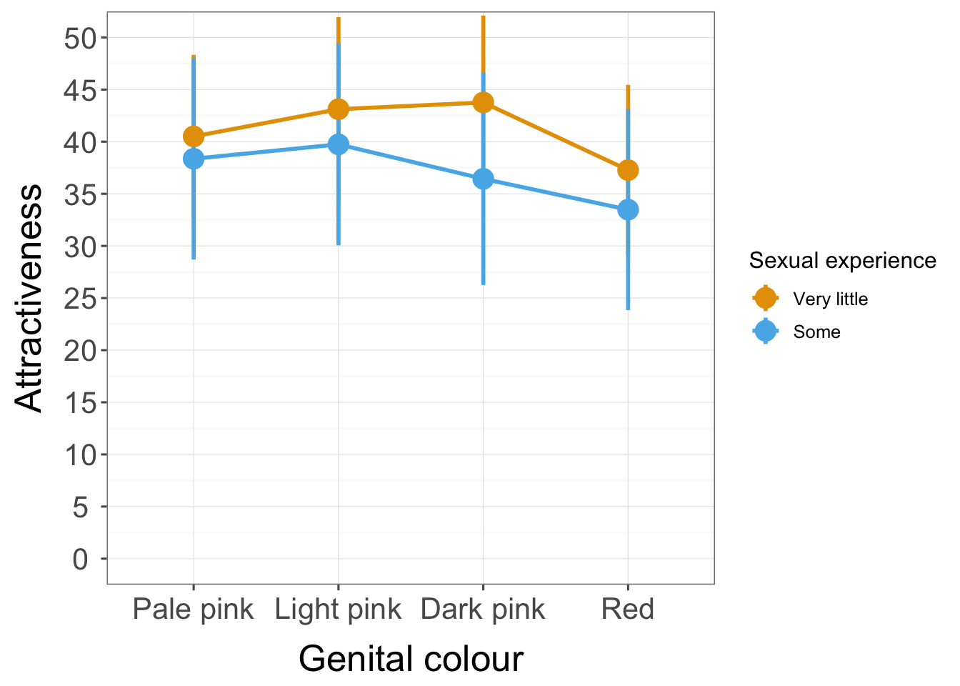
The Mauchley test is significant (and the estimates of sphericity are less than 1) suggesting that we should use Greenhouse-Geisser corrected values. The authors actually report the multivariate tests, which is another appropriate way to deal with a lack of sphericity (because multivariate tests do not assume it).
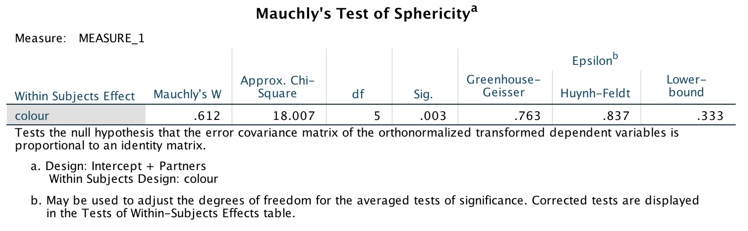
Output
Levene’s test shows no heterogeneity of variance (although in such a small sample it will be hideously underpowered to detect a problem).
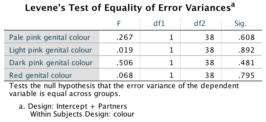
Output
The main effect of colour is significant, so we can conclude that, ignoring sexual experience, attractiveness ratings were significantly affected by the genital colour. We’ll explore this below. The colour × Partners interaction is not significant suggesting that the effect of colour is not significantly moderated by sexual exoperience (p = .121).
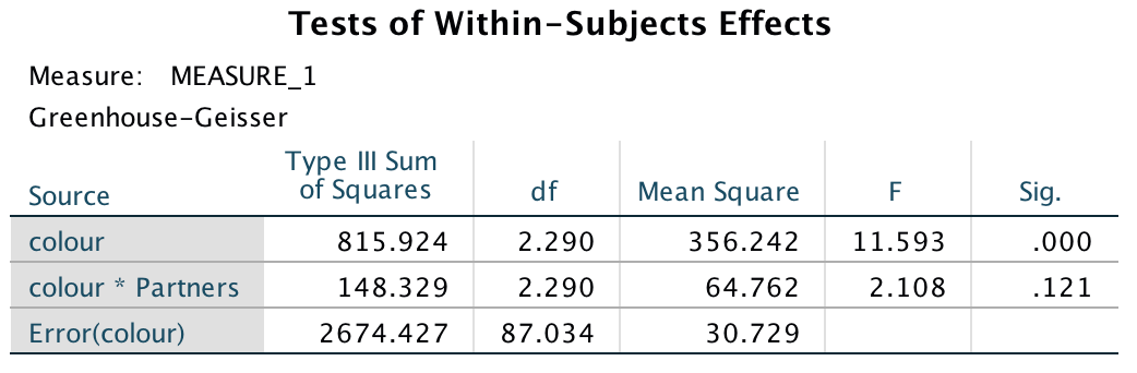
Output
The authors actually report the multivariate tests for the main effect of colour which are reporduced here:
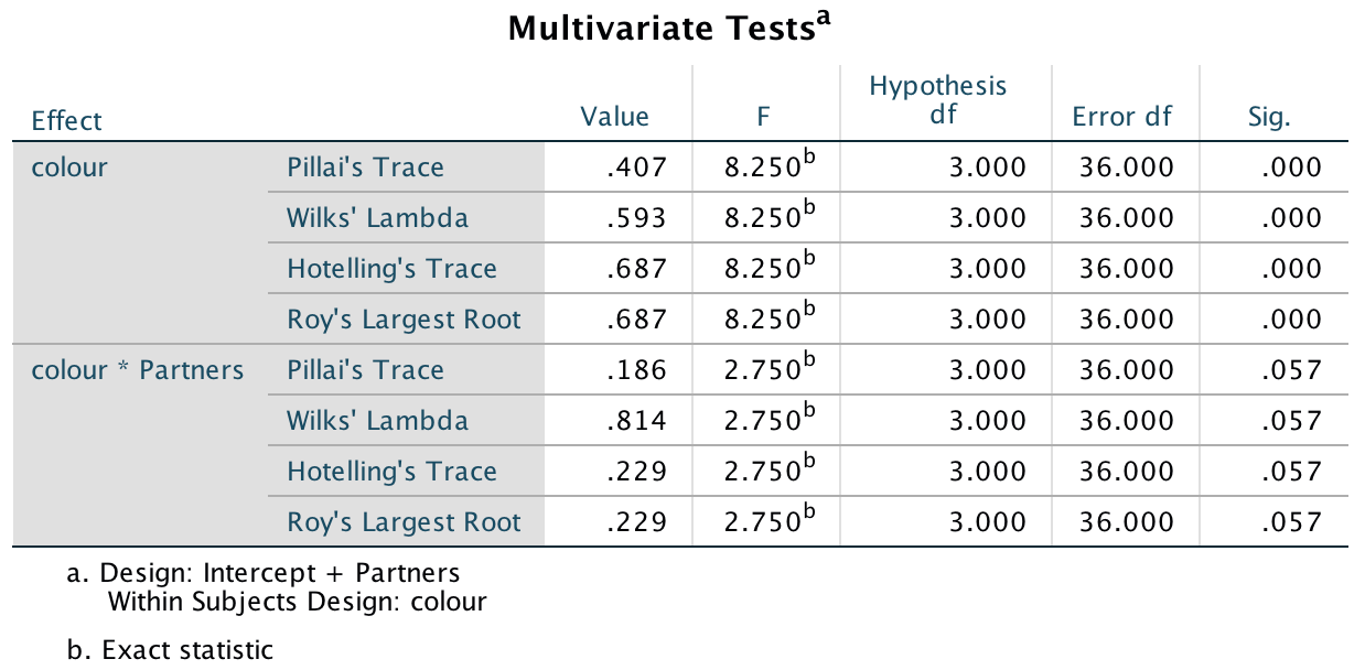
Output
The contrasts for the main effect of colour show that attractiveness ratings were significantly lower when the colour was red compared to dark pink, F(1, 38) = 15.47, p < .001, light pink, F(1, 38) = 22.82, p < .001, and pale pink, F(1, 38) = 17.44, p < .001. This is contrary to the theory, which suggested that red would be rated as more attractive than other colours.
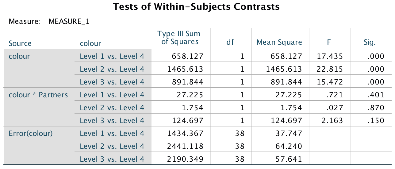
Output
The main effect of sexual experience was not significant, F(1, 38) = 0.48, p = .492. Therefore, we can conclude that when ignoring genital colour, attractiveness ratings were not significant;y different for those with ‘some’ compared to ‘very little’ sexual experience.
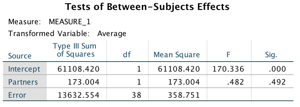
Output
Chapter 17
Task 17.1
A clinical psychologist decided to compare his patients against a normal sample. He observed 10 of his patients as they went through a normal day. He also observed 10 lecturers at the University of Sussex. He measured all participants using two outcome variables: how many chicken impersonations they did, and how good their impersonations were (as scored out of 10 by an independent farmyard noise expert). Use MANOVA and discriminant function analysis to find out whether these variables could be used to distinguish manic psychotic patients from those without the disorder (Chicken.sav).
It seems that manic psychotics and Sussex lecturers do pretty similar numbers of chicken impersonations (lecturers do slightly fewer actually, but they are of a higher quality).
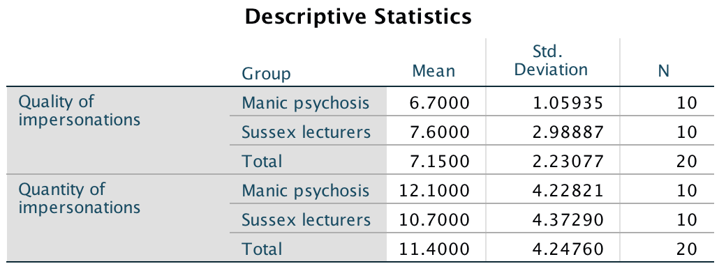
Output
Box’s test of the assumption of equality of covariance matrices tests the null hypothesis that the variance-covariance matrices are the same in both groups. For these data p is .000 (which is less than .05), hence, the covariance matrices are significantly different (the assumption is broken). However, because group sizes are equal we can ignore this test because Pillai’s trace should be robust to this violation (fingers crossed!).
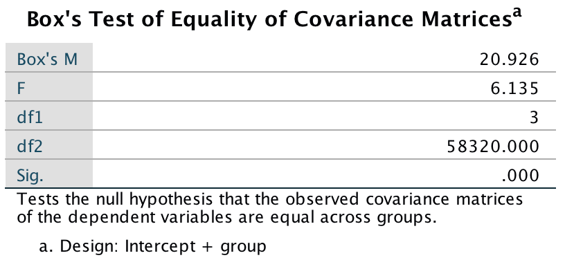
Output
All test statistics for the effect of group are significant with p = .032 (which is less than .05). From this result we should probably conclude that the groups differ significantly in the quality and quantity of their chicken impersonations; however, this effect needs to be broken down to find out exactly what’s going on.
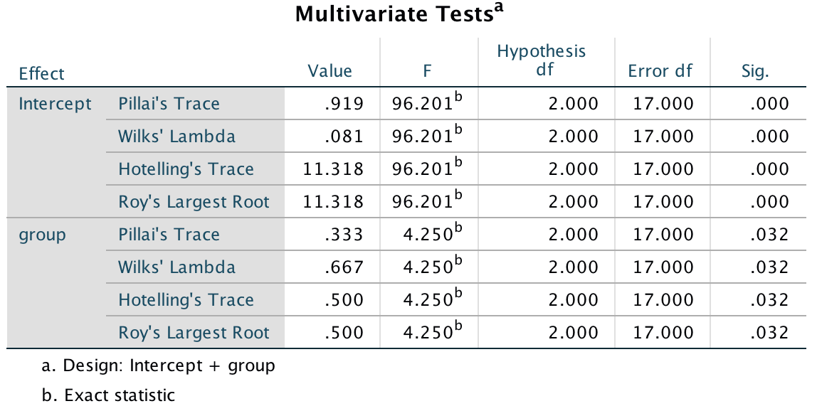
Output
Levene’s test should be non-significant for all dependent variables if the assumption of homogeneity of variance has been met. The results for these data clearly show that the assumption has been met for the quantity of chicken impersonations but has been broken for the quality of impersonations. This might dent our confidence in the reliability of the univariate tests to follow (especially given the small sample size because this test will have low power to detect a difference, so the fact it has suggests that variances are very dissimilar).
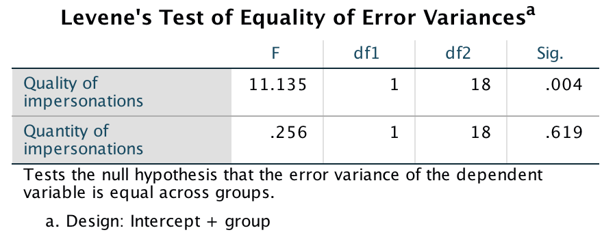
Output
The univariate test of the main effect of group contains separate F-statistics for quality and quantity of chicken impersonations, respectively. The values of p indicate that there was a non-significant difference between groups in terms of both (p is greater than .05 in both cases). The multivariate test statistics led us to conclude that the groups did differ in terms of the quality and quantity of their chicken impersonations yet the univariate results contradict this!
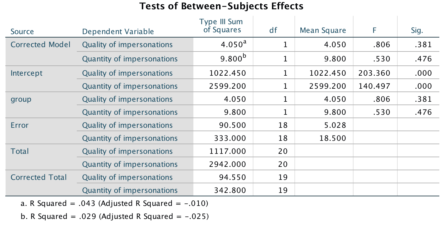
Output
We don’t need to look at contrasts because the univariate tests were non-significant (and in any case there were only two groups and so no further comparisons would be necessary). Instead, to see how the dependent variables interact, we need to carry out a discriminant function analysis (DFA). The initial statistics from the DFA tell us that there was only one variate (because there are only two groups) and this variate is significant. Therefore, the group differences shown by the MANOVA can be explained in terms of one underlying dimension.
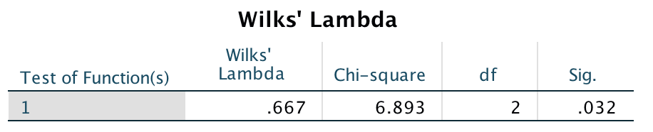
Output
The standardized discriminant function coefficients tell us the relative contribution of each variable to the variates. Both quality and quantity of impersonations have similar-sized coefficients indicating that they have equally strong influence in discriminating the groups. However, they have the opposite sign, which suggests that that group differences are explained by the difference between the quality and quantity of impersonations.
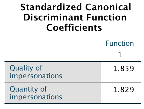
Output
The variate centroids for each group (Output 8) confirm that variate 1 discriminates the two groups because the manic psychotics have a negative coefficient and the Sussex lecturers have a positive one. There won’t be a combined-groups plot because there is only one variate.
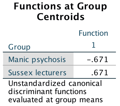
Output
Overall we could conclude that manic psychotics are distinguished from Sussex lecturers in terms of the difference between the pattern of results for quantity of impersonations compared to quality. If we look at the means we can see that manic psychotics produce slightly more impersonations than Sussex lecturers (but remember from the non-significant univariate tests that this isn’t sufficient, alone, to differentiate the groups), but the lecturers produce impersonations of a higher quality (but again remember that quality alone is not enough to differentiate the groups). Therefore, although the manic psychotics and Sussex lecturers produce similar numbers of impersonations of similar quality (see univariate tests), if we combine the quality and quantity we can differentiate the groups.
Task 17.2
A news story claimed that children who lie would become successful citizens. I was intrigued because although the article cited a lot of well-conducted work by Dr. Khang Lee that shows that children lie, I couldn’t find anything in that research that supported the journalist’s claim that children who lie become successful citizens. Imagine a Huxleyesque parallel universe in which the government was daft enough to believe the contents of this newspaper story and decided to implement a systematic programme of infant conditioning. Some infants were trained not to lie, others were bought up as normal, and a final group was trained in the art of lying. Thirty years later, they collected data on how successful these children were as adults. They measured their salary, and two indices out of 10 (10 = as successful as it could possibly be, 0 = better luck in your next life) of how successful their family and work life was. Use MANOVA and discriminant function analysis to find out whether lying really does make you a better citizen (Lying.sav).
The means show that children encouraged to lie landed the best and highest-paid jobs, but had the worst family success compared to the other two groups. Children who were trained not to lie had great family lives but not so great jobs compared to children who were brought up to lie and children who experienced normal parenting. Finally, children who were in the normal parenting group (if that exists!) were pretty middle of the road compared to the other two groups.
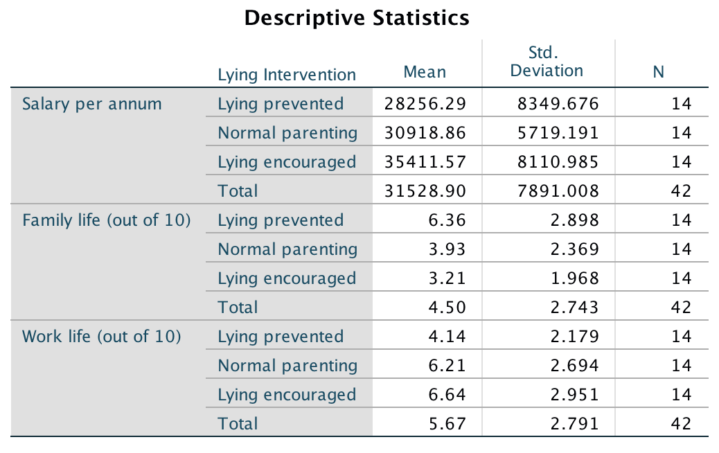
Output
Box’s test is non-significant, p = .345 (which is greater than .05), hence the covariance matrices are roughly equal as assumed.
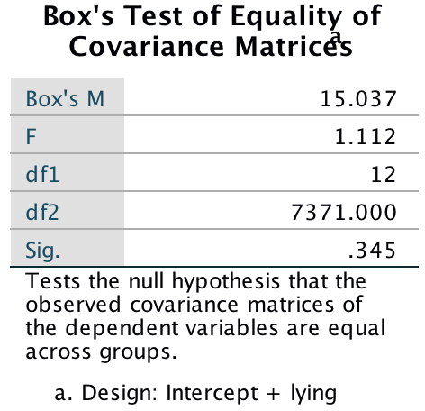
Output
In the main table of results the column of real interest is the one containing the significance values of the F-statistics. For these data, Pillai’s trace (p = .002), Wilks’s lambda (p = .001), Hotelling’s trace (p < .001) and Roy’s largest root (p < .001) all reach the criterion for significance at the .05 level. Therefore, we can conclude that the type of lying intervention had a significant effect on success later on in life. The nature of this effect is not clear from the multivariate test statistic: it tells us nothing about which groups differed from which, or about whether the effect of lying intervention was on work life, family life, salary, or a combination of all three. To determine the nature of the effect, a discriminant analysis would be helpful, but for some reason SPSS provides us with univariate tests instead.
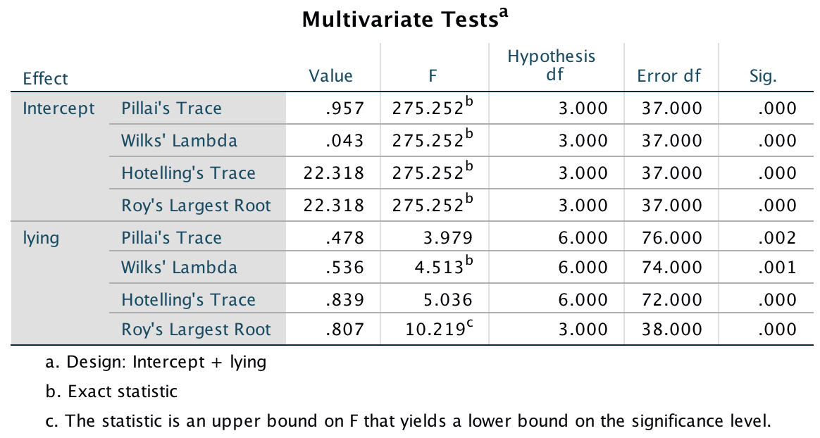
Output
Levene’s test should be non-significant for all dependent variables if the assumption of homogeneity of variance has been met. We can see here that the assumption has been met (p > .05 in all cases), which strengthens the case for assuming that the multivariate test statistics are robust.
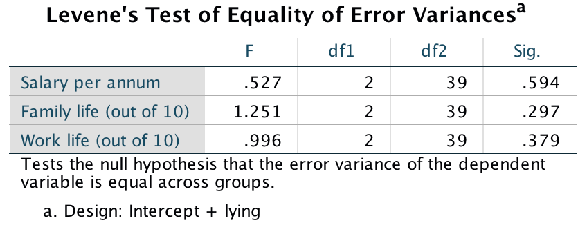
Output
The F-statistics for each univariate ANOVA and their significance values are listed in the columns labelled F and Sig. These values are identical to those obtained if one-way ANOVA was conducted on each dependent variable independently. As such, MANOVA offers only hypothetical protection of inflated Type I error rates: there is no real-life adjustment made to the values obtained. The values of p indicate that there was a significant difference between intervention groups in terms of salary (p = .049), family life (p = .004), and work life (p = .036). We should conclude that the type of intervention had a significant effect on the later success of children. However, this effect needs to be broken down to find out exactly what’s going on.
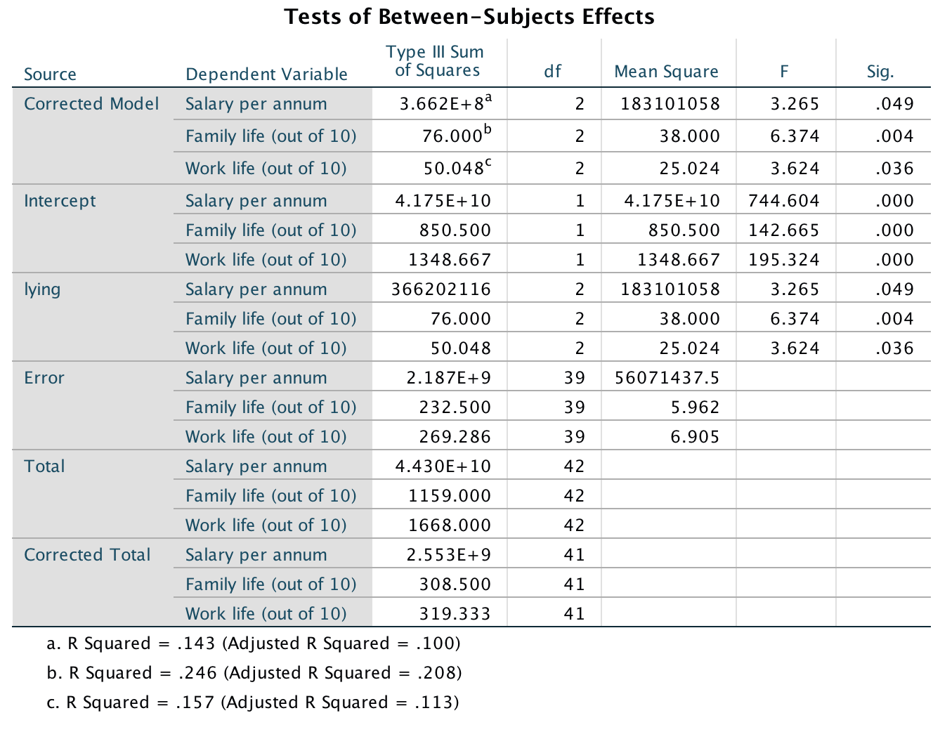
Output
The contrasts show that there were significant differences in salary (p = .016), family success (p = .002) and work success (p = .016) when comparing children who were prevented from lying (level 1) with those who were encouraged to lie (level 3). Looking back at the means, we can see that children who were trained to lie had significantly higher salaries, significantly better work lives but significantly less successful family lives when compared to children who were prevented from lying.
When we compare children who experienced normal parenting (level 2) with those who were encouraged to lie (level 3), there were no significant differences between the three life success outcome variables (p > .05 in all cases).
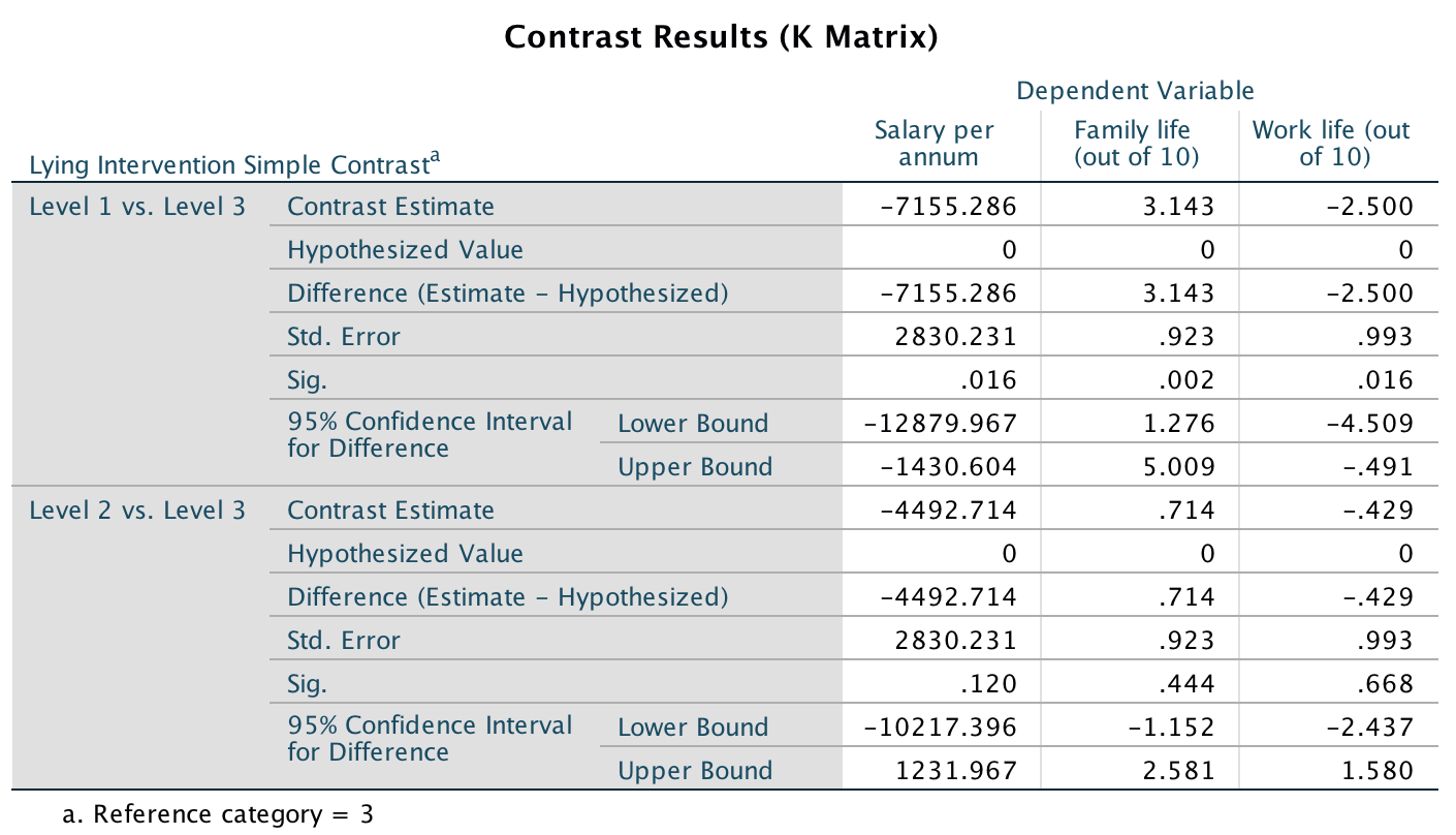
Output
In my opinion discriminant analysis is the best method for following up a significant MANOVA (see the book chapter) and we will do this next. The covariance matrices are made up of the variances of each dependent variable for each group. The values in this output are useful because they give us some idea of how the relationship between dependent variables changes from group to group. For example, in the lying prevented group, all the dependent variables are positively related, so as one of the variables increases (e.g., success at work), the other two variables (family life and salary) increase also. In the normal parenting group, success at work is positively related to both family success and salary. However, salary and family success are negatively related, so as salary increases family success decreases and vice versa. Finally, in the lying encouraged group, salary has a positive relationship with both work success and family success, but success at work is negatively related to family success. It is important to note that these matrices don’t tell us about the substantive importance of the relationships because they are unstandardized - they merely give a basic indication.
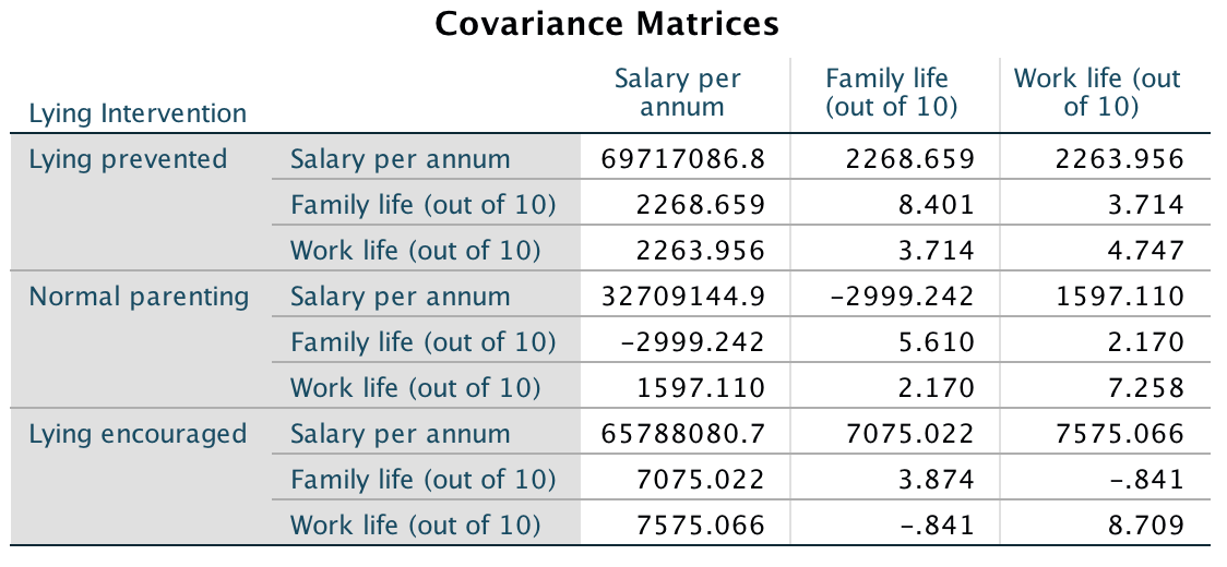
Output
The eigenvalues for each variate are converted into percentage of variance accounted for, and the first variate accounts for 96.1% of variance compared to the second variate, which accounts for only 3.9%. This table also shows the canonical correlation, which we can square to use as an effect size (just like \(R^2\), which we have encountered in the linear model).
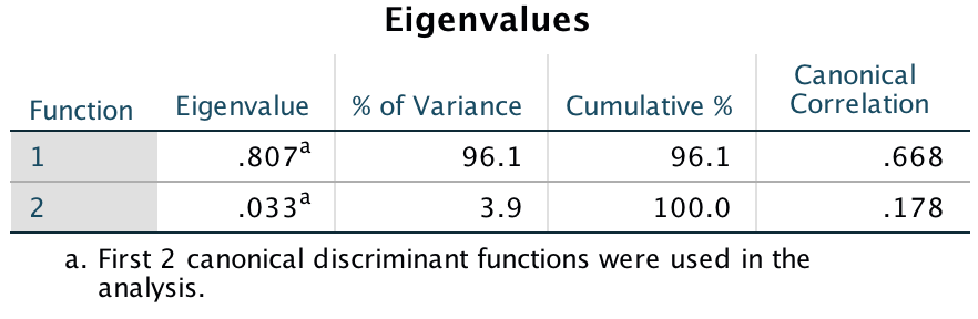
Output
The next output shows the significance tests of both variates (‘1 through 2’ in the table), and the significance after the first variate has been removed (‘2’ in the table). So, effectively we test the model as a whole, and then peel away variates one at a time to see whether what’s left is significant. In this case with two variates we get only two steps: the whole model, and then the model after the first variate is removed (which leaves only the second variate). When both variates are tested in combination Wilks’s lambda has the same value (.536), degrees of freedom (6) and significance value (.001) as in the MANOVA. The important point to note from this table is that the two variates significantly discriminate the groups in combination (p = .001), but the second variate alone is non-significant, p = .543. Therefore, the group differences shown by the MANOVA can be explained in terms of two underlying dimensions in combination.
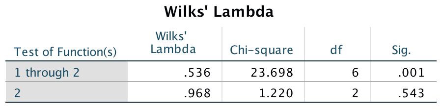
Output
The next two outputs are the most important for interpretation. The coefficients in these tables tell us the relative contribution of each variable to the variates. If we look at variate 1 first, family life has the opposite effect to work life and salary (work life and salary have positive relationships with this variate, whereas family life has a negative relationship). Given that these values (in both tables) can vary between 1 and 1, we can also see that family life has the strongest relationship, work life also has a strong relationship, whereas salary has a relatively weaker relationship to the first variate. The first variate, then, could be seen as one that differentiates family life from work life and salary (it affects family life in the opposite way to salary and work life). Salary has a very strong positive relationship to the second variate, family life has only a weak positive relationship and work life has a medium negative relationship to the second variate. This tells us that this variate represents something that affects salary and to a lesser degree family life in a different way than work life. Remembering that ultimately these variates are used to differentiate groups, we could say that the first variate differentiates groups by some factor that affects family differently than work and salary, whereas the second variate differentiates groups on some dimension that affects salary (and to a small degree family life) and work in different ways.
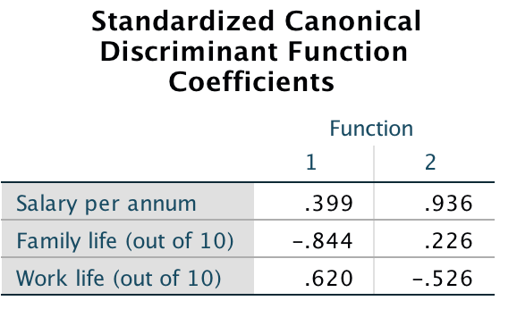
Output
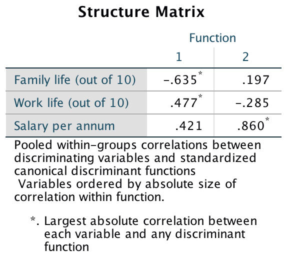
Output
We can also use a combined-groups plot. This graph plots the variate scores for each person, grouped according to the experimental condition to which that person belonged. The graph (Figure 7) tell us that (look at the big squares) variate 1 discriminates the lying prevented group from the lying encouraged group (look at the horizontal distance between these centroids). The second variate differentiates the normal parenting group from the lying prevented and lying encouraged groups (look at the vertical distances), but this difference is not as dramatic as for the first variate. Remember that the variates significantly discriminate the groups in combination (i.e., when both are considered).
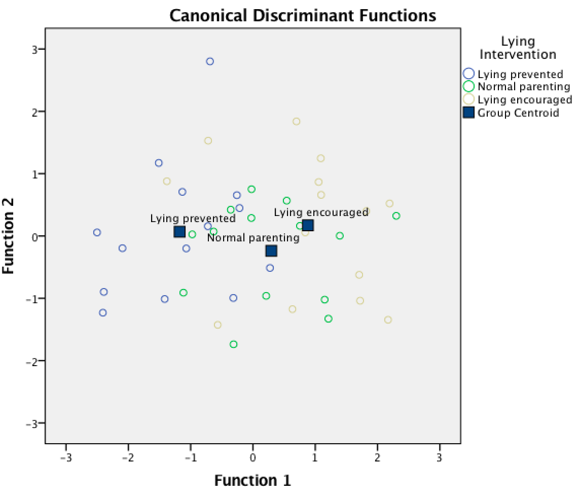
Output
We could report the results as follows:
- Using Pillai’s trace, there was a significant effect of lying on future success, V = 0.48, F(6, 76) = 3.98, p = .002. Separate univariate ANOVAs on the outcome variables revealed significant effects of lying on salary F(2, 39) = 3.27, p = .049, family, F(2, 39) = 6.37, p = .004 and work F(2, 39) = 3.62, p = .036.
- The MANOVA was followed up with discriminant analysis, which revealed two discriminant functions. The first explained 96.1% of the variance, canonical \(R^2\) = .45, whereas the second explained only 3.9%, canonical \(R^2\) = .03. In combination these discriminant functions significantly differentiated the lying intervention groups, Λ = .536, \(\chi^2\)(6) = 23.70, p = .001, but removing the first function indicated that the second function did not significantly differentiate the intervention groups, Λ = .968, \(\chi^2\)(2) = 1.22, p = .543. The correlations between outcomes and the discriminant functions revealed that salary loaded more highly onto the second function (r = .94) than the first (r = .40); family life loaded more highly on the first function (r = .84) than the second function (r = .23); work life loaded fairly evenly onto both functions but in opposite directions (r = .62 for the first function and r = .53 for the second). The discriminant function plot showed that the first function discriminated the lying intervention group from the lying prevented group, and the second function differentiated the normal parenting group from the two interventions.
Task 17.3
I was interested in whether students’ knowledge of different aspects of psychology improved throughout their degree (Psychology.sav). I took a sample of first-years, second-years and third-years and gave them five tests (scored out of 15) representing different aspects of psychology: Exper (experimental psychology such as cognitive and neuropsychology); Stats (statistics); Social (social psychology); Develop (developmental psychology); Person (personality). (1) Determine whether there are overall group differences along these five measures. (2) Interpret the scale-by-scale analyses of group differences. (3) Select contrasts that test the hypothesis that second and third years will score higher than first years on all scales. (4) Select post hoc tests and compare these results to the contrasts. (5) Carry out a discriminant function analysis including only those scales that revealed group differences for the contrasts. Interpret the results.
The first output contains the overall and group means and standard deviations for each dependent variable in turn.
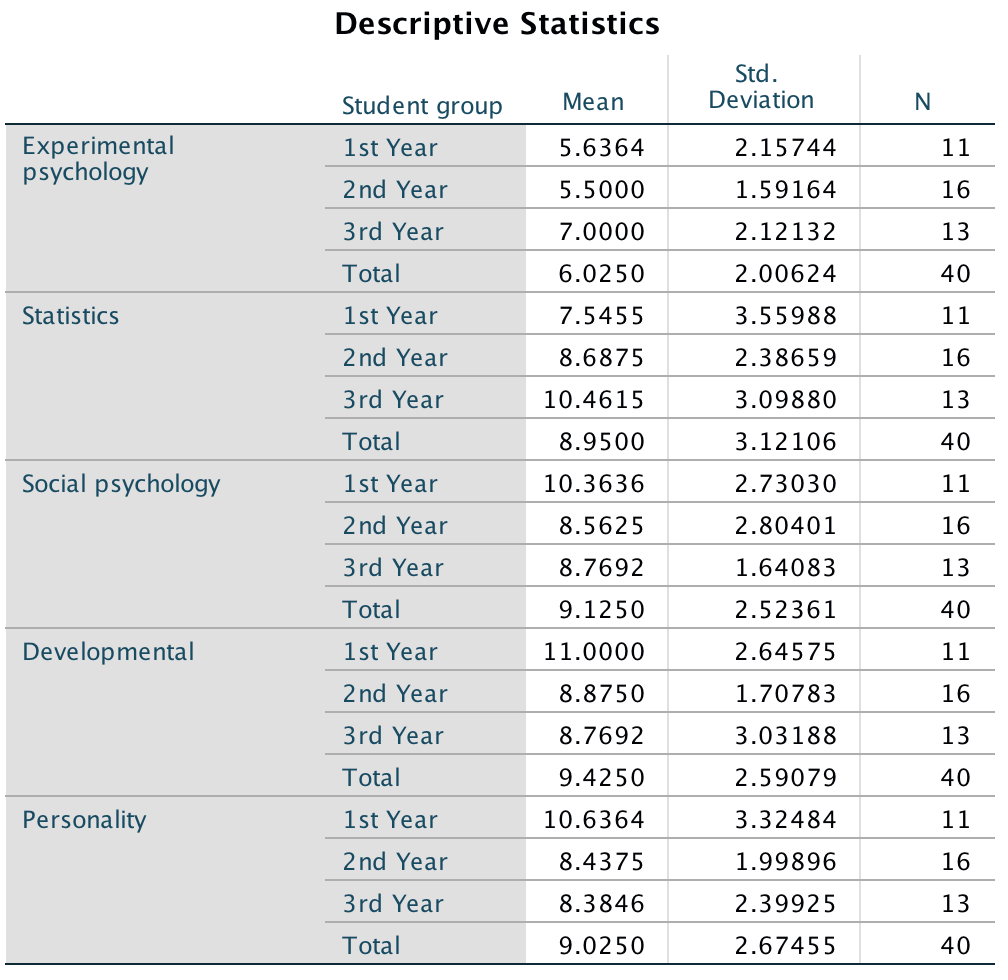
Output
Box’s test has a p = .06 (which is greater than .05); hence, the covariance matrices are roughly equal and the assumption is tenable. (I mean, it’s probably not because it is close to significance in a relatively small sample.)
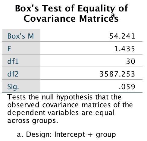
Output
The group effect tells us whether the scores from different areas of psychology differ across the three years of the degree programme. For these data, Pillai’s trace (p =.02), Wilks’s lambda (p = .012), Hotelling’s trace (p =.007) and Roy’s largest root (p =.01) all reach the criterion for significance of the .05 level. From this result we should probably conclude that the profile of knowledge across different areas of psychology does indeed change across the three years of the degree. The nature of this effect is not clear from the multivariate test statistic.

Output
Levene’s test should be non-significant for all dependent variables if the assumption of homogeneity of variance has been met. The results for these data clearly show that the assumption has been met. This finding not only gives us confidence in the reliability of the univariate tests to follow, but also strengthens the case for assuming that the multivariate test statistics are robust.
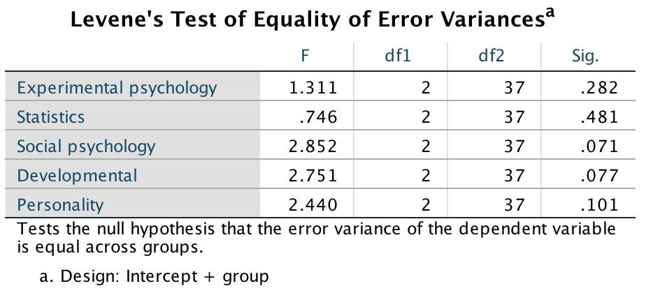
Output
The univariate F-statistics for each of the areas of psychology indicate that there was a non-significant difference between student groups in all areas (p > .05 in each case). The multivariate test statistics led us to conclude that the student groups did differ significantly across the types of psychology, yet the univariate results contradict this (I really should stop making up data sets that do this!).
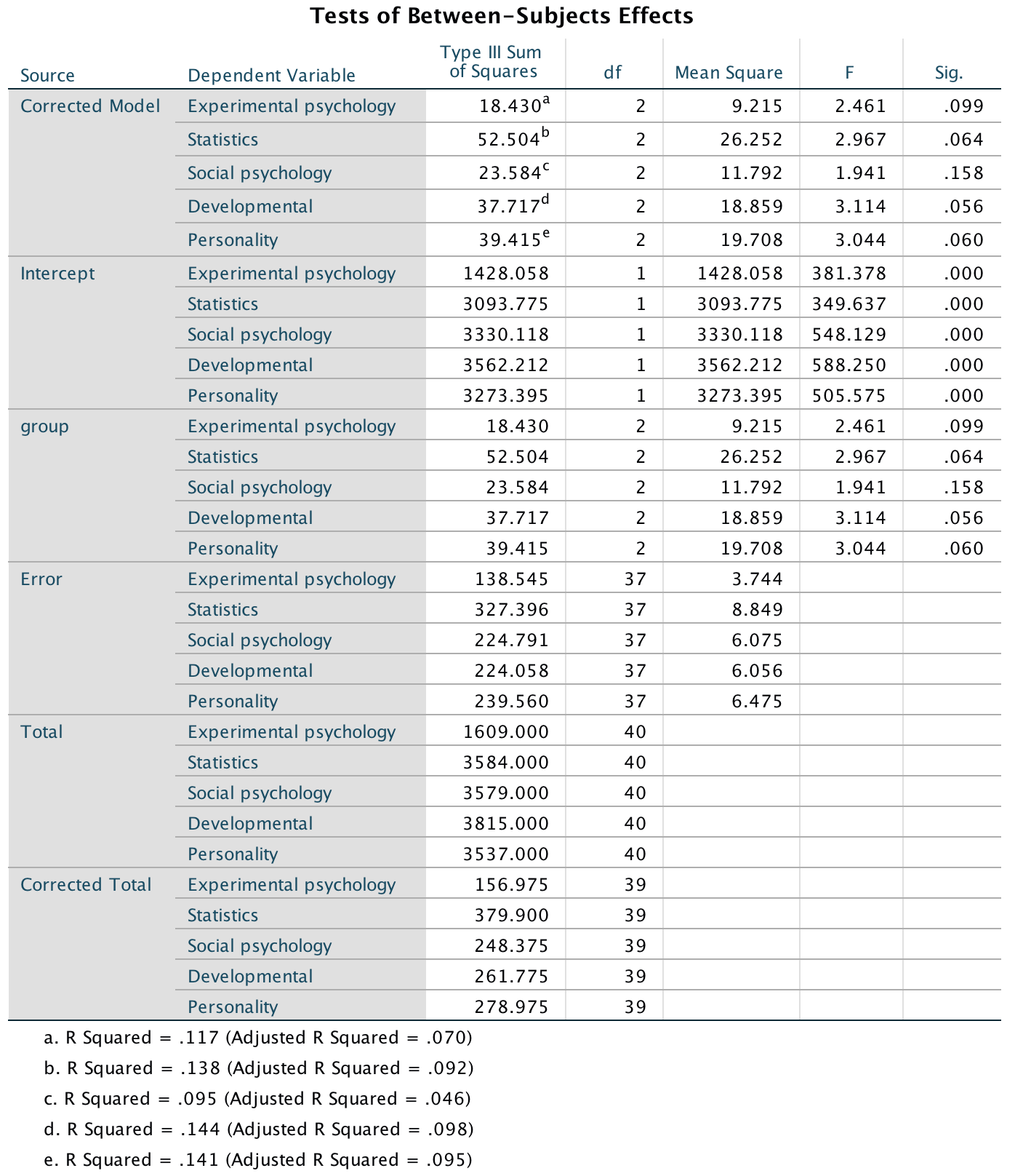
Output
We don’t need to look at contrasts because the univariate tests were non-significant, and instead, to see how the dependent variables interact, we will carry out a DFA. The initial statistics from the DFA tell us that only one of the variates is significant (the second variate is non-significant, p = .608). Therefore, the group differences shown by the MANOVA can be explained in terms of one underlying dimension.
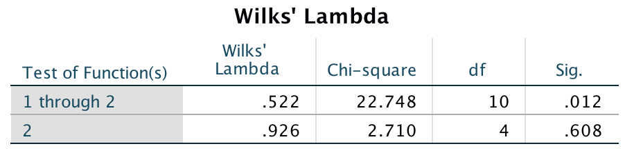
Output
The standardized discriminant function coefficients tell us the relative contribution of each variable to the variates. Looking at the first variate, it’s clear that statistic has the greatest contribution to the first variate. Most interesting is that on the first variate, statistics and experimental psychology have positive weights, whereas social, developmental and personality have negative weights. This suggests that the group differences are explained by the difference between experimental psychology and statistics compared to other areas of psychology.
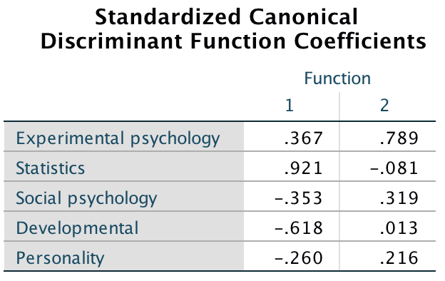
Output
The variate centroids for each group tell us that variate 1 discriminates the first years from second and third years because the first years have a negative value whereas the second and third years have positive values on the first variate.
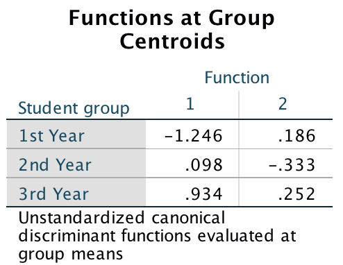
Output
The relationship between the variates and the groups is best illuminated using a combined-groups plot, which plots the variate scores for each person, grouped according to the year of their degree. In addition, the group centroids are indicated, which are the average variate scores for each group. The plot for these data confirms that variate 1 discriminates the first years from subsequent years (look at the horizontal distance between these centroids).
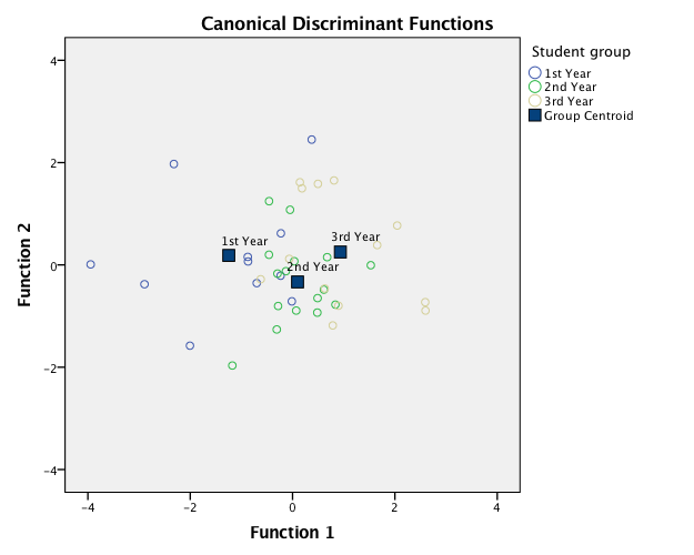
Output
Overall we could conclude that different years are discriminated by different areas of psychology. In particular, it seems as though statistics and aspects of experimentation (compared to other areas of psychology) discriminate between first-year undergraduates and subsequent years. From the means, we could interpret this as first years struggling with statistics and experimental psychology (compared to other areas of psychology) but with their ability improving across the three years. However, for other areas of psychology, first years are relatively good but their abilities decline over the three years. Put another way, psychology degrees improve only your knowledge of statistics and experimentation.
Chapter 18
General
For these tasks, access the factor analysis dialog boxes by selecting Analyze > Dimension Reduction > Factor …. Simply select the variables you want to include in the analysis and drag them to the box labelled Variables. Use the book chapter to learn how to use the other options/dialog boxes.
Task 18.1
Rerun the analysis in this chapter using principal component analysis and compare the results to those in the chapter. (Set the iterations to convergence to 30.)
Follow the instructions in the chapter, except that in the Extraction dialog box select Principal components in the drop-down menu labelled Method, as shown below:
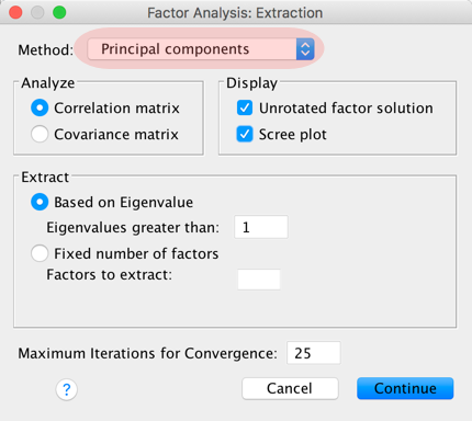
Completed dialog box
The question also suggests increasing the iterations to convergence to 30, and we do this in the Rotation dialog box as follows:
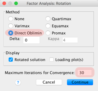
Completed dialog box
Note that I have selected an oblique rotation (Direct Oblimin) because (as explained in the book) it is unrealistic to assume that components measuring different aspects of a psychological construct will be independent. Complete all of the other dialog boxes as in the book.
All of the descriptives, correlation matrices, KMO tests and so on should be exactly the same as in the book (these will be unaffected by our choice of principal components as the method of dimension reduction). Follow the book to interpret these.
Things start to get different at the point of extraction. The first part of the factor extraction process is to determine the linear components (note, linear components not factors) within the data (the eigenvectors) by calculating the eigenvalues of the R-matrix. There are as many components (eigenvectors) in the R-matrix as there are variables, but most will be unimportant. The eigenvalue tells us the importance of a particular vector. We can then apply criteria to determine which components to retain and which to discard. By default IBM SPSS Statistics uses Kaiser’s criterion of retaining components with eigenvalues greater than 1 (see the book for details).
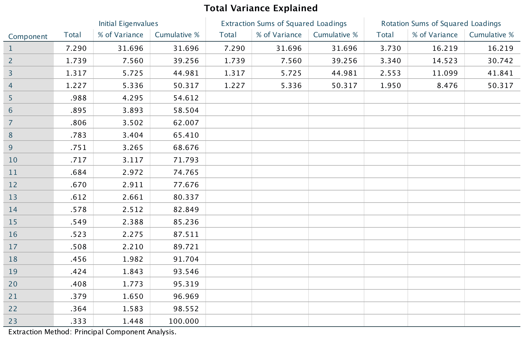
Output
The output lists the eigenvalues associated with each linear component before extraction, after extraction and after rotation. Before extraction, 23 linear components are identified within the data (i.e., the number of original variables). The eigenvalues represent the variance explained by a particular linear component, and this value is also displayed as the percentage of variance explained (so component 1 explains 31.696% of total variance). The first few components explain relatively large amounts of variance (especially component 1), whereas subsequent components explain only small amounts of variance. The four components with eigenvalues greater than 1 are then extracted. The eigenvalues associated with these components are again displayed (and the percentage of variance explained) in the columns labelled Extraction Sums of Squared Loadings. The values in this part of the table are the same as the values before extraction, except that the values for the discarded components are ignored (i.e., the table is blank after the fourth component). The final part of the table (labelled Rotation Sums of Squared Loadings) shows the eigenvalues of the components after rotation. Rotation has the effect of optimizing the component structure, and for these data it has equalized the relative importance of the four components. Before rotation, component 1 accounted for considerably more variance than the remaining three (31.696% compared to 7.560, 5.725 and 5.336%), but after rotation it accounts for only 16.219% of variance (compared to 14.523, 11.099 and 8.475%, respectively).
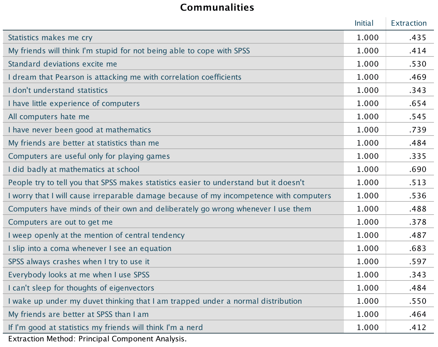
Output
The next output shows the communalities before and after extraction. Remember that the communality is the proportion of common variance within a variable. Principal component analysis works on the initial assumption that all variance is common; therefore, before extraction the communalities are all 1 (see the column labelled Initial). In effect, all of the variance associated with a variable is assumed to be common variance. Once components have been extracted, we have a better idea of how much variance is, in reality, common. The communalities in the column labelled Extraction reflect this common variance. So, for example, we can say that 43.5% of the variance associated with question 1 is common, or shared, variance. Another way to look at these communalities is in terms of the proportion of variance explained by the underlying components. Before extraction, there are as many components as there are variables, so all variance is explained by the components and communalities are all 1. However, after extraction some of the components are discarded and so some information is lost. The retained components cannot explain all of the variance present in the data, but they can explain some. The amount of variance in each variable that can be explained by the retained components is represented by the communalities after extraction.
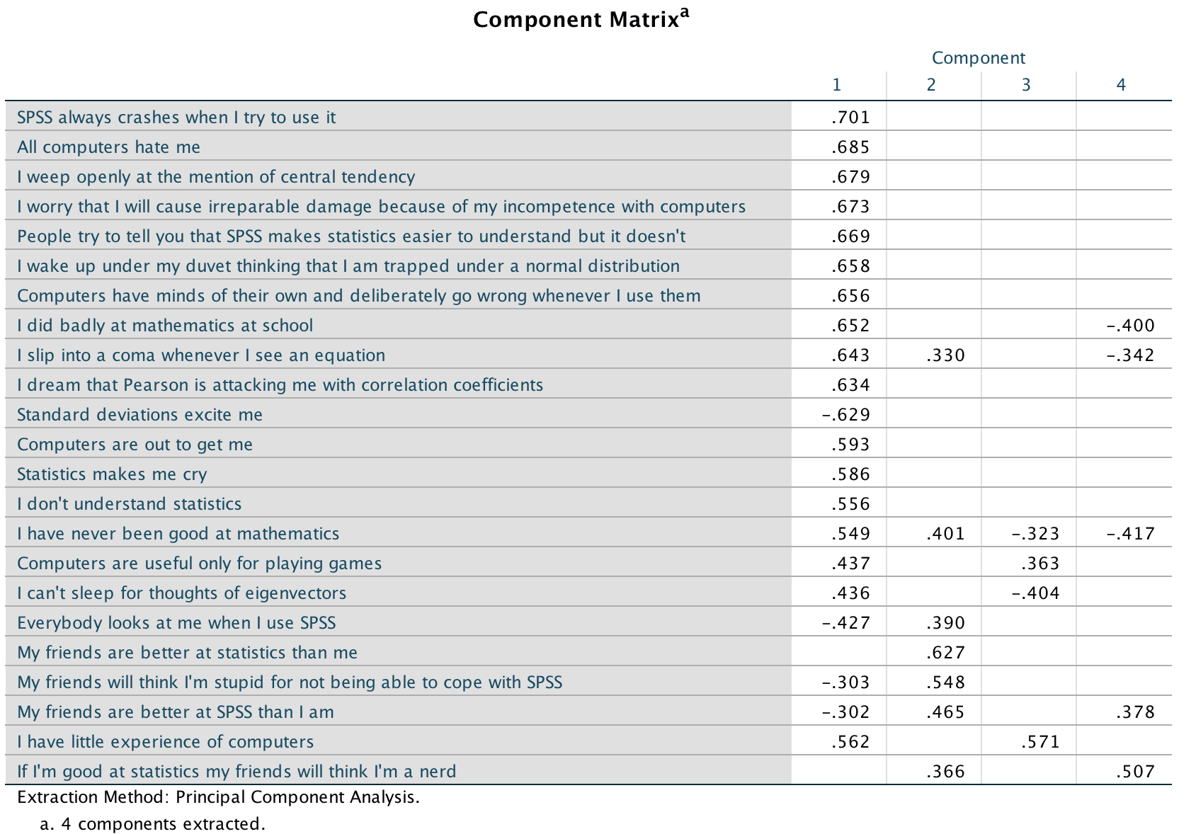
Output
The next output shows the component matrix before rotation. This matrix contains the loadings of each variable onto each component. By default IBM SPSS Statistics displays all loadings; however, if you followed the book you’d have requested that all loadings less than 0.3 be suppressed and so there are blank spaces. This doesn’t mean that the loadings don’t exist, merely that they are smaller than 0.3. This matrix is not particularly important for interpretation, but it is interesting to note that before rotation most variables load highly onto the first component.
At this stage IBM SPSS Statistics has extracted four components based on Kaiser’s criterion. This criterion is accurate when there are fewer than 30 variables and communalities after extraction are greater than 0.7, or when the sample size exceeds 250 and the average communality is greater than 0.6. The communalities are shown in one of the outputs above and only one exceeds 0.7. The average of the communalities is 11.573/23 = 0.503. Therefore, on both grounds Kaiser’s rule might not be accurate. However, you should consider the huge sample that we have, because the research into Kaiser’s criterion gives recommendations for much smaller samples. The scree plot (below)
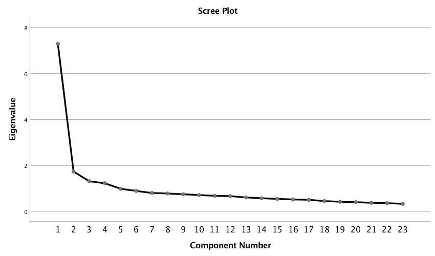
Output
The scree plot looks very similar to the one in the book (where we used principal axis factoring). The book gives more explanation, but essentially we could probably justify retaining either two or four components. As in the chapter we’ll stick with four.
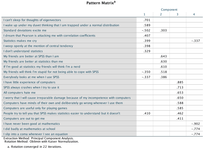
Output
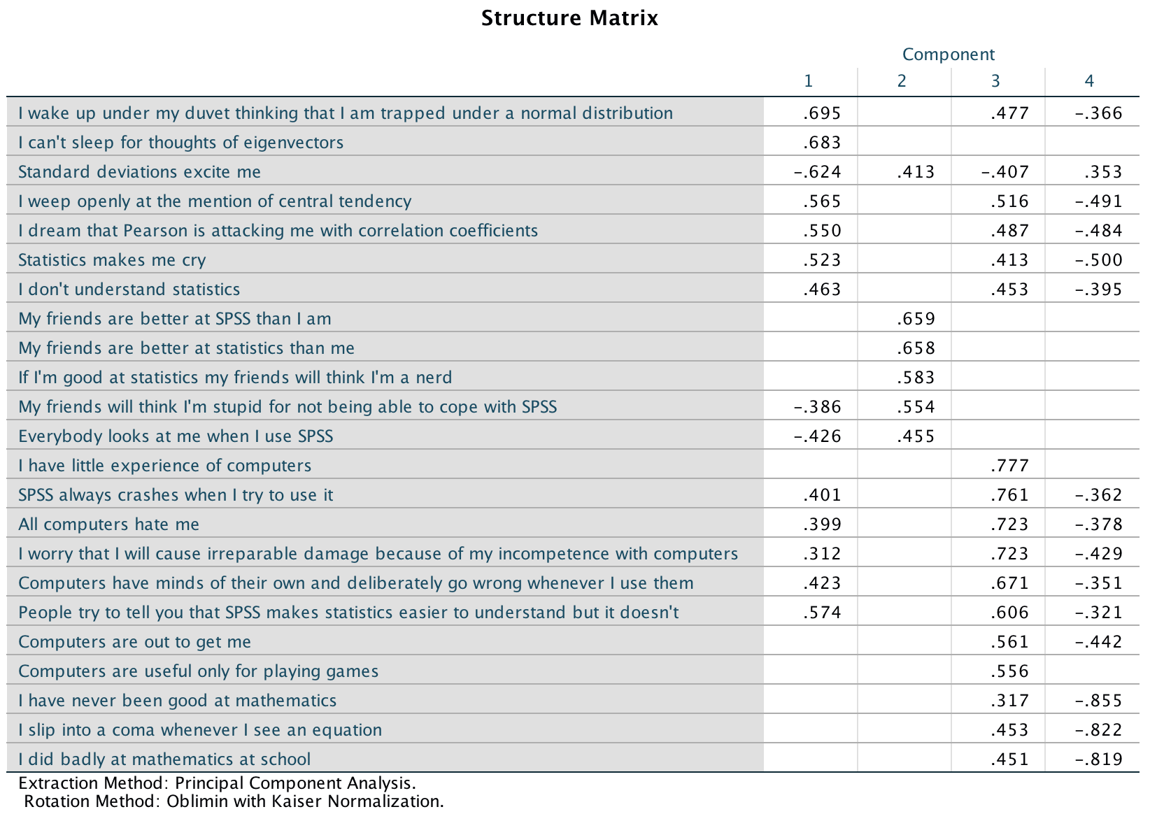
Output
The next outputs shows the pattern and structure matrices, which contain the component loadings for each variable onto each component (see the chapter for an explanation of the differences between these matrices). Let’s interpret the pattern matrix, because it’s a bit more straighforward. Remember that we suppressed loadings less than 0.3, so the blank spaces represent loadings lower than this threshold. Also, the variables are listed in the order of size of their component loadings (because we selected this option, by default they will be listed in the order you list them in the main dialog box. Compare this matrix to the unrotated solution from earlier. Before rotation, most variables loaded highly onto the first component and the remaining components didn’t really get a look in. The rotation of the component structure has clarified things considerably: there are four components and variables generally load highly onto only one component and less so on the others. As in the chapter, we can look for themes among questions that load onto the same component. Like the factor analysis in the chapter, the principal components analysis reveals that the initial questionnaire is composed of four subscales:
- Fear of statistics: the questions that load highly on component 1 relate to statistics
- Peer evaluation: the questions that load highly on component 2 relate to aspects of peer evaluation
- Fear of computers: the questions that load highly on component 3 relate to using computers or IBM SPSS Statistics
- Fear of mathematics: the questions that load highly on component 4 relate to mathematics
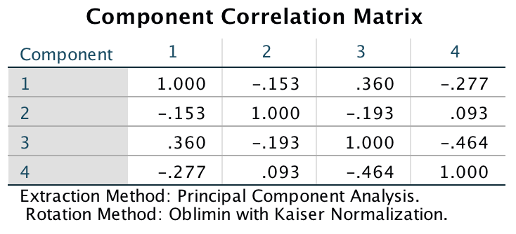
Output
The final output is the component correlation matrix (comparable to the factor correlation matrix in the book). This matrix contains the correlation coefficients between components. Component 2 has fairly small relationships with all other components (the correlation coefficients are low), but all other components are interrelated to some degree (notably components 1 and 3 and components 3 and 4). The constructs measured appear to be correlated. This dependence between components suggests that oblique rotation was a good decision (that is, the components are not orthogonal/independent). At a theoretical level the dependence between components makes sense: we might expect a fairly strong relationship between fear of maths, fear of statistics and fear of computers. Generally, the less mathematically and technically minded people struggle with statistics. However, we would not, necessarily, expect these constructs to correlate with fear of peer evaluation (because this construct is more socially based) and this component correlates weakly with the others.
Task 18.2
The University of Sussex constantly seeks to employ the best people possible as lecturers. They wanted to revise the ‘Teaching of Statistics for Scientific Experiments’ (TOSSE) questionnaire, which is based on Bland’s theory that says that good research methods lecturers should have: (1) a profound love of statistics; (2) an enthusiasm for experimental design; (3) a love of teaching; and (4) a complete absence of normal interpersonal skills. These characteristics should be related (i.e., correlated). The University revised this questionnaire to become the ’Teaching of Statistics for Scientific Experiments - Revised (TOSSE - R). They gave this questionnaire to 239 research methods lecturers to see if it supported Bland’s theory. Conduct a factor analysis (with appropriate rotation) and interpret the factor structure (TOSSE-R.sav).
Like in the chapter, I ran the analysis with principal axis factoring and oblique rotation. The syntax for my analysis is as follows:
FACTOR
  /VARIABLES q1 q2 q3 q4 q5 q6 q7 q8 q9 q10 q11 q12 q13 q14 q15 q16 q17 q18 q19 q20 q21 q22 q23 q24
    q25 q26 q27 q28
  /MISSING LISTWISE
  /ANALYSIS q1 q2 q3 q4 q5 q6 q7 q8 q9 q10 q11 q12 q13 q14 q15 q16 q17 q18 q19 q20 q21 q22 q23 q24
    q25 q26 q27 q28
  /PRINT UNIVARIATE INITIAL CORRELATION SIG DET KMO INV REPR AIC EXTRACTION ROTATION
  /FORMAT SORT BLANK(.30)
  /PLOT EIGEN
  /CRITERIA MINEIGEN(1) ITERATE(25)
  /EXTRACTION PAF
  /CRITERIA ITERATE(25) DELTA(0)
  /ROTATION OBLIMIN
  /METHOD=CORRELATION.
Multicollinearity: The determinant of the correlation matrix was 1.240E-6 (i.e., 0.00000124), which is smaller than 0.00001 and, therefore, indicates that multicollinearity could be a problem in these data.
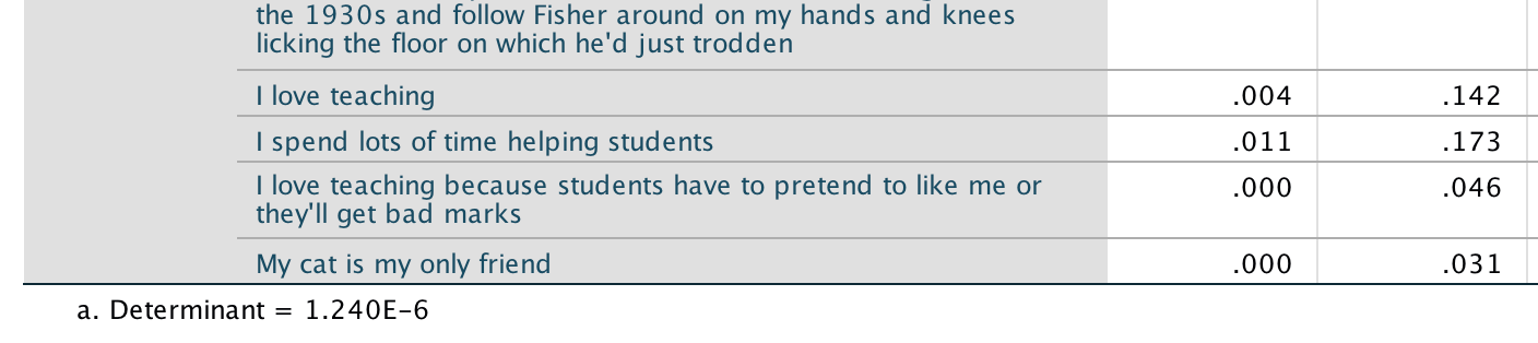
Output
Sample size: MacCallum et al. (1999) have demonstrated that when communalities after extraction are above 0.5 a sample size between 100 and 200 can be adequate, and even when communalities are below 0.5 a sample size of 500 should be sufficient. We have a sample size of 239 with some communalities below 0.5, and so the sample size may not be adequate. However, the KMO measure of sampling adequacy is .894, which is above Kaiser’s (1974) recommendation of 0.5. This value is also ‘meritorious’ (and almost ‘marvellous’). As such, the evidence suggests that the sample size is adequate to yield distinct and reliable factors.
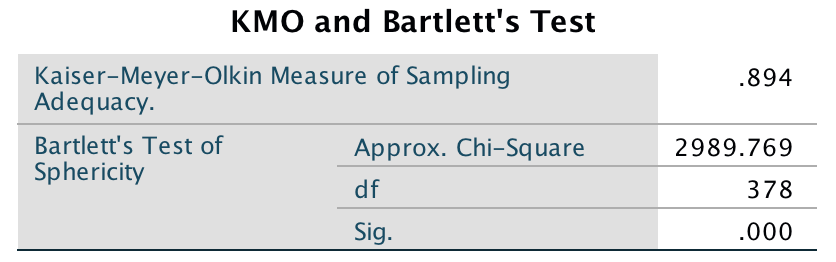
Output
Bartlett’s test: This tests whether the correlations between questions are sufficiently large for factor analysis to be appropriate (it actually tests whether the correlation matrix is sufficiently different from an identity matrix). In this case it is significant, \(\chi^2\)(378) = 2989.77, p < .001, indicating that the correlations within the R-matrix are sufficiently different from zero to warrant factor analysis.
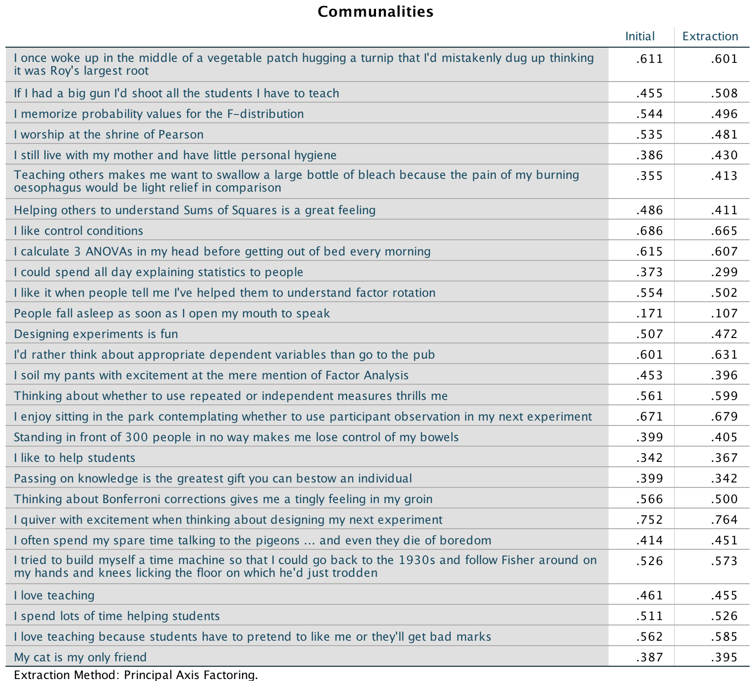
Output
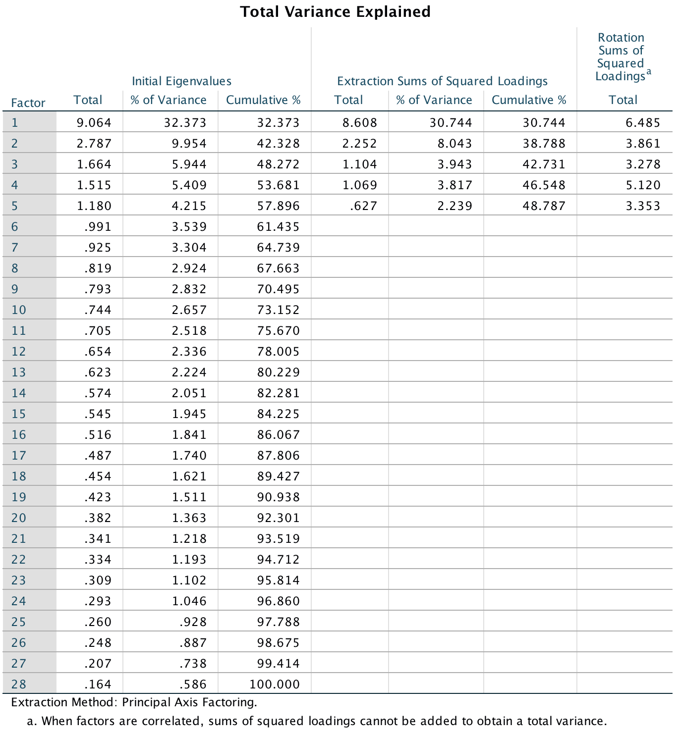
Output
Extraction: By default five factors are extracted based on Kaiser’s criterion of retaining factors with eigenvalues greater than 1. Is this warranted? Kaiser’s criterion is accurate when there are fewer than 30 variables and the communalities after extraction are greater than 0.7, or when the sample size exceeds 250 and the average communality is greater than 0.6. For these data the sample size is 239, there are 28 variables, and the mean communality is 0.488, so extracting five factors is not really warranted. The scree plot shows clear inflexions at 3 and 5 factors and so using the scree plot you could justify extracting 2 or 4 factors.
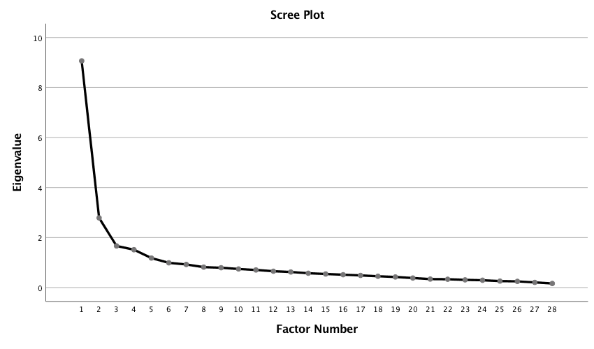
Output
Rotation: You should choose an oblique rotation because the question says that the constructs we’re measuring are related. Looking at the pattern matrix (and using loadings greater than 0.3 as recommended by Stevens) we see the following:
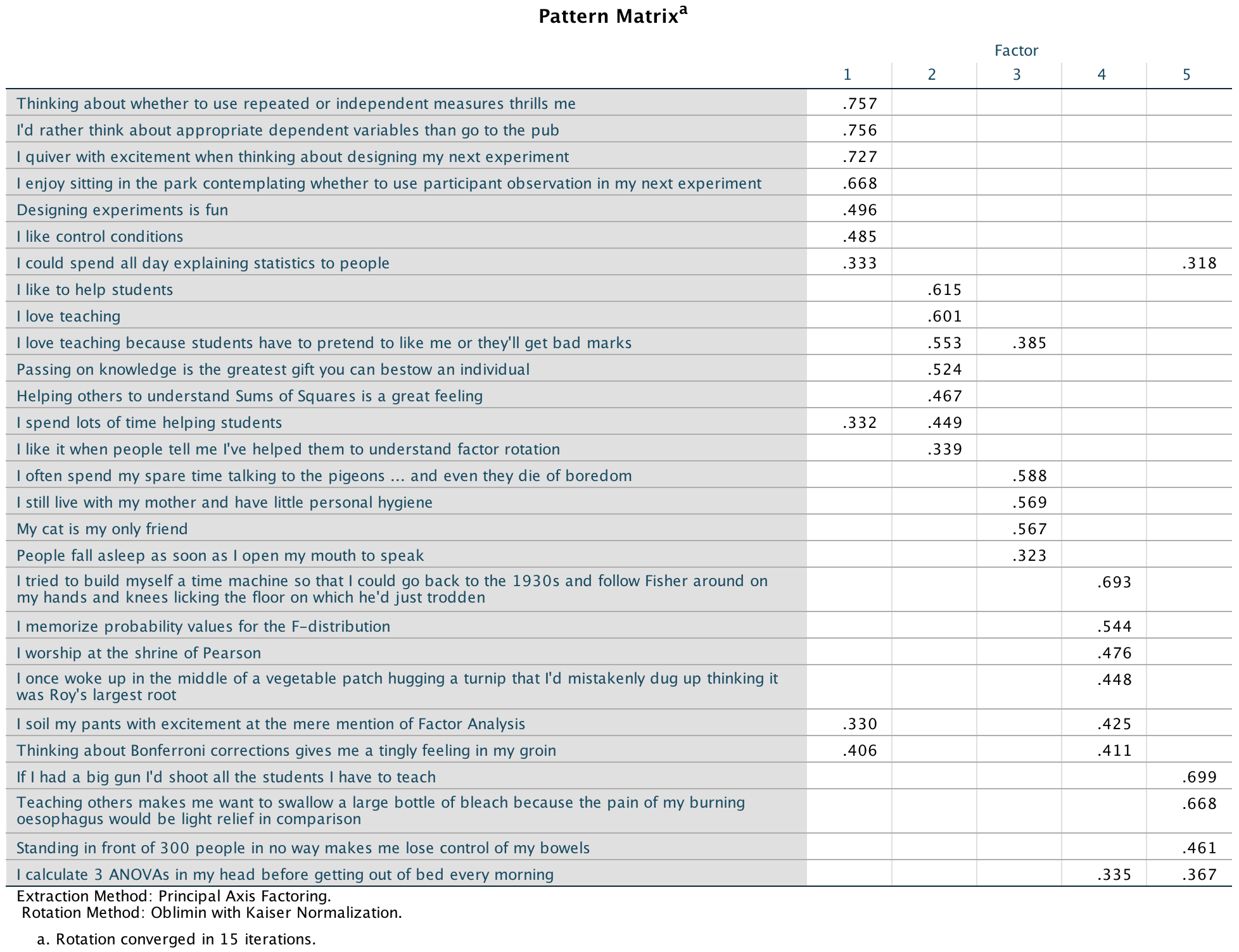
Output
- Factor 1:
- Q 16: Thinking about whether to use repeated or independent measures thrills me
- Q 14: I’d rather think about appropriate dependent variables than go to the pub
- Q 22: I quiver with excitement when thinking about designing my next experiment
- Q 17: I enjoy sitting in the park contemplating whether to use participant observation in my next experiment
- Q 13: Designing experiments is fun
- Q 8: I like control conditions
- Q 10: I could spend all day explaining statistics to people
- Factor 2:
- Q 19: I like to help students
- Q 20: Passing on knowledge is the greatest gift you can bestow an individual
- Q 25: I love teaching
- Q 27: I love teaching because students have to pretend to like me or they’ll get bad marks
- Q 7: Helping others to understand sums of squares is a great feeling
- Q 26: I spend lots of time helping students
- Factor 3:
- Q 23: I often spend my spare time talking to the pigeons … and even they die of boredom
- Q 28: My cat is my only friend
- Q 5: I still live with my mother and have little personal hygiene
- Q 12: People fall asleep as soon as I open my mouth to speak
- Factor 4:
- Q 24: I tried to build myself a time machine so that I could go back to the 1930s and follow Fisher around on my hands and knees licking the floor on which he’d just trodden
- Q 3: I memorize probability values for the F-distribution
- Q 4: I worship at the shrine of Pearson
- Q 15: I soil my pants with excitement at the mere mention of factor analysis
- Q 21: Thinking about Bonferroni corrections gives me a tingly feeling in my groin
- Q 1: I once woke up in the middle of a vegetable patch hugging a turnip that I’d mistakenly dug up thinking it was Roy’s largest root
- Factor 5:
- Q 6: Teaching others makes me want to swallow a large bottle of bleach because the pain of my burning oesophagus would be light relief in comparison
- Q 2: If I had a big gun I’d shoot all the students I have to teach
- Q 18: Standing in front of 300 people in no way makes me lose control of my bowels No factor:
- Q 9: I calculate three ANOVAs in my head before getting out of bed every morning
- Q 11: I like it when people tell me I’ve helped them to understand factor rotation
Factor 1 seems to relate to research methods, factor 2 to teaching, factor 3 to general social skills, factor 4 to statistics and factor 5 to, well, err, teaching again. All in all, this isn’t particularly satisfying and doesn’t really support the theoretical four-factor model. We saw earlier that the extraction of five factors probably wasn’t justified. In fact the scree plot seems to indicate four Let’s rerun the analysis but asking for four factors in the extraction dialog box:
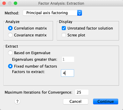
Completed dialog box
Let’s see how this changes the pattern matrix:
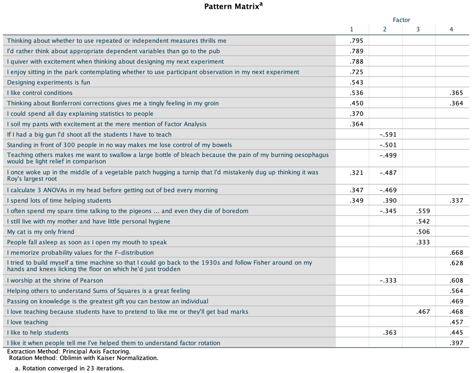
Output
We now get the following:
- Factor 1:
- Q 16: Thinking about whether to use repeated or independent measures thrills me
- Q 14: I’d rather think about appropriate dependent variables than go to the pub
- Q 22: I quiver with excitement when thinking about designing my next experiment
- Q 17: I enjoy sitting in the park contemplating whether to use participant observation in my next experiment
- Q 13: Designing experiments is fun
- Q 8: I like control conditions
- Q 21: Thinking about Bonferroni corrections gives me a tingly feeling in my groin
- Q 10: I could spend all day explaining statistics to people
- Q 15: I soil my pants with excitement at the mere mention of factor analysis
- Factor 2:
- Q 2: If I had a big gun I’d shoot all the students I have to teach (note negative weight)
- Q 18: Standing in front of 300 people in no way makes me lose control of my bowels (note negative weight)
- Q 6: Teaching others makes me want to swallow a large bottle of bleach because the pain of my burning oesophagus would be light relief in comparison (note negative weight)
- Q 1: I once woke up in the middle of a vegetable patch hugging a turnip that I’d mistakenly dug up thinking it was Roy’s largest root
- Q 9: I calculate three ANOVAs in my head before getting out of bed every morning
- Q 26: I spend lots of time helping students
- Factor 3:
- Q 23: I often spend my spare time talking to the pigeons … and even they die of boredom
- Q 5: I still live with my mother and have little personal hygiene
- Q 28: My cat is my only friend
- Q 12: People fall asleep as soon as I open my mouth to speak
- Factor 4:
- Q 3: I memorize probability values for the F-distribution
- Q 24: I tried to build myself a time machine so that I could go back to the 1930s and follow Fisher around on my hands and knees licking the floor on which he’d just trodden
- Q 4: I worship at the shrine of Pearson
- Q 7: Helping others to understand sums of squares is a great feeling
- Q 20: Passing on knowledge is the greatest gift you can bestow an individual
- Q 27: I love teaching because students have to pretend to like me or they’ll get bad marks
- Q 25: I love teaching
- Q 19: I like to help students
- Q 11: I like it when people tell me I’ve helped them to understand factor rotation
This factor structure is a bit clearer-cut: factor 1 largely relates to an enthusiasm for experimental design, factor 2 to a love of teaching (although a lot of reversed itsme there!), factor 3 to a complete absence of normal interpersonal skills, and 4. is a bit of a mishmash of a profound love of statistics and a love of teaching. Again, this factor structure doesn’t fully support the original four-factor model suggested because the data indicate that love of statistics can’t be separated out from a love of methods or a love of teaching. It’s almost as though the example is completely made up.
Task 18.3
Dr Sian Williams (University of Brighton) devised a questionnaire to measure organizational ability. She predicted five factors to do with organizational ability:(1) preference for organization; (2) goal achievement; (3) planning approach; (4) acceptance of delays; and (5) preference for routine. These dimensions are theoretically independent. Williams’s questionnaire contains 28 items using a seven-point Likert scale (1 = strongly disagree, 4 = neither, 7 = strongly agree). She gave it to 239 people. Run a principal component analysis on the data in Williams.sav.
The questionnaire items are as follows:
- I like to have a plan to work to in everyday life
- I feel frustrated when things don’t go to plan
- I get most things done in a day that I want to
- I stick to a plan once I have made it
- I enjoy spontaneity and uncertainty
- I feel frustrated if I can’t find something I need
- I find it difficult to follow a plan through
- I am an organized person
- I like to know what I have to do in a day
- Disorganized people annoy me
- I leave things to the last minute
- I have many different plans relating to the same goal
- I like to have my documents filed and in order
- I find it easy to work in a disorganized environment
- I make ‘to do’ lists and achieve most of the things on it
- My workspace is messy and disorganized
- I like to be organized
- Interruptions to my daily routine annoy me
- I feel that I am wasting my time
- I forget the plans I have made
- I prioritize the things I have to do
- I like to work in an organized environment
- I feel relaxed when I don’t have a routine
- I set deadlines for myself and achieve them
- I change rather aimlessly from one activity to another during the day
- I have trouble organizing the things I have to do
- I put tasks off to another day
- I feel restricted by schedules and plans
I ran the analysis with principal components and oblique rotation. The syntax for my analysis is as follows:
FACTOR
  /VARIABLES org1 org2 org3 org4 org6 org7 org9 org10 org11 org12 org13 org14 org16 org17 org18
    org19 org20 org21 org22 org23 org24 org25 org26 org27 org28 org29 org30 org31
  /MISSING LISTWISE
  /ANALYSIS org1 org2 org3 org4 org6 org7 org9 org10 org11 org12 org13 org14 org16 org17 org18
    org19 org20 org21 org22 org23 org24 org25 org26 org27 org28 org29 org30 org31
  /PRINT UNIVARIATE INITIAL CORRELATION SIG DET KMO INV REPR AIC EXTRACTION ROTATION
  /FORMAT SORT BLANK(.30)
  /PLOT EIGEN
  /CRITERIA MINEIGEN(1) ITERATE(25)
  /EXTRACTION PC
  /CRITERIA ITERATE(25) DELTA(0)
  /ROTATION OBLIMIN
  /METHOD=CORRELATION.
By default, five components have been extracted based on Kaiser’s criterion. The scree plot shows clear inflexions at 3 and 5 factors, and so using the scree plot you could justify extracting 3 or 5 factors.
Output
Output
Output
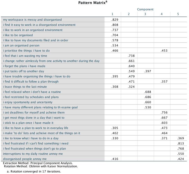
Output
Looking at the rotated component matrix (and using loadings greater than 0.4) we see the following pattern:
- Component 1: preference for organization (Note: It’s odd that none
of these have reverse loadings.)
- Q8: I am an organized person
- Q13: I like to have my documents filed and in order
- Q14: I find it easy to work in a disorganized environment
- Q 16: My workspace is messy and disorganized
- Q17: I like to be organized
- Q22: I like to work in an organized environment
- Component 2: goal achievement
- Q7: I find it difficult to follow a plan through
- Q11: I leave things to the last minute
- Q19: I feel that I am wasting my time
- Q20: I forget the plans I have made
- Q25: I change rather aimlessly from one activity to another during the day
- Q26: I have trouble organizing the things I have to do
- Q27: I put tasks off to another day Component 3: preference for routine
- Q5: I enjoy spontaneity and uncertainty
- Q12: I have many different plans relating to the same goal
- Q23: I feel relaxed when I don’t have a routine
- Q28: I feel restricted by schedules and plans
- Component 4: plan approach
- Q1: I like to have a plan to work to in everyday life
- Q3: I get most things done in a day that I want to
- Q4: I stick to a plan once I have made it
- Q9: I like to know what I have to do in a day
- Q15: I make ‘to do’ lists and achieve most of the things on it
- Q 21: I prioritize the things I have to do
- Q24: I set deadlines for myself and achieve them Component 5: acceptance of delays
- Q2: I feel frustrated when things don’t go to plan
- Q6: I feel frustrated if I can’t find something I need
- Q10: Disorganized people annoy me
- Q18: Interruptions to my daily routine annoy me
It seems as though there is some factorial validity to the structure.
Task 18.4
Zibarras, Port, and Woods (2008) looked at the relationship between personality and creativity. They used the Hogan Development Survey (HDS), which measures 11 dysfunctional dispositions of employed adults: being volatile, mistrustful, cautious, detached, passive_aggressive, arrogant, manipulative, dramatic, eccentric, perfectionist, and dependent. Zibarras et al. wanted to reduce these 11 traits down and, based on parallel analysis, found that they could be reduced to three components. They ran a principal component analysis with varimax rotation. Repeat this analysis (Zibarras et al. (2008).sav) to see which personality dimensions clustered together (see page 210 of the original paper).
As indicated in the question, I ran the analysis with principal components and varimax rotation. I specified to extract three factors to match Zibarras et al. (2008). The syntax for my analysis is as follows:
FACTOR
  /VARIABLES volatile mistrustful cautious detached passive_aggressive arrogant manipulative
    dramatic eccentric perfectist dependent
  /MISSING LISTWISE
  /ANALYSIS volatile mistrustful cautious detached passive_aggressive arrogant manipulative
    dramatic eccentric perfectist dependent
  /PRINT UNIVARIATE INITIAL CORRELATION SIG DET KMO INV REPR AIC EXTRACTION ROTATION
  /FORMAT SORT BLANK(.30)
  /PLOT EIGEN
  /CRITERIA FACTORS(3) ITERATE(25)
  /EXTRACTION PC
  /CRITERIA ITERATE(25)
  /ROTATION VARIMAX
  /METHOD=CORRELATION.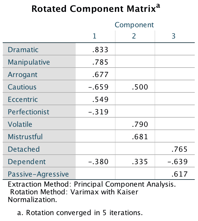
Output
The output shows the rotated component matrix, from which we see this pattern:
- Component 1:
- Dramatic
- Manipulative
- Arrogant
- Cautious (negative weight)
- Eccentric
- Perfectionist (negative weight)
- Component 2:
- Volatile
- Mistrustful
- Component 3:
- Detached
- Dependent (negative weight)
- Passive-aggressive
Compare these results to those of Zibarras et al. (Table 4 from the original paper reproduced below), and note that they are the same.
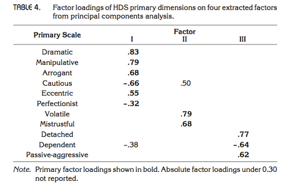
Output
Chapter 19
General
- To open the dialog box to weight cases select Data > Weight
Cases …. Next drag the variable containing the number of cases
(i.e. the frequency) to the box labelled Frequency Variable:
(or select the variable and click )
- To open the dialog box for a chi-square test select Analyze > Descriptive Statistics > Crosstabs ….
Task 19.1
Research suggests that people who can switch off from work (Detachment) during off-hours are more satisfied with life and have fewer symptoms of psychological strain (Sonnentag, 2012). Factors at work, such as time pressure, affect your ability to detach when away from work. A study of 1709 employees measured their time pressure (Time_Pressure) at work (no time pressure, low, medium, high and very high time pressure). Data generated to approximate Figure 1 in Sonnentag (2012) are in the file Sonnentag (2012).sav. Carry out a chi-square test to see if time pressure is associated with the ability to detach from work.
Follow the general instructions for this chapter to weight cases by the variable Frequency (see the completed dialog box below).
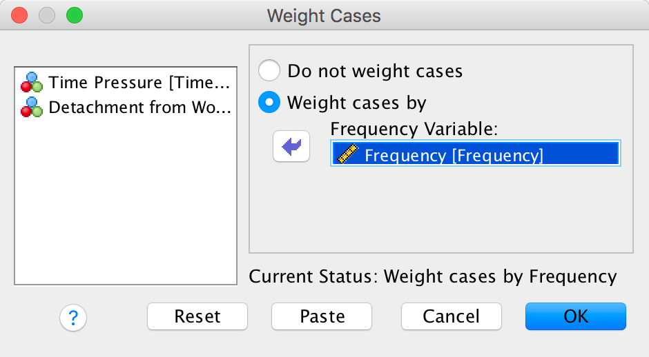
Completed dialog box
To conduct the chi-square test, use the crosstabs command by selecting Analyze > Descriptive Statistics > Crosstabs …. We have two variables in our crosstabulation table: Detachment and Time pressure. Drag one of these variables into the box labelled Row(s) (I selected Time Pressure in the figure). Next, drag the other variable of interest (Detachment) to the box labelled Column(s). Use the book chapter to select other appropriate options.
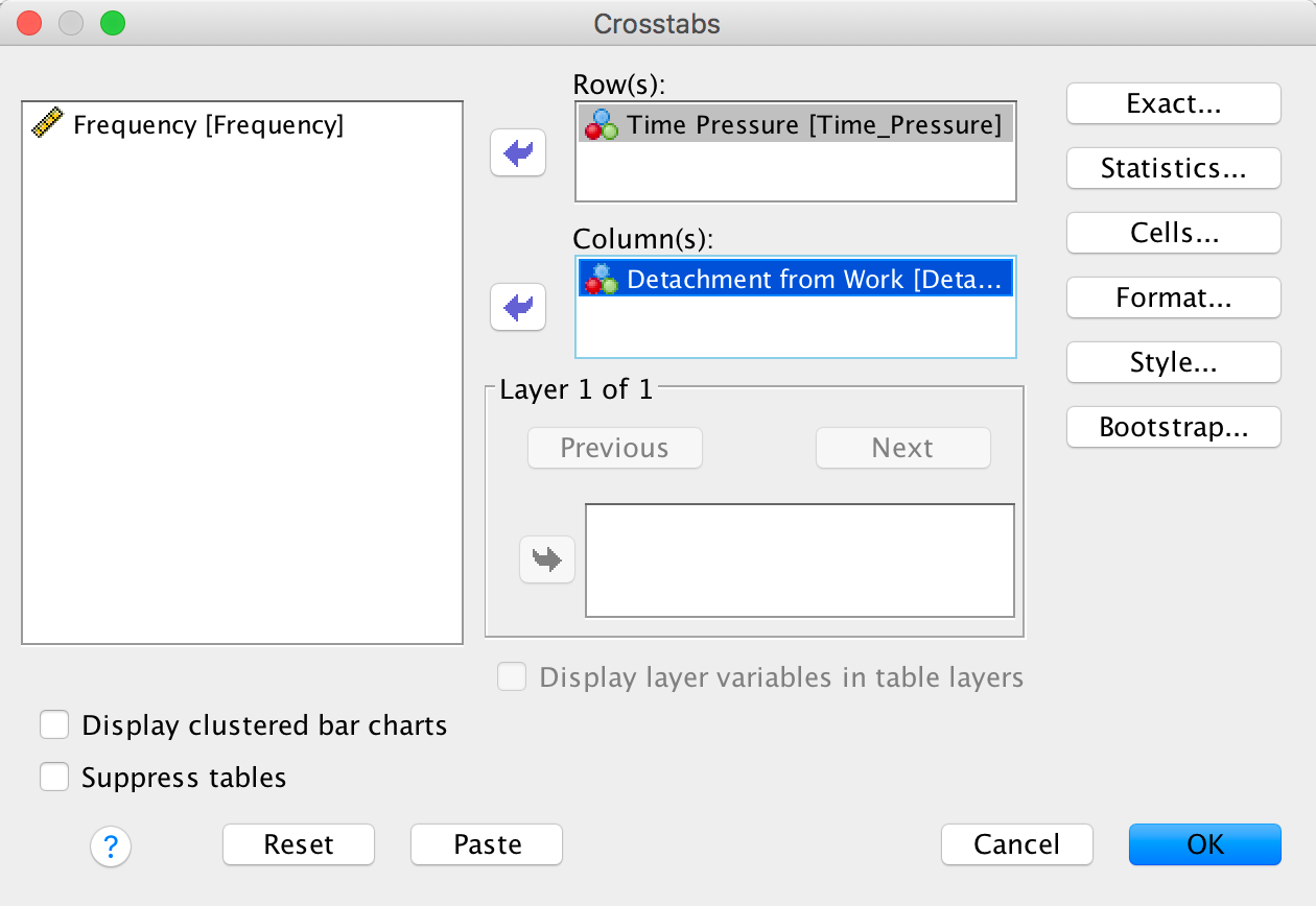
Completed dialog box
The chi-square test is highly significant, \(\chi^2\) 2(4) = 15.55, p = .004, indicating that the profile of low-detachment and very low-detachment responses differed across different time pressures. Looking at the standardized residuals, the only time pressure for which these are significant is very high time pressure, which showed the greatest split of whether the employees experienced low detachment (36%) or very low detachment (64%). Within the other time pressure groups all of the standardized residuals are lower than 1.96. It’s interesting to look at the direction of the residuals (i.e., whether they are positive or negative). For all time pressure groups except very high time pressure, the residual for ‘low detachment’ was positive but for ‘very low detachment’ was negative; these are, therefore, people who responded more than we would expect that they experienced low detachment from work and less than expected that they experienced very low detachment from work. It was only under very high time pressure that the opposite pattern occurred: the residual for ‘low detachment’ was negative but for ‘very low detachment’ was positive; these are, therefore, people who responded less than we would expect that they experienced low detachment from work and more than expected that they experienced very low detachment from work. In short, there are similar numbers of people who experience low detachment and very low detachment from work when there is no time pressure, low time pressure, medium time pressure and high time pressure. However, when time pressure was very high, significantly more people experienced very low detachment than low detachment.
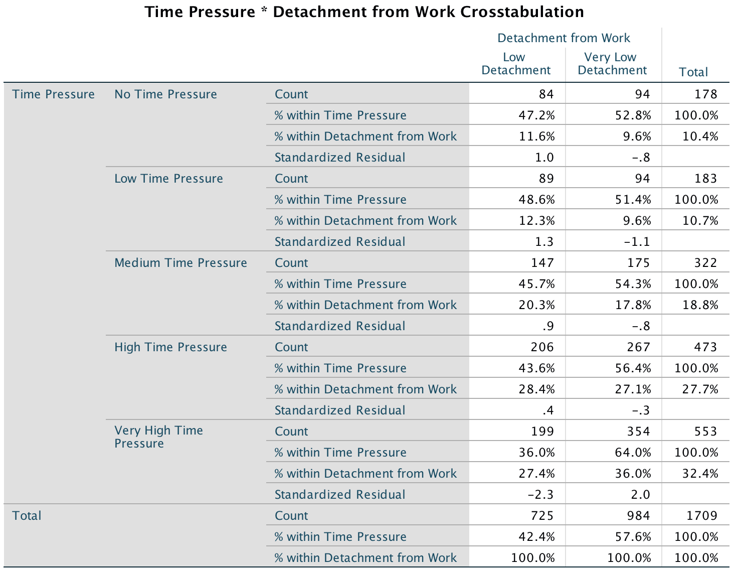
Output
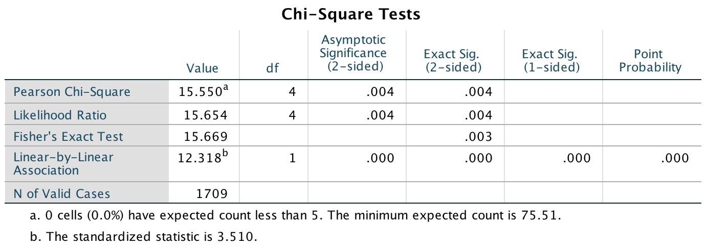
Output
Task 19.2
Labcoat Leni’s Real Research describes a study (Daniels, 2012) that looked at the impact of sexualized images of atheletes compared to performance pictures on women’s perceptions of the athletes and of themselves. Women looked at different types of pictures (Picture) and then did a writing task. Daniels identified whether certain themes were present or absent in each written piece (Theme_Present). We looked at the self-evaluation theme, but Daniels idetified others: commenting on the athlete’s body/appearance (Athletes_Body), indicating admiration or jelousy for the athlete (Admiration), indicating that the athlete was a role model or motivating (Role_Model), and their own physical activity (Self_Physical_Activity). Test whether the type of picture viewed was associated with commenting on the athlete’s body/appearance (Daniels (2012).sav).
Follow the general instructions for this chapter to weight cases by the variable Athletes_Body (see the completed dialog box below).
Completed dialog box
To conduct the chi-square test, use the crosstabs command by selecting Analyze > Descriptive Statistics > Crosstabs …. We have two variables in our crosstabulation table: Picture and Theme_Present. Drag one of these variables into the box labelled Row(s) (I selected Picture in the figure). Next, drag the other variable of interest (Theme_Present) to the box labelled Column(s). Use the book chapter to select other appropriate options.
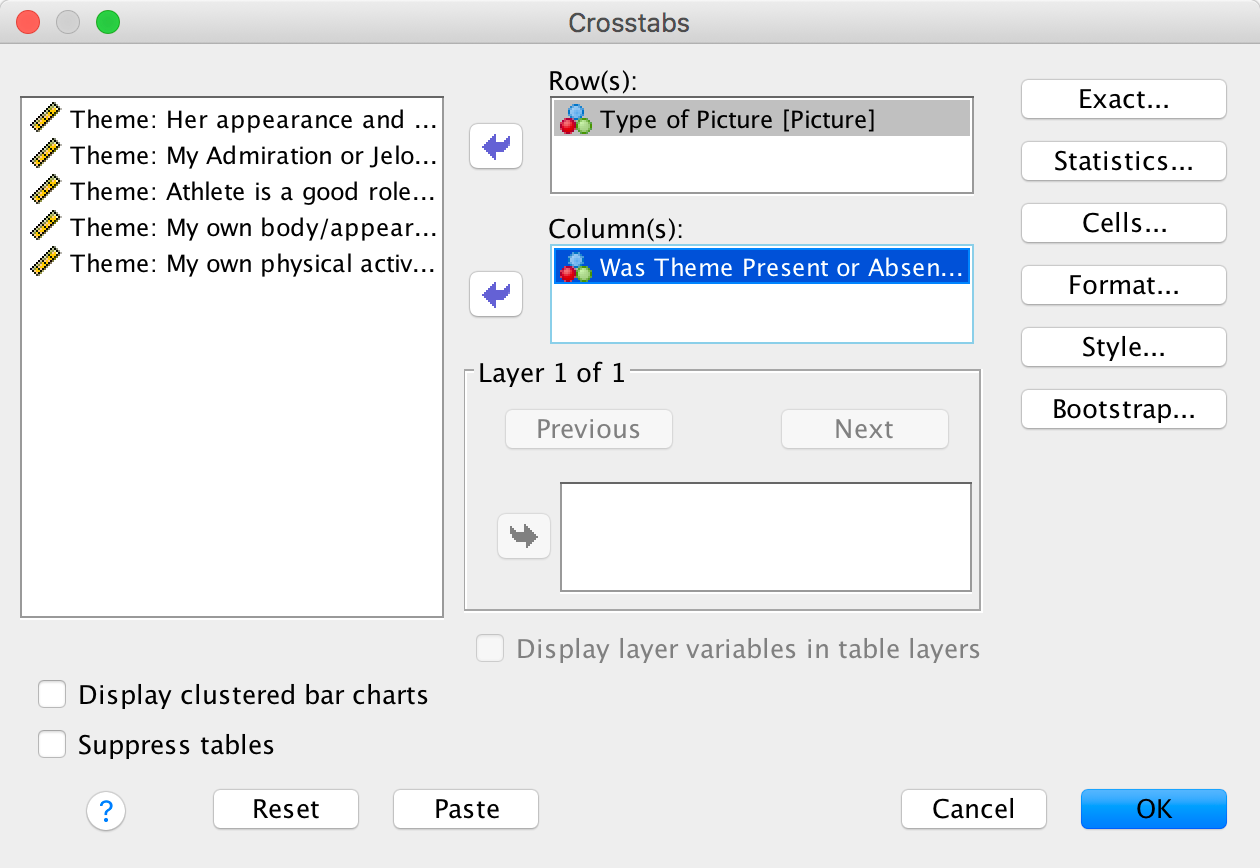
Completed dialog box
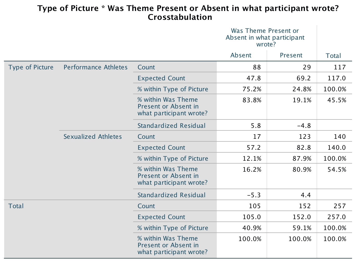
Output
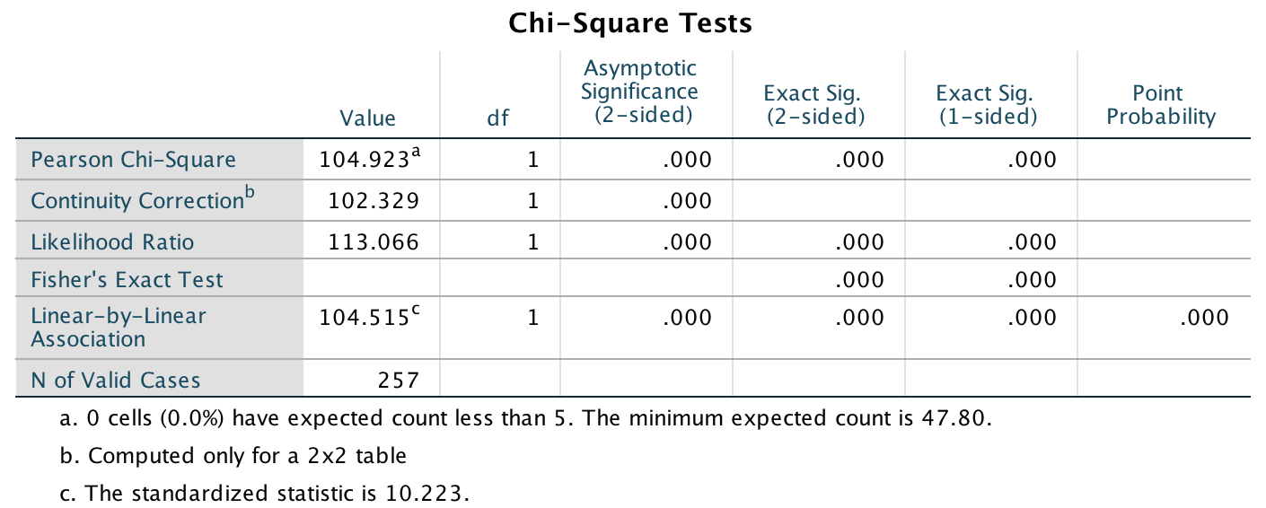
Output
The chi-square test is highly significant, \(\chi^2\)(1) = 104.92, p < .001. This indicates that the profile of theme present vs. theme absent differed across different pictures. Looking at the standardized residuals, they are significant for both pictures of performance athletes and sexualized pictures of athletes. If we look at the direction of these residuals (i.e., whether they are positive or negative), we can see that for pictures of performance athletes, the residual for ‘theme absent’ was positive but for ‘theme present’ was negative; this indicates that in this condition, more people than we would expect did not include the theme her appearance and attractiveness and fewer people than we would expect did include this theme in what they wrote. In the sexualized picture condition on the other hand, the opposite was true: the residual for ‘theme absent’ was negative and for ‘theme present’ was positive. This indicates that in the sexualized picture condition, more people than we would expect included the theme her appearance and attractiveness in what they wrote and fewer people than we would expect did not include this theme in what they wrote.
Daniels reports:
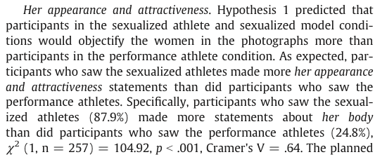
Extract from article
Task 19.3
Using the data in Task 2, see whether the type of picture viewed was associated with indicating admiration or jelousy for the athlete.
Follow the general instructions for this chapter to weight cases by the variable Admiration (see the completed dialog box below).
 To conduct the chi-square test, use the
crosstabs command by selecting Analyze > Descriptive Statistics
> Crosstabs …. We have two variables in our crosstabulation
table: Picture and Theme_Present. Drag
one of these variables into the box labelled Row(s) (I selected
Picture in the figure). Next, drag the other variable
of interest (Theme_Present) to the box labelled
Column(s). Use the book chapter to select other appropriate
options.
To conduct the chi-square test, use the
crosstabs command by selecting Analyze > Descriptive Statistics
> Crosstabs …. We have two variables in our crosstabulation
table: Picture and Theme_Present. Drag
one of these variables into the box labelled Row(s) (I selected
Picture in the figure). Next, drag the other variable
of interest (Theme_Present) to the box labelled
Column(s). Use the book chapter to select other appropriate
options.
Completed dialog box

Output
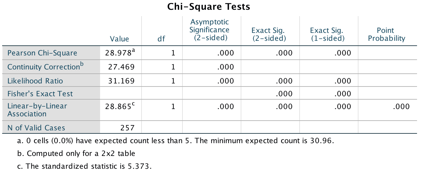
Output
The chi-square test is highly significant, \(\chi^2\)(1) = 28.98, p < .001. This indicates that the profile of theme present vs. theme absent differed across different pictures. Looking at the standardized residuals, they are significant for both pictures of performance athletes and sexualized pictures of athletes. If we look at the direction of these residuals (i.e., whether they are positive or negative), we can see that for pictures of performance athletes, the residual for ‘theme absent’ was positive but for ‘theme present’ was negative; this indicates that in this condition, more people than we would expect did not include the theme My admiration or jealousy for the athlete and fewer people than we would expect did include this theme in what they wrote. In the sexualized picture condition, on the other hand, the opposite was true: the residual for ‘theme absent’ was negative and for ‘theme present was positive’. This indicates that in the sexualized picture condition, more people than we would expect included the theme My admiration or jealousy for the athlete in what they wrote and fewer people than we would expect did not include this theme in what they wrote.
Daniels reports:
Extract from article
Task 19.4
Using the data in Task 2, see whether the type of picture viewed was associated with indicating that the athlete was a role model or motivating.
Follow the general instructions for this chapter to weight cases by the variable Role_Model (see the completed dialog box below).
 To conduct the chi-square test, use the
crosstabs command by selecting Analyze > Descriptive Statistics
> Crosstabs …. We have two variables in our crosstabulation
table: Picture and Theme_Present. Drag
one of these variables into the box labelled Row(s) (I selected
Picture in the figure). Next, drag the other variable
of interest (Theme_Present) to the box labelled
Column(s). Use the book chapter to select other appropriate
options.
To conduct the chi-square test, use the
crosstabs command by selecting Analyze > Descriptive Statistics
> Crosstabs …. We have two variables in our crosstabulation
table: Picture and Theme_Present. Drag
one of these variables into the box labelled Row(s) (I selected
Picture in the figure). Next, drag the other variable
of interest (Theme_Present) to the box labelled
Column(s). Use the book chapter to select other appropriate
options.
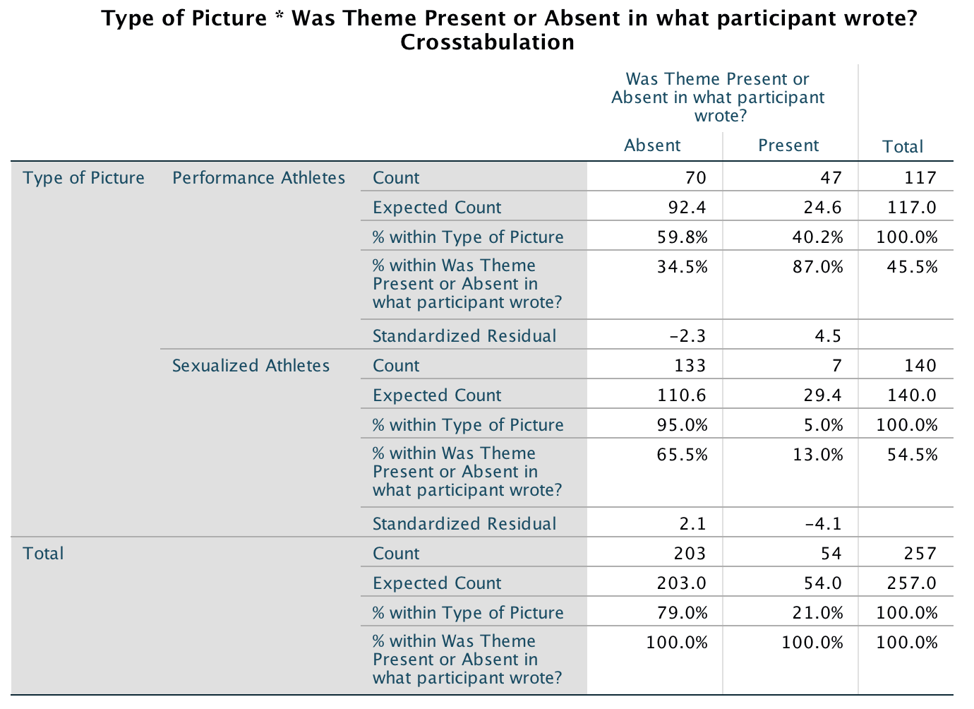
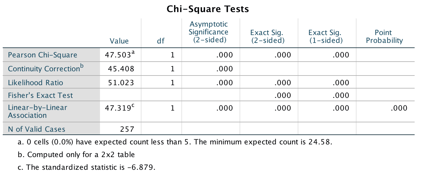
Output
The chi-square test is highly significant, \(\chi^2\)(1) = 47.50, p < .001. This indicates that the profile of theme present vs. theme absent differed across different pictures. Looking at the standardized residuals, they are significant for both types of pictures. If we look at the direction of these residuals (i.e., whether they are positive or negative), we can see that for pictures of performance athletes, the residual for ‘theme absent’ was negative but was positive for ‘theme present’. This indicates that when looking at pictures of performance athletes, more people than we would expect included the theme Athlete is a good role model and fewer people than we would expect did not include this theme in what they wrote. In the sexualized picture condition on the other hand, the opposite was true: the residual for ‘theme absent’ was positive and for ‘theme present’ it was negative. This indicates that in the sexualized picture condition, more people than we would expect did not include the theme Athlete is a good role model in what they wrote and fewer people than we would expect did include this theme in what they wrote.
Daniels reports:
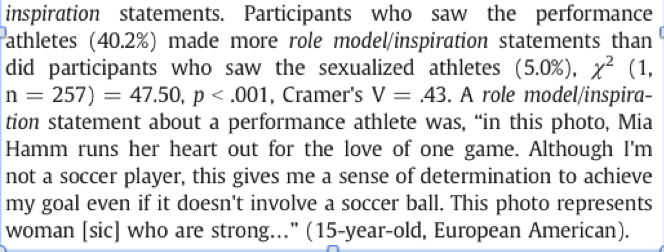
Extract from article
Task 19.5
Using the data in Task 2, see whether the type of picture viewed was associated with the participant commenting on their own physical activity.
Follow the general instructions for this chapter to weight cases by the variable Self_Evaluation (see the completed dialog box below).
Completed dialog box
To conduct the chi-square test, use the crosstabs command by selecting Analyze > Descriptive Statistics > Crosstabs …. We have two variables in our crosstabulation table: Picture and Theme_Present. Drag one of these variables into the box labelled Row(s) (I selected Picture in the figure). Next, drag the other variable of interest (Theme_Present) to the box labelled Column(s). Use the book chapter to select other appropriate options.
Completed dialog box
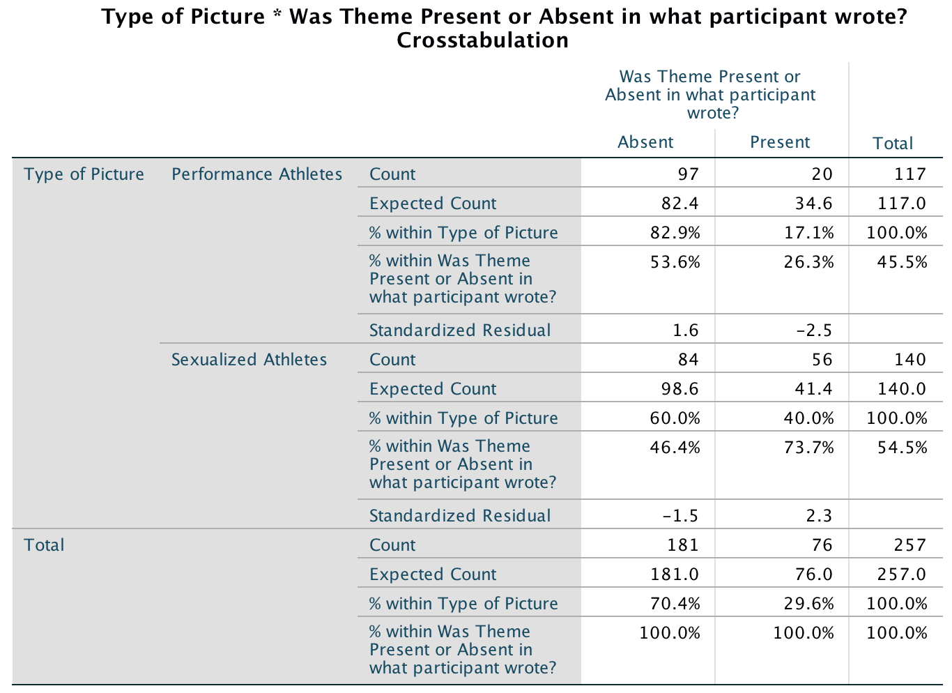
Output
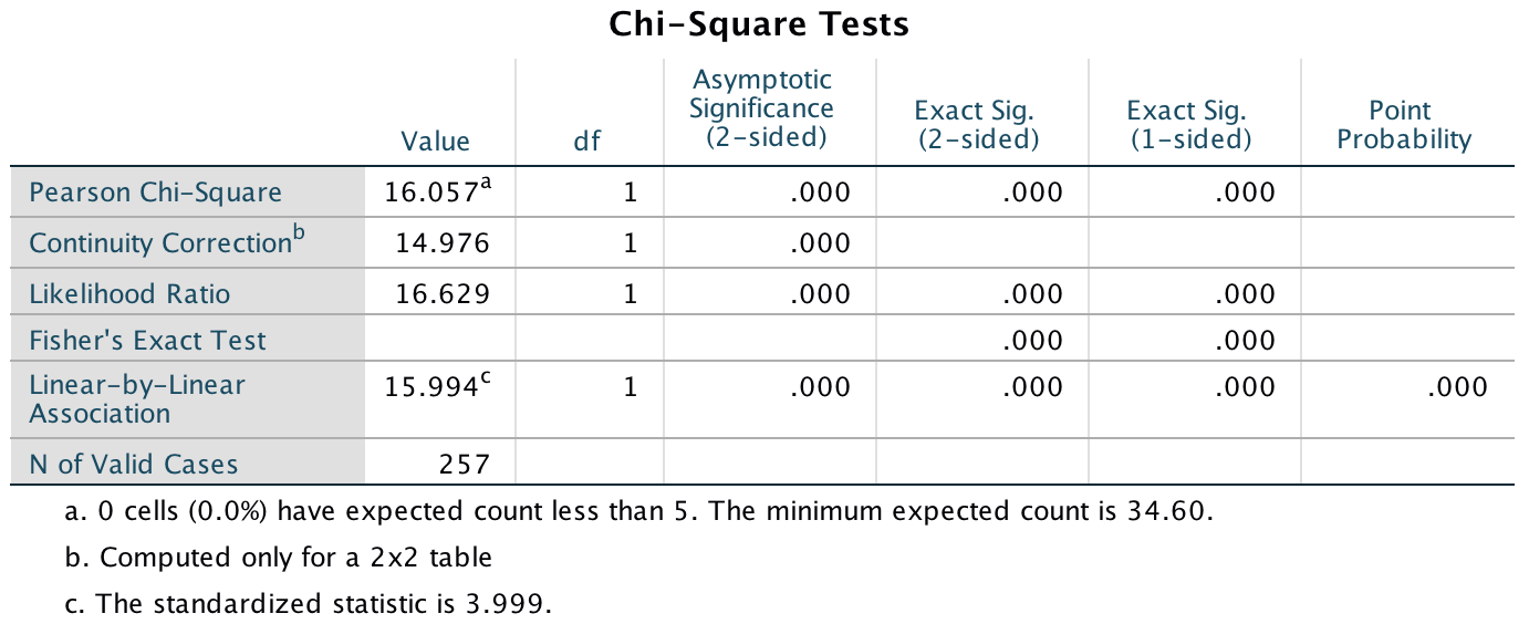
Output
The chi-square test is significant, \(\chi^2\)(1) = 5.91, p = .02. This indicates that the profile of theme present vs. theme absent differed across different pictures. Looking at the standardized residuals, they are not significant for either type of picture (i.e., they are less than 1.96). If we look at the direction of these residuals (i.e., whether they are positive or negative), we can see that for pictures of performance athletes, the residual for ‘theme absent’ was negative and for ‘theme present’ was positive. This indicates that when looking at pictures of performance athletes, more people than we would expect included the theme My own physical activity and fewer people than we would expect did not include this theme in what they wrote. In the sexualized picture condition on the other hand, the opposite was true: the residual for ‘theme absent’ was positive and for ‘theme present’ it was negative. This indicates that in the sexualized picture condition, more people than we would expect did not include the theme My own physical activity in what they wrote and fewer people than we would expect did include this theme in what they wrote.
Daniels reports:
Extract from article
Task 19.6
I wrote much of the third edition of this book in the Netherlands (I have a soft spot for it). The Dutch travel by bike much more than the English. I noticed that many more Dutch people cycle while steering with only one hand. I pointed this out to one of my friends, Birgit Mayer, and she said that I was a crazy English fool and that Dutch people did not cycle one-handed. Several weeks of me pointing at one-handed cyclists and her pointing at two-handed cyclists ensued. To put it to the test I counted the number of Dutch and English cyclists who ride with one or two hands on the handlebars (Handlebars.sav). Can you work out which one of us is correct?
Follow the general instructions for this chapter to weight cases by the variable Frequency (see the completed dialog box below).
Completed dialog box
To conduct the chi-square test, use the crosstabs command by selecting Analyze > Descriptive Statistics > Crosstabs …. We have two variables in our crosstabulation table: Nationality and Hands. Drag one of these variables into the box labelled Row(s) (I selected Nationality in the figure). Next, drag the other variable of interest (Hands) to the box labelled Column(s). Use the book chapter to select other appropriate options.
Completed dialog box
The crosstabulation table produced by SPSS contains the number of cases that fall into each combination of categories. We can see that in total 137 people rode their bike one-handed, of which 120 (87.6%) were Dutch and only 17 (12.4%) were English; 732 people rode their bike two-handed, of which 578 (79%) were Dutch and only 154 (21%) were English.
Before moving on to look at the test statistic itself, we can check that the assumption for chi-square has been met. The assumption is that in 2 × 2 tables (which is what we have here), all expected frequencies should be greater than 5. The smallest expected count is 27 (for English people who ride their bike one-handed). This value exceeds 5 and so the assumption has been met.
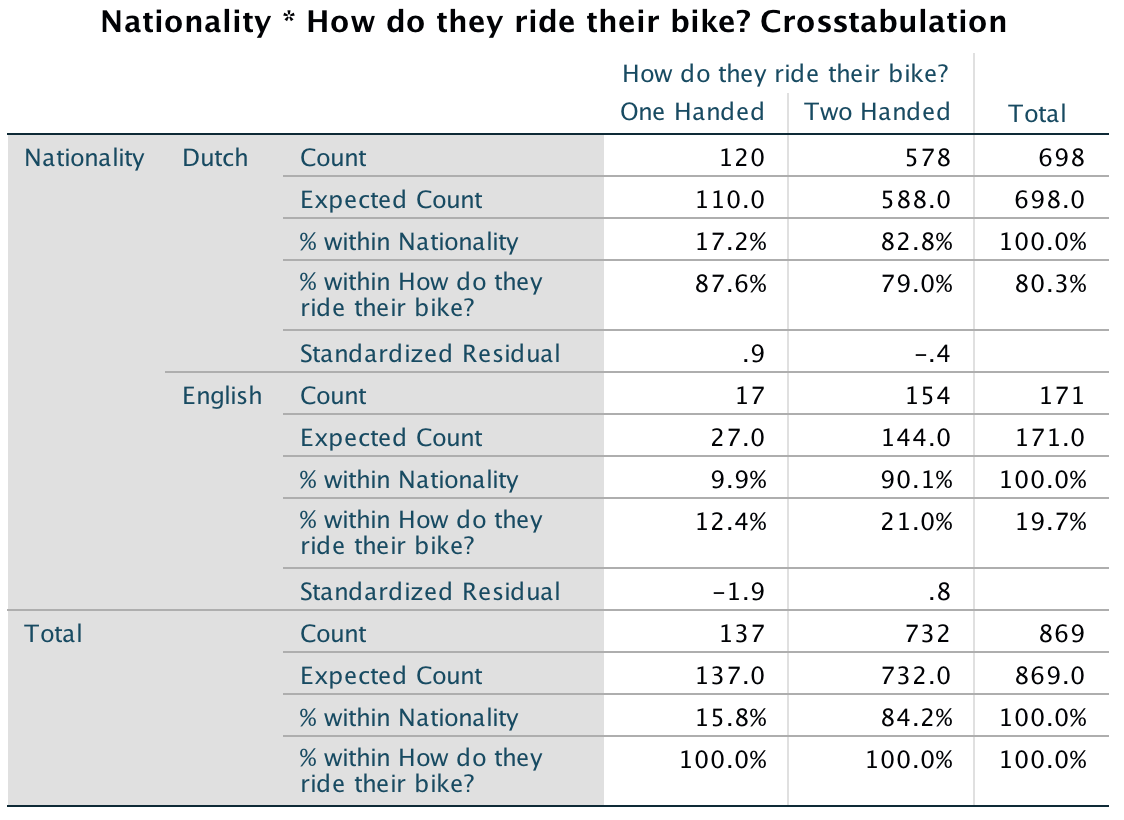
Output
The value of the chi-square statistic is 5.44. This value has a two-tailed significance of .020, which is smaller than .05 (hence significant), which suggests that the pattern of bike riding (i.e., relative numbers of one- and two-handed riders) significantly differs in English and Dutch people.
The significant result indicates that there is an association between whether someone is Dutch or English and whether they ride their bike one- or two-handed. Looking at the frequencies, this finding seems to show that the ratio of one- to two-handed riders differs in Dutch and English people. In Dutch people 17.2% ride their bike one-handed compared to 82.8% who ride two-handed. In England, though, only 9.9% ride their bike one-handed (almost half as many as in Holland), and 90.1% ride two-handed. If we look at the standardized residuals (in the contingency table) we can see that the only cell with a residual approaching significance (a value that lies outside of ±1.96) is the cell for English people riding one-handed (z = -1.9). The fact that this value is negative tells us that fewer people than expected fell into this cell.
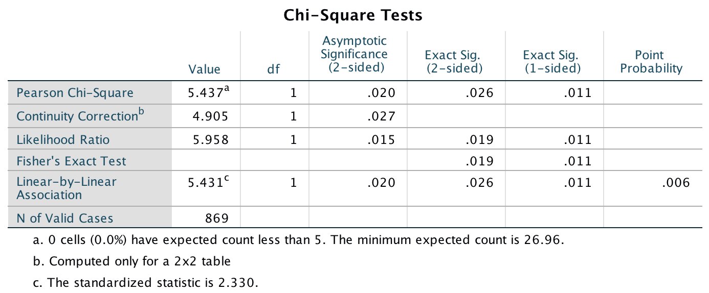
Output
Task 19.7
Compute and interpret the odds ratio for Task 6.
The odds of someone riding one-handed if they are Dutch are:
\[ \text{odds}_{one-handed, Dutch} = \frac{120}{578} = 0.21 \]
The odds of someone riding one-handed if they are English are:
\[ \text{odds}_{one-handed, English} = \frac{17}{154} = 0.11 \]
Therefore, the odds ratio is:
\[ \text{odds ratio} = \frac{\text{odds}_{one-handed, Dutch}}{\text{odds}_{one-handed, English}} = \frac{0.21}{0.11} = 1.90 \]
In other words, the odds of riding one-handed if you are Dutch are 1.9 times higher than if you are English (or, conversely, the odds of riding one-handed if you are English are about half that of a Dutch person). We could report this effect as:
- There was a significant association between nationality and whether the Dutch or English rode their bike one- or two-handed, \(\chi^2\)(1) = 5.44, p < .05. This represents the fact that, based on the odds ratio, the odds of riding a bike one-handed were 1.9 time higher for Dutch people than for English people. This supports Field’s argument that there are more one-handed bike riders in the Netherlands than in England and utterly refutes Mayer’s competing theory. These data are in no way made up.
Task 19.8
Certain editors at Sage like to think they’re great at football (soccer). To see whether they are better than Sussex lecturers and postgraduates we invited employees of Sage to join in our football matches. Every person played in one match. Over many matches, we counted the number of players that scored goals. Is there a significant relationship between scoring goals and whether you work for Sage or Sussex? (Sage Editors Can’t Play Football.sav)
Follow the general instructions for this chapter to weight cases by the variable frequency (see the completed dialog box below).

Completed dialog box
To conduct the chi-square test, use the crosstabs command by selecting Analyze > Descriptive Statistics > Crosstabs …. We have two variables in our crosstabulation table: Employer and Score. Drag one of these variables into the box labelled Row(s) (I selected Employer in the figure). Next, drag the other variable of interest (Score) to the box labelled Column(s). Use the book chapter to select other appropriate options.
Completed dialog box
The crosstabulation table produced by SPSS Statistics contains the number of cases that fall into each combination of categories. We can see that in total 28 people scored goals and of these 5 were from Sage Publications and 23 were from Sussex; 49 people didn’t score at all (63.6% of the total) and, of those, 19 worked for Sage (38.8% of the total that didn’t score) and 30 were from Sussex (61.2% of the total that didn’t score).
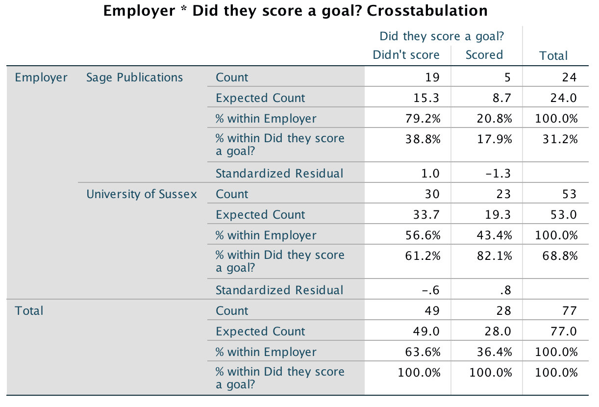
Output
Before moving on to look at the test statistic itself we check that the assumption for chi-square has been met. The assumption is that in 2 × 2 tables (which is what we have here), all expected frequencies should be greater than 5. The smallest expected count is 8.7 (for Sage editors who scored). This value exceeds 5 and so the assumption has been met.
Pearson’s chi-square test examines whether there is an association between two categorical variables (in this case the job and whether the person scored or not). The value of the chi-square statistic is 3.63. This value has a two-tailed significance of .057, which is bigger than .05 (hence, non-significant). Because we made a specific prediction (that Sussex people would score more than Sage people), there is a case to be made that we can halve this p-value, which would give us a significant association (because p = .0285, which is less than .05). However, as explained in the book, I’m not a big fan of one-tailed tests. In any case, we’d be well-advised to look for other information such as an effect size. Which brings us neatly onto the next task …
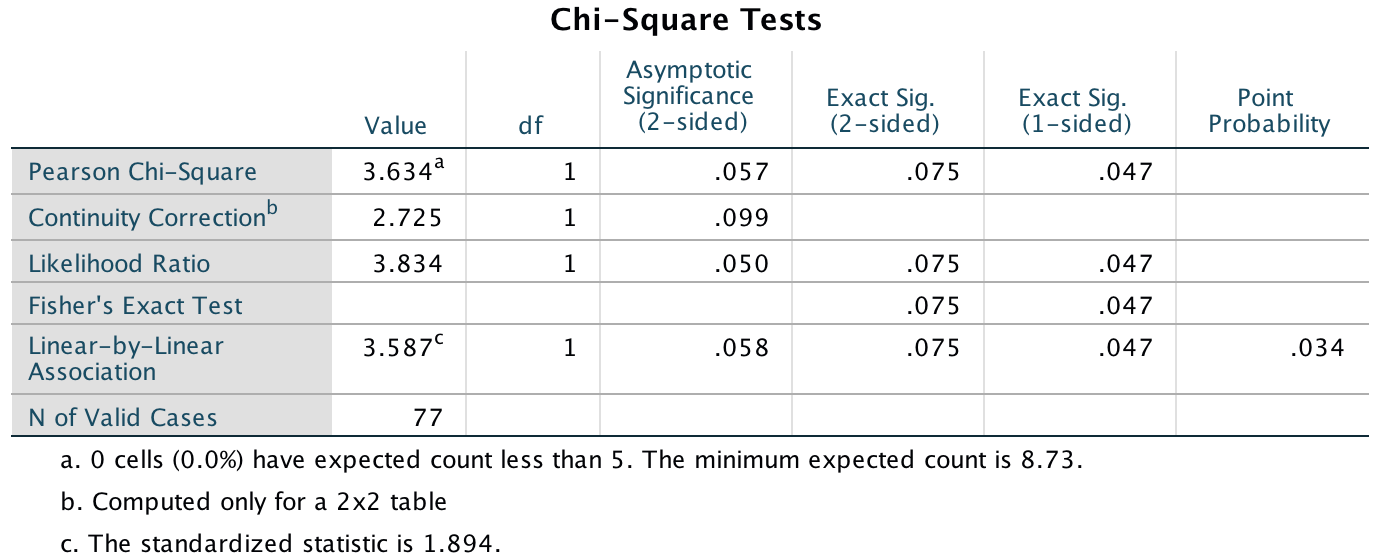
Output
Task 19.9
Compute and interpret the odds ratio for Task 8.
The odds of someone scoring given that they were employed by SAGE are:
\[ \text{odds}_{scored, Sage} = \frac{5}{19}= 0.26 \]
The odds of someone scoring given that they were employed by Sussex are:
\[ \text{odds}_{scored, Sussex} = \frac{23}{30} = 0.77 \]
Therefore, the odds ratio is:
\[ \text{odds ratio} = \frac{\text{odds}_{scored, Sage}}{\text{odds}_{scored, Sussex}} = \frac{0.26}{0.77} = 0.34 \] The odds of scoring if you work for Sage are 0.34 times as high as if you work for Sussex; another way to express this is that if you work for Sussex, the odds of scoring are 1/0.34 = 2.95 times higher than if you work for Sussex. We could report this as follows:
- There was a non-significant association between the type of job and whether or not a person scored a goal, \(\chi^2\)(1) = 3.63, p = .057, OR = 2.95. Despite the non-significant result, the odds of Sussex employees scoring were 2.95 times higher than that for Sage employees.
Task 19.10
I was interested in whether horoscopes are tosh. I recruited 2201 people, made a note of their star sign (this variable, obviously, has 12 categories: Capricorn, Aquarius, Pisces, Aries, Taurus, Gemini, Cancer, Leo, Virgo, Libra, Scorpio and Sagittarius) and whether they believed in horoscopes (this variable has two categories: believer or unbeliever). I sent them an identical horoscope about events in the next month, which read ‘August is an exciting month for you. You will make friends with a tramp in the first week and cook him a cheese omelette. Curiosity is your greatest virtue, and in the second week, you’ll discover knowledge of a subject that you previously thought was boring. Statistics perhaps. You might purchase a book around this time that guides you towards this knowledge. Your new wisdom leads to a change in career around the third week, when you ditch your current job and become an accountant. By the final week you find yourself free from the constraints of having friends, your boy/girlfriend has left you for a Russian ballet dancer with a glass eye, and you now spend your weekends doing loglinear analysis by hand with a pigeon called Hephzibah for company.’ At the end of August I interviewed these people and I classified the horoscope as having come true, or not, based on how closely their lives had matched the fictitious horoscope. Conduct a loglinear analysis to see whether there is a relationship between the person’s star sign, whether they believe in horoscopes and whether the horoscope came true (Horoscope.sav).
Follow the general instructions for this chapter to weight cases by the variable Frequency (see the completed dialog box below).
Completed dialog box
To get a crosstabulation table, select Analyze > Descriptive Statistics > Crosstabs …. We have three variables in our crosstabulation table: Star_Sign Believe and True. Drag one of these variables into the box labelled Row(s) (I selected Believe in the figure). Drag a second variable of interest (I chose True) to the box labelled Column(s), and drag the final variable (Star_Sign) to the box labelled Layer 1 of 1. The table is quite large so I’ve set a minimal set of cell values (observed values, expected values and standardized residuals).
Completed dialog box

Completed dialog box
The crosstabulation table produced by SPSS Statistics contains the number of cases that fall into each combination of categories. Although this table is quite complicated, you should be able to see that there are roughly the same number of believers and non-believers and similar numbers of those whose horoscopes came true or didn’t. These proportions are fairly consistent also across the different star signs. There are no expected counts less than 5, so the assumption of the test is met.
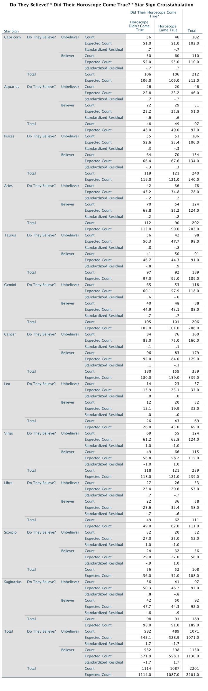
Output
To run a loglinear analysis that is consistent with my section on the
theory is to select Analyze > Loglinear > Model Selection
… to access the dialog box in the figure. Drag the variables that
you want to include in the analysis to the box labelled
Factor(s). Select each variable in the Factor(s) box
and click  to
activate a dialog box in which you specify the value of the minimum and
maximum code that you’ve used for that variable (the figure shows these
values for the variables in this dataset). When you’ve done this, click
to
activate a dialog box in which you specify the value of the minimum and
maximum code that you’ve used for that variable (the figure shows these
values for the variables in this dataset). When you’ve done this, click
 to
return to main dialog box, and to fit the
model.
to
return to main dialog box, and to fit the
model.
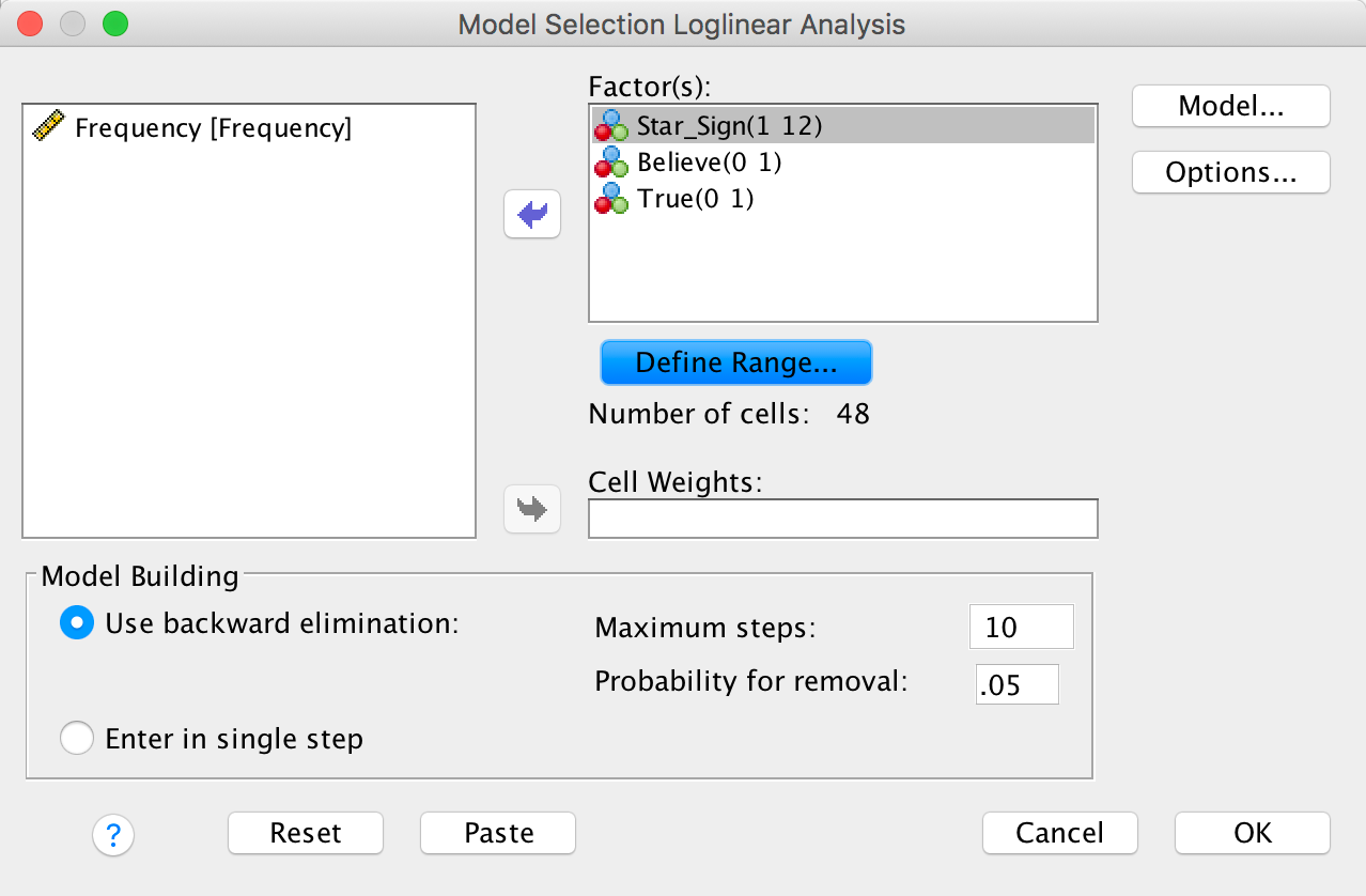
Completed dialog box
To begin with, SPSS Statistics fits the saturated model (all terms are in the model, including the highest-order interaction, in this case the star sign × believe × true interaction). The two goodness-of-fit statistics (Pearson’s chi-square and the likelihood-ratio statistic) test the hypothesis that the frequencies predicted by the model (the expected frequencies) are significantly different from the actual frequencies in our data (the observed frequencies). At this stage the model fits the data perfectly, so both statistics are 0 and yield a p-value of ‘.’ (i.e., SPSS Statistics can’t compute the probability).
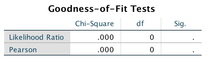
Output
The next part of the output tells us something about which components of the model can be removed. The first bit of the output is labelled K-Way and Higher-Order Effects, and underneath there is a table showing likelihood-ratio and chi-square statistics when K = 1, 2 and 3 (as we go down the rows of the table). The first row (K = 1) tells us whether removing the one-way effects (i.e., the main effects of star sign, believer and true) and any higher-order effects will significantly affect the fit of the model. There are lots of higher-order effects here - there are the two-way interactions and the three-way interaction - and so this is basically testing whether if we remove everything from the model there will be a significant effect on the fit of the model. This is highly significant because the p-value is given as .000, which is less than .05. The next row of the table (K = 2) tells us whether removing the two-way interactions (i.e., the star sign × believe, star sign × true, and believe × true interactions) and any higher-order effects will affect the model. In this case there is a higher-order effect (the three-way interaction) so this is testing whether removing the two-way interactions and the three-way interaction would affect the fit of the model. This is significant (p = .03, which is less than .05) indicating that if we removed the two-way interactions and the three-way interaction then this would have a significant detrimental effect on the model. The final row (K = 3) is testing whether removing the three-way effect and higher-order effects will significantly affect the fit of the model. The three-way interaction is of course the highest-order effect that we have. so this is simply testing whether removal of the three-way interaction (star sign × believe × true) will significantly affect the fit of the model. If you look at the two columns labelled Sig. then you can see that both chi-square and likelihood ratio tests agree that removing this interaction will not significantly affect the fit of the model (because p > .05).
The next part of the table expresses the same thing but without including the higher-order effects. It’s labelled K-Way Effects and lists tests for when K = 1, 2 and 3. The first row (K = 1), therefore, tests whether removing the main effects (the one-way effects) has a significant detrimental effect on the model. The p-values are less than .05, indicating that if we removed the main effects of star sign, believe and true from our model it would significantly affect the fit of the model (in other words, one or more of these effects is a significant predictor of the data). The second row (K = 2) tests whether removing the two-way interactions has a significant detrimental effect on the model. The p-values are less than .05, indicating that if we removed the star sign × believe, star sign × true and believe × true interactions then this would significantly reduce how well the model fits the data. In other words, one or more of these two-way interactions is a significant predictor of the data. The final row (K = 3) tests whether removing the three-way interaction has a significant detrimental effect on the model. The p-values are greater than .05, indicating that if we removed the star sign × believe × true interaction then this would not significantly reduce how well the model fits the data. In other words, this three-way interaction is not a significant predictor of the data. This row should be identical to the final row of the upper part of the table (the K-Way and Higher-Order Effects) because it is the highest-order effect and so in the previous table there were no higher-order effects to include in the test (look at the output and you’ll see the results are identical).
In a nutshell, this tells us that the three-way interaction is not significant: removing it from the model does not have a significant effect on how well the model fits the data. We also know that removing all two-way interactions does have a significant effect on the model, as does removing the main effects, but you have to remember that loglinear analysis should be done hierarchically and so these two-way interactions are more important than the main effects.
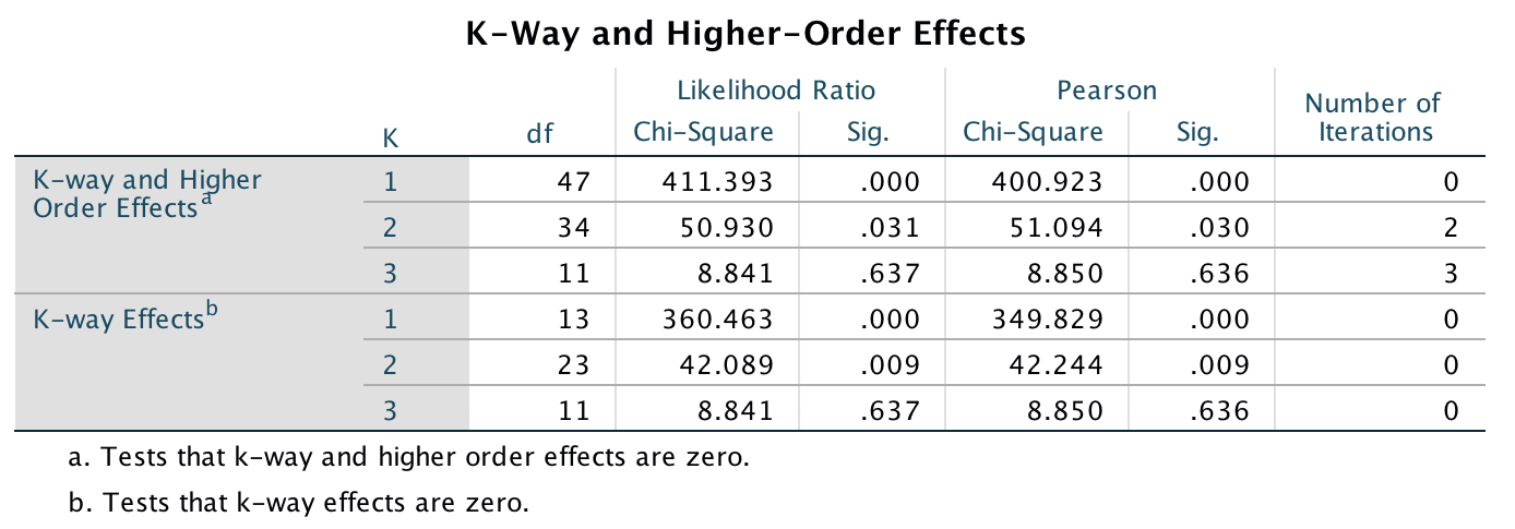
Output
The Partial Associations table simply breaks down the table that we’ve just looked at into its component parts. So, for example, although we know from the previous output that removing all of the two-way interactions significantly affects the model, we don’t know which of the two-way interactions is having the effect. This table tells us. We get a Pearson chi-square test for each of the two-way interactions and the main effects, and the column labelled Sig. tells us which of these effects is significant (values less than .05 are significant). We can tell from this that the star sign × believe and believe × true interactions are significant, but the star sign × true interaction is not. Likewise, we saw in the previous output that removing the one-way effects also significantly affects the fit of the model, and these findings are confirmed here because the main effect of star sign is highly significant (although this just means that we collected different amounts of data for each of the star signs!).
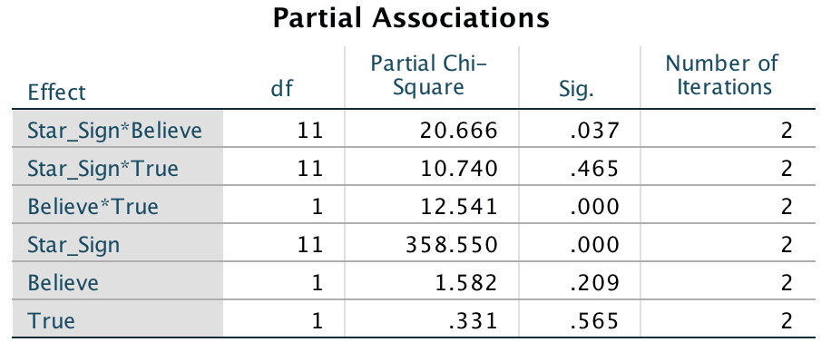
Output
The final bit of output deals with the backward elimination. SPSS Statistics begins with the highest-order effect (in this case, the star sign × believe × true interaction), remove it from the model, see what effect this has, and, if this effect is not significant, move on to the next highest effects (in this case the two-way interactions). As we’ve already seen, removing the three-way interaction does not have a significant effect, and the table labelled Step Summary confirms that removing the three-way interaction has a non-significant effect on the model. At step 1, the three two-way interactions are then assessed in the bit of the table labelled Deleted Effect. From the values of Sig. it’s clear that the star sign × believe (p = .037) and believe × true (p = .000) interactions are significant but the star sign × true interaction (p = 0. 465) is not. Therefore, at step 2 the non-significant star sign × true interaction is deleted, leaving the remaining two-way interactions in the model. These two interactions are then re-evaluated and both the star sign × believe (p = .049) and believe × true (p = .001) interactions are still significant and so are still retained. The final model is the one that retains all main effects and these two interactions. As neither of these interactions can be removed without affecting the model, and these interactions involve all three of the main effects (the variables star sign, true and believe are all involved in at least one of the remaining interactions), the main effects are not examined (because their effect is confounded with the interactions that have been retained).
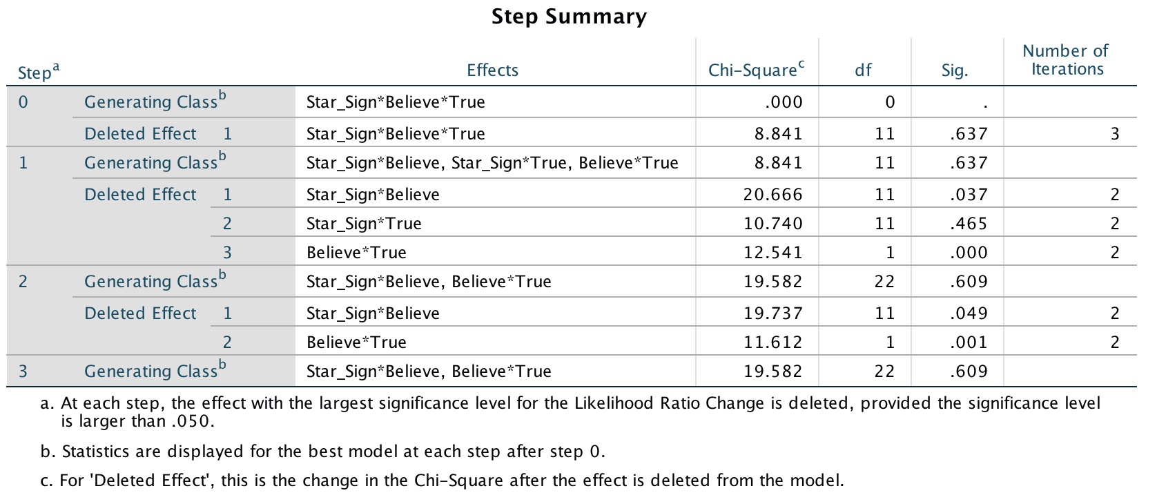
Output
Finally, SPSS Statistics evaluates this final model with the likelihood ratio statistic and we’re looking for a non-significant test statistic, which indicates that the expected values generated by the model are not significantly different from the observed data (put another way, the model is a good fit of the data). In this case the result is very non-significant, indicating that the model is a good fit of the data.
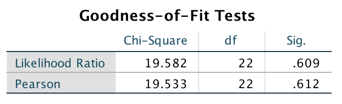
Output
Task 19.11
On my statistics module students have weekly SPSS classes in a computer laboratory. I’ve noticed that many students are studying Facebook more than the very interesting statistics assignments that I have set them. I wanted to see the impact that this behaviour had on their exam performance. I collected data from all 260 students on my module. I classified their Attendance as being either more or less than 50% of their lab classes, and I classified them as someone who looked at Facebook during their lab class, or someone who never did. After the exam, I noted whether they passed or failed (Exam). Do a loglinear analysis to see if there is an association between studying Facebook and failing your exam (Facebook.sav).
Follow the general instructions for this chapter to weight cases by the variable Frequency (see the completed dialog box below).
Completed dialog box
To get a crosstabulation table, select Analyze > Descriptive Statistics > Crosstabs …. We have three variables in our crosstabulation table: Attendance Facebook and Exam. Drag one of these variables into the box labelled Row(s) (I selected Facebook in the figure). Drag a second variable of interest (I chose Exam) to the box labelled Column(s), and drag the final variable (Attendance) to the box labelled Layer 1 of 1.
Completed dialog box
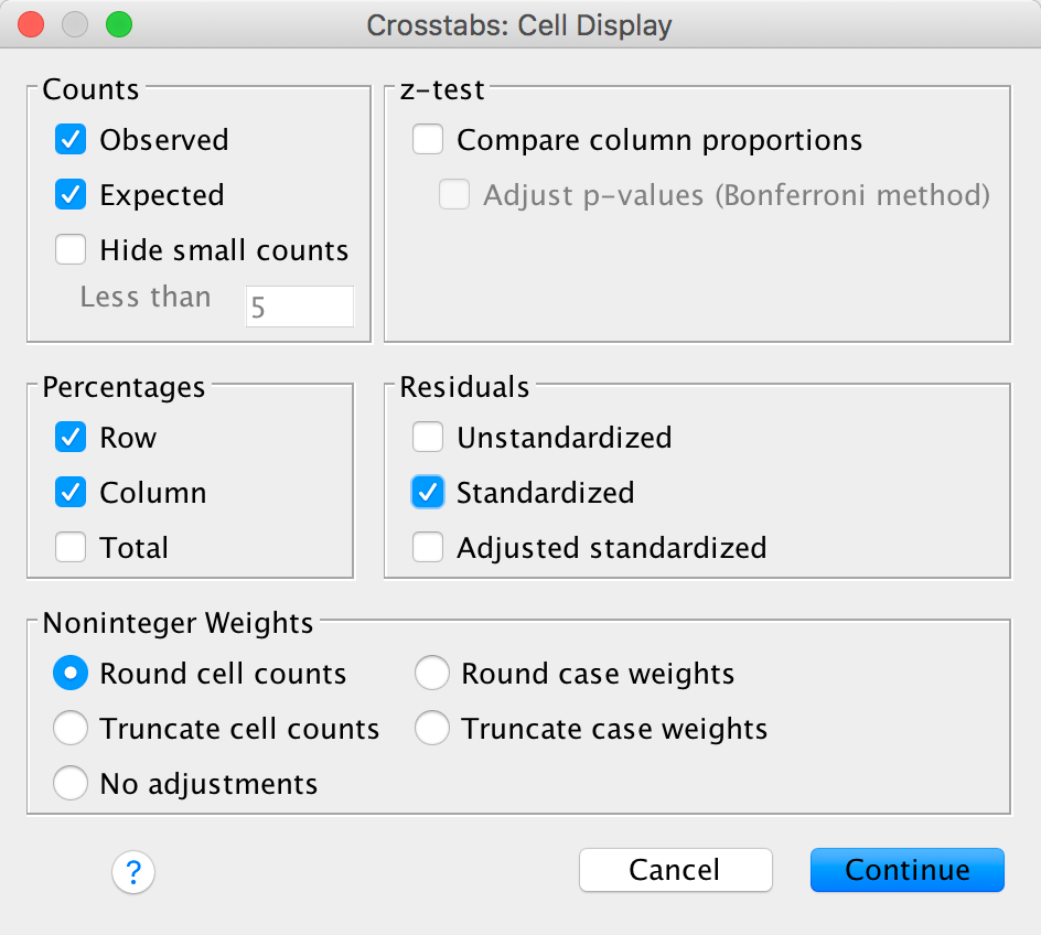
Completed dialog box
The crosstabulation table produced by SPSS Statistics contains the number of cases that fall into each combination of categories. There are no expected counts less than 5, so the assumption of the test is met.
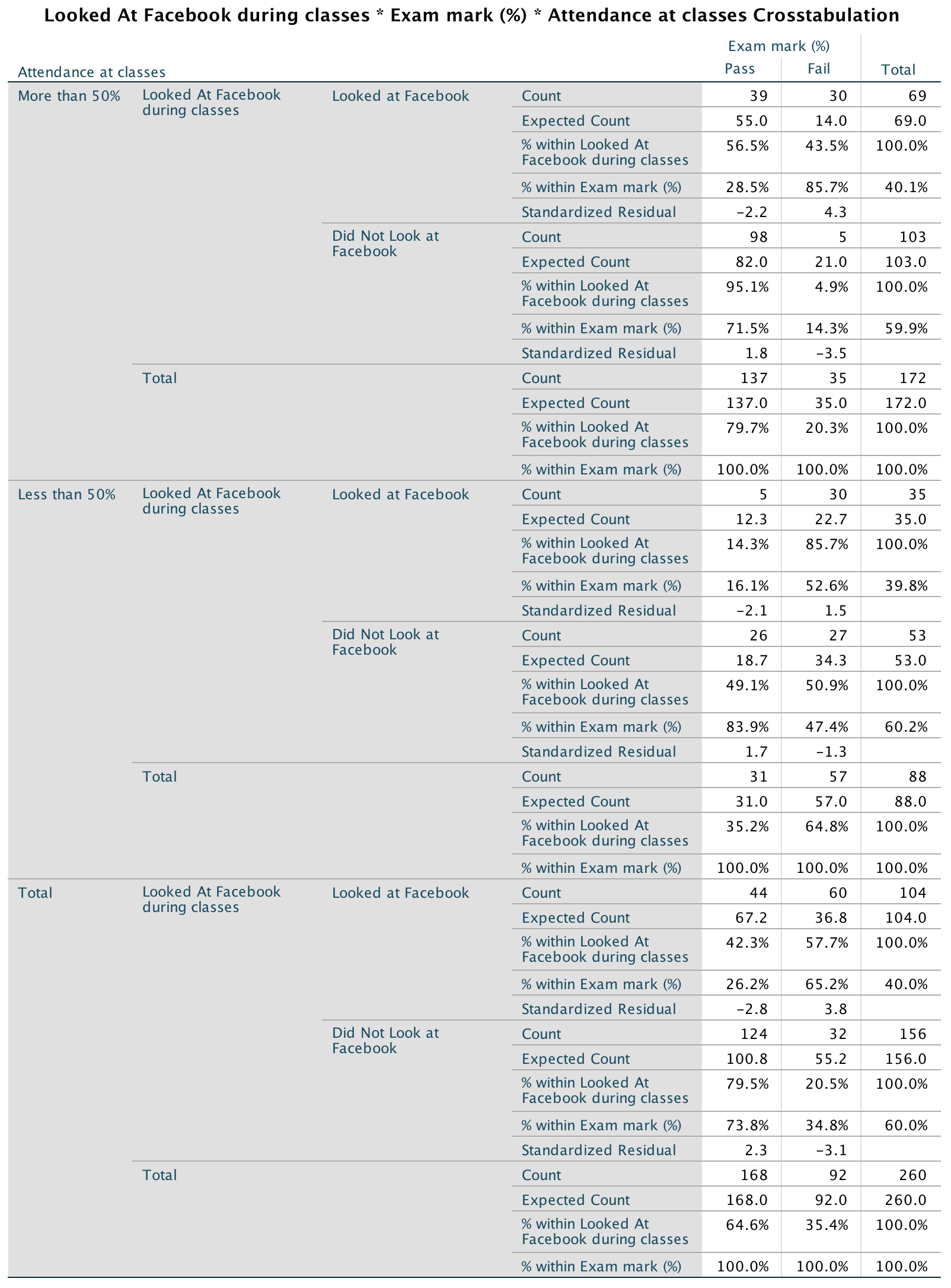
Output
To run a loglinear analysis that is consistent with my section on the
theory is to select Analyze > Loglinear > Model Selection
… to access the dialog box in the figure. Drag the variables that
you want to include in the analysis to the box labelled
Factor(s). Select each variable in the Factor(s) box
and click to
activate a dialog box in which you specify the value of the minimum and
maximum code that you’ve used for that variable (the figure shows these
values for the variables in this dataset). When you’ve done this, click
to
return to main dialog box, and to fit the
model.
Completed dialog box
The first bit of the output labelled K-Way and Higher-Order Effects shows likelihood ratio and chi-square statistics when K = 1, 2 and 3 (as we go down the rows of the table). The first row (K = 1) tells us whether removing the one-way effects (i.e., the main effects of attendance, Facebook and exam) and any higher-order effects will significantly affect the fit of the model. There are lots of higher-order effects here - there are the two-way interactions and the three-way interaction - and so this is basically testing whether if we remove everything from the model there will be a significant effect on the fit of the model. This is highly significant because the p-value is given as .000, which is less than .05. The next row of the table (K = 2) tells us whether removing the two-way interactions (i.e., Attendance × Exam, Facebook × Exam and Attendance × Facebook) and any higher-order effects will affect the model. In this case there is a higher-order effect (the three-way interaction) so this is testing whether removing the two-way interactions and the three-way interaction would affect the fit of the model. This is significant (the p-value is given as .000, which is less than .05), indicating that if we removed the two-way interactions and the three-way interaction then this would have a significant detrimental effect on the model. The final row (K = 3) is testing whether removing the three-way effect and higher-order effects will significantly affect the fit of the model. The three-way interaction is of course the highest-order effect that we have, so this is simply testing whether removal of the three-way interaction (Attendance × Facebook × Exam) will significantly affect the fit of the model. If you look at the two columns labelled Sig. then you can see that both chi-square and likelihood ratio tests agree that removing this interaction will not significantly affect the fit of the model (because the p > .05).
The next part of the table expresses the same thing but without including the higher-order effects. It’s labelled K-Way Effects and lists tests for when K = 1, 2 and 3. The first row (K = 1), therefore, tests whether removing the main effects (the one-way effects) has a significant detrimental effect on the model. The p-values are less than .05, indicating that if we removed the main effects of Attendance, Facebook and Exam from our model it would significantly affect the fit of the model (in other words, one or more of these effects is a significant predictor of the data). The second row (K = 2) tests whether removing the two-way interactions has a significant detrimental effect on the model. The p-values are less than .05, indicating that if we removed the two-way interactions then this would significantly reduce how well the model fits the data. In other words, one or more of these two-way interactions is a significant predictor of the data. The final row (K = 3) tests whether removing the three-way interaction has a significant detrimental effect on the model. The p-values are greater than .05, indicating that if we removed the three-way interaction then this would not significantly reduce how well the model fits the data. In other words, this three-way interaction is not a significant predictor of the data. This row should be identical to the final row of the upper part of the table (the K-way and Higher-Order Effects) because it is the highest-order effect and so in the previous table there were no higher-order effects to include in the test (look at the output and you’ll see the results are identical).
Output
- The main effect of Attendance was significant, \(\chi^2\)(1) = 27.63, p < .001, indicating (based on the contingency table) that significantly more students attended over 50% of their classes (N = 39 + 30 + 98 + 5 = 172) than attended less than 50% (N = 5 + 30 + 26 + 27 = 88).
- The main effect of Facebook was significant, \(\chi^2\)(1) = 10.47, p < .01, indicating (based on the contingency table) that significantly fewer students looked at Facebook during their classes (N = 39 + 30 + 5 + 30 = 104) than did not look at Facebook (N = 98 + 5 + 26 + 27 = 156).
- The main effect of Exam was significant, \(\chi^2\)(1) = 22.54, p < .001, indicating (based on the contingency table) that significantly more students passed the RMiP exam (N = 39 + 98 + 5 + 26 = 168) than failed (N = 39 + 98 + 5 + 26 = 92).
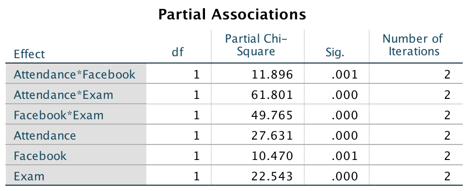
Output
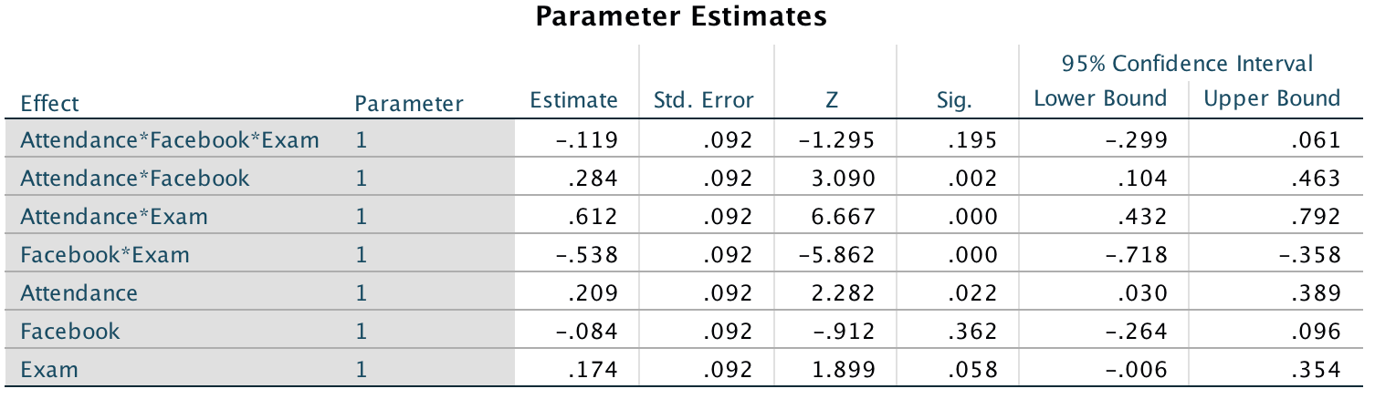
Output
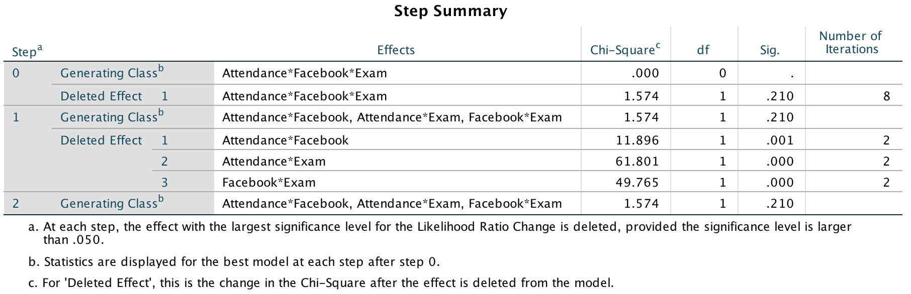
Output
The Attendance × Exam interaction was significant, \(\chi^2\)(1) = 61.80, p < .01, indicating that whether you attended more or less than 50% of classes affected exam performance. The contingency table shows that those who attended more than half of their classes had a much better chance of passing their exam (nearly 80% passed) than those attending less than half of their classes (only 35% passed). All of the standardized residuals are significant, indicating that all cells contribute to this overall association.
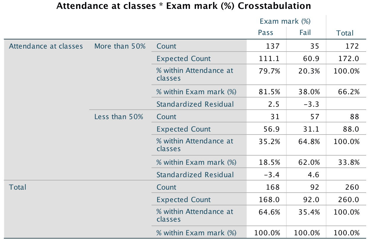
Output
The Facebook × Exam interaction was significant, $^2$1) = 49.77, p < .001, indicating that whether you looked at Facebook or not affected exam performance. The contingency table shows that those who looked at Facebook had a much lower chance of passing their exam (58% failed) than those who didn’t look at Facebook during their lab classes (around 80% passed).
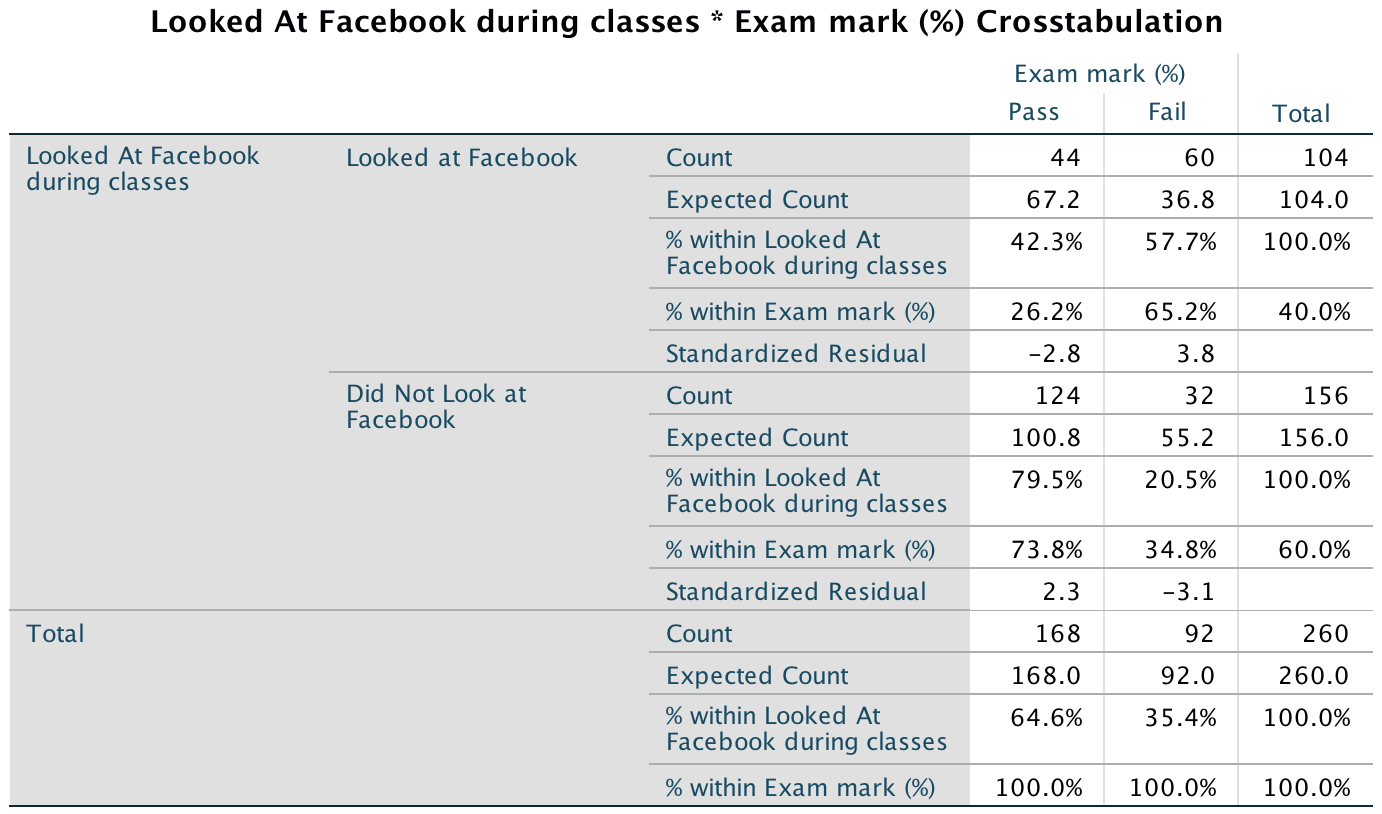
Output
Finally, the Facebook × Attendance × Exam interaction was not significant, \(\chi^2\)(1) = 1.57, p = .20. This result indicates that the effect of Facebook (described above) was the same (roughly) in those who attended more than 50% of classes and those that attended less than 50% of classes. In other words, although those attending less than 50% of classes did worse than those attending more than 50%, within that group, those looking at Facebook did relatively worse than those not looking at Facebook.
Chapter 20
General instructions
To access the dialog boxes for logistic regression select Analyze > Regression > Binary Logistic …. The main dialog box is shown in the figure (taken from Task 1).
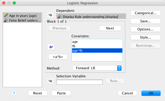
Completed dialog box
Drag the outcome variable to the Dependent box, then specify
the covariates (i.e., predictor variables) by dragging them to the box
labelled Covariates:. If you have several predictors, specify
the main effects by selecting one predictor and then holding down
Ctrl (⌘ on a mac) while you select others and transfer them by
clicking ![]() . To
input an interaction, again select two or more predictors while holding
down Ctrl (⌘ on a mac) but click
. To
input an interaction, again select two or more predictors while holding
down Ctrl (⌘ on a mac) but click  to
transfer them. Use the drop down list labelled Method: to
select the method for entering rpedictors into the model (in the figire
Forward: LR has been selected).
to
transfer them. Use the drop down list labelled Method: to
select the method for entering rpedictors into the model (in the figire
Forward: LR has been selected).
In the Categorical … dialog box drag any categorical variables you have to the Categorical Covariates: box and select a coding scheme to apply to them (by default SPSS Statistics uses indicator coding). Click to return to the main dialog box.
Completed dialog box
In the Save … dialog box select the options shown in the figure below. Click to return to the main dialog box.
Completed dialog box
In the Options … dialog box select the options shown in the figure below. Click to return to the main dialog box, and once there click to fit the model.
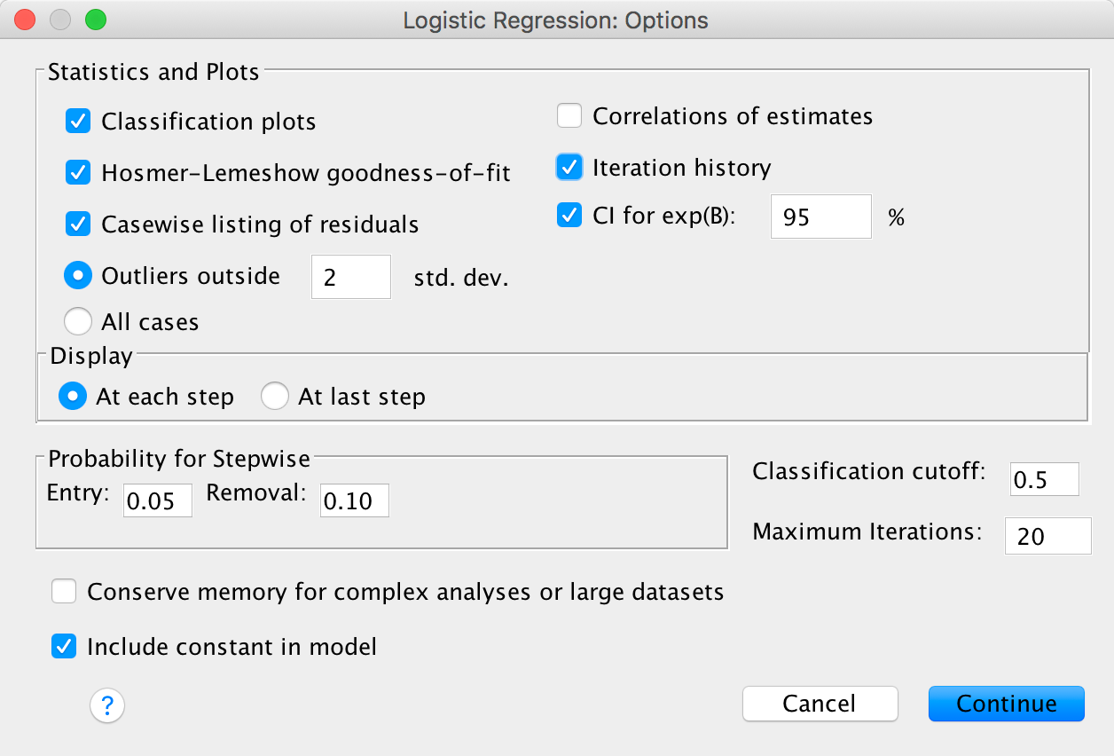
Completed dialog box
Task 20.1
A ‘display rule’ refers to displaying an appropriate emotion in a situation. For example, if you receive a present that you don’t like, you should smile politely and say ‘Thank you Auntie Kate, I’ve always wanted a rotting cabbage’; you do not start crying and scream ‘Why did you buy me a rotting cabbage, you selfish old turd?!’ A psychologist measured children’s understanding of display rules (with a task that they could pass or fail), their age (months), and their ability to understand others’ mental states (‘theory of mind’, measured with a false belief task that they could pass or fail). Can display rule understanding (did the child pass the test: yes/no?) be predicted from theory of mind (did the child pass the false belief task: yes/no?), age and their interaction? (Display.sav.)
Open the file Display.sav. Notice that both of the categorical variables have been entered as coding variables: the outcome variable is coded as 1 is having display rule understanding, and 0 represents an absence of display rule understanding. For the false-belief task a similar coding has been used (1 = passed the false-belief task, 0 = failed the false-belief task).
Select Analyze > Regression > Binary Logistic … to access the main dialog box in the figure.
Completed dialog box
Drag display to the Dependent box, then
specify the covariates (i.e., predictor variables). To specify the main
effects, select one predictor (e.g. age) and then hold
down Ctrl (⌘ on a mac) and select the other
(fb). Transfer them to the box labelled
Covariates: by clicking ![]() . To
input the interaction, again select age and
fb while holding down Ctrl (⌘ on a mac) but
then click . For
this analysis select the Forward:LR method of regression.
. To
input the interaction, again select age and
fb while holding down Ctrl (⌘ on a mac) but
then click . For
this analysis select the Forward:LR method of regression.
In the Categorical … dialog box the covariates we specified
in the main dialog box are listed on the left-hand side. Drag any
categorical variables you have (in this example fb) to
the Categorical Covariates:. By default SPSS Statistics uses
indicator coding (i.e., the standard dummy variable coding explained in
the book). This is fine for us because fb has only two
catregories, but to ease interpretation change the Reference
Category to first and click  . Click to
return to the main dialog box.
. Click to
return to the main dialog box.
Completed dialog box
In the Save … dialog box select the options shown in the figure below. Click to return to the main dialog box.
Completed dialog box
In the Options … dialog box select the options shown in the figure below. Click to return to the main dialog box, and once there click to fit the model.
Completed dialog box
The first part of the output tell us the parameter codings given to the categorical predictor variable. We requested a forward stepwise method so the initial model is derived using only the constant in the model. The initial output tells us about the model when only the constant is included (i.e. all predictor variables are omitted). The log-likelihood of this baseline model is 96.124. This represents the fit of the model when including only the constant. Initially every child is predicted to belong to the category in which most observed cases fell. In this example there were 39 children who had display rule understanding and only 31 who did not. Therefore, of the two available options it is better to predict that all children had display rule understanding because this results in a greater number of correct predictions. Overall, the model correctly classifies 55.7% of children. The next part of the output summarizes the model, and at this stage this entails quoting the value of the constant (\(b_0\)), which is equal to 0.23.
Output
In the first step, false-belief understanding (fb) is added to the model as a predictor. As such, a child is now classified as having display rule understanding based on whether they passed or failed the false-belief task. The next output shows summary statistics about the new model. The overall fit of the new model is assessed using the log-likelihood statistic (multiplied by -2 to give it a chi-square distribution, -2LL). Remember that large values of the log-likelihood statistic indicate poorly fitting statistical models.
If fb has improved the fit of the model then the value of −2LL should be less than the value when only the constant was included (because lower values of −2LL indicate better fit). When only the constant was included, −2LL = 96.124, but now fb has been included this value has been reduced to 70.042. This reduction tells us that the model is better at predicting display rule understanding than it was before fb was added. We can assess the significance of the change in a model by taking the log-likelihood of the new model and subtracting the log-likelihood of the baseline model from it. The value of the model chi-square statistic works on this principle and is, therefore, equal to −2LL with fb included minus the value of −2LL when only the constant was in the model (96.124 − 70.042 = 26.083). This value has a chi-square distribution. In this example, the value is significant at the .05 level and so we can say that overall the model predicts display rule understanding significantly better than with fb included than with only the constant included. The output also shows various \(R^2\) statistics, which we’ll return to in due course.
Output
The classification table indicates how well the model predicts group membership. The current model correctly classifies 23 children who don’t have display rule understanding but misclassifies 8 others (i.e. it correctly classifies 74.2% of cases). For children who do have display rule understanding, the model correctly classifies 33 and misclassifies 6 cases (i.e. correctly classifies 84.6% of cases). The overall accuracy of classification is, therefore, the weighted average of these two values (80%). So, when only the constant was included, the model correctly classified 56% of children, but now, with the inclusion of fb as a predictor, this has risen to 80%.
Output
The next part of the output tells us the estimates for the coefficients for the predictors included in the model (namely, fb and the constant). The coefficient represents the change in the logit of the outcome variable associated with a one-unit change in the predictor variable. The logit of the outcome is the natural logarithm of the odds of Y occurring.
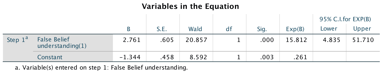
Output
The Wald statistic has a chi-square distribution and tells us whether the b coefficient for that predictor is significantly different from zero. If the coefficient is significantly different from zero then we can assume that the predictor is making a significant contribution to the prediction of the outcome (Y). For these data it seems to indicate that false-belief understanding is a significant predictor of display rule understanding (note the significance of the Wald statistic is less than .05).
We can calculate an analogue of R using the equation in the chapter (for these data, the Wald statistic and its df are 20.856 and 1, respectively, and the original -2LL was 96.124). Therefore, R can be calculated as:
\[ R = \sqrt{\frac{20.856-(2 \times 1)}{96.124}} = 0.4429 \]
Hosmer and Lemeshow’s measure (\(R^2_{L}\)) is calculated by dividing the model chi-square by the original −2LL. In this example the model chi-square after all variables have been entered into the model is 26.083, and the original -2LL (before any variables were entered) was 96.124. So \(R^2_{L}\) = 26.083/96.124 = .271, which is different from the value we would get by squaring the value of R given above (\(R^2 = 0.4429^2 = .196\)).
Cox and Snell’s \(R^2\) is 0.311 (see earlier output), which is calculated from this equation:
\[ R_{\text{CS}}^{2} = 1 - exp\bigg(\frac{-2\text{LL}_\text{new} - (-2\text{LL}_\text{baseline})}{n}\bigg) \]
The −2LL(new) is 70.04 and −2LL(baseline) is 96.124. The sample size, n, is 70, which gives us:
\[ \begin{align} R_{\text{CS}}^{2} &= 1 - exp\bigg(\frac{70.04 - 96.124}{70}\bigg) \\ &= 1 - \exp( -0.3726) \\ &= 1 - e^{- 0.3726} \\ &= 0.311 \end{align} \]
Nagelkerke’s adjustment (see earlier output) is calculated from:
\[ \begin{align} R_{N}^{2} &= \frac{R_\text{CS}^2}{1 - \exp\bigg( -\frac{-2\text{LL}_\text{baseline}}{n} \bigg)} \\ &= \frac{0.311}{1 - \exp\big( - \frac{96.124}{70} \big)} \\ &= \frac{0.311}{1 - e^{-1.3732}} \\ &= \frac{0.311}{1 - 0.2533} \\ &= 0.416 \end{align} \]
As you can see, there’s a fairly substantial difference between the two values!
The odds ratio, exp(b) (Exp(B) in the output) is the change in odds. If the value is greater than 1 then it indicates that as the predictor increases, the odds of the outcome occurring increase. Conversely, a value less than 1 indicates that as the predictor increases, the odds of the outcome occurring decrease. In this example, we can say that the odds of a child who has false-belief understanding also having display rule understanding are 15 times higher than those of a child who does not have false-belief understanding.
In the options, we requested a confidence interval for exp(b) and it can also be found in Output 4. Remember that if we ran 100 experiments and calculated confidence intervals for the value of exp(b), then these intervals would encompass the actual value of exp(b) in the population (rather than the sample) on 95 occasions. So, assuming that this experiment was one of the 95% where the confidence interval contains the population value then the population value of exp(b) lies between 4.84 and 51.71. However, this experiment might be one of the 5% that ‘misses’ the true value.
The next output shows the test statistic for fb if it were removed from the model. Removing fb would result in a change in the -2LL that is highly significant (p < .001), which means that removing fb from the model would have a significant detrimental effect on the fit of the model - in other words, it fb significantly predicts display rule understanding. We are also told about the variables currently not in the model. First of all, the residual chi-square (labelled Overall Statistics in the output), which is non-significant, tells us that none of the remaining variables have coefficients significantly different from zero. Furthermore, each variable is listed with its score statistic and significance value, and for both variables their coefficients are not significantly different from zero (as can be seen from the significance values of .128 for age and .261 for the interaction of age and false-belief understanding). Therefore, no further variables will be added to the model.
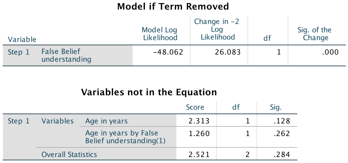
Output
The classification plot shows the predicted probabilities of a child passing the display rule task. If the model perfectly fits the data, then this histogram should show all of the cases for which the event has occurred on the right-hand side, and all the cases for which the event hasn’t occurred on the left-hand side. In this example, the only significant predictor is dichotomous and so there are only two columns of cases on the plot. As a rule of thumb, the more that the cases cluster at each end of the graph, the better (se ethe bookc hapter for more details). In this example there are two Ns on the right of the model and one Y on the left of the model. These are misclassified cases, and the fact there are relatively few of them suggests the model is making correct predictions for most children.
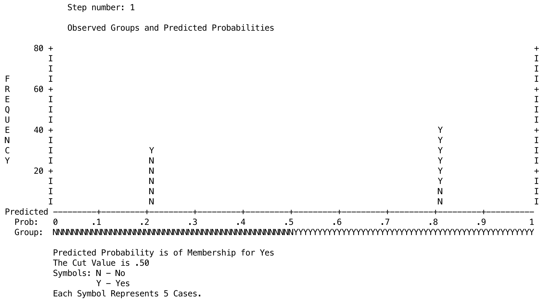
Output
The predicted probabilities and predicted group memberships will have been saved as variables in the data editor ( PRE_1 and PGR_1). These probabilities can be listed using the Analyze > Reports > Case Summaries … dialog box (see the book chapter). The output shows a selection of the predicted probabilities. Because the only significant predictor was a dichotomous variable, there are only two different probability values. The only significant predictor of display rule understanding was false-belief understanding, which could have a value of either 1 (pass the false-belief task) or 0 (fail the false-belief task). These values tells us that when a child doesn’t possess second-order false-belief understanding (fb = 0, No), there is a probability of .2069 that they will pass the display rule task, approximately a 21% chance (1 out of 5 children). However, if the child does pass the false-belief task (fb = 1, yes), there is a probability of .8049 that they will pass the display rule task, an 80.5% chance (4 out of 5 children). Consider that a probability of 0 indicates no chance of the child passing the display rule task, and a probability of 1 indicates that the child will definitely pass the display rule task. Therefore, the values obtained suggest a role for false-belief understanding as a prerequisite for display rule understanding.
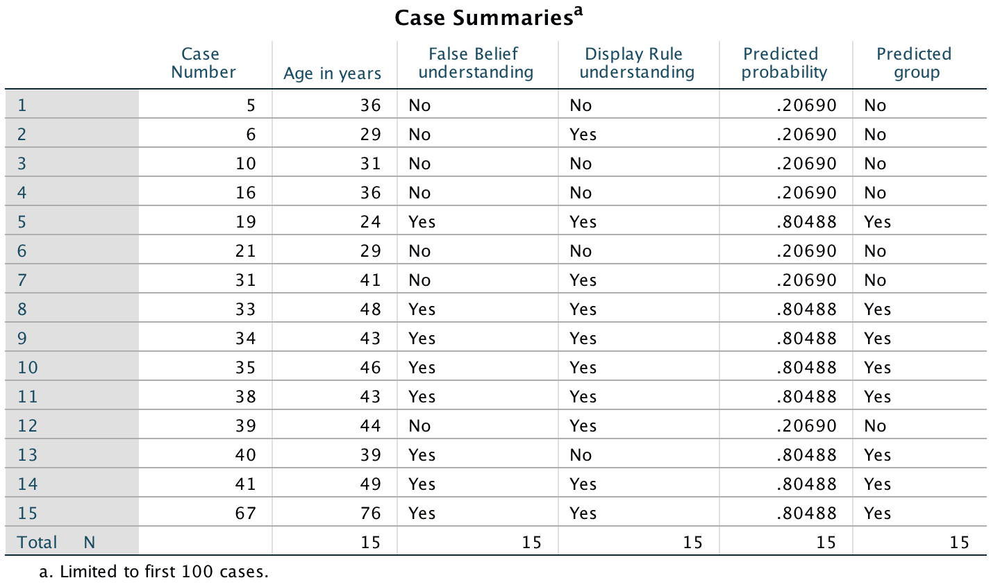
Output
Assuming we are content that the model is accurate and that false-belief understanding has some substantive significance, then we could conclude that false-belief understanding is the single best predictor of display rule understanding. Furthermore, age and the interaction of age and false-belief understanding did not significantly predict display rule understanding. This conclusion is fine in itself, but to be sure that the model is a good one, it is important to examine the residuals, which brings us nicely onto the next task.
Task 20.2
Are there any influential cases or outliers in the model for Task 1?
To answer this question we need to look at the model residuals. These residuals are slightly unusual because they are based on a single predictor that is categorical. This is why there isn’t a lot of variability in their values. The basic residual statistics for this example (Cook’s distance, leverage, standardized residuals and DFBeta values) show little cause for concern. Note that all cases have DFBetas less than 1 and leverage statistics (LEV_1) close to the calculated expected value of 0.03. There are also no unusually high values of Cook’s distance (COO_1) which, all in all, means that there are no influential cases having an effect on the model. For Cook’s distance you should look for values which are particularly high compared to the other cases in the sample, and values greater than 1 are usually problematic. About half of the leverage values are a little high but given that the other statistics are fine, this is probably no cause for concern. The standardized residuals all have values within ±2.5 and predominantly have values within ±2, and so there seems to be very little here to concern us.
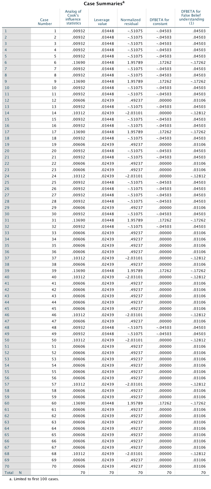
Output
Task 20.3
Piff, Stancato, Côté, Mendoza-Dentona, and Keltner (2012) used the behaviour of drivers to claim that people of a higher social class are more unpleasant. They classified social class by the type of car (Vehicle) on a five-point scale and observed whether the drivers cut in front of other cars at a busy intersection (Vehicle_Cut). Do a logistic regression to see whether social class predicts whether a driver cut in front of other vehicles (Piff et al. (2012) Vehicle.sav).
Follow the general instructions for logistic regression to fit the model. The main dialog box should look like the figure below.
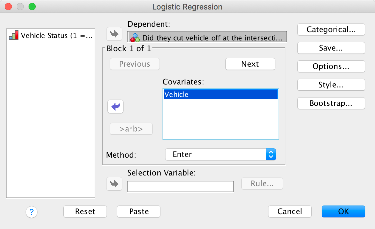
Completed dialog box
The first block of output tells us about the model when only the constant is included.In this example there were 34 participants who did cut off other vehicles at intersections and 240 who did not. Therefore, of the two available options it is better to predict that all participants did not cut off other vehicles because this results in a greater number of correct predictions. The contingency table for the model in this basic state shows that predicting that all participants did not cut off other vehicles results in 0% accuracy for those who did cut off other vehicles, and 100% accuracy for those who did not. Overall, the model correctly classifies 87.6% of participants.
The table labelled Variables in the Equation at this stage contains only the constant, which has a value of \(b_0 = −1.95\). The table labelled Variables not in the Equation. The bottom line of this table reports the residual chi-square statistic (labelled Overall Statistics) as 4.01 which is only just significant at p = .045. This statistic tells us that the coefficient for the variable not in the model is significantly different from zero - in other words, that the addition of this variable to the model will significantly impoprve its fit.
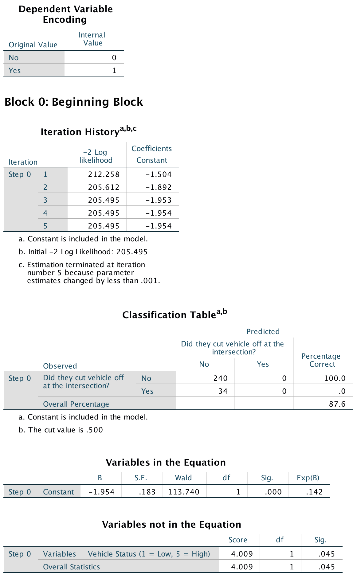
Output
The next part of the output deals with the model after the predictor variable (Vehicle) has been added to the model. As such, a person is now classified as either cutting off other vehicles at an intersection or not, based on the type of vehicle they were driving (as a measure of social status). The output shows summary statistics about the new model. The overall fit of the new model is significant because the Model chi-square in the table labelled Omnibus Tests of Model Coefficients is significant, \(\chi^2\)(1) = 4.16, p = .041. Therefore, the model that includes the variable Vehicle predicted whether or not participants cut off other vehicles at intersections better than the model that includes only the constant.

Output
The classification table indicates how well the model predicts group membership. In step 1, the model correctly classifies 240 participants who did not cut off other vehicles and does not misclassify any (i.e. it correctly classifies 100% of cases). For participants who do did cut off other vehicles, the model correctly classifies 0 and misclassifies 34 cases (i.e. correctly classifies 0% of cases). The overall accuracy of classification is, therefore, the weighted average of these two values (87.6%). Therefore, the accuracy is no different than when only the constant was included in the model.
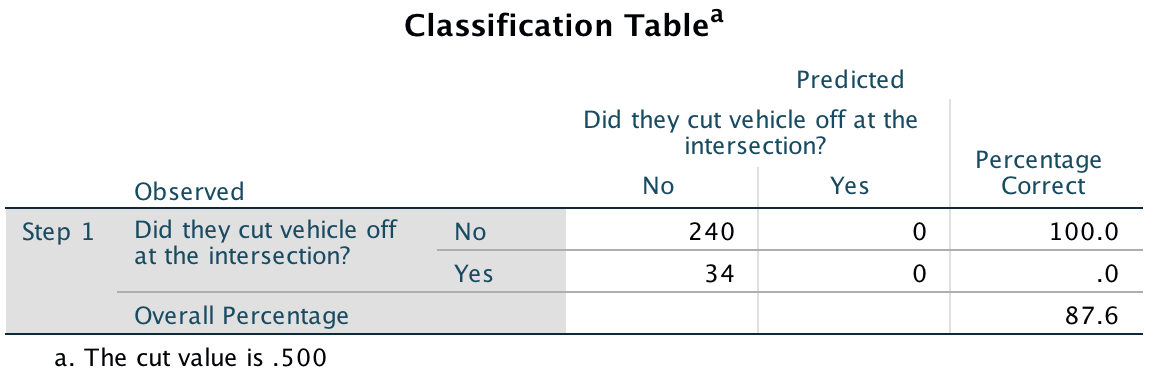
Output
The significance of the Wald statistic is .047, which is less than .05. Therefore, we can conclude that the status of the vehicle the participant was driving significantly predicted whether or not they cut off another vehicle at an intersection. However, I’d interpret this significance in the context of the classification table, which showed us that adding the predecitor of vehicle did not result in any more cases being more accurately classified.
The exp b (Exp(B) in the output) is the change in odds of the outcome resulting from a unit change in the predictor. In this example, the exp b for vehicle in step 1 is 1.441, which is greater than 1, indicating that as the predictor (vehicle) increases, the value of the outcome also increases, that is, the value of the categorical variable moves from 0 (did not cut off vehicle) to 1 (cut off vehicle). In other words, drivers of vehicles of a higher status were more likely to cut off other vehicles at intersections.
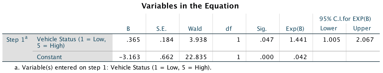
Output
Task 20.4
In a second study, Piff et al. (2012) observed the behaviour of drivers and classified social class by the type of car (Vehicle), but the outcome was whether the drivers cut off a pedestrian at a crossing (Pedestrian_Cut). Do a logistic regression to see whether social class predicts whether or not a driver prevents a pedestrian from crossing (Piff et al. (2012) Pedestrian.sav).
Follow the general instructions for logistic regression to fit the model. The main dialog box should look like the figure below.
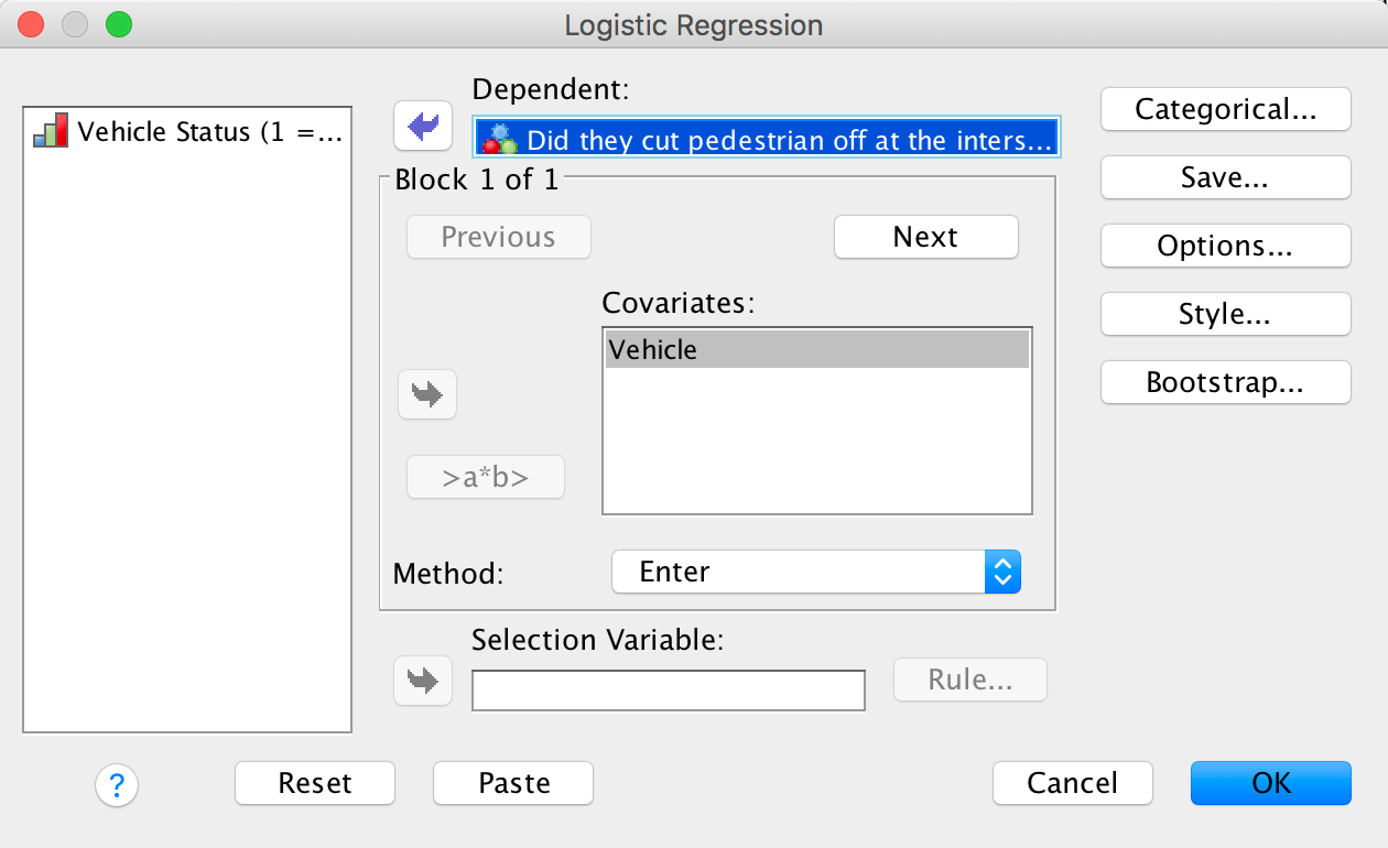
Completed dialog box
The first block of output tells us about the model when only the constant is included. In this example there were 54 participants who did cut off pedestrians at intersections and 98 who did not. Therefore, of the two available options it is better to predict that all participants did not cut off other vehicles because this results in a greater number of correct predictions. The contingency table for the model in this basic state shows that predicting that all participants did not cut off pedestrians results in 0% accuracy for those who did cut off pedestrians, and 100% accuracy for those who did not. Overall, the model correctly classifies 64.5% of participants.
The table labelled Variables in the Equation at this stage contains only the constant, which has a value of \(b_0 = −0.596\). The table labelled Variables not in the Equation. The bottom line of this table reports the residual chi-square statistic (labelled Overall Statistics) as 4.77 which is only just significant at p = .029. This statistic tells us that the coefficient for the variable not in the model is significantly different from zero - in other words, that the addition of this variable to the model will significantly impoprve its fit.
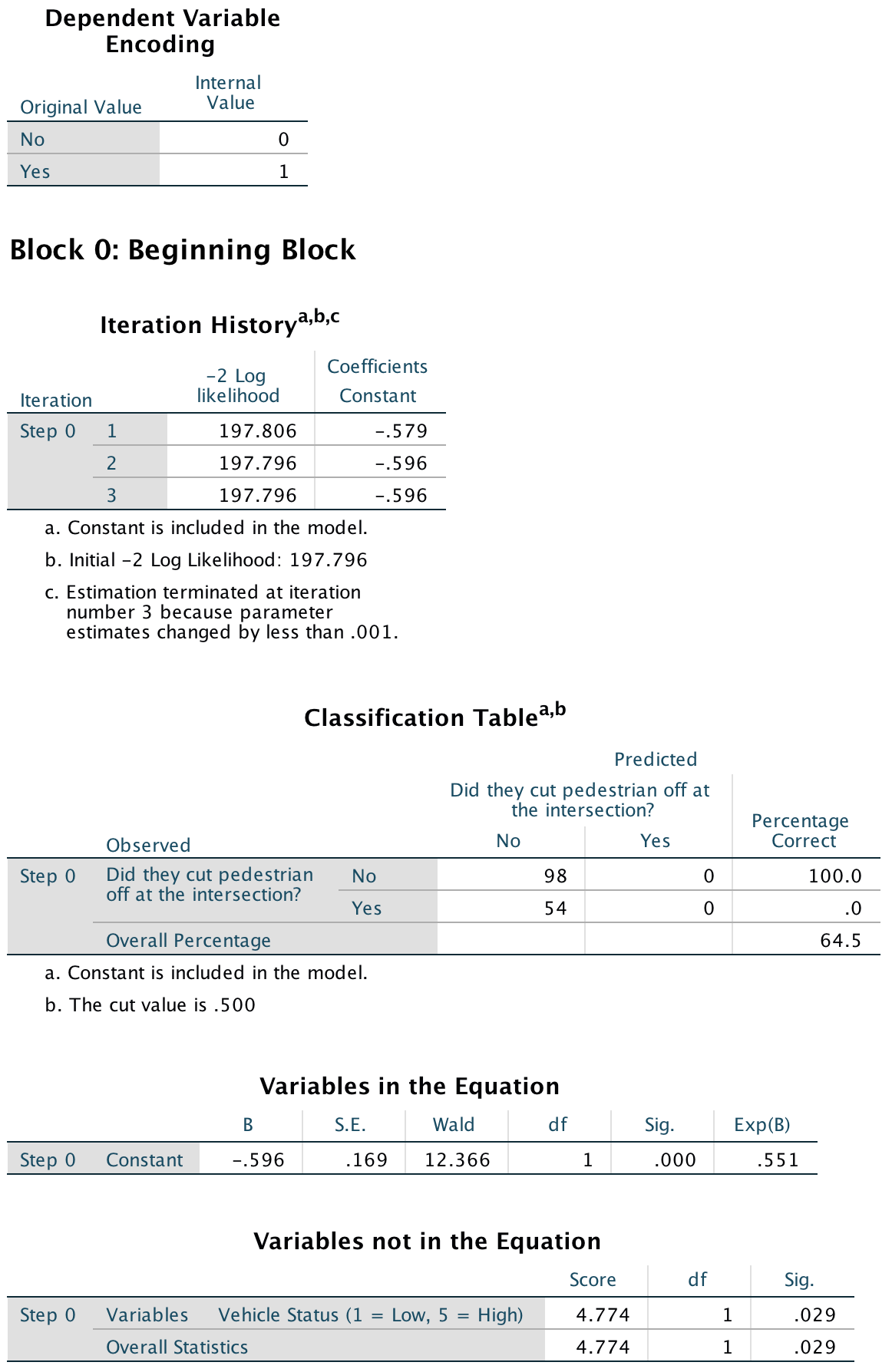
Output
The next part of the output deals with the model after the predictor variable (Vehicle) has been added to the model. As such, a person is now classified as either cutting off pedestrians at an intersection or not, based on the type of vehicle they were driving (as a measure of social status). The output shows summary statistics about the new model. The overall fit of the new model is significant because the Model chi-square in the table labelled Omnibus Tests of Model Coefficients is significant, \(\chi^2\)(1) = 4.86, p = .028. Therefore, the model that includes the variable Vehicle predicted whether or not participants cut off pedestrians at intersections better than the model that includes only the constant.
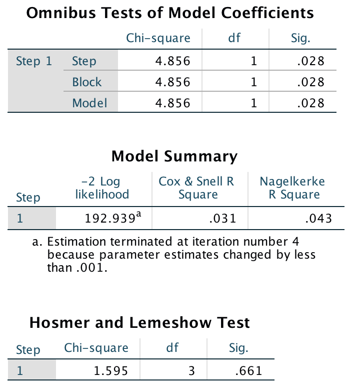
Output
The classification table indicates how well the model predicts group membership. In step 1, the model correctly classifies 91 participants who did not cut off pedestrians and does not misclassify any (i.e. it correctly classifies 92.9% of cases). For participants who do did cut off pedestrians, the model correctly classifies 6 and misclassifies 48 cases (i.e. correctly classifies 11.1% of cases). The overall accuracy of classification is the weighted average of these two values (63.8%). Therefore, the accuracy (0verall) has decreaed slightly (from 64.5% to 63.8%).
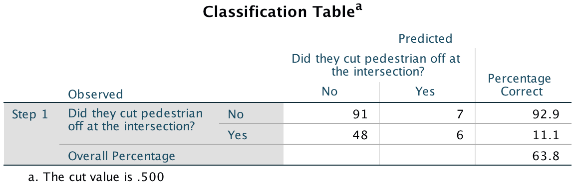
Output
The significance of the Wald statistic is .031, which is less than .05. Therefore, we can conclude that the status of the vehicle the participant was driving significantly predicted whether or not they cut off pedestrians at an intersection. The exp b (Exp(B) in the output) is the change in odds of the outcome resulting from a unit change in the predictor. In this example, the exp b for vehicle in step 1 is 1.495, which is greater than 1, indicating that as the predictor (vehicle) increases, the value of the outcome also increases, that is, the value of the categorical variable moves from 0 (did not cut off pedestrian) to 1 (cut off pedestrian). In other words, drivers of vehicles of a higher status were more likely to cut off pedestrians at intersections.
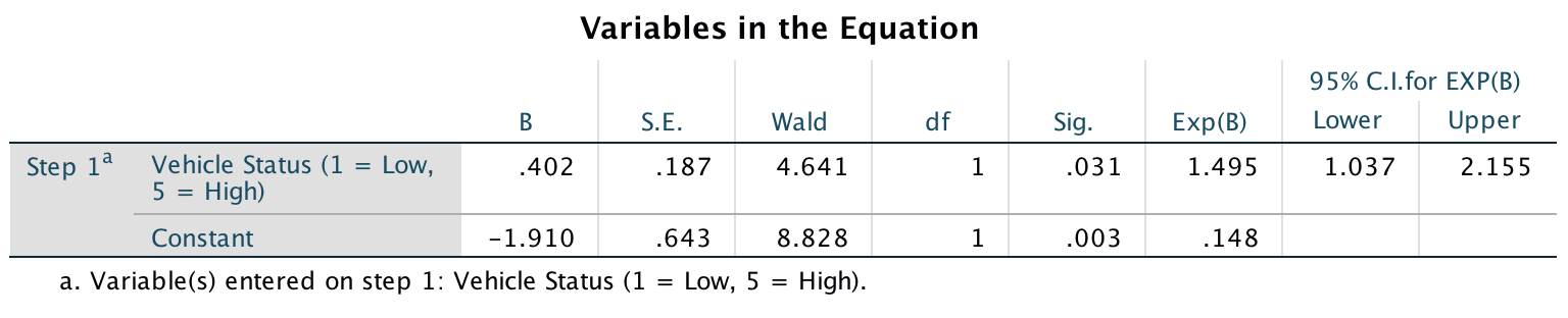
Output
Task 20.5
Four hundred and sixty-seven lecturers completed questionnaire measures of Burnout (burnt out or not), Perceived Control (high score = low perceived control), Coping Style (high score = high ability to cope with stress), Stress from Teaching (high score = teaching creates a lot of stress for the person), Stress from Research (high score = research creates a lot of stress for the person) and Stress from Providing Pastoral Care (high score = providing pastoral care creates a lot of stress for the person). Cooper, Sloan, and Williams’s (1988) model of stress indicates that perceived control and coping style are important predictors of burnout. The remaining predictors were measured to see the unique contribution of different aspects of a lecturer’s work to their burnout. Conduct a logistic regression to see which factors predict burnout? (Burnout.sav).
Follow the general instructions for logistic regression to fit the model. The model should be fit hierarchically because Cooper’s model indicates that perceived control and coping style are important predictors of burnout. So, these variables should be entered in the first block:
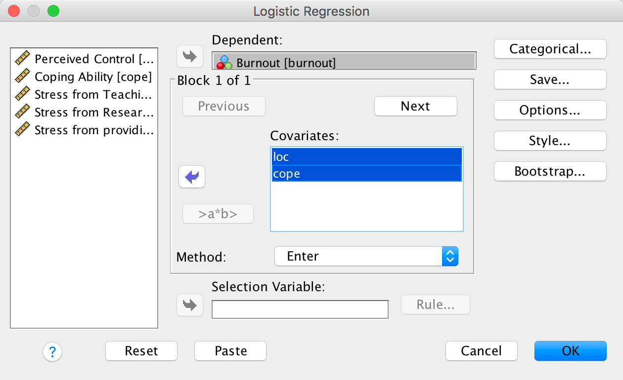
Completed dialog box
The second block should contain all other variables, and because we don’t know anything much about their predictive ability, we might enter them in a stepwise fashion (I chose Forward: LR):
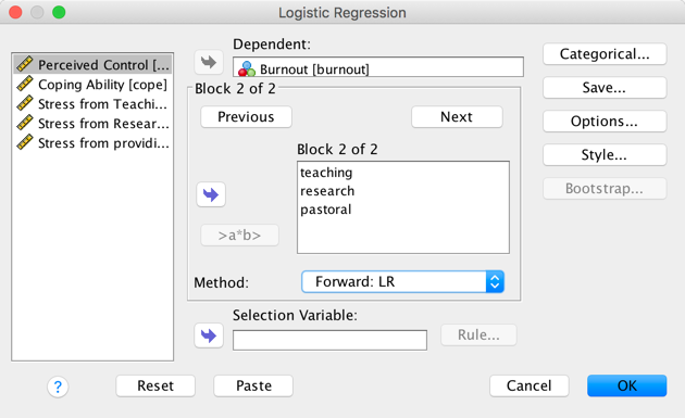
Completed dialog box
At step 1, the overall fit of the model is significant, \(\chi^2\)(2) = 165.93, p < .001. The model accounts for 29.9% or 44.1% of the variance in burnout (depending on which measure of \(R^2\) you use).
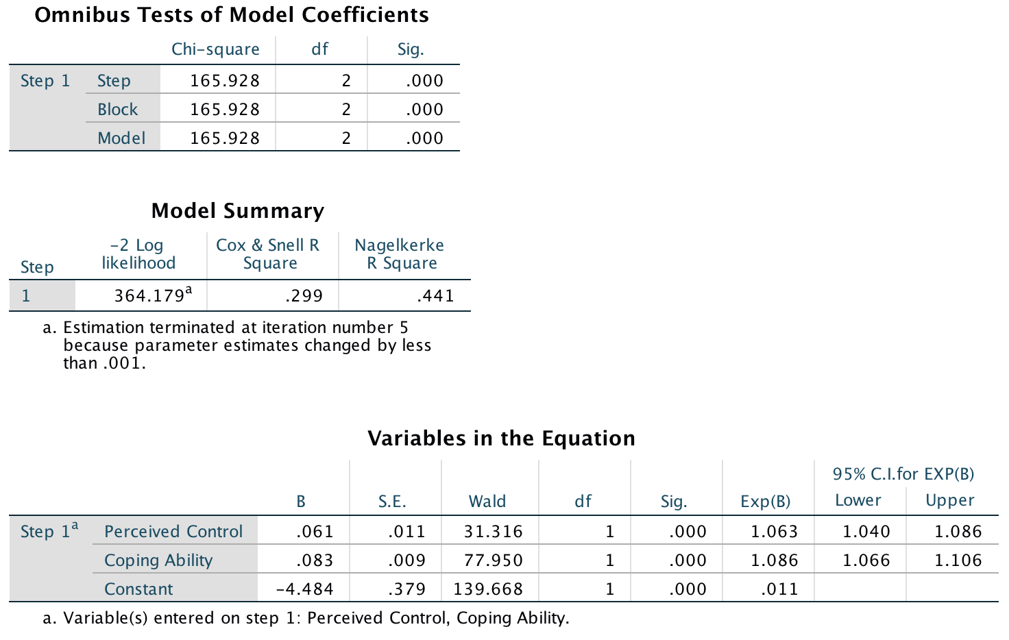
Output
At step 2, the overall fit of the model is significant after both the first new variable (teaching), \(\chi^2\)(3) = 193.34, p < .001, and second new variable (pastoral) have been entered, \(\chi^2\)(4) = 205.40, p < .001. The final model accounts for 35.6% or 52.4% of the variance in burnout (depending on which measure of \(R^2\) you use).
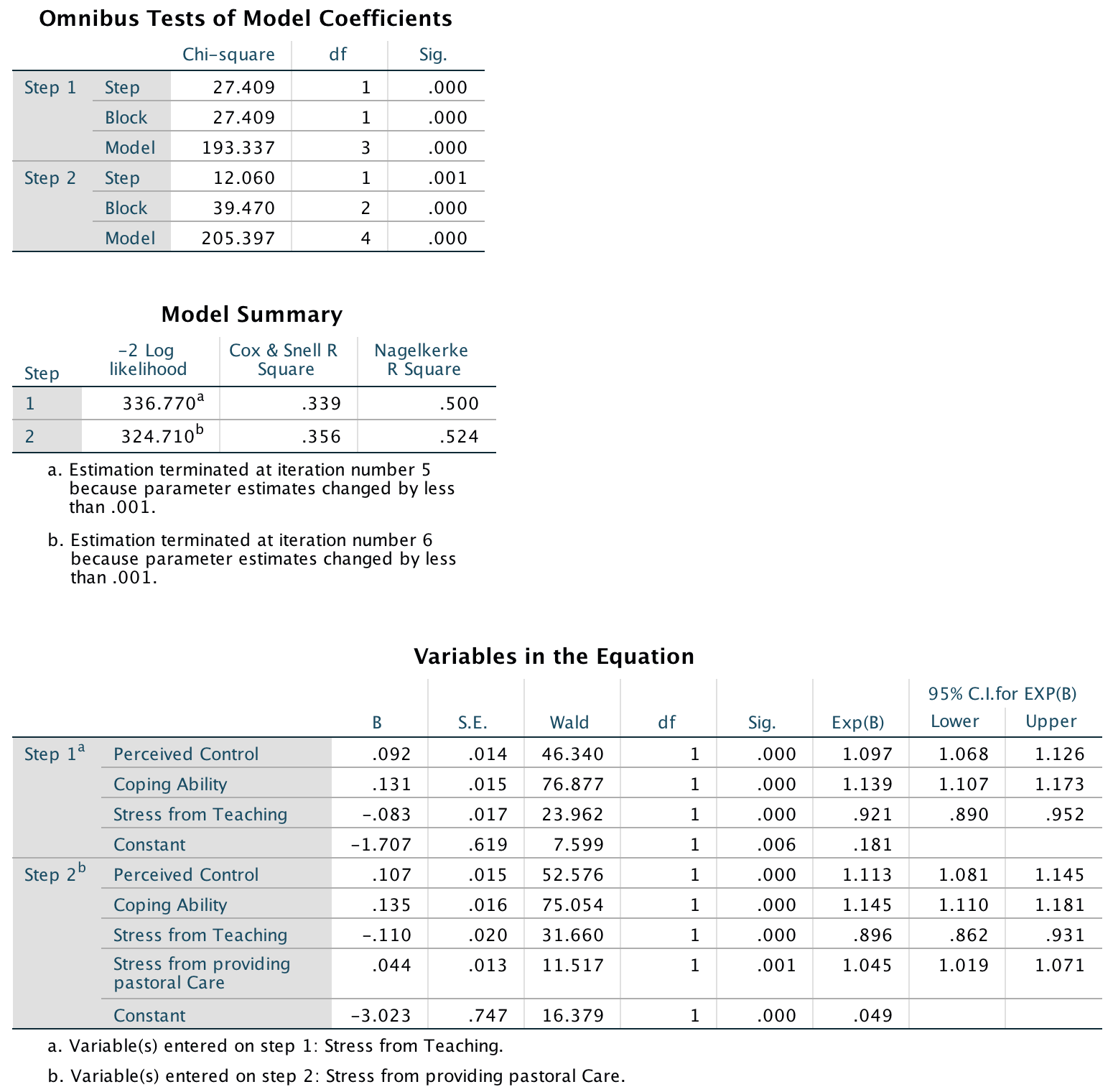
Output
In terms of the individual predictors we could report the following:
| B (SE) | 95%CI for E | xp(B) | |||
|---|---|---|---|---|---|
| Lower | Exp(B) | Upper | |||
| Step 1 | |||||
| Constant | –4.48** (0.38) |
||||
| Perceived control | 0.06** (0.01) |
1.04 | 1.06 | 1.09 | |
| Coping style | 0.08** (0.01) |
1.07 | 1.09 | 1.11 | |
| Final | |||||
| Constant | –3.02** (0.75) |
||||
| Perceived control | 0.11** (0.02) |
1.08 | 1.11 | 1.15 | |
| Coping style | 0.14** (0.02) |
1.11 | 1.15 | 1.18 | |
| Teaching stress | –0.11** (0.02) |
0.86 | 0.90 | 0.93 | |
| Pastoral stress | 0.04** (0.01) |
1.02 | 1.05 | 1.07 |
Note: \(R^2\) = .36 (Cox and Snell), .52 (Nagelkerke). Model \(\chi^2\)(4) = 205.40, p < .001. p < .01, p < .001.
Burnout is significantly predicted by perceived control, coping style (as predicted by Cooper), stress from teaching and stress from giving pastoral care. The Exp(B) and direction of the beta values tell us that, for perceived control, coping ability and pastoral care, the relationships are positive. That is (and look back to the question to see the direction of these scales, i.e., what a high score represents), poor perceived control, poor ability to cope with stress and stress from giving pastoral care all predict burnout. However, for teaching, the relationship if the opposite way around: stress from teaching appears to be a positive thing as it predicts not becoming burnt out.
Task 20.6
An HIV researcher explored the factors that influenced condom use with a new partner (relationship less than 1 month old). The outcome measure was whether a condom was used (use: condom used = 1, not used = 0). The predictor variables were mainly scales from the Condom Attitude Scale (CAS) by Sacco, Levine, Reed, and Thompson (1991): gender; the degree to which the person views their relationship as ‘safe’ from sexually transmitted disease (safety); the degree to which previous experience influences attitudes towards condom use (sexexp); whether or not the couple used a condom in their previous encounter (Previous: 1 = condom used, 0 = not used, 2 = no previous encounter with this partner); the degree of self-control that a person has when it comes to condom use (selfcon); the degree to which the person perceives a risk from unprotected sex (perceive). Previous research (Sacco, Rickman, Thompson, Levine, & Reed, 1993) has shown that gender, relationship safety and perceived risk predict condom use. Verify these previous findings and test whether self-control, previous usage and sexual experience predict condom use (Condom.sav).
Follow the general instructions for logistic regression to fit the model. We run a hierarchical logistic regression entering perceive, safety and gender in the first block:
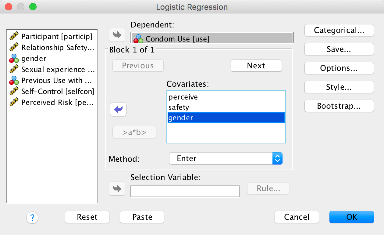
Completed dialog box
In the second block we add previous, selfcon and sexexp. I used forced entry on both blocks:

Completed dialog box
For the variable previous I used an indicator contrast with ‘No condom’ (the first category) as the base category. I left gender with the default indicator coding:
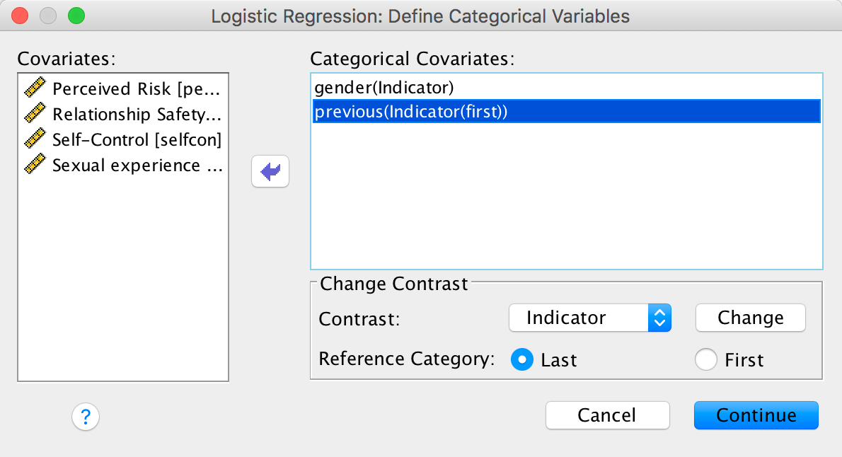
Completed dialog box
In this analysis we forced perceive, safety and gender into the model first. The first output tells us that 100 cases have been accepted, that the dependent variable has been coded 0 and 1 (because this variable was coded as 0 and 1 in the data editor, these codings correspond exactly to the data itself).
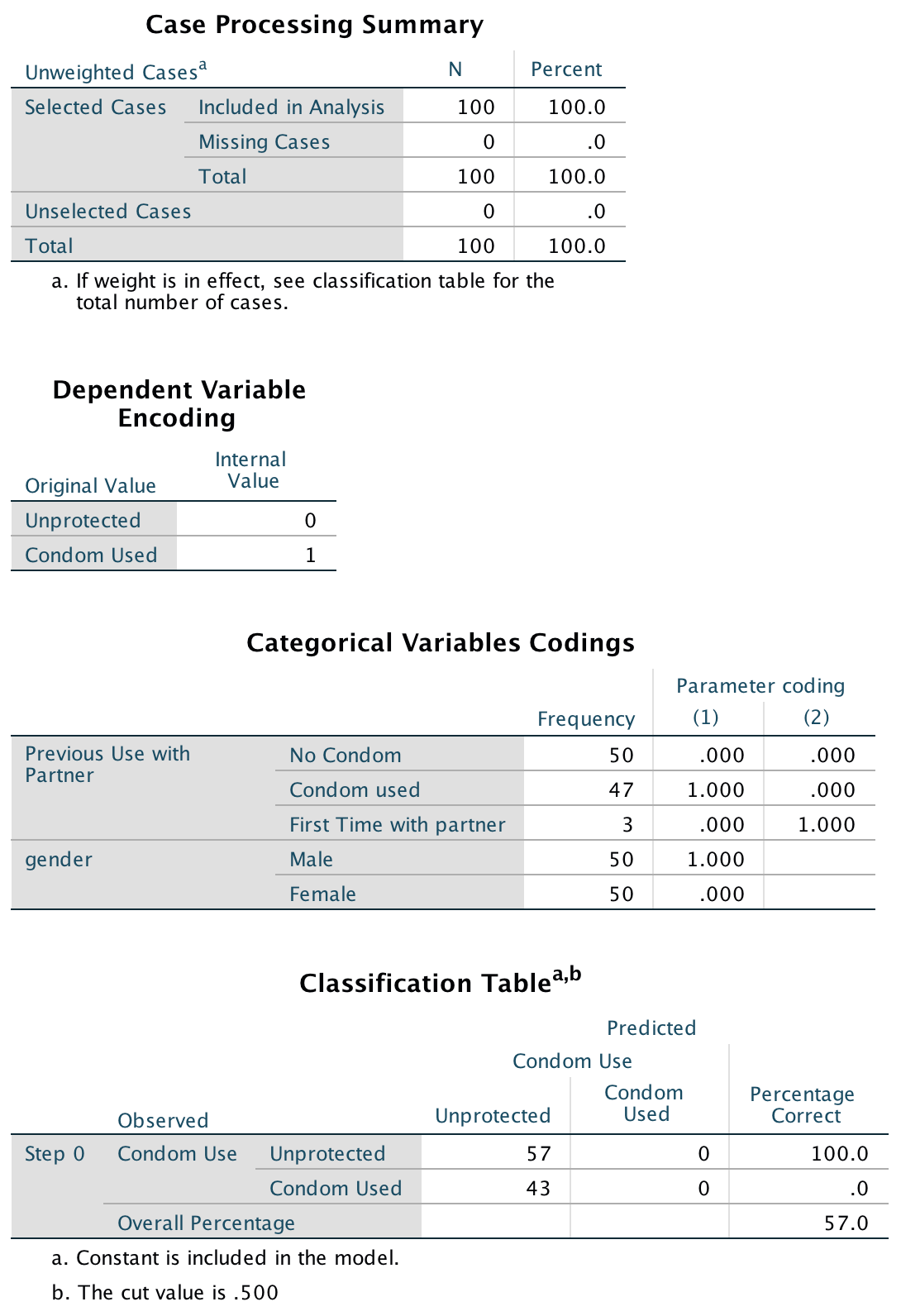
Output
The output for block 1 provides information about the model after the variables perceive, safety and gender have been added. The −2LL has dropped to 105.77, which is a change of 30.89 (the model chi-square). This value tells us about the model as a whole, whereas the block tells us how the model has improved since the last block. The change in the amount of information explained by the model is significant (\(\chi^2\)(3) = 30.89, p < .001) and so using perceived risk, relationship safety and gender as predictors significantly improves our ability to predict condom use. Finally, the classification table shows us that 74% of cases can be correctly classified using these three predictors.
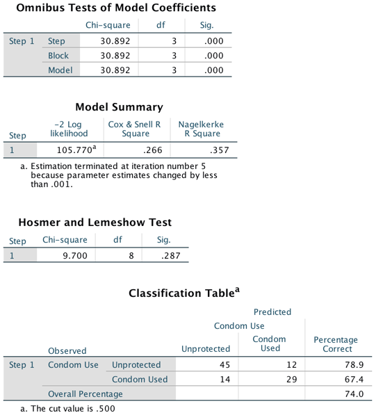
Output
Hosmer and Lemeshow’s goodness-of-fit test statistic tests the hypothesis that the observed data are significantly different from the predicted values from the model. So, in effect, we want a non-significant value for this test (because this would indicate that the model does not differ significantly from the observed data). In this case (\(\chi^2\)(8) = 9.70, p = .287) it is non-significant, which is indicative of a model that is predicting the real-world data fairly well.
The table labelled Variables in the Equation tells us the parameters of the model for the first block. The significance values of the Wald statistics for each predictor indicate that both perceived risk (Wald = 17.78, p < .001) and relationship safety (Wald = 4.54, p = .033) significantly predict condom use. Gender, however, does not (Wald = 0.41, p = .523).
The odds ratio for perceived risk (Exp(B) = 2.56 [1.65, 3.96] indicates that if the value of perceived risk goes up by 1, then the odds of using a condom also increase (because Exp(B) is greater than 1). The confidence interval for this value ranges from 1.65 to 3.96, so if this is one of the 95% of samples for which the confidence interval contains the population value the value of Exp(B) in the population lies somewhere between these two values. In short, as perceived risk increase by 1, people are just over twice as likely to use a condom.
The odds ratio for relationship safety (Exp(B) = 0.63 [0.41, 0.96] indicates that if the relationship safety increases by one point, then the odds of using a condom decrease (because Exp(B) is less than 1). The confidence interval for this value ranges from 0.41 to 0.96, so if this is one of the 95% of samples for which the confidence interval contains the population value the value of Exp(B) in the population lies somewhere between these two values. In short, as relationship safety increases by one unit, subjects are about 1.6 times less likely to use a condom.
The odds ratio for gender (Exp(B) = 0.729 [0.28, 1.93] indicates that as gender changes from 1 (female) to 0 (male), then the odds of using a condom decrease (because Exp(B) is less than 1). The confidence interval for this value crosses 1. Assuming that this is one of the 95% of samples for which the confidence interval contains the population value this means that the direction of the effect in the population could indicate either a positive (Exp(B) > 1) or negative (Exp(B) < 1) relationship between gender and condom use.
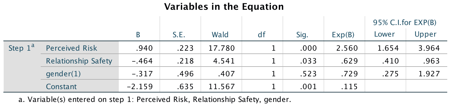
Output
A glance at the classification plot brings not such good news because a lot of cases are clustered around the middle. This pattern indicates that the model could be making better predictions (there are currently a lot of cases that have a probability of condom use at around 0.5).

Output
The output for block 2 shows what happens to the model when our new predictors are added (previous use, self-control and sexual experience).So, we begin with the model that we had in block 1 and we then add previous, selfcon and sexexp to it. The effect of adding these predictors to the model is to reduce the –2 log-likelihood to 87.97 (a reduction of 48.69 from the original model (the model chi-square) and an additional reduction of 17.80 from block 1 (the block statistics). This additional improvement of block 2 is significant (\(\chi^2\)(4) = 17.80, p < .001), which tells us that including these three new predictors in the model has significantly improved our ability to predict condom use. The classification table tells us that the model is now correctly classifying 78% of cases. Remember that in block 1 there were 74% correctly classified and so an extra 4% of cases are now classified (not a great deal more – in fact, examining the table shows us that only four extra cases have now been correctly classified).
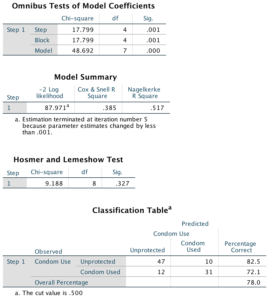
Output
The table labelled Variables in the Equation contains details of the final model. The significance values of the Wald statistics for each predictor indicate that both perceived risk (Wald = 16.04, p < .001) and relationship safety (Wald = 4.17, p = .041) still significantly predict condom use and, as in block 1, gender does not (Wald = 0.00, p = .996).
Previous use has been split into two components (according to whatever contrasts were specified for this variable). Looking at the very first output, we are told the parameter codings for previous(1) and previous(2). From the output we can see that previous(1) compares the condom used group against the no condom used group, and previous(2) compares the first time with partner against the no condom used group. Therefore we can tell that (1) using a condom on the previous occasion does predict use on the current occasion (Wald = 3.88, p = .049); and (2) there is no significant diference between not using a condom on the previous occasion and this being the first time (Wald = 0.00, p = .991). Of the other new predictors we find that self-control predicts condom use (Wald = 7.51, p = .006) but sexual experience does not (Wald = 2.61, p = .106).
The odds ratio for perceived risk (Exp(B) = 2.58[1.62, 4.11] indicates that if the value of perceived risk goes up by 1, then the odds of using a condom also increase (because Exp(B) is greater than 1). The confidence interval for this value ranges from 1.62 to 4.11, so if this is one of the 95% of samples for which the confidence interval contains the population value the value of Exp(B) in the population lies somewhere between these two values. In short, as perceived risk increase by 1, people are just over twice as likely to use a condom.
The odds ratio for relationship safety (Exp(B) = 0.62 [0.39, 0.98] indicates that if the relationship safety increases by one point, then the odds of using a condom decrease (because Exp(B) is less than 1). The confidence interval for this value ranges from 0.39 to 0.98, so if this is one of the 95% of samples for which the confidence interval contains the population value the value of Exp(B) in the population lies somewhere between these two values. In short, as relationship safety increases by one unit, subjects are about 1.6 times less likely to use a condom.
The odds ratio for gender (Exp(B) = 0.996 [0.33, 3.07] indicates that as gender changes from 1 (female) to 0 (male), then the odds of using a condom decrease (because Exp(B) is less than 1). The confidence interval for this value crosses 1. Assuming that this is one of the 95% of samples for which the confidence interval contains the population value this means that the direction of the effect in the population could indicate either a positive (Exp(B) > 1) or negative (Exp(B) < 1) relationship between gender and condom use.
The odds ratio for previous(1) (Exp(B) = 2.97[1.01, 8.75) indicates that if the value of previous usage goes up by 1 (i.e., changes from not having used one to having used one), then the odds of using a condom also increase. If this is one of the 95% of samples for which the confidence interval contains the population value then the value of Exp(B) in the population lies somewhere between 1.01 and 8.75. In other words it is a positive relationship: previous use predicts future use. For previous(2) the odds ratio (Exp(B) = 0.98 [0.06, 15.29) indicates that if the value of previous usage goes changes from not having used one to this being the first time with this partner), then the odds of using a condom do not change (because the value is very nearly equal to 1). If this is one of the 95% of samples for which the confidence interval contains the population value then the value of Exp(B) in the population lies somewhere between 0.06 and 15.29 and because this interval contains 1 it means that the population relationship could be either positive or negative (and very wide ranging).
The odds ratio for self-control (Exp(B) = 1.42 [1.10, 1.82] indicates that if self-control increases by one point, then the odds of using a condom increase also. As self-control increases by one unit, people are about 1.4 times more likely to use a condom. If this is one of the 95% of samples for which the confidence interval contains the population value then the value of Exp(B) in the population lies somewhere between 1.10 and 1.82. In other words it is a positive relationship
Finally, the odds ratio for sexual experience (Exp(B) = 1.20[0.95, 1.49] indicates that as sexual experience increases by one unit, people are about 1.2 times more likely to use a condom. If this is one of the 95% of samples for which the confidence interval contains the population value then the value of Exp(B) in the population lies somewhere between 0.06 and 15.29 and because this interval contains 1 it means that the population relationship could be either positive or negative.
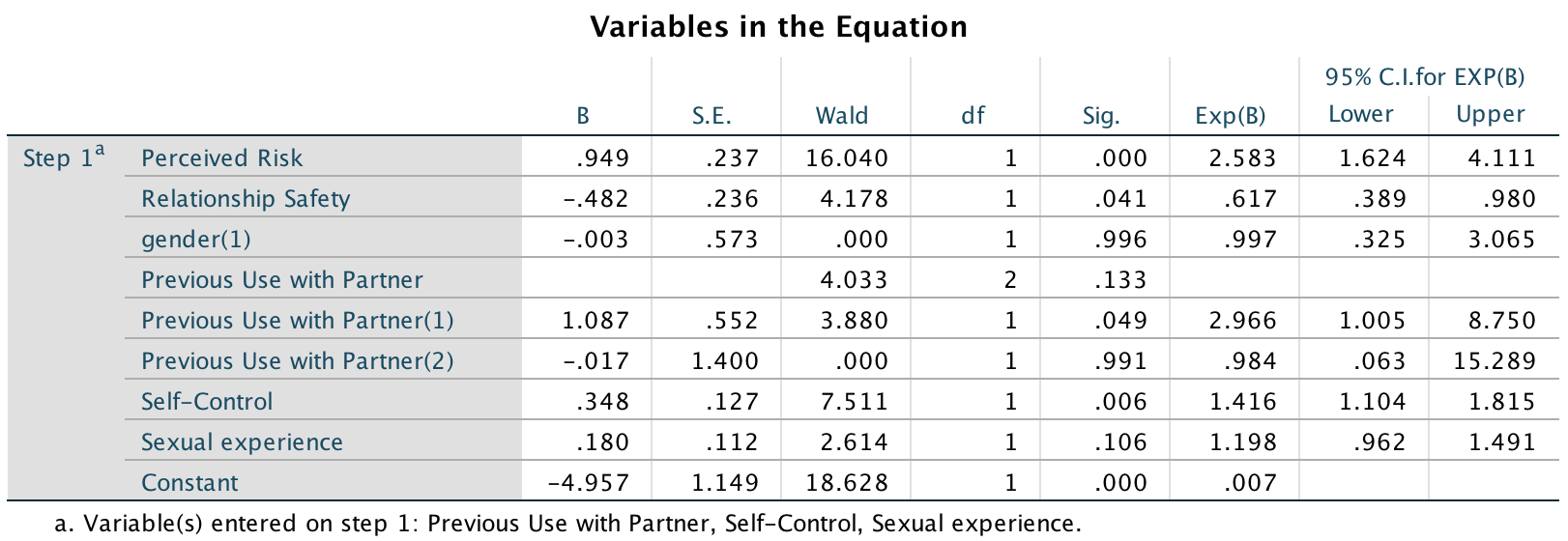
Output
A glance at the classification plot brings better news because a lot of cases that were clustered in the middle are now spread towards the edges. Therefore, overall this new model is more accurately classifying cases compared to block 1.
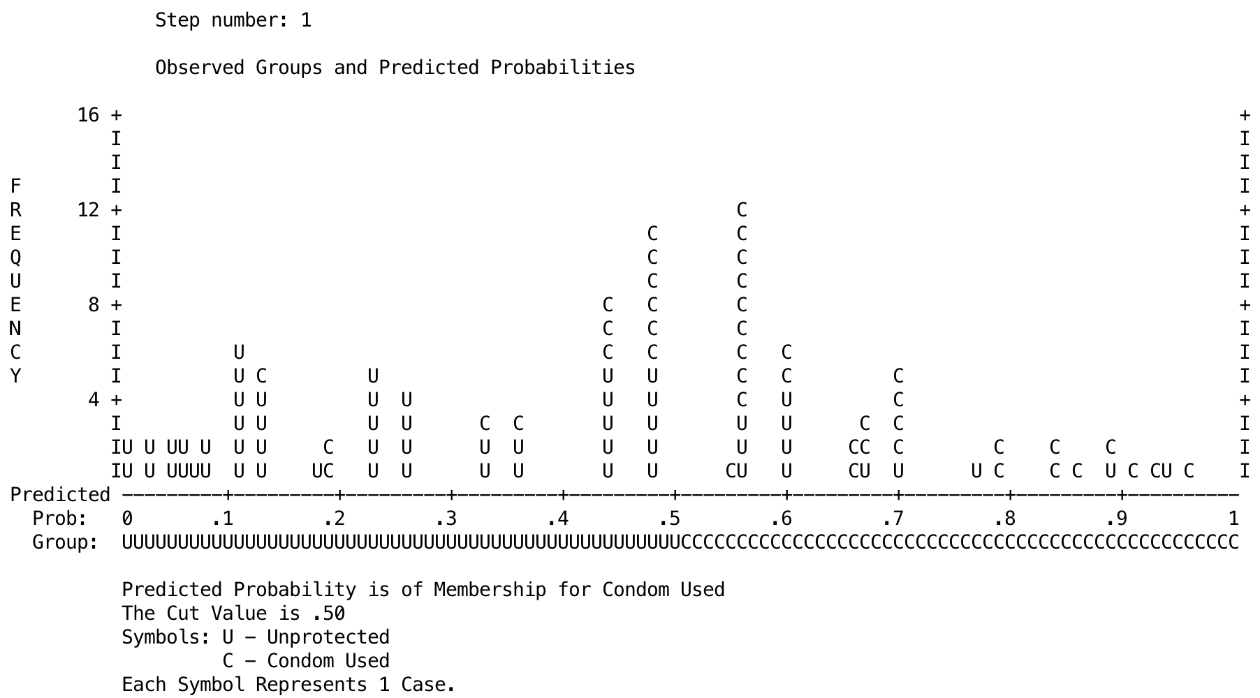
Output
Task 20.7
How reliable is the model in Task 6?
First, we’ll check for multicollinearity (see the book for how to do this). The tolerance values for all variables are close to 1 and VIF values are much less than 10, which suggests no collinearity issues. The table labelled Collinearity Diagnostics shows the eigenvalues of the scaled, uncentred cross-products matrix, the condition index and the variance proportions for each predictor. If the eigenvalues are fairly similar then the derived model is likely to be unchanged by small changes in the measured variables. The condition indexes represent the square root of the ratio of the largest eigenvalue to the eigenvalue of interest (so, for the dimension with the largest eigenvalue, the condition index will always be 1). The variance proportions shows the proportion of the variance of each predictor’s b that is attributed to each eigenvalue. In terms of collinearity, we are looking for predictors that have high proportions on the same small eigenvalue, because this would indicate that the variances of their b coefficients are dependent (see the main textbook for more detail). No variables have similarly high variance proportions for the same dimensions. The result of this output suggests that there is no problem of collinearity in these data.
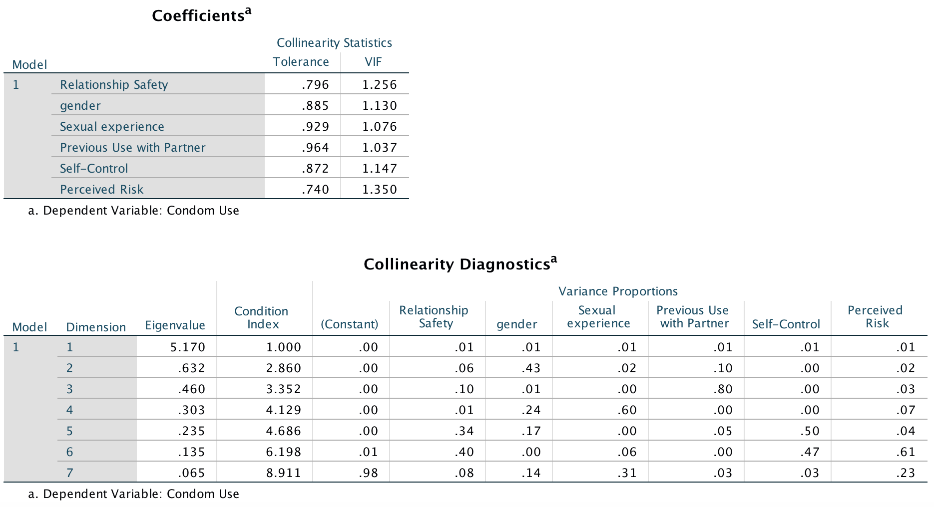
Output
Residuals should be checked for influential cases and outliers. The output lists cases with standardized residuals greater than 2. In a sample of 100, we would expect around 5–10% of cases to have standardized residuals with absolute values greater than this value. For these data we have only four cases (out of 100) and only one of these has an absolute value greater than 3. Therefore, we can be fairly sure that there are no outliers (the number of cases with large standardized residuals is consistent with what we would expect).
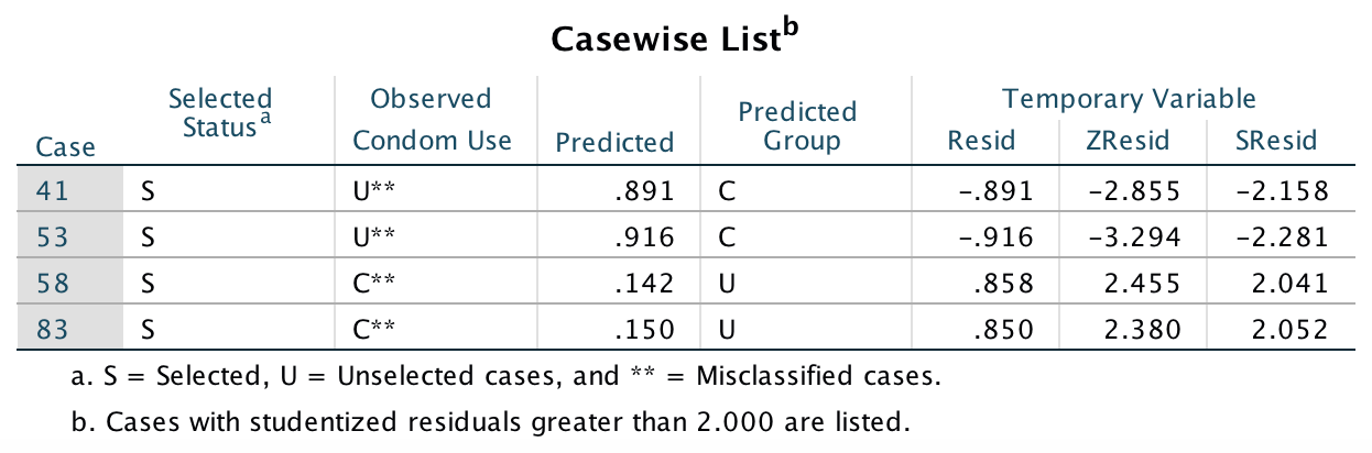
Output
Task 20.8
Using the final model from Task 6, what are the probabilities that participants 12, 53 and 75 will use a condom?
The values predicted for these cases will depend on exactly how you ran the analysis (and the parameter coding used on the variable previous). Therefore, your answers might differ slightly from mine.
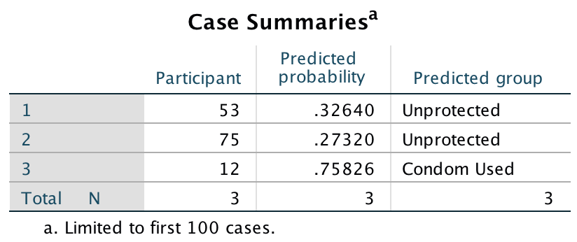
Output
Task 20.9
A female who used a condom in her previous encounter scores 2 on all variables except perceived risk (for which she scores 6). Use the model in Task 6 to estimate the probability that she will use a condom in her next encounter.
Use the logistic regression equation:
\[ p(Y_i) = \frac{1}{1 + e^{-Z}} \\ \] where
\[ Z = b_0 + b_1X_{1i} + b_2X_{2i} + ... + b_nX_{ni} \]
We need to use the values of b from the output (final model) and the values of X for each variable (from the question). The values of b we can get from an earlier output:
Output
For the values of X, remember that we need to check how the categorical variables were coded. Again, refer back to an earlier output:
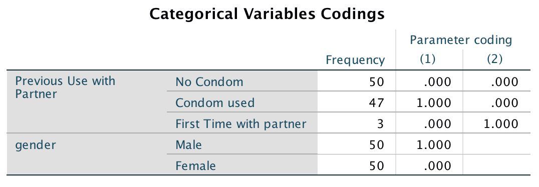
Output
For example, a female is coded as 0, so that will be the value of X for this person. Similarly, she used a condom with her previous partner so this will be coded as 1 for previous(1) and 0 for previous(2).
The table below shows the values of b and X and then multiplies them.
| Predictor | b | X | bX |
|---|---|---|---|
| Perceived risk | 0.949 | 6 | 5.694 |
| Relationship safety | -0.482 | 2 | -0.964 |
| Biological sex | -0.003 | 0 | 0.000 |
| Previous use (1) | 1.087 | 1 | 1.087 |
| Previous use (2) | -0.017 | 0 | 0.000 |
| Self-control | 0.348 | 2 | 0.696 |
| Sexual experience | 0.180 | 2 | 0.360 |
| Constant | -4.957 | 1 | -4.957 |
We now sum the values in the last column to get the number in the brackets in the equation above:
\[ \begin{align} Z &= 5.694 -0.964 + 0.000 + 1.087 + 0.000 + 0.696 + 0.360 -4.957 \\ &= 1.916 \end{align} \]
Replace this value of z into the logistic regression equation:
\[ \begin{align} p(Y_i) &= \frac{1}{1 + e^{-Z}} \\ &= \frac{1}{1 + e^{-1.916}} \\ &= \frac{1}{1 + 0.147} \\ &= \frac{1}{1.147} \\ &= 0.872 \end{align} \]
Therefore, there is a 0.872 probability (87.2% if you prefer) that she will use a condom on her next encounter.
Task 20.10
At the start of the chapter we looked at whether the type of instrument a person plays is connected to their personality. A musicologist measured Extroversion and Agreeableness in 200 singers and guitarists (Instrument). Use logistic regression to see which personality variables (ignore their interaction) predict which instrument a person plays (Sing or Guitar.sav).
Follow the general instructions for logistic regression to fit the model. The main dialog box should look like the figure below.
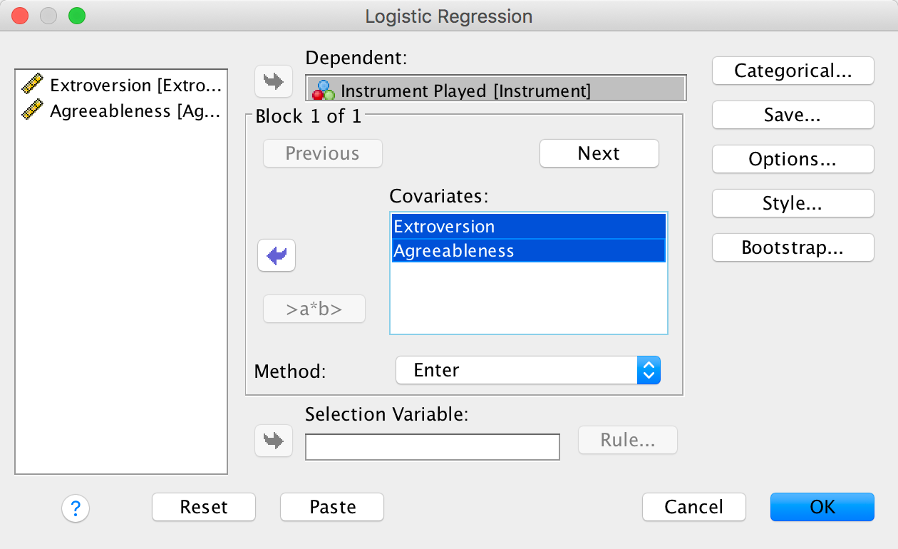
Completed dialog box
The first part of the output tells us about the model when only the constant is included (i.e., all predictor variables are omitted). The log-likelihood of this baseline model is 271.957, which represents the fit of the model when including only the constant. At this point, the model predicts that every participant is a singer, because this results in more correct classifications than if the model predicted that everyone was a guitarist. Self-evidently, this model has 0% accuracy for the participants who played the guitar, and 100% accuracy for singers. Overall, the model correctly classifies 53.8% of participants.
The next part of the output summarizes the model, which at this stage tells us the value of the constant (\(b_0\)), which is −0.153. The table labelled Variables not in the Equation reports the residual chi-square statistic (labelled Overall Statistics) as 115.231 which is significant at p < .001 . This statistic tells us that the coefficients for the variables not in the model are significantly different from zero – in other words, the addition of one or more of these variables to the model will significantly improve predictions from the model. This table also lists both predictors with the corresonding value of Roa’s efficient score statistic ( labelled Score). Both excluded variables have significant score statistics at p < .001 and so both could potentially make a contribution to the model. The next part of the output deals with the model after these predictors have been added to the model.
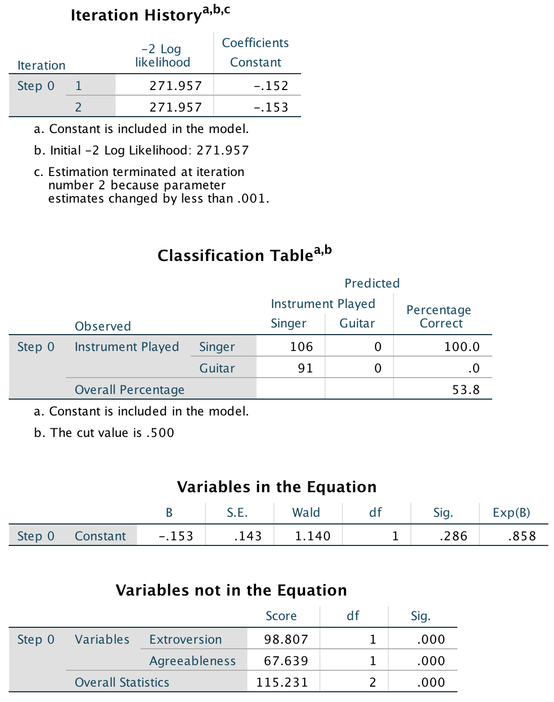
Output
The overall fit of the new models is assessed using the −2log-likelihood statistic (−2LL). Remember that large values of the log-likelihood statistic indicate poorly fitting statistical models. The value of −2log-likelihood for a new model should, therefore, be smaller than the value for the previous model if the fit is improving. When only the constant was included, −2LL = 271.96, but with the two predictors added it has reduced to 225.18 (a change of 46.78), which tells us that the model is better at predicting which instrument participants’ played when both predictors are included.
The classification table how well the model predicts group membership. Before the predictors were entered into the model, the model correctly classified the 106 participants who are singers and misclassified all of the guitarests. So, overall it classified 53.8 of cases (see above). After the predictors are added it correctly classifies 103 of the 106 singers and 87 of the 91 guitarists. Overall then, it correctly classifies 96.4% of cases. A huge number (which you might want to think about for the following task!).
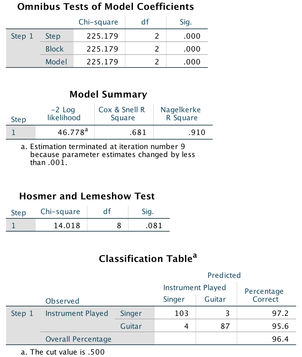
Output
The table labelled Variables in the Equation tells us the estimates for the coefficients for the predictors included in the model. These coefficients represents the change in the logit (log odds) of the outcome variable associated with a one-unit change in the predictor variable. The Wald statistics suggest that both Extroversion, Wald(1) = 22.90, p < .001, and Agreeableness, Wald(1) = 15.30, p < .001, significantly predict the instrument played. The corresponding odds ratio (labelled Exp(B)) tells us the change in odds associated with a unit change in the predictor. The odds ratio for Extroversion is 0.238, which is less than 1 meaning that as the predictor (extroversion) increases, the odds of the outcome decrease, that is, the odds of being a guitarist (compared to a singer) decrease. In other words, more extroverted participants are more likely to be singers. The odds ratio for Agreeableness is 1.429, which is greater than 1 meaning that as agreeableness increases, the odds of the outcome increase, that is, the odds of being a guitarist (compared to a singer) increase. In other words, more agreeable people are more likely to be guitarists. Note that the odds ratio for the constant is insanely large, which brings us neatly onto the next task …
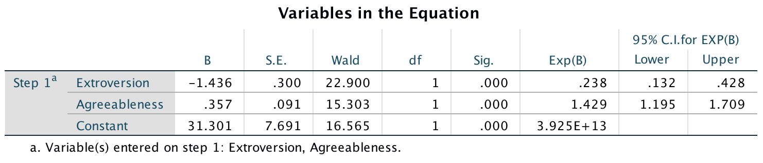
Output
Task 20.11
Which problem associated with logistic regression might we have in the analysis in Task 10?
Looking at the classification plot, it looks as though we might have complete separation. The model almost perfectly predicts group membership.
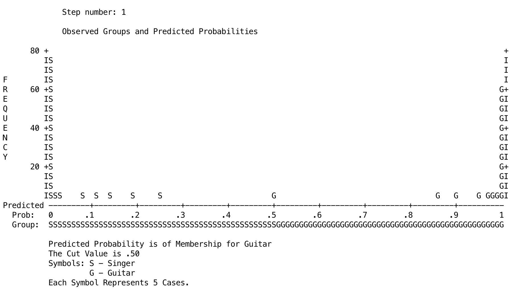
Output
Task 20.12
In a new study, the musicologist in Task 10 extended her previous one by collecting data from 430 musicians who played their voice (singers), guitar, bass, or drums (Instrument). She measured the same personality variables but also their Conscientiousness (Band Personality.sav). Use multinomial logistic regression to see which of these three variables (ignore interactions) predict which instrument a person plays (use drums as the reference category).
To fit the model select Analyze > Regression > Multinomial Logistic …. The main dialog box should look like the figure below. Drag the outcome Instrument to the box labelled Dependent. We can specify which category to compare other categories against by clicking the Reference Category … button but the default is to use the last category, and this default is perfect for us because drums is the last category and is also the category that we want to use as our reference category.
Next, specify the predictor variables by dragging them (Agreeableness, Extroversion and Conscientiousness) to the box labelled Covariate(s). For a basic analysis in which all of these predictors are forced into the model, this is all we really need to do, but consult with the book chapter to select other options.
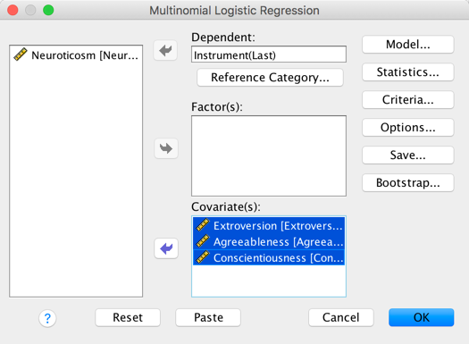
Completed dialog box
The first output shows the log-likelihood. The change in log-likelihood indicates how much new variance has been explained by the model. The chi-square test tests the decrease in unexplained variance from the baseline model (1122.82) to the final model (450.91), which is a difference of 1149.53−871 = 672.02. This change is significant, which means that our final model explains a significant amount of the original variability in the instrument played (in other words, it’s a better fit than the original model).
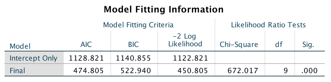
Output
The next part of the output relates to the fit of the model. We know that the model with predictors is significantly better than the one without predictors, but is it a good fit of the data? The Pearson and deviance statistics both test whether the predicted values from the model differ significantly from the observed values. If these statistics are not significant then the model is a good fit. Here we have contrasting results: the deviance statistic says that the model is a good fit of the data (p = 1.00, which is much higher than .05), but the Pearson test indicates the opposite, namely that predicted values are significantly different from the observed values (p < .001). Oh dear. Differences between these statistics can be caused by overdispersion. We can compute the dispersion parameters from both statistics:
\[ \begin{align} \phi_\text{Pearson} &= \frac{\chi_{\text{Pearson}}^2}{\text{df}} = \frac{1042672.72}{1140} = 914.63 \\ \phi_\text{Deviance} &= \frac{\chi_{\text{Deviance}}^2}{\text{df}} = \frac{448.032}{1140} = 0.39 \end{align} \]
The dispersion parameter based on the Pearson statistic is 914.63, which is ridiculously high compared to the value of 2, which I cited in the chapter as being a threshold for ‘problematic’. Conversely, the value based on the deviance statistic is below 1, which we saw in the chapter indicated underdispersion. Again, these values contradict, so all we can really be sure of is that there’s something pretty weird going on. Large dispersion parameters can occur for reasons other than overdispersion, for example omitted variables or interactions and predictors that violate the linearity of the logit assumption. In this example there were several interaction terms that we could have entered but chose not to, which might go some way to explaining these strange results.
The output also shows us the two other measures of \(R^2\). The first is Cox and Snell’s measure (.81) and the second is Nagelkerke’s adjusted value (.86). They are reasonably similar values and represent very large effects.
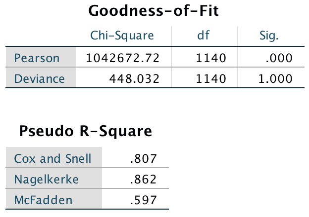
Output
The likelihood ratio tests can be used to ascertain the significance of predictors to the model. This table tells us that extroversion had a significant main effect on type of instrument played, \(\chi^2\)(3) = 339.73, p < .001, as did agreeableness, \(\chi^2\)(3) = 100.16, p < .001, and conscientiousness, \(\chi^2\)(3) = 84.26, p < .001.
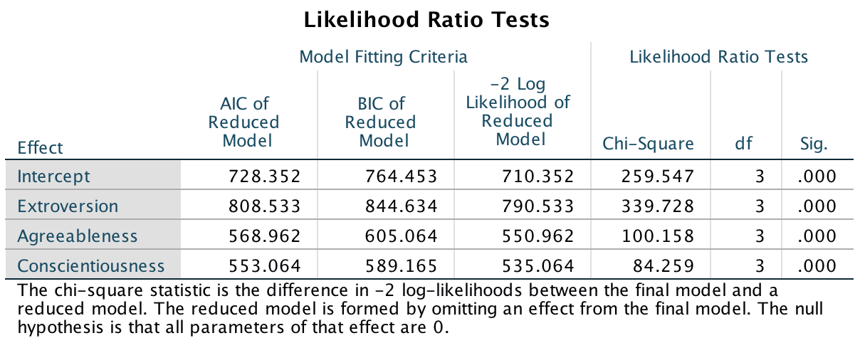
Output
These likelihood statistics can be seen as overall statistics that tell us which predictors significantly enable us to predict the outcome category, but they don’t really tell us specifically what the effect is. To see this we have to look at the individual parameter estimates. We specified the last category (drums) as our reference category; therefore, each section of the table compares one of the instrument categories against the drums category. Let’s look at the effects one by one; because we are just comparing two categories the interpretation is the same as for binary logistic regression (so if you don’t understand my conclusions reread the book chapter):
- Extroversion. Whether a person was a drummer or a singer was significantly predicted by how extroverted they were, b = 1.70, Wald \(\chi^2\)(1) = 54.34, p < .001. The odds ratio tells us that as extroversion increases by one unit, the change in the odds of being a singer (rather than being a drummer) is 5.47. The odds ratio (5.47) is greater than 1, therefore we can say that as participants move up the extroversion scale, they were more likely to be a singer (coded 1) than they were to be a drummer (coded 0). Similarly, Whether a person was a drummer or a bassist was significantly predicted by how extroverted they were, b = 0.25, Wald \(\chi^2\)(1) = 18.28, p < .001. The odds ratio tells us that as extroversion increases by one unit, the change in the odds of being a bass player (rather than being a drummer) is 1.29, so the more extroverted the participant was, the more likely they were to be a bass player than they were to be a drummer. However, whether a person was a drummer or a guitarest was not significantly predicted by how extroverted they were, b = .06, Wald \(\chi^2\)(1) = 3.58, p = .06.
- Agreeableness. Whether a person was a drummer or a singer was significantly predicted by how agreeable they were, b = −0.40, Wald \(\chi^2\)(1) = 35.49, p < .001. The odds ratio tells us that as agreeableness increases by one unit, the change in the odds of being a singer (rather than being a drummer) is 0.67, so the more agreeable the participant was, the more likely they were to be a drummer than they were to be a singer. Similarly, whether a person was a drummer or a bassist was significantly predicted by how agreeable they were, b = −0.40, Wald \(\chi^2\)(1) = 41.55, p < .001. The odds ratio tells us that as agreeableness increases by one unit, the change in the odds of being a bass player (rather than being a drummer) is 0.67, so, the more agreeable the participant was, the more likely they were to be a drummer than they were to be a bass player. However, whether a person was a drummer or a guitarist was not significantly predicted by how agreeable they were, b = .02, Wald \(\chi^2\)(1) = 0.51, p = .48.
- Conscientiousness. Whether a person was a drummer or a singer was significantly predicted by how conscientious they were, b = −0.35, Wald \(\chi^2\)(1) = 21.27, p < .001. The odds ratio tells us that as conscientiousness increases by one unit, the change in the odds of being a singer (rather than being a drummer) is 0.71, so the more conscientious the participant was, the more likely they were to be a drummer than they were to be a singer. Similarly, Whether a person was a drummer or a bassist was significantly predicted by how conscientious they were, b = −0.36, Wald \(\chi^2\)(1) = 40.93, p < .001. The odds ratio tells us that as conscientiousness increases by one unit, the change in the odds of being a bass player (rather than being a drummer) is 0.70, so the more conscientious the participant was, the more likely they were to be a drummer than they were to be a bass player. However, whether a person was a drummer or a guitarist was not significantly predicted by how conscientious they were, b = 0.00, Wald \(\chi^2\)(1) = 0.00, p = 1.00.
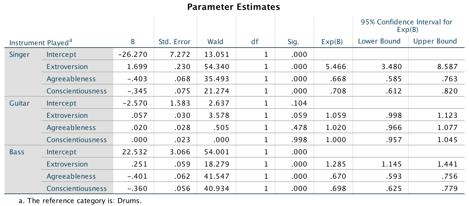
Output
Chapter 21
Task 21.1
Using the cosmetic surgery example, run the analysis described in Section 1.6.5 but also including BDI, age and sex as fixed effect predictors. What differences does including these predictors make?
To fit the model follow the instructions in section 21.6.6 of the book except that the main dialog box (Figure 21.20 in the book) should include Surgery, Base_QoL, Age, Sex, Reason and BDI in the list of covariates: hold down Ctrl (⌘ on MacOS) to select all of these simultaneously and drag them to the box labelled Covariate(s):.
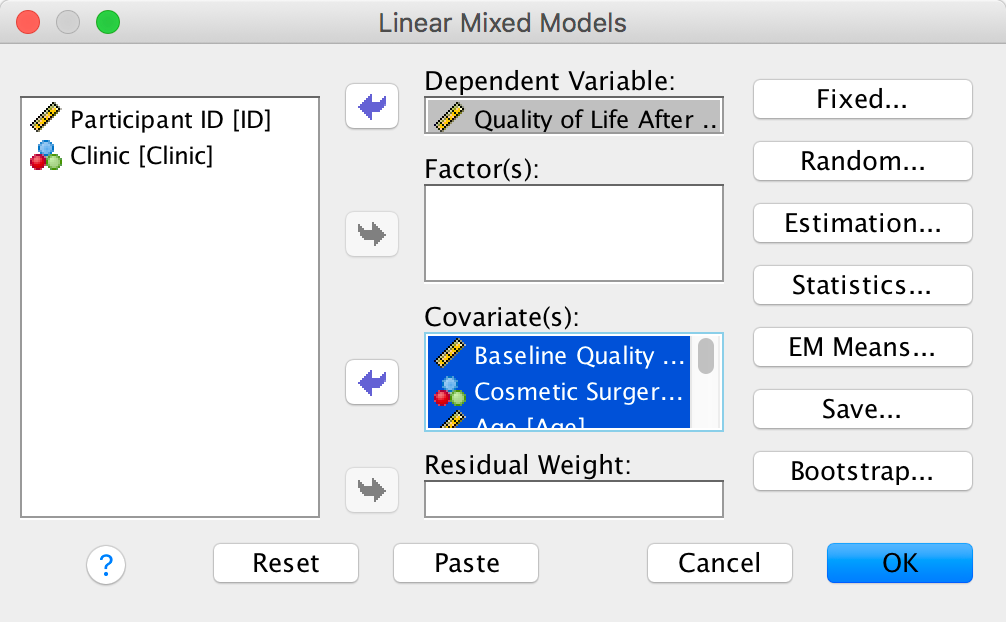
Completed dialog box
We’d set up the Fixed Effects dialog box (Figure 21.21 in the book) as follows:
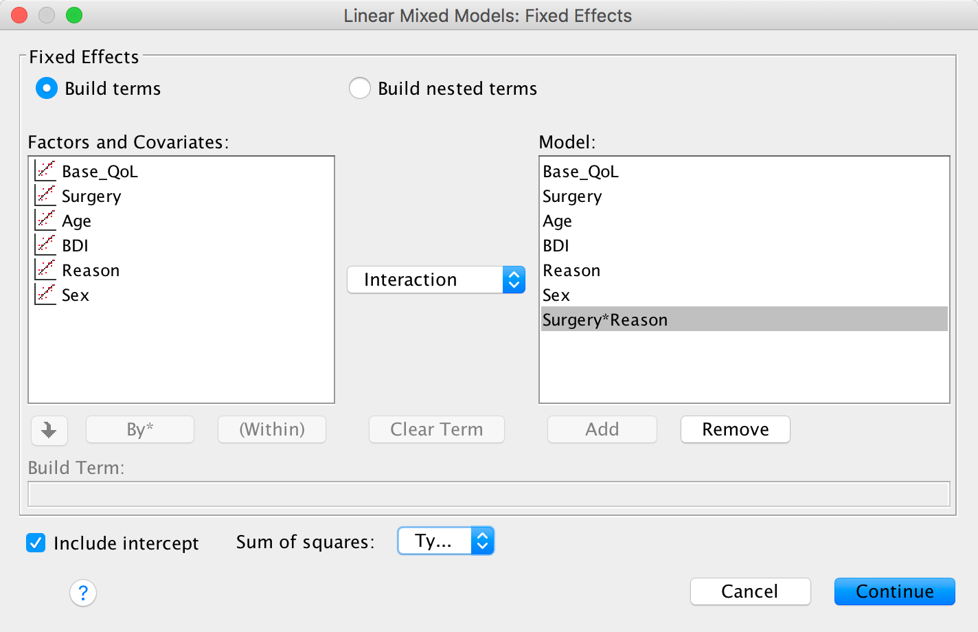
Completed dialog box
We’d set up the Random Effects dialog box (Figure 21.18 in the book) as follows:
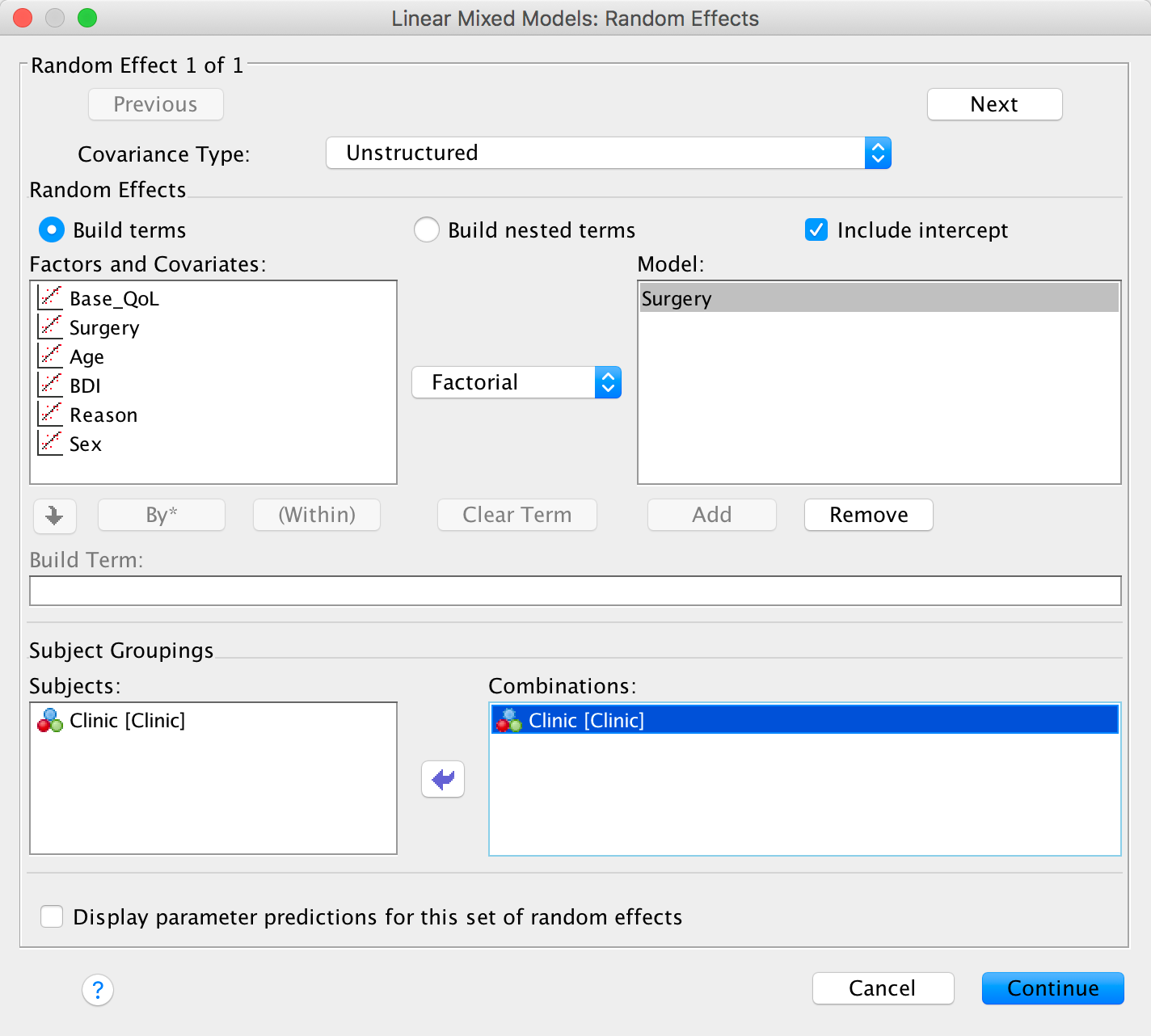
Completed dialog box
Set all of the other options as described for the example in the book.
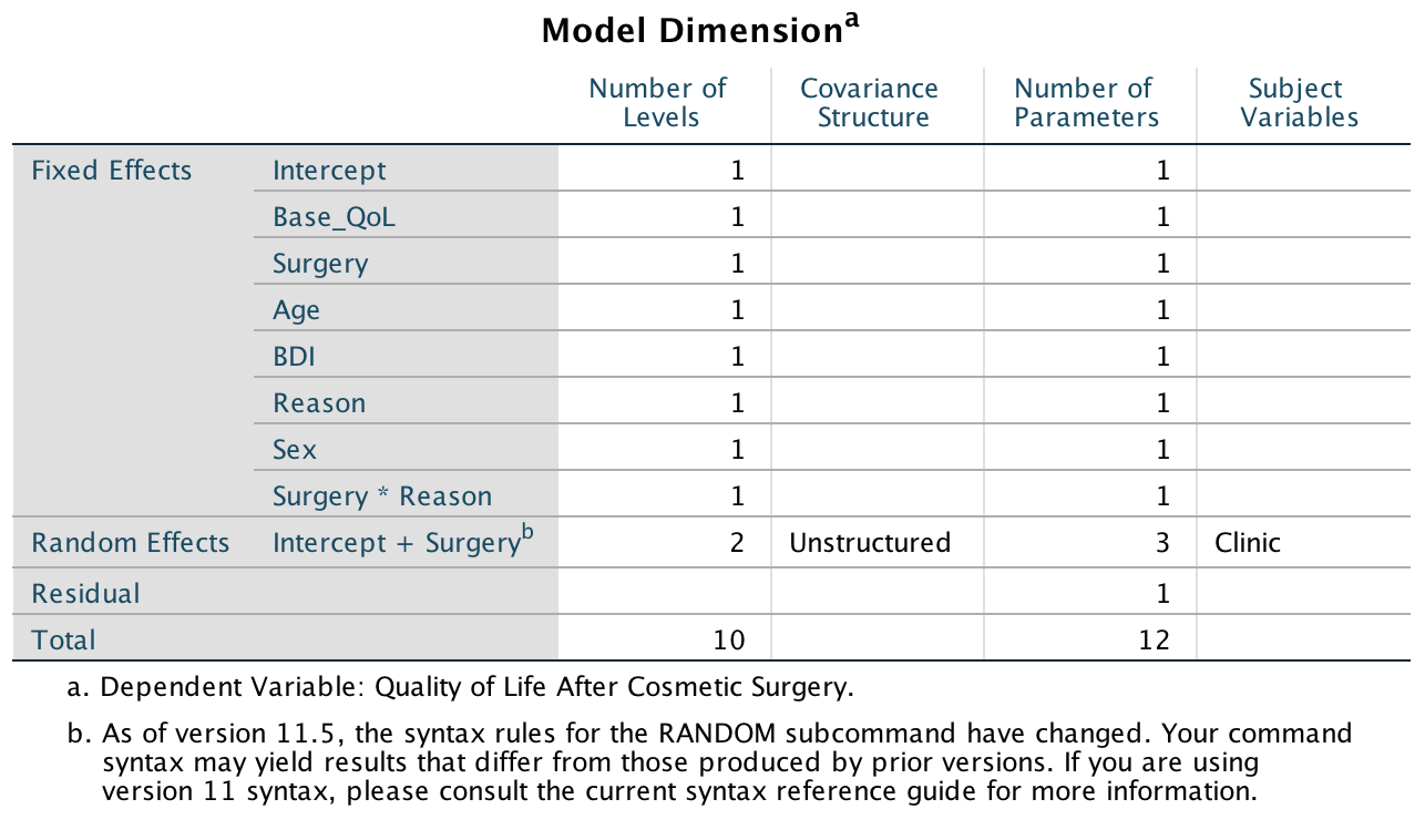
Output
We can test the fit this new model using the log-likelihood statistics. the model in the book had a -2LL of 1789.05 with 9 degrees of freedom, and by adding the new predictors the model here this value has changed to 1725.39 with 12 degrees of freedom. This is a change of 63.66 with a difference of 3 degrees of freedom:
\[ \begin{aligned} \chi_\text{Change}^2 &= 1789.05 - 1725.39 = 63.66 \\ \text{df}_\text{Change} &= 12 - 9 = 3 \end{aligned} \]
The critical value for the chi-square statistic (see the book Appendix) is significant \(\chi^2\)(3) = 7.81, p < .05; therefore, this change is significant.
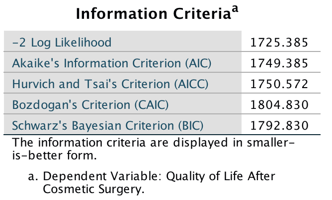
Output
Including these three predictors has improved the fit of the model. Age, F(1, 150.83) = 37.32, p < .001, and BDI, F(1, 260.83) = 16.74, p < .001, significantly predicted quality of life after surgery but Sex did not, F(1, 264.48) = 0.90, p = .34. The main difference that including these factors has made is that the main effect of Reason has become non-significant, and the Reason × Surgery interaction has become more significant (its b has changed from 4.22, p = .013, to 5.02, p = .001).
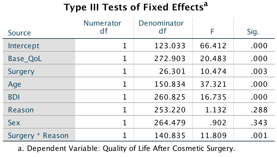
Output
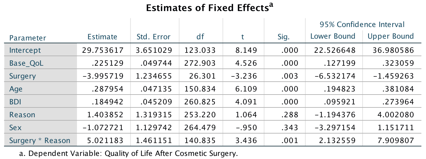
Output
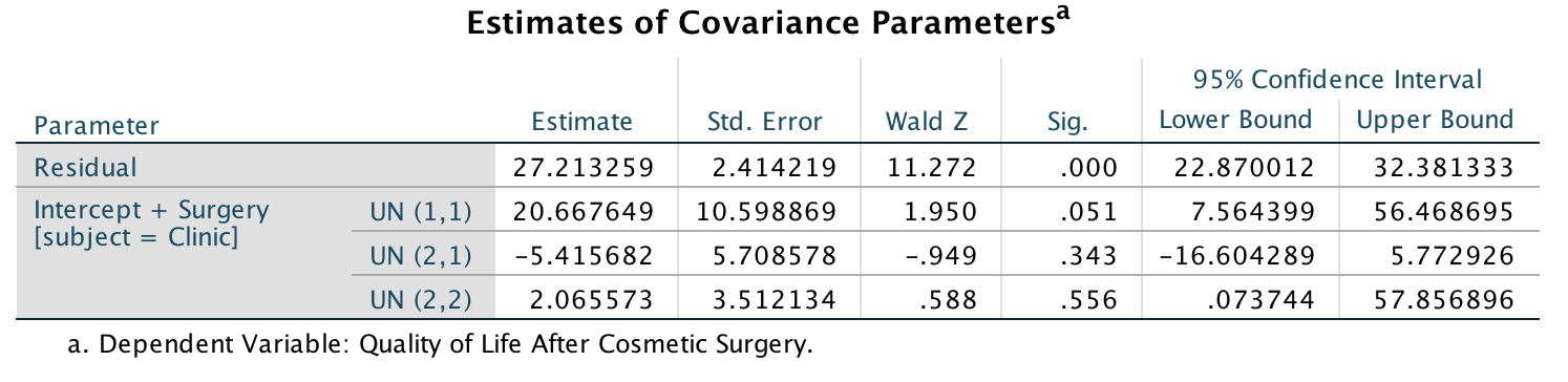
Output
We could break down this interaction as we did in the chapter by splitting the file and running a simpler analysis (without th interaction and the main effect of Reason, but including Base_QoL, Surgery, BDI, Age, and Sex). If you do these analyses you will get the parameter tables shown below. These tables show a similar pattern to the example in the book. For those operated on only to change their appearance, surgery significantly predicted quality of life after surgery, b = -3.16, t(5.25) = -2.63, p = .04. Unlike when age, sex and BDI were not included, this effect is now significant. The negative gradient shows that in these people quality of life was lower after surgery compared to the control group. However, for those who had surgery to solve a physical problem, surgery did not significantly predict quality of life, b = 0.67, t(10.59) = 0.58, p = .57. In essence, the inclusion of age, sex and BDI has made very little difference in this latter group. However, the slope was positive, indicating that people who had surgery scored higher on quality of life than those on the waiting list (although not significantly so!). The interaction effect, therefore, as in the chapter, reflects the difference in slopes for surgery as a predictor of quality of life in those who had surgery for physical problems (slight positive slope) and those who had surgery purely for vanity (a negative slope).
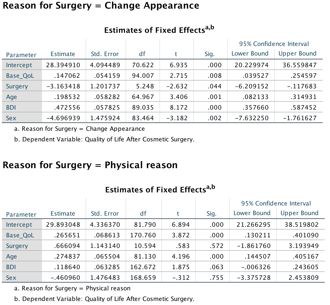
Output
Task 21.2
Using our growth model example in this chapter, analyse the data but include Sex as an additional covariate. Does this change your conclusions?
To fit the model follow the instructions in the book except that the main dialog box (Figure 21.27 in the book) should look like this:
Completed dialog box
The Fixed Effects dialog box should look like this:
Completed dialog box
All other dialog boxes should be completed as in the book (section 21.7.4). The output is the same as the final one in the chapter, except that it now includes the effect of Sex. To see whether Sex has improved the model we compare the value of -2LL for this new model to the value in the previous model. We have added only one term to the model, so the new degrees of freedom will have risen by 1, from 8 to 9 (you can find the value of 9 in the row labelled Total in the column labelled Number of Parameters, in the table called Model Dimension). We can compute the change in -2LL as a result of Sex by subtracting the -2LL for this model from the -2LL for the last model in the chapter:
\[ \begin{aligned} \chi_\text{Change}^2 &= 1798.86 - 1798.74 = 0.12 \\ \text{df}_\text{Change} &= 9 - 8 = 1 \end{aligned} \]
The critical values for the chi-square statistic for df = 1 in the Appendix are 3.84 (p < .05) and 6.63 (p < .01); therefore, this change is not significant because 0.12 is less than the critical value of 3.84.
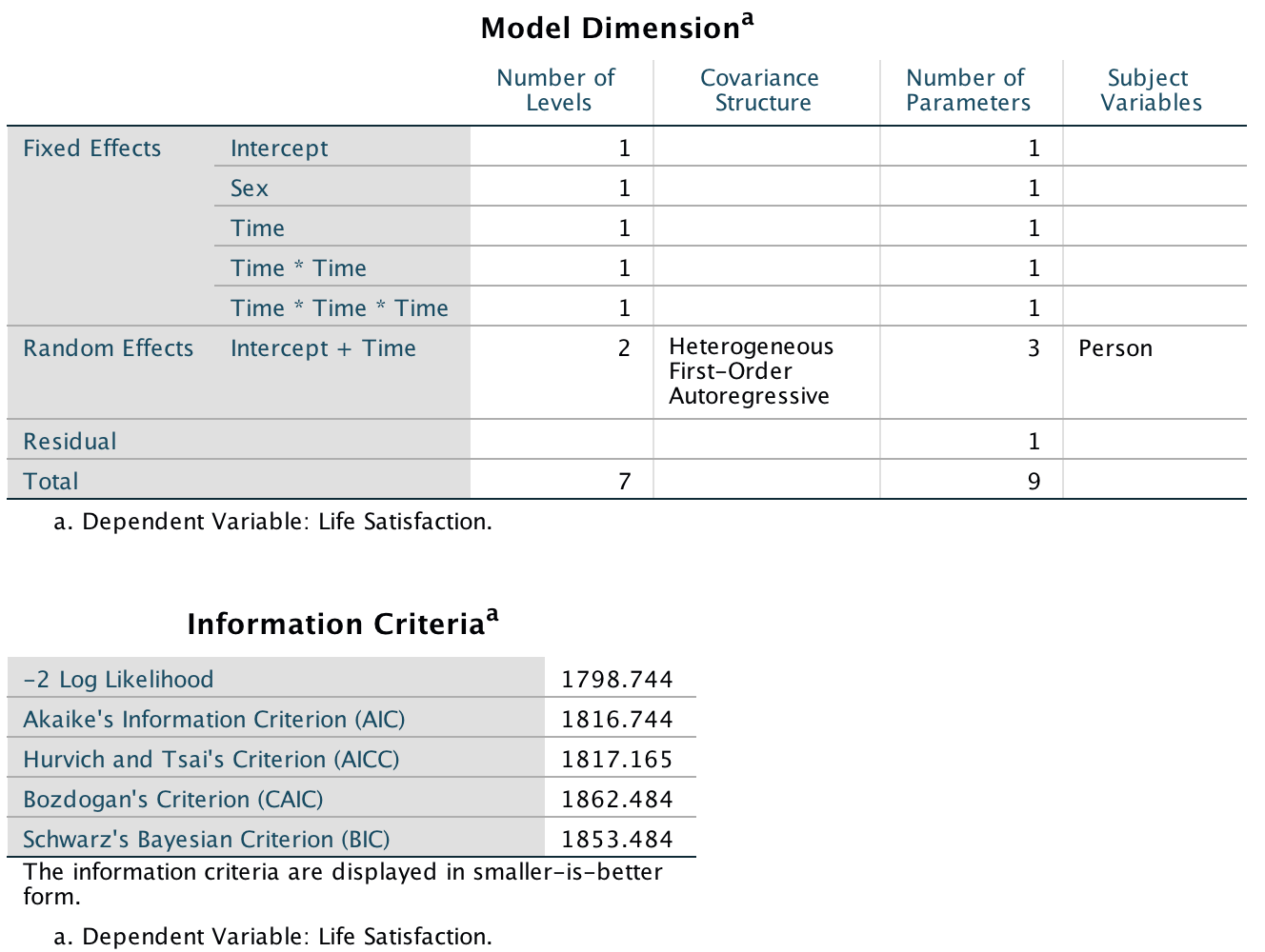
Output
The table of fixed effects and the parameter estimates tell us that the linear, F(1, 221.41) = 10.01, p = .002, and quadratic, F(1, 212.51) = 9.41, p = .002, trends both significantly described the pattern of the data over time; however, the cubic trend, F(1, 214.39) = 3.19, p = .076, does not. These results are basically the same as in the chapter. Sex itself is also not significant in this table, F(1, 113.02) = 0.11, p = .736.
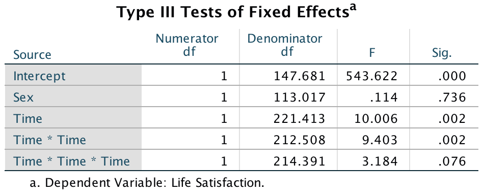
Output
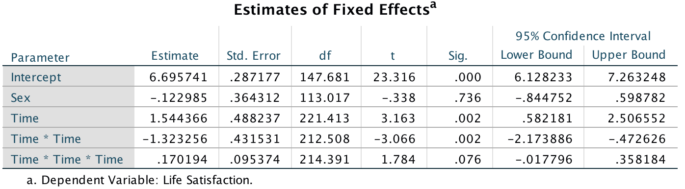
Output
The output also tells us about the random parameters in the model. First, the variance of the random intercepts was Var(\(u_{0j}\)) = 3.90. This suggests that we were correct to assume that life satisfaction at baseline varied significantly across people. Also, the variance of the people’s slopes varied significantly Var(\(u_{1j}\)) = 0.24. This suggests also that the change in life satisfaction over time varied significantly across people too. Finally, the covariance between the slopes and intercepts (−0.39) suggests that as intercepts increased, the slope decreased.
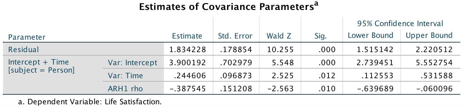
Output
These results confirm what we already know from the chapter. The trend in the data is best described by a second-order polynomial, or a quadratic trend. This reflects the initial increase in life satisfaction 6 months after finding a new partner but a subsequent reduction in life satisfaction at 12 and 18 months after the start of the relationship. The parameter estimates tell us much the same thing. As such, our conclusions have been unaffected by adjusting for biological sex.
Task 21.3
Hill, Abraham, and Wright (2007) examined whether providing children with a leaflet based on the ‘theory of planned behaviour’ increased their exercise. There were four different interventions (Intervention): a control group, a leaflet, a leaflet and quiz, and a leaflet and a plan. A total of 503 children from 22 different classrooms were sampled (Classroom). The 22 classrooms were randomly assigned to the four different conditions. Children were asked ‘On average over the last three weeks, I have exercised energetically for at least 30 minutes ______ times per week’ after the intervention (Post_Exercise). Run a multilevel model analysis on these data (Hill et al. (2007).sav) to see whether the intervention affected the children’s exercise levels (the hierarchy is children within classrooms within interventions).
To fit the model use the Analyze > Mixed Models > Linear … menu to access the first dialog box, which should be completed as follows:
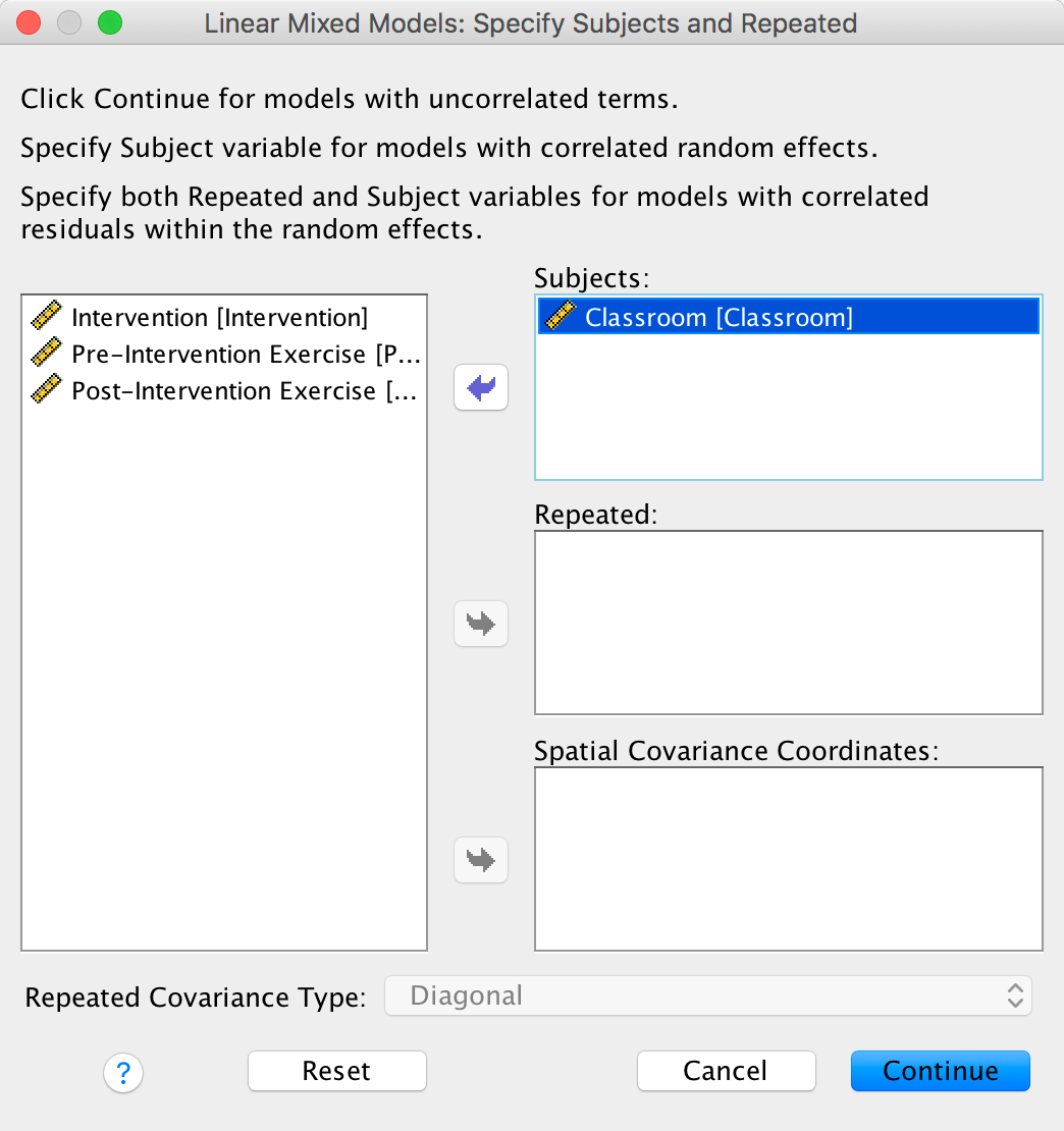
Completed dialog box
Click to access
the main dialog box and complete it as follows:
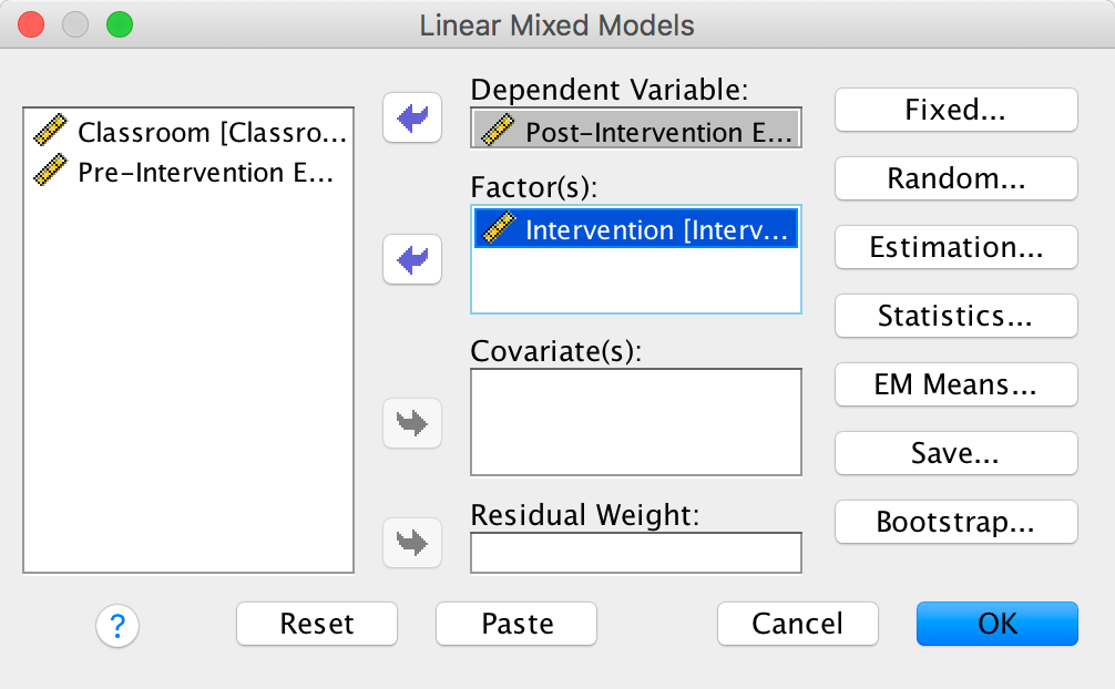
Completed dialog box
The Fixed Effects dialog box should look like this:
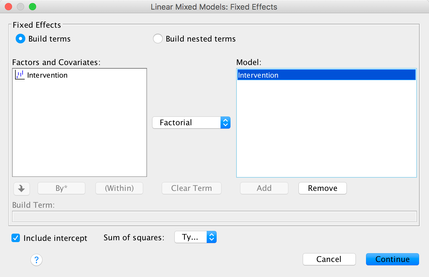
Completed dialog box
The Random Effects dialog box should look like this:
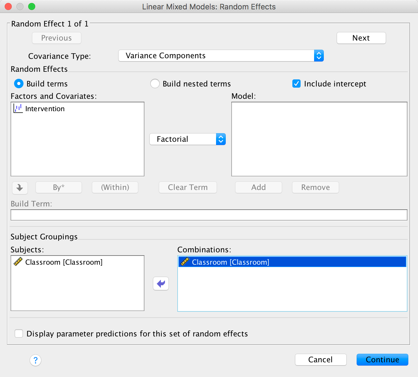
Completed dialog box
The Estimation dialog box should look like this:
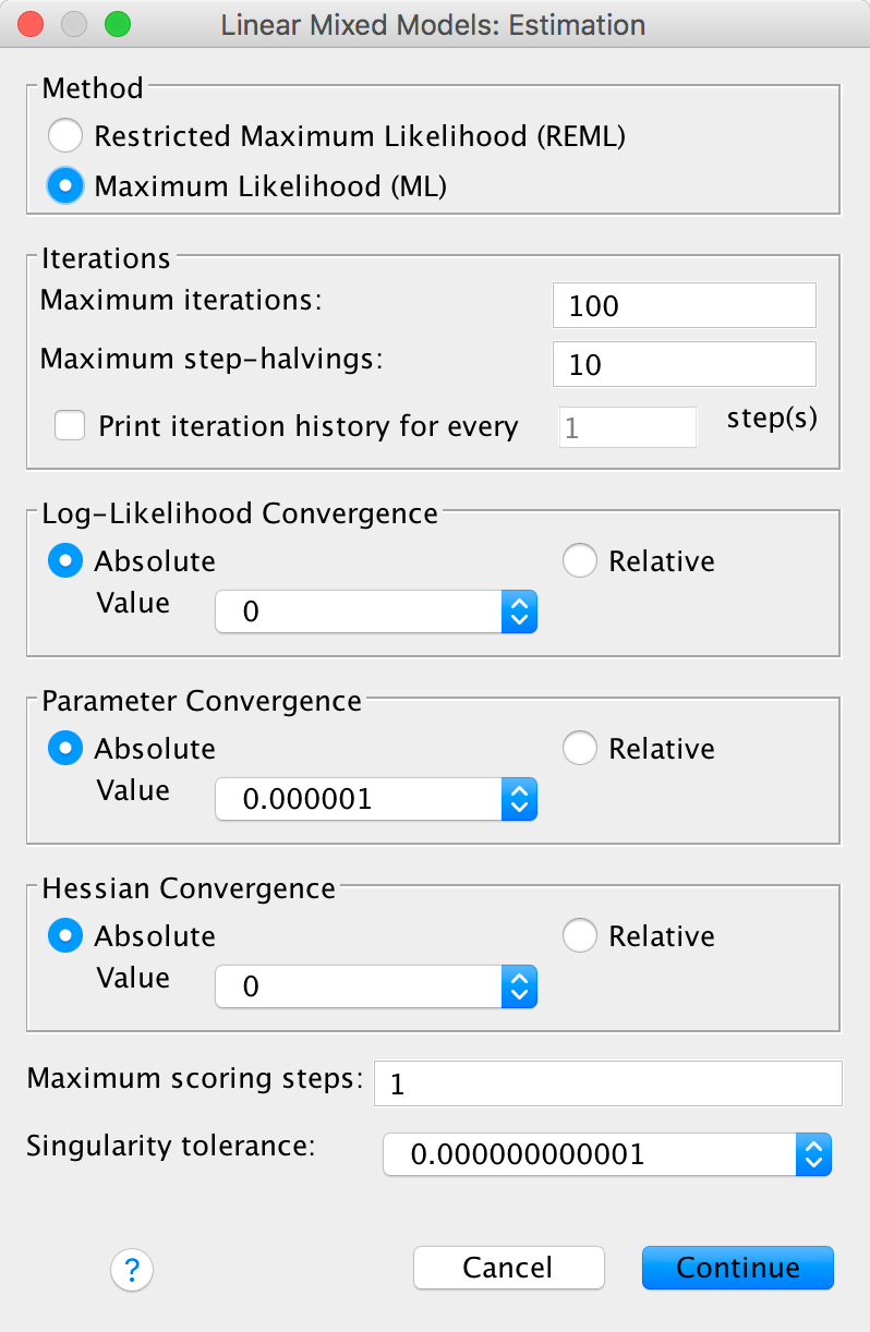
Completed dialog box
The Statistics dialog box should look like this:
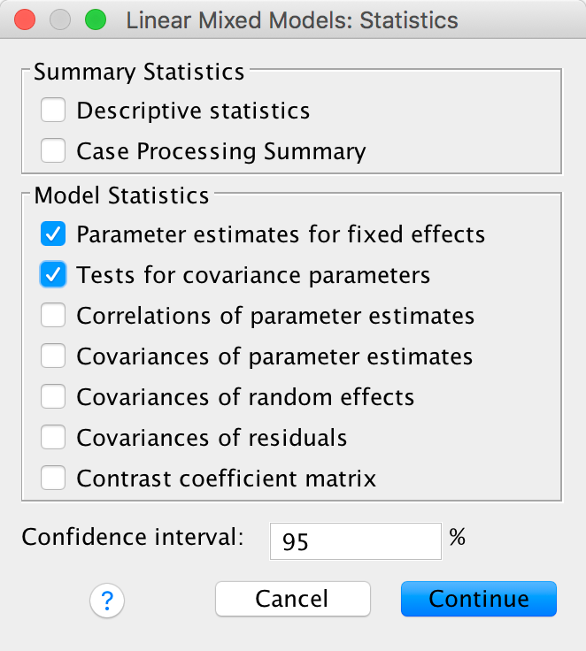
Completed dialog box
The first part of the output tells you details about the model that are being entered into the SPSS machinery. The Information Criteria table gives some of the popular methods for assessing the fit models. AIC and BIC are two of the most popular.
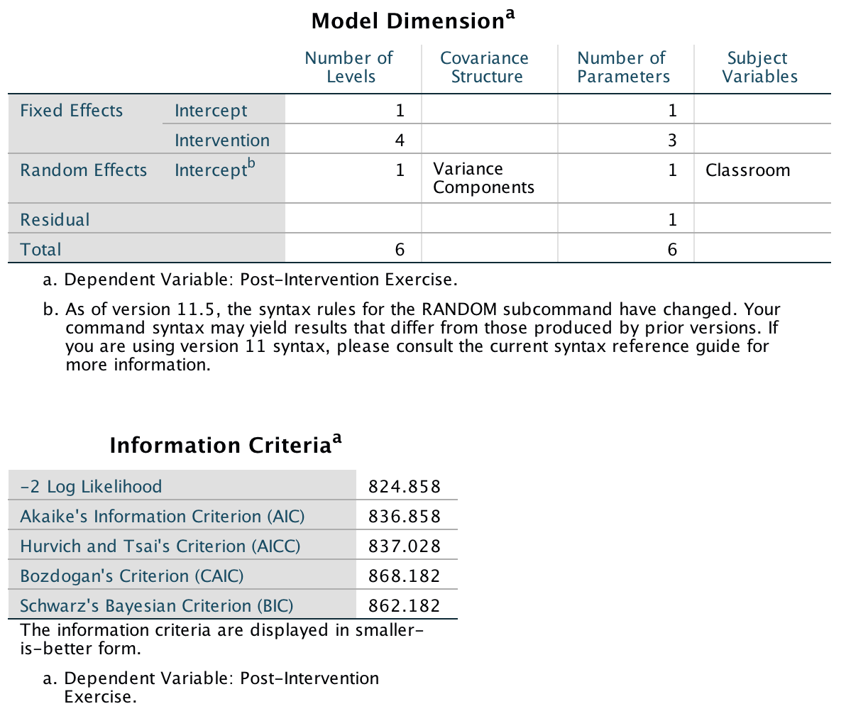
Output
The Fixed Effects box gives the information in which most of you will be most interested. It says the effect of intervention is non-significant, F(3, 22.10) = 2.08, p = .131. A few words of warning: calculating a p-value requires assuming that the null hypothesis is true. In most of the statistical procedures covered in this book you would construct a probability distribution based on this null hypothesis, and often it is fairly simple, like the z- or t-distributions. For multilevel models the probability distribution of the null is often not known. Most packages that estimate p-values for multilevel models estimate this probability in complex way. This is why the denominator degrees of freedom are not whole numbers. For more complex models there is concern about the accuracy of some of these approximations. Many methodologists urge caution in rejecting hypotheses even when the observed p-value is less than .05.
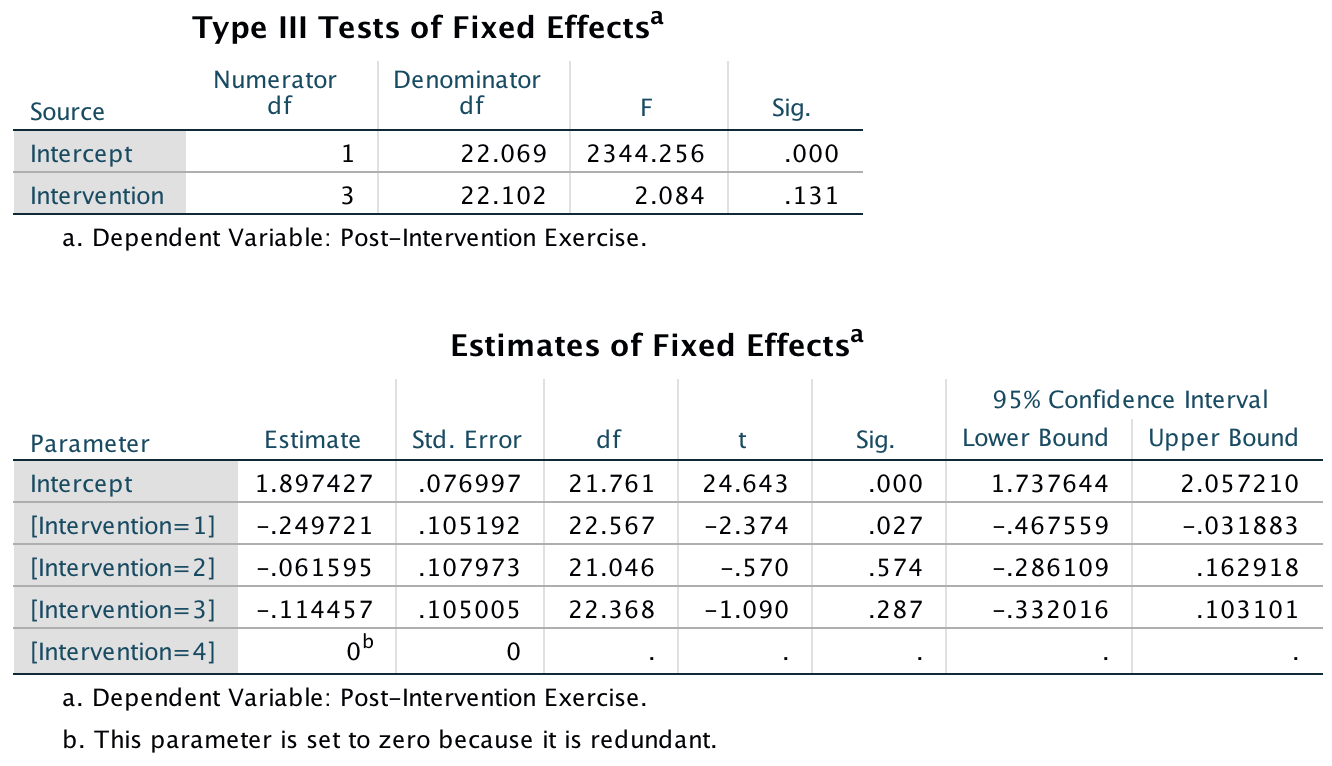
Output
The random effects show how much of the variability in responses is associated with which class a person is in: 0.017178/(0.017178 + 0.290745) = 5.58%. This is fairly small. The corresponding Wald z just fails to reach the traditional level for statistical significance, p = .057. The result from these data could be that the intervention failed to affect exercise. However, there is a lot of individual variability in the amount of exercise people get. A better approach would be to take into account the amount of self-reported exercise prior to the study as a covariate, which leads us to the next task.
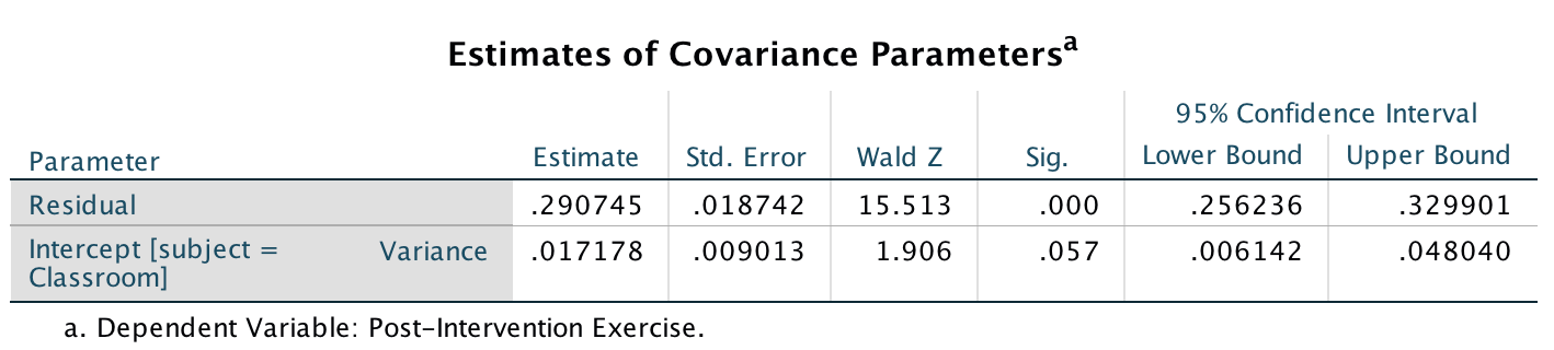
Output
Task 21.4
Repeat the analysis in Task 3 but include the pre-intervention exercise scores (Pre_Exercise) as a covariate. What difference does this make to the results?
To fit the model follow the instructions for the previous task excpe the main dialog box should be completed as follows:
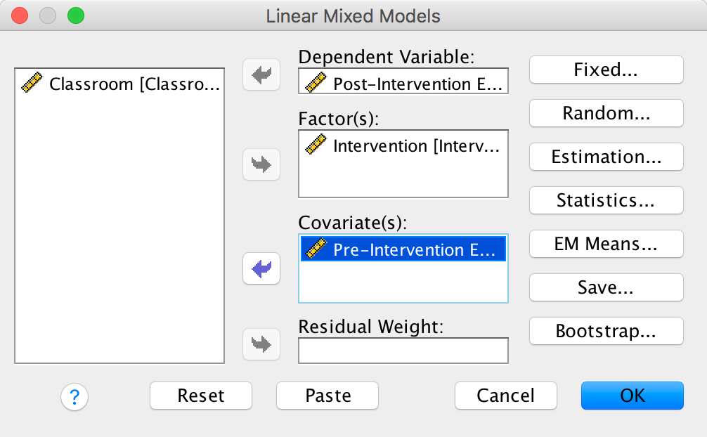
Completed dialog box
and the Fixed Effects dialog box should look like this:
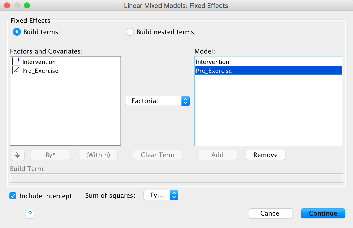
Completed dialog box
Otherwise complete the dialog boxes in the same way as the previous example. The first part of the output tells you details about the model that is being entered into the SPSS machinery. The Information Criteria box gives some of the popular methods for assessing the fit models. AIC and BIC are two of the most popular.
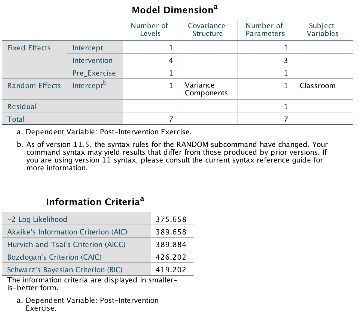
Output
The Fixed Effects box gives the information in which most of you will be most interested. It says the effect of pre-intervention exercise level is a significant predictor of post-intervention exercise level, F(1, 478.54) = 719.775, p < .001, and, most interestingly, the effect of intervention is now significant, F(1, 22.83) = 8.02, p = .001. These results show that when we adjust for the amount of self-reported exercise prior to the study, the intervention group becomes a significant predictor of post-intervention exercise levels.
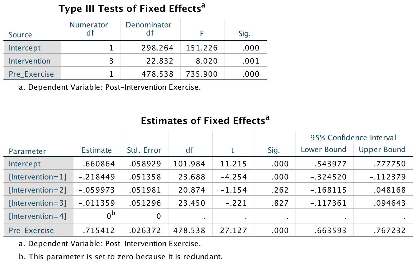
Output
The random effects show how much of the variability in responses is associated with which class a person is in: 0.001739/(0.001739 + 0.122045) = 1.40%. This is pretty small. The corresponding Wald z is not significant, p = .410.
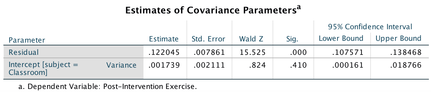
Output
Copyright © 2000-2019, Professor Andy Field.