Labcoat Leni

These pages provide run throughs of the Labcoat Leni boxes in Discovering Statistics Using IBM SPSS Statistics (5th edition).
Chapter 1
Is Friday 13th unlucky?
Let’s begin with accidents and poisoning on Friday the 6th. First, arrange the scores in ascending order: 1, 1, 4, 6, 9, 9.
The median will be the (n + 1)/2th score. There are 6 scores, so this will be the 7/2 = 3.5th. The 3.5th score in our ordered list is half way between the 3rd and 4th scores which is (4+6)/2= 5 accidents.
The mean is 5 accidents:
\[ \begin{align} \bar{X} &= \frac{\sum_{i = 1}^{n}x_i}{n} \\ &= \frac{1 + 1 + 4 + 6 + 9 + 9}{6} \\ &= \frac{30}{6} \\ &= 5 \end{align} \]
The lower quartile is the median of the lower half of scores. If we split the data in half, there will be 3 scores in the bottom half (lowest scores) and 3 in the top half (highest scores). The median of the bottom half will be the (3+1)/2 = 2nd score below the mean. Therefore, the lower quartile is 1 accident.
The upper quartile is the median of the upper half of scores. If we again split the data in half and take the highest 3 scores, the median will be the (3+1)/2 = 2nd score above the mean. Therefore, the upper quartile is 9 accidents.
The interquartile range is the difference between the upper and lower quartiles: 9 − 1 = 8 accidents.
To calculate the sum of squares, first take the mean from each score, then square this difference, and finally, add up these squared values:
| Score | Error (Score − Mean) |
Error Squared |
|---|---|---|
| 1 | –4 | 16 |
| 1 | –4 | 16 |
| 4 | –1 | 1 |
| 6 | 1 | 1 |
| 9 | 4 | 16 |
| 9 | 4 | 16 |
So, the sum of squared errors is: 16 + 16 + 1 + 1 + 16 + 16 = 66.
The variance is the sum of squared errors divided by the degrees of freedom (N − 1):
\[ s^{2} = \frac{\text{sum of squares}}{N- 1} = \frac{66}{5} = 13.20 \]
The standard deviation is the square root of the variance:
\[ s = \sqrt{\text{variance}} = \sqrt{13.20} = 3.63 \]
Next let’s look at accidents and poisoning on Friday the 13th. First, arrange the scores in ascending order: 5, 5, 6, 6, 7, 7.
The median will be the (n + 1)/2th score. There are 6 scores, so this will be the 7/2 = 3.5th. The 3.5th score in our ordered list is half way between the 3rd and 4th scores which is (6+6)/2 = 6 accidents.
The mean is 6 accidents:
\[ \begin{align} \bar{X} &= \frac{\sum_{i = 1}^{n}x_{i}}{n} \\ &= \frac{5 + 5 + 6 + 6 + 7 + 7}{6} \\ &= \frac{36}{6} \\ &= 6 \\ \end{align} \]
The lower quartile is the median of the lower half of scores. If we split the data in half, there will be 3 scores in the bottom half (lowest scores) and 3 in the top half (highest scores). The median of the bottom half will be the (3+1)/2 = 2nd score below the mean. Therefore, the lower quartile is 5 accidents.
The upper quartile is the median of the upper half of scores. If we again split the data in half and take the highest 3 scores, the median will be the (3+1)/2 = 2nd score above the mean. Therefore, the upper quartile is 7 accidents.
The interquartile range is the difference between the upper and lower quartiles: 7 − 5 = 2 accidents.
To calculate the sum of squares, first take the mean from each score, then square this difference, finally, add up these squared values:
| Score | Error (Score − Mean) |
Error Squared |
|---|---|---|
| 7 | 1 | 1 |
| 6 | 0 | 0 |
| 5 | –1 | 1 |
| 5 | –1 | 1 |
| 7 | 1 | 1 |
| 6 | 0 | 0 |
So, the sum of squared errors is: 1 + 0 + 1 + 1 + 1 + 0 = 4.
The variance is the sum of squared errors divided by the degrees of freedom (N − 1):
\[ s^{2} = \frac{\text{sum of squares}}{N - 1} = \frac{4}{5} = 0.8 \]
The standard deviation is the square root of the variance:
\[ s = \sqrt{\text{variance}} = \sqrt{0.8} = 0.894 \]
Next, let’s look at traffic accidents on Friday the 6th. First, arrange the scores in ascending order: 3, 5, 6, 9, 11, 11.
The median will be the (n + 1)/2th score. There are 6 scores, so this will be the 7/2 = 3.5th. The 3.5th score in our ordered list is half way between the 3rd and 4th scores. The 3rd score is 6 and the 4th score is 9. Therefore the 3.5th score is (6+9)/2 = 7.5 accidents.
The mean is 7.5 accidents:
\[ \begin{align} \bar{X} &= \frac{\sum_{i = 1}^{n}x_{i}}{n} \\ &= \frac{3 + 5 + 6 + 9 + 11 + 11}{6} \\ &= \frac{45}{6} \\ &= 7.5 \end{align} \]
The lower quartile is the median of the lower half of scores. If we split the data in half, there will be 3 scores in the bottom half (lowest scores) and 3 in the top half (highest scores). The median of the bottom half will be the (3+1)/2 = 2nd score below the mean. Therefore, the lower quartile is 5 accidents.
The upper quartile is the median of the upper half of scores. If we again split the data in half and take the highest 3 scores, the median will be the (3+1)/2 = 2nd score above the mean. Therefore, the upper quartile is 11 accidents.
The interquartile range is the difference between the upper and lower quartiles: 11 − 5 = 6 accidents.
To calculate the sum of squares, first take the mean from each score, then square this difference, finally, add up these squared values:
| Score | Error (Score − Mean) |
Error Squared |
|---|---|---|
| 9 | 1.5 | 2.25 |
| 6 | –1.5 | 2.25 |
| 11 | 3.5 | 12.25 |
| 11 | 3.5 | 12.25 |
| 3 | –4.5 | 20.25 |
| 5 | –2.5 | 6.25 |
So, the sum of squared errors is: 2.25 + 2.25 + 12.25 + 12.25 + 20.25 + 6.25 = 55.5.
The variance is the sum of squared errors divided by the degrees of freedom (N − 1):
\[ s^{2} = \frac{\text{sum of squares}}{N - 1} = \frac{55.5}{5} = 11.10 \]
The standard deviation is the square root of the variance:
\[ s = \sqrt{\text{variance}} = \sqrt{11.10} = 3.33 \]
Finally, let’s look at traffic accidents on Friday the 13th. First, arrange the scores in ascending order: 4, 10, 12, 12, 13, 14.
The median will be the (n + 1)/2th score. There are 6 scores, so this will be the 7/2 = 3.5th. The 3.5th score in our ordered list is half way between the 3rd and 4th scores. The 3rd score is 12 and the 4th score is 12. Therefore the 3.5th score is (12+12)/2= 12 accidents.
The mean is 10.83 accidents:
\[ \begin{align} \bar{X} &= \frac{\sum_{i = 1}^{n}x_{i}}{n} \\ &= \frac{4 + 10 + 12 + 12 + 13 + 14}{6} \\ &= \frac{65}{6} \\ &= 10.83 \end{align} \]
The lower quartile is the median of the lower half of scores. If we split the data in half, there will be 3 scores in the bottom half (lowest scores) and 3 in the top half (highest scores). The median of the bottom half will be the (3+1)/2 = 2nd score below the mean. Therefore, the lower quartile is 10 accidents.
The upper quartile is the median of the upper half of scores. If we again split the data in half and take the highest 3 scores, the median will be the (3+1)/2 = 2nd score above the mean. Therefore, the upper quartile is 13 accidents.
The interquartile range is the difference between the upper and lower quartile: 13 − 10 = 3 accidents.
To calculate the sum of squares, first take the mean from each score, then square this difference, finally, add up these squared values:
| Score | Error (Score − Mean) |
Error Squared |
|---|---|---|
| 4 | –6.83 | 46.65 |
| 10 | –0.83 | 0.69 |
| 12 | 1.17 | 1.37 |
| 12 | 1.17 | 1.37 |
| 13 | 2.17 | 4.71 |
| 14 | 3.17 | 10.05 |
So, the sum of squared errors is: 46.65 + 0.69 + 1.37 + 1.37 + 4.71 + 10.05 = 64.84.
The variance is the sum of squared errors divided by the degrees of freedom (N − 1):
\[ s^{2} = \frac{\text{sum of squares}}{N- 1} = \frac{64.84}{5} = 12.97 \]
The standard deviation is the square root of the variance:
\[ s = \sqrt{\text{variance}} = \sqrt{12.97} = 3.6 \]
Chapter 2
No Labcoat Leni in this chapter.
Chapter 3
Researcher degrees of freedom: a sting in the tale
No solution required.
Chapter 4
Gonna be a rock ‘n’ roll singer
Using a task from experimental economics called the ultimatum game, individuals are assigned the role of either proposer or responder and paired randomly. Proposers were allocated $10 from which they had to make a financial offer to the responder (i.e., $2). The responder can accept or reject this offer. If the offer is rejected neither party gets any money, but if the offer is accepted the responder keeps the offered amount (e.g., $2), and the proposer keeps the original amount minus what they offered (e.g., $8). For half of the participants the song ‘It’s a long way to the top’ sung by Bon Scott was playing in the background; for the remainder ‘Shoot to thrill’ sung by Brian Johnson was playing. Oxoby measured the offers made by proposers, and the minimum accepted by responders (called the minimum acceptable offer). He reasoned that people would accept lower offers and propose higher offers when listening to something they like (because of the ‘feel-good factor’ the music creates). Therefore, by comparing the value of offers made and the minimum acceptable offers in the two groups he could see whether people have more of a feel-good factor when listening to Bon or Brian. These data are estimated from Figures 1 and 2 in the paper because I couldn’t get hold of the author to get the original data files. The offers made (in dollars) are as follows (there were 18 people per group):
Bon Scott group: 1, 2, 2, 2, 2, 3, 3, 3, 3, 3, 4, 4, 4, 4, 4, 5, 5, 5
Brian Johnson group: 2, 3, 3, 3, 3, 3, 4, 4, 4, 4, 4, 5, 5, 5, 5, 5, 5, 5
Enter these data into the IBM SPSS Statistics data editor, remembering to include value labels, to set the measure property, to give each variable a proper label, and to set the appropriate number of decimal places. This file can be found in oxoby_2008_offers.sav and should look like this:
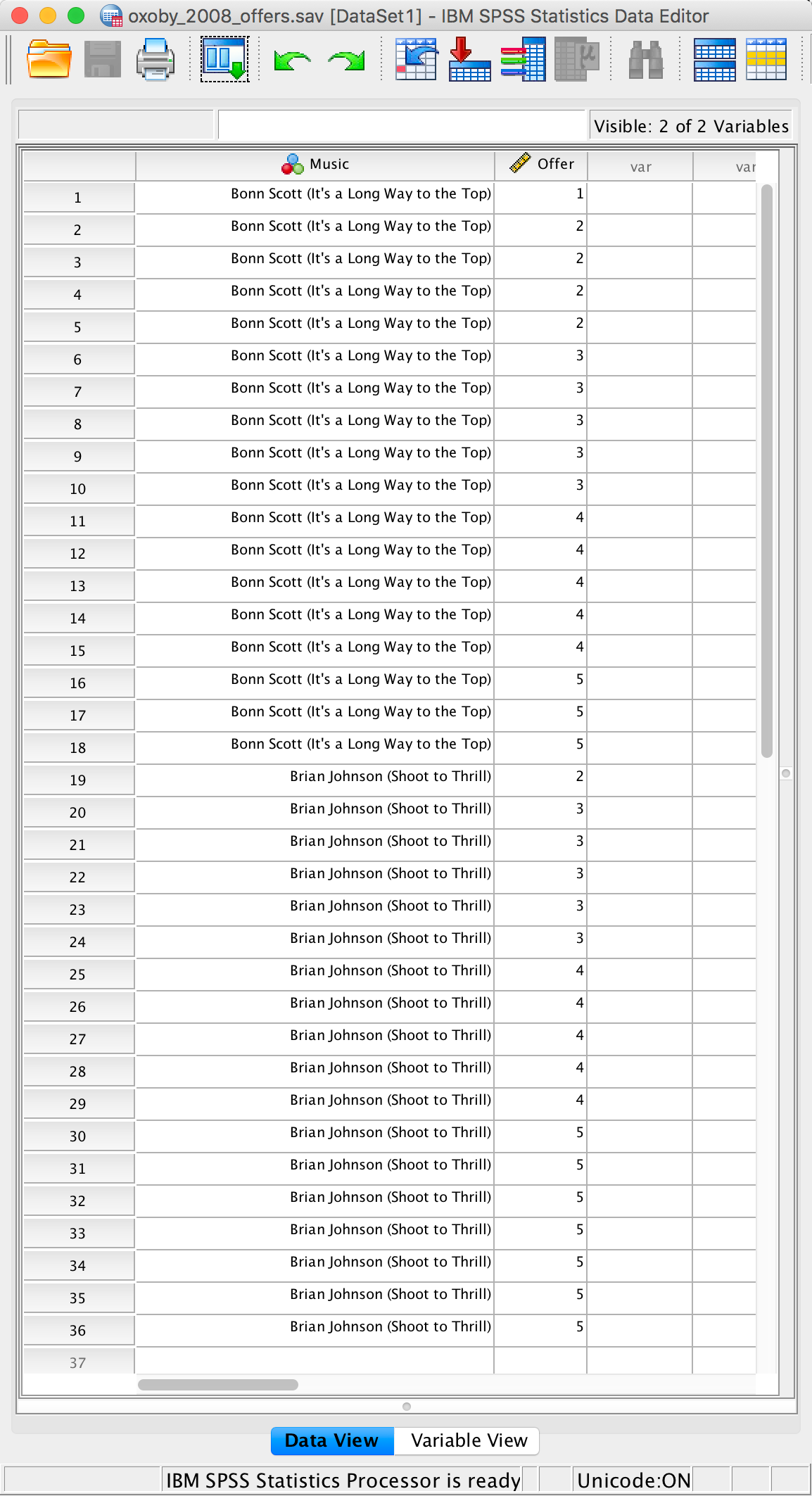
Completed data editor
Or with the value labels off, like this:
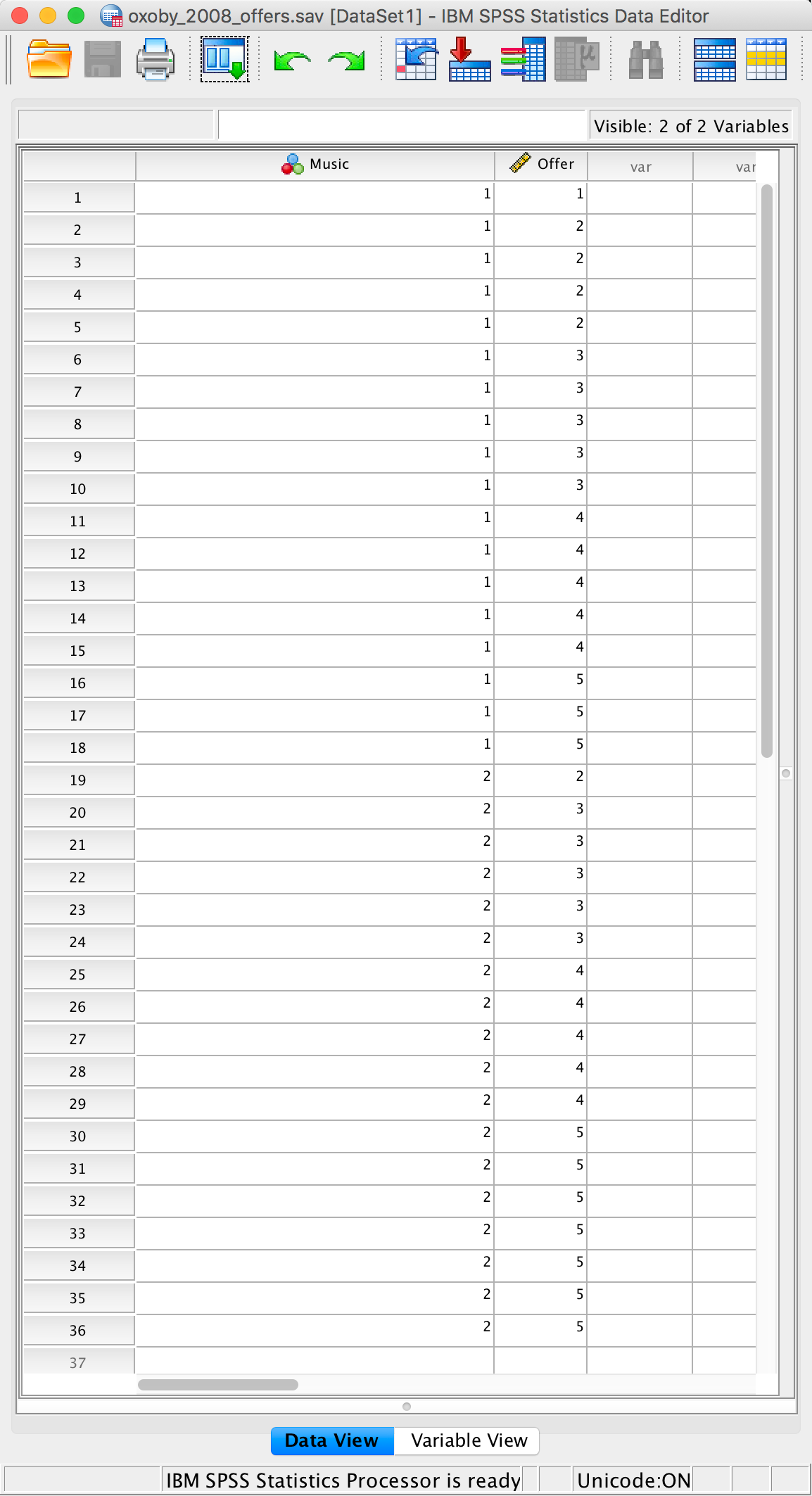
Completed data editor
Chapter 5
Gonna be a rock ‘n’ roll singer (again!)
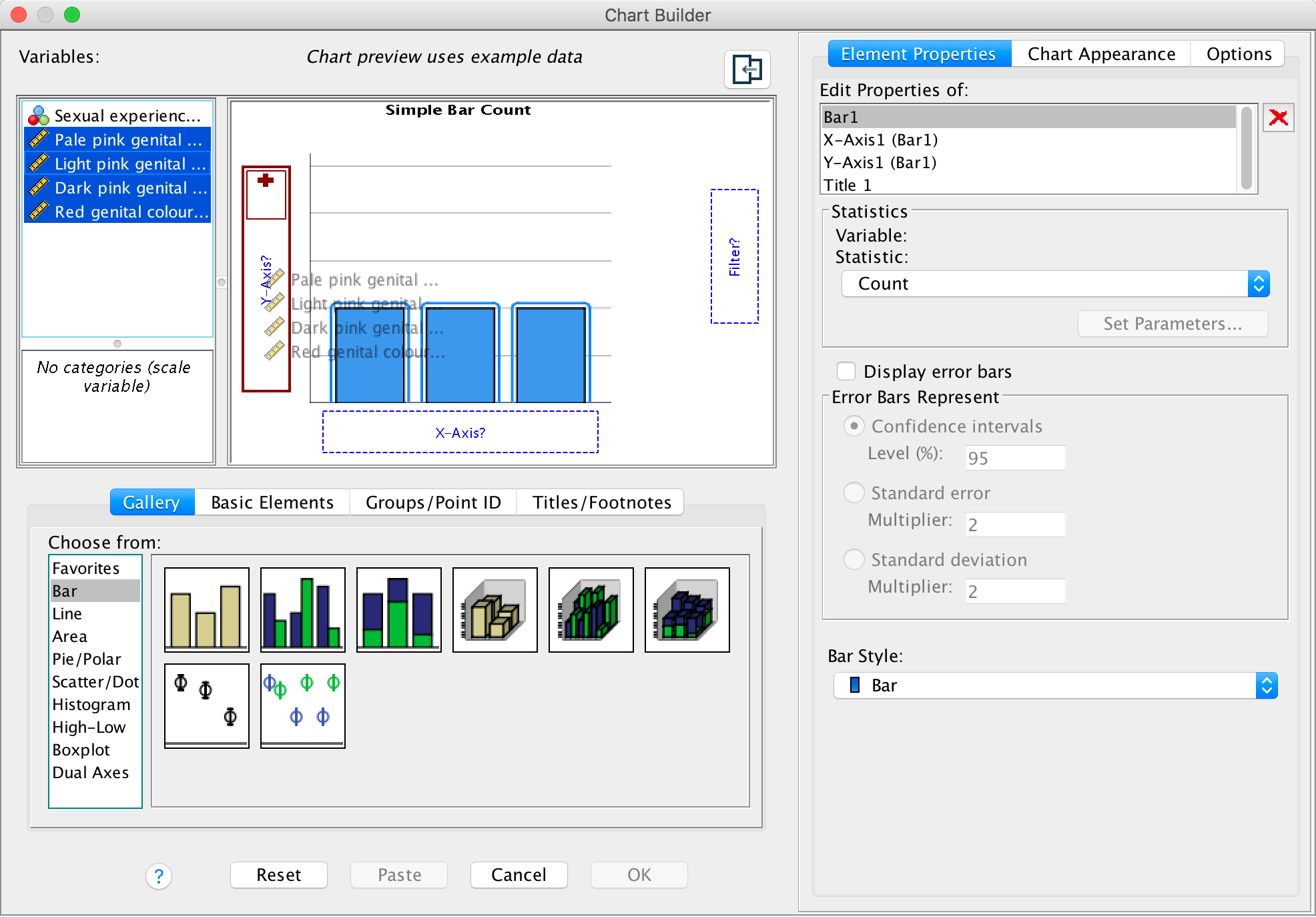
First, let’s produce a population pyramid for the minimum acceptable
offer data. To do this, open the file oxoby_2008_mao.sav,
access Graphs > Chart Builder … and then select
Histogram in the list labelled Choose from to bring up
the gallery. This gallery has four icons representing different types of
histogram, and you should select the appropriate one either by
double-clicking on it, or by dragging it onto the canvas in the Chart
Builder. Click on the population pyramid icon (see the book chapter) to
display the template for this graph on the canvas. Then from the
variable list select the variable representing the minimum acceptable
offer and drag it to  to
set it as the variable that you want to plot. Then drag the variable
representing background music to
to
set it as the variable that you want to plot. Then drag the variable
representing background music to  to set it
as the variable for which you want to plot different distributions.
Click on
to set it
as the variable for which you want to plot different distributions.
Click on  to
produce the graph. The resulting population pyramid is show below.
to
produce the graph. The resulting population pyramid is show below.
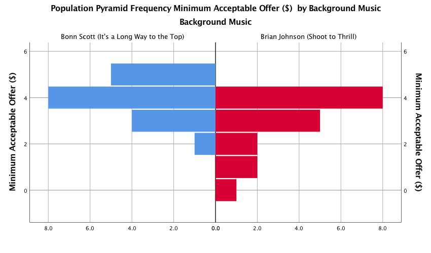
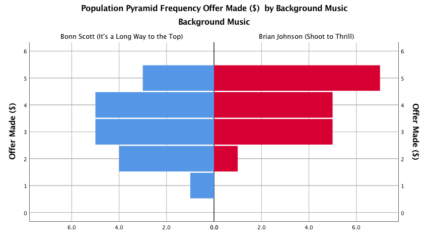
Population pyramid of minimum acceptable offers
We can compare the resulting population pyramid above with Figure 2 from the original article (below). Both graphs show that MAOs were higher when participants heard the music of Bon Scott. This suggests that more offers would be rejected when listening to Bon Scott than when listening to Brian Johnson.
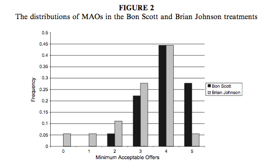
Oxoby (2008) Figure 2
Next we want to produce a population pyramid for number of offers
made. To do this, open the file Oxoby (2008)
Offers.sav, access Graphs > Chart Builder … and
then select Histogram in the list labelled Choose from
to bring up the gallery. This gallery has four icons representing
different types of histogram, and you should select the appropriate one
either by double-clicking on it, or by dragging it onto the canvas in
the Chart Builder. Click on the population pyramid icon (see
the book chapter) to display the template for this graph on the canvas.
Then drag the variable representing offers made to to
set it as the variable that you want to plot. Next, drag the variable
representing background music to to set it
as the variable for which you want to plot different distributions.
Click on to
produce the graph. The resulting population pyramid is show below.
Population pyramid of offers made
We can compare the resulting population pyramid above with Figure 1 from the original article (below). Both graphs show that offers made were lower when participants heard the music of Bon Scott.
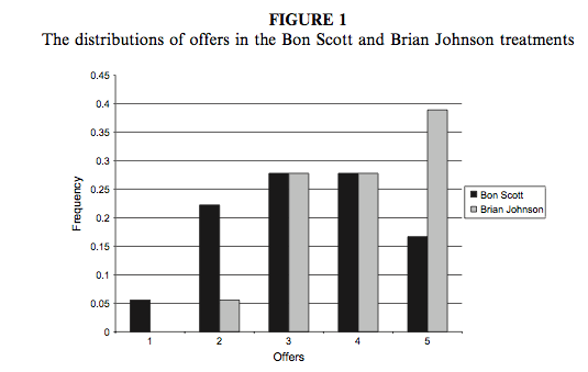
Oxoby (2008) Figure 1
Seeing red
Select Graphs > Chart Builder … and then a simple bar
chart. The y-axis needs to be the dependent variable, or the
thing you’ve measured, or more simply the thing for which you want to
display the mean. In this case it would be the four different colours
(pale pink, light pink, dark pink and red). So select all of these
colours from the variable list and drag them into the y-axis
drop zone ( ):
):
Completed dialog box
A dialog box should pop up (see below) informing you that the values from your variables will be used to summarize your data:
Completed dialog box
This is fine, so click .To add error bars
to your graph select Display error bars and make sure you have
select mean from the statistics dropdown list:
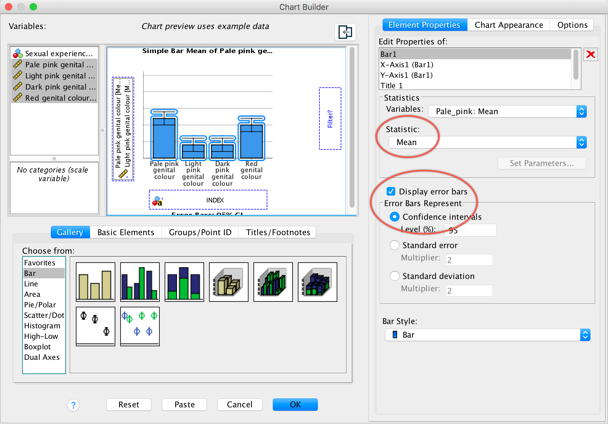
Completed dialog box
Click to
produce the graph:
The mean ratings for all colours are fairly similar, suggesting that men don’t prefer the colour red. In fact, the colour red has the lowest mean rating, suggesting that men liked the red genitalia the least. The light pink genital colour had the highest mean rating, but don’t read anything into that: the means are all very similar.
Chapter 6
No Labcoat Lenis in this chapter.
Chapter 7
Having a quail of a time?
To run a Wilcoxon test you need to follow the general procedure outlined in the book chapter. First, select Analyze > Nonparametric Tests > Related Samples …. In the Objective tab select Customize analysis. In the Fields tab you will see all of the variables in the data editor listed in the box labelled Fields. If you assigned roles for the variables in the data editor Use predefined roles will be selected and SPSS Statistics will have automatically assigned your variables. Otherwise Use custon field assignments will be selected and you’ll need to assign variables yourself. Drag both dependent variables (select Signaled Male then, holding down Ctrl (⌘ on a Mac), click Control Male) to the box labelled Test Fields. The completed dialog box is shown below.
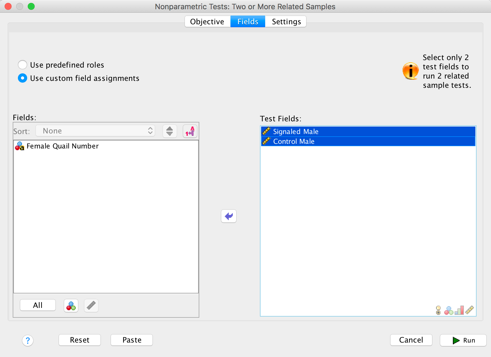
Completed dialog box
In the Settings tab select Choose Tests. To do a
Wilcoxon test select Customize tests and Wilcoxon
matched-pair signed rank (2 samples) and click  .
.
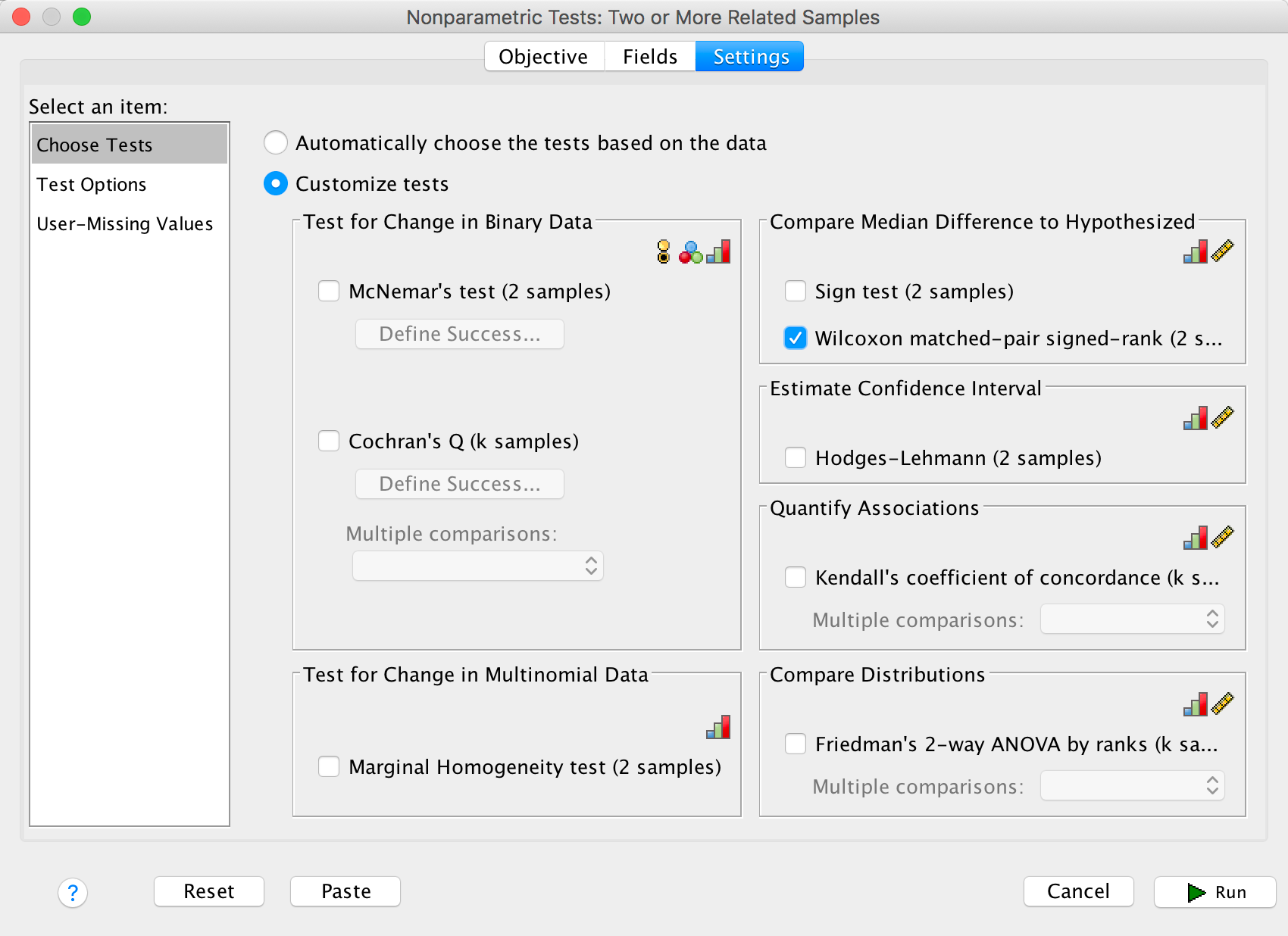
Completed dialog box
The summary table in the output tells you that the significance ofthe test was .022 and suggests that we reject the null hypothesis. Double click on this table to enter the model viewer. Notice that we have different coloured bars: the brown bars represent positive differences (these are females that produced fewer eggs fertilized by the male in his signalled chamber than the male in his control chamber) and the blue bars negative differences (these are females that produced more eggs fertilized by the male in his signalled chamber than the male in his control chamber). We can see that the bars are predominantly blue. The legend of the graph confirms that there were 3 positive differences, 10 negative differences and 1 tie. This means that for 10 of the 14 quails, the number of eggs fertilized by the male in his signalled chamber was greater than for the male in his control chamber, indicating an adaptive benefit to learning that a chamber signalled reproductive opportunity. The one tied rank tells us that there was one female who produced an equal number of fertilized eggs for both males.
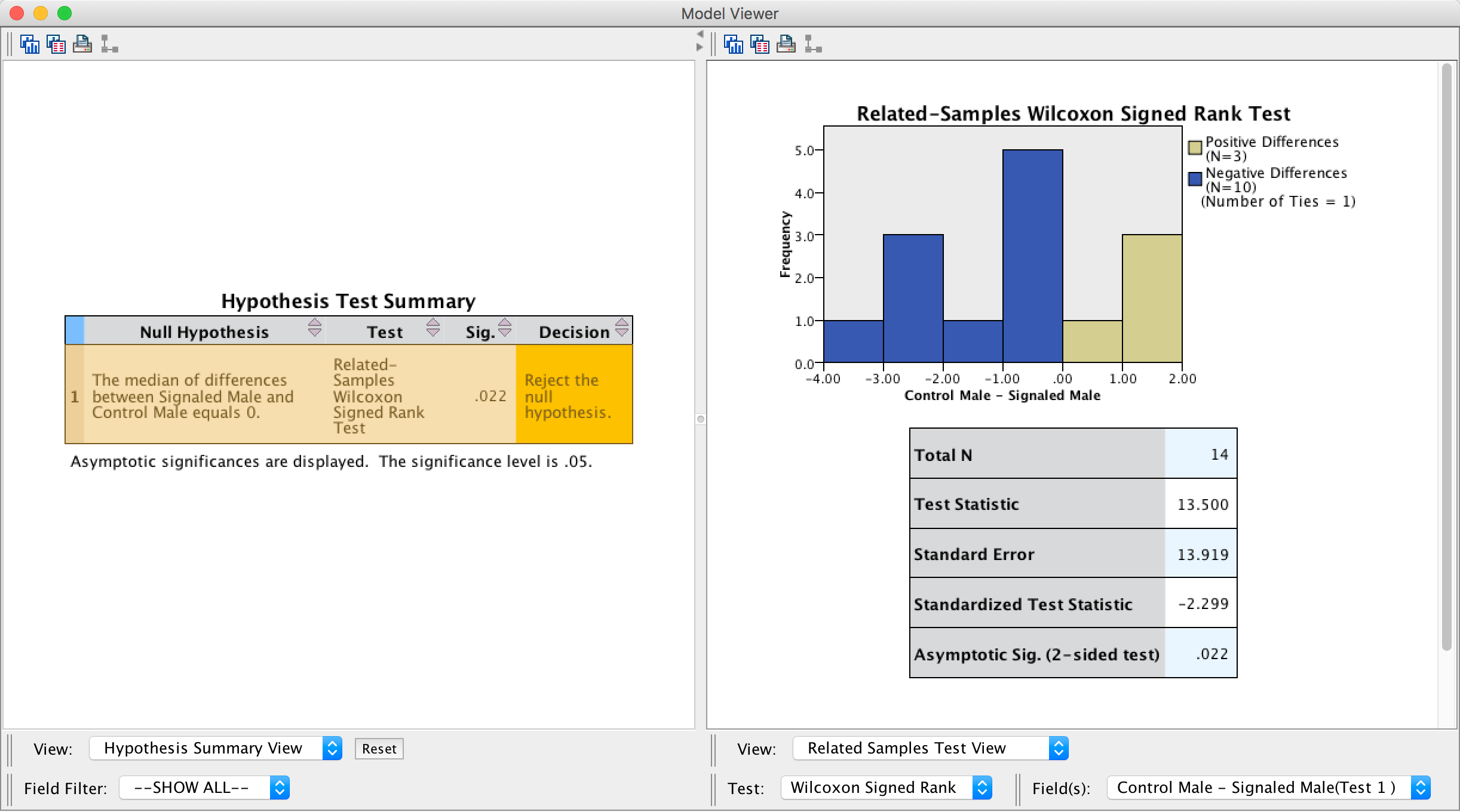
Output
There is a table below the histogram that tells us the test statistic (13.50), its standard error (13.92), and the corresponding z-score (−2.30). The p-value associated with the z-score is .022, which means that there’s a probability of .022 that we would get a value of z at least as large as the one we have if there were no effect in the population; because this value is less than the critical value of .05 we should conclude that there were a greater number of fertilized eggs from males mating in their signalled context, z = −2.30, p < .05. In other words, conditioning (as a learning mechanism) provides some adaptive benefit in that it makes it more likely that you will pass on your genes.
The authors concluded as follows (p. 760:
Of the 78 eggs laid by the test females, 39 eggs were fertilized. Genetic analysis indicated that 28 of these (72%) were fertilized by the signalled males, and 11 were fertilized by the control males. Ten of the 14 females in the experiment produced more eggs fertilized by the signalled male than by the control male (see Fig. 1; Wilcoxon signed-ranks test, T = 13.5, p < .05). These effects were independent of the order in which the 2 males copulated with the female. Of the 39 fertilized eggs, 20 were sired by the 1st male and 19 were sired by the 2nd male. The present findings show that when 2 males copulated with the same female in succession, the male that received a Pavlovian CS signalling copulatory opportunity fertilized more of the female’s eggs. Thus, Pavlovian conditioning increased reproductive fitness in the context of sperm competition.
Eggs-traordinary
To run a Kruskal–Wallis test, follow the general procedure outlined in the book chapter. First, select Analyze > Nonparametric Tests > Related Samples …. In the Objective tab select Customize analysis. In the Fields tab you will see all of the variables in the data editor listed in the box labelled Fields. If you assigned roles for the variables in the data editor Use predefined roles will be selected and SPSS Statistics will have automatically assigned your variables. Otherwise Use custon field assignments will be selected and you’ll need to assign variables yourself. Drag both dependent variables (select Percentage of Eggs Fertilised then, holding down Ctrl (⌘ on a Mac), click Time taken to initiate copulation) to the box labelled Test Fields. Next, drag the grouping variable, in this case Group, to the box labelled Groups. The completed dialog box is shown below.
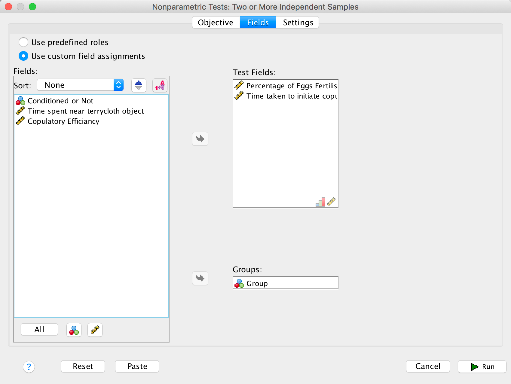
Completed dialog box
In the Settings tab select Choose Tests. To do a
Kruskal–Wallis test select Customize tests and
Kruskal-Wallis 1-way ANOVA (k samples). Below this option there
is a drop down list labelled Multiple comparisons, select
All pairwise and be on your way by clicking :
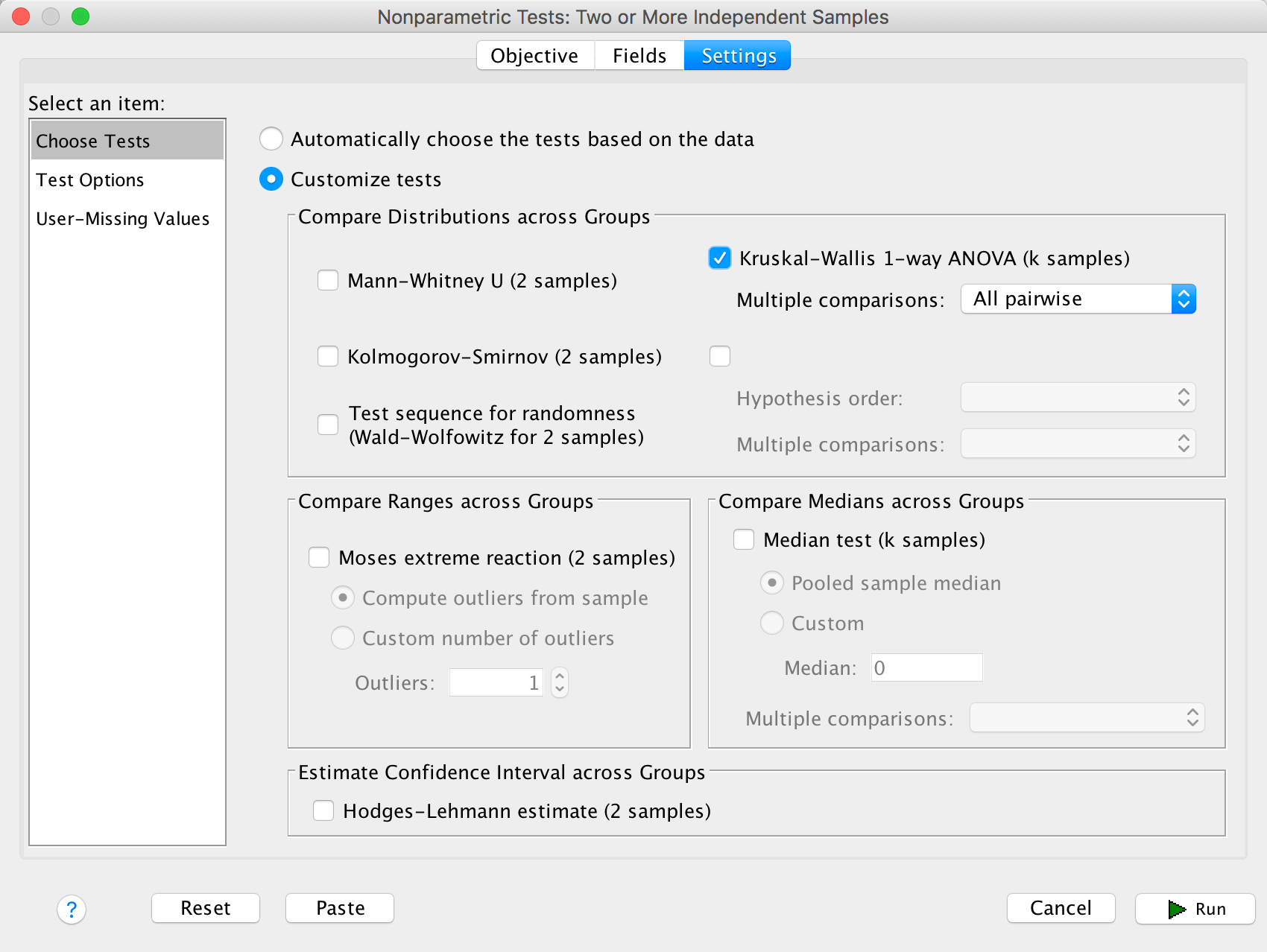
Completed dialog box
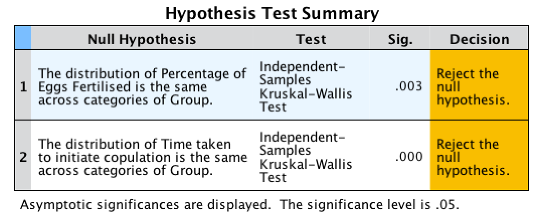
The summary table tells us for both outcome variables that there was a significant effect, and we are given a little message of advice to reject the null hypotheses. How helpful.
Output
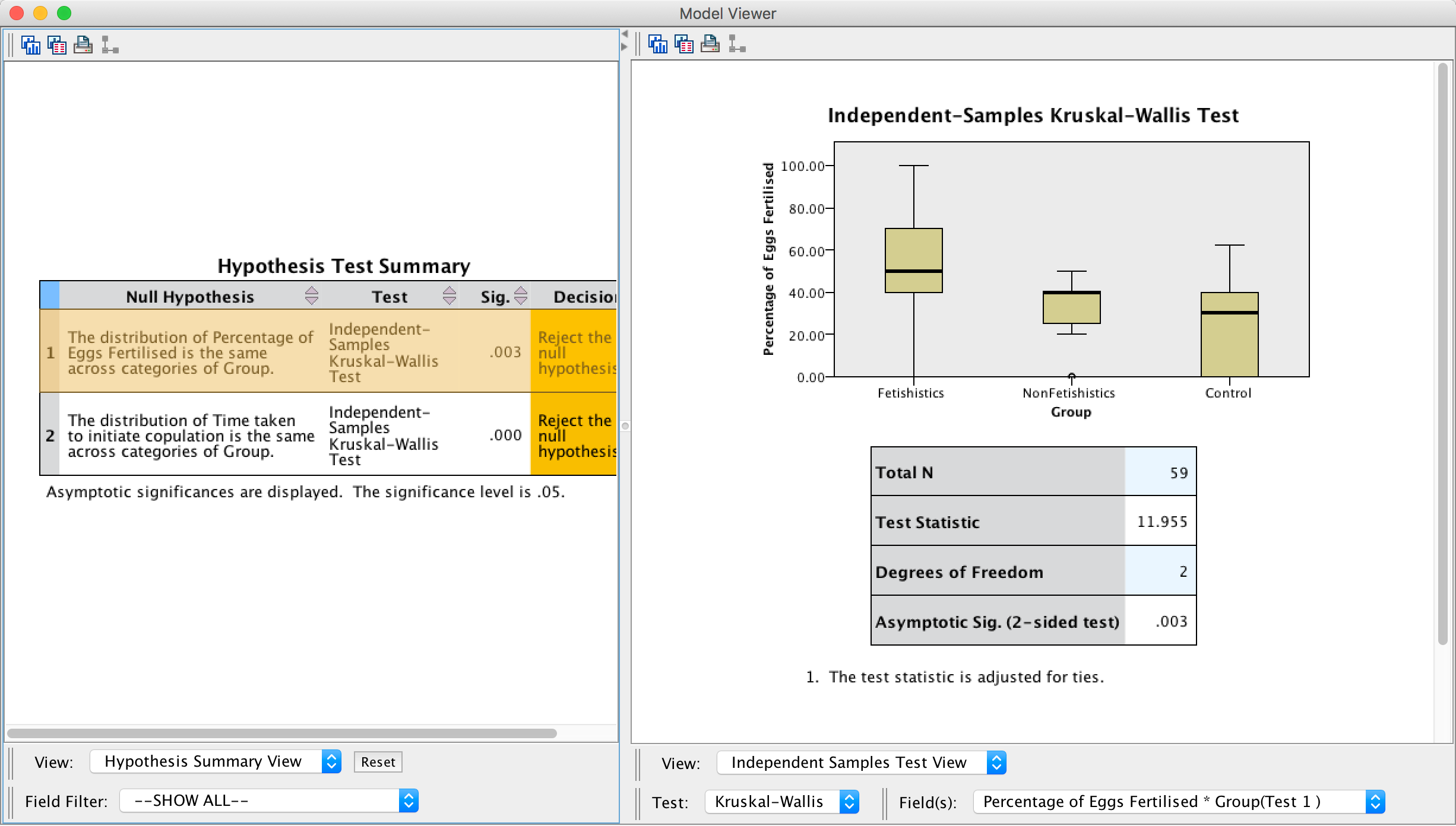
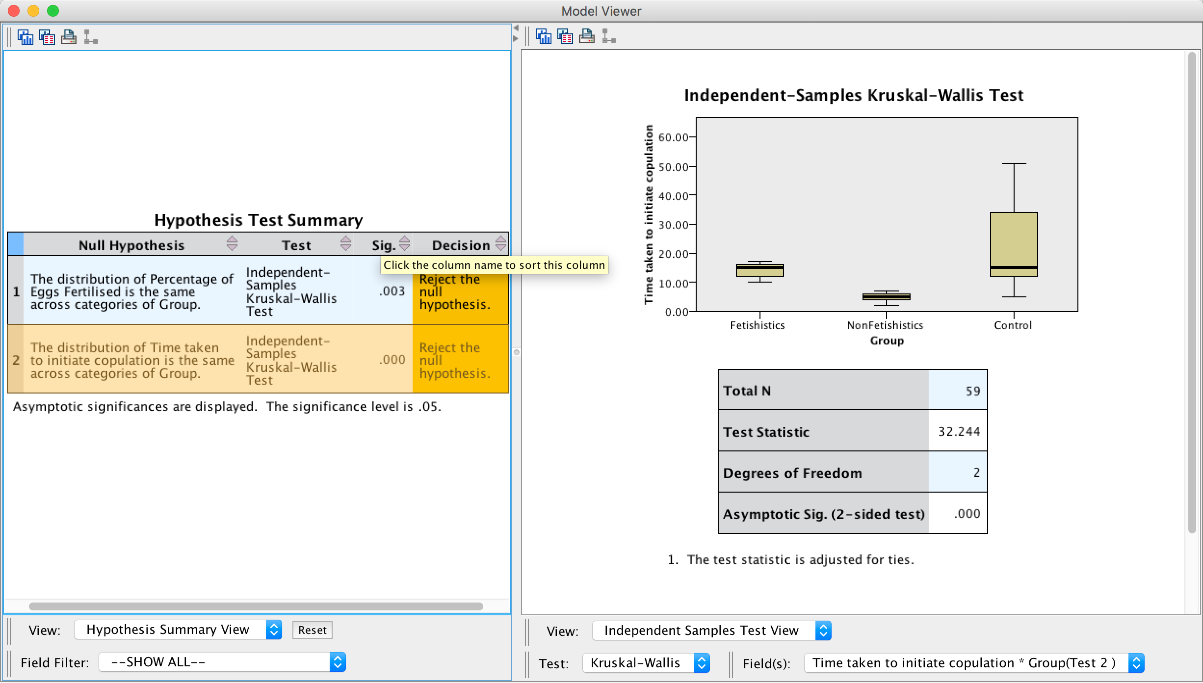
Double-click on the first row of the summary table to open up the model viewer window, which shows the results of whether the percentage of eggs fertilized was different across groups in more detail (see below). Here we can see the test statistic, H, for the Kruskal–Wallis (11.955), its associated degrees of freedom (2) and the significance. The significance value of.003 is less than .05, so we could conclude that the percentage of eggs fertilized was significantly different across the two groups.
Output
Next, double-click on the second row of the summary table to open up the model viewer window, which displays the results of the test of whether the time taken to initiate copulation was different across groups in more detail. In this window we can see the test statistic, H, for the Kruskal–Wallis (32.244) its associated degrees of freedom (2) and the significance, which is .000; because this value is less than .05 we could conclude that the time taken to initiate copulation differed significantly across the two groups.
Output
We know that there are differences between the groups but we don’t know where these differences lie. One way to see which groups differ is to look at boxplots. SPSS produces boxplots for us (see the outputs above). If we look at the boxplot in the first output (percentage of eggs fertilized), using the control as our baseline, the medians for the non-fetishistic male quail and the control group were similar, indicating that the non-fetishistic males yielded similar rates of fertilization to the control group. However, the median of the fetishistic males is higher than the other two groups, suggesting that the fetishistic male quail yielded higher rates of fertilization than both the non-fetishistic male quail and the control male quail.
If we now look at the boxplot for the time taken to initiate copulation, the medians suggest that non-fetishistic males had shorter copulatory latencies than both the fetishistic male quail and the control male. However, these conclusions are subjective. What we really need are some follow-up analyses.
The output of the follow-up tests won’t be immediately visible in the model viewer window. The right-hand side of the model viewer window shows the main output by default (labelled the Independent Samples Test View), but we can change what is visible in the right-hand panel by using the drop-down list at the bottom of the window labelled View. By clicking on this drop-down list you’ll see several options including Pairwise Comparisons (because we selected All pairwise when we ran the analysis). Selecting this option displays the output for the follow-up analysis in the right-hand panel of the model viewer, and to switch back to the main output you would use the same drop-down list but select Independent Samples Test View.
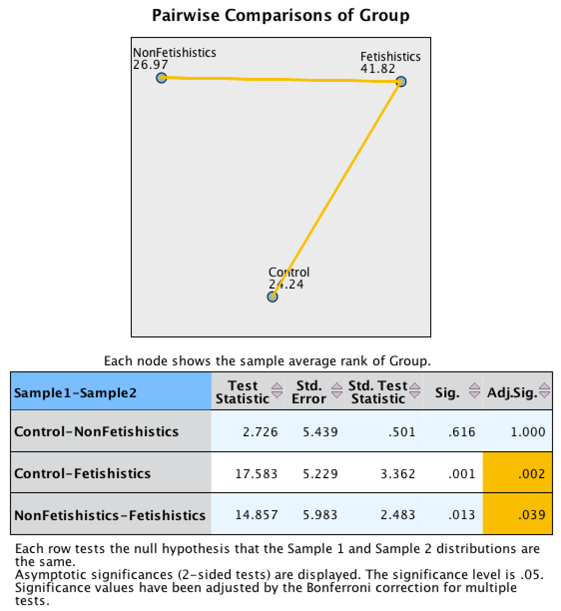
Let’s look at the pairwise comparisons first for the percentage of eggs fertilized first (see output below). The diagram at the top shows the average rank within each group: so, for example, the average rank in the fetishistic group was 41.82, and in the non-fetishistic group it was 26.97. This diagram will also highlight differences between groups by using a different coloured line to connect them. In the current example, there are significant differences between the fetishistic group and the control group, and also between the fetishistic group and the non-fetishistic group, which is why these connecting lines are in yellow. There was no significant difference between the control group and the non-fetishistic group, which is why there is no connecting line. The table underneath shows all of the possible comparisons. The column labelled Adj.Sig. contains the adjusted p-values and it is this column that we need to interpret (no matter how tempted we are to interpret the one labelled Sig.). Looking at this column, we can see that significant differences were found between the control group and the fetishistic group, p = .002, and between the fetishistic group and the non-fetishistic group, p = .039. However, the non-fetishistic group and the control group did not differ significantly, p = 1. We know by looking at the boxplot and the ranks that the fetishistic males yielded significantly higher rates of fertilization than both the non-fetishistic male quail and the control male quail.
Output
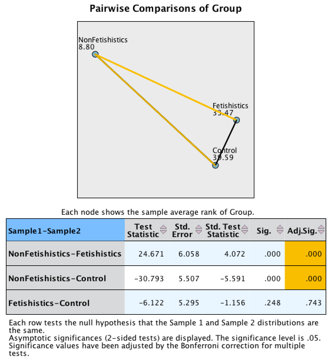
Let’s now look at the pairwise comparisons for the time taken to initiate copulation (see output below). The diagram highlights differences between groups by using a different coloured line to connect them. In the current example, there was not a significant difference between the fetishistic group and the control group, as indicated by the absence of a connecting line. However, there were significant differences between the fetishistic group and the non-fetishistic group, and between the non-fetishistic group and the control, which is why they are connected with a yellow line. The table underneath shows all of the possible comparisons. Interpret the column labelled Adj.Sig. which contains the p-values adjusted for the number of comparisons. Significant differences were found between the control group and the non-fetishistic group, p = .000, and between the fetishistic group and the non-fetishistic group, p = .000. However, the fetishistic group and the control group did not differ significantly, p = .743. We know by looking at the boxplot and the ranks that the non-fetishistic males yielded significantly shorter latencies to initiate copulation than the fetishistic males and the controls.
Output
The authors reported as follows (p. 429):
Kruskal–Wallis analysis of variance (ANOVA) confirmed that female quail partnered with the different types of male quail produced different percentages of fertilized eggs, \(\chi^{2}\)(2, N = 59) =11.95, p < .05, \(\eta^{2}\) = 0.20. Subsequent pairwise comparisons with the Mann–Whitney U test (with the Bonferroni correction) indicated that fetishistic male quail yielded higher rates of fertilization than both the nonfetishistic male quail (U = 56.00, N1 = 17, N2 = 15, effect size = 8.98, p < .05) and the control male quail (U = 100.00, N1 = 17, N2 = 27, effect size = 12.42, p < .05). However, the nonfetishistic group was not significantly different from the control group (U = 176.50, N1 = 15, N2 = 27, effect size = 2.69, p > .05).
For the latency data they reported as follows:
A Kruskal–Wallis analysis indicated significant group differences,\(\ \chi^{2}\)(2, N = 59) = 32.24, p < .05, \(\eta^{2}\) = 0.56. Pairwise comparisons with the Mann–Whitney U test (with the Bonferroni correction) showed that the nonfetishistic males had significantly shorter copulatory latencies than both the fetishistic male quail (U = 0.00, N1 = 17, N2 = 15, effect size = 16.00, p < .05) and the control male quail (U = 12.00, N1 = 15, N2 = 27, effect size = 19.76, p < .05). However, the fetishistic group was not significantly different from the control group (U = 161.00, N1 = 17, N2 = 27, effect size = 6.57, p > .05). (p. 430)
These results support the authors’ theory that fetishist behaviour may have evolved because it offers some adaptive function (such as preparing for the real thing).
Chapter 8
Why do you like your lecturers?
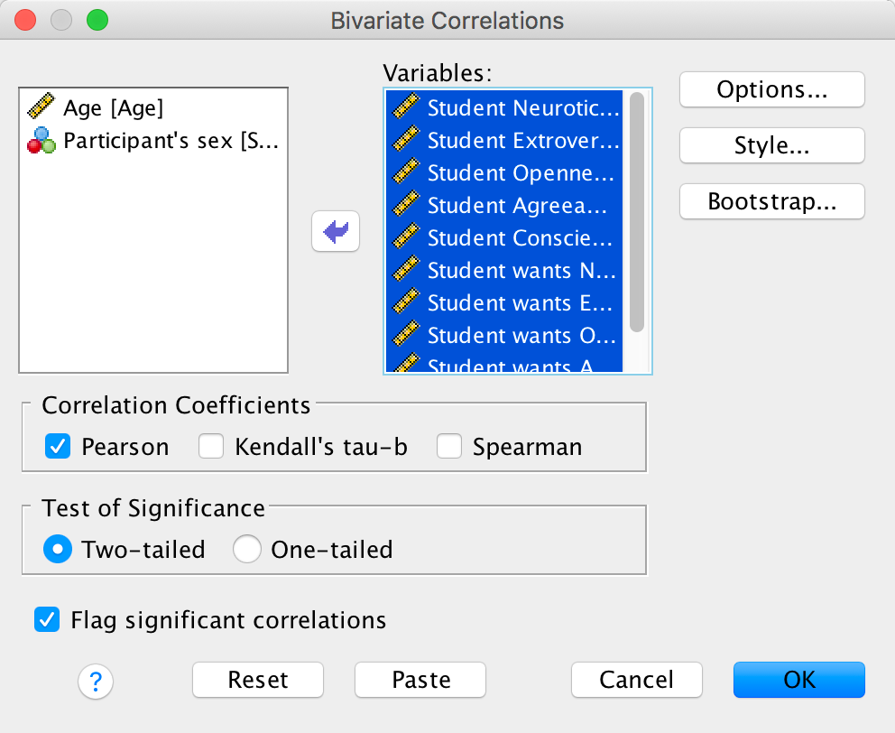
We can run this analysis by loading the file and just pretty much selecting everything in the variable list and running a Pearson correlation. The dialog box will look like this:
Completed dialog box
The resulting output will look like this:
Output
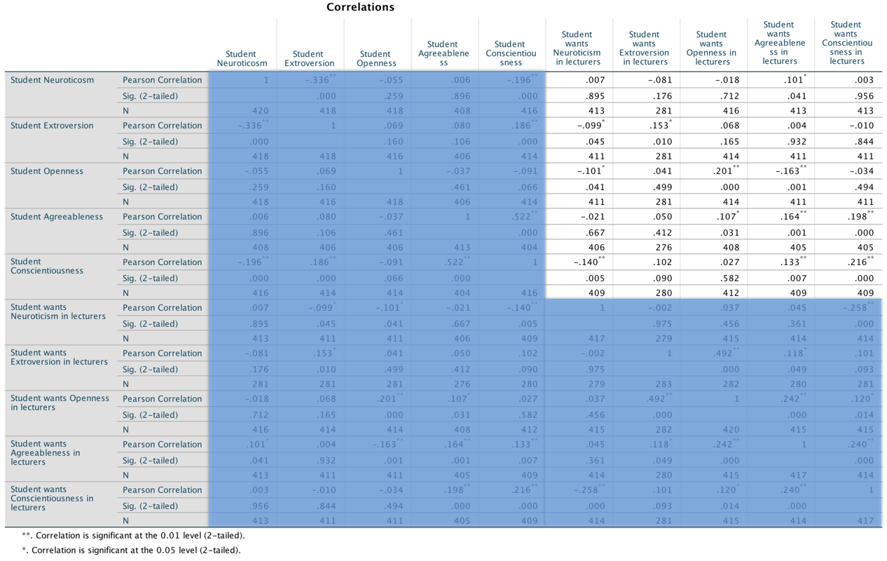
This looks pretty horrendous, but there are a lot of correlations that we don’t need. First, the table is symmetrical around the diagonal so we can first ignore either the top diagonal or the bottom (the values are the same). The second thing is that we’re interested only in the correlations between students’ personality and what they want in lecturers. We’re not interested in how their own five personality traits correlate with each other (i.e. if a student is neurotic are they conscientious too?). I have shaded out all of the correlations that we can ignore so that we can focus on the top right quadrant, which replicated the values reported in the original research paper (part of the authors’ table is below so you can see how they reported these values – match these values to the values in your output):
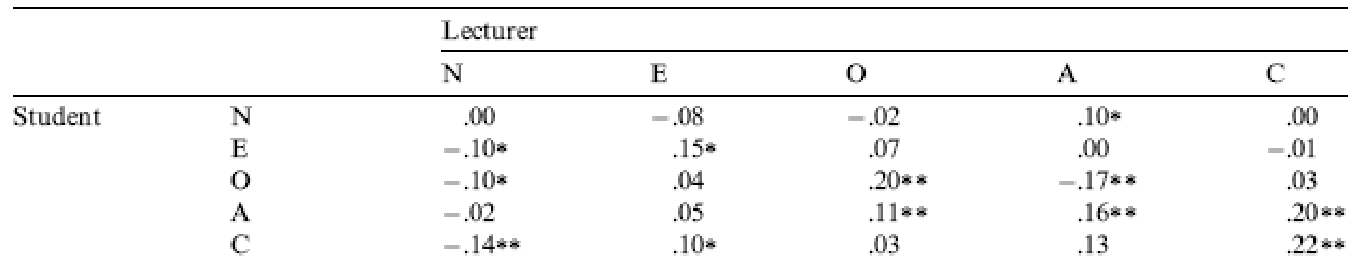
As for what we can conclude, well, neurotic students tend to want agreeable lecturers, r = .10, p = .041; extroverted students tend to want extroverted lecturers, r = .15, p = .010; students who are open to experience tend to want lecturers who are open to experience, r = .20, p < .001, and don’t want agreeable lecturers, r = −.16, p < .001; agreeable students want every sort of lecturer apart from neurotic. Finally, conscientious students tend to want conscientious lecturers, r = .22, p < .001, and extroverted ones, r = .10, p = .09 (note that the authors report the one-tailed p-value), but don’t want neurotic ones, r = −.14, p = .005.
Chapter 9
I want to be loved (on Facebook)
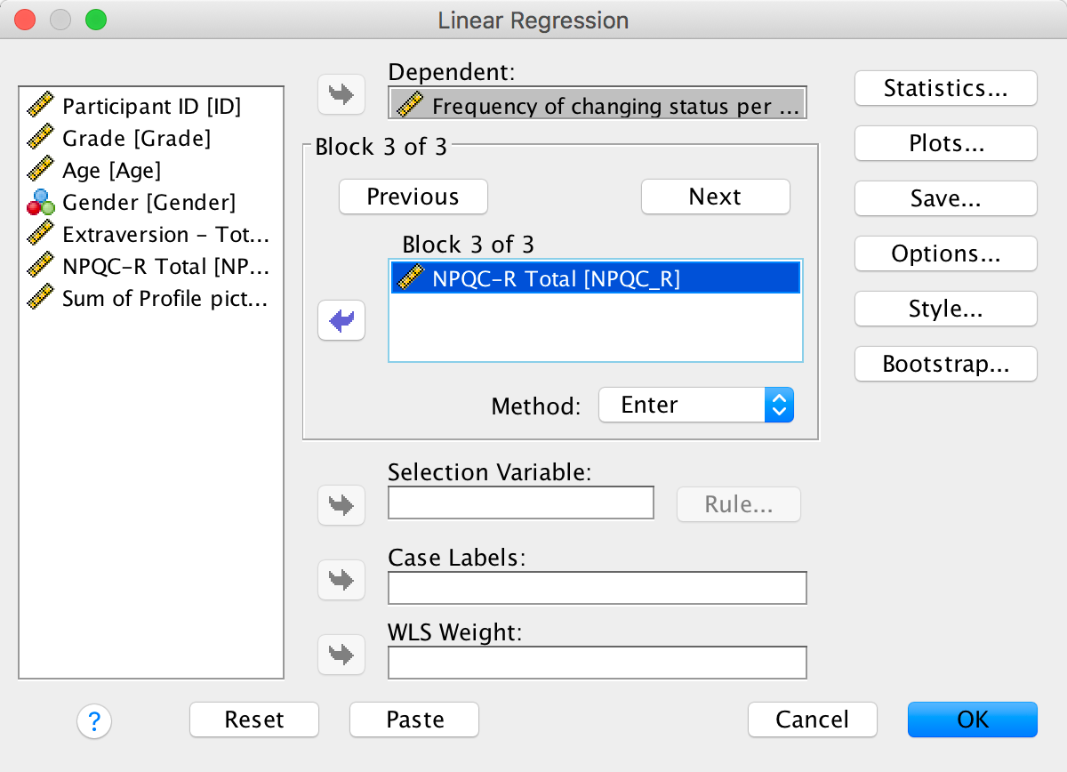
The first linear model looks at whether narcissism predicts, above and beyond the other variables, the frequency of status updates. To do this, drag the outcome variable Frequency of changing status per week to the Dependent box, then define the three blocks as follows. In the first block put Age, Gender and Grade:
Completed dialog box
In the second block, put extraversion (NEO_FFI):
Completed dialog box
And in the third block put narcissism (NPQC_R):
Completed dialog box
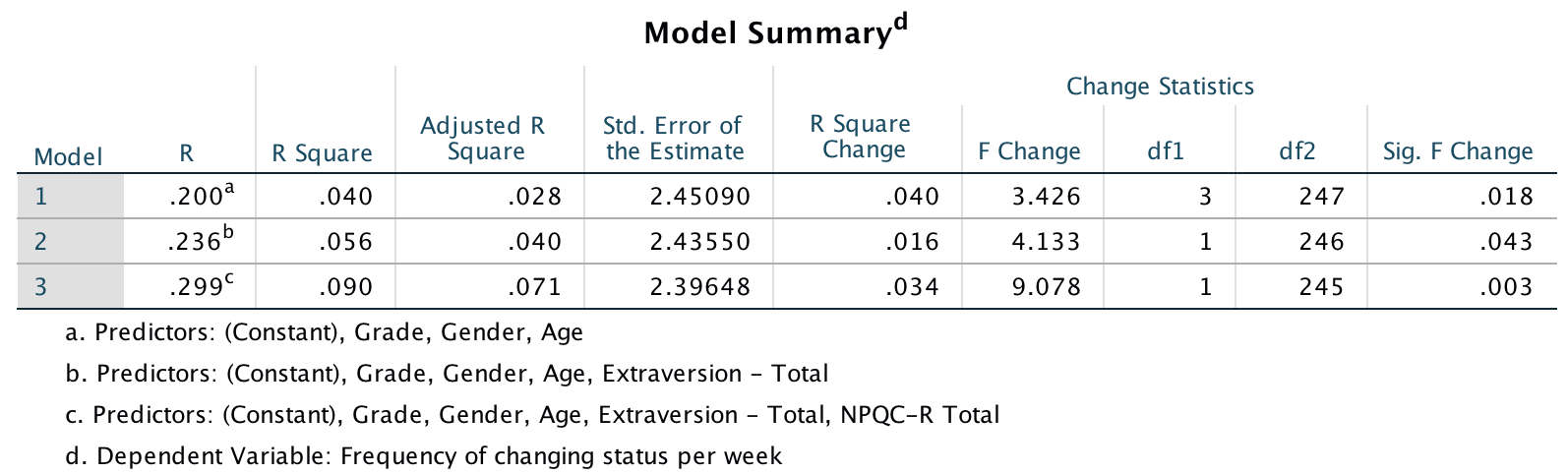
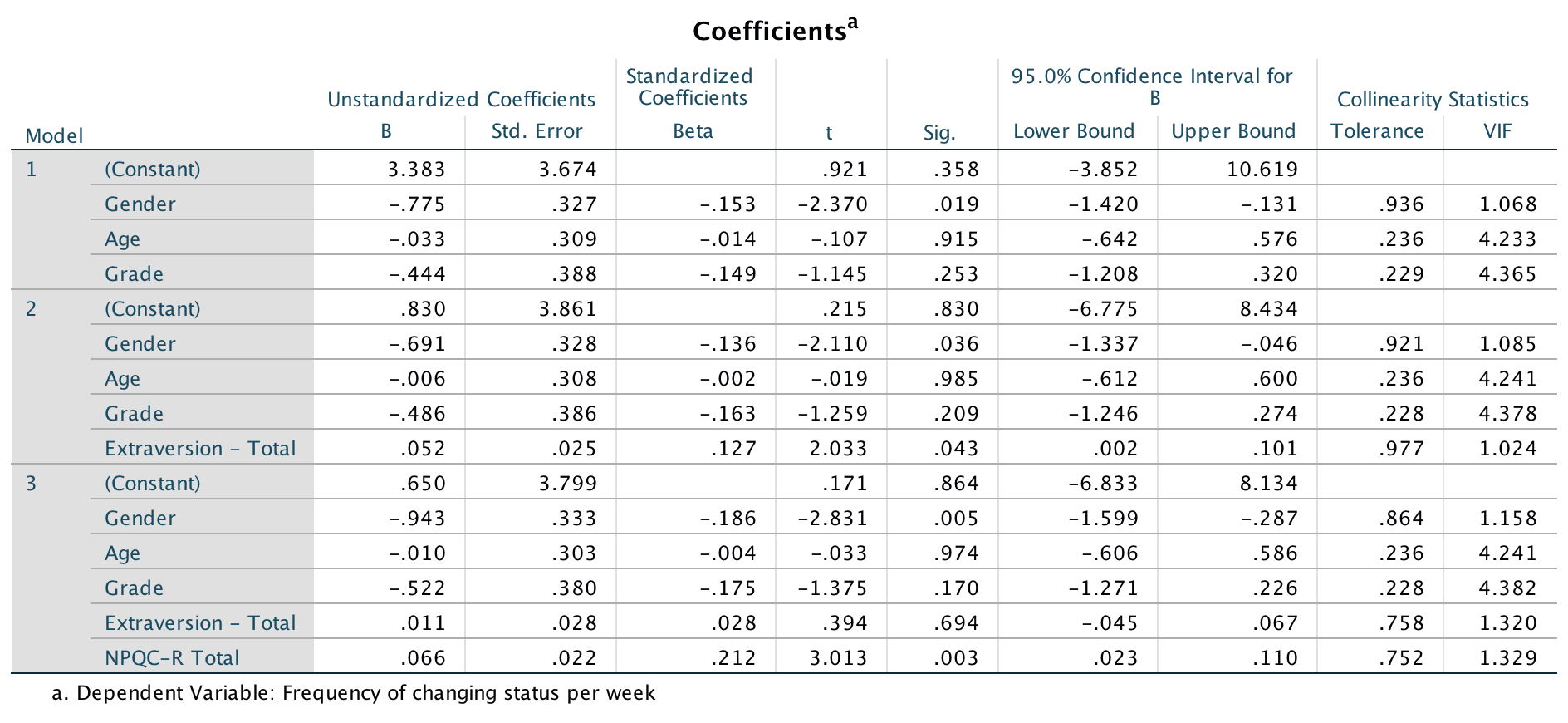
Set the options as in the book chapter. The main output is as follows:
Output
Output
Output
So basically, Ong et al.’s prediction was supported in that after adjusting for age, grade and gender, narcissism significantly predicted the frequency of Facebook status updates over and above extroversion. The positive standardized beta value (.21) indicates a positive relationship between frequency of Facebook updates and narcissism, in that more narcissistic adolescents updated their Facebook status more frequently than their less narcissistic peers did. Compare these results to the results reported in Ong et al. (2011). The Table 2 from their paper is reproduced at the end of this task below.
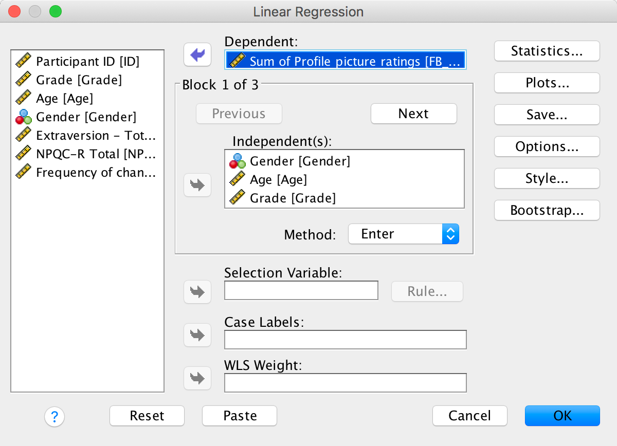
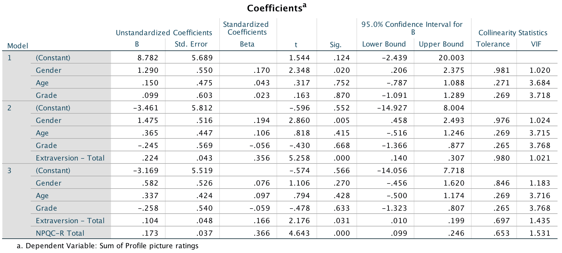
OK, now let’s fit the second model to investigate whether narcissism predicts, above and beyond the other variables, the Facebook profile picture ratings. Drag the outcome variable Sum of Profile picture ratings to the Dependent box, then define the three blocks as follows. In the first block put Age, Gender and Grade:
Completed dialog box
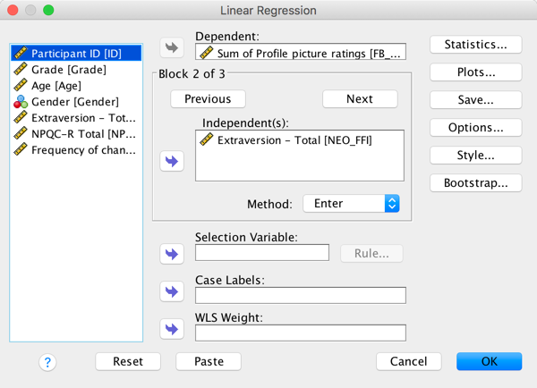
In the second block, put extraversion (NEO_FFI):
Completed dialog box
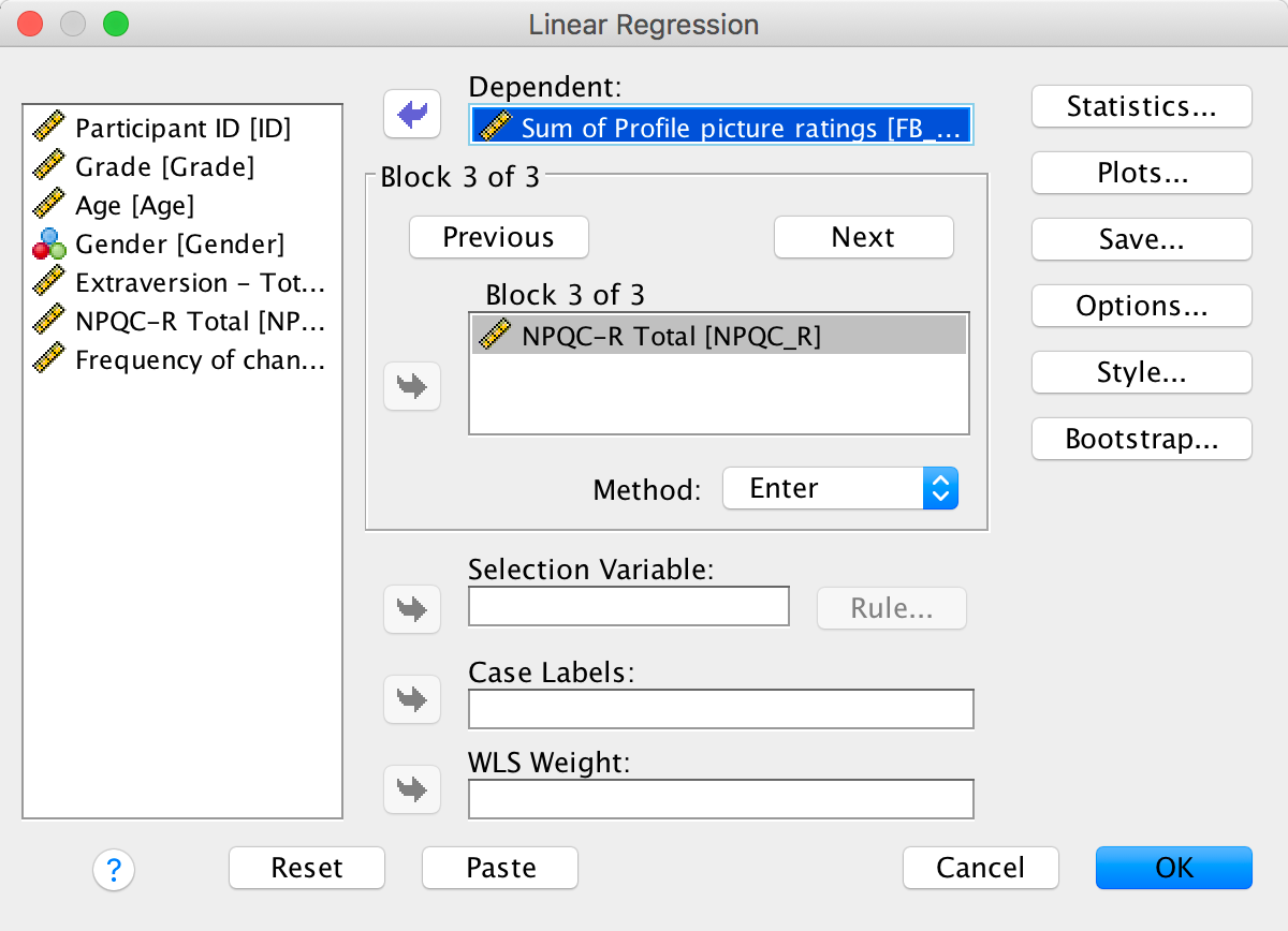
And in the third block put narcissism (NPQC_R):
Completed dialog box
The main output is as follows:
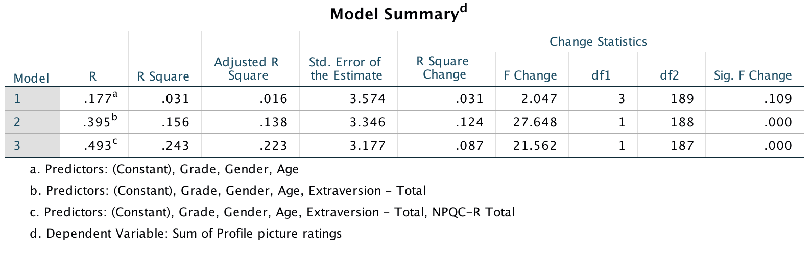
Output
Output
Output
These results show that after adjusting for age, grade and gender, narcissism significantly predicted the Facebook profile picture ratings over and above extroversion. The positive beta value (.37) indicates a positive relationship between profile picture ratings and narcissism, in that more narcissistic adolescents rated their Facebook profile pictures more positively than their less narcissistic peers did. Compare these results to the results reported in Table 2 of Ong et al. (2011) below.
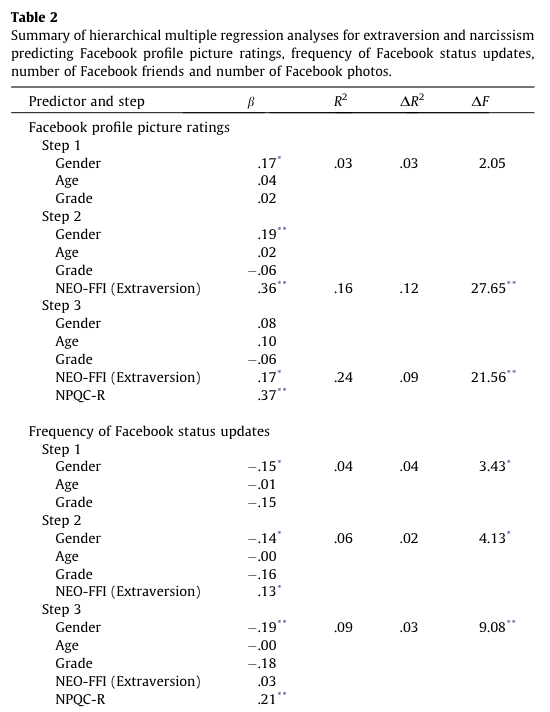
Table 2 from Ong et al. (2011)
Why do you like your lecturers?
Lecturer neuroticism
The first model we’ll fit predicts whether students want lecturers to be neurotic. Drag the outcome variable (LectureN) to the box labelled Dependent:. Then define the predictors in the two blocks as follows. In the first block put Age and Sex:
Completed dialog box
In the second block, put all of the student personality variables (five variables in all):
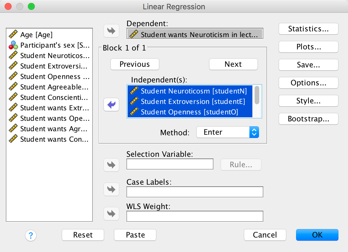
Completed dialog box
Set the options as in the book chapter.
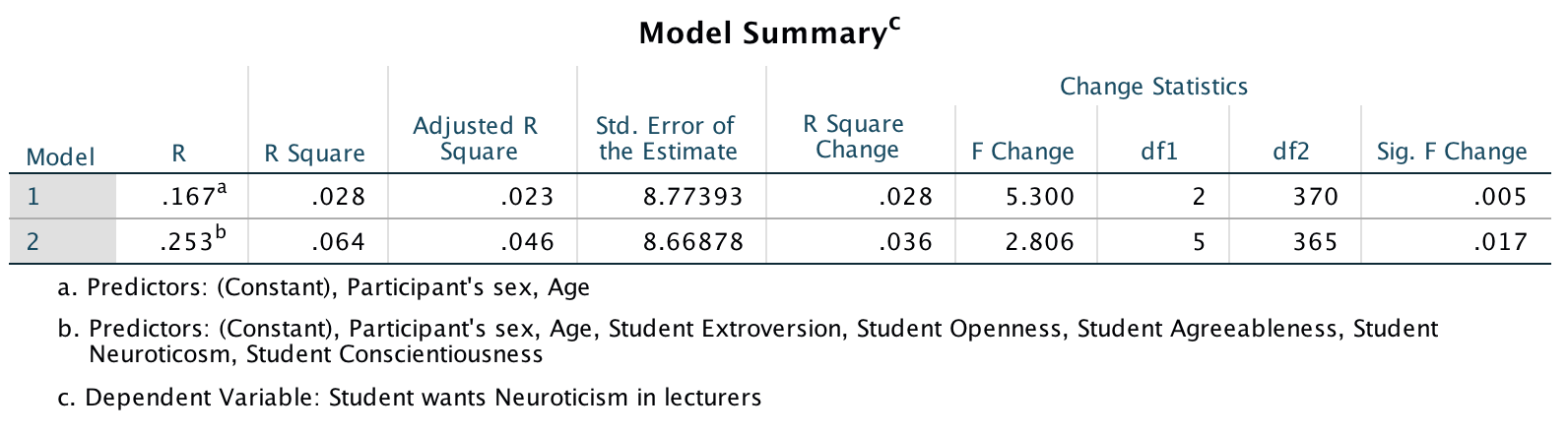
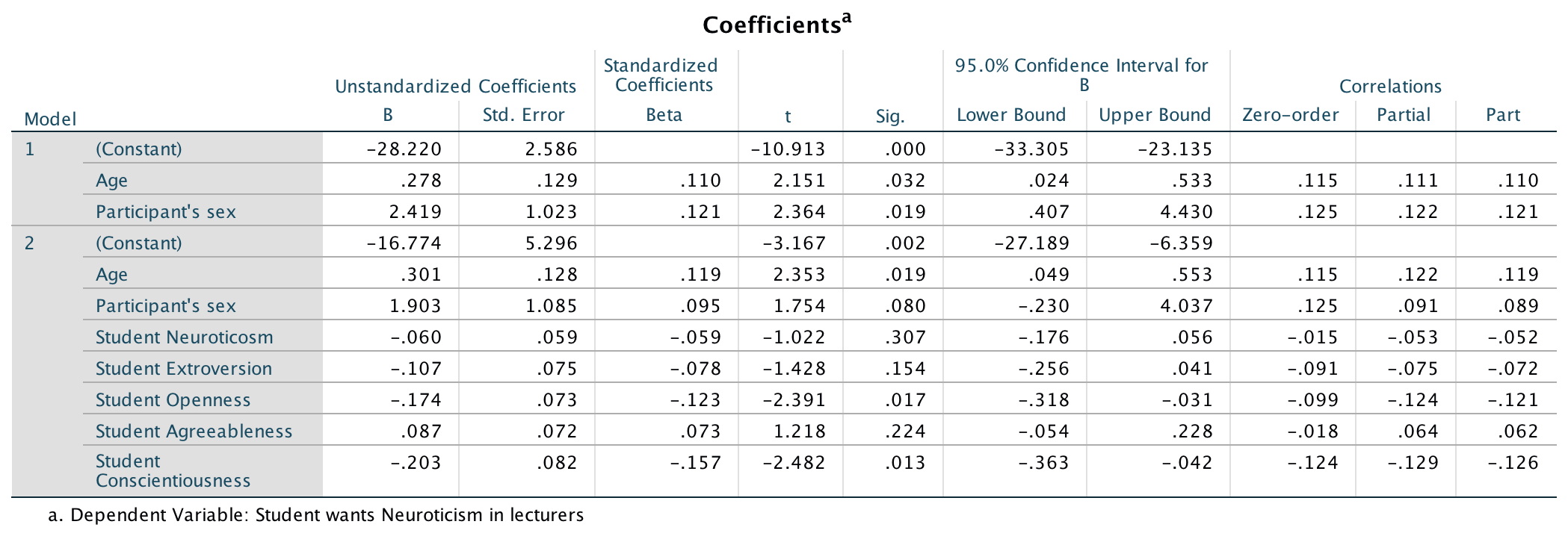
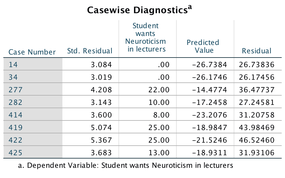
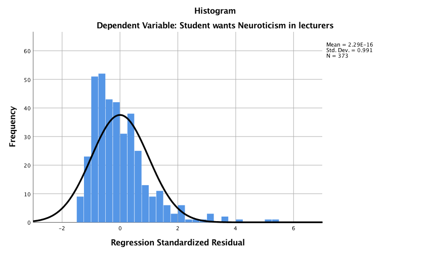
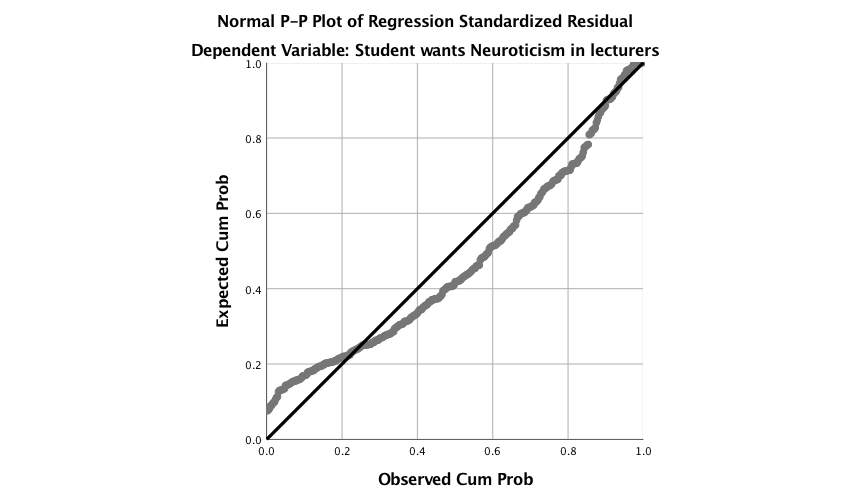
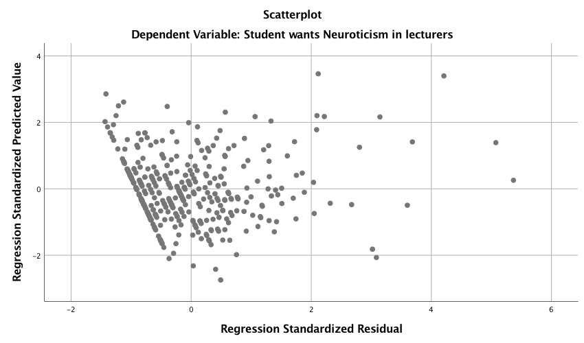
The main output (I haven’t reproduced it all), is as follows:
Output
Output
Output
Output
Output
Output
So basically, age, openness and conscientiousness were significant predictors of wanting a neurotic lecturer (note that for openness and conscientiousness the relationship is negative, i.e. the more a student scored on these characteristics, the less they wanted a neurotic lecturer).
Lecturer extroversion
The second variable we want to predict is lecturer extroversion. You can follow the steps of the first example but drag the outcome variable of LectureN out of the box labelled Dependent: and in its place drag LecturE. Alternatively run the following syntax:
REGRESSION
  /DESCRIPTIVES MEAN STDDEV CORR SIG N
  /MISSING LISTWISE
  /STATISTICS COEFF OUTS CI(95) R ANOVA CHANGE ZPP
  /CRITERIA=PIN(.05) POUT(.10)
  /NOORIGIN
  /DEPENDENT lecturE
  /METHOD=ENTER Age Sex
  /METHOD=ENTER studentN studentE studentO studentA studentC
  /PARTIALPLOT ALL
  /SCATTERPLOT=(*ZPRED ,*ZRESID)
  /RESIDUALS HISTOGRAM(ZRESID) NORMPROB(ZRESID)
  /CASEWISE PLOT(ZRESID) OUTLIERS(3).
You should find that student extroversion was the only significant predictor of wanting an extrovert lecturer; the model overall did not explain a significant amount of the variance in wanting an extroverted lecturer.
Lecturer openness to experience
You can follow the steps of the first example but drag the outcome variable of LectureN out of the box labelled Dependent: and in its place drag LecturO. Alternatively run the following syntax:
REGRESSION
  /DESCRIPTIVES MEAN STDDEV CORR SIG N
  /MISSING LISTWISE
  /STATISTICS COEFF OUTS CI(95) R ANOVA CHANGE ZPP
  /CRITERIA=PIN(.05) POUT(.10)
  /NOORIGIN
  /DEPENDENT lecturO
  /METHOD=ENTER Age Sex
  /METHOD=ENTER studentN studentE studentO studentA studentC
  /PARTIALPLOT ALL
  /SCATTERPLOT=(*ZPRED ,*ZRESID)
  /RESIDUALS HISTOGRAM(ZRESID) NORMPROB(ZRESID)
  /CASEWISE PLOT(ZRESID) OUTLIERS(3).
You should find that student openness to experience was the most significant predictor of wanting a lecturer who is open to experience, but student agreeableness predicted this also.
Lecturer agreeableness
The fourth variable we want to predict is lecturer agreeableness. You can follow the steps of the first example but drag the outcome variable of LectureN out of the box labelled Dependent: and in its place drag LecturA. Alternatively run the following syntax:
REGRESSION
  /DESCRIPTIVES MEAN STDDEV CORR SIG N
  /MISSING LISTWISE
  /STATISTICS COEFF OUTS CI(95) R ANOVA CHANGE ZPP
  /CRITERIA=PIN(.05) POUT(.10)
  /NOORIGIN
  /DEPENDENT lecturA
  /METHOD=ENTER Age Sex
  /METHOD=ENTER studentN studentE studentO studentA studentC
  /PARTIALPLOT ALL
  /SCATTERPLOT=(*ZPRED ,*ZRESID)
  /RESIDUALS HISTOGRAM(ZRESID) NORMPROB(ZRESID)
  /CASEWISE PLOT(ZRESID) OUTLIERS(3).
You should find that Age, student openness to experience and student neuroticism significantly predicted wanting a lecturer who is agreeable. Age and openness to experience had negative relationships (the older and more open to experienced you are, the less you want an agreeable lecturer), whereas as student neuroticism increases so does the desire for an agreeable lecturer (not surprisingly, because neurotics will lack confidence and probably feel more able to ask an agreeable lecturer questions).
Lecturer conscientiousness
The final variable we want to predict is lecturer conscientiousness. You can follow the steps of the first example but drag the outcome variable of LectureN out of the box labelled Dependent: and in its place drag LecturC. Alternatively run the following syntax:
REGRESSION
  /DESCRIPTIVES MEAN STDDEV CORR SIG N
  /MISSING LISTWISE
  /STATISTICS COEFF OUTS CI(95) R ANOVA CHANGE ZPP
  /CRITERIA=PIN(.05) POUT(.10)
  /NOORIGIN
  /DEPENDENT lecturC
  /METHOD=ENTER Age Sex
  /METHOD=ENTER studentN studentE studentO studentA studentC
  /PARTIALPLOT ALL
  /SCATTERPLOT=(*ZPRED ,*ZRESID)
  /RESIDUALS HISTOGRAM(ZRESID) NORMPROB(ZRESID)
  /CASEWISE PLOT(ZRESID) OUTLIERS(3).
Student agreeableness and conscientiousness both signfiicantly predict wanting a lecturer who is conscientious. Note also that gender predicted this in the first step, but its b became slightly non-significant (p = .07) when the student personality variables were forced in as well. However, gender is probably a variable that should be explored further within this context.
Compare all of your results to Table 4 in the actual article (shown below) - our five analyses are represented by the columns labelled N, E, O, A and C).
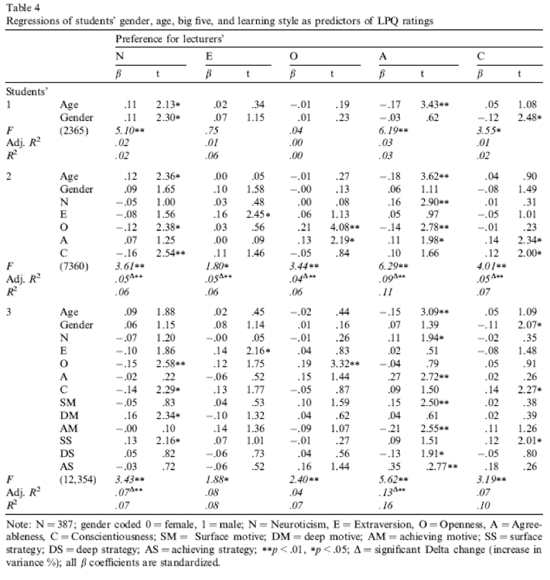
Table 4 from Chamorro-Premuzic et al. (2008)
Chapter 10
You don’t have to be mad here, but it helps
The data look like this:
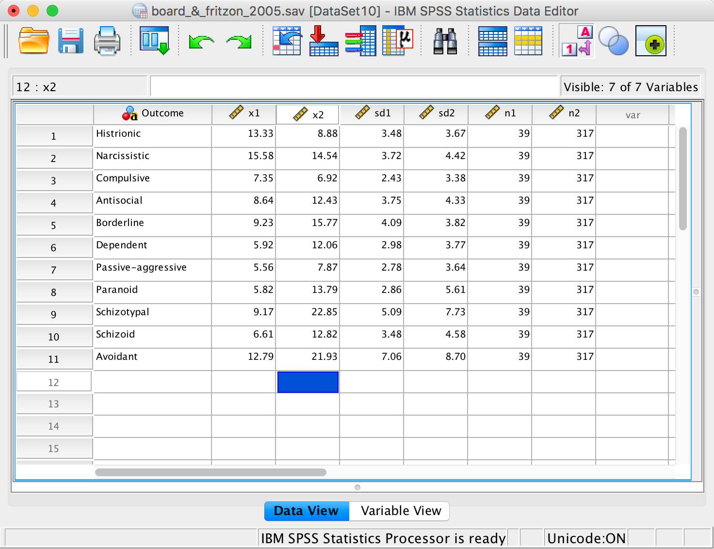
The data
The columns represent the following:
- Outcome: A string variable that tells us which personality disorder the numbers in each row relate to.
- X1: Mean of the managers group.
- X2: Mean of the psychopaths group.
- sd1: Standard deviation of the managers group.
- sd2: Standard deviation of the psychopaths group.
- n1: The number of managers tested.
- n2: The number of psychopaths tested.
The syntax file looks like this:
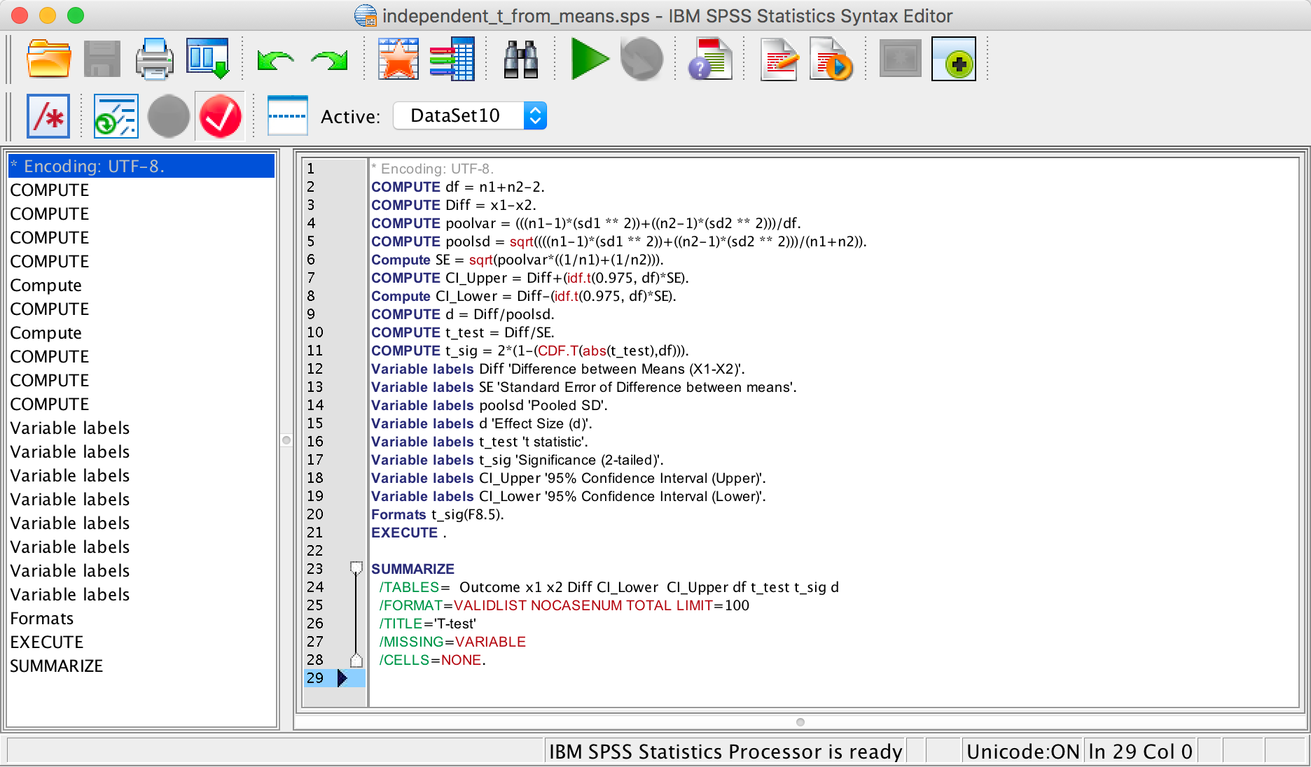
The syntax editor
We can run the syntax by selecting Run > All. The output looks like this:
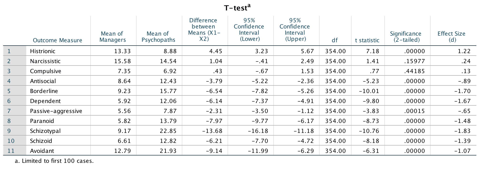
The data
We can report that managers scored significantly higher than psychopaths on histrionic personality disorder, t(354) = 7.18, p < .001, d = 1.22. There were no significant differences between groups on narscissistic personality disorder, t(354) = 1.41, p = .160, d = 0.24 , or compulsive personality disorder, t(354) = 0.77, p = .442, d = 0.13. On all other measures, psychopaths scored significantly higher than managers: antisocial personality disorder, t(354) = −5.23, p < .001, d = −0.89; borderline personality disorder, t(354) = −10.01, p < .001, d = −1.70; dependent personality disorder, t(354) = −9.80, p < .001, d = −1.67; passive-aggressive personality disorder, t(354) = −3.83, p < .001, d = −0.65; paranoid personality disorder, t(354) = −8.73, p < .001, d = −1.48; schizotypal personality disorder, t(354) = −10.76, p < .001, d = −1.83; schizoid personality disorder, t(354) = −8.18, p < .001, d = −1.39; avoidant personality disorder, t(354) = −6.31, p < .001, d = −1.07.
The results show the presence of elements of PD in the senior business manager sample, especially those most associated with psychopathic PD. The senior business manager group showed significantly higher levels of traits associated with histrionic PD than psychopaths. They also did not significantly differ from psychopaths in narcissistic and compulsive PD traits. These findings could be an issue of power (effects were not detected but are present). The effect sizes d can help us out here, and these are quite small (0.24 and 0.13), which can give us confidence that there really isn’t a difference between psychopaths and managers on these traits. Broad and Fritzon (2005) conclude that:
‘At a descriptive level this translates to: superficial charm, insincerity, egocentricity, manipulativeness (histrionic), grandiosity, lack of empathy, exploitativeness, independence (narcissistic), perfectionism, excessive devotion to work, rigidity, stubbornness, and dictatorial tendencies (compulsive). Conversely, the senior business manager group is less likely to demonstrate physical aggression, consistent irresponsibility with work and finances, lack of remorse (antisocial), impulsivity, suicidal gestures, affective instability (borderline), mistrust (paranoid), and hostile defiance alternated with contrition (passive/aggressive.)’.
Remember, these people are in charge of large companies. Suddenly a lot things make sense.
Bladder control
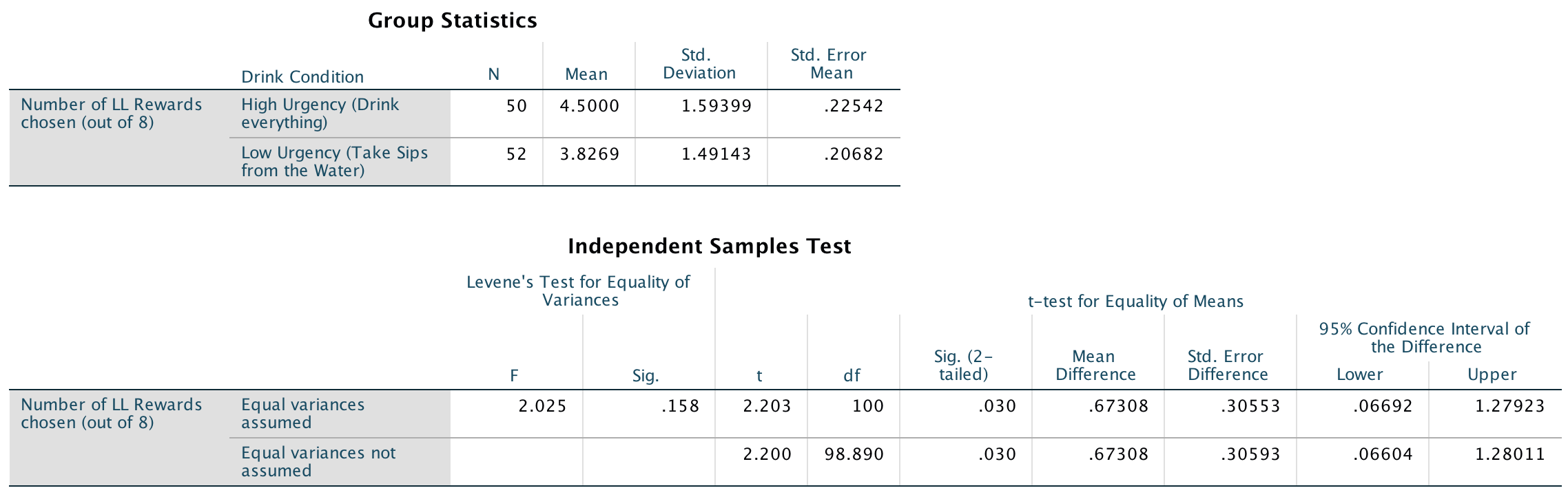
We will conduct an independent samples t-test on these data because there were different participants in each of the two groups (independent design). Your completed dialog box should look like this:
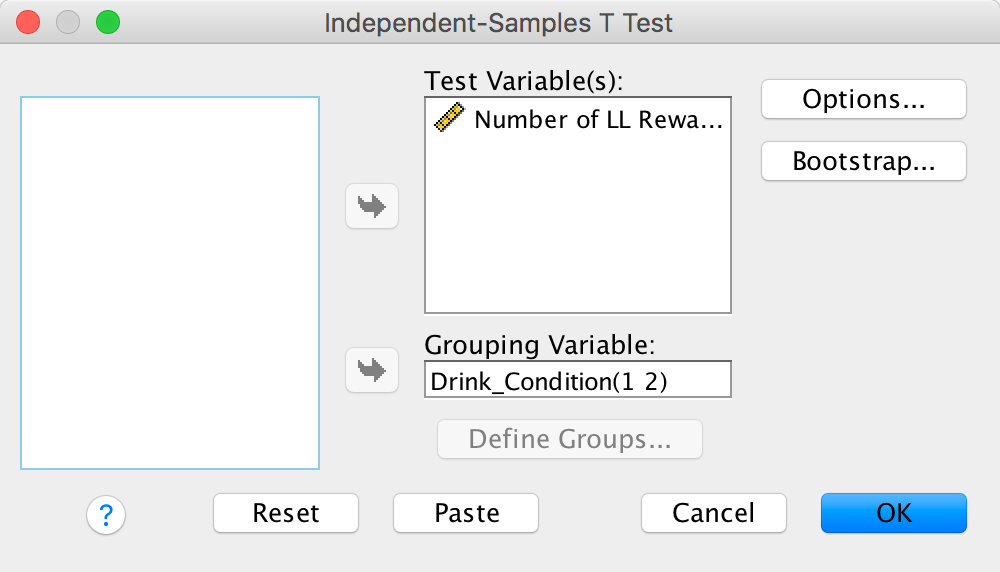
Completed dialog box
Looking at the means in the Group Statistics table below, we can see that on average more participants in the High Urgency group (M = 4.5) chose the large financial reward for which they would wait longer than participants in the Low Urgency group (M = 3.8). Looking at the Independent Samples Test table, we can see that this difference was significant, p = .03.
Output
To calculate the effect size r, all we need is the value of t and the df from the Independent Samples Test table:
\[ \begin{align} r &= \sqrt{\frac{{2.203}^{2}}{{2.203}^{2} + 100}} \\ &= \sqrt{\frac{4.853}{104.853}} \\ &= 0.215 \end{align} \]
Think back to our benchmarks for effect sizes, this represents a small to medium effect (it is between .1 (small effect) and .3 (a medium effect)).
In this example the Independent Samples Test table tells us that the value of t was 2.20, that this was based on 100 degrees of freedom, and that it was significant at p = .03. We can also see the means for each group. We could write this as:
- On average, participants who had full bladders (M = 4.5, SD = 1.59) were more likely to choose the large financial reward for which they would wait longer than participants who had relatively empty bladders (M = 3.8, SD = 1.49), t(100) = 2.20, p = .03.
The beautiful people
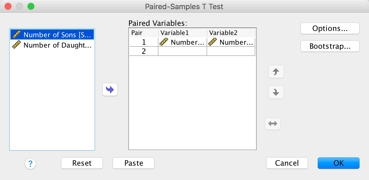
We need to run a paired samples t-test on these data because the researchers recorded the number of daughters and sons for each participant (repeated-measures design). Your completed dialog should look like this:
Completed dialog box
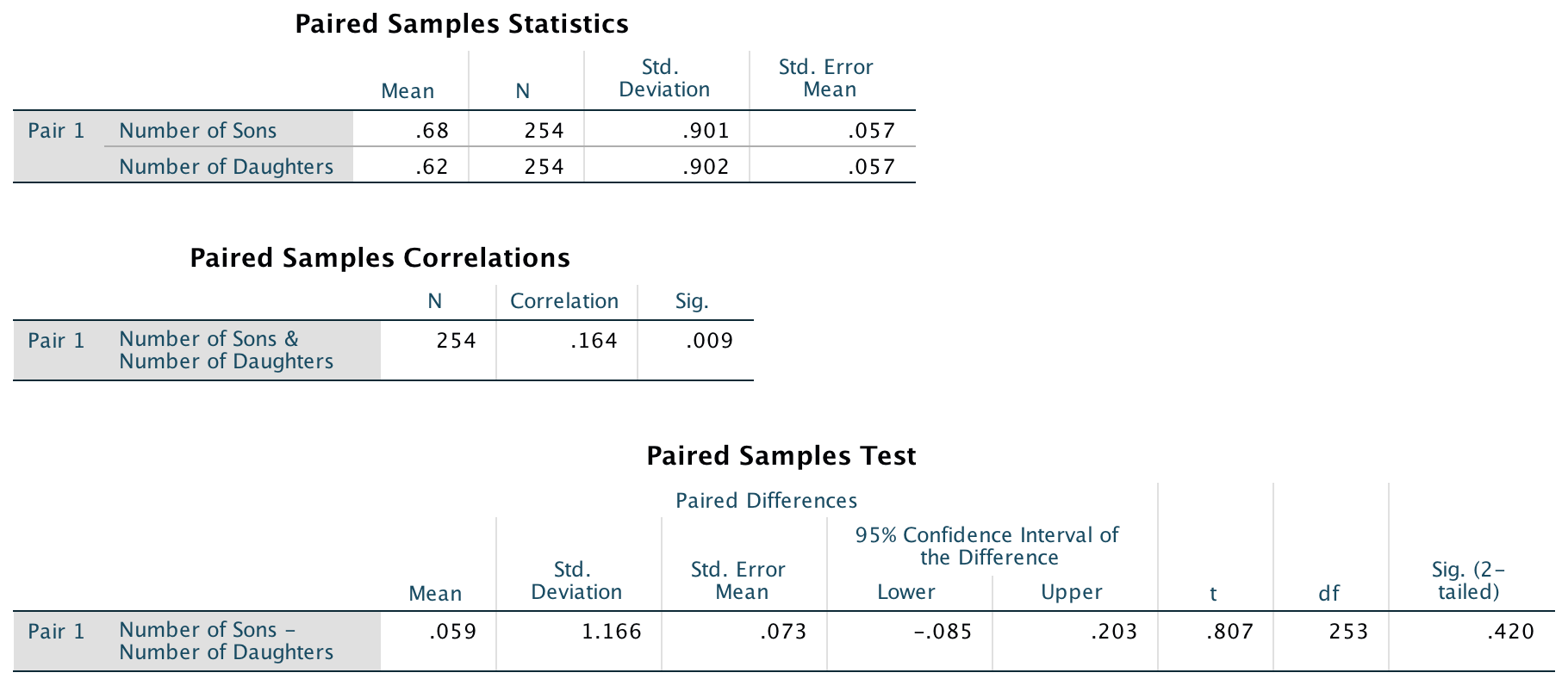
Looking at the output below, we can see that there was a non-significant difference between the number of sons and daughters produced by the ‘beautiful’ celebrities.
Output
We are going to calculate Cohen’s d as our effect size. To do this we first need to get some descriptive statistics for these data – the means and standard deviations (see above).
We can now compute Cohen’s d using the two means (.68 and .62) and the standard deviation of the control group (it doesn’t matter which one you choose here, but I have chosen to use the sons):
\[ \begin{align} \widehat{d} &= \frac{{\overline{X}}_{\text{Daughters}} - {\overline{X}}_{\text{Sons}}}{s_{\text{Sons}}} \\ &= \frac{0.62 - 0.68}{0.901} \\ &= - 0.07 \end{align} \]
This means that there is −0.07 of a standard deviation difference between the number of sons and daughters produced by the celebrities, which is a very small effect.
In this example the SPSS Statistics output tells us that the value of t was 0.81, that this was based on 253 degrees of freedom, and that it was non-significant, p = .420. We also calculated the means for each group. We could write this as follows:
- There was no significant difference between the number of daughters (M = 0.62, SE = 0.06) produced by the ‘beautiful’ celebrities and the number of sons (M = 0.68, SE = 0.06), t(253) = 0.81, p = .420, d = −0.07.
Chapter 11
I heard that Jane has a boil and kissed a tramp
Solution using Baron and Kenny’s method
Baron and Kenny suggested that mediation is tested through three linear models:
- A linear model predicting the outcome (Gossip) from the predictorvariable (Age).
- A linear model predicting the mediator (Mate_Value) from the predictor variable (Age).
- A linear model predicting the outcome (Gossip) from both the predictor variable (Age) and the mediator (Mate_Value).
These models test the four conditions of mediation: (1) the predictor variable (Age) must significantly predict the outcome variable (Gossip) in model 1; (2) the predictor variable (Age) must significantly predict the mediator (Mate_Value) in model 2; (3) the mediator (Mate_Value) must significantly predict the outcome (Gossip) variable in model 3; and (4) the predictor variable (Age) must predict the outcome variable (Gossip) less strongly in model 3 than in model 1.
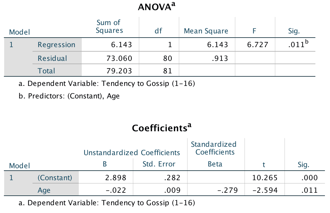
Model 1: Predicting Gossip from Age
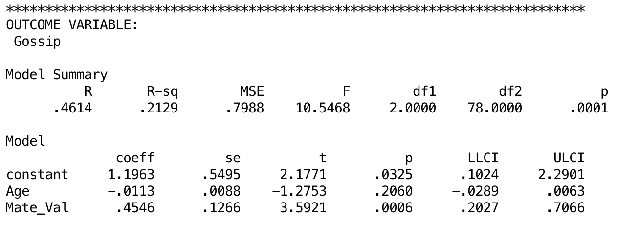
Model 1 indicates that the first condition of mediation was met, in that participant age was a significant predictor of the tendency to gossip, t(80) = −2.59, p = .011.
Model 2: Predicting Mate_Value from Age
Model 2 shows that the second condition of mediation was met: participant age was a significant predictor of mate value, t(79) = −3.67, p < .001.
Model 3: Predicting Gossip from Age and Mate_Value
Model 3 shows that the third condition of mediation has been met: mate value significantly predicted the tendency to gossip while adjusting for participant age, t(78) = 3.59, p < .001. The fourth condition of mediation has also been met: the standardized coefficient between participant age and tendency to gossip decreased substantially when adjusting for mate value, in fact it is no longer significant, t(78) = −1.28, p. Therefore, we can conclude that the author’s prediction is supported, and the relationship between participant age and tendency to gossip is mediated by mate value.
Diagram of the mediation model, taken from Massar et al. (2011)
Solution using PROCESS
{width=“5.901388888888889in” height=“3.926388888888889in”}
The first oputput shows that age significantly predicts mate value, b = −0.03, t = −3.67, p < .001. The R2 value tells us that age explains 14.6% of the variance in mate value, and the fact that the b is negative tells us that the relationship is negative also: as age increases, mate value declines (and vice versa).
Output
The next output shows the results of the model predicting tendency to gossip from both age and mate value. We can see that while age does not significantly predict tendency to gossip with mate value in the model, b = −0.01, t = −1.28, p = .21, mate value does significantly predict tendency to gossip, b = 0.45, t = 3.59, p = .0006. The R2 value tells us that the model explains 21.3% of the variance in tendency to gossip. The negative b for age tells us that as age increases, tendency to gossip declines (and vice versa), but the positive b for mate value indicates that as mate value increases, tendency to gossip increases also. These relationships are in the predicted direction.
Output
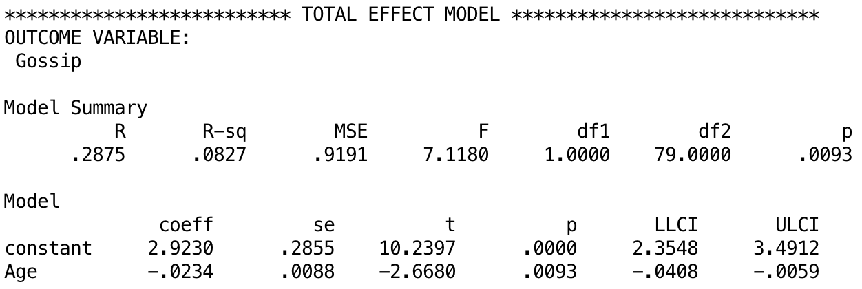
The next output shows the total effect of age on tendency to gossip (outcome). You will get this bit of the output only if you selected Total effect model. The total effect is the effect of the predictor on the outcome when the mediator is not present in the model. When mate value is not in the model, age significantly predicts tendency to gossip, b = −0.02, t = −2.67, p = .009. The R2 value tells us that the model explains 8.27% of the variance in tendency to gossip. Therefore, when mate value is not included in the model, age has a significant negative relationship with infidelity (as shown by the negative b value).
Output
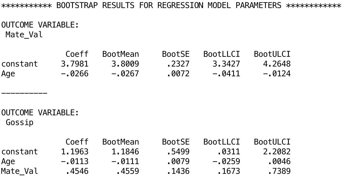
The next output shows the bootstrapped model parameters. For example, the total effect of age that we just discussed had a b = –0.0234 with a 95% confidience interval from –0.0408 to –0.0059. The estimates based on bootstrapping are b = –0.0266 [–0.0411, –0.0124]1. Similarly, if we look at the model that also included the effect of Mate_Val, the parameter [and 95% CI] is b = 0.4546 [0.2027, 0.7066] and the bootstrap estimates (below) are b = 0.4546 [0.1673, 0.7389]. Remember that the bootstrap estimates are robust.
Output
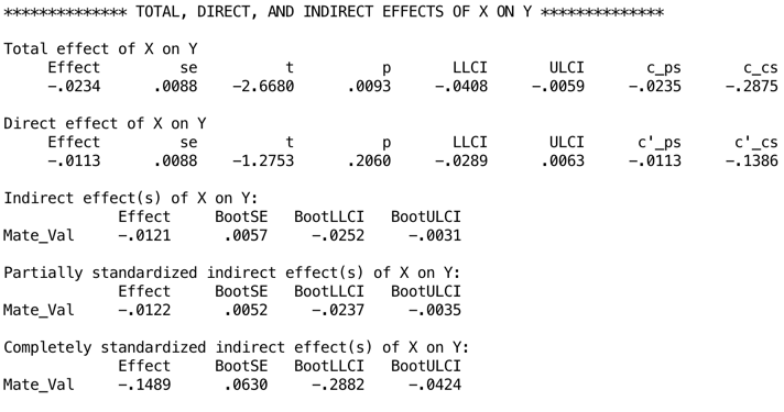
The next output displays the results for the indirect effect of age on gossip (i.e., the effect via mate value). We’re told the effect of age on gossip when mate value is included as a predictor as well (the direct effect). The first bit of new information is the Indirect effect of X on Y, which in this case is the indirect effect of age on gossip. We’re given an estimate of this effect (b = −0.012) as well as a bootstrapped standard error and confidence interval. As we have seen many times before, 95% confidence intervals contain the true value of a parameter in 95% of samples. Therefore, we tend to assume that our sample isn’t one of the 5% that does not contain the true value and use them to infer the population value of an effect. In this case, assuming our sample is one of the 95% that ‘hits’ the true value, we know that the true b-value for the indirect effect falls between −0.0252 and −0.0031.2 This range does not include zero (although both values are not much bigger than zero), and remember that b = 0 would mean ‘no effect whatsoever’; therefore, the fact that the confidence interval does not contain zero means that there is likely to be a genuine indirect effect. Put another way, mate value is a mediator of the relationship between age and tendency to gossip.
Output
Chapter 12
Scraping the barrel?
Let’s do the graph first. There are two variables in the data editor: Phallus (the independent variable that has three levels: no ridge, minimal ridge and normal ridge) and Displacement (the dependent variable, the percentage of sperm displaced). The graph should therefore plot Phallus on the x-axis and Displacement on the y-axis. The completed dialog box should look like this:
Completed dialog box
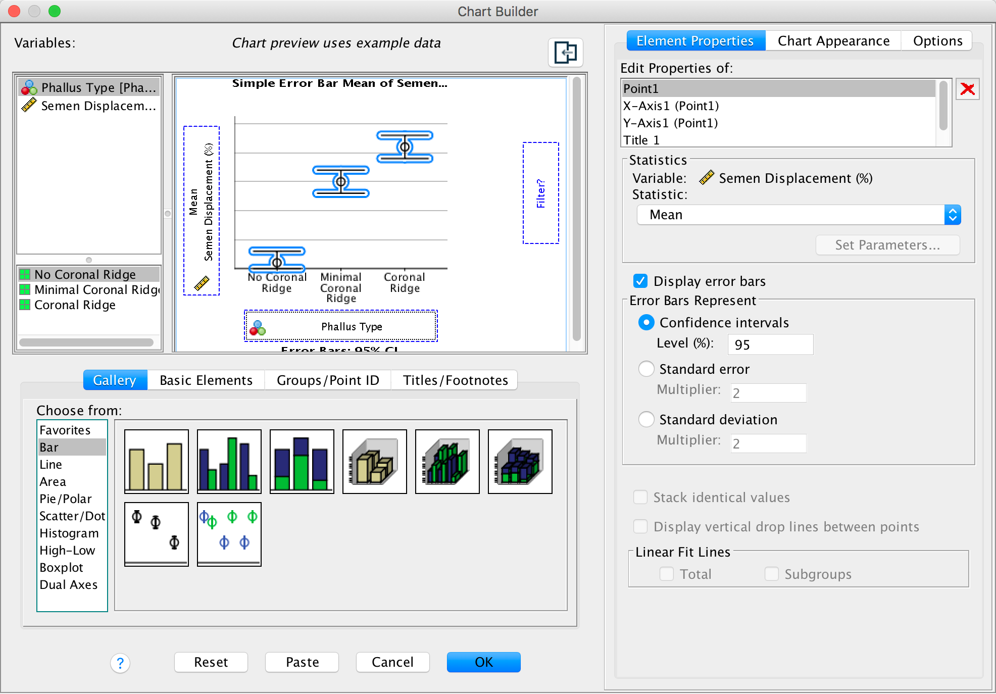
The graph shows that having a coronal ridge results in more sperm displacement than not having one. The size of ridge made very little difference:
Output
We can fit the model using Analyze > Compare Means > One-Way ANOVA …. The main dialog box should look like this:
Completed dialog box
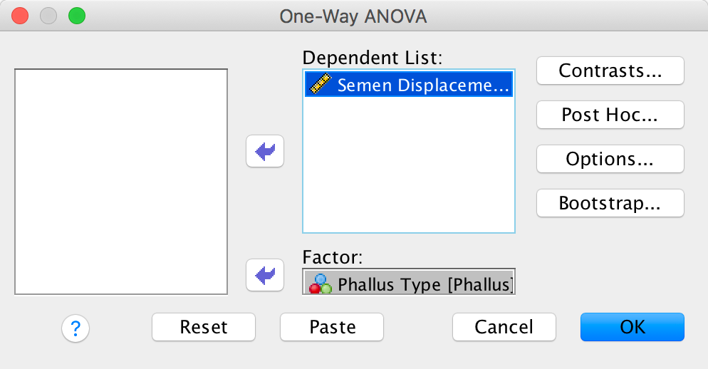
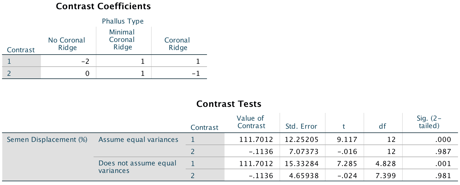
To test our hypotheses we need to enter the following codes for the contrasts:
| Contrast | No Ridge | Minimal ridge | Coronal ridge |
|---|---|---|---|
| No ridge vs. ridge | -2 | 1 | 1 |
| Minimal vs. coronal | 0 | -1 | 1 |
Contrast 1 tests hypothesis 1: that having a bell-end will displace more sperm than not. To test this we compare the two conditions with a ridge against the control condition (no ridge). So we compare chunk 1 (no ridge) to chunk 2 (minimal ridge, coronal ridge). The numbers assigned to the groups are the number of groups in the opposite chunk, and then we randomly assigned one chunk to be a negative value (the codes 2, −1, −1 would work fine as well). We enter these codes into SPSS Statistics using the Contrasts dialog box:
Completed dialog box
Contrast 2 tests hypothesis 2: the phallus with the larger coronal ridge will displace more sperm than the phallus with the minimal coronal ridge. First we get rid of the control phallus by assigning a code of 0; next we compare chunk 1 (minimal ridge) to chunk 2 (coronal ridge). The numbers assigned to the groups are the number of groups in the opposite chunk, and then we randomly assigned one chunk to be a negative value (the codes 0, 1, −1 would work fine as well). We enter these codes into SPSS Statistics using the Contrasts dialog box:
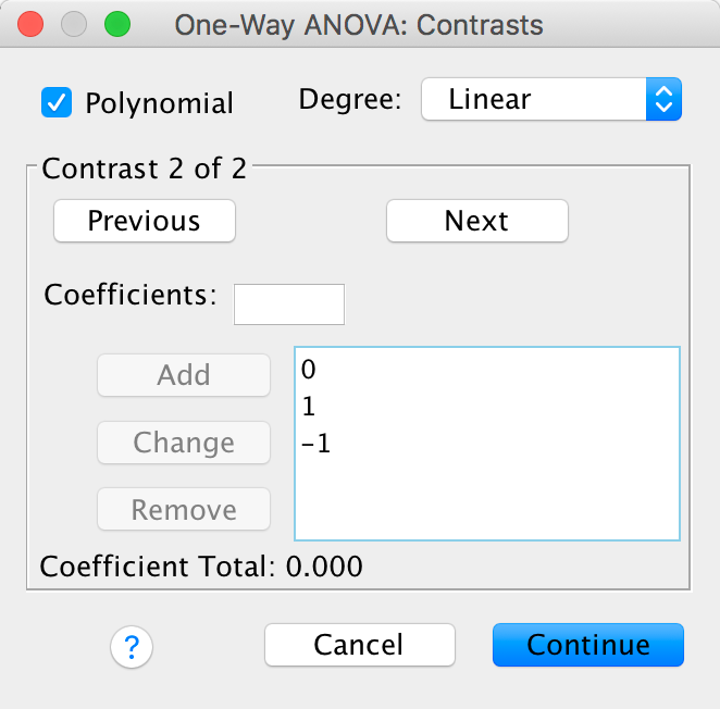
Completed dialog box
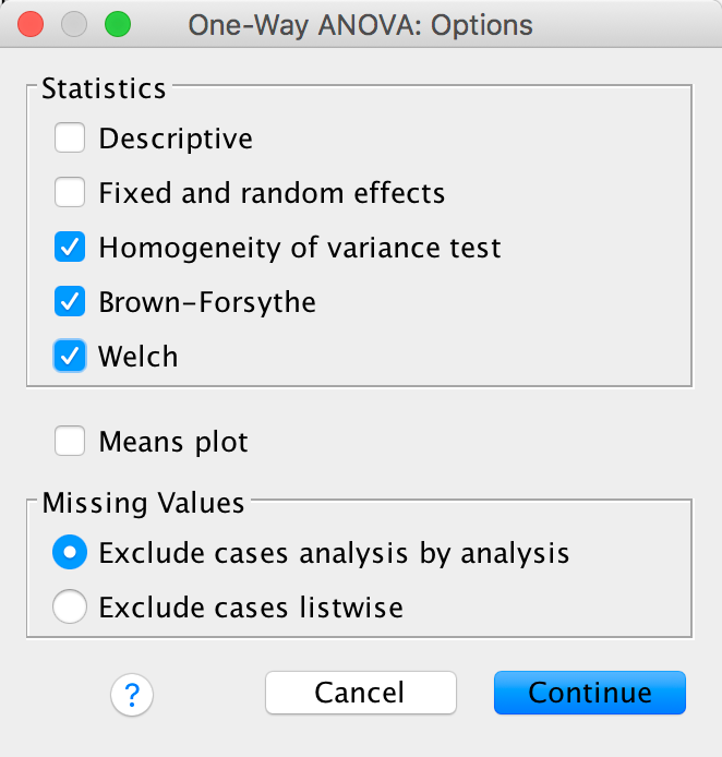
We should also ask for corrections for heteroscedasticity using the Options dialog box:
Completed dialog box
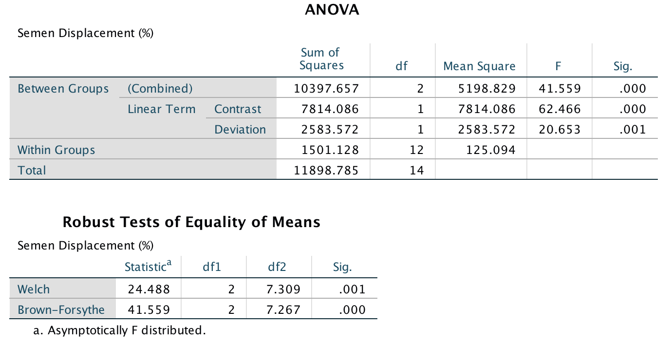
The main output tells us that there was a significant effect of the type of phallus, F(2, 12) = 41.56, p < .001. (This is exactly the same result as reported in the paper on page 280.) There is also a significant linear trend, F(1, 12) = 62.47, p > .001, indicating that more sperm was displaced as the ridge increased (however, note from the graph that this effect reflects the increase in displacement as we go from no ridge to having a ridge; there is no extra increase from ‘minimal ridge’ to ‘coronal ridge’). Note that using robust F-tests that correct for lack of homogeneity the effect is still highly significant (p = .001 using Welch’s F, and p < .001 using Brown-Forsythe’s F).
Output
The next output firstly tells us that we entered our weights correctly. Next the table labelled Contrast Tests shows that hypothesis 1 is supported (contrast 1): having some kind of ridge led to greater sperm displacement than not having a ridge, t(12) = 9.12, p < .001. Contrast 2 shows that hypothesis 2 is not supported: the amount of sperm displaced by the normal coronal ridge was not significantly different from the amount displaced by a minimal coronal ridge, t(12) = −0.02, p = .99.
Output
Chapter 13
Space invaders
To run this analysis we need to access the main dialog box by selecting Analyze > General Linear Model > Univariate …. Drag Interpretational_Bias and to the box labelled Dependent Variable:. Drag Training (i.e., the type of training that the child had) to the box labelled Fixed Factor(s):, and then select Gender, Age and SCARED by holding down Ctrl (⌘ on a mac) while you click on these variables and drag them to the box labelled Covariate(s):. The finished dialog box should look like this:
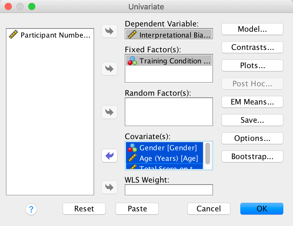
Completed dialog box
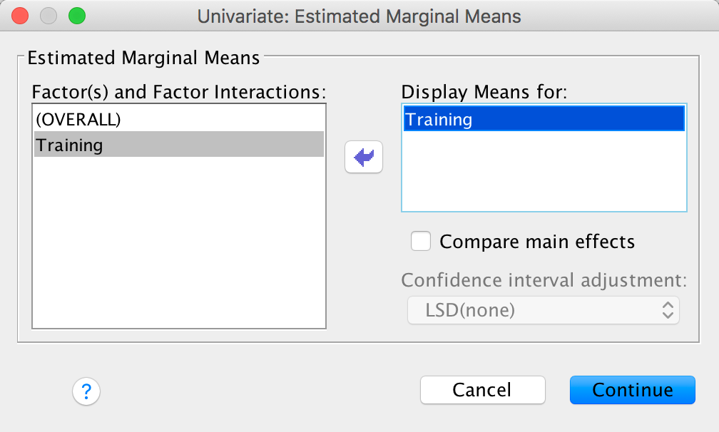
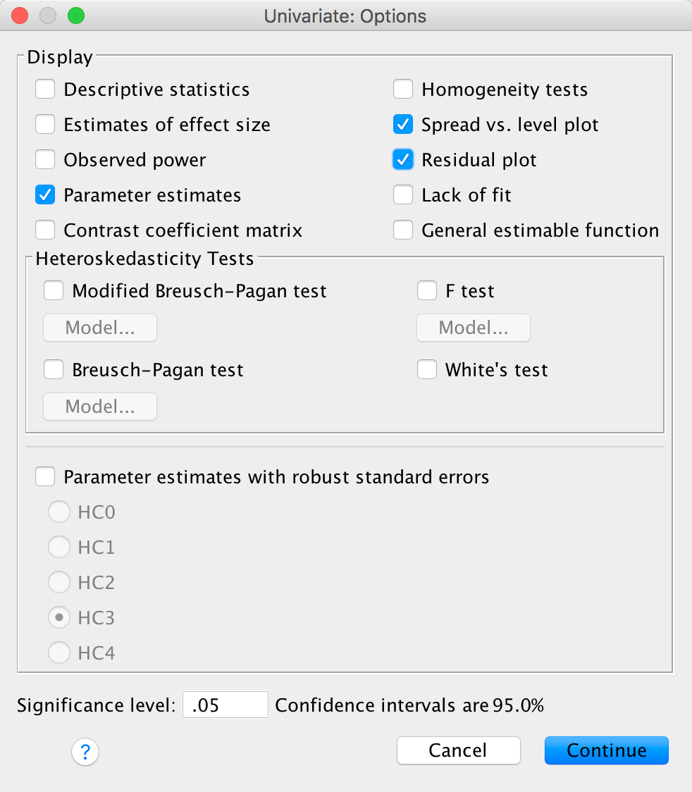
In the chapter we looked at how to select contrasts, but because our main predictor variable (the type of training) has only two levels (positive or negative) we don’t need contrasts: the main effect of this variable can only reflect differences between the two types of training. We can ask for adjusted means and parametr estimates though:
Completed dialog box
Completed dialog box
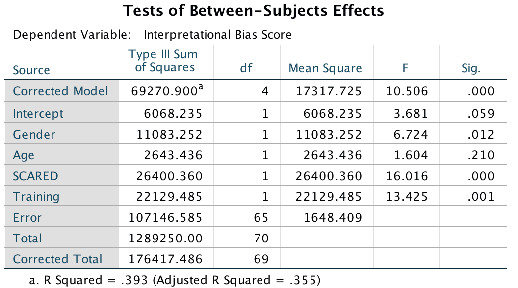
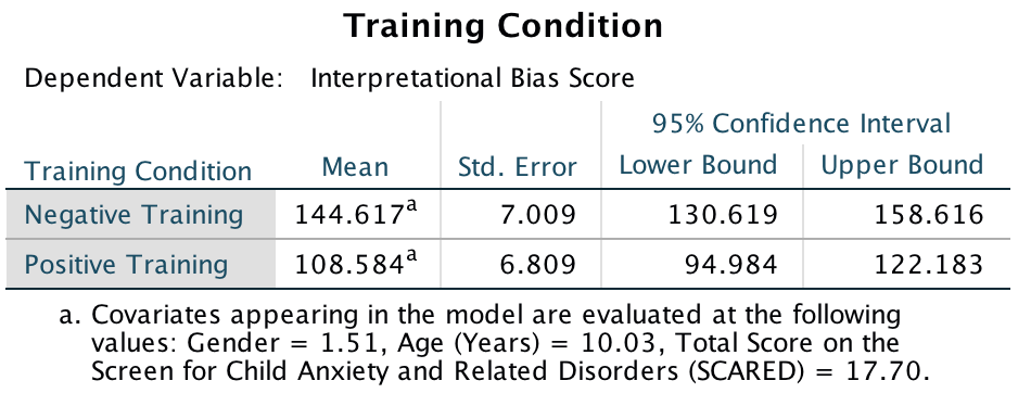
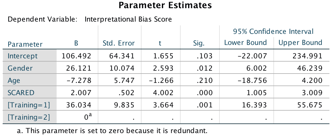
In the main table, we can see that even after partialling out the effects of age, gender and natural anxiety, the training had a significant effect on the subsequent bias score, F(1, 65) = 13.43, p < .001.
Output
The adjusted means tell us that interpretational biases were stronger (higher) after negative training (adjusting for age, gender and SCARED). This result is as expected. It seems then that giving children feedback that tells them to interpret ambiguous situations negatively does induce an interpretational bias that persists into everyday situations, which is an important step towards understanding how these biases develop.
Output
In terms of the covariates, age did not have a significant influence on the acquisition of interpretational biases. However, anxiety and gender did.If we look at the Parameter Estimates table, we can use the beta values to interpret these effects. For anxiety (SCARED), b = 2.01, which reflects a positive relationship. Therefore, as anxiety increases, the interpretational bias increases also (this is what you would expect, because anxious children would be more likely to naturally interpret ambiguous situations in a negative way). If you draw a scatterplot of the relationship between SCARED and Interpretational_Bias you’ll see a very nice positive relationship. For Gender, b = 26.12, which again is positive, but to interpret this we need to know how the children were coded in the data editor. Boys were coded as 1 and girls as 2. Therefore, as a child ‘changes’ (not literally) from a boy to a girl, their interpretational biases increase. In other words, girls show a stronger natural tendency to interpret ambiguous situations negatively. This is consistent with the anxiety literature, which shows that females are more likely to have anxiety disorders.
Output
One important thing to remember is that although anxiety and gender naturally affected whether children interpreted ambiguous situations negatively, the training (the experiences on the alien planet) had an effect adjusting for these natural tendencies (in other words, the effects of training cannot be explained by gender or natural anxiety levels in the sample).
Have a look at the original article to see how Muris et al. reported the results of this analysis – this can help you to see how you can report your own data from an ANCOVA. (One bit of good practice that you should note is that they report effect sizes from their analysis – as you will see from the book chapter, this is an excellent thing to do.)
Chapter 14
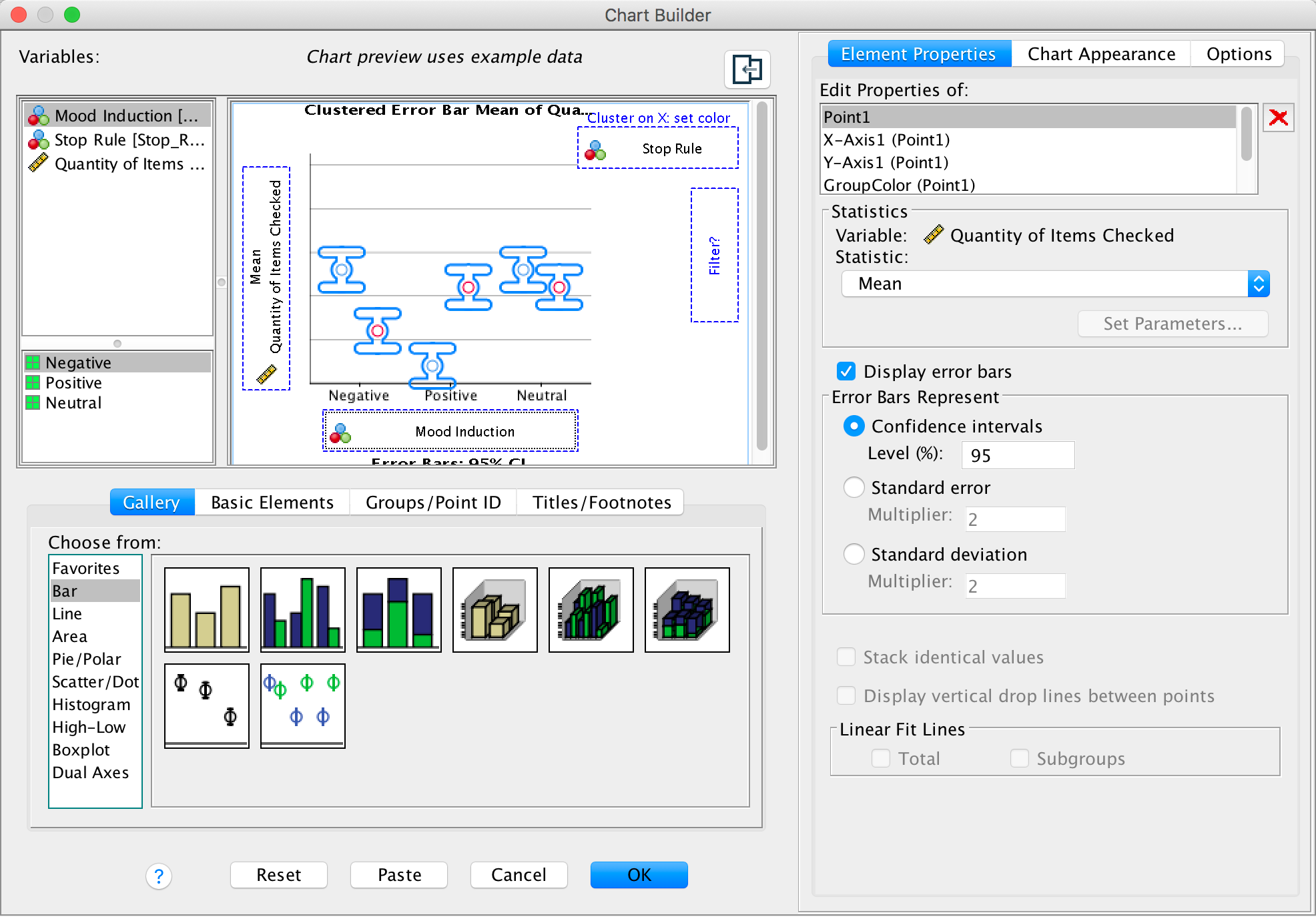
Going out on the pierce
To do an error bar chart for means that are independent (i.e., have
come from different groups) double-click on the clustered error bar
chart icon in the Chart Builder (see the book chapter) and drag
our variables into the appropriate drop zones. Drag
Alcohol into , drag
Group into  and drag
Sex it into
and drag
Sex it into  .
This will mean that error bars representing males and females will be
displayed in different colours. The completed dialog box should look
like this:
.
This will mean that error bars representing males and females will be
displayed in different colours. The completed dialog box should look
like this:
Completed dialog box
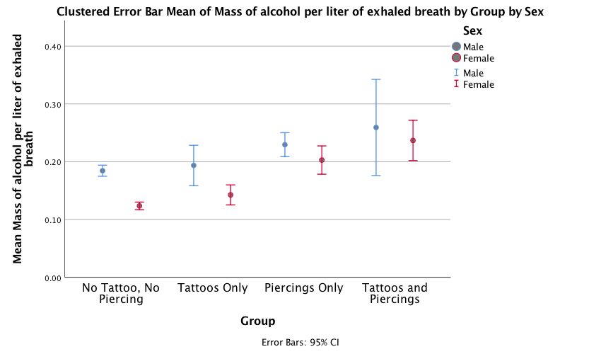
The error bar graph shows that in each group the men had consumed more alcohol than the women (the blue bars are taller than the red bars for all groups); this suggests that there may be a significant main effect of Sex. There is a steady increase in the volume of alcohol consumed as we move along the Group variable – the no tattoos, no piercing group consumed the least amount of alcohol and the tattoos and piercings group consumed the largest amount of alcohol – suggesting that there may be a significant main effect of Group. This trend appears to be the same for both men and women, suggesting that the interaction effect of Sex and Group is unlikely to be significant.
Output
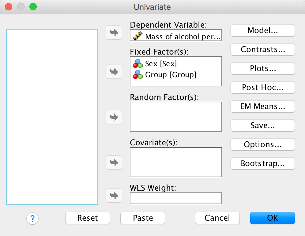
We need to conduct a 4 (experimental group) × 2 (gender) two-way independent ANOVA on the mass of alcohol per litre of exhaled breath. Select Analyze > General Linear Model > Univariate …. In the main dialog box, drag the dependent variable Alcohol from the to the space labelled Dependent Variable: . Select Group and Sex simultaneously by holding down Ctrl (⌘ on a Mac) while clicking on the variables and drag them to the Fixed Factor(s): box:
Output
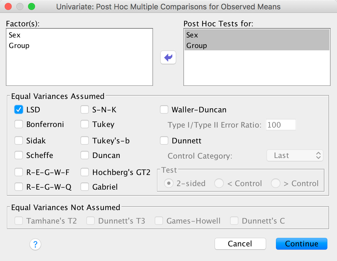
Let’s ask for some LSD post hoc tests (to mimic the article):
Output
Finally, we’ll ask for effect sizes:

Output
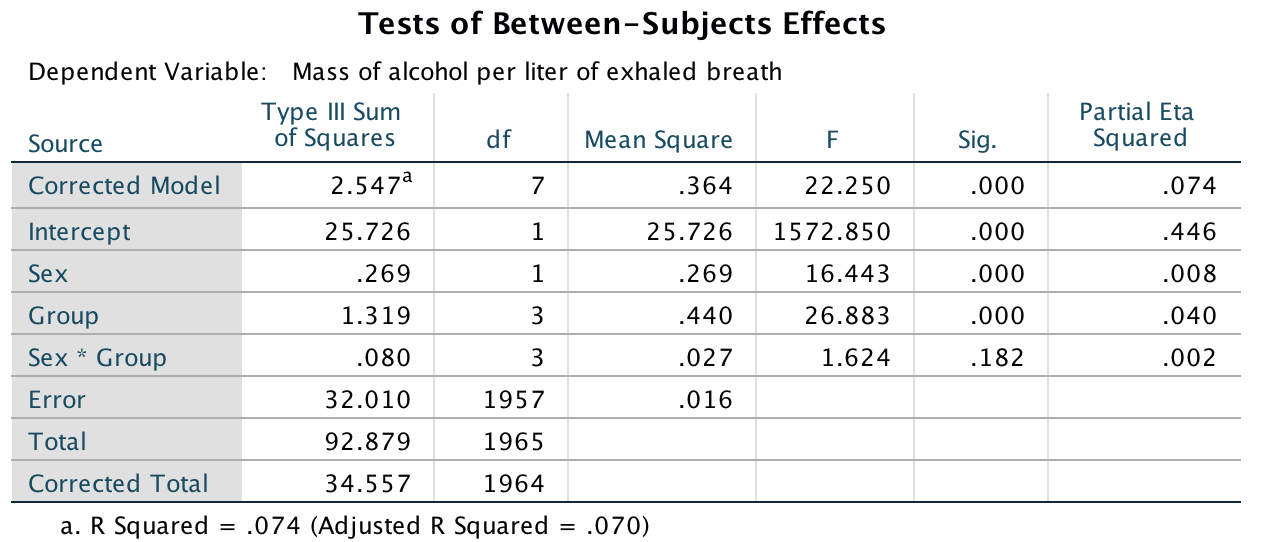
The main ANOVA shows a significant main effect of sex, F(1, 1957) = 16.44, p < .001,\(\eta_p^2 = .01\) with a partial eta squared of .01. Men (M = 0.19, SD = 0.15) consumed a significantly higher mass of alcohol than women (M = 0.15, SD = 0.11).
Output
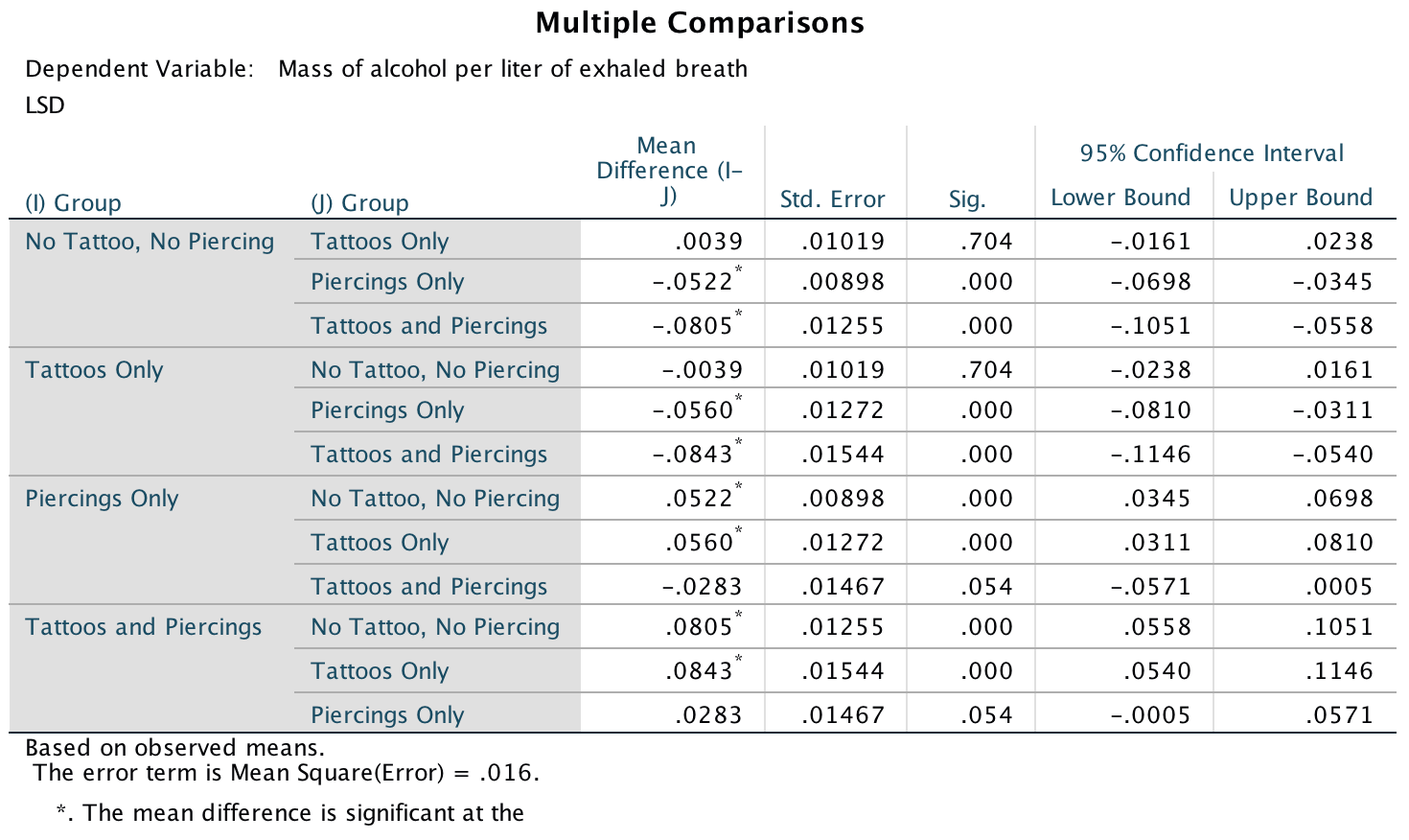
There was also a significant main effect of group, F(3, 1957) = 26.88, p < .001, \(\eta_p^2 = .04\). Post hoc tests (Output 3) revealed that participants who had only piercings (M = 0.22) consumed a significantly greater mass of alcohol than those who only had tattoos (M = 0.17) (least significant difference (LSD) test, p < .001) and those who had no tattoos and no piercings (M = 0.15) (LSD test, p < .001). Participants who had both tattoos and piercings (M = 0.25) consumed a significantly greater mass of alcohol than those who only had tattoos (M = 0.17) (LSD test, p < .001), and those who had no tattoos and no piercings (M = 0.15) (LSD test, p < .001). However, they did not consume a significantly greater mass than those who only had piercings (M = 0.22) (LSD test, p = .05).
This effect of group was not significantly moderated by the biological sex of the participant, F(3, 1957) = 1.62, p = .182, \(\eta_p^2 = .002\). This nonsignificant interaction implies that the effects we just described were comparable for males and females (especially given the large sample size).
Output
Don’t forget your toothbrush
To do an error bar chart for means that are independent (i.e., have
come from different groups) double-click on the clustered error bar
chart icon in the Chart Builder (see the book chapter) and drag
our variables into the appropriate drop zones. Drag
Checks into , drag
Mood into and drag
Stop_Rule it into .
This will mean that error bars representing people using different stop
rules will be displayed in different colours. The completed dialog box
should look like this:
Completed dialog box
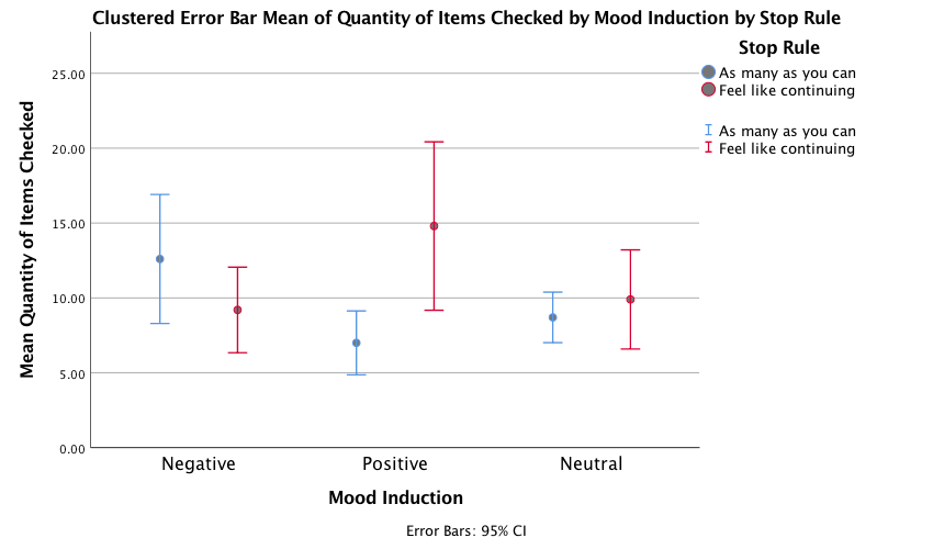
The error bar graph shows that when in a nagetive mood people performed more checks when using an as many as can stop rule than when using a feel like continuing stop rule. In a positive mood the oppsoite was true, and in neutral moods the number of cheks was very similar in the two stop rule conditions.
Output
Select Analyze > General Linear Model > Univariate …. In the main dialog box, drag the dependent variable Checks from the to the space labelled Dependent Variable: . Select Mood and Stop_Rule simultaneously by holding down Ctrl (⌘ on a Mac) while clicking on the variables and drag them to the Fixed Factor(s): box:
Output
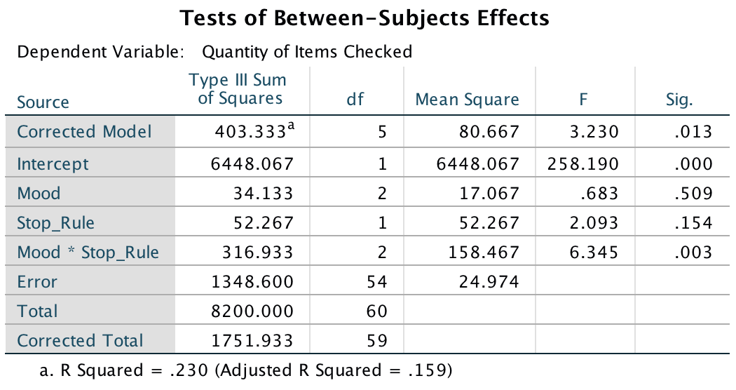
The resulting output can be interpreted as follows. The main effect of mood was not significant, F(2, 54) = 0.68, p = .51, indicating that the number of checks (when we ignore the stop rule adopted) was roughly the same regardless of whether the person was in a positive, negative or neutral mood. Similarly, the main effect of stop rule was not significant, F(1, 54) = 2.09, p = .15, indicating that the number of checks (when we ignore the mood induced) was roughly the same regardless of whether the person used an ‘as many as can’ or a ‘feel like continuing’ stop rule. The mood × stop rule interaction was significant, F(2, 54) = 6.35, p = .003, indicating that the mood combined with the stop rule significantly affected checking behaviour. Looking at the graph, a negative mood in combination with an ‘as many as can’ stop rule increased checking, as did the combination of a ‘feel like continuing’ stop rule and a positive mood, just as Davey et al. predicted.
Output
Chapter 15
Are splattered cadavers distracting?
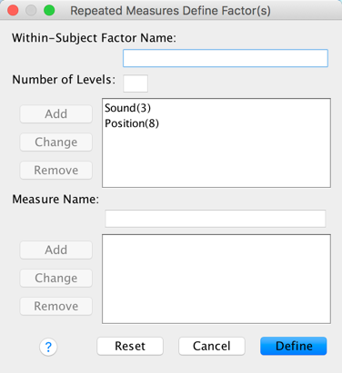
Select Analyze > General Linear Model > Reperated measures
… . In the define factors dialog box supply a name for the
first within-subject (repeated-measures) variable. The first
repeated-measures variable we’re going to ender is the type of sound
(quiet, liked or disliked), so replace the word factor1 with
the word Sound. Next, specify how many levels there were (i.e.,
how many experimental conditions there were). In this case, there were
three type of sound, so enter the number 3 into the box labelled
Number of Levels:. Click  to add this
variable to the list of repeated-measures variables. This variable will
now appear as Sound(3). Repeat this process for the second
independent variable, the position of the letter in the list, by
entering the word Position into the space labelled
Within-Subject Factor Name: and then, because there were eight
levels of this variable, enter the number 8 into the space labelled
Number of Levels:. Again click and this
variable will appear as Position(8). The finished dialog box is
shown below.
to add this
variable to the list of repeated-measures variables. This variable will
now appear as Sound(3). Repeat this process for the second
independent variable, the position of the letter in the list, by
entering the word Position into the space labelled
Within-Subject Factor Name: and then, because there were eight
levels of this variable, enter the number 8 into the space labelled
Number of Levels:. Again click and this
variable will appear as Position(8). The finished dialog box is
shown below.
Completed dialog box
Once you are in the main dialog box (Figure 2) you are required to replace the question marks with variables from the list on the left-hand side of the dialog box. In this design, if we look at the first variable, Sound, there were three conditions, like, dislike and quiet. The quiet condition is the control condition, therefore for this variable we might want to compare the like and dislike conditions with the quiet condition. In terms of conducting contrasts, it is therefore essential that the quiet condition be entered as either the first or last level of the independent variable Sound (because you can’t specify the middle level as the reference category in a simple contrast). I have coded quiet = level 1, liked = level 2 and disliked = level 3.
Now, let’s think about the second factor Position. This variable doesn’t have a control category and so it makes sense for us to just code level 1 as position 1, level 2 as position 2 and so on for ease of interpretation. Coincidentally, this order is the order in which variables are listed in the data editor. Actually it’s not a coincidence: I thought ahead about what contrasts would be done, and then entered variables in the appropriate order:
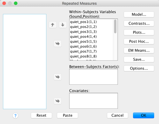
Completed dialog box
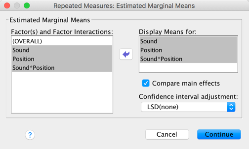
In the Estimated Marginal Means dialog box drag all of the effects to the box labelled Display Means for:, select ro Compare main effects and choose an appropriate correction (I chose LSD(none), which isn’t an appropriate correction but there you go …). These tests are interesting only if the interaction effect is not significant.
Completed dialog box
The plots dialog box is a convenient way to plot the means
for each level of the factors (although really you should do some proper
graphs before the analysis). Drag Position to the space
labelled Horizontal Axis and Sound to the
space labelled Separate Lines and click . I also selected
to include error bars.
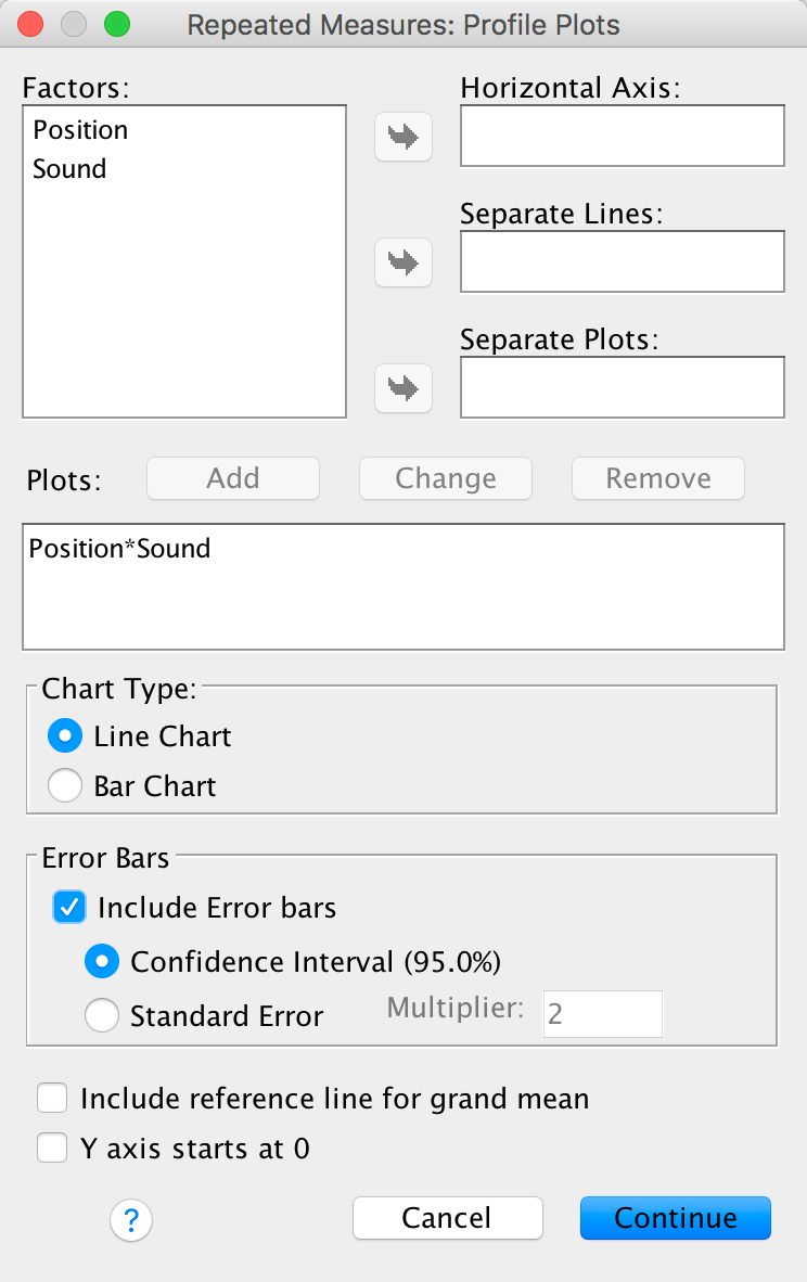
Completed dialog box
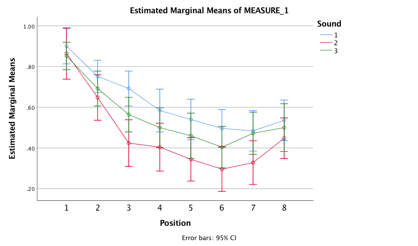
The resulting plot displays the estimated marginal means of letters recalled in each of the positions of the lists when no music was played (blue line), when liked music was played (red line) and when disliked music was played (green line). The chart shows that the typical serial curve was elicited for all sound conditions (participants’ memory was best for letters towards the beginning of the list and at the end of the list, and poorest for letters in the middle of the list) and that performance was best in the quiet condition, poorer in the disliked music condition and poorest in the liked music condition.
Output
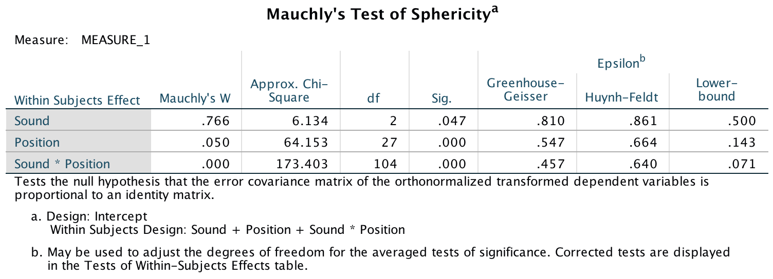
Mauchly’s test shows that the assumption of sphericity has been broken for both of the independent variables and also for the interaction. In the book I advise you to routinely interpret the Greenhouse-Geisser corrected values for the main model anyway, but for these data this is certainly a good idea.
Output
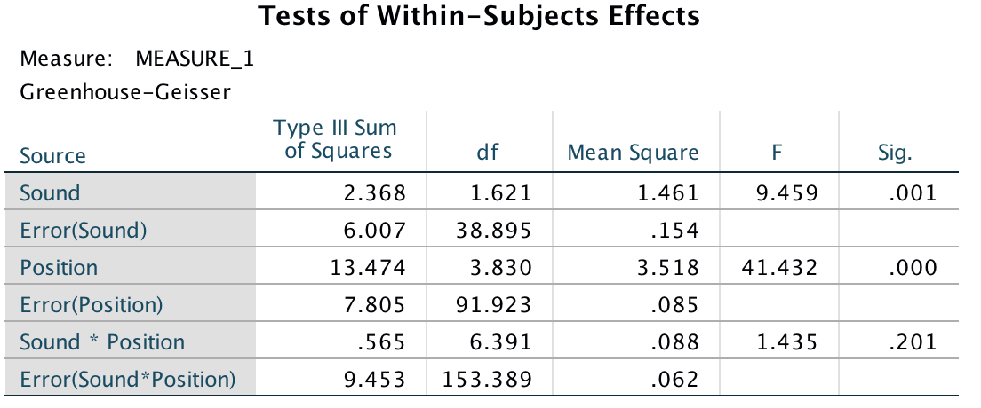
The main ANOVA summary table (which, as I explain in the book, I have edited to show only the Greenhouse-Geisser correct values) shows a significant main effect of the type of sound on memory performance F(1.62, 38.90) = 9.46, p = .001. Looking at the earlier graph, we can see that performance was best in the quiet condition, poorer in the disliked music condition and poorest in the liked music condition. However, we cannot tell where the significant differences lie without looking at some contrasts or post hoc tests. There was also a significant main effect of position, F(3.83, 91.92) = 41.43, p < 0.001, but no significant position by sound interaction, F(6.39, 153.39) = 1.44, p = 0.201.
Output
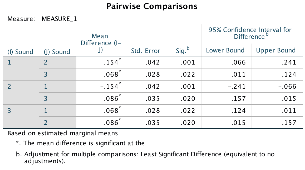
The main effect of position was significant because of the production of the typical serial curve, so post hoc analyses were not conducted. However, we did conduct post hoc least significant difference (LSD) comparisons on the main effect of sound. These post hoc tests revealed that performance in the quiet condition (level 1. was significantly better than both the liked condition (level 2), p = .001, and in the disliked condition (level 3), p = .022. Performance in the disliked condition (level 3) was significantly better than in the liked condition (level 2), p = 0.020. We can conclude that liked music interferes more with performance on a memory task than disliked music.
Output
Chapter 16
The objection of desire
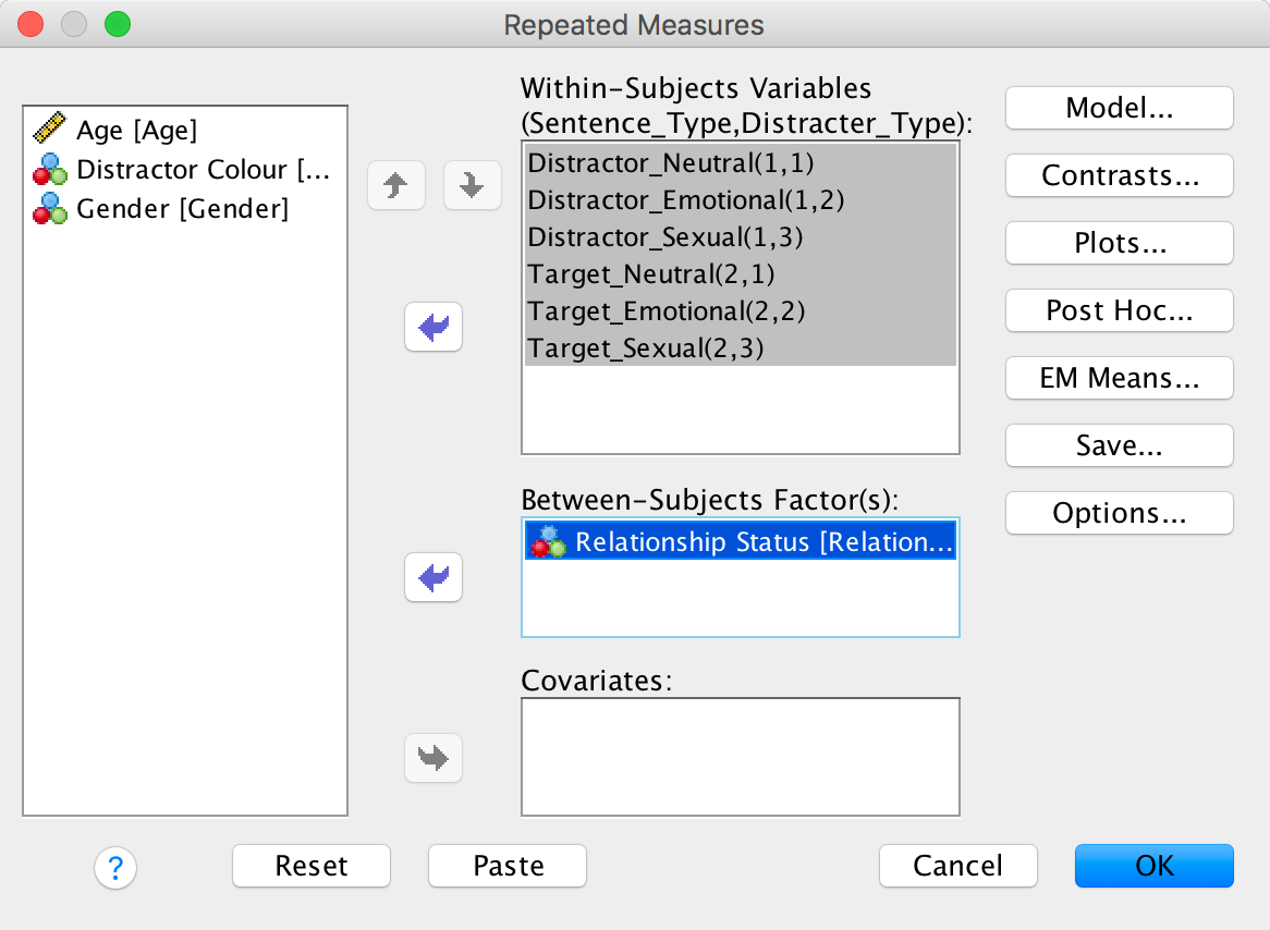
There are two repeated-measures variables: whether the target picture was of a male or female (let’s call this TargetGender) and whether the target picture was upright or inverted (let’s call this variable TargetLocation). The resulting model will be a 2 (TargetGender: male or female) × 2 (TargetLocation: upright or inverted) × 2 (Gender: male or female) three-way mixed ANOVA with repeated measures on the first two variables. Select Analyze > General Linear Model > Reperated measures … and complete the initial dialog box as follows:
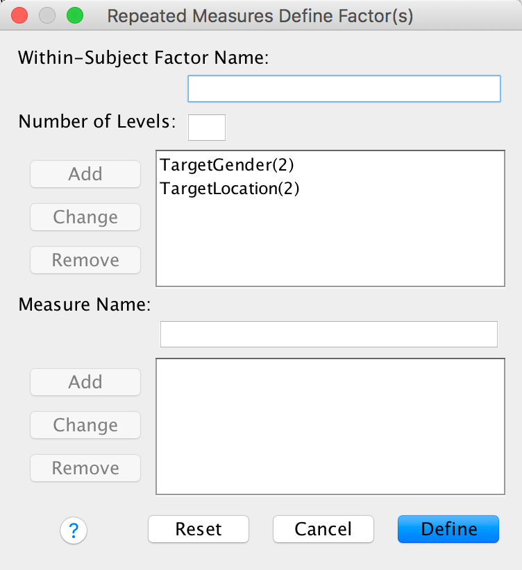
Completed dialog box
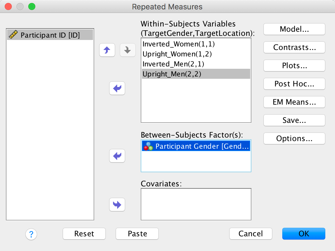
Next, we need to define these variables that we just created (TargetGender and TargetLocation) by specifying the columns in the data editor that relate to the different combinations of the gender and orientation of the picture:
Completed dialog box
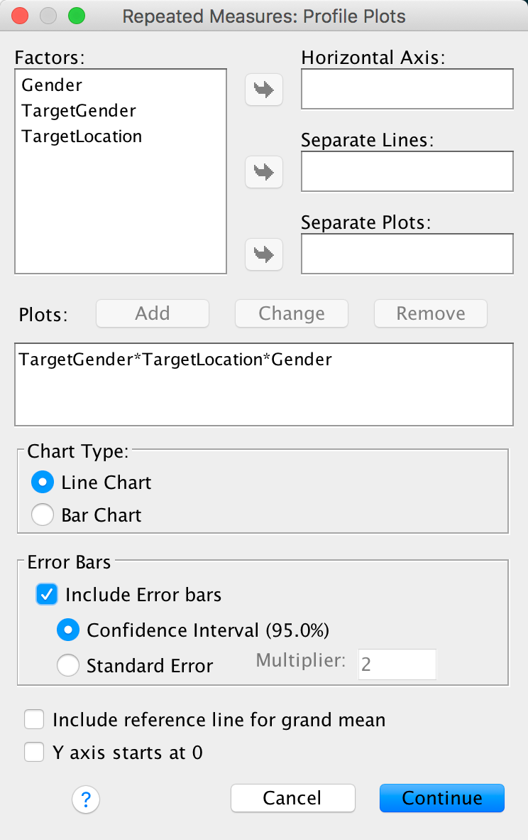
You could also ask for an interaction graph for the three-way interaction:
Completed dialog box
You can set other options as in the book chapter.
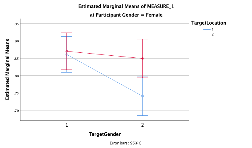
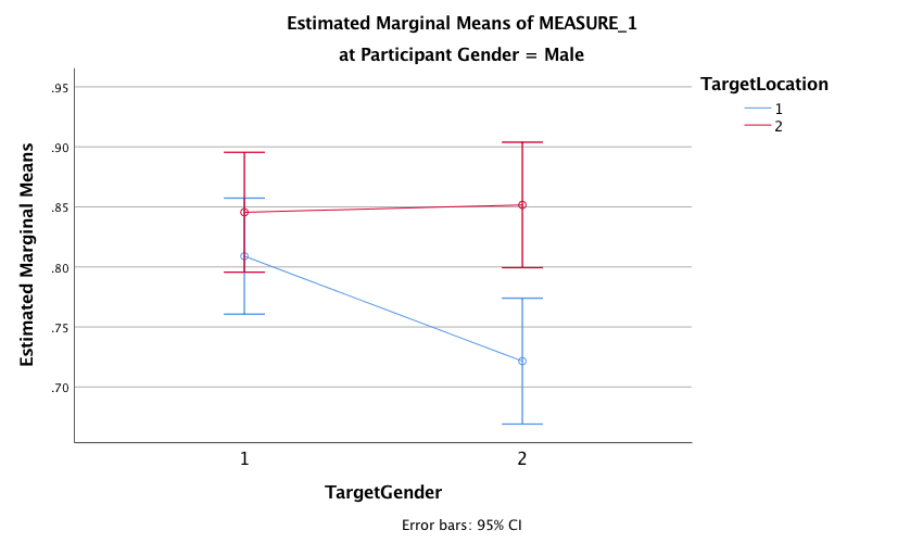
The plot for the two-way interaction between target gender and target location for female participants shows that when the target was of a female (i.e., when Target Gender = 1. female participants correctly recognized a similar number of inverted (blue line) and upright (red line) targets, indicating that there was no inversion effect for female pictures. We can tell this because the dots are very close together. However, when the target was of a male (Target Gender = 2), the female participants’ recognition of inverted male targets was very poor compared with their recognition of upright male targets (the dots are very far apart), indicating that the inversion effect was present for pictures of males.
Output
The plot for the two-way interaction between target gender and target location for male participants shows that there appears to be a similar pattern of results as for the female participants: when the target was of a female (i.e., when Target Gender = 1) male participants correctly recognized a fairly similar number of inverted (blue line) and upright (red line) targets, indicating no inversion effect for the female target pictures. We can tell this because the dots are reasonably together. However, when the target was of a male (Target Gender = 2), the male participants’ recognition of inverted male targets was very poor compared with their recognition of upright male targets (the dots are very far apart), indicating the presence of the inversion effect for male target pictures. The fact that the pattern of results were very similar for male and female participants suggests that there may not be a significant three-way interaction between target gender, target location and participant gender
Output
Because both of our repeated-measures variables have only two levels, we do not need to worry about sphericity. As such I have edited the main summary table to show the effects when sphericity is assumed (see the book for how to do this). We could report these effects as follows:
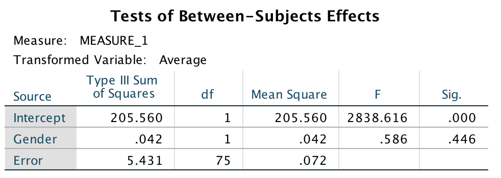
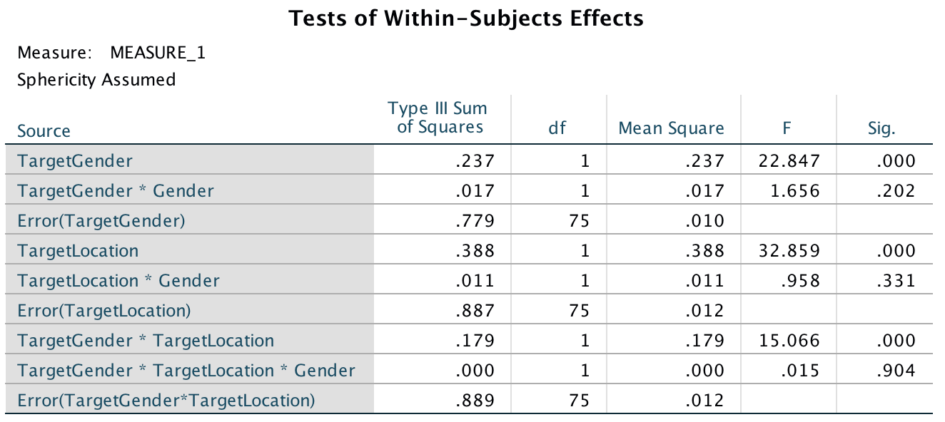
- There was a significant interaction between target gender and target location, F(1, 75) = 15.07, p < .001, η2 = .167, indicating that if we ignore whether the participant was male or female, the relationship between recognition of upright and inverted targets was different for pictures depicting men and women. The two-way interaction between target location and participant gender was not significant, F(1, 75) = .96, p = .331, η2 = .013, indicating that if we ignore whether the target depicted a picture of a man or a woman, male and female participants did not significantly differ in their recognition of inverted and upright targets. There was also no significant three-way interaction between target gender, target location and participant gender, F(1, 75) = .02, p = .904, η2 = .000, indicating that the relationship between target location (whether the target picture was upright or inverted) and target gender (whether the target was of a male or female) was not significantly different in male and female participants.
Output
Output
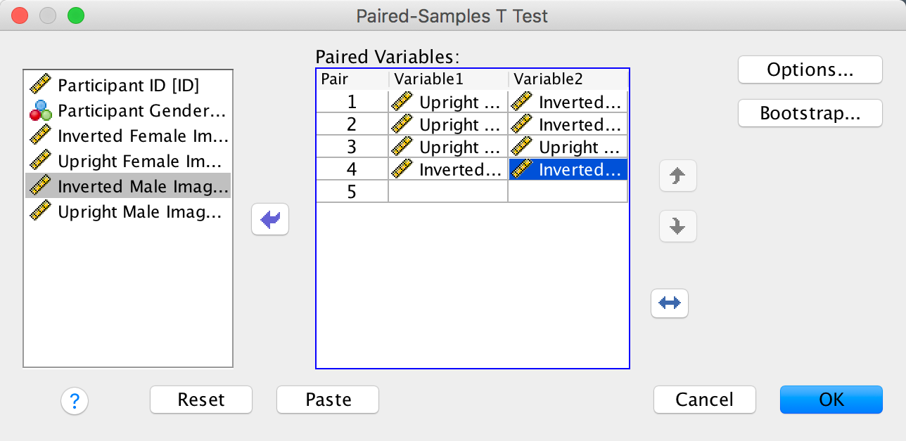
The next part of the question asks us to follow up the analysis with t-tests looking at inversion and gender effects. To do this , we need to conduct four paired-samples t-tests. Once you have the Paired-Samples T- Test dialog box open, transfer pairs of varialbles from the left-hand side to the box labelled Paired Variables. The first pair I am going to compare is Upright Female vs. Inverted Female, to look at the inversion effect for female pictures. The next pair will be Upright Male vs. Inverted Male, and this comparison will investigate the inversion effect for male pictures. To look at the gender effect for upright pictures we need to compare Upright Female vs. Upright Male. Finally, to look at the gender effect for inverted pictures we need to compare the variables Inverted Female and Inverted Male. Your complated dialog box should look like this:
Completed dialog box
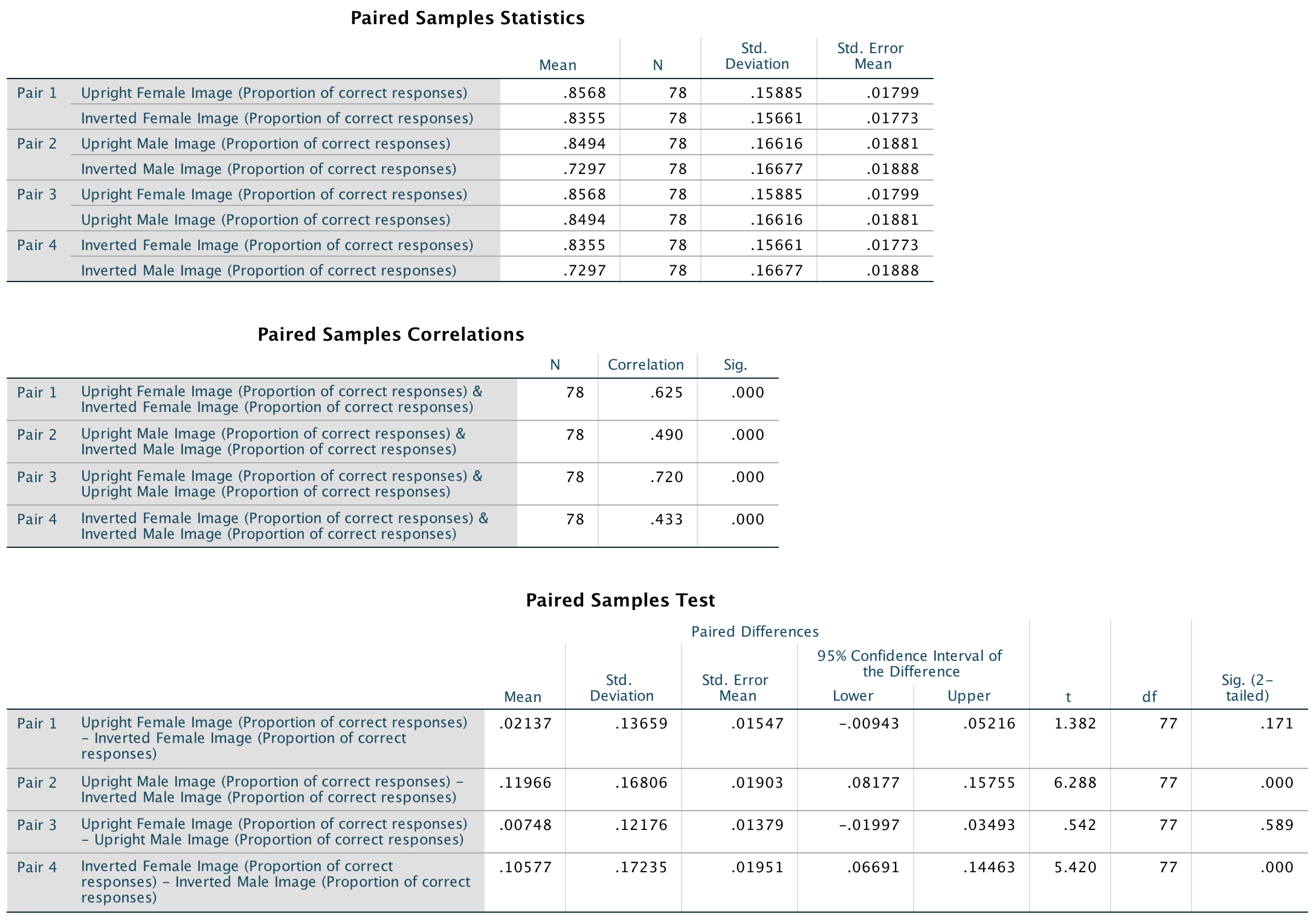
The results of the paired samples t-tests show that people recognized upright males (M = 0.85, SD = 0.17) significantly better than inverted males (M = 0.73, SD = 0.17), t(77) = 6.29, p < .001, but this pattern did not emerge for females, t(77) = 1.38, p = .171. Additionally, participants recognized inverted females (M = 0.83, SD = 0.16) significantly better than inverted males (M = 0.73, SD = 0.17), t(77) = 5.42, p < .001. This effect was not found for upright males and females, t(77) = 0.54, p = .59. Note: the sign of the t-statistic will depend on which way round you entered the variables in the Paired-Samples T Test dialog box.
Output
Consistent with the authors’ hypothesis, the results showed that the inversion effect emerged only when participants saw sexualized males. This suggests that, at a basic cognitive level, sexualized men were perceived as people, whereas sexualized women were perceived as objects.
Keep the faith(ful)?
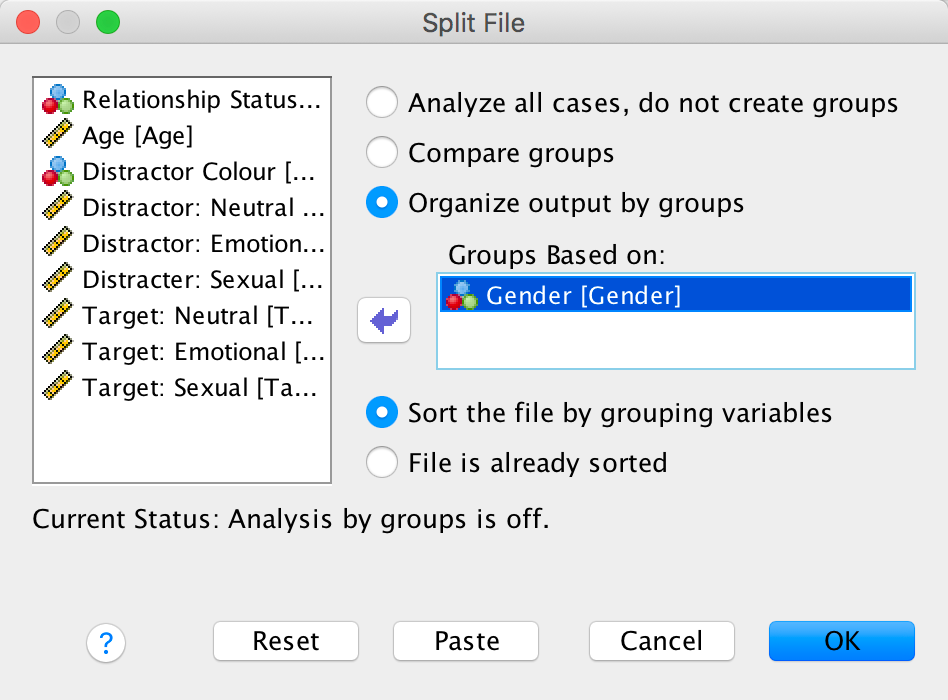
We want to run these analyses on men and women separately. An efficient way to do this ism to split the file by the variable Gender (see the book):
Completed dialog box
For the main model there are two repeated-measures variables: whether the sentence was a distractor or a target (let’s call this Sentence_Type) and whether the distractor used on a trial was neutral, indicated sexual infidelity or emotional infidelity (let’s call this variable Distracter_Type). The resulting model will be a 2 (relationship: with partner or not) × 2 (sentence type: distractor or target) × 3 (distractor type: neutral, emotional infidelity or sexual infidelity) three-way mixed ANOVA with repeated measures on the last two variables. First, we must define our two repeated-measures variables. Select Analyze > General Linear Model > Reperated measures … and complete the initial dialog box as follows:
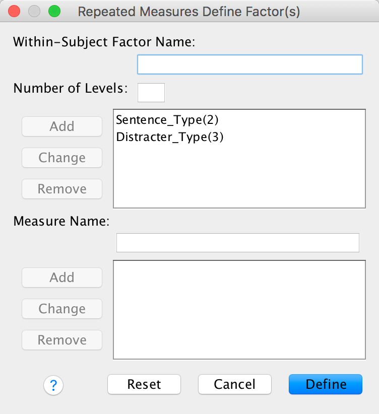
Completed dialog box
Next, we need to define these variables by specifying the columns in the data editor that relate to the different combinations of the type of sentence and the type of trial. As you can see in the figure below, because we specified Sentence_Type first we have all of the variables relating to distractors specified before those for targets. For each type of sentence there are three different variants, depending on whether the distractor used was neutral, emotional or sexual. Note that we have use the same order for both types of sentence (neutral, emotional, sexual) and that we have put neutral distractors as the first category so that we can look at some contrasts (neutral distractors are the control).
Completed dialog box
Use the Contrasts dialog box to select some simple contrasts comparing everything to the first category:
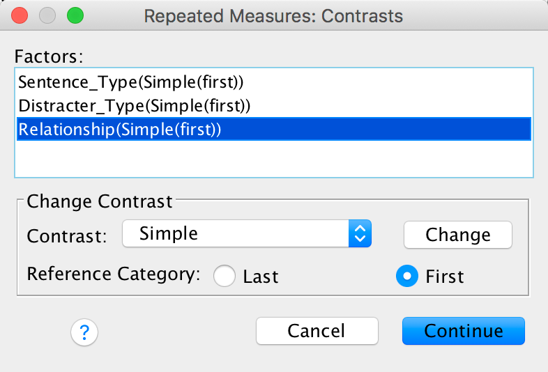
Completed dialog box
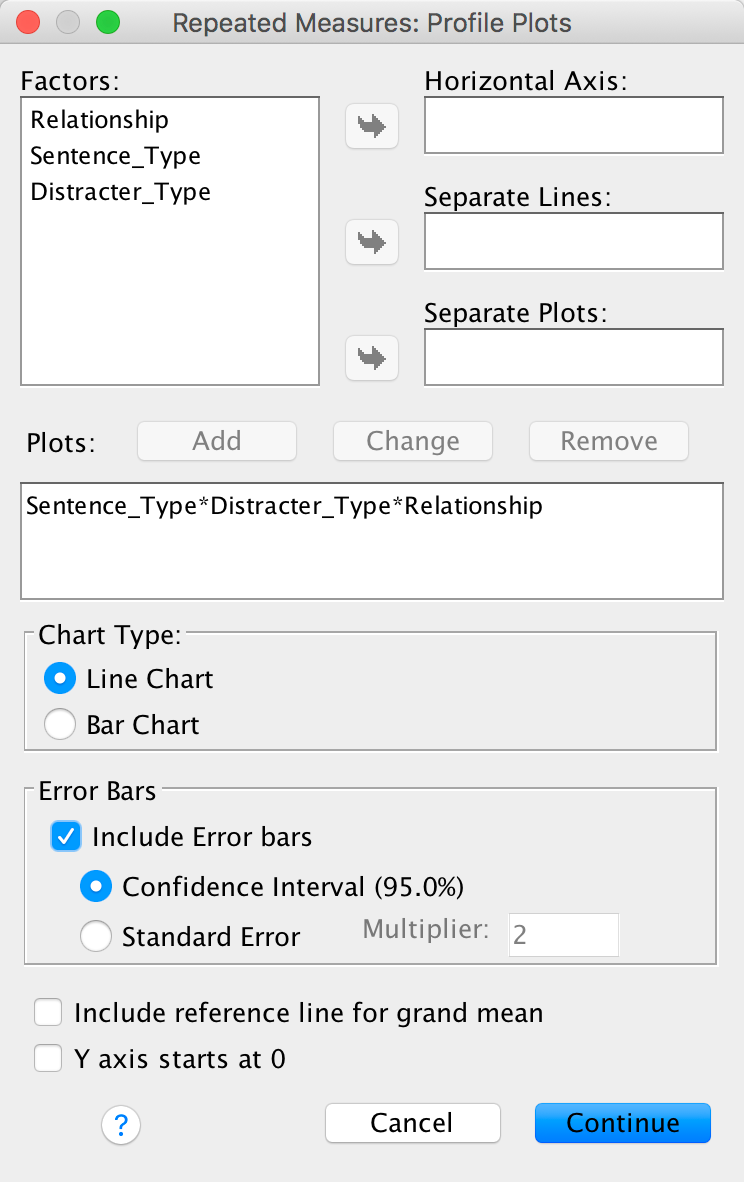
Specify a graph for the three-way interaction with error bars:
Completed dialog box
Set other options as in the book chapter.
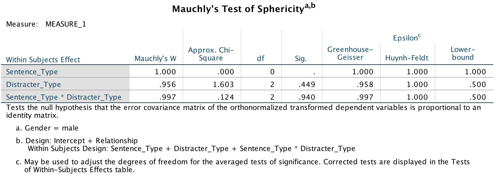
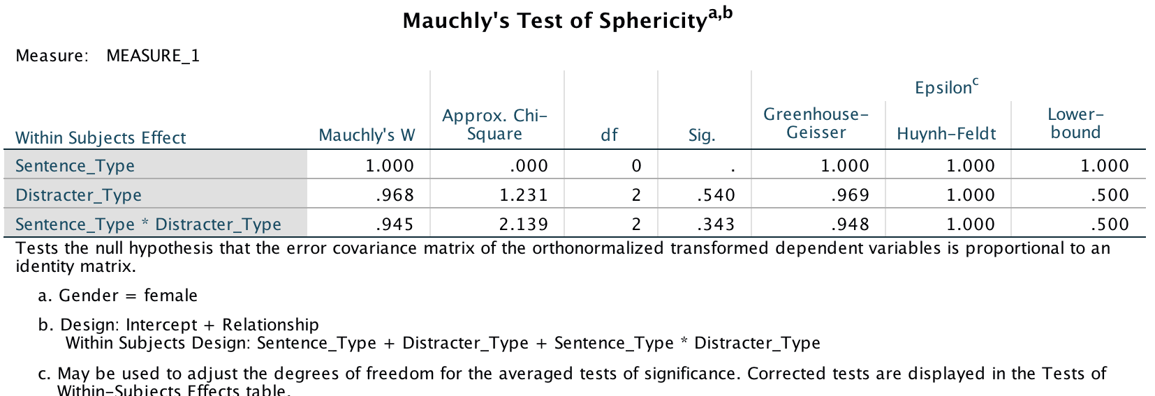
The sphericity tests are all non-significant, which means we can assume sphericity. In the book I recommend to ignore this test and routinely interpret Greenhouse-Geisser corrected values, but that’s not what the authors did so in keeping with what they did I have simplified the main output to show only the sphericity assumed tests (you can find out how to do this in the book):
Output
Output
We could report these effects as follows:
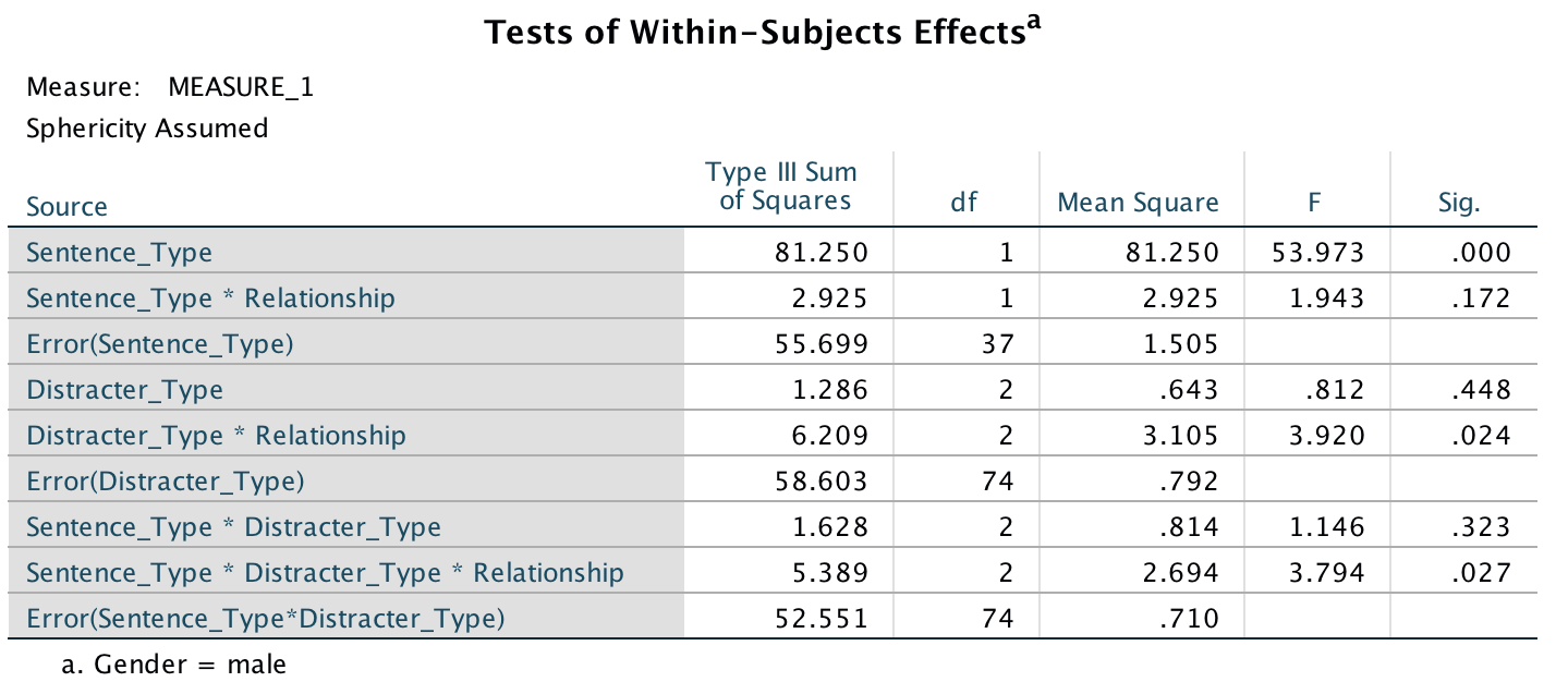
- A three-way ANOVA with current relationship status as the between-subjects factor and men’s recall of sentence type (targets vs. distractors) and distractor type (neutral, emotional infidelity and sexual infidelity) as the within-subjects factors yielded a significant main effect of sentence type, F(1, 37) = 53.97, p < .001, and a significant interaction between current relationship status and distractor content, F(2, 74) = 3.92, p = .024. More important, the three-way interaction was also significant, F(2, 74) = 3.79, p = .027. The remaining main effects and interactions were not significant, Fs < 2, ps > .17.
To pick apart the three-way interaction we can look at the table of contrasts:
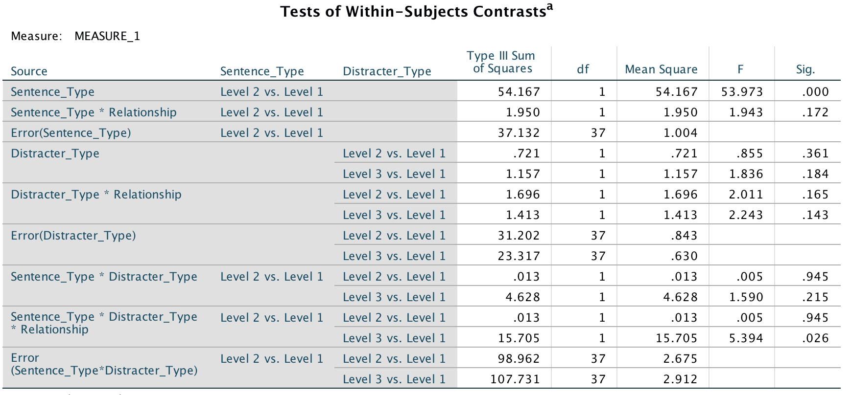
Output
The contrasts for the three way interaction in this table tell us that the effect of whether or not you are in a relationship and whether you were remembering a distractor or target was similar in trials in which an emotional infidelity distractor was used compared to when a neutral distractor was used, F(1, 37) = .005, p = .95 (level 2 vs. level 1 in the table). However, as predicted, there is a difference in trials in which a sexual infidelity distractor was used compared to those in which a neutral distractor was used, F(1, 37) = 5.39, p = .026 (level 3 vs. level 1).
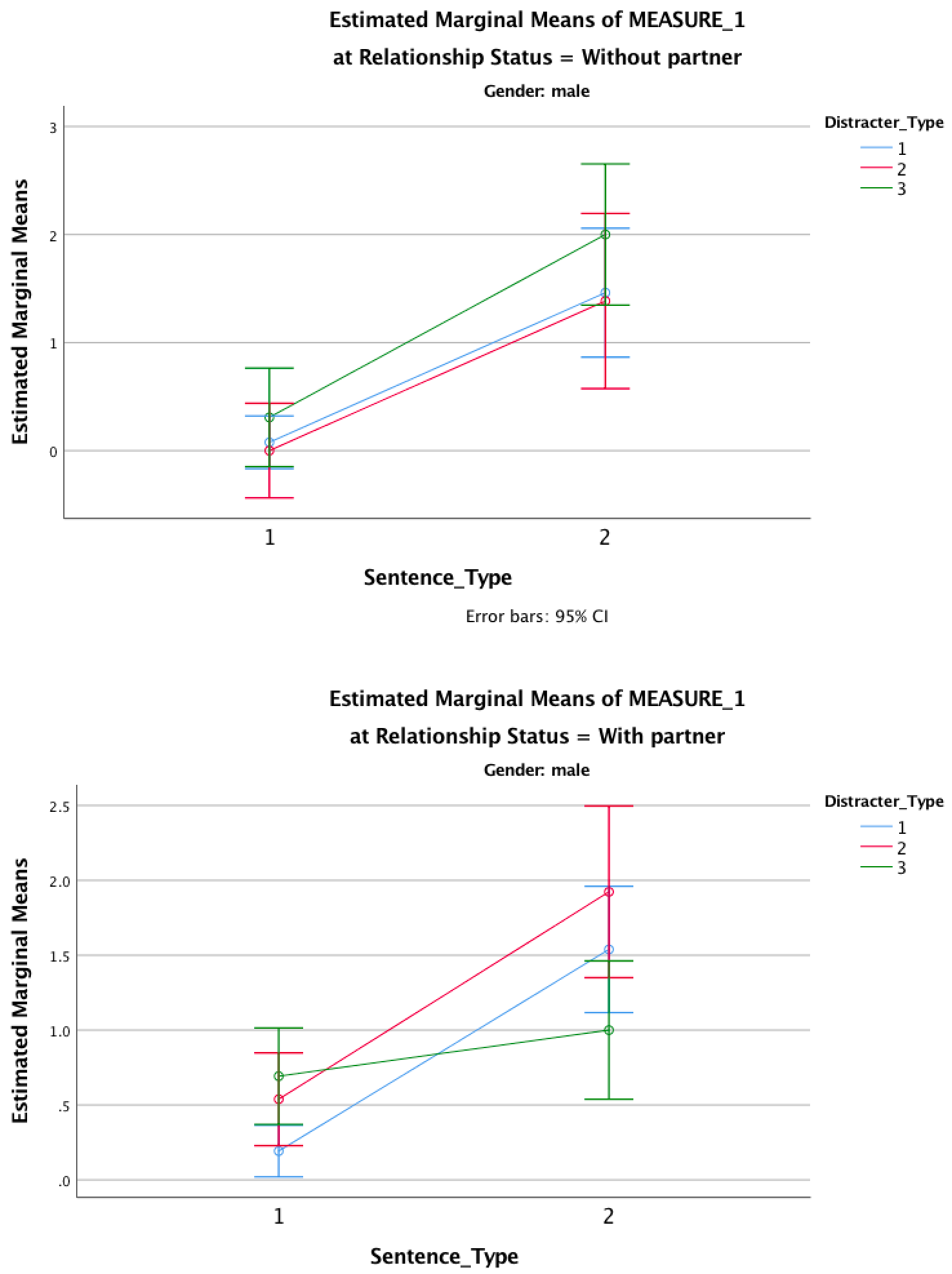
To further see what these contrasts tell us, look at the graphs below. First off, those without partners remember many more targets than they do distractors, and this is true for all types of trials. In other words, it doesn’t matter whether the distractor is neutral, emotional or sexual; these people remember more targets than distractors. The same pattern is seen in those with partners except for distractors that indicate sexual infidelity (the green line). For these, the number of targets remembered is reduced. Put another way, the slopes of the red and blue lines are more or less the same for those in and out of relationships (compare graphs) and the slopes are more or less the same as each other (compare red with blue). The only difference is for the green line, which is comparable to the red and blue lines for those not in relationships, but is much shallower for those in relationships. They remember fewer targets that were preceded by a sexual infidelity distractor. This supports the predictions of the author: men in relationships have an attentional bias such that their attention is consumed by cues indicative of sexual infidelity.
Output
Let’s now look at the women’s output. Sphericity tests are all non-significant and I’ve (again) simplified the main output to show only the sphericity assumed tests.
Output
Output
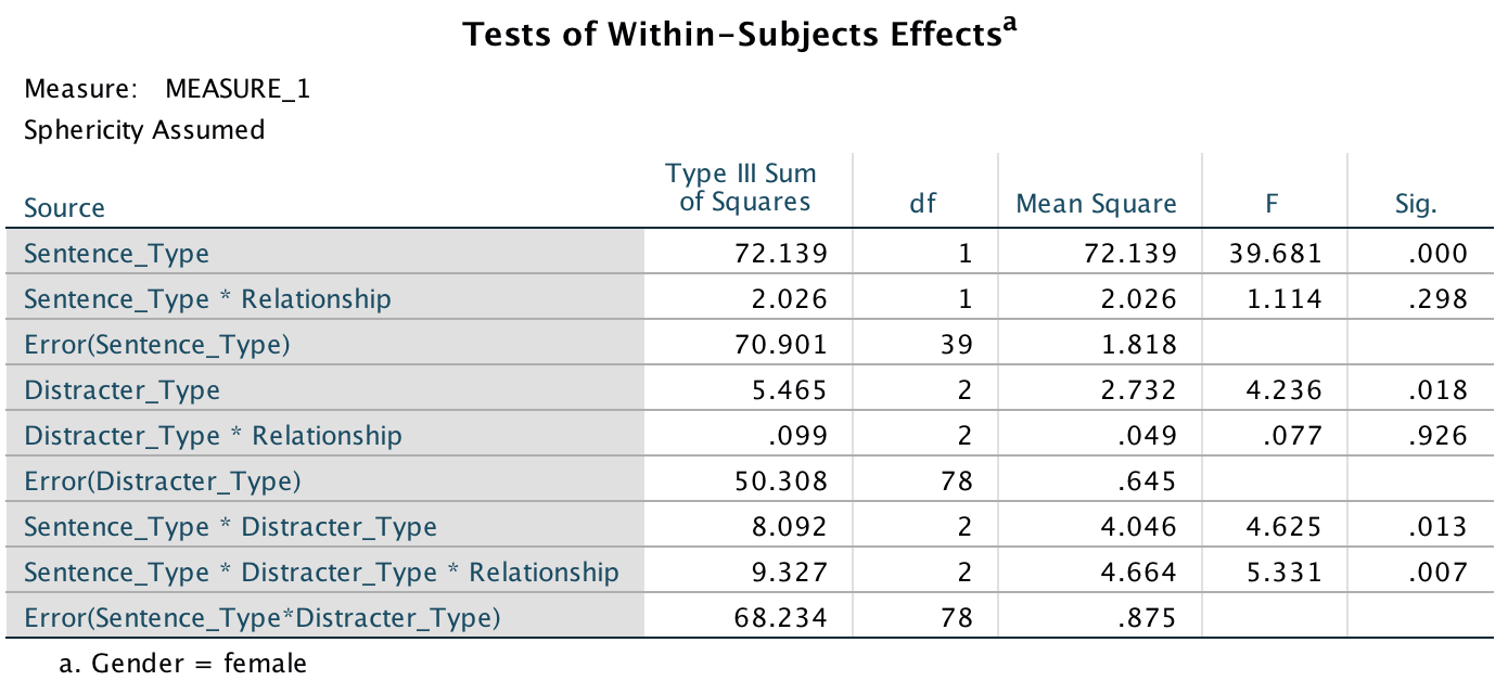
We could report these effects as follows:
- A three-way ANOVA with current relationship status as the between-subject factor and men’s recall of sentence type (targets vs. distractors) and distractor type (neutral, emotional infidelity and sexual infidelity) as the within-subject factors yielded a significant main effect of sentence type, F(1, 39) = 39.68, p < .001, and distractor type, F(2, 78) = 4.24, p = .018. Additionally, significant interactions were found between sentence type and distractor type, F(2, 78) = 4.63, p = .013, and, most important, sentence type × distractor type × relationship, F(2, 78) = 5.33, p = .007. The remaining main effect and interactions were not significant, F < 1.2, p > .29.
To pick apart the three-way interaction we can look at the contrasts for the three-way interaction. The contrasts tell us that the effect of whether or not you are in a relationship and whether you were remembering a distractor or target was significantly different in trials in which a emotional infidelity distractor was used compared to when a neutral distractor was used, F(1, 39) = 7.56, p = .009 (level 2 vs. level 1 in the table). However, there was not a significant difference in trials in which a sexual infidelity distractor was used compared to those in which a neutral distractor was used, F(1, 39) = 0.31, p = .58 (level 3 vs. level 1).
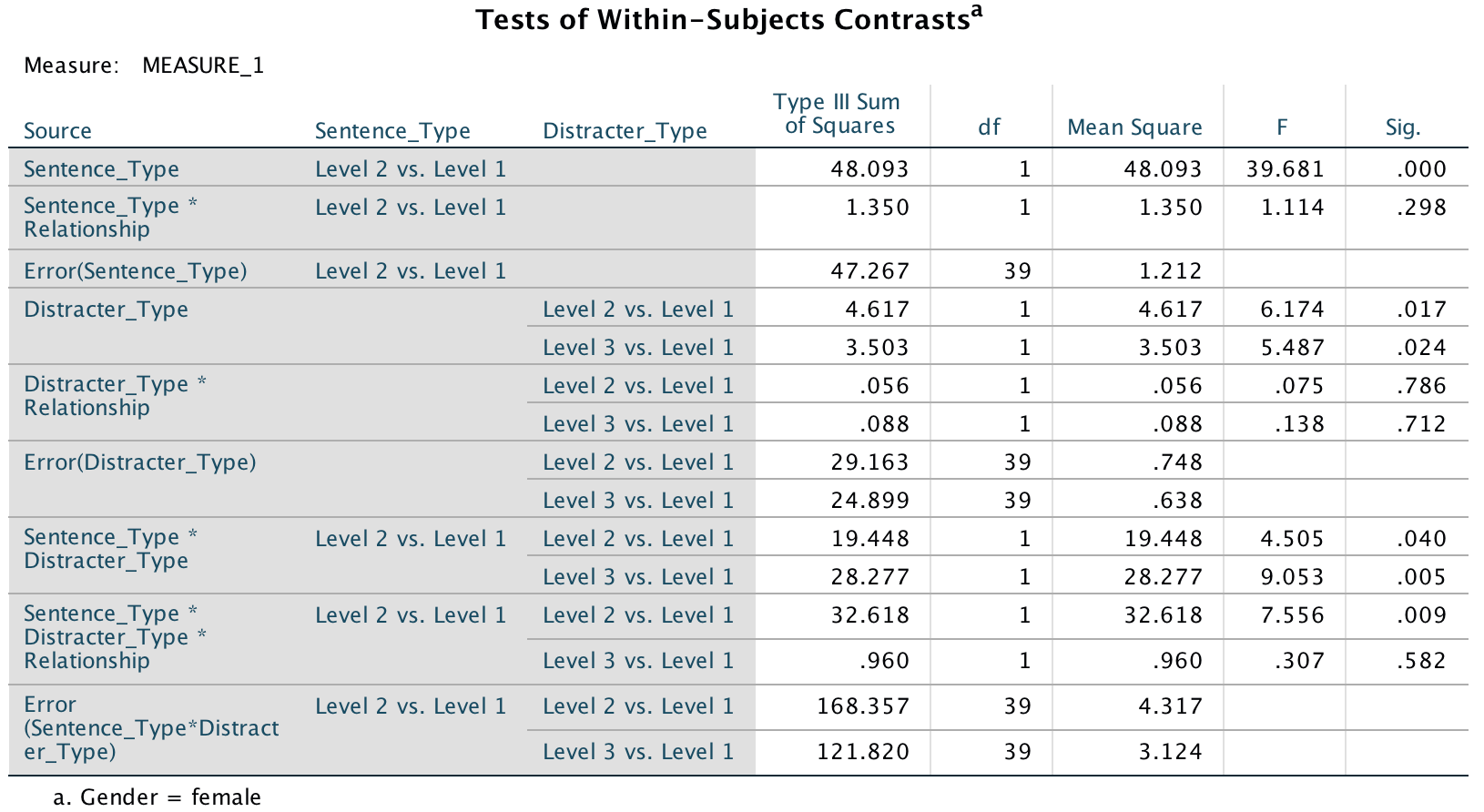
Output
The graphs we requested for the 3-way interaction illustrate what these contrasts tell us. As for the men, women without partners remember many more targets than they do distractors, and this is true for all types of trials (although it’s less true for the sexual infidelity trials because this line has a shallower slope). The same pattern is seen in those with partners except for distractors that indicate emotional infidelity (the red line). For these, the number of targets remembered is reduced. Put another way, the slopes of the green and blue lines are more or less the same for those in and out of relationships (compare graphs). The only difference is for the red line, which is much shallower for those in relationships. They remember fewer targets that were preceded by a emotional infidelity distractor. This supports the predictions of the author: women in relationships have an attentional bias such that their attention is consumed by cues indicative of emotional infidelity.
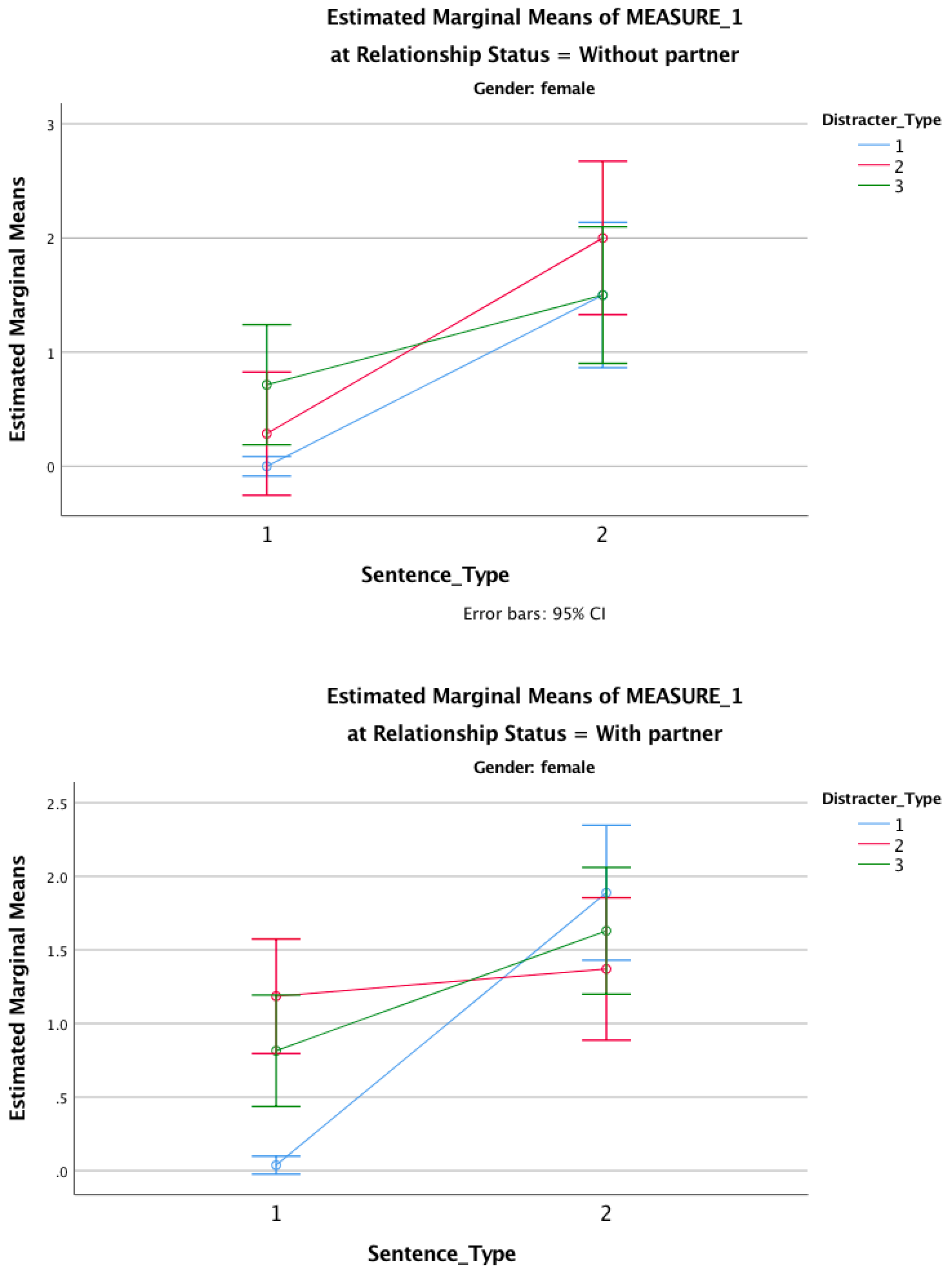
Output
Chapter 17
A lot of hot air!
To do the graph select Graphs > Chart Builder …, choose a
clustered error bar chart and drag Mood to . Next, select all
of the dependent variables (click on change in anxiety, then
hold Shift down and click on change in contempt and
all six should become highlighted) and drag them (simultaneously) into
. This will
have the effect that different moods will be displayed by
different-coloured bars:
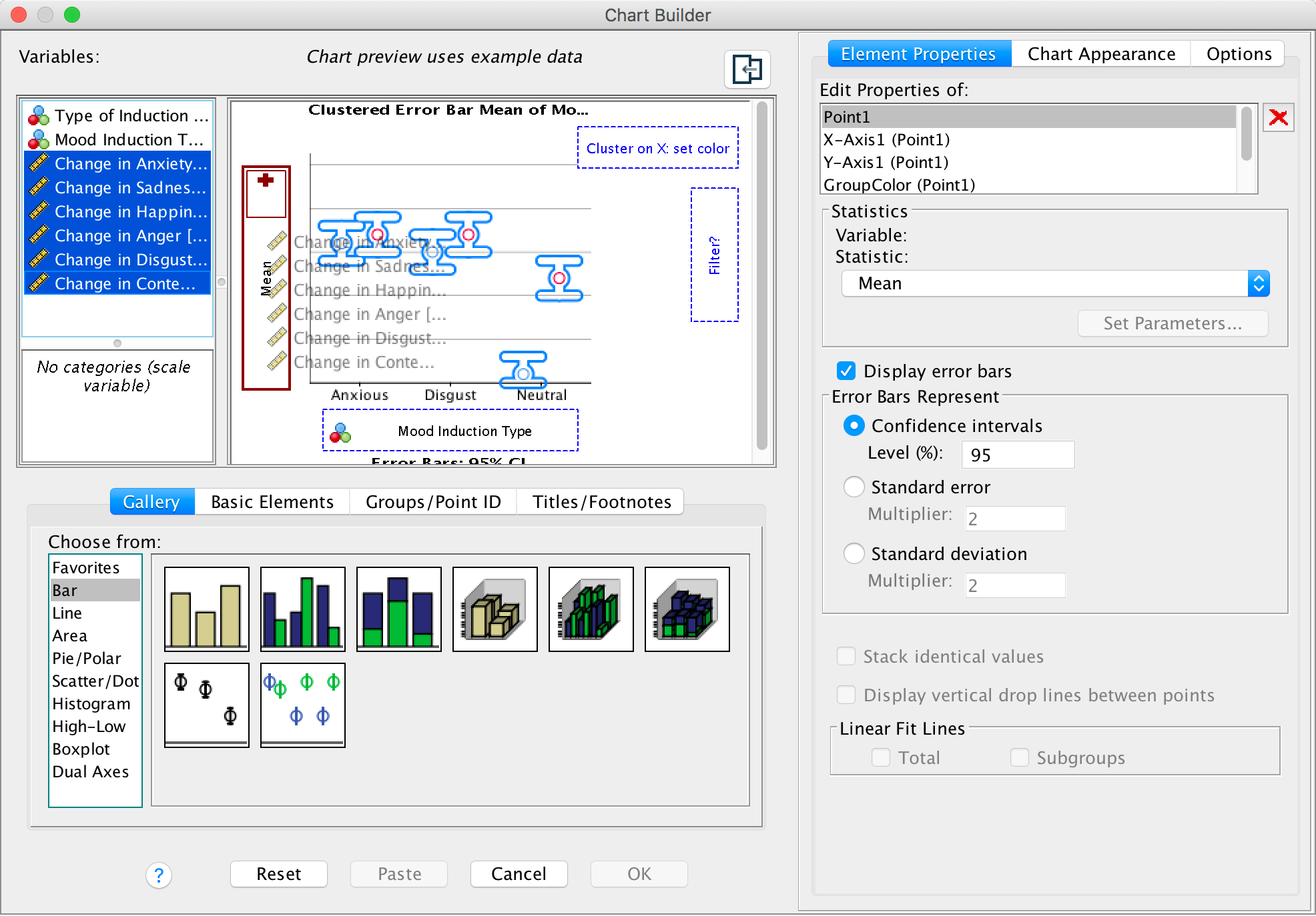
Completed dialog box
So far, so good, but we have another variable, the type of induction, that we want to plot. We can display this variable too. First, click on the Groups/Point ID tab and select Rows panel variable. Checking this option activates a new drop zone (called Panel?) on the bottom right of the canvas. Drag the type of induction into that zone as shown:
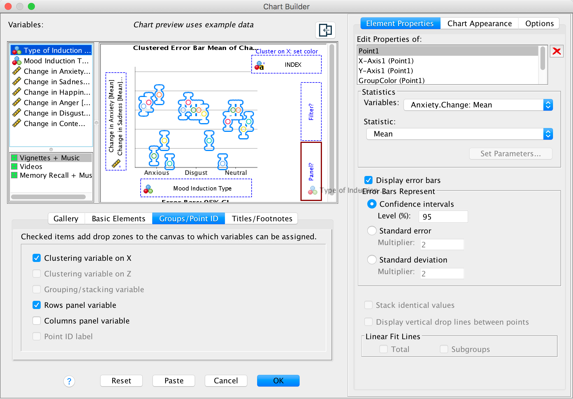
Completed dialog box
The completed graph shows that the neutral mood induction (regardless of the way in which it was induced) didn’t really affect mood too much (the changes are all quite small). For the disgust mood induction, disgust always increased quite a lot (the yellow bars) regardless of how disgust was induced. Similarly, the anxiety induction raised anxiety (predominantly). Happiness decreased for both anxiety and disgust mood inductions.
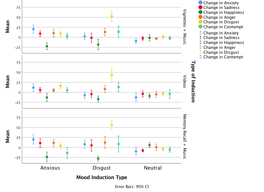
Output
To run the MANOVA, selecy Analyze > General Linear Model > Multivariate …. The main dialog box should look like this:
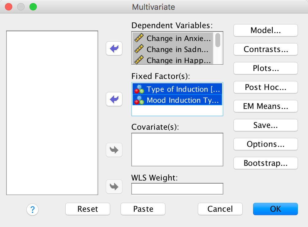
Completed dialog box
You can set whatever options you like based on the chapter. The main multivariate statistics are shown below. A main effect of mood was found F(12, 334) = 21.91, p < .001, showing that the changes for some mood inductions were bigger than for others overall (looking at the graph, this finding probably reflects that the disgust mood induction had the greatest effect overall – mainly because it produced such huge changes in disgust).
There was no significant main effect of the type of mood induction F(12, 334) = 1.12, p = .340, showing that whether videos, memory, tapes, etc., were used did not affect the changes in mood. Also, the type of mood × type of induction interaction, F(24, 676) = 1.22, p = .215, showed that the type of induction did not influence the main effect of mood. In other words, the fact that the disgust induction seemed to have the biggest effect on mood (overall) was not influenced by how disgust was induced.
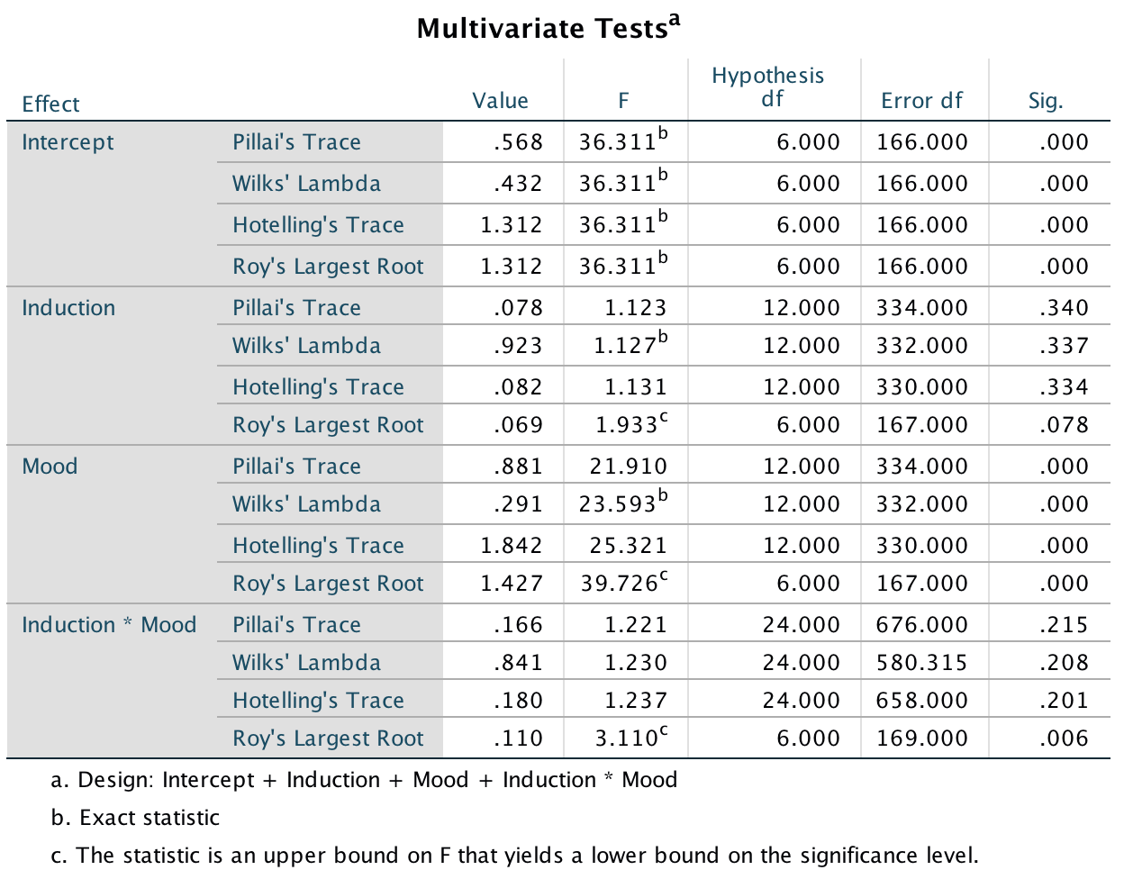
Output
The univariate effects for type of mood (which was the only significant multivariate effect) show that the effect of the type of mood induction was significant for all six moods (in other words, for all six moods there were significant differences across the anxiety, disgust and neutral conditions).
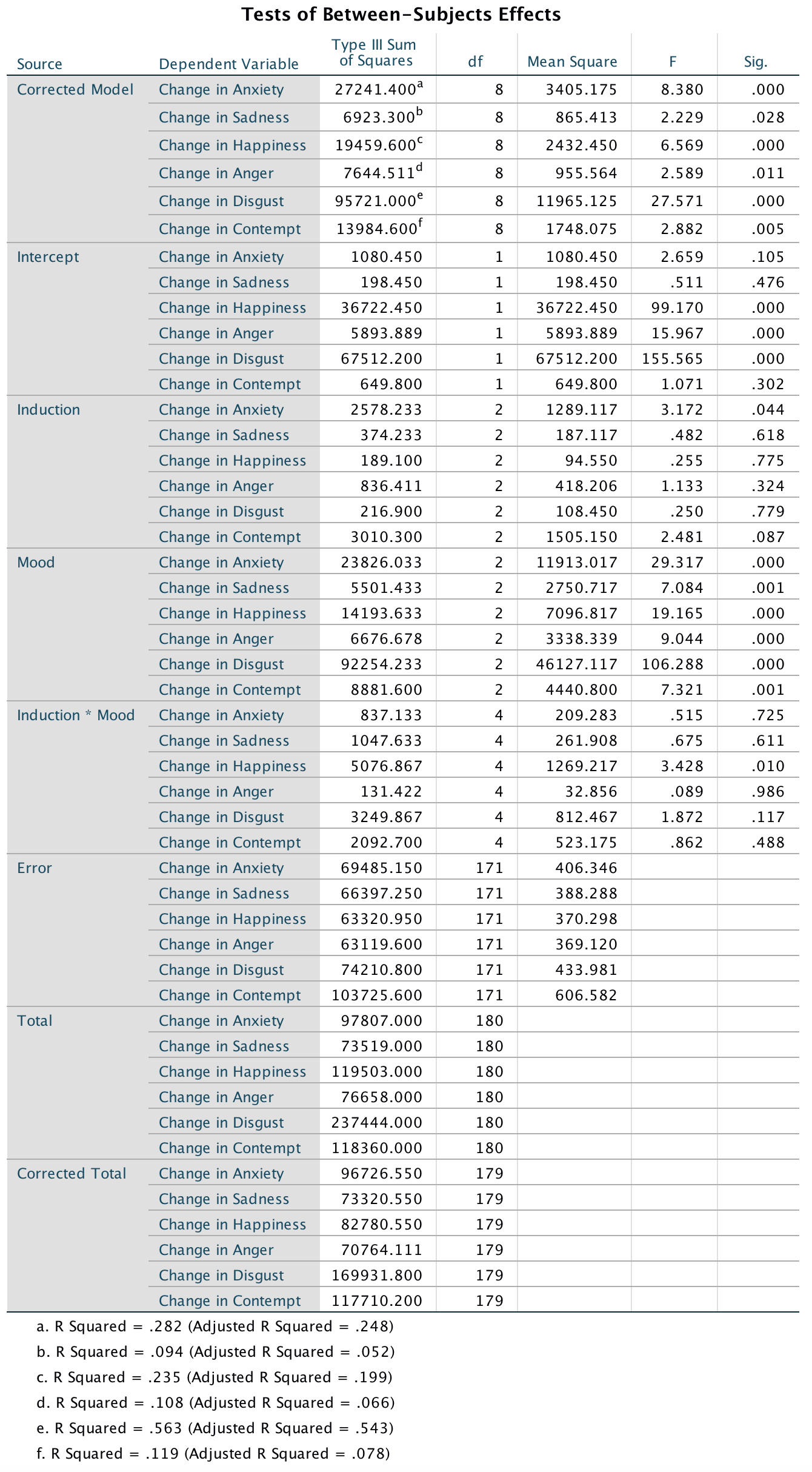
Output
You could produce a graph that collapses across the way that mood was induced (video, music, etc.) because this effect was not significant. (You can create this by going back to the chart builder and deselecting Rows panel variable.) We should do more tests, but just looking at the graph shows that change score in anxiety (blue bars) is highest for the anxiety induction, around 0 (i.e. there was no change) for the disgust induction, and negative for the neutral induction (i.e., anxiety went down). For disgust, the change was largest after the disgust induction, close to zero for the neutral conditiona nd slightly positive for the anxiety induction. For happiness, the change scores are strongly negative (i.e. happiness decreased) after both anxiety and disgust inductions, but the change score was close to zero after the neutral induction (i.e. happiness didn’t change).
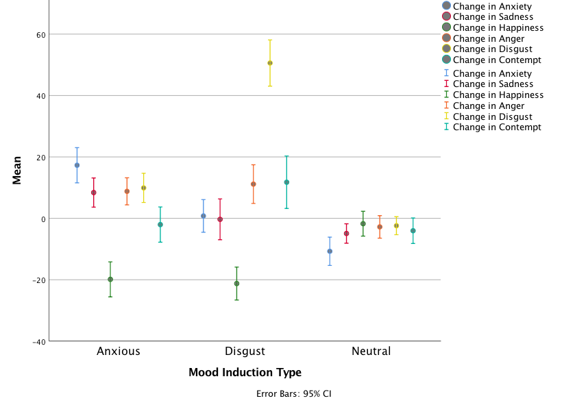
Output
Chapter 18
World wide addiction?
To get the descriptive statistics I would use Analyze > Descriptive Statistics > Frequencies …. Select all of the questionnaire items but just ask for means and standard deviations:
Completed dialog box
Completed dialog box
The table of means and standard deviations shows that the items with the lowest values are IAS-23 (I see my friends less often because of the time that I spend on the Internet) and IAS-34 (When I use the Internet, I experience a buzz or a high).
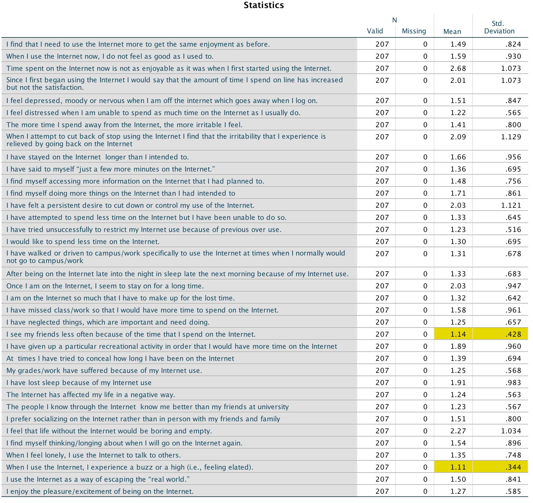
Output
To get a table of correlations select Analyze > Correlate > Bivariate ….. Select all of the variables:

Completed dialog box
To help interpret the resulting table you could use the Style dialog box to set a rule that highlights correlations that are small. For example, below I have set it to highlight correlations between –0.3 and 0.3:
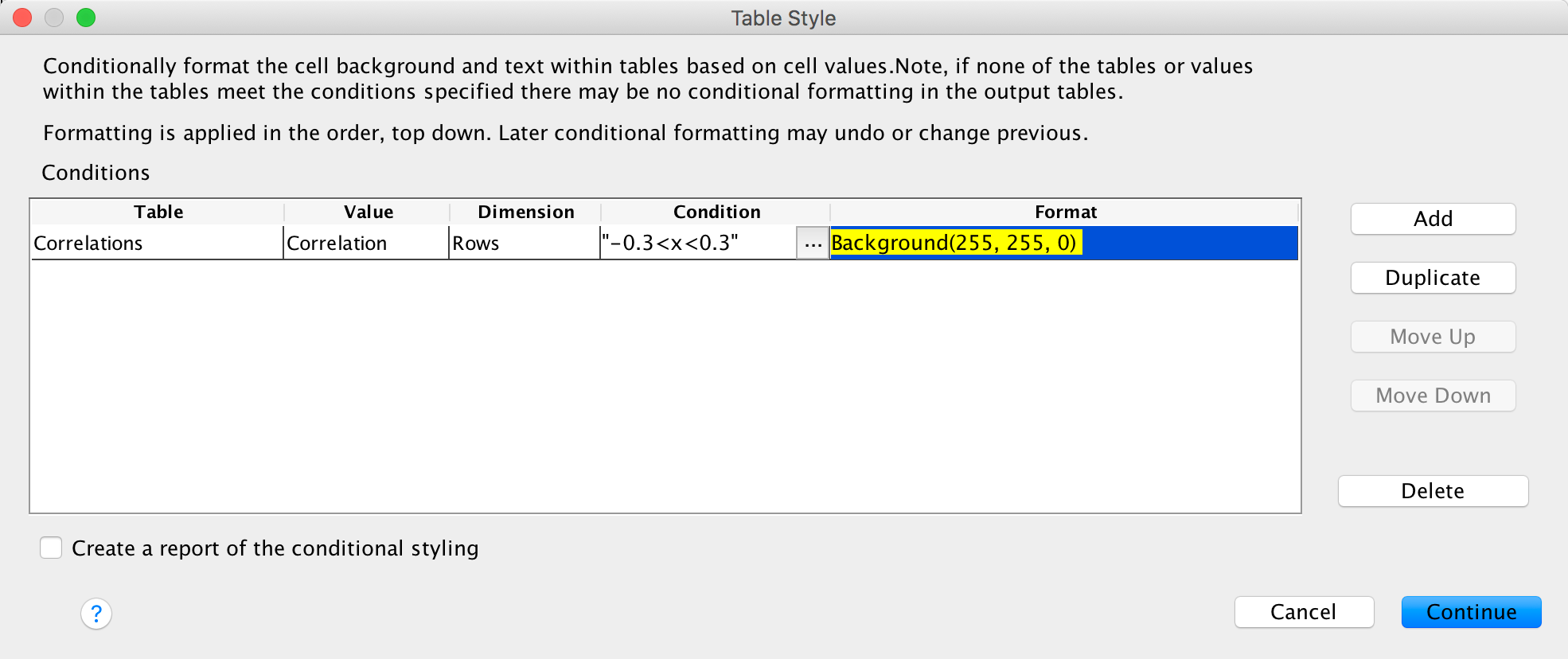
Completed dialog box
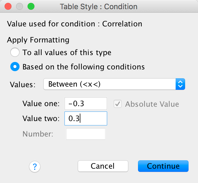
Completed dialog box
We know that the authors eliminated three items for having low correlations. Because we asked SPSS to highlight cells with low correlations (–0.3 to 0.3) we’re looking for variables that have a lot of highlighted cells. The three items that stand out are IAS-13 (I have felt a persistent desire to cut down or control my use of the internet), IAS-22 (I have neglected things which are important and need doing), and IAS-32 (I find myself thinking/longing about when I will go on the internet again.). As such these variables will also be excluded from the factor analysis.
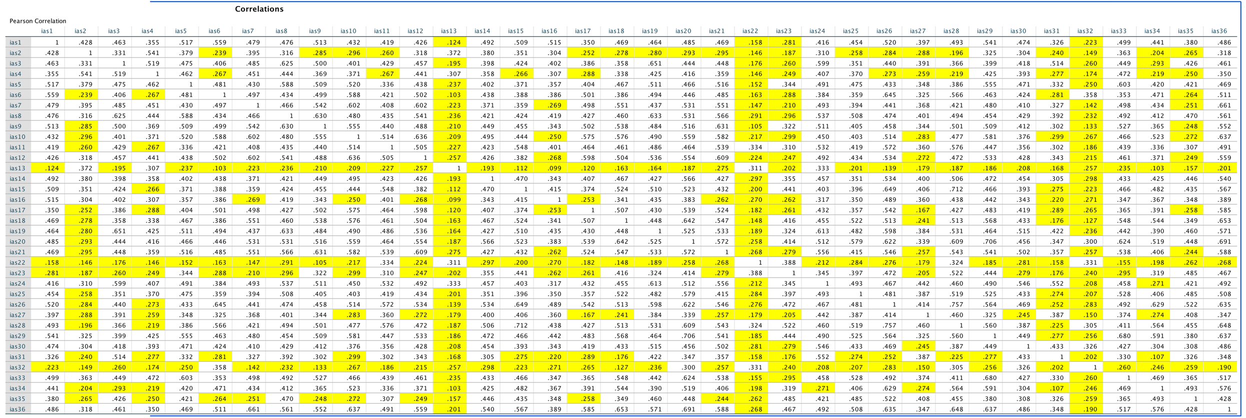
Output
To do the principal component analysis select Analyze > Dimension Reduction > Factor …. Choose all of the variables except for the five that we have excluded:
Completed dialog box
We can set the following options to replicate what the authors did:
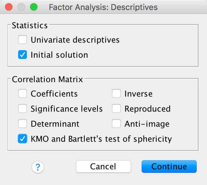
Completed dialog box
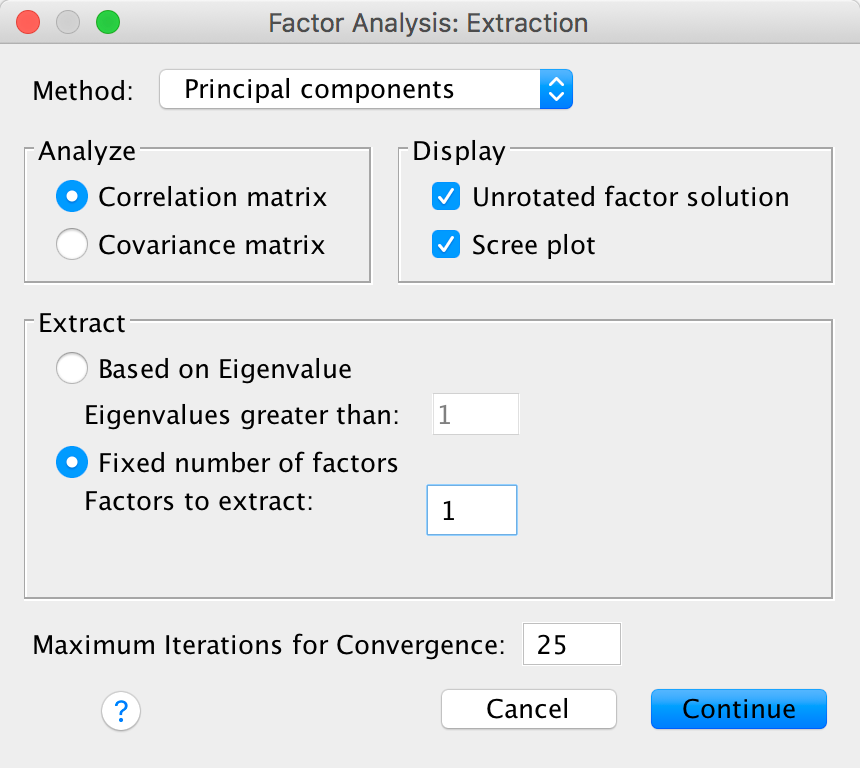
Completed dialog box
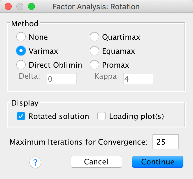
Completed dialog box
Sample size: When communalities after extraction are above .5, a sample size between 100 and 200 can be adequate, and even when communalities are below .5, a sample size of 500 should be sufficient (MacCallum, Widaman, Zhang, & Hong, 1999). We have a sample size of 207 with only one communality below .5, and so the sample size should be adequate. However, the KMO measure of sampling adequacy is .942, which is above Kaiser’s (1974) recommendation of .5. As such, the evidence suggests that the sample size is adequate to yield distinct and reliable factors.
Bartlett’s test: This test is significant, χ2(465) = 4238.98, p < .001, indicating that the correlations within the R-matrix are sufficiently different from zero to warrant factor analysis.
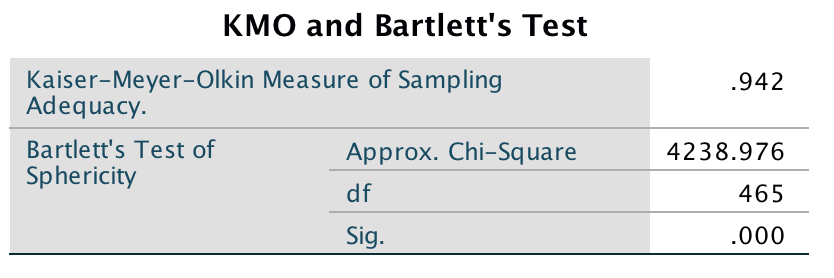
Output
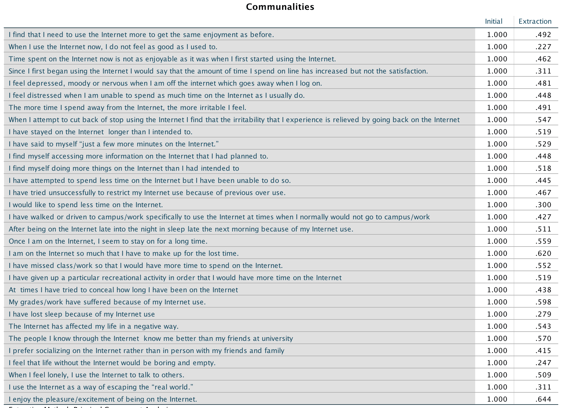
Output
Extraction: Note in the diagrams I forced SPSS Statistics to extract only 1 factor. By default it would have extracted five factors based on Kaiser’s criterion of retaining factors with eigenvalues greater than 1. Is this warranted? Kaiser’s criterion is accurate when there are less than 30 variables and the communalities after extraction are greater than .7, or when the sample size exceeds 250 and the average communality is greater than .6. For these data the sample size is 207, there are 31 variables and the mean communality is .64, so extracting five factors is probably not warranted. The scree plot (Output 6) shows a clear one-factor solution. This is the solution that the authors adopted and is the reason I forced a one-factor solution.
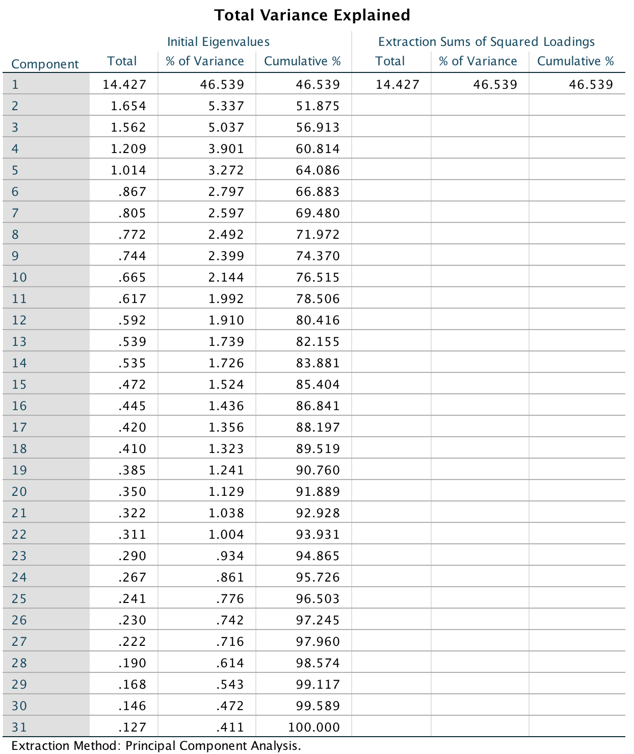
Output
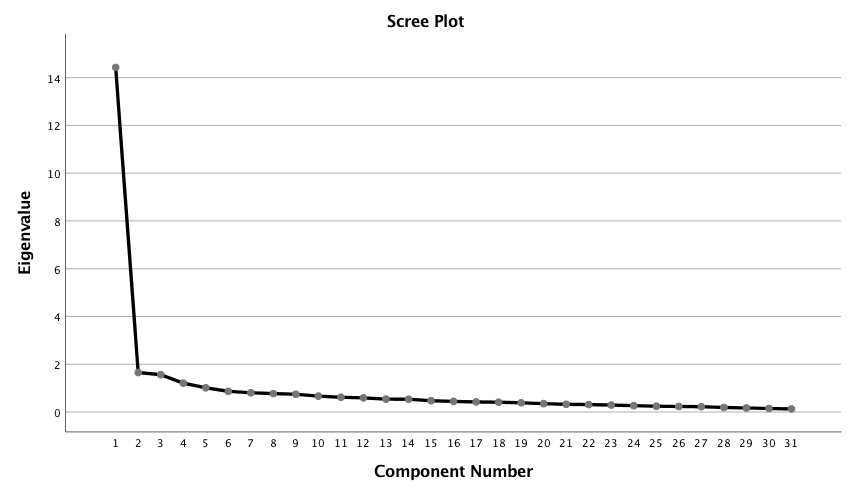
Output
Because we are retaining only one factor there won’t be a rotated factor solution so we can look at the unrotated component matrix. This shows that all items have a high loading on the one factor we extracted.
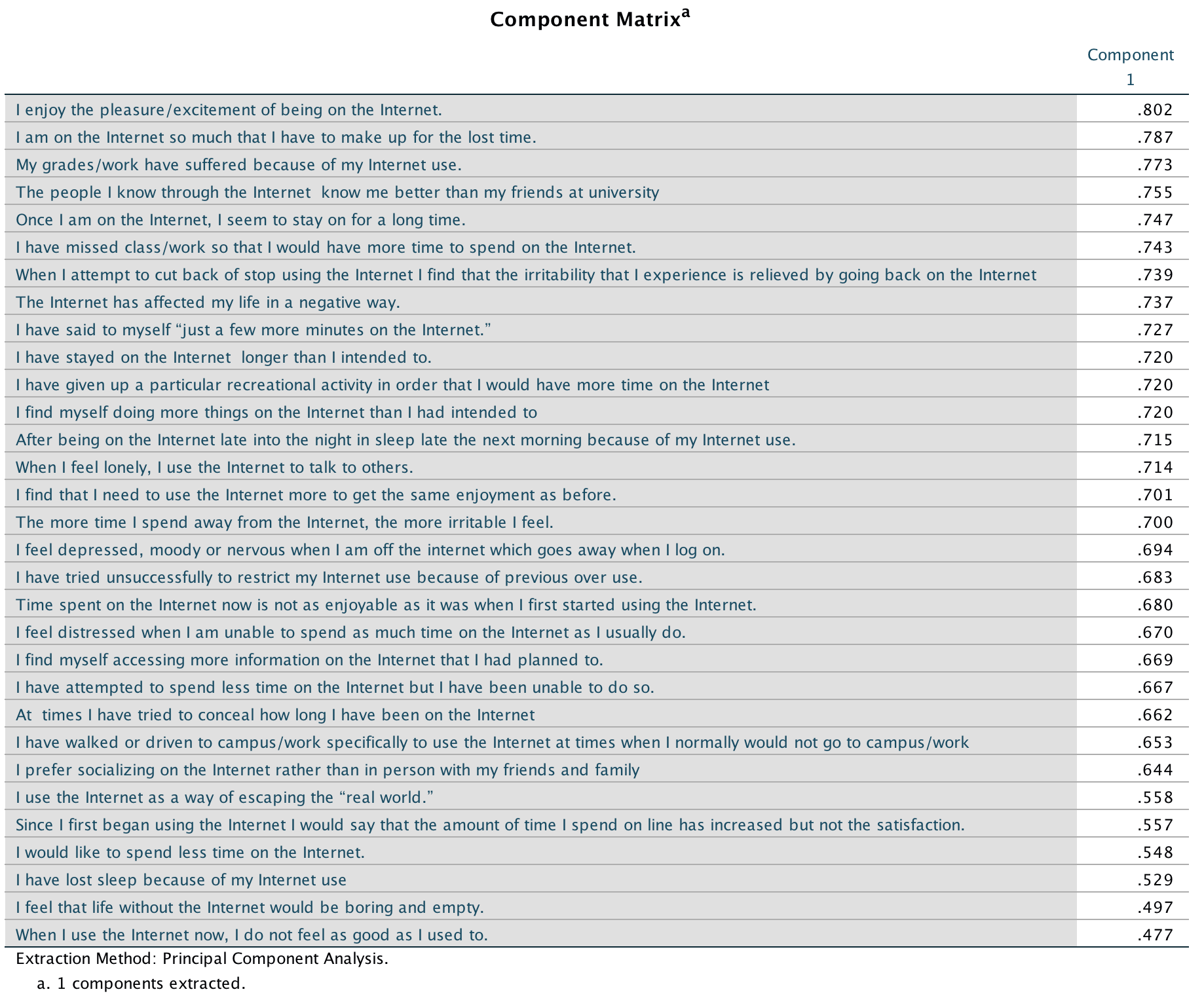
Output
The authors reported their analysis as follows (p. 382):
We conducted principal-components analyses on the log transformed scores of the IAS (see above). On the basis of the scree test (Cattell, 1978) and the percentage of variance accounted for by each factor, we judged a one-factor solution to be most appropriate. This component accounted for a total of 46.50% of the variance. A value for loadings of .30 (Floyd & Widaman, 1995) was used as a cut-off for items that did not relate to a component.
All 31 items loaded on this component, which was interpreted to represent aspects of a general factor relating to Internet addiction reflecting the negative consequences of excessive Internet use.
Chapter 19
The impact of sexualized images on women’s self-evaluations
Because the frequency data have been entered rather than raw data, we must tell SPSS Statistics that the variable Self_Evaluation represents the number of cases that fell into a particular combination of categories. To do this, access the Weight Cases dialog box (Data > Weight Cases …). Drag Self_Evaluation) to the box labelled Frequency variable:. Your completed dialog box should look like this:
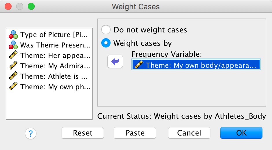
Completed dialog box
Next, select Analyze > Descriptive Statistics > Crosstabs …. Drag Type of Picture to the area labelled Row(s): and drag Was Theme Present or Absent in what participant wrote to the box labelled Column(s):
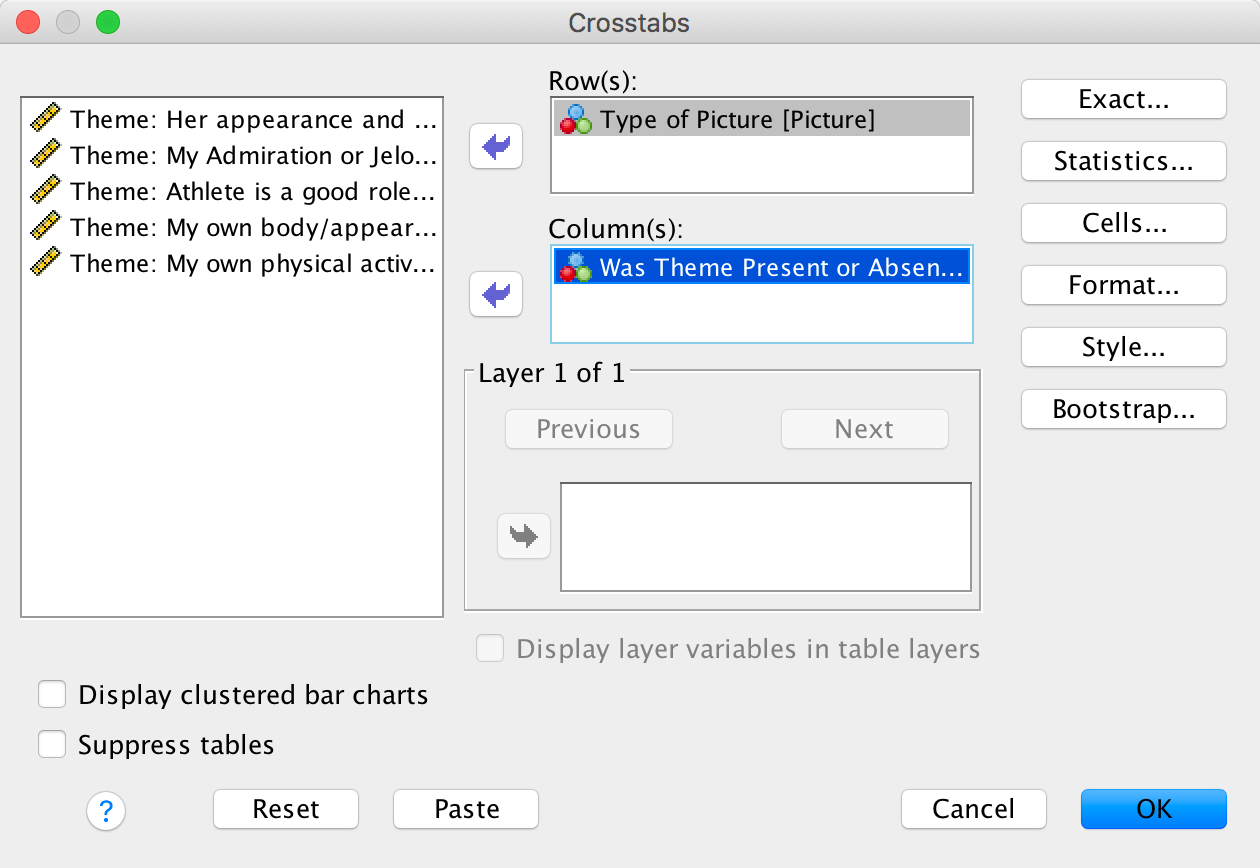
Completed dialog box
The Statistics dialog box is used to specify various statistical tests. Select the chi-square test, the contingency coefficient, phi and lambda:
Completed dialog box
The Cells dialog box is used to specify the information displayed in the crosstabulation table. It is important that you ask for expected counts because this is how we check the assumptions about the expected frequencies. It is also useful to have a look at the row, column and total percentages because these values are usually more easily interpreted than the actual frequencies and provide some idea of the origin of any significant effects. There are two other options that are useful for breaking down a significant effect (should we get one): (1) we can select a z-test to compare cell counts across columns of the contingency table, and if we do we should use a Bonferroni correction; and (2) select standardized residuals:
Completed dialog box
Let’s check that the expected frequencies assumption has been met. We have a 2 × 2 table, so all expected frequencies need to be greater than 5. If you look at the expected counts in the contingency table, we see that the smallest expected count is 34.6 (for women who saw pictures of performance athletes and did self-evaluate). This value exceeds 5 and so the assumption has been met.
The other thing to note about this table is that because we selected Compare column proportions our counts have subscript letters. For example, in the row labelled Performance Athletes the count of 97 has a subscript letter a and the count of 20 has a subscript letter b. These subscripts tell us the results of the z-test that we asked for: columns with different subscripts have significantly different column proportions. We need to look within rows of the table. So, for Performance Athletes the columns have different subscripts as I just explained, which means that proportions within the column variable (i.e., Was the theme present or absent in what they wrote?) are significantly different. The z-test compares the proportion of the total frequency of the first column that falls into the first row against the proportion of the total frequency of the second column that falls into the first row. So, of all the women who did self-evaluate (theme present), 26.3% saw pictures of performance athletes, and of all the women who didn’t self-evaluate (theme absent), 53.6% saw pictures of performance athletes. The different subscripts tell us that these proportions are significantly different. Put another way, the proportion of women who self-evaluated after seeing pictures of performance athletes was significantly less than the proportion who didn’t self-evaluate after seeing pictures of performance athletes.
If we move on to the row labelled Sexualized Athletes, the count of 84 has a subscript letter a and the count of 56 has a subscript letter b; as before, the fact they have different letters tells us that the column proportions are significantly different. The proportion of women who self-evaluated after seeing sexualized pictures of female athletes (73.7%) was significantly greater than the proportion who didn’t self-evaluate after seeing sexualized pictures of female athletes (46.4%).
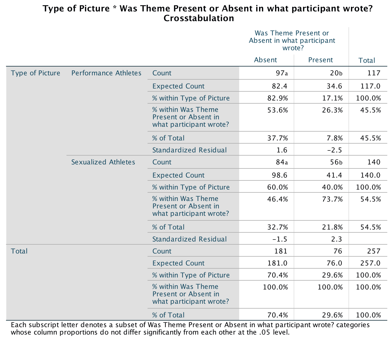
Output
As we saw earlier, Pearson’s chi-square test examines whether there is an association between two categorical variables (in this case the type of picture and whether the women self-evaluated or not). The value of the chi-square statistic is 16.057. This value is highly significant (p < .001), indicating that the type of picture used had a significant effect on whether women self-evaluated.
Underneath the chi-square table there are several footnotes relating to the assumption that expected counts should be greater than 5. If you forgot to check this assumption yourself, SPSS kindly gives a summary of the number of expected counts below 5. In this case, there were no expected frequencies less than 5, so we know that the chi-square statistic should be accurate.
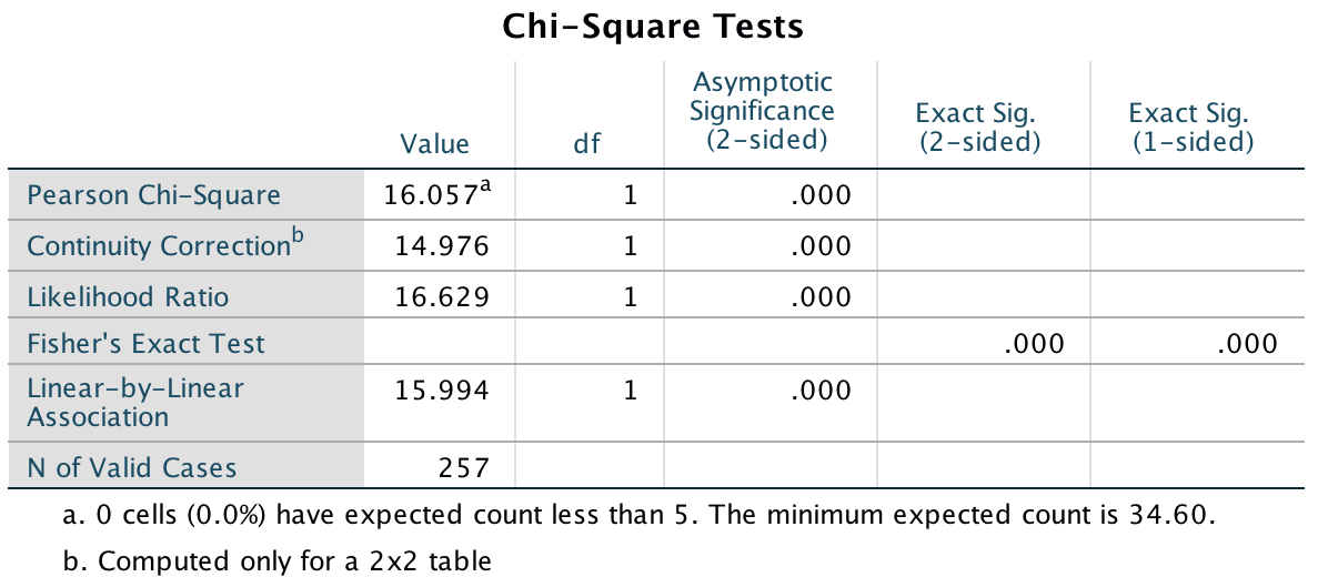
Output
The highly significant result indicates that there is an association between the type of picture and whether women self-evaluated or not. In other words, the pattern of responses (i.e., the proportion of women who self-evaluated to the proportion who did not) in the two picture conditions is significantly different. Below is an excerpt from Daniels’s (2012) conclusions:
Output
Is the Black American happy?
Are Black Americans happy?
Let’s run the analysis on the first question. First we must remember to tell SPSS Statistics which variable contains the frequencies by using Data > Weight Cases …. In the resulting dialog box drag Happy to the box labelled Frequency variable:
Completed dialog box
Next, select Analyze > Descriptive Statistics > Crosstabs …. Drag Profession to the area labelled Row(s): and drag Response to the box labelled Column(s):
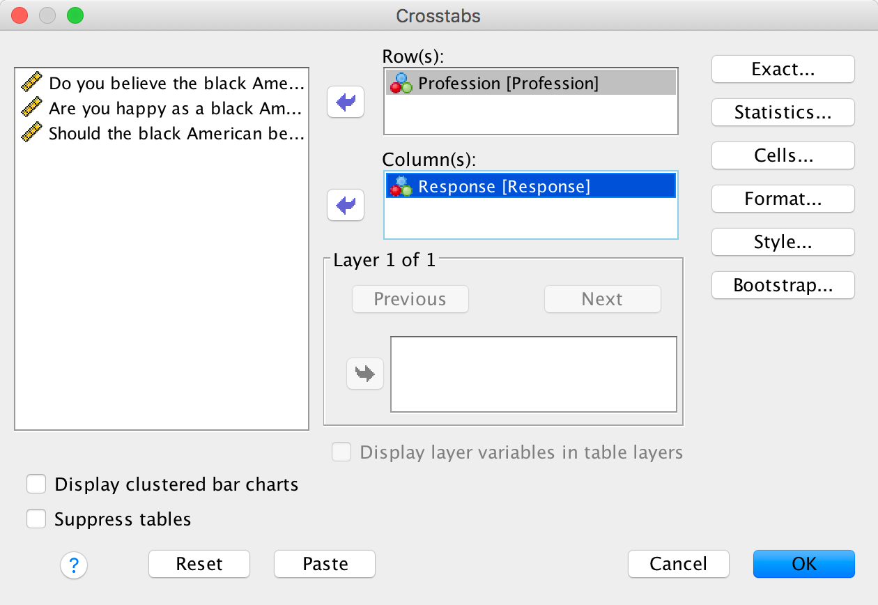
Completed dialog box
The Statistics dialog box is used to specify various statistical tests. Select the chi-square test, the contingency coefficient, phi and lambda:
Completed dialog box
The Cells dialog box is used to specify the information displayed in the crosstabulation table. It is important that you ask for expected counts because this is how we check the assumptions about the expected frequencies. It is also useful to have a look at the row, column and total percentages because these values are usually more easily interpreted than the actual frequencies and provide some idea of the origin of any significant effects. There are two other options that are useful for breaking down a significant effect (should we get one): (1) we can select a z-test to compare cell counts across columns of the contingency table, and if we do we should use a Bonferroni correction; and (2) select standardized residuals:
Completed dialog box
The chi-square test is highly significant, χ2(7) = 936.14, p < .001. This indicates that the profile of yes and no responses differed across the professions. Looking at the standardized residuals, the only profession for which these are non-significant are housewives who showed a fairly even split of whether they thought Black Americans were happy (40%) or not (60%). Within the other professions all of the standardized residuals are much higher than 1.96, so how can we make sense of the data? What’s interesting is to look at the direction of these residuals (i.e., whether they are positive or negative). For the following professions the residual for ‘no’ was positive but for ‘yes’ was negative; these are therefore people who responded more than we would expect that Black Americans were not happy and less than expected that Black Americans were happy: college students, preachers and lawyers. The remaining professions (labourers, physicians, school teachers and musicians) show the opposite pattern: the residual for ‘no’ was negative but for ‘yes’ was positive; these are, therefore, people who responded less than we would expect that Black Americans were not happy and more than expected that Black Americans were happy.
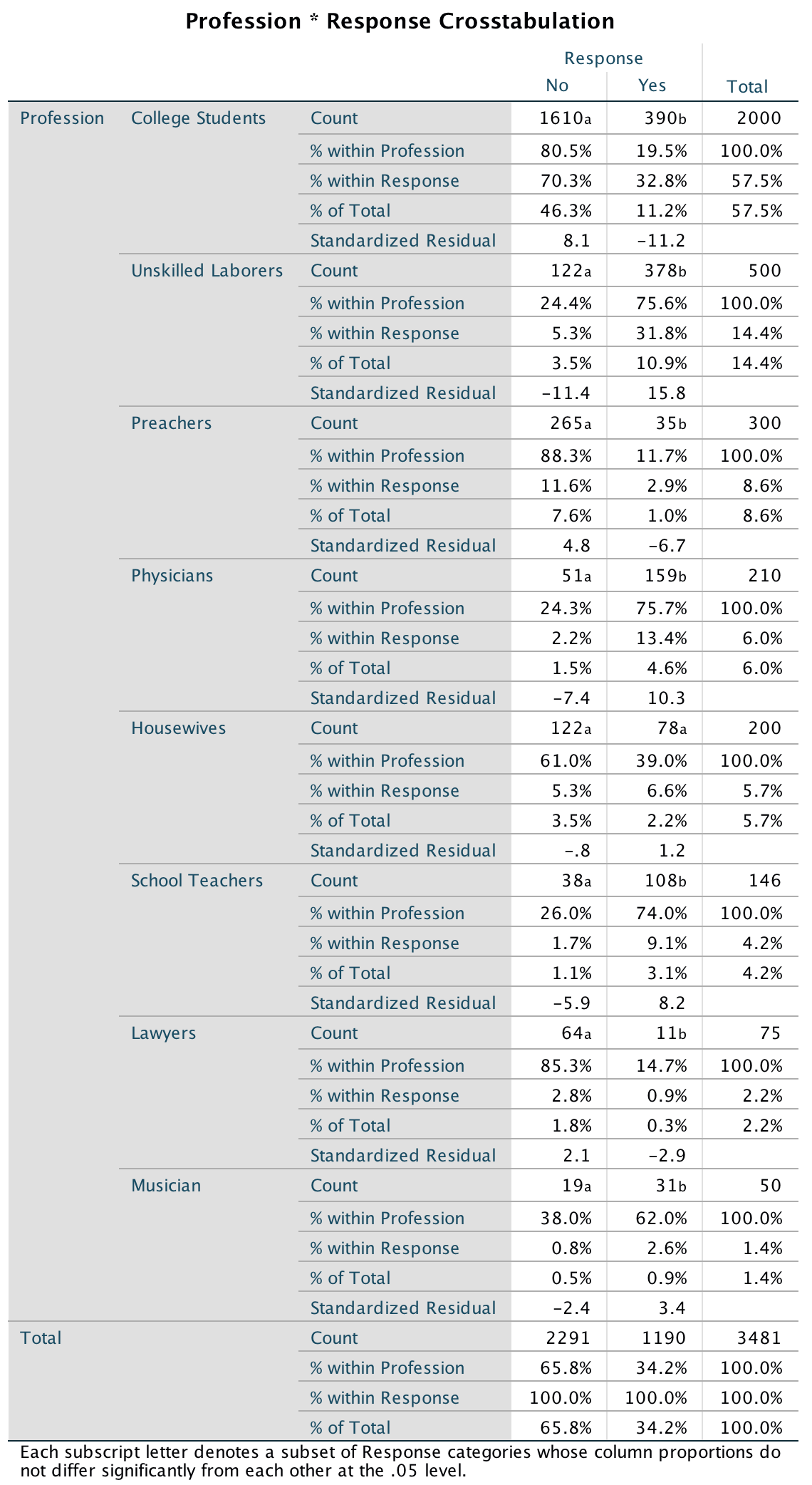
Output
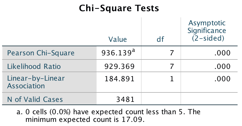
Output
Are they Happy as Black Americans?
We run this analysis in exactly the same way except that we now have
to weight the cases by the variable You_Happy. Select
Data > Weight Cases …. Assuming you’re following up the
previous analysis, click ![]() to place
Happy back into the variable list, then drag
You_Happy into the box labelled Frequency
variable:
to place
Happy back into the variable list, then drag
You_Happy into the box labelled Frequency
variable:
Completed dialog box
Next, select Analyze > Descriptive Statistics > Crosstabs
… and use the exact same options as before (if you’re following up
the previous analysis everything will be set up from the previous
analusis and you can simply click .
The chi-square test is highly significant, χ2(7) = 1390.74, p < .001. This indicates that the profile of yes and no responses differed across the professions. Looking at the standardized residuals, these are significant in most cells with a few exceptions: physicians, lawyers and school teachers saying ‘yes’. Within the other cells all of the standardized residuals are much higher than 1.96. Again, we can look at the direction of these residuals (i.e., whether they are positive or negative). For labourers, housewives, school teachers and musicians the residual for ‘no’ was positive but for ‘yes’ was negative; these are, therefore, people who responded more than we would expect that they were not happy as Black Americans and less than expected that they were happy as Black Americans. The remaining professions (college students, physicians, preachers and lawyers) show the opposite pattern: the residual for ‘no’ was negative but for ‘yes’ was positive; these are, therefore, people who responded less than we would expect that they were not happy as Black Americans and more than expected that they were happy as Black Americans. Essentially, the former group are in low-paid jobs in which conditions would have been very hard (especially in the social context of the time). The latter group are in much more respected (and probably better-paid) professions. Therefore, the responses to this question could say more about the professions of the people asked than their views of being Black Americans.
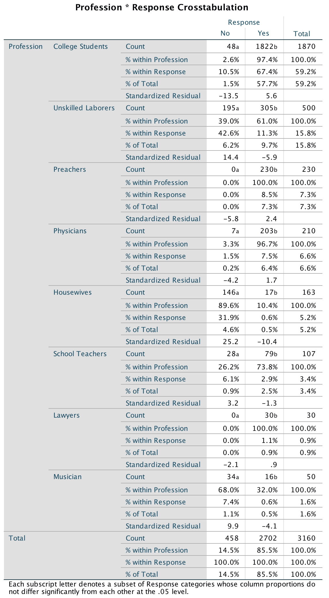
Output
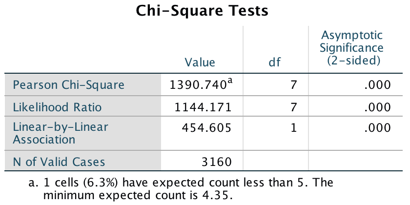
Output
Should Black Americans be happy?
We run this analysis in exactly the same way except that we now have
to weight the cases by the variable Should_Be_Happy.
Select Data > Weight Cases …. Assuming you’re following up
the previous analysis, click ![]() to place
You_Happy back into the variable list, then drag
Should_Be_Happy into the box labelled Frequency
variable:
to place
You_Happy back into the variable list, then drag
Should_Be_Happy into the box labelled Frequency
variable:
Completed dialog box
Next, select Analyze > Descriptive Statistics > Crosstabs
… and use the exact same options as before (if you’re following up
the previous analysis everything will be set up from the previous
analusis and you can simply click .
The chi-square test is highly significant, χ2(7) = 1784.23, p < .001. This indicates that the profile of yes and no responses differed across the professions. Looking at the standardized residuals, these are nearly all significant. Again, we can look at the direction of these residuals (i.e., whether they are positive or negative). For college students and lawyers the residual for ‘no’ was positive but for ‘yes’ was negative; these are, therefore, people who responded more than we would expect that they thought that Black Americans should not be happy and less than expected that they thought Black Americans should be happy. The remaining professions show the opposite pattern: the residual for ‘no’ was negative but for ‘yes’ was positive; these are, therefore, people who responded less than we would expect that they did not think that Black Americans should be happy and more than expected that they thought that Black Americans should be happy.
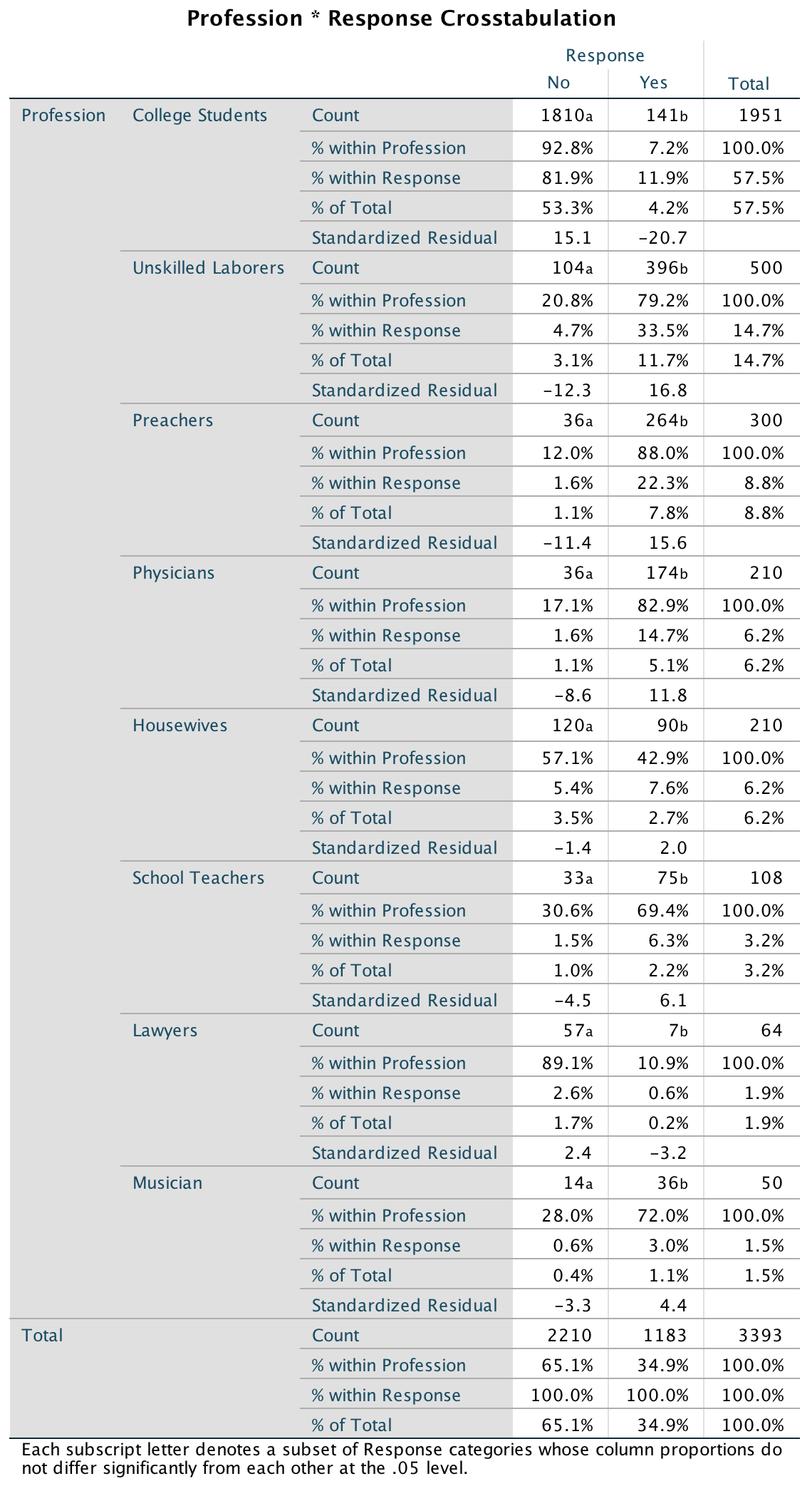
Output
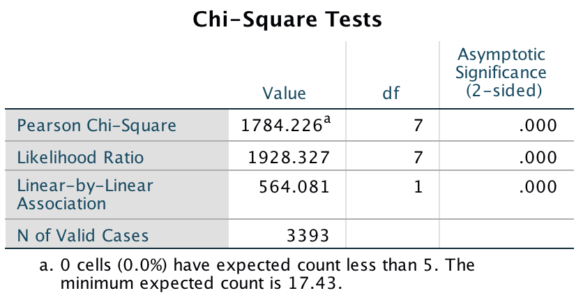
Output
What is interesting here and in the first question is that college students and lawyers are in vocations in which they are expected to be critical about the world. Lawyers may well have defended Black Americans who had been the subject of injustice and discrimination or racial abuse, and college students would likely be applying their critically trained minds to the immense social injustice that prevailed at the time. Therefore, these groups can see that their racial group should not be happy and should strive for the equitable and just society to which they are entitled. People in the other professions perhaps adopt a different social comparison.
It’s also possible for this final question that the groups interpreted the question differently: perhaps the lawyers and students interpreted the question as ‘should they be happy given the political and social conditions of the time?’, while the others interpreted the question as ‘do they deserve happiness?’
It might seem strange to have picked a piece of research from so long ago to illustrate the chi-square test, but what I wanted to demonstrate is that simple research can sometimes be incredibly illuminating. This study asked three simple questions, yet the data are utterly fascinating. It raises further hypotheses that could be tested, it unearths very different views in different professions, and it illuminates a very important social and psychological issue. There are others studies that sometimes use the most elegant paradigms and the highly complex methodologies, but the questions they address are utterly meaningless for the real world. They miss the big picture. Albert Beckham was a remarkable man, trying to understand important and big real-world issues that mattered to hundreds of thousands of people.
Chapter 20
Mandatory suicide?
The main analysis is fairly simple to specify because we’re just forcing all predictors in at the same time. Therefore, the completed main dialog box should look like the figure below. (Note that I have ordered the predictors as suggested by Labcoat Leni, and that you won’t see all of them in the dialog box because the list is too long!)
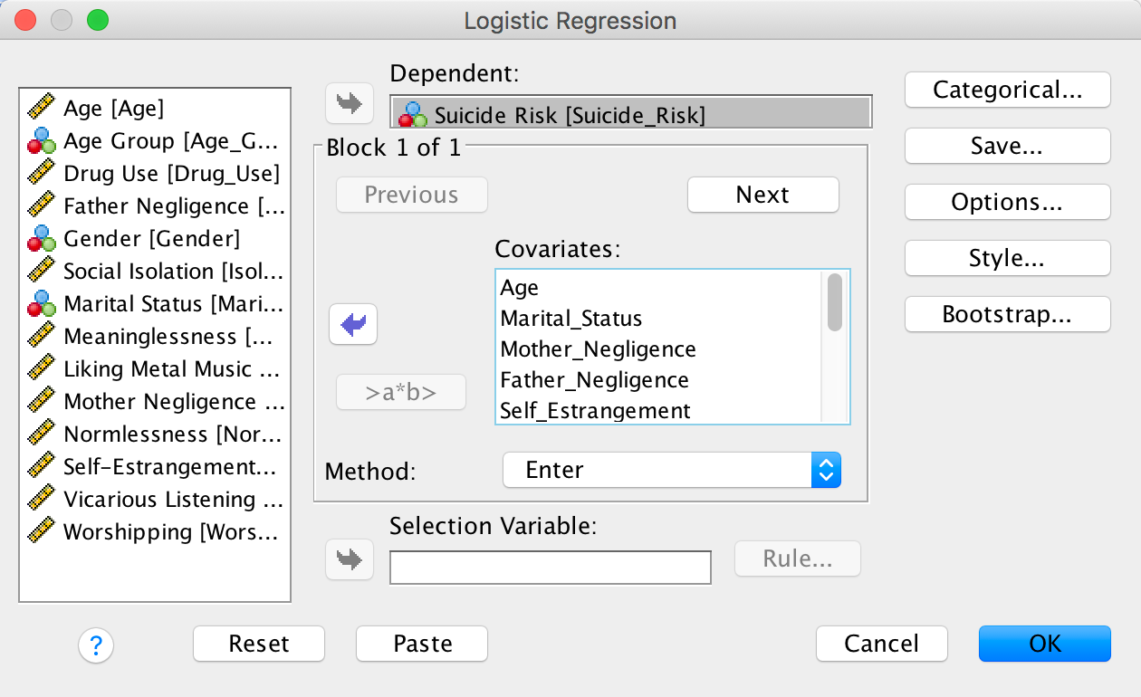
Completed dialog box
We also need to specify our categorical variables (ee have only 1, Marital_Status) using the Categorical dialog box. I have chosen an indicator contrast with the first category (Together) as the reference category. It actually doesn’t matter whether you select first or last because there are only two categories. However, it will affect the sign of the beta coefficient. I have chosen the first category as the reference category purely because it gives us a positive beta as in Lacourse et al.’s table. If you chose ‘last’ (the default) the resulting coefficient will be the same magnitude but a negative value instead.
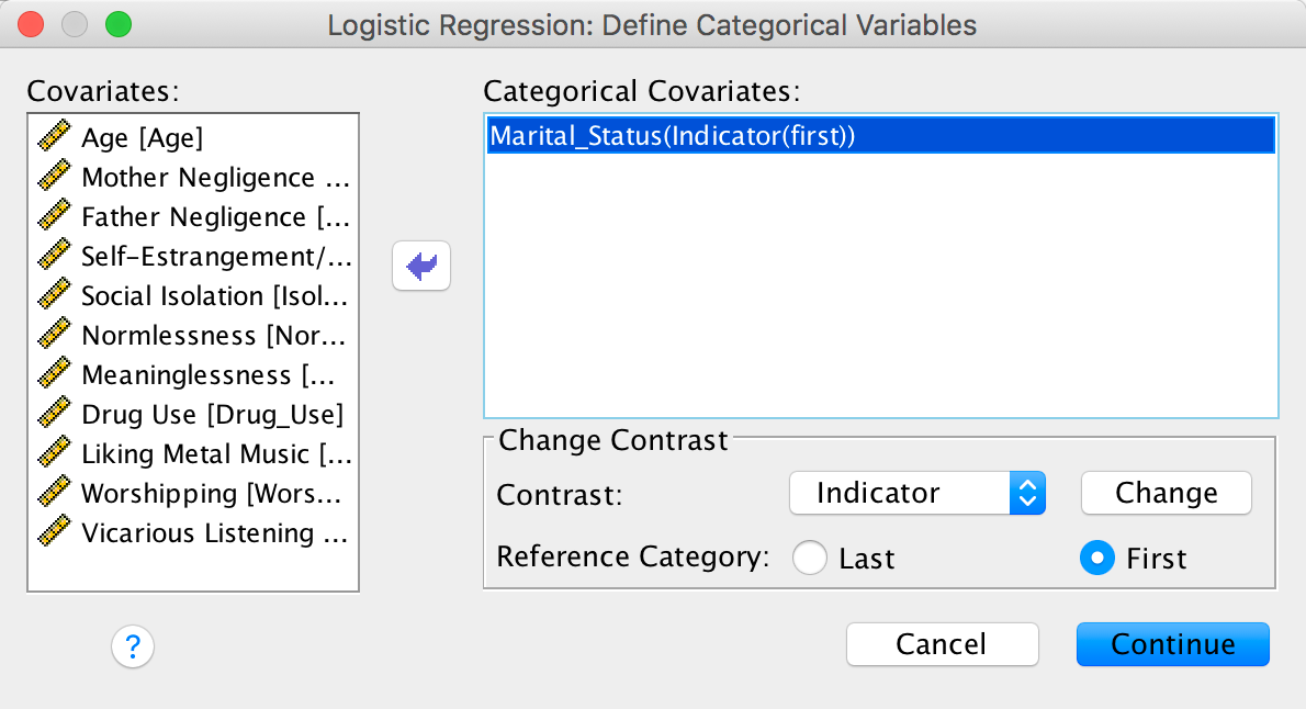
Completed dialog box
We can also use the Options dialog box to specify some options. You can select whatever other options you see fit based on the chapter but the CI for exp(B) option will need to be selected to get the same output as below.
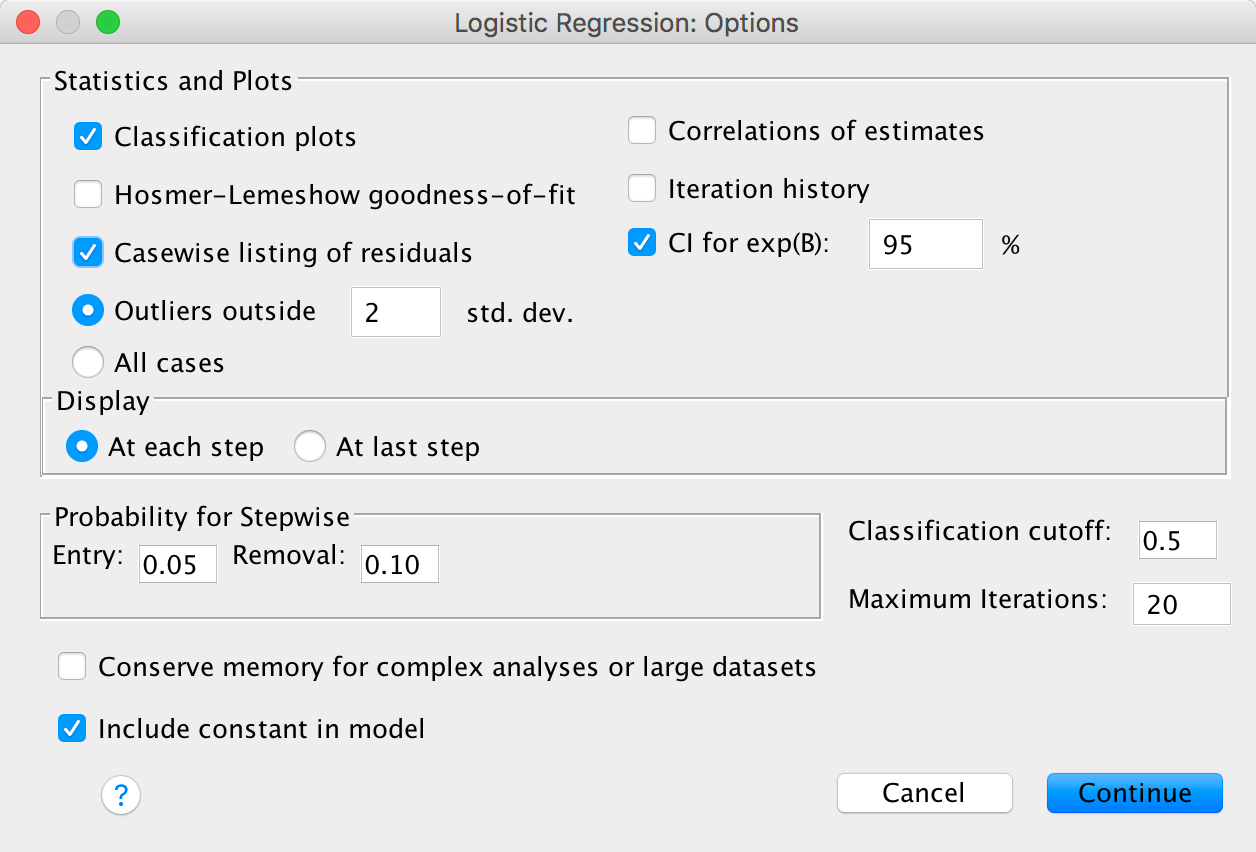
Completed dialog box
The main output is as follows:
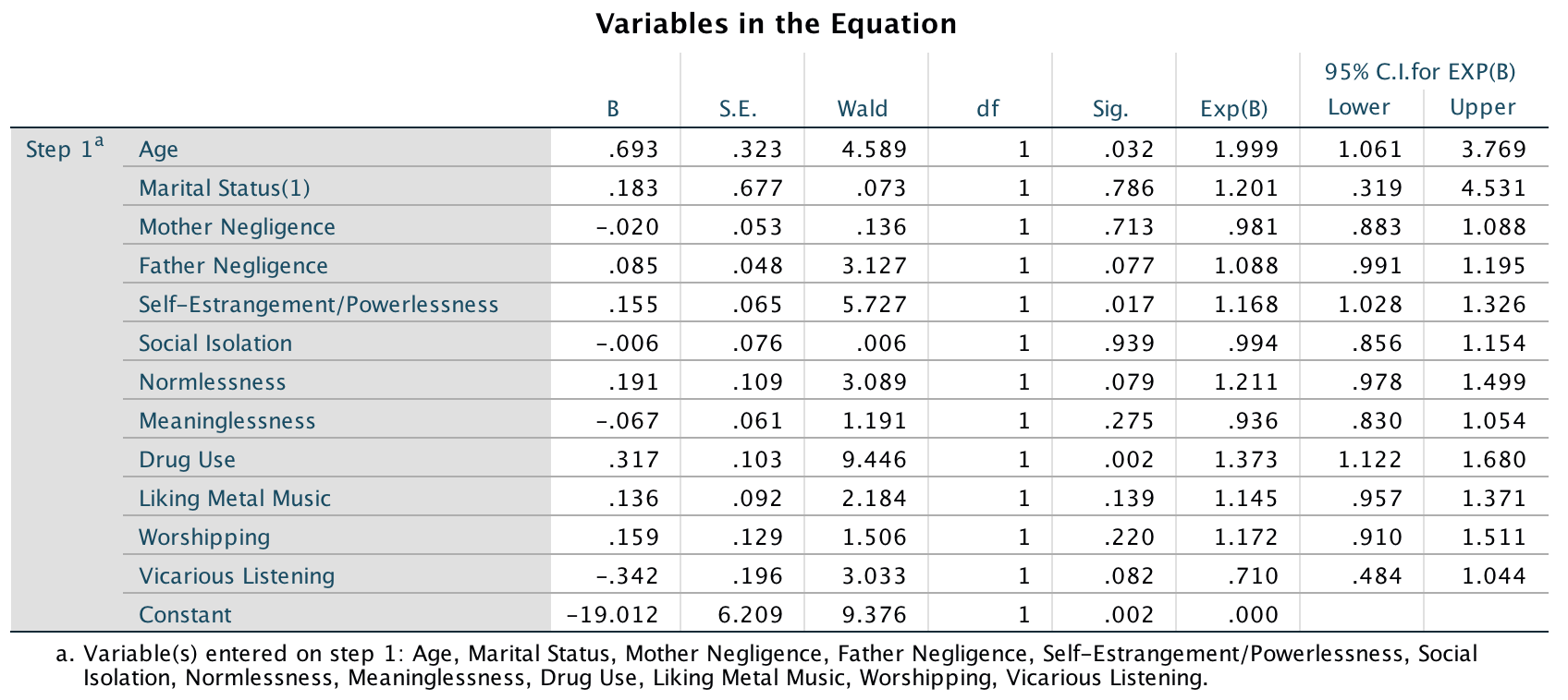
Output
We can present these results in the following table:
| Predictor | B | SE | 95% CI lower | Odds ratio | 95% CI upper |
|---|---|---|---|---|---|
| Constant | 6.21 | 6.21 | |||
| Age | 0.69* | 0.32 | 1.06 | 2.00 | 3.77 |
| Marital status | 0.18 | 0.68 | 0.32 | 1.20 | 4.53 |
| Mother negligence | −0.02 | 0.05 | 0.88 | 0.98 | 1.09 |
| Father negligence | 0.09* | 0.05 | 0.99 | 1.09 | 1.20 |
| Self-estrangement/ powerlessness | 0.15* | 0.06 | 1.03 | 1.17 | 1.33 |
| Social isolation | −0.01 | 0.08 | 0.86 | 0.99 | 1.15 |
| Normlessness | 0.19* | 0.11 | 0.98 | 1.21 | 1.50 |
| Meaninglessness | −0.07 | 0.06 | 0.83 | 0.94 | 1.05 |
| Drug use | 0.32** | 0.10 | 1.12 | 1.37 | 1.68 |
| Metal | 0.14 | 0.09 | 0.96 | 1.15 | 1.37 |
| Worshipping | 0.16* | 0.13 | 0.91 | 1.17 | 1.51 |
| Vicarious listening | −0.34 | 0.20 | 0.48 | 0.71 | 1.04 |
*p < .05, **p < .01; one-tailed
I’ve reported one-tailed significances (because Lacourse et al. do and it makes it easier to compare our results to Table 3 in their paper). We can conclude that listening to heavy metal did not significantly predict suicide risk in women (of course not; anyone I’ve ever met who likes metal does not conform to the stereotype). However, in case you’re interested, listening to country music apparently does (Stack & Gundlach, 1992)3. The factors that did predict suicide risk were age (risk increased with age), father negligence (although this was significant only one-tailed, it showed that as negligence increased so did suicide risk), self-estrangement (basically low self-esteem predicted suicide risk, as you might expect), normlessness (again, only one-tailed), drug use (the more drugs used, the more likely a person was to be in the at-risk category), and worshipping (the more the person showed signs of worshipping bands, the more likely they were to be in the at-risk group).
The most significant predictor was drug use. So, this shows you that, for girls, listening to metal was not a risk factor for suicide, but drug use was. To find out what happens for boys, you’ll just have to read the article! This is scientific proof that metal isn’t bad for your health, so download some Deathspell Omega and enjoy!
Chapter 21
A fertile gesture
Select Analyze > Mixed Models > Linear … to access the
main dialog box. In this example, multiple scores or shifts are nested
within each dancer. Therefore, the level 2 variable is the participant
(the dancer) and this variable is represented by the variable labelled
ID. Drag this variable to the box labelled
Subjects and click  to access
the main dialog box.
to access
the main dialog box.
Completed dialog box
In the main dialog box we need to set up our predictors and outcome. The outcome was the value of tips earned, so drag Tips to the box labelled Dependent variable:. We have two predictors: Cyclephase and Contraceptive. Drag both of these to the box labelled Factor(s):. We use the Factor(s) box because both variables are categorical.
Completed dialog box
To add these fixed effects to our model click on  to access the
Fixed Effects dialog box. To specify both main effects and the
interaction term, select both predictors (click on
Cyclephase and then, while holding down Ctrl
(⌘ on a mac), click on Contraceptive), then select
to access the
Fixed Effects dialog box. To specify both main effects and the
interaction term, select both predictors (click on
Cyclephase and then, while holding down Ctrl
(⌘ on a mac), click on Contraceptive), then select  , and
then click .
You should find that both main effects and the interaction term are
transferred to the Model: box. Click to return
to the main dialog box.
, and
then click .
You should find that both main effects and the interaction term are
transferred to the Model: box. Click to return
to the main dialog box.
Completed dialog box
In the model that Miller et al. fitted, they did not assume that there would be random slopes (i.e., the relationship between each predictor and tips was not assumed to vary within lap dancers). This decision is appropriate for Contraceptive because this variable didn’t vary at level 2 (the lap dancer was either taking contraceptives or not, so this could not be set up as a random effect because it doesn’t vary over our level 2 variable of participant). Also, because Cyclephase is a categorical variable with three unordered categories we could not expect a linear relationship with tips: we expect tips to vary over categories but the categories themselves have no meaningful order. However, we might expect tips to vary over participants (some lap dancers will naturally get more money than others) and we can factor this variability in by allowing the intercept to be random. As such, we’re fitting a random intercept model to the data.
To do this, click on  in the main
dialog box to access the Random Effects dialog box. The first
thing we need to do is to specify our contextual variable. We do this by
selecting it from the list of contextual variables that we have already
specified. These appear in the section labelled Subjects.
Because we specified only one variable, there is only one variable in
the list, ID.
in the main
dialog box to access the Random Effects dialog box. The first
thing we need to do is to specify our contextual variable. We do this by
selecting it from the list of contextual variables that we have already
specified. These appear in the section labelled Subjects.
Because we specified only one variable, there is only one variable in
the list, ID.
Drag this variable to the area labelled Combinations. We
want to specify that only the intercept is random, and we do this by
selecting  .
Notice that this dialog box includes a drop-down list used to specify
the type of covariance (
.
Notice that this dialog box includes a drop-down list used to specify
the type of covariance ( ).
For a random intercept model this default option is fine. Click to return
to the main dialog box.
).
For a random intercept model this default option is fine. Click to return
to the main dialog box.
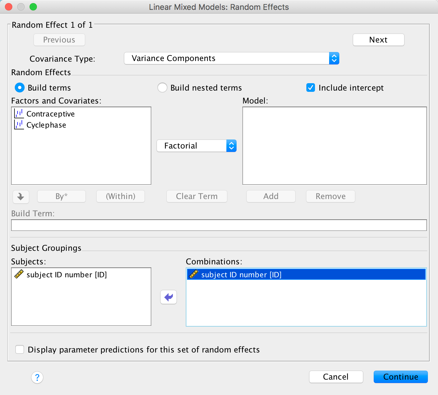
Completed dialog box
The authors report in the paper that they used restricted
maximum-likelihood estimation (REML), so click on  and
select this option. Finally, click
and
select this option. Finally, click  and
select Parameter estimates and Tests for covariance
parameters. Click to return
to the main dialog box. To fit the model click .
and
select Parameter estimates and Tests for covariance
parameters. Click to return
to the main dialog box. To fit the model click .
The first output tells us our fixed effects. As you can see they are all significant. Miller et al. reported these results as follows: ‘Main effects of cycle phase [F(2, 236) = 27.46, p < .001] and contraception use [F(1, 17) = 6.76, p = .019] were moderated by an interaction between cycle phase and pill use [F(2, 236) = 5.32, p = .005]’ (p. 378). Hopefully you can see where these values come from in the table (they rounded the df off to whole numbers).
Basically this shows that the phase of the dancer’s cycle significantly predicted tip income, and this interacted with whether or not the dancer was having natural cycles or was on the contraceptive pill. However, we don’t know which groups differed. We can use the parameter estimates to tell us.
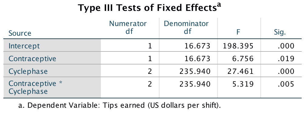
Output
I coded Cyclephase in a way that would be most useful for interpretation, which was to code the group of interest (fertile period) as the last category (2), and the other phases as 1 (Menstrual) and 0 (Luteal). The parameter estimates for this variable, therefore, compare each category against the last category, and because I made the last category the fertile phase this means we get a comparison of the fertile phase against the other two. Therefore, we could say (because the b is negative) that tips were significantly higher in the fertile phase than in the luteal phase, b = –100.41, t(235.21) = –6.11, p < .001, and in the menstrual phase, b = –170.86, t(234.92) = –9.84, p < .001. The beta, as in regression, tells us the change in tips as we shift from one group to another, so during the fertile phase, dancers than the menstrual phase.
These effects don’t factor in the contraceptive use. To look at this we need to look at the contrasts for the interaction term. The first of these tells us the following: if we worked out the relative difference in tips between the fertile phase and the luteal phase, how much more do those in their natural cycle earn compared to those on contraceptive pills? The answer is about $86. In other words, there is a combined effect of being in a natural cycle (relative to being on the pill) and being in the fertile phase (relative to the luteal phase), and this is significant, b = 86.09, t(237) = 2.86, p = .005. The second contrast tells us the following: if we worked out the relative difference in tips between the fertile phase and the menstrual phase, how much more do those in their natural cycle earn compared to those on contraceptive pills? The answer is about $90 (the b). In other words, there is a combined effect of being in a natural cycle and being in the fertile phase compared to the menstrual phase, and this is significant, b = 89.94, t(236.80) = 2.63, p = .009.
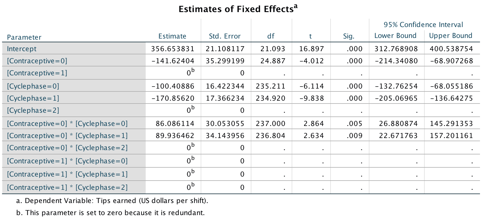
Output
The final table is not central to the hypotheses, but it does tell us about the random intercept. In other words, it tells us whether tips (in general) varied from dancer to dancer. The variance in tips across dancers was 3571.12, and this is significant, z = 2.37, p < .05. In other words, the average tip per dancer varied significantly. This confirms that we were justified in treating the intercept as a random variable.
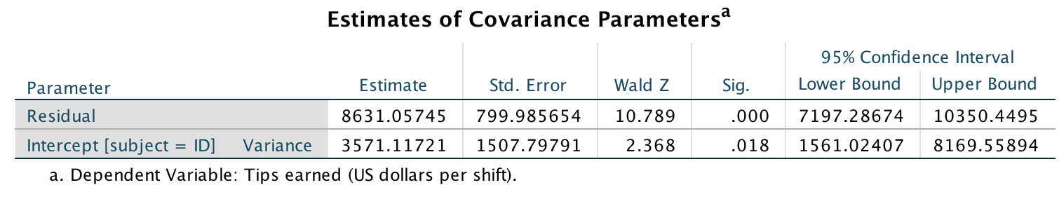
Output
To conclude, then, this study showed that the ‘estrus-hidden’ hypothesis is wrong: men did find women more attractive (as indexed by how many lap dances a woman performed and therefore how much she earned) during the fertile phase of their cycle compared to the other phases.
Remember that because of the nature of bootstrapping you will get slightly different values in your output.↩︎
Remember that because of the nature of bootstrapping you will get slightly different values in your output.↩︎
Stack, S., & Gundlach, J. (1992). The effect of country music on suicide. Social Forces, 71(1), 211–218.↩︎
Copyright © 2000-2019, Professor Andy Field.